10,000 search results
(0.074 seconds)
- Bandera Text Cyrillic by AndrijType,
$21.00 This serif typeface is a real workhorse. It is a modern tool for text design: extremely legible and well shaped. Bandera Text Cyrillic has six weights with original italics. It catches attention in headlines of posters and magazines or makes reading comfortable in plain texts. Don't forget try Medium and Medium Italic faces for free. Bandera Text Cyrillic works well with Bandera Cyrillic (slab serif), Osnova Cyrillic (sans serif) and Bandera Display Cyrillic (contrast serif) fonts. Bandera is Spanish for ‘flag’. And Bandera is a symbol of Ukrainian fighting for freedom for many years.
 - Monod Brun by Resident,
$40.00 Created in 2009 by V.H. Fleisher, Monod Brun is a geometric sans-serif typeface. The font has OpenType features that can be accessed in programs like the Adobe Creative Suite. These features include tabular lining figures, titling caps which are heavier & more loosely spaced than the regular caps, alternative punctuation marks, and arbitrary nut fractions (for single digit numerators & denominators). By clicking on the “Gallery” tab above, you can see an illustration of the OpenType features. The “ff” tab on the “Sample Text” bar below allows you to test the OpenType features with your own text. Supported languages include: Albanian, Czech, Danish, Dutch, English, Faroese, Finnish, French, German, Icelandic, Italian, Norwegian, Portuguese, Spanish & Swedish.
 - Praysire by Letterhend,
$19.00 Praysire is a sophisticated sans serif with beautiful swashes. It has many alternates which you can play around to match your project, whether for a standout headline, or for a tagline, you name it. The unique letterform makes this font one of a kind! Perfectly to be applied to the other various formal forms such as invitations, labels, logos, magazines, books, greeting / wedding cards, packaging, fashion, make up, stationery, novels, labels or any type of advertising purpose. Features : uppercase & lowercase numbers and punctuation multilingual alternates & ligatures PUA encoded We highly recommend using a program that supports OpenType features and Glyphs panels like many of Adobe apps and Corel Draw, so you can see and access all Glyph variations.
 - SK Selanik by Salih Kizilkaya,
$12.99 SK Selanik is a double weight geometric sans serif font family. It is named after Thessaloniki, one of the largest cities in Greece. This font, which depicts the historical texture of Thessaloniki with modern forms, is a synthesis of the past and today's design understanding. This font family includes a total of 40 fonts and 35,720 glyphs. It offers full support for the Latin, Greek and Cyrillic alphabets and supports hundreds of different languages. In this way, it contains all the typographic elements you will need. You can easily use it in all areas and sizes you need, from headings to body texts. You can visit my Behance account by clicking here to view more detailed project images.
 - Meta Link by Logofonts,
$10.00 Meta Link is Sans Serif inspired by future techno and sport great for product logo, poster, headline, card logo, web, magazine, packaging, stationery and much more. Easily creates your own logo types with font. Meta Link have 4 weight fonts with italic style also has an Open Type feature to access a large selection of unique alternative letters and many ligatures to make it easier for you to create. Meta Link can be accessed perfectly on design applications such as Adobe Illustrator, Adobe Photoshop, Corel Draw, Affinity Designer but does not rule out the possibility that it can also be accessed using web-based applications such as kittl, canva, artboard studio and others.
 - Genesa by Typogama,
$19.00 The Genesa typeface is a condensed, rounded sans serif typeface with a contemporary styling ideal for editorial or branding design. With it’s 4 weights and accompanying italics, this family can be used for large titles or display settings but is equally legible in small sizes for longer passages of text. Genesa combines a strong, vertical constructed style with a softer rounded approach that adds a humanist flavour. This typeface covers multiple languages through an extensive character set and a wide range of Opentype features that allow various character or numeral choices. A set of over 60 pictograms and arrows are equally features and through their carrying weights, can also be combined seamlessly with any style of the family.
 - Linotype Sicula by Linotype,
$29.99Linotype Sicula, from German designer Roberto Manella, is part of the TakeType Library, chosen from the entries of the Linotype-sponsored International Digital Type Design Contest 1999 for inclusion on the TakeType 3 CD. It is available in two weights, regular and oblique. Linotype Sicula will quickly win over any nostalgic spirits. Ornamental and sweeping, the figures line up on the paper, their contrasting strokes and playfully irregular forms giving them an exuberant, decorative character. The careful details of each figure come to light best when used in larger point sizes. Linotype Sicula is therefore best for headlines and can easily inspire typographic experiments and its capitals can serve as initials combined with other typefaces, especially sans serif. - Karl Geoff by Mas Anis Studio,
$16.00 Karl Geoff is a unique and cool looking handwritten script, ideal for use in projects that need an organic and natural style. This font is great for logotype, signatures, labels, and can add an elegant and classy look to your work. We keep Karl Geoff looks elegant, classy, readable, stylish, eye catching and easy to use. With Modern and Classy style, make this font perfect for project like watermark for photo, wedding, event, invitation, escort card, table number, header menus, editorial, display, logos, slider blog, social media, custom address, stamps, packaging, greeting card, etc. You can easily pair them with sans or serif font from all over the world to make your work more interesting!
 - Boltz by Designova,
$10.00 Boltz is a simple & cute sans-serif typeface perfect for headlines, big text, branding, logotypes & display usage. It can be excellent choice for creating outstanding logos, promotional content and marketing graphics that can bring uniqueness and freshness. Boltz comes with a highly creative handmade collection of Stylistic Alternatives for 14 uppercase letters which makes it easy to create unique monograms, logo and identities with these combinations. Please see the examples shown above to get an idea about the capability of this typeface. The typeface comes with Extended Latin character sets including Western European, Central European and South Eastern European character sets. Boltz comes with single weight but 6 variants (Regular, Italic, Outline, Outline Italic, 3D and 3D Italic).
 - Peloric by TanveerType,
$8.00 Introducing fresh PELORIC sans serif typeface which is well crafted for the classic and modern outlook. It can be read easily from a small size to a large size. Feeling fresh & trendy with it’s distinctive visual. It is well suited for branding, website & mobile layout and many more. It can also be used for branding materials, business cards, social media, packaging, prints, quotes & posters, etc. It comes up with 12 different weights as thin, thin italic, light, light italic, regular, italic, medium, medium italic, bold, bold italic, inline & inline italic. So, if you are looking for a new stylish and unique font, then here is the best font just designed for you and supporting any operating system and platform.
 - ITC Johnston by ITC,
$29.00ITC Johnston is the result of the combined talents of Dave Farey and Richard Dawson, based on the work of Edward Johnston. In developing ITC Johnston, says London type designer Dave Farey, he did “lots of research on not only the face but the man.” Edward Johnston was something of an eccentric, “famous for sitting in a deck chair and carrying toast in his pockets.” (The deck chair was his preferred furniture in his own living room; the toast was so that he’d always have sustenance near at hand.) Johnston was also almost single-handedly responsible, early in this century, for the revival in Britain of the Renaissance calligraphic tradition of the chancery italic. His book Writing & Illuminating, & Lettering (with its peculiar extraneous comma in the title) is a classic on its subject, and his influence on his contemporaries was tremendous. He is perhaps best remembered, however, for the alphabet that he designed in 1916 for the London Underground Railway (now London Transport), which was based on his original “block letter” model. Johnston’s letters were constructed very carefully, based on his study of historical writing techniques at the British Museum. His capital letters took their form from the best classical Roman inscriptions. “He had serious rules for his sans serif style,” says Farey, “particularly the height-to-weight ratio of 1:7 for the construction of line weight, and therefore horizontals and verticals were to be the same thickness. Johnston’s O’s and C’s and G’s and even his S’s were constructions of perfect circles. This was a bit of a problem as far as text sizes were concerned, or in reality sizes smaller than half an inch. It also precluded any other weight but medium ‘ any weight lighter or heavier than his 1:7 relationship.” Johnston was famously slow at any project he undertook, says Farey. “He did eventually, under protest, create a bolder weight, in capitals only ‘ which took twenty years to complete.” Farey and his colleague Richard Dawson have based ITC Johnston on Edward Johnston’s original block letters, expanding them into a three-weight type family. Johnston himself never called his Underground lettering a typeface, according to Farey. It was an alphabet meant for signage and other display purposes, designed to be legible at a glance rather than readable in passages of text. Farey and Dawson’s adaptation retains the sparkling starkness of Johnston’s letters while combining comfortably into text. Johnston’s block letter bears an obvious resemblance to Gill Sans, the highly successful type family developed by Monotype in the 1920s. The young Eric Gill had studied under Johnston at the London College of Printing, worked on the Underground project with him, and followed many of the same principles in developing his own sans serif typeface. The Johnston letters gave a characteristic look to London’s transport system after the First World War, but it was Gill Sans that became the emblematic letter form of British graphic design for decades. (Johnston’s sans serif continued in use in the Underground until the early ‘80s, when a revised and modernized version, with a tighter fit and a larger x-height, was designed by the London design firm Banks and Miles.) Farey and Dawson, working from their studio in London’s Clerkenwell, wanted to create a type family that was neither a museum piece nor a bastardization, and that would “provide an alternative of the same school” to the omnipresent Gill Sans. “These alphabets,” says Farey, referring to the Johnston letters, “have never been developed as contemporary styles.” He and Dawson not only devised three weights of ITC Johnston but gave it a full set of small capitals in each weight ‘ something that neither the original Johnston face nor the Gill faces have ‘ as well as old-style figures and several alternate characters. - Gramers by Dora Typefoundry,
$15.00 Gramers is an elegant and modern minimalist font family, a new roman sans serif font carefully crafted, These font ideas come from various references, from vintage, classic, art deco, to the modern era. Carefully drawn with high contrast between the strokes bold and thin with the aim of making even the simplest sans serif letters look sensual, elegant, and warm. The feeling of versatility and luxury you get in Gramers. As you can see in the display of our creations such as Branding, Header, Logotype, Posters, Magazines, Packaging, Art deco wedding invitations, and others. This shows that Gramers can accommodate various design styles. The flat lines cover five styles (each light, regular, medium, semi thick, Thick), each of which includes nearly 293 glyphs. OpenType features include 103 standard ligatures and a small number of character variants, and multilingual support (including multiple currency symbols). Features: • 5 Font weight • uppercase • Alternative & Ligature Styles • Numbers & Punctuation • Characters with accents • Supports Multiple Languages This type of family has become the work of real love, making it as easy and enjoyable as possible. I really hope you enjoy it! I can't wait to see what you make with Gramers! Feel free to use the #Dora Typefoundry and #Gramersfont tags to show what you've done!
 - Pamplemousse by The Ampersand Forest,
$19.00 Meet Pamplemousse, a display font that's part fun, casual script and part elegant typeface! Pamplemousse is most decidedly a fellow who enjoys lazy Sunday mornings spent sipping mimosas or bloody marys over a plate of eggs benedict and the New York Times crossword puzzle. He enjoys dressing up for use in branding and headlines (he looks particularly dashing in all caps) and also sitting back and composing a casual note to a dear friend. Pamplemousse is mostly sweet and just a little sophisticated, and he likes being just as he is. Pamplemousse started out as a typeface based on the lettering of Gustav Klimt in his poster for the first exhibition of the Vienna Secession movement (Art Nouveau). This drifted into an homage to Rea Irvin's iconic masthead typeface for the New Yorker magazine. Finally, with the addition of a lowercase (absent from Irvin's typeface), a significant revision away from both Klimt and Irvin into a more casual space, Pamplemousse was born! Oh — why "pamplemousse?" "Pamplemousse" is French for grapefruit. What goes better in your Sunday gin and tonic than an aromatic slice of pamplemousse? Say it a few times. Preferably after a couple of those g & t's. You'll see how fun he can be...
 - Bloemche by TypeThis!Studio,
$54.00 It's spring time and this is our tribute to the wonderful city of Colonia! Bloemche is a warm-hearted display serif font combining a set of floral symbols with an extravagant semi-script style. It is perfect for blogging a revitalizing style into the loveliest season. Create floral typography dreams and socialise with the people around you. Enjoy yourself! -- Typeface Features 711 Glyphs 45 Stylistic Alternates 6 Styles: Regular, Medium, Bold, Extra Bold, Black, Flowers Full Latin Language Support Numerators/Denominators Sub- and Superscript Fractions Ordinals Standard Ligatures Slashed Zero
 - Pacho by madeDeduk,
$15.00 Introducing Pacho is a brand new serif family with much special alternative glyphs and ligatures comes with 9 variable weight to get more stunning. Use this font family for any branding, product packaging, invitation, quotes, t-shirt, label, poster, logo etc. Feature 9 Weight UPPERCASE & Lowercase Number & Symbol International Glyphs Alternative & Ligatures Multilingual support Feel free to drop us a message any time and follow my shop for upcoming updates Shoot me on email at: dedukvic@gmail.com and find more previews on my Instagram here : https://www.instagram.com/acekelgondolayu/?hl=en Hope you enjoy it.
 - Valveto by Maulana Creative,
$16.00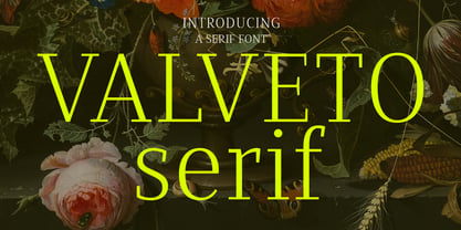 Valveto is a modern display serif. With light and consist serif stroke, fun character with a bit of ligatures and alternates. To give you an extra creative work. Valveto font support multilingual more than 100+ language. This font is good for logo design, Social media, Movie Titles, Books Titles, a short text even a long text letter and good for your secondary text font with sans or serif. Make a stunning work with Valveto font. Cheers, Maulana Creative
 - Holy Cream by Shakira Studio,
$17.00 Say hello to new serif font, Holy Cream! Holy Cream is a font that takes you back to the trendy retro era. With a classic display serif style but with a modern feel, Holy Cream emphasizes the uniqueness and elegance of each letter. The bold, contoured serif design provides a strong vintage touch, while stylish and quirky alternatives add a charming creative dimension. When using Holy Cream, you will feel a touch of fun nostalgia, but also explore ongoing design trends at the same time. Whether you want to feature your headline in a print ad, poster, or other graphic design, Holy Cream delivers a trendy, retro vibe that grabs attention with its ability to adapt to a variety of visual styles. So, with Holy Cream, make your design speak in a stylish and unique retro style, captivate the audience and make an unforgettable impression. Here's what you get: Holy Cream Regular and Italic All Multilingual symbol Opentype features ( ligature, alternate ) Accessible in the Adobe Illustrator, Adobe Photoshop, Adobe InDesign, even work on Microsoft Word. PUA Encoded Characters - Fully accessible without additional design software. Multilingual character supports : (Afrikaans, Albanian, Catalan, Croatian, Czech, Danish, Dutch, English, Estonian, Finnish, French, German, Hungarian, Icelandic, Italian, Lithuanian, Maltese, Norwegian, Polish, Portuguese, Slovenian, Spanish, Swedish, Turkish, Zulu)
 - ITC Motter Corpus by ITC,
$40.99ITC Motter Corpus was designed by the Austrian type designer Othmar Motter in 1993 to combine the display advantages of a sans serif extra bold design with the legibility of a roman weight. The Motter Corpus is available in the weights regular and condensed regular. The capitals with their strong strokes display slight irregularities and natural looking outlines. When used in very large point sizes the tiny serifs become noticeable. Distinguishing characteristics of this typeface are the unusual design of the g with its upward reaching ear and that of the capital C, whose curve ends in an angular stroke in its upper third. Almost, but not quite, a sans serif, the typeface has diminutive serifs which, along with its modulated weight contrasts, make ITC Motter Corpus remarkable legible in display applications and will give text a nostalgic feel. A similar typeface is Linotype Bariton. - Royal Glamour by Fikryal,
$22.00 Royal Glamor is a modern serif font with a luxurious and elegant feel. With its thin, bold serif lines, this font can convey a professional and profound impression, while still looking friendly and inviting. The “Royal Glamor” font has a clean, regular Typeform, with symmetrical and proportionate parts. This makes them easy to read and suitable for use with a variety of media types, such as brochures, magazines and logo designs. With the right color, this font can provide a strong contrast effect, giving a design an exclusive and luxurious impression. Perfect for projects that require a serious feel, but are still modern and elegant. Features: Multilingual Support If you have any questions please don’t hesitate to contact me follow my Instagram: @fkryall Thank you
 - Qaligo by Youthlabs,
$18.00 Introducing Qaligo Serif Font - A Brand New Serif Font with Luxury Shape, More Opentype Feature, more neat curves Qaligo Serif Font Inspired by Modern and Luxury Typography. Qaligo Serif Font is a very versatile font. you can use this font to various design. Basics can improve more than 250 alternates character where can collaborate with premade logos. WHAT'S YOU GET ? Unique Letterforms Works on PC & Mac Simple Installations Accessible in the Adobe Illustrator, Adobe Photoshop, Microsoft Word even work on Canva! Fully accessible without additional design software. I really hope you'll get pleasure using Qaligo Serif font and it will be perfect addition to your font collection! Contact me with an inbox message If you have any question. Thank you! Happy Creating.
 - VNI-Thufap3 - Unknown license

- Double Nines JNL by Jeff Levine,
$29.00 Double Nines JNL is a dingbat font containing fifty-five glyphs for the tiles found in the second level of domino games. Sets of dominoes can be of either double six, double nine or double twelve. In this font, the double blank tile is located on the zero keystroke, while the one/blank and 1/1 tiles are on the 1 and 2 keystrokes. The rest of the tiles (in numerical order through 9/9) are located on the A-Z and a-z keystrokes respectively. To use any or all of the images contained in Double Nines JNL in any manufactured products or services, please refer to the software license agreement provided when purchasing this font. A separate royalty license must be secured from Jeffrey N. Levine for such purposes. The images are NOT licensed for use in proprietary logos or service marks.
 - Gelion by Halbfett,
$30.00 Gelion is a large family of geometric sans serif fonts. It ships both as two Variable Fonts or as 16 traditional fonts. Those static fonts span eight different weights, ranging from Extralight to Black. Each has an upright and an italic font on offer. The italics are carefully crafted, with an 8° slope. Gelion is inspired by 20th-century geometric sans serifs and classic neo-grotesque designs from the late 19th century and the middle of the 20th century. Its forms remain true to the gracefully geometric look of its classic predecessors, which will surely tick off any client’s long list of branding requirements. Letters in all of Gelion’s weights are drawn with virtually monolinear strokes. Its lowercase letters have a tall x-height. Yet, that still leaves enough room for the fonts’ diacritical marks. Gelion’s default “a” and “g” each have single-storey forms by default. The dots on the ‘i’, ‘j’, and diacritics are round, as are the punctuation marks. Gelion is an excellent choice for both corporate design and editorial design projects, thanks to its range of weights and its legibility in text. The fonts include a lot of ligatures, some monochromatic emoji, a set of arrows, lovely Roman Numerals, and more. Thanks to Gelion’s stylistic alternates, if a project comes up where you do not need a geometric vibe, you can activate Stylistic Set 1. That will replace many of the fonts’ letters with more humanistic-sans alternates, giving your text the feeling of a whole other type design with just one click. Last but not least, the descending “f” available in Gelion’s italics is a nice typographic trait.
 - Retro Thunders by Lettersiro,
$25.00 This is our newest product, inspired by retro style. We call this font "Retro Thunders". Retro Thunders is perfect for any retro project, poster, logo, label, clothing, music album cover, and many others. Comes with solid and extrude style, you can use this font easily, and make save a lot of your time in creating. Retro Thunders also contains: - Opentype Features : swash, ligatures, stylistic alternate, ss01, ss02 , ss03 - 8 end swashes - Basic Latin Language Support (AÀÁÂÃÄÅCÇDÐEÈÉÊËIÌÍÎÏNÑOØÒÓÔÕÖUÙÜÚÛWYÝŸÆßÞþ )
 - 2010 Dance Of Death by GLC,
$30.00 This font was inspired from the medieval Dances of Death patterns, as a modest tribute to the famous engraver Hans Holbein's Alphabet of Death. We have tried to keep the spirit of the time -- its sarcastic humor mixed with its objective and frozen realism. The font, consisting in two complete capital alphabets: Initials and caps, and a lot of separate figures added, is especially improved by strong enlargements, 72 pts and more, and has very good results when printed.
 - La Jefa by Lauren Ashpole,
$15.00 A short font for short people* La Jefa is very, very loosely based on a Christmas card I received years ago from my boss at the time. Designed to capture that personalized touch, it's a hand lettered font with a short x-height and ample spacing. Although all of the letters are lowercase, the uppercase provides a unique set of characters that can be mixed in for a more natural handwritten feel. *also people of tall or average height
 - Boundary by Larin Type Co,
$15.00 Boundary This is a vintage display font inspired by signage, logos in the style of the old time. This is a great find for creating logos, various kinds of designs in vintage style. This font includes 2 font styles: regular and rough style, also it includes alternates for uppercase and lowercase. Try changing them and see how diverse it can be. Font includes: Full alphabet A-z Numbers, fractions Punctuation and symbols Alternates for Uppercase Alternates for Lowercase
 - SF Mabsut by Sultan Fonts,
$19.99 Sultan-Mabsut, designed by Sultan Maqtari in 2018, is an Arabic typeface in the style of Maghribi (Moroccan Mabsut). This style, which originated in western North Africa, is characterized by a strong baseline and long, fluid, and curvaceous curves. It can be used in headlines or in text and gives a very fresh and calligraphic look. The font combines two methods of writing at one time (writing oriental and writing Moroccan). It also includes lots of Stylistic Alternates.
 - Knip by Hanoded,
$15.00 Knip, in Dutch, means ‘cut’. You can tell by the glyphs that I made this font by cutting out the shapes from black paper, gluing it onto white paper and photographing the result so I could digitalise it! I don’t make too many cut out fonts, as it is a lot of work and it often leads to nothing. Besides that, I depend on the paper supply from my kids and they happened to have black paper this time!
 - Fancy by Arodora Type,
$15.00 Fancy Font Family is a font that I have been working on since 2012 and I have been trying to complete it for a long time. Thanks to its wide lines, you can use it easily in your paragraphs and poster designs. In fact, the purpose of using a font is entirely related to your imagination and your originality. The Fancy Font Family adapts to any design format you need and does not let you down.
 - Briosh by Larin Type Co,
$12.00 Briosh - a hand drawn script font. Beautiful and elegant but at the same time unique thanks to its ending letters. It is stretched and not in a hurry , attracts attention and is perfect for creating logos, greeting cards, branding, book covers and many others. Alternative characters will help you create a project that is not repeatable. I decided to reflect this font in two styles, clean and rough, as you can see in the preview image. Enjoy using!
 - Conseration by Letterhend,
$17.00 Conseration is a condensed font family. This family has 5 styles: Light, Regular, Medium, Semi Bold, and Bold. You can use it according to your needs. Luxury, classy yet still looks fun and playful in the same time. This font is perfectly made to be applied especially in logos and the other various formal forms such as invitations, labels, magazines, books, greeting / wedding cards, packaging, fashion, make up, stationery, novels or any type of advertising purpose.
 - Organa by TypeFaith Fonts,
$5.00 Now that we're done with the hipster stuff, the handwritten and the brush fonts, it is time for something new: Organa, a stylish geometric font family. Create a new feel for your designs. Organa is a unique and creative font that can be used for logo design and branding, posters flyers and book covers. Organa will help you to shake off the old feel and to create something new. It comes in three styles that are easy to combine.
 - Interbellum by Punch,
$22.00 Interbellum is an Art Deco inspired font family which contains 3 display fonts, 2 modern-looking text fonts and 4 AllCaps fonts. In combination, you can easily give your designs a bold, yet elegant look. And by using the many different style sets, it is able to stand tall in all sorts of designs. Although it was inspired by the roaring 20s, we still think of Interbellum as an everlasting time traveller that will definitely impress your clients.
 - Whitley by Arendxstudio,
$18.00 Whitley is a handwritten signature font package with a personal charm. With a style that I feel is the first time being blended with a different brush so it has a natural hand. It includes Whitley Alt weights which have alternative characters, both with capital letters and small that is completely new. Ligatures are available for some lowercase letters (more natural double letters). This can be accessed through software with different devices or glyph panels, e.g. Photoshop / Illustrator.
 - Mollinder by TypeClassHeroes,
$17.00 Mollinder is a Aesthetic script come with retro and refined style, you can explore and combine creating rhythm for comfortable reading. This font perfect for any projects, such logotype, stickers, greeting / wedding cards, packaging design, headlines, brand identity, t-shirt, posters, magazines, books, Instagram, websites, and many more. Feature Uppercase & Lowercase Number & Symbol International Glyphs Multilingual support Alternative Ligature Feel free to drop us a message any time and follow my shop for upcoming updates. Hope you enjoy it.
 - Argonautica by URW Type Foundry,
$39.99 Argonautica is based on a relict of the future that was left on earth by time-travelling extra-terrestrials. In 1947, an UFO crashed in the New Mexico desert. There were unknown glyphs found on the spaceship which couldn�t be deciphered to date. Based on one of the unknown glyphs, Gabriele Lindemann developed a complete alphabet readable for human beings. Argonautica is particularly suited for colored typography and can be read much better with growing distance.
 - Juggling Squad by Bogstav,
$19.00 The name of the font is from the hilarious movie "21 Jump Street" - and that is where the similarity ends. While the movie is quite funny, it is also super goofy! I can't say the same about the font, because terms like organic and organic comes to my mind. Strange, yes! And I have really no good reason for this naming, other that its an odd way to tribute this one of my all time favourite comic movies! :)
 - Calla Script by Great Lakes Lettering,
$30.00 Calla is a scripted typeface with an interesting personality. Each letter was created many times so you can get a truly distinctive look to your designs. Notice when you type with open type feature switched on, your letters will bounce around and change as you type? This feature ensures you get a new version of each letter throughout the words you use! Want to get even more custom? Pair all caps words with your lowercase words to create hierarchy!
 - Rough Hearts by Nathatype,
$29.00 Do you want a handwriting style font in consistent, professional displays? Well, finding such fonts can be tough and time-consuming work. Therefore, Rough Hearts is here for your perfect choice. Rough Hearts is a font in a handwriting style with different, more natural shapes looking like spontaneously written letters. Each letter detail is made in swinging styles and this font also has high letter contrast, which means the thickness and thinness differences of the lines on each letter can be clearly seen. This font produces personal and creative impressions resulting in its legibility and attractiveness to apply for simply interesting design projects. You can use this font for big text sizes to be greatly legible and also enjoy the available features here. Features: Alternates Ligatures Stylistic Sets Multilingual Supports PUA Encoded Numerals and Punctuations Rough Hearts fits best for various design projects, such as brandings, headings, magazine covers, quotes, printed products, invitations, greeting cards, name cards, merchandise, social media, etc. Find out more ways to use this font by taking a look at the font preview. Thanks for purchasing our fonts. Hopefully, you have a great time using our font. Feel free to contact us anytime for further information or when you have trouble with the font. Thanks a lot and happy designing.
