10,000 search results
(0.016 seconds)
- SpeedSketch by Greater Albion Typefounders,
$16.00 It’s surprising - it can take more time and effort to make something deliberately and artfully imperfect than it does to make a more conventional design. We certainly found this to be the case when designing ‘SpeedSketch’. Perhaps a more accurate name would have been ‘SlowDraw’ but that wouldn’t really capture the essence of the finished design.
 - Braggadocio by Monotype,
$29.99 Braggadocio is a very black typeface. Braggadocio is a strange hybrid with characteristics of both sans serif and modern faces; and it belongs very much to its time. Like high society in the 1920's, it should not be taken too seriously. Use the Braggadocio font for display lines in advertising, magazines and light hearted communications.
 - Entuista by Azzam Ridhamalik,
$10.00 Introducing Entuista, a squary and chunky typeface with a touch of unique retro style. It has 2 style font, regular and oblique with extra Extruded Font version on each style. So you won't need extra effort for create an extrude effect for this fonts, that means it will save your precious time to make amazing stand out designs.
 - ND Kapitel by NeueDeutsche,
$17.50 Experience the evolution of the humanist sans-serif style with this contemporary and classic font. Designed with a modern sensibility and clean, spurless letterforms, this font offers a fresh take on a time-honored tradition. Its refined curves and harmonious proportions create a sophisticated look that is perfect for branding, editorial design, and other professional projects.
 - Pinky Scream by Illushvara,
$18.00 Pinky Scream is the ideal for for any crafting project during the scariest time of the year. It will take any Halloween craft with the sweet feeling to the next level! Font includes: All caps glyphs, numbers, basic punctuation, and international characters. If you have any question, don’t hesitate to contact me. Happy Designing !!! Thank You, Bayu Suwirya
 - System Overload by Hanoded,
$15.00 I sometimes think that we live in strange times: a lot of good (and bad) things seems to happen all at once. System Overload font is based on the protest posters from the seventies. You can use it for your own protest posters, your restaurant signs or whatever you fancy. Comes with several interesting discretionary ligatures as well!
 - Casty by TypeClassHeroes,
$12.00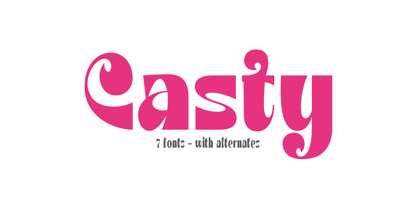 Introducing Casty, access your OpenType features to access the large selection of alternate letters and ligatures. Use this font for any branding, product packaging, invitation, quotes, t-shirt, label, poster, logo etc. Feature 7 Weight Uppercase & Lowercase Number & Symbol International Glyphs Multilingual support Alternative Ligature Feel free to drop us a message any time Hope you enjoy it.
 - Bareback by Solotype,
$19.95The devil does indeed find work for idle hands. This was designed by Dan X. Solo about with no excuse whatsoever. The name comes from the fact that a circus that we regularly did work for used it in one of their programs, the only time it was ever used as far as we can recall. - Thunderbold by Gartype Studio,
$15.00 Thunderbold is inspired by "Fast & Bold character" so,this is a powerful font suitable for poster, banner, flyer, race number, logo, logotype and more.This font have an extrude style to save your time to make extruded fonts just switch to extrude style!.Not just that, Thunderbold have a lot of Alternate too. Be bold like Thunder !
 - Gaia by Outras Fontes,
$21.95 Gaia is the first dingbat series made by Ricardo Esteves Gomes. Each glyph in this font was designed to be used as single forms or as graphic pattens. When repeated several times, they create some interesting optical effects. Their organic shapes gives a nice feeling of nature. I hope this can be useful for your artworks.
 - EM by Wilton Foundry,
$29.00 Time to EMbrace the new EMerging typeface from WiltonFoundry : EM consisting of EM Regular, EM Italic, EM Bold, EM Bold Italic. Loosely based on our very popular Cyan typeface, EM is EMphatically the most distinctive and modern typeface we’ve created yet. Slight variations between thick and thin with stenciled effects, and Flared stem EMphasis for character. Go get’EM!!
 - Circles JY by JY&A,
$39.00Based on electrical circuitry, David Philpott's Circles typefaces are oddly legible, even though one might think they were destined for display usage only. The circle is the base form, repeated throughout the design. Originally drafted during his time at the Massey University School of Design, subsequent refinements have turned Circles into two complete fonts with a full character set. - Dubuffet by SAMUEL DESIGN,
$19.00 The name of this font is Dubuffet, named after a famous artist. The font style is distinct and unforgettable at the same time, showing a simple temperament. The extra thick strokes bring readers a warmer visual experience. The overall shape is artistic and literary. The serif uses a sharp shape that adds a youthful, modern vibe.
 - Supremely Luxurious by TypeClassHeroes,
$15.00 Introducing Supremely Luxurious, Access your OpenType features to access the large selection of alternate letters and ligatures. Use this font for any branding, product packaging, invitation, quotes, t-shirt, label, poster, logo etc. Feature Uppercase & Lowercase Number & Symbol International Glyphs Multilingual support Alternative Ligature Feel free to drop us a message any time Hope you enjoy it.
 - FS Siena for Walbusch by Fontsmith,
$80.00Siena is a luxurious type. A modern contrasted sans serif. Over 25 years in the making, FS Siena is tailor made for high-end brands. Sumptuous, elegant and eclectic, a nonconformist typeface with classical roots. It’s been a long time coming, but with its heady mix of elegance and quirky charm, FS Siena is worth the wait. - Girlstory Script by Alterspieler,
$18.00 Girlstory is a font that inspired the story of a woman who tries hard for her children, never giving up in order to achieve and keep happiness together. This font has simple and interesting style characters for various design needs at this time, you can use it for embroidery, screen printing, business cards, cutting, branding, etc.
 - Neuer Weltschmerz by Hanoded,
$15.00 About 7 years ago, I released a beautiful (imho) Art Deco inspired font called Weltschmerz. Weltschmerz was an all-caps font and I always wanted to do a lower case version as well. But as things so often go in life, I never found the time and forgot about it. Some time ago, I ‘rediscovered’ my good old Weltschmerz font and remembered that I wanted to create a lower case version. Without further ado: here is Neuer Weltschmerz (‘New Weltschmerz’). I redid the whole font, better kerning, better spacing, better looks… and with a proper lower case! I did keep the original handwritten look intact - because, well, it IS hand made!
 - Wildrace by Din Studio,
$29.00 Get ready to be bold and elegant at the same time. It’s time to see Wildrace, a display font created in capital letters with the racing theme. The font’s character is the thick letters formed similar to rectangles to give strong impressions. Therefore, it will be more noticeable and match the large-sized texts. Wildrace also provides interesting features to enjoy. Features: Multilingual Supports PUA Encoded Numerals and Punctuation Use Wildrace for any design projects such as posters, banners, logos, book covers, headings, printed products, merchandise, social media, etc. Find out more ways to use this font by taking a look at the font preview. Purchase now. Happy designing.
 - Semilla by Sudtipos,
$79.00 I spend a lot of time following two obsessions: packaging and hand lettering. Alongside a few other minor obsessions, those two have been my major ones for so many years now, I've finally reached the point where I can actually claim them as “obsessions” without getting a dramatic reaction from the little voice in the back of my head. When you spend so much time researching and studying a subject, you become very focused, directionally and objectively. But of course some of the research material you run into turns out to be tangential to whatever your focus happens to be at the time, so you absorb what you can from it, then shelf it — like the celebrity bobblehead that amused you for a while, but is now an almost invisible ornament eating dust and feathers somewhere in your environment. And just like the bobblehead may fall off the shelf one day to remind you of its existence, some of my lettering research material unveiled itself in my head one day for no particular reason. Hand lettering is now mostly perceived as an American art. Someone with my historical knowledge about lettering may be snooty enough to go as far as pointing out the British origins of almost everything American, including lettering — but for the most part, the contemporary perspective associates great lettering with America. The same perspective also associates blackletter, gothics and sans serifs with Germany. So you can imagine my simultaneous surprise and impatience when, in my research for one of my American lettering-based fonts, I ran into a German lettering book from 1953, by an artist called Bentele. It was no use for me because it didn't propel my focus at that particular time, but a few months ago I was marveling at what we take for granted — the sky is blue, blackletter is German, lettering is American — and found myself flipping through the pages of that book again. The lettering in that book is upbeat and casual sign making stuff, but it has a slightly strange and youthful experimentation at its heart. I suppose I find it strange because it deviates a lot from the American stuff I'm used to working with for so long now. To make a long story short, what’s inside that German book served as the semilla, which is Spanish for seed, for the typeface you see all over these pages. With Semilla, my normal routine went out the window. My life for a while was all Bezier all the time. No special analog or digital brushes or pens were used in drawing these forms. They're the product of a true Bezier process, all starting with a point creating a curve to another point, which draws a curve to another point, and so on. It’s a very time-consuming process, but at the end I am satisfied that it can get to pretty much the same results easier and more traditional methods accomplish. And as usual with my fonts, the OpenType is plenty and a lot of fun. Experimenting with substitution and automation is still a great pleasure for me. It is the OpenType that always saves me from the seemingly endless work hours every type designer must inevitably have to face at one point in his career. The artful photos used in this booklet are by French photographer and designer Stéphane Giner. He is very deserving of your patronage, so please keep an eye out for his marvelous work. I hope you like Semilla and enjoy using it. I have a feeling that it marks a transition to a more curious and flexible period in my career, but only time will tell.
 - Brinar by Hackberry Font Foundry,
$24.95 I've been working on a usable sans serif for body copy since the mid-1990s (though I certainly did not know it at the time). This one works well. It started life back in the mists of time as a scan of an old German font by Carl Fahrenwaldt. It was developed fully as a synergized serif with strong traditional roots and released as Bergsland Pro. Now it finally makes it to where I was headed all along as a sans text font. This is a well modulated humanist, sans serif font family with many OpenType features and over 600 characters: Caps, lower case, small caps, ligatures, swashes, small cap figures, old style figures, numerators, denominators, accents characters, ordinal numbers, and so on. It is designed for text use in body copy. But it also works very well for elegantly stylized display.
 - Katsudon by Hanoded,
$15.00 Katsudon is a Japanese crumbed and deep fried pork cutlet, typically served on rice with egg drizzled over it. There is also a chicken variety. I have been to Japan numerous times (it is my favourite country) and each time I revelled in the great variety of foods being served in street stalls and hole-in-the-wall eateries. I especially love the grandma-and-grandpa eateries that are tucked away in alleys behind the major shopping streets. They never speak English and my Japanese is shaky (to say the least), but the food is always good and we always seem to understand each other. This year, I couldn’t travel to Japan, because of the Covid outbreak, but I can tell you that I miss Japan a lot! Katsudon is a crumbed and deep fried font. It comes with a splash of authenticity, a sprinkling of cheekiness and a generous dose of oomph. Oh, yeah, and double letter ligatures, plus a few alternates as well.
 - Découpe by Sudtipos,
$39.00 Sudtipos is proud to announce the release of Découpe, a display typeface program of eight fonts, designed by María Carla Mazzitelli and born during her Masters in Typography at the University of Buenos Aires (FADU-UBA). Inspired by gestural graphic expressions –like paper cut-outs (découpes) and spontaneous handwriting– from the most diverse postmodern and contemporaneous artists of the design world, Découpe has been created specifically to be used in big sizes. A little bit irreverent and effervescent from time to time, this gestural sans serif family reveals its contrasts and asymmetrical shapes when it breaks through display functions. From Light to Extra Bold, it reaches the most extreme weights, looking for power and impact. This program is meant to catch the eye in typographic compositions, to shout it out loud and clear. Definitely, to be seen. *Découpe has been recently selected to be part of different typography exhibitions such as Tipos Latinos and the Type Directors Club.
 - Bizarries by Typephases,
$25.00 This series, with 104 illustrations in three files, collects original ink drawings with absurdities, bizarre people, whimsical personalities and risky behaviors! There is a very peculiar sense of narrative in the sucession of characters, even if they came out rather spontaneously and their order is random.With a vintage look and feel, these people seem to come out of a time capsule from Victorian times. Almost everything in the Bizarries (and also in their close relatives, our Illustries, Whimsies, Ombres, Absurdies and Genteta dingbats) is invented and drawn with no references —just a handful of images were sketched from historical photography. These illustrations can be very useful for a variety of projects, either in black and white, or colored in a paint or drawing application. You can use them at any size, from a small spot illustration to a huge poster, depending on your needs. The outlines remain crisp and clear no matter how much you enlarge, reduce, distort or tweak their shapes.
 - Paddy Wagon NF by Nick's Fonts,
$10.00The typeface which inspired this offering was originally called "Chaucer", not because it is typical of lettering of Chaucer’s time (which it is not) but, more likely, because it’s pretty funny, even if the humor is low. Another purveyor of low humor, Mack Sennett and his Keystone Kops, suggested this version’s name. Both versions of this font include the complete Unicode Latin 1252 and Central European 1250 character sets. - Not So Grotesk JNL by Jeff Levine,
$29.00 A circa-1920s book on lettering entitled "Book of Alphabets" by Regan Publishing displayed an example of a Grotesk typeface (a popular style of sans serif of the time). This design was re-drawn digitally as Not So Grotesk JNL and is available in four varieties - regular, oblique, condensed and condensed oblique. Not So Grotesk JNL is the perfect companion font family to use alongside Simply Grotesk JNL.
 - Weeping Willow by Hanoded,
$15.00 I have always liked Weeping Willows, they sort of remind me of China. During my years as a tour guide, I spent a lot of time in China and I can tell you that the Chinese love weeping willows - they plant them everywhere! Weeping Willow was created using a Japanese brush pen (bought in China actually…). It comes with double letter ligatures and a bunch of swashes as well.
 - Nature Boy by Adorae Types,
$20.00 Nature Boy was born in a fantasy world of old, where you can find magic, elegance, dreams and fun all together... just like nature in its purest form with its leafy curves and shapes that make it peacefully enjoyable. Soft and simple yet fairly ornamental, attributes that create an enchanting atmosphere but keep the texts legible at the same time when combined. Nature Boy can bring life and magic to every design, from editorial to posters, brands and packagings. Just picture this font on any product intended to move your soul and take you on a journey into a different and most beautiful place and time and let the adventure begin. This font family is made up of optically corrected regular, italic and bold types. All of them contain functional ligatures with alternative glyphs for texts and words to be dynamical and fluently graphed.
 - URW Grotesk by URW Type Foundry,
$102.99 URW Grotesk was designed exclusively for URW by Prof. Hermann Zapf in 1985. At the same time, Zapf designed URW Antiqua to go with URW Grotesk. At that time, we were working with a large German publishing house (Axel Springer) on type design solutions to replace certain of their newspaper fonts. Test pages of large German newspapers (e.g. Bildzeitung) were printed with URW Grotesk and URW Antiqua font families. For reasons not disclosed to us, the project was dropped and Springer never used URW Grotesk and URW Antiqua for that purpose. Anyway, Zapf finished his designs and URW produced both families. Zapf’s intention for the two typefaces was to design two highly legible, open and classical fonts that could be used for any kind of typography, especially books, newspapers, magazines, etc. However, we realized later on, that URW Grotesk is very well suited for multi media applications on screen.
 - URW Antiqua by URW Type Foundry,
$89.99 URW Grotesk was designed exclusively for URW by Prof. Hermann Zapf in 1985. At the same time, Zapf designed URW Antiqua to go with URW Grotesk. At that time, we were working with a large German publishing house (Axel Springer) on type design solutions to replace certain of their newspaper fonts. Test pages of large German newspapers (e.g. Bildzeitung) were printed with URW Grotesk and URW Antiqua font families. For reasons not disclosed to us, the project was dropped and Springer never used URW Grotesk and URW Antiqua for that purpose. Anyway, Zapf finished his designs and URW produced both families. Zapf's intention for the two typefaces was to design two highly legible, open and classical fonts that could be used for any kind of typography, especially books, newspapers, magazines, etc. However, we realized later on, that URW Grotesk is very well suited for multi media applications on screen.
 - René Menue by URW Type Foundry,
$39.99 Some time ago, I started to think about the idea of combining my passionate hobby cooking with my profession as a graphic designer. While browsing through cooking books, cooking magazines and graphic publications I noticed that there were no symbols and drawings easily recognizable for interested cooks (hobby or professional). So I decided to create symbols for all the classical cooking paraphernalia still found in grand mother’s kitchen cabinet. René Menue Symbol contains 99 kitchen symbols of classical design and quality. To complement the symbols typographically, there is René Menue, a fitting linear Sans Serif typeface with plenty of extra characters such as ligatures, figures etc. René Menue is a modern, slightly condensed and economic design with round shapes, very modern but classical at the same time. These features make it perfectly usable in many different publications, not necessarily restricted to cooking… A successful cooking and enjoy your meal!
 - Gratitude Script by Sudtipos,
$59.00 The quality or feeling of being grateful or thankful. An appreciation for the world around us. Gratitude for being a part of it all. No matter what’s happening in our lives, there’s always something to be grateful for. When we have an appreciation for all we have, life gives us more to feel grateful for. It’s a naturally occurring cycle. Some of the most profoundly grateful times in our lives can be felt when we find ourselves surrounded by beauty: in art, nature, music, special places, the seasons, family, loving relationships, a cozy home, meaningful work; in doing what brings us joy, comfort, and feelings of deep love and satisfaction. There is beauty everywhere, and creating beauty is an artist’s mission. We all have the ability to create and experience beauty. In this high-tech, fast paced world of strict, unbending rules, we give you Gratitude Script: A celebratory font that’s deeply rooted in tradition letterforms but with a modern, updated twist; a casual, whimsical, fun look that is also elegant and versatile! Partnering with Ale Paul is seasoned wedding calligrapher Kathy Milici, who is well known for her passionate writing style and highly ornamental pen flourishing. With its signature hand-written look, flowing lines, graceful curves and flourishes, Gratitude Script’s space saving, vertical style is perfect for small printing areas as well as large format presentations. An extended variety of alternates makes it a perfect and versatile addition to your font repertoire.. These are tender times. Long hours and work pressures add to our stress. Time spent with family and friends is more valuable than ever before, as we try to balance it all. It’s important to mark time with special, happy events in our lives that we can all appreciate and enjoy. Let’s be grateful for it all! Hooray for Gratitude, and Gratitude Script! About the font: Gratitude Script is an OpenType font that contains more than 1400 glyphs icluding ligatures, alternates, endings , a wide range of latin languages and a set of ornaments and words specially designed to use in stationery for weddings, birthdays, etc. There is a smooth version of Gratitude Script too. To access to all the extra characters you will need to use software that actually supports OpenType like Adobe CS apps or later where we recommend the use of the Glyph palette. About the presentation: Every time we publish a new typeface we love to invite an artist to collaborate. Vero Scherini, an argentinian and very talented designer and illustrator, fits perfectly with Gratitude.
 - Credit Crunch by Comicraft,
$29.00 Here in the heart of Santa Monica, in the disused 1940s aircraft hangar we like to call the Comicraft Studios, we know that times are tough. As we were driving to “work” in the back of our chauffeur driven Humvee limo, sipping martinis out of the navels of Playboy bunnies and wondering what font we should release next, we decided it was time to reach out to the poor people. Yes, we felt it was time to create a font for the huddled masses yearning to breathe free, for the wretched refuse of our teeming shores. A font, if you will, for the tempest-tossed. It’s a little skinny and might be described as pinched and starved, but it’s guaranteed to see you through this current economic crisis as only the 26 letters of the alphabet can. It was a tall order, but Jazzy JG Roshell created this one while he was in line at the bank, waiting for his personal bailout. Meticulously crafted using one of those ballpoint pens attached to the cashier’s station by elastic, Credit Crunch is the Hamburger Helper of comic book fonts. It’s kind of a hybrid -- just like the Priuses our trophy wives drive to their personal plastic surgeons -- and it’s solar powered and also comes with a tank full of good old fashioned Biro ink. The Recession, Climate Change AND Global Hunger will probably end mere minutes after you crack open your life’s savings to buy this font. How can you afford NOT to...? See the families related to Credit Crunch: Credit Extension.
 - Shelter Me - Personal use only

- Sunshine In My Soul - Personal use only

- Ten Million Fireflies - Personal use only

- La Belle Aurore - Personal use only

- Written on His Hands - Personal use only

- Contrary Mary - Personal use only

- Never Let Go - Personal use only

- Life Cinema Screen by Andrey Ukhanev,
$- This font was inspired by an old photographic film package I found. Over time, the vertical slits in the letters have become more complex and acquired slanted sections. The font is suitable for accidences: headlines, posters... maybe you can suggest something interesting ;)


