10,000 search results
(0.017 seconds)
- Anabelia by Rockboys Studio,
$23.00 The Anabelia is a handcrafted monoline font. It has a vintage and classic feel with an old, handmade look. Included in this download are various styles which gives you the opportunity to create unique designs, every time you use it!
 - TCF Zellige by TypeCult Foundry,
$22.00 Zellige is a modular typeface inspired by the tiles that can be found in Southern Europe and North Africa. Made of ornamental geometric shapes, with two layers for improved legibility, Zellige reflects the luxurious and sophisticated flare of the mediterranean spirit of architectonical composition, employing the latin script into very baroque shapes.
 - Neuer Weltschmerz by Hanoded,
$15.00 About 7 years ago, I released a beautiful (imho) Art Deco inspired font called Weltschmerz. Weltschmerz was an all-caps font and I always wanted to do a lower case version as well. But as things so often go in life, I never found the time and forgot about it. Some time ago, I ‘rediscovered’ my good old Weltschmerz font and remembered that I wanted to create a lower case version. Without further ado: here is Neuer Weltschmerz (‘New Weltschmerz’). I redid the whole font, better kerning, better spacing, better looks… and with a proper lower case! I did keep the original handwritten look intact - because, well, it IS hand made!
 - Wildrace by Din Studio,
$29.00 Get ready to be bold and elegant at the same time. It’s time to see Wildrace, a display font created in capital letters with the racing theme. The font’s character is the thick letters formed similar to rectangles to give strong impressions. Therefore, it will be more noticeable and match the large-sized texts. Wildrace also provides interesting features to enjoy. Features: Multilingual Supports PUA Encoded Numerals and Punctuation Use Wildrace for any design projects such as posters, banners, logos, book covers, headings, printed products, merchandise, social media, etc. Find out more ways to use this font by taking a look at the font preview. Purchase now. Happy designing.
 - Hounslow by Device,
$29.00 Hounslow is closely related to Acton in structure, and takes the latter’s simple block construction into the third dimension. Three variants – open, solid and shadow – can be freely mixed in one setting for effect. Originally designed solely in the italic variant, an upright was added by request. A further unreleased set with a range of line weights was later commissioned by the New York Times magazine, and used extensively in their television supplement.
 - Kingsmead Script by Hanoded,
$15.00 Last year I spent some time exploring the city of Bath in England. Its claim to fame are the Roman Baths in the city center, which are well worth a visit. Kingsmead is an electoral ward within Bath and I thought it was an apt name for this rather stylish - if old fashioned - font. Kingsmead Script is a handmade font. It comes with diacritics and some discretionary ligatures for double lower case letter combinations.
 - Heath Notted by YuliusParyadi,
$11.00 Heath Notted is suitable for display like poster, halloween, witch theme. We created it inpired by the night, because some times night is not always just dark, but sometimes it's beautiful. Heath Notted is includes: - full set uppercase and lowercase letter; - numerals; - large number of punctuations; - ligatures, and swash. Please add this font as your favorit, hit like button, or follow me. I'll very happy for that and aprreciated it. Thank you!
 - Vulnerable by Gian Studio,
$12.00 Vulnerable is an elegant script typeface inspired by a vintage type specimen I found some time ago at an art fair. Thin to thick contrasting lines and elegant curves make Beginta the perfect font for this type of logo and display purposes. Hope you enjoy it Feel free to contact me if you have any questions or concerns you may have and I will get back to you as soon as I can.
 - Encrypted Wallpaper by Characters Font Foundry,
$- With Encrypted Wallpaper you can create your own decorative wallpaper that you can still read. The forms of the font are perfect for creating wallpaper, background patterns and decorative elements. The human eye needs time to decypher the cryptic forms back into a font. Women can decypher Encrypted Wallpaper much faster than men. So all you guys out there, if you don't want to look like a fool, don't show this to your wife.
 - Pisak by Cuda Wianki,
$20.00How many times have you been looking for a handwritten yet not childish font without result? We have a nice solution for you-our brand new PISAK! :) Thanks to extra thin condensed letters PISAK is easy readable and ideal for text writing. Its subtle irregularity makes it warm and friendly good for unoficial designs. If you like the shape of the letters but you need a more official and regular version see our Lalalo font. - Athletic Condensed by Mandarin,
$19.00 Athletic Condensed was designed to be a must have for any kind of projects. Bold and elegant at the same time, both the regular and slanted styles are super versatile and can be used to dictate a strong message, headlines or just setting casual text. Practical and simple, this font is a classic that will not let you down, as it does an excellent job either as the main character or supporting role.
 - Old Style 7 by Linotype,
$29.00The name Old Style No. 7 comes from a time when foundries released a variety of typefaces under one name. Linotype produced Old Style No. 7, which was based on an early 1870s typeface from the Bruce Typefoundry, which had based its design on a type from the Scottish foundry Miller and Richards. Old Style No. 7 is a reliable text type that is serviceable for both books and shorter copy demands, such as magazines. - Gulti Brush by Piece of Cake Typework,
$19.00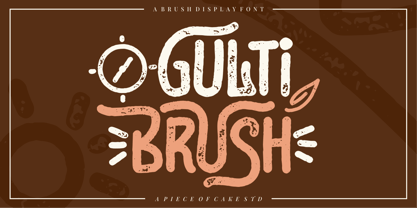 Hello World, Introducing, Gulti Brush is a textured display font suitable for your design project needs, such as; social media posts, quotes, overlays on images, taglines, logos, posters, print needs, website banners, and more. Features * A set of uppercase and lowercase glyphs * Number, symbol, and punctuation * Multilingual Support * Alternate * Swashes Thank you a million times for downloading and using this font for your projects. Enjoy this font and happy creating! Thank You
 - Humble Manford Font Duo by Jinan Studio,
$12.00 Humble Manford Font Duo is an excellent choice for logo design, branding, packaging, business card, and adventure-themed designs. Its combination of script and sans serif styles, along with the textured and solid options, provides ample creative opportunities for designers to explore and create stunning visual identities and marketing materials. Thank you a million times for buying and using this font for your projects. Enjoy this font and happy creating! Jinan Studio
 - Blow Jumped by Piece of Cake Typework,
$17.00 Hello World, Introducing, Blow Jumped is a casual display font suitable for your design project needs, such as; social media posts, quotes, overlays on images, taglines, logos, posters, print needs, website banners, and more. Features * A set of uppercase and lowercase glyphs * Number, symbol, and punctuation * Multilingual Support * Extrude Version * Some Swashes Thank you a million times for downloading and using this font for your projects. Enjoy this font and happy creating! Thank You
 - Bottle Fork by PizzaDude.dk,
$15.00 Here is my font with carved out letters, like a really bad stamp. Each lowercase letter has 3 different versions, and that makes your text more natural, organic and handmade. Normally I kern my fonts throughout, but this time there is no kerning at all...and that's odd, when we're not talking about monospaced fonts. Anyway, Bottle Fork has its flaws and jumpy x-height...but that's exactly the charm of it all! :)
 - Nova Hispane by Ixipcalli,
$30.00 NovaHispane typeface is a serif typeface with a clear, serious, elegant, old and modern touch at the same time. This typeface is perfectly suitable to be used in books, magazines or any printed media that requires showing a set of traditional or modern styles. Its four weights Light, Regular, Bold, and Heavy make a well-marked visual game for highlighting words from text; in addition to having the italic forms for each weight.
 - Caslon Gotisch by RMU,
$25.00 A blackletter font by William Caslon (1692-1766), with Dutch influences, which appeared for the first time in a font sample book of William Caslon & Son, London, 1763. To access all ligatures in this font, it is recommended to activate both OT features Standard and Discretionary Ligatures. The round s occupies the number sign key, and typing N - o - period and activating this combination with the OT feature Ordinals gives you the numero sign.
 - Wolves Gothic by Chank,
$39.00 Make a little extra impact with this strong athletic font with big geometric muscles, clean lines and sharp teeth, too. Originally created for a local pro basketball team in Minnesota, this sporty and big-shoulder poster font is now available directly to you for the first time ever to add some punch to your printed or web designs. Crisp and clear and ready for action a concise variety of weights and styles!
 - Diilgant by Piece of Cake Typework,
$19.00 Hello World, Introducing, Diilgant is a textured script font suitable for your design project needs, such as; social media posts, quotes, overlays on images, taglines, logos, posters, print needs, website banners, and more. Features * A set of uppercase and lowercase glyphs * Number, symbol, and punctuation * Multilingual Support * Alternates, ligatures, and swashes Thank you a million times for downloading and using this font for your projects. Enjoy this font and happy creating! Thank You
 - Veritas by Altered Ego,
$45.00Veritas is a serif text family. It is a narrow-width typeface, with a taller x-height than Times Roman for added legibility, but maintains a similar character count in text. It is typeface designed for publication, newspaper (anywhere where narrow columns are necessary) and identity design. It is exquisitely spaced and kerned, even in European characters. The Digital Type Review states "...Veritas is one of the most important contributions ... from any independent foundry." - Hola Witch by Piece of Cake Typework,
$19.00 Hello World, Introducing, Hola Witch is a display font suitable for your design project needs, such as; Halloween themes, social media posts, quotes, overlays on images, tagline logos, posters, print needs, website banners, and more. Features * A set of uppercase and lowercase glyphs * Number, symbol, and punctuation * Multilingual Support * Some Swashes and alternates Thank you a million times for downloading and using this font for your projects. Enjoy this font and happy creating! Thank You
 - Clocko by upirTYPO,
$7.00 Clocko automatically turns the time stamp text into an analog clocks using the OpenType ligatures. Even when the ligatures are turned off, the time is still visible and readable, and it does not change or ruin the layout. Perfect for web usage and even for small sizes. For a crisp look, please use sizes divisible by 30, for example 30pt or 60pt. To make a custom analog clock, type any uppercase or lowercase letter to have a border (see previews for examples), and then type the time in 12 hour or 24 hour format with or without seconds. Use colon, comma, semicolon, hyphen, period or plus as a separator. Few examples: 12:45 9:25:46 10.50 13:30.10 The borders can be mixed together for more interesting look, please see the screenshots above. An additional background shape can be added to the clocks by typing a symbol (! # $ % & ( ) < = > ) as a first character, for example %A12:40:55. Please note that in order to keep the clocks visible, the background shape and the clocks need to have a different colors.
 - Immi 505 by Adobe,
$29.00Immi 505 is another of Tim Donaldson�s prolific works. Inventive and fun-loving as always, Tim used a pen nib called a ?Brause 505? to create the letterforms for this design. The Brause 505 was an invention of Karlgeorg Hoefer. Hoefer created his typefaces Salto" and Saltino" with this nib. The other part of the name, Immi, is the nickname of Donaldson�s five-year-old daughter Imogen. The resulting unusual curves and open character of Immi 505 create a distinctive rhythm and color appropriate for short blocks of ad copy, titles, music CD covers, and Web page headlines where a bit of extra width is needed." - Replete Sans by Sudtipos,
$49.00 Sudtipos’ new sans serif font Replete is inspired by the mixture of aesthetics and philosophies found on the streets of metropolitan cities the world over. Buildings constructed throughout the twentieth century, including those made in the Art Deco style or influenced by the Bauhaus’s gospel, stand side-by-side as symbols of their time. Typography is one factor that bonds these vistas, and simultaneously further complexifies them. Art deco letters appear on storefronts and signage in Europe’s oldest cities and as remnants of the Golden Age of economic expansion for Latin America. Typography, like architecture, sometimes coexists in perfect harmony, and other times in ideological opposition. But it is these juxtapositions in places such as Shanghai, New York, London, Buenos Aires and Tokyo that shape each city’s identity. Replete is inspired by this mixture. We wanted to create a useful modern sans serif family – a set of 7 weights with playful geometric alternates – that allows you to combine characters including wide-width and filled letterforms. Replete is apt for long texts, and equally, for instances where letterforms can stand together like a cityscape. Replete means full, packed and abounding … it is a sans, it is grotesque, it is geometric and it is Deco. Replete is a new family that has a little of everything we like, equipped with everything you need to design anything you want.
 - Selfie Neue Sharp by Lián Types,
$29.00 INTRODUCTION When I started the first Selfie back in 2014 I was aware that I was designing something innovative at some point, because at that time there were not too many, (if any) fonts which rescued so many calligraphy features being at the same time a monolinear sans. I took inspiration from the galerías’ neon signs of my home city, Buenos Aires, and incorporated the logic and ductus of the spencerian style. The result was a very versatile font with many ligatures, swashes and a friendly look. But… I wasn’t cognizant of how successful the font would become! Selfie is maybe the font of my library that I see the most when I finally go out, (type-designers tend to be their entire lives glued to a screen), when I travel, and also the font that I mostly get emails about, asking for little tweaks, new capitals, new swashes. Selfie was used by several renowned clients, became part of many ‘top fonts of the year’ lists and was published in many magazines and books about type-design. These recognitions were, at the same time, cuddles for me and my Selfie and functioned as a driving force in 2020 to start this project which I called Selfie Neue. THE FONT "Selfie for everything" Selfie Neue, because it’s totally new: All its glyphs were re-drawn, all the proportions changed for better, and the old and somehow naive forms of the first Selfie were redesigned. Selfie Neue is now a family of many members (you can choose between a Rounded or a Sharp look), from Thin to Black, and from Short to Tall (because I noticed the feel of the font changed notoriously when altering its proportions). It also includes swashy Caps, which will serve as a perfect match for the lowercase and some incredibly cute icons/dingbats (designed by the talented Melissa Cronenbold, see also Selfie Neue Rounded for more!) which, as you see in the posters, make the font even more attractive and easy to use. You'll find tons of alternates per glyph. It's impossible to get tired with Selfie! Like it happened with the old Selfie, Selfie Neue Sharp was thought for a really wide range of uses. Magazines, Book-covers, digital media, restaurants, logos, clothing, etc. Hey! The font is also a VF (Variable Font)! So you can have fun with its two axes: x-height and weight, in applications that support them. Let me take a New Sharp Selfie! TECHNICAL If you plan to print Selfie Neue VF (Rounded or Sharp), please remember to convert it to outlines first. The majority of the posters above have the "contextual" alternates activated, and this makes the capitals a little smaller. I'd recommend deactivating it if you plan to use Selfie for just one word. Use the font always with the "fi" feature activated so everything ligatures properly. The slant of the font is 24,7 degrees, so if you plan to have its stems vertical, you may use Selfie with that rotation in mind. THANKS FOR READING
 - MVB Celestia Antiqua by MVB,
$39.00Mark van Bronkhorst designed MVB Celestia Antiqua at a time when font choice was limited. Design was characterized by overuse of the few fonts that came with laser printers. A rustic typeface, recalling the roughness and irregularity of pre-digital printing, was a response to the cold crispness of DTP. MVB Celestia Antiqua holds its own among a large group of other “weathered” serif fonts, in part due to the size of the family: three weights, small caps, italics, and two titling styles. But it's also successful because it's simply drawn well, the contours only as rough as they need to be, enabling text at any size, large or small. - Pucky by Just My Type,
$25.00 When teaching font-making at the Art Institute of Tucson, I give my students plenty of lab time to come up with design ideas. I designed Pucky while one class created their fonts. It came about through an idea for a capital A: sort of a triangle with two round sides and a crossbar formed by a circle falling out. (You can see it here.) In drawing that, I hit upon the idea of making the tops of the alphabet sharp and square and the bottoms rounded. (See the whole alphabet here.) Pucky suggests both circus and psychedelia. Hmmmm, does anybody have an “in” at Cirque du Soleil?
 - Texas Hero by Three Islands Press,
$39.00 It occurred to me years ago that the graphic arts community might find useful a digital typeface that mimicked the classic look of nineteenth-century handwriting. Conveniently, my mother then still volunteered at the Center for American History at the University of Texas at Austin, my hometown. She made copies of the letters of a few famous Texans -- Houston, Austin, Travis, Burnet, Rusk. Thomas J. Rusk’s penmanship caught my eye as the most accessible of the bunch. I hadn't realized at the time what a challenge it'd be to render a realistic-looking script face, but the result has, in fact, filled a niche.
 - Geographica Hand by Three Islands Press,
$39.00 Geographica Hand replicates the neat hand-lettering typical of engraved British maps of the 18th century, including the work of cartographers Emanuel Bowen (circa 1694–1767), Geographer to King George II, and Thomas Jefferys (circa 1719–1771) Geographica ro King George III. A kindred font to our Geographica serif family, Geographica Hand exhibits long serifs, irregular edges, and a genuinely hand-made character. Use to simulate historical materials, vintage documents, or other time-worn text. The OpenType release of Geographica Hand comes with true small capitals, contextual and historical ligatures, a series of sketchy map ornaments (e.g., trees, churches, windmills, boats), and full Latin support.
 - Geometry Circle by Vjeko Sumic,
$39.00 Geometry circle is a heading/display type, built with the intent to illustrate and attract the viewer, not to be used for long text. The inspiration comes from the Futurist movement typefaces, especially from Marinetti’s own workshop on new age typography of that time (Italy 1920). The typeface is composed of only capital letters. The letters are of an unique geometric design taking the basic 64 grid system and subtracting the shape of a circle form each glyph in a unique way to form a letter. There is a full complement of typography symbols as well as a support for Central and Eastern European symbols and characters.
 - Seagrass BF by Bomparte's Fonts,
$39.00 Inspired by lettering styles of the 1930s, Seagrass BF is jazzy and jumping as a Lindy Hop. As such it captures I believe, something of the spirit of that age, yet somehow retains a fresh, contemporary feel. Headlines, logos, packaging, signage and branding are just a few of many usages. Seagrass BF contains Stylistic Alternates and Stylistic Sets for uppercase letters Y and Z, as well as ampersand (&). Other OpenType features include Standard Ligatures and Contextual Alternates. These features should at all times be employed to optimize the appeal of your word settings. So whenever your visual communication demands an energetic, vibrant voice please consider Seagrass BF.
 - Sans Beam by Stawix,
$35.00 After releasing Amsi in 2015, this year Sans Beam is now ready to launch with the design that support many different usability from Headline to Body text, and specifically designed to be compatible with other font families of Stawix Foundry. This typeface has been designed under the simple idea of ‘Choose. Play. Repeat.’ on the limited space of typographic layout, in which most of the time faces the problem of choosing appropriate font weight that would serve the right intention. This typeface is designed to erase those problems, preventing impossibility in designer’s layout in both Body Text and Headline, which comes in 15 different weights.
 - Eckhardt Bold JNL by Jeff Levine,
$29.00 Eckhardt Bold JNL continues a series of sign painter-inspired type designs and is named in honor of the late Al Eckhardt, a talented sign man who was a good friend of Jeff Levine for about 18 years until his passing. The font is available in both regular and oblique versions and was inspired by an example found in the 1928 edition of E.C. Mattthews' "How to Paint Signs and Sho' Cards". Both squat and wide for maximum use in wall and window applications, the original name for the design is "Heavy Plug". Plug was the sign painter's term at the time for describing this type of letter form.
 - P22 Slogan by IHOF,
$24.95 P22 Slogan is a non-connecting script font that captures the essence of the lettering used in 1950s European advertising. Bold strokes of this brush-drawn face make this design a great choice for both retro design and contemporary work. The font is based on the 1957 design Slogan by Aldo Novarese for the Italian Nebiolo Type Foundry. At the time of its original release, it was touted for "striking publicity work". This new digitization accurately reproduces the outlines of the original not found in previous digital versions of this design. P22 Slogan is a non-Pro Opentype font that includes Central European characters.
 - TX Signal Signifier by Typebox,
$39.00Eight designers present a set of icons that indicate the fun and fantastic world of signage. Each collaborator's solution represents a completely different interpretations on signage vernacular. Akira Kobayashi's "Subsumption", obscured by foliage, offers a perspective that signs on Japanese roads can be vague and beautiful. M.A.D.'s "People Signs" is a graphical association of people signage with a variety of well known situation symbols. Cynthia Jacquette's "Honest Arrows" are a series of arrows that attempts to honestly tell you how to get from point A to Point B in a big, confusing city. Mike Kohnke's "Road Kill" and the "Bump & Bruise" highlight how signs make for perfect targets when unloading a round of buckshot, and the licking a contruction barrier often endures. Joachim Muller-Lance's "Traffic Blends" places faces on things! Hey, didn't you give your first car a nickname? Cars are alive, you know - they guzzle and smoke all day. Jean-Benoît Lévy's "Inner-State" was inspired while reading the California driver handbook to pass a driver's test. Kevin Roberson's "Tail Lighting" reminds us to drive carefully and not to forget to signal. Diana Stoen's "Drivers Out There" shows us "driver personality archetypes", including the lil'ol lady that everyone tries to avoid. - Librum E by Hackberry Font Foundry,
$24.95 The major focus of my life and ministry at this point is book design. In the brave new world of 21st century self-publishing a new paradigm has arisen: the indie small shop. One of the problems is that all books are published as ebooks, and many books are published only as ebooks. There are two problems with this: character availability and licensing. The licensing problem is solved by including an ebook license with all of the Librum E fonts. The character availability is the core of the design. OpenType features do not work yet with ePUBs [though it is in the spec, if I understand correctly]. Kerning doesn't work, and so on. So these five fonts have only the 256-character [or less] ASCII set. A separate small caps is included. It has lining figures {proportional} and small caps instead of the graphics. The other four fonts have graphics to give bullet choices in lists, oldstyle figures {proportional}, and care given to character shapes so they will work better without kerning. For a great deal, see Librum Book Design Group , for a package containing all fifteen fonts!
 - Lancelot Pro by Canada Type,
$39.95 When type historians look back on Jim Rimmer, they will consider him the last type designer who just couldn't let go of metal type, even though he was just as proficient in digital type. Lancelot is one definite case in point: A face designed and produced in digital as late in the game as 1999, only to spring onto the new millenium a couple of years later as a metal type cast in three sizes. That was Jim, a time traveler constantly reminding the craft of its origins. This particular time machine was originally designed as a simple set of attractive caps that emphasize the beauty of the variable conventional dialogue between the drawing tool and the intended final form, and the one exchanged within the totality of the forms themselves. Jim designed two weights, with contrast and counterspace being the main difference between them. In 2013, the Lancelot family was remastered and greatly expanded. Lancelot Pro is now a wonder of over 840 glyphs per font, including smaller versions of the caps in the minuscule slots, and alternates and ligatures that can transform the historic spirit of the original design into anything from half-uncial to outright gothic. Language support goes beyond the extended Latin stuff, to cover Cyrillic and Greek as well. 20% of the Lancelot Pro family's revenues will be donated to the Canada Type Scholarship Fund, supporting higher typography education in Canada.
 - Crescendo by Canada Type,
$29.95 A year after the tremendous success of Memoriam in the "Lives They Lived" issue of the New York Times magazine at the end of 2008, Patrick Griffin and Nancy Harris Rouemy teamed up once more to tackle the same project for the 2009 issue. This time the magazine's design concept revolved around a typeface they created specifically for custom vertical malleability, and that can play just as well in single- or multi-color environments. The result was another iconic commemorative issue that shows exotic tri-line letters merging, swashing, extending and flourishing in stunning gold, silver and blue on black on the cover, and in black on white on the inside pages. Just like in the previous year, the issue won multiple publication design and typography awards. Crescendo is that typeface, finally issued for retail by public demand. Just turn your setting into outlines in your favorite vector program, grab single strands and extend away, and do your best alternating colours between strands. Crescendo comes with a limited punctuation set, but accented characters for Western Latin languages are included, and there many, many alternates and ligatures in there as well. This typeface is best used in large display sizes.
 - Trigomy by Markus Reiter,
$24.90 Trigomy is a proportional pixel font designed on a 5 pixel grid. It is intended for either very small text or as huge display font for posters and the like. To get a crisp look this font should be used at 10 pt or multiples of 10 pt. (A tip for Adobe Creative Suite applications is to change the standard anti-aliasing method from “sharp” to “crisp” and to align the text to whole pixels. Also avoid centered text.) To get started with type design I thought it was best to start with a pixel font because you don't have to focus much on the design itself, but rather have to focus on how kerning and spacing works and the various features you can implement with OpenType. And of course I wanted to have a pixel font that had all that I was missing from other pixel fonts. We were learning trigonometry at the time I started designing Trigomy, and most of the time I misspoke it “trigometry”. So, when I had to come up with a name for my first font I thought: "Why not go with Trigomy?"