10,000 search results
(0.021 seconds)
- Glenda by Hubert Jocham Type,
$39.00 Since I designed Mommie you can see a lot of script typefaces with big contrast for big sizes. With Narziss I created a roman interpretation with the very expressive Swirls version. Glenda is again an italic script like Mommie. In the Regular the characters join and it looks like a neatly written sprencerian handwriting. But like Narziss it has got a Swirls version too. Every glyph and swirl is carefully designed to work in every connection. Use Glenda at only very large sizes.
 - Old Paris Nouveau by Baseline Fonts,
$24.00Old Paris Nouveau is based on letterpress stylings of modern roman alphabets from the 1920s. Adapting the nouveau sensibility to the digital age required several conventions, including several alternate glyphs for specific individual letterforms as well as creating consistent stem weights and x-heights for more effective body copy. The inherent charm of Old Paris lies in its variation in form and style -- and yet the uniformity. Organic simplicity and elegance underscore the strength and utility inherent in the family of fonts. - Valor by Tim Rolands,
$29.00Valor is a display face inspired by uncial forms seen through a modern roman lens. The result is a type with strong contrast between thick and thin strokes and a highly geometrical construction that even so retains a hint of the charm of hand-written uncial letters. A number of alternate forms and ligatures add to the personality of the face and offer flexibility in usage. Best suited for large titling work such as in posters or book and magazine covers. - Karolina by Studio Indigo,
$17.00 Karolina is a calligraphic serif font. It is inspired by Edward Johnstons (1872–1944) calligraphy and the foundational hand (which was based on the carolingian letters and therefore the name Karolina). The Uppercase letters are based on the perfect proportioned roman capitals. Karolina is a classic and clean typeface with smooth shapes that will give an elegant touch to your projects. It is suitable for formal use and works well both for headlines and as body text in smaller sizes.
 - Caslon Open Face by Image Club,
$29.99Open, outline or inline faces became very popular in the 1940's. By removing the usual weight, a clear-cut letterform is achieved. In Caslon Open Face, the right-hand strokes are accentuated, providing a slightly three-dimensional effect. The ascenders of Caslon Open Face are large and the overall design of this version does not relate to Caslon 3 Roman. This Caslon Open Face font is good for personal stationery, or sentences where a decorative but distinguished result is sought. - TDL Ruha Crown by Tipos Das Letras,
$15.00 TDL Ruha Crown is a decorative, modern and mechanical display typeface and it results from the development of the stencil RUHA. Being the first typeface of the family, sets the basic concepts to be developed further, on each version to come. There is an rigid geometrical connection with the Roman du Roi design approach, since the letterforms are imposed by the constraints of the RUHA ruler. The main typographic proportions are connected with the modern typefaces, like Didot or Bodoni.
 - Granjon by Linotype,
$29.99 The design for Granjon was produced at the English branch of Linotype under the direction of George William Jones and appeared in 1928. This reproduction of a Garamond typeface was based on the typeface sample of the Frankfurt font foundry Egenolff from the year 1592 . The roman characters of the sample were made by Claude Garamond and the italic forms were designed by Robert Granjon. Jones made sure that the Granjon font remained true to the original characters of Garamond and Granjon.
 - Madrone by Adobe,
$29.00Madrone is an Adobe Originals typeface designed by Barbara Lind in 1991. Madrone was digitized from proofs of the woodtype collection in the National Museum of American History of the Smithsonian Institution in Washington, D.C. A fat face roman, Madrone is typical of popular early nineteenth-century styles. Fat face types are characterized by their squatness and extreme letter width. One familiar version of this design is Bodoni Ultra Bold. Madrone is eye-catching for display uses in advertising and packaging. - Alinea Incise by Présence Typo,
$36.00Alinea is a typeface in 3 styles (Sans, Incise, and Serif) conceived for being mixed in the same document. Alinea incise is a flare serif (incise in French). It finds its origin in the roman letters carved in stone. The great advantage of such a style is that it can be associated to any other style of typeface. The most famous flare serifs are: Optima of Hermann Zapf, Pascal of José Mendoza, Amerigo of Gerard Unger and Alinea Incise of course! - Incognia by Nasir Udin,
$29.00 Incognia is a sharp and high-contrast long-serif type family of 10 fonts inspired by classic roman typography. Ranging from light to bold with matching italics, Incognia offers many possibilities to be applied in many graphic or editorial projects. The lighter weights are suitable for short paragraph, and the heavier weights are perfect for display purpose such as titling or headlines, branding, editorial, book covers, and packaging. Incognia has extended latin character set that supports 200+ latin-based languages.
 - Fossegrim by Kitchen Table Type Foundry,
$15.00 I have always liked Scandinavian folklore, although I have to admit that I didn’t know about the Fossegrim. Fossegrim is a fiddle or harp playing water sprite - usually friendly, but he has been known to lure children and women in deep water with his music. Fossegrim font is a little bit weird as well: I made it using a broken bamboo satay skewer and Chinese ink. It comes with extensive language support and a set of alternates for the lower case letters.
 - Anko by Eko Bimantara,
$22.00 Anko is a mix of Old Style Roman Serif styles. The glyphs are formed in extend width, smooth strokes, moderate stem contrast and soft edges to pursue clarity, quick recognizable text and warm personality. The italics style is 8 degree low slanted with redrawned lowercase which shown in more organic and flowy forms. Anko contains 8 weights with more than 450 glyphs that support extended latin language and opentype features such as standard and discretionary ligature and a variation of numeral figures.
 - Koorkin by Monotype,
$29.99 “I originally drew the primary characters with a felt tip marker, scanned them and then proceeded to noodle on the computer,” says George Ryan of his new typeface, Koorkin. “Over the years, I’ve designed many original typefaces, but Koorkin has become one of my favorites. I’ve worked on hundreds of highly structured text faces. For the most part, the roots of all of them can be found in the handwritten letterforms we learn as children. I enjoy going back to these shapes whenever the opportunity presents itself. ”The happy result of Ryan‘s felt tip marker sketches and his love of simple letterforms is a new family of upright and italic scripts in medium and bold weights.
 - Rellyan by Gatype,
$12.00 Hello friends... We are proud to present our new font. Rellyan's new natural script with handwriting and script style makes this font look elegant, natural, stylish. Rellyan will be perfect for invitations, logos & branding, photography, advertising, watermarks, social media posts, product packaging, product designs, labels, wedding designs, stationery, special events or anything else that requires a taste for handwriting. Rellyan brings OpenType style alternatives, International binders, and support for most Western Languages is included. To enable the OpenType Stylistic alternative, you need a program that supports OpenType features such as Adobe Illustrator CS, Adobe Indesign & CorelDraw X6-X7, Microsoft Word 2010 or later. Thank you very much for viewing and enjoying it.
 - Lazy Coffee by Gassstype,
$23.00 Hello Everyone, introduce our new product Font Hello Everyone, introduce our new product Lazy Coffee is All Caps Bold Typeface Serif Display , inspired by the title of the sports poster and We make it very energetically. Lazy Coffee font with strong and challenging nuances. very suitable for the title, typography, Poster, magazines, brochures, packaging,Websites and much more for your design needs, making your designs more modern and professional This handmade font will make your design has a beautiful natural touch for each details. It is perfect for any design project as Invitation,logo, book cover, craft or any design purposes. That is has charming, authentic and relaxed characteristic more natural look to your text.
 - Blinsithar by Hanzel Space,
$25.00 introduce our font "Blinsithar" font Happy! finally this font has been released in 2023, with full of new ideas having new character for each letter. It has beautiful curves that enhance the appearance of the font which is no less attractive. Complete with lowercase and uppercase letters, punctuation, swash and ligature. By creating this font, we hope to help your design type needs, to support your business and your business. This font is very suitable for use as branding, logos, slogans, websites, weddings, products and so on. Full Set of standard alphabet and punctuation Extra set of ending swashed lowercase Handwritten ligatures Thanks so much for checking out my shop! Happy creating! Cheers! Hanief - Hanzel Space
 - Eponymous by Monotype,
$25.99 Eponymous is an Egyptian-style typeface with chunky, scalloped serifs. It is available in five weights in both roman and italic. I have always loved slab serif type and have created Eponymous to fulfil a yearning for a versatile, stylish and contemporary slab face. A key design characteristic is the implementation of scalloped serifs which, to me, imbues the typeface with a distinctive personality. Make use of the Open Type features that are part of Eponymous. For a start, you can implement some stylistic alternates, so, if the main characters don’t quite suit your concept, try activating Stylistic Set 1. There’s also a full set of small caps included. You can mix and match these characters with regular lowercase to create some interesting unicase typography. Of course, all characters have complementing diacritics, enabling multi-language support. Key features: Eponymous is is an Egyptian-style typeface with chunky, scalloped serifs 5 weights in roman and italic: Light | Regular | Medium | Bold | Black Full set of small caps with diacritics and figures 30+ alternate characters Full European character set 650+ glyphs per font Eponymous was redrawn and re-spaced to a higher standard in April 2021 (v2.0).
 - Audacious by Monotype,
$40.00 Audacious is a quirky, confident and adorable serif type family across five weights in both text and display styles. This attention-grabbing retro typeface has an imperfect nature that embraces its quirks and irregularities, giving each font a distinctive and somewhat oddball personality. Its defining characteristics include large open counters, awkward stresses, large exaggerated wedge serifs, and voluptuous teardrop terminals. Whatever typographic compositions you create, Audacious will demand attention, making it perfect for titling, headlines, logotype, and branding projects. Take advantage of the 182 stylistic alternates to embellish your type and add that touch of class to titles and logos. Display weights work really well with close line spacing and stunning headlines are a breeze to create. Text weights make for a pleasant reading experience while packing all the punch and versatility found in the display variants. There are 20 fonts altogether, in Text and Display styles with weights from Regular to Black in both roman and italic. Audacious has an extensive character set that covers all Latin European languages. Key features: 2 Styles in Roman and Italic 5 weights: Regular, Medium, SemiBold, Bold, & Black 182 Alternates Full European character set (Latin only) 1100+ glyphs per font.
 - Sqwared by Monotype,
$25.00 Sqwared is a square sans serif type family... with flares! This typeface has a retro, hand-painted quality – the slight flaring of its verticals evoke the steady brush of a signwriter. Sqwared benefits from large, open counters and a generous x-height that aids clarity and legibility, while a wide footprint gives these fonts a degree of stature and an air of confidence. Each character was drawn while immersed in a late sixties/early seventies vibe, but there’s no reason why Sqwared can’t be used for your contemporary designs. There are 16 fonts altogether, ranging from Thin to Ultra weights in both roman and italic. It has a Latin character set that covers all Latin European languages. Sqwared will dazzle in headlines, add flair and distinction to your logo designs, bring flamboyance to your branding material, and your body text will most definitely be unique! Variable fonts are included in this family, so you can tune the weight of each font to your exact preference. Key features: 8 weights in Roman and Italic Old Style Figures included Full European character set (Latin only) 440 glyphs per font.
 - Sienna by Monotype,
$40.00 Sienna is a soft serif typeface designed for both text and display purposes. Its soft and sharp structure creates an unusual, yet pleasing appearance. This leads to a comfortable reading experience with enough personality to create impactful titles and headlines, and Sienna will really shine in your branding projects. Variable versions of the fonts are available allowing you to fine tune the weight to your exact liking. Small Caps are included (along with their matching diacritics) – adding another layer of versatility to this typeface. Proportional Lining figures are an option if you prefer them to the default Old Style figures. A number of swash alternates enhance Sienna, giving you the opportunity to add more flair and personality to your title and branding designs. Simply activate Stylistic Sets to start adding flourishes to your typography. There are 14 fonts altogether, with 7 weights in roman and italic from Thin to Black styles. Sienna has an extensive character set (800+ glyphs) that covers every Latin European language. Key features: 7 weights in both roman and italic Variable fonts included with full family 59 Alternates 8 Ligatures Small Caps Full European character set (Latin only) 800+ glyphs per font.
 - Open Serif by Matteson Typographics,
$19.95 OPEN SERIF - answering the question “what font pairs well with Open Sans?”. Designed by Steve Matteson for extraordinary legibility and comfortable reading on screen and in print. Open Interpretation: Not quite Veronese – not quite Egyptian. A dash of panache in an otherwise sturdy serif typeface. Open Serif is an elegant text and display typeface family. Open Interiors: Visually open and legible at text sizes just like its cousin Open Sans. Open Serif reads smoothly but has an energetic texture. The chancery style italic contrasts nicely to the roman in a full bodied nod to Italian Renaissance forms. Open Type: Open Serif is full of OpenType features including Small Capitals for the Roman, Italic Swash Capitals and Old Style Figures for both. Open Translation: Supporting all the languages available in Open Sans, Open Serif completes the translation capabilities of international companies. Extended text is more pleasant to read in a serif typeface so go global with a unified typeface family! Open Face: Open Serif Titling is an elegant companion to round out the family. These ‘open-face' capital letters are ideal for initial letters, mastheads, titles and decoration.
 - Rodia by Monotype,
$25.00 Rodia is an Oddball Geometric Sans Typeface consisting of nine weights in both roman and oblique. It’s a geometric sans with a twist that’s perfect for branding and identity projects – it will also give your body text a unique voice. Inspiration came from the iconic “RADIO” signage that was once in place at 5041, Pico Boulevard, Los Angeles in 1985 (documented at https://tinyurl.com/y2krt2ox). With its distinctive leg, the /R/ provides a personality trait to define the style of the character set. You can clearly see how this characteristic separates Rodia from other geometric sans families – the /k/v/w/x/y/K/R/V/W/X/Y/ glyphs all display the distinctive ‘feet’ and ‘hands’ as terminals to legs and arms. Then there is the /A/ with its triangular crossbar – this triangular motif has been used to embellish alternates in Stylistic Set 1 for /A/E/F/G/H/Q/S/ glyphs. These will add another layer of versatility for your typographic projects. Rodia features an extensive character set covering all Latin European languages. Key features: 9 weights in Roman and Oblique Full European character set (Latin only) 400+ glyphs per font.
 - View Slant Black ExtExp - Personal use only

- Rotis II Sans by Monotype,
$50.99 Developed over several years by the late Otl Aicher and first released in the late 1980s, the Rotis® typeface has become a timeless classic. ROTIS II SANS HISTORY Aicher was a renowned German designer and corporate image consultant. He created the four basic designs of Rotis – sans serif, semi sans, semi seif and serif – within an extended typeface family concept, wherein all designs share a common cap height, lowercase x-height, basic stem weight and general proportions. While each version is part of the large, integrated family, each was also designed to function on its own as a distinctive typestyle. The result is that all members of the Rotis family combine smoothly with each other. Aicher, however, did not design the Rotis family with the weights and proportions normal for more contemporary releases. Rotis Sans Serif, for example, was drawn with just six weights and only two italics. Starting in 2010, Robin Nicholas, senior designer for Monotype Imaging in the UK, and freelance designer Alice Savoie collaborated to bring Rotis Sans Serif up to current standards. The result is Rotis II Sans, a completely new addition to the Rotis family. “We devised our approach together,” recalls Savoie, “deciding which weights to start with, what kind of alterations to make to the original Rotis, etc. I went to work on the typefaces, regularly submitting proofs to Robin. We would then decide in tandem on the next steps to take.” Nicholas elaborates, “We revisited the range of weights and added matching italics so that the new additions to the family offer increased versatility. We optimized the outlines, corrected the weight of several letters and re-examined overall spacing and kerning. In addition to a new set of numerals, with a height similar to the capitals, we also drew case-sensitive punctuation.” ROTIS II SANS USAGE The new Rotis II Sans suite comprises 14 typefaces: seven weights, ranging from extra light to black, each with a companion italic. The designs are available as OpenType® Pro fonts, allowing for automatic insertion of ligatures and fractions. Pro fonts also offer an extended character set supporting most Central European and many Eastern European languages. Aicher’s original Rotis designs were widely used for branding and advertising. With the addition of Rotis II Sans, the family is again poised to become a powerful communicator.
 - Wall Street Gothic by BA Graphics,
$45.00A new gothic with the great new look for today. Universal, works for all applications. - Auberge Script by Sudtipos,
$79.00 It took me a long time, but I think I now understand why people of my generation and older feel the need to frame current events in an historical context or precedents, while most of the young couldn't care less about what happened ten years ago, let alone centuries back. After living for a few decades, you get to a point when time seems to be moving quite fast, and it’s humbling to see that your entire existence so far can be summed up in a paragraph or two which may or may not be useful to whoever ends up reading the stuff anyhow. I suppose one way to cope with the serenity of aging is trying to convince yourself that your life and work are really an extension of millenia of a species striving to accept, adapt to, and improve the human condition through advancing the many facets of civilization -- basically making things more understandable and comfortable for ourselves and each other while we go about doing whatever it is we are trying to do. And when you do finally convince yourself of that, history becomes a source of much solace and even a little premonition, so you end up spending more time there. Going far back into the history of what I do, one can easily see that for the most part it was ruled by the quill. Western civilization’s writing was done with quill pens for more than thirteen centuries and with newer instruments for about two. By the mid-18th century, the height of the quill experience, various calligraphy techniques could be discerned and writing styles were arranged in distinct categories. There are many old books that showcase the history of it all. I recommend looking at some whenever the urge comes calling and you have to get away from backlit worlds. Multiple sources usually help me get a better perspective on the range of a specific script genre, so many books served as reference to this quill font of mine. Late 17th century French and Spanish professional calligraphy guides were great aides in understanding the ornamental scope of what the scribes were doing back then. The French books, with their showings of the Ronde, Bâtarde and Coulée alphabets, were the ones I referenced the most. So I decided to name the font Auberge, a French word for hotel or inn, because I really felt like a guest in different French locales (and times) when I going through all that stuff. Because it is multi-sourced, Auberge does not strictly fit in a distinct quill pen category. Instead, it shows strong hints of both Bâtarde and Coulée alphabets. And like most of my fonts, it is an exercise in going overboard with alternates, swashes, and ornamental devices. Having worked with it for a while, I find it most suitable for display calligraphic setting in general, but it works especially well for things like wine labels and event invitations. It also shines in the original quill pen application purpose, which of course was stationery. Also, as it just occurred to me, if you find yourself in a situation where you have to describe your entire life in 50 words or less, you may as well make it look good and swashy, so Auberge would probably be a good fit there as well. This is one quill script that no large bird had to die for. A few technical notes The Auberge Script Pro version includes 1800 glyphs, everything is included there. Also latin language support. We recommend you to use the latest design application to have full access to alternates, swashes, small caps, ornaments, etc. The images from the gallery uses this version. For better results use the fonts with “liga” feature on. Awards During 2014 the early develop of Auberge Script was chosen to be part of Tipos Latinos, the most important type exhibition in South America.
 - Huxley Vertical by Bitstream,
$29.99 The PARATYPE library is our latest major addition, consisting of more than 370 typefaces. In the spirit of the perestroika changes and following the collapse of the Soviet Union, a group of Russian type designers quit the state-owned Polygraphmash foundry to establish ParaType, the first, and now largest Russian digital type foundry. The ParaType team under the supervision of Vladimir Yefimov creates new typefaces and explores the Russian typographic heritage by making digital versions of existing Russian designs: these include the hits of Soviet typography such as Literaturnaya and Journal Sans. Most ParaType fonts are available in Western/Roman, Central European, Turkish and Cyrillic encodings. The Russian constructivist and avant garde movements of the early 20th century inspired many ParaType typefaces, including Rodchenko, Quadrat Grotesk, Ariergard, Unovis, Tauern, Dublon and Stroganov. The ParaType library also includes many excellent book and newspaper typefaces such as Octava, Lazurski, Bannikova, Neva or Petersburg. On the other hand, if you need a pretty face to knock your clients dead, meet the ParaType girls: Tatiana, Betina, Hortensia, Irina, Liana, Nataliscript, Nina, Olga and Vesna (also check Zhikharev who is not a girl but still very pretty). ParaType excels in adding Cyrillic characters to existing Latin typefaces — if your company is ever going to do business with Eastern Europe, we recommend you make them part of your corporate identity! ParaType created CE and Cyrillic versions of popular typefaces licensed from other foundries, including Bell Gothic, Caslon, English 157, Futura, Original Garamond, Gothic 725, Humanist 531, Kis, Raleigh, or Zapf Elliptical 711.
 - As of my last update in early 2023, there might not be a widely recognized or specific font called "Naz" that has achieved significant prominence or notoriety in the fields of typography or graphic d...
- Lamphier by Juliawan90,
$15.00 Introducing our new product called Lamphier a Spooky Playful Serif Font, Lamphier inspired by Playful style with spooky style typography theme. This font is suitable for book covers, children's books, comics, posters, packaging, merchandise, logotypes and much more. We highly recommend using a program that supports OpenType features and Glyphs panels like many of Adobe apps and Corel Draw, so you can see and access all Glyph variations. Happy Designing!
 - Cybermoon by Sensatype Studio,
$15.00 Cybermoon is Futuristic Neon Font with Modern shape make your design look unique and stylish A new Display Font that we created special for Headline, Title and more stand out typography needs, with extra ligature that will add your variations. Font ready with: Any options to get creative variations Preview as a inspirations that you can do with this font Ready with Uppercase & Lowercase characters Wish you enjoy our font. :)
 - 1906 Fantasio Auriol by GLC,
$38.00 We have created this family inspired from the set of well known Auriol fonts used by the French popular "cheerful" satirical magazine Fantasio (1906-1948). The present version contains Normal, Italic, Bold and Bold Italic styles, in use for texts, plus narrow titlings and normal outlined with upper and lower case, both in use for titles. This family may be used together with 1906 French News, 1906 Titrage and 1890 Notice.
 - Snack Lover by Illushvara,
$14.00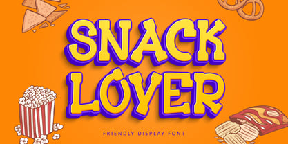 Hello, We are so excited to announce our new fonts "Snack Lover" is a friendly, casual and fun display font. Whether you use it for cartoon related designs, children games or just any creation that requires a lovely touch, this font will be an amazing choice. Features : Uppercase and lowercase Numbers Symbols Multilingual Accent If you have any question, don’t hesitate to contact me. Happy Designing !!! Thank You, Bayu Suwirya
 - Fateya by Sulthan Studio,
$14.00 Fateya is a handcrafted script font amazing typeface that we created in freestyle for those of you doing work and crafts. This font has a total of 777 Glyphs to make it easier for you to choose a character according to your needs. It's perfect for all kinds of work you do with multiple purposes like logos, wedding invitations, titles, t-shirts, letterheads, signage, labels, news, posters, badges, etc.
 - ZionTrain Cyrillic by AndrijType,
$27.00 Originally ZionTrain was built as a (probably first in Cyrillic!) navigation typeface for the Kharkiv identity project and Kharkiv subway and airport navigation systems. We wanted comprehensible, distinctive letterforms, that can help everybody on the way from Babylon to Zion. The project was used in Kharkiv promotion at homeland and abroad, but was rejected by the new government. As a corporate typeface it was used for a few cultural projects.
 - Murisa Ashley by Murisa Studio,
$10.00 Today we want to show you all a new, unique font, which includes dynamic and aesthetic lines. Murisa Ashley is our newest font. This font is so beautiful and so powerful in its retro feel. Things that can help you in making designs or product names with dynamic shapes. Murisa Ashley is made with the premise of the lines on each letter. Use this font, and have glorious success with you.
 - 1906 Titrage by GLC,
$38.00 We have created this family as a complement to 1906 French News since the two type families were commonly in use in the same publications, including newspapers, popular books, calendars, almanacs and posters. This font, as its name suggests, was mainly used for titlings and subtitles. Small caps, included in the single file of the TTF and OTF versions, are added as a separate file in the MacTT version.
 - Mundbind DK by PizzaDude.dk,
$15.00 A few days ago, my good friend David from Hanoded.com visited me for a few days. We drank a lot of coffee and walked the streets of Copenhagen - we even took a trip up in Rundetårn! :) Well, on one of our walk (of course looking for inspiration for new fonts) we spotted this handmade sign. We agreed to make a font of the 7 letters available, using our own imagination and style! I called my font Mundbind DK and David named his Mundbind NL - of course it is the landcodes of Denmark and Holland. As you can tell, the font is uneven and somewhat unpredictable - following only the "rules" of the person who handprinted that sign ... and not many of the rules of the good old and respected painter who make beautiful signs ... however, this sign had it's beauty in a natural and innocent way.
 - Avenir Next Paneuropean by Linotype,
$99.00 Avenir Next Paneuropean is a new take on a classic face—it’s the result of a project whose goal was to take a beautifully designed sans and update it so that its technical standards surpass the status quo, leaving us with a truly superior sans family. This family is not only an update though, in fact it is the expansion of the original concept that takes the Avenir Next design to the next level. In addition to the standard styles ranging from UltraLight to Heavy, this 56-font collection offers condensed and semi condensed faces that rival any other sans on the market in on and off—screen readability at any size alongside heavy weights that would make excellent display faces in their own right and have the ability to pair well with so many contemporary serif body types. Overall, the family’s design is clean, straightforward and works brilliantly for blocks of copy and headlines alike. Akira Kobayashi worked alongside Avenir’s esteemed creator Adrian Frutiger to bring Avenir Next Pro to life. It was Akira’s ability to bring his own finesse and ideas for expansion into the project while remaining true to Frutiger’s original intent, that makes this not just a modern typeface, but one ahead of its time. Complete your designs with these perfect pairings: Dante™, Joanna® Nova, Kairos™, Menhart™, Soho® and ITC New Veljovic®.
 - Compasso by Plau,
$30.00 The idea that mathematical precision and the supposed "purity" of geometric forms are part of the discourse of us graphic designers is not new. Studying typography for some time now and learning about all the small alterations and adjustments that this geometry undergoes to better adapt to the imperfect human eye, I found myself with a new way of seeing things. Compasso is, in a way, a result of my growth as a designer. Established and recognized fonts like Futura, Avenir, and their predecessors (including Tempo - published by the Ludlow foundry in the early 20th century) informed the result of Compasso at some level. Others opened my mind to possibilities. Mallory, Azo Sans, the font designed for Audi by Bold Monday, and many other contemporary sans-serif fonts that left me speechless are also responsible for details present in this font. From the first sketch, the family grew on both sides, gaining condensed and extended counterparts. From there - and from a brilliant insight from designer Nicole Rauen - I learned that Compasso was not about geometry. Compasso is about rhythm. It's about the rhythmic movement that provides a foundation, supports, and also makes you dance and swing. My musical taste is too eclectic, I can go from classical to funk in less than two songs on Spotify. Compasso is also eclectic. It's a font to take your project anywhere, a record to listen to on any occasion.
 - Linden by Journey's End,
$12.00I hope that you enjoy the "Linden" font. The basis for this new font is my Leaf font. As much as I love the Leaf font, however, I felt (and still feel) the desire to have a larger font, for three reasons: 1. I enjoy customizing my internet browser to show different fonts. The original "Leaf" font was a bit too small for that. The new "Linden" font is perfect for this function. 2. Some of the fonts that I use in writing e-mails look their best at sizes 24 or 36. That’s fine for me, but unless I want to go to the trouble each time of changing the size, then the recipients oft my e-mails get wolloped with an enormous-sized font. When I use "Linden" for my e-mails, it’s automatically a perfect size at 12 or 14, solving this problem. 3. I also enjoy customizing the font in which I read my e-mails. Unfortunately, there are only a few which are legible in the tiny size in which this is configured. Again, "Linden" is configured to be large enough automatically so that it can easily be read by anyone. I am pleased to offer a pleasant font for use in any or all of the scenarios; I love fun solutions and hope that you will enjoy the "Linden" font. (Just a tip: when printing out documents using the "Linden" font, I love it best in font size 11!)
