10,000 search results
(0.046 seconds)
- 24 HRS by Design is Culture,
$39.00 A font designed by Christian Acker (2002), based upon neon signage in downtown New York. 24Hrs was an exercise in creating flat artwork from the inspiration of neon's three dimensional forms. All of the tubing's overlapping and twisting is documented and taken into account in the design of the letterforms.
 - Chilok by Dhan Studio,
$19.00 Chilok is a cool handwritten font that is also elegant and fashionable, which looks like a signature or logo, this font also has an alternative to beautify your design. Chilok is perfect for branding, logos, business cards, posters, invitations, greeting cards, news, product packaging, blog posters, all including personal charm, etc.
 - Thin Fox by Gassstype,
$22.00 Hello Everyone, introduce our new product Font THIN FOX This Is Display Font.This is a Textured Natural Style and classy style with a clear style and dramatic movement. This font THIN FOX is great for your next creative project such as logos, printed quotes, invitations, cards, product packaging, headers, Logotype.
 - Telegraph by Solotype,
$19.95Charles Beeler Jr. designed this in 1895 for Mackellar, Smiths and Jordan, which was part of the American Type Founders combine. The font had a short life because five years later ATF began an "off with the old, on with the new" program, and this font was an early victim. - Lutfey Arabic by NamelaType,
$27.00 Lutfey Arabic is new version of Lutfey with the addition of Arabic glyphs (Arabic, Urdu, Kurdish, Pegon and Farsi. It is a chunky & cute typeface, visually featuring bold, firm and gentle characters. It’s has smooth lines on each side, especially on the outside, with subtle ink-trap details at every corner.
 - Paramount by Aestherica Studio,
$12.00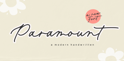 Introducing the new Fun Handwritten Font by Aestherica Studio. Proudly Present, Paramount Paramount is perfect for product packaging, branding project, megazine, social media, wedding, or just used to express words above the background. Paramount also multilingual support. Enjoy the font, feel free to comment or feedback, send me PM or email.
 - Faux Hebrew by Page Studio Graphics,
$24.00 The simulated font is based on the characteristic Hebrew calligraphy. Some of the original Hebrew characters have been given new roles, others modified to resemble modern Latin characters. The font includes an upper case alphabet, numerals, and basic faux punctuation, plus Harp of David, Menorah, and Star of David symbols.
 - Retail Shop JNL by Jeff Levine,
$29.00 Vintage New York neon signage alongside the landmark Dubrow's Cafeteria [probably circa the 1940s] of the words "retail shop" inspired the namesake digital type design. Retail Shop JNL is a bold and somewhat eccentric Art Deco font with varying widths and unusual character forms available in both regular and oblique versions.
 - Ridgewood JNL by Jeff Levine,
$29.00 While watching a movie filmed on location in New York, one scene stood out with a classic neon sign for a neighborhood restaurant. Ridgewood JNL is based on the lettering from that sign, and emulates many of the Art Deco elements that was so unique to sign work of the day.
 - Scissorgirl by Type-Ø-Tones,
$40.00 Scissorgirl by Julia Friese and Clare Keogh OpenType, 1 style Scsissorgirl is the crafty work of Ms. Julia Friese and Clare Keogh with the unselfish help of Josema Urós. Following Cortada path, this is a new fresh cut-out typeface, made not with vectors but real scsissor strokes on cardboard.
 - Maple Leaf Rag NF by Nick's Fonts,
$10.00The book Modern Alphabets, published in 1930, called this diamond in the rough from Continental Typefounders Nova Bold. Well, it’s neither new nor modern anymore, but it’s a warm, friendly face that’s sure to please. Both versions of this font contain complete Latin 1252 and Central European 1250 character sets. - Mystica by Aestherica Studio,
$12.00 Introducing the new Fun Handwritten Font by Aestherica Studio. Proudly Present, Mystica Mystica is perfect for product packaging, branding project, megazine, social media, wedding, or just used to express words above the background. Mystica also multilingual support. Enjoy the font, feel free to comment or feedback, send me PM or email.
 - Blog by BA Graphics,
$45.00Blog has a new distinctive look and comes in four weights light, regular, medium and bold. It can be seen as quite elegant in the light weights while looking masculine in the heavy weight. Its unique look lends to so many different applications. Blog works well for both headline and text. - Terasu Brush by Prioritype,
$18.00 Introducing a new brush font with a cool texture, you can use in your project to apply to music events, clothing products, crafts, image previews, creative posts and much more. As an illustration you can see some of the preview above. Features: -Uppercase -Lowercase -Numeral -Punctuation -Multilingual -Ligature -Swash Thanks.
 - Bridgeta by Nk Studio,
$14.00 The Bridgeta is a very legible Elegant Calligraphy, which is simply beautiful, classy, and elegant. Can be used for various purposes. Such as logos, wedding invitations, t-shirts, letterheads, signboards, news, posters, badges etc. The Bridgeta features 389 glyphs, including initials and terminal letters, alternates, ligatures, and multiple language support.
 - Rosalinda Script by My Creative Land,
$18.00 Rosalinda is a new handwritten typeface designed with wedding invitations in mind but can be used for various purposes like t-shirt design, logos, quotes design etc. The font contains 900+ characters and is best used in an Opentype-aware application such as Adobe Illustrator, Adobe InDesign, MSWord, Adobe Photoshop etc.
 - Ying by Wiescher Design,
$39.50 Ying is a new Serif typeface that has a little bit of Yang in it. This combination makes it a very versatile Serif font. Just give it a try and you will see. Ying goes together very well with Yang its brother-font. Yours working on the "Yong", Gert Wiescher
 - Qomarun by Wildan Type,
$14.00 Introducing new typeface. Qomarun- A modern, luxury, fashionable display serif font. It has unic construction for future style. Qomarun perfectly used for product presentation, elegant logo design, packaging or invitation cards or heading text. it is allcap with symbol and multilingual support Features Two style/ Numbers & Punctuation / Extensive Language Support/ligature
 - Extravaganza by Solotype,
$19.95Originally, this 1870s wood type font was called Armenian. We came across a showing of alphabet at the South Street Seaport in New York, bought it and immediately drew the additional characters needed to make the font. We used it for some circus program work that was part of our livelihood. - Faceless by Gassstype,
$29.00 Hello Everyone, introduce our new product Font Faceless it is lack metal Typeface, Rooted, but still readable.This is a Textured Natural Style and classy style with a clear style and dramatic movement. This font Faceless is great for your next creative project such as logos, printed quotes, invitations, cards, product .
 - Billy Boss by Gassstype,
$29.00 Hello Everyone, introduce our new product Font Billy Boss This Is Rough Brush Font.This is a Textured Natural Style and classy style with a clear style and dramatic movement. That is has charming, authentic and relaxed characteristic more natural look to your text. You can activate 47 Ligatures glyphs OpenType panel.
 - Edangu by Twinletter,
$15.00 Edangu Arabic display font is a new typeface inspired by the oriental fonts used in Arabic calligraphy and other Middle Eastern architectural features. This font features a Kufic version that has beautiful and neatly arranged shapes. This font will make your design elegant, especially designs that carry the middle eastern theme.
 - F2F Tyrell Corp by Linotype,
$29.99The Techno sound of the 1990s, a personal computer, a font creation software and some inspiration had been the sources to the F2F (Face2Face) font series. Thomas Nagel and his friends had the demand to create new unusual faces that should be used in the leading german techno magazine Frontpage"." - Caniago by Wildan Type,
$10.00 Introducing new typeface. Caniago- A modern, luxury, fashionable display serif font. Embargo perfectly used for product presentation, elegant logo design, packaging or invitation cards or heading text. it is allcap with symbol and multilingual support Two style, Caniago Italic Caniago Regular Features Two style/ Numbers & Punctuation / Extensive Language Support/ligature/Alternate
 - Massimo by Borutta Group,
$29.00 Massimo is a semi-serif geometric type family. For as long as I can remember, I've admired the visual style of New York – its architecture, fashion, design, and typography. After spending two weeks in Manhattan this summer, I wanted to prepare a sharp and modern typeface in Big Apple style.
 - Leo by Canada Type,
$29.95 Leo is an economic magazine and book face meant for use in sizes suitable for immersive reading, with different cuts optimized for different body copy size ranges, like footnotes and legal text. Designed with the explicit intent of relaying information without calling attention to itself, this typeface places itself squarely on the "function" side of the eternal debate about form versus content. The roman Leo fonts were built with as little ornamentation as possible, with wedge serifs, a high x-height and a skeleton somehwat rooted in the designers' reflections on the modern, post-war Dutch archetype. Rather than follow traditional models with entirely different forms, contracted widths and steep slants, the Leo italics deliver naturally subtle emphasis in reading by closely relating to the forms, stance and rhythm of their roman counterparts. The 12 Leo fonts contain over 700 glyphs each, and include support for the vast majority of Latin languages. Included OpenType features are built-in small caps, lining and oldstyle figures in both proportional and tabular sets, superiors, numerators, denominators inferiors, ordinals, automatic fractions, ligatures, and optional long descenders for optimal counterspace management in book and magazine text layout. For more information on Leo's character set, features and some print tests, please consult the PDF in the gallery section of this page.
 - Lugo by Eurotypo,
$90.00 The font "Lugo" is a heavy typeface designed for use in headlines and caption text. Their design has a strong visual impact, a persuasive and seductive personality throughout its organic shapes. This is a versatile and expressive font. Lugo can create an appealing atmosphere, conveying a gamut of message and emotions. It is well suited in the jobbing areas like packaging, logotypes, magazines, web pages and advertising, etc. Lugo has all the advantages of OpenType features that allow a variety of combinations: You may choose to set types in connected or unconnected ways, being used as body text or headlines for its good legibility, visual impact and accurate kerning. It has more than thousand glyphs: swashes, standard and discretional ligatures, stylistics and contextual alternates, old style numerals, word ending and tails. It has also an extended character set to support Central and Eastern European as well as Western European languages. Lugo is a city in northwestern Spain in the autonomous community of Galicia. The Celtic name Lug suggests that it may have been a sacred site. Augustus founded the Roman town of Lucus Augusti in 15-13 BCE following the pacification of this region. It is the only city in the world to be surrounded by completely intact Roman walls.
 - Evoque Text by Monotype,
$40.00 Evoque Text is a humanist serif type family specifically designed for a comfortable reading experience. This has been achieved by optically adjusting the regular weights from my original Evoque family (released November 2021). You will notice a significantly reduced x-height and longer ascenders and descenders, complemented by adjustments to weight and spacing. This makes Evoque Text a perfect choice for any long passages of text. All OpenType features have been retained from Evoque. A plethora of swash alternates and discretionary ligatures enhance Evoque Text, giving you the opportunity to embellish your typography. Simply activate Stylistic Sets to start adding these flourishes to your text. Other useful features include Small Caps at the click of a button, and Old Style Figures are an option to the default proportional figure style. There are 14 fonts altogether over 7 weights in roman and italic, you can also avail of two variable fonts which allow you to fine tune the weight to your exact liking. Evoque Text has an extensive character set (900+ glyphs) that covers every Latin European language. Key features: 7 weights in both roman and italic 80 Alternates 26 Ligatures Small Caps Variable fonts included with full family Full European character set (Latin only) 900+ glyphs per font.
 - Yolk by Monotype,
$31.99 Yolk is an Eggcentric Sans Serif Typeface consisting of nine weights in both roman and italic. Essentially, this is a geometric sans typeface that has been inspired by the shape and proportions of an egg. With its bottom-heavy glyphs, Yolk has an unusual personality – it’s not too awkward to be off-putting, and it’s not too uniform to be associated with the myriad of generic geometric sans fonts that are available. Yolk has a distinctive presence in its upright form, while the italics exude a more flamboyant nature. When combined, your typographic results will be pleasing and perhaps a little quirky too. This 18-font type family achieves a good balance of personality, versatility, and usability. Small Caps are available at the click of a button, then add Stylistic Set 1 to achieve Petite Caps. The petite caps harmonise with the regular lowercase forms, so that you can create unicase-style typography too. All Latin-based languages are covered within the 1000+ glyphs of each Yolk font. Key Features: • 18 font family – 9 weights in Roman and Italic • Small Caps, Petite Caps, with Proportional, Old Style, and Small Cap figures, plus Fractions, Numerators, Denominators, Superiors, and Inferiors • Full European character set (Latin Extended) • 1,000+ glyphs per font.
 - Laima by TypeTogether,
$39.00 Laima is the brush-formed stencil from Bogidar Mascareñas that will create an ovation for branding, album art, upscale venues, and packaging. If wide appeal, attention to detail, or international reach is necessary for your brand, consider Laima’s high-calibre design as your personal ambassador. The general font user is accustomed to stencil typefaces that have a brute look to them — industrial, mechanical, restrictive, or even militarised. Stencils are commonly used because they serve a function, like spray-painting over template letters, giving the reader a warning that must be heeded for safety, or a command to follow immediately. Wooden crates and grunge art are the medium and black or red paint are the norm. Laima, instead, creates a stencil from the world of calligraphy to turn all this on its head. Laima’s 12 stencil styles (six roman and six italic) use the junctures of calligraphic strokes as an opportunity to achieve an uncommon stencil effect, shifting to create unexpected shapes and the illusion of twisted, disconnected overlaps. Inspired by “Arte Nueva de Escribir”, an engravings book published by Francisco Palomares in 1776, Laima progressed well beyond its beginning as a Type and Media Master’s project at KABK, The Hague (NL). It sometimes required completely new character shapes to accommodate the space needed for clear diacritic marks, and was further enhanced with flourishes and alternates for liveliness and variety in individual or branded work. Laima’s italic begins with swashes and uses OpenType features to automatically turn them off with more than two successive capital letters. Use one swashed character for a drop cap, two for ligatured fun, turn them on or off at your discretion, or change the ascender length and swash shape to suit your creative need. With two styles of numerals and stylistic sets for final forms, Laima’s 12 styles and hundreds of Latin-based languages can turn simple words into an occasion that would immediately benefit high-class brands and special uses. Set that article title, release that new product, code your best-looking UI yet, letterpress that business card, and print that gourmet label. Whatever is next, Laima is the unexpected stencil partner to introduce it to an expectant world.
 - Odile by Kontour Type,
$50.00 Odile is a text typeface with bracketed head and bracket-free bottom lower case serifs, a quality that counters rigidness most traditional slab serif typefaces possess. This contemporary design draws inspiration from an experimental typeface named Charter originally designed by the American book and type designer William Addision Dwiggins. It consisted of an informal lowercase alphabet, a narrow seemingly non-inclined vertical letter with script attributes, featuring non-joining letterforms. Dwiggins’ contemplated Charter as the italic companion to Arcadia, Experimental No. 221. The Charter project progressed sporadic stalled during the Second World War and came to a halt in 1955. Charter remained incomplete and was never commercially released. Assessing Charter’s whimsical design, its fragments were rethought and developed into a comprehensive text family. Odile Upright Italic reveals recognizable similarities shared by Dwiggin’s Charter and defines the design approach for the family. The steep calligraphic outstroke and low junctions off the stem as in the upright italic “n” or “r”, for example, are gradually lessened in the italic and moved up for the roman weights. The six optically balanced weights range from the delicate Light to stark Black, accompanied by display variants with feminine flair and ardent Ornaments. Two sorts of Initials, one amplified with interweaving swashes, the other more restrained, both are clearly derived from the Upright Italic. This mid-contrast serif offers a wide range of tools for text and display typographies with a palette of strict to playful. This family shines in magazine, book and display use. The graceful serifed type harmonizes perfectly with Elido, Odile’s sans companion. Sans and serif share the family array and OpenType features in perfect tune. Odile offers an extensive character set, numerous OT features including roman and italic Small Caps, five sets of numerals, alluring ligatures, and many more. OT stylistic variants (with accents) offer a one-story “a” for the roman weights, alternate “g” and “s” designs for the italics, and a variant “s” for the Upright Italic.
 - Boldiva by Graphicfresh,
$9.00 Looking for a way to add a touch of bold, retro charm to your designs that evoke the fun and creativity of the 70s, 80s, and 90s? Look no further than our collection of classic and modern fonts that are perfect for logos, posters, and all kinds of design projects, whether you're going for an old-school vibe or a fresh new twist on retro design. With our carefully curated selection of fonts, you'll have everything you need to create eye-catching and memorable designs that capture the essence of classic design from the past. Whether you're looking to add some vintage flair to a modern design, or you want to create a throwback look that's right at home in the 90s, our fonts are the perfect tool for the job. From bold, geometric designs that harken back to the 80s, to playful, colorful fonts that embody the fun-loving spirit of the 70s, our collection has something for everyone. And with our easy-to-use design tools and resources, you'll have everything you need to bring your creative vision to life in no time. So why wait? Start exploring our collection of classic and modern fonts today, and discover how easy it can be to create stunning logos, posters, and designs that are truly one-of-a-kind. Whether you're a seasoned designer or just starting out, our fonts are the perfect way to add a touch of old-school charm to any project.
 - DynaGrotesk by Storm Type Foundry,
$55.00 The most exciting new feature of DynaGotesk is the Vintage Italics stylistic set, which activates the decorative forms. It includes the looped "w", curved ascenders and descenders of many lowercase letters. These can significantly change the feel of a poster or invitation. DynaGrotesk may look like a revival of an old typeface, but it is not. It uses only some historical reminiscences, sharp edges and curved shapes, but it’s completely original design aimed at ease of use. The bigger the size, the more evident and pronounced are the spicy details. In smaller and even smallest sizes it’s appearance is qieter, very well suited even for long portions of text. DynaGrotesk was created in 1995 with the use of Multiple Master interpolation. But the MM fonts never achieved the desired application in industry, so designers returned back to single fonts. Over the following decades, the font was modified several times as an old house, and the present re-animation includes the Variable font format. Since its first release in the mid-nineties, it is widely used in all areas of graphic industry from small publishing to international corporate identity. The warm character of DynaGrotesk derives from early sans-serif typefaces, those which appeared before Helvetica. All 60 styles contain common OTF features like Small Caps, various sorts of figures, ligatures, Cyrillics, Greek, and full Latin diacritics. Perfect for branding systems and corporate identities, lettering, as well as cultural posters and catalogs.
 - Macklin Variable by Monotype,
$156.99Designed by Malou Verlomme of the Monotype Studio, Macklin is a superfamily, which brings together several attention-grabbing styles. Macklin is an elegant, high contrast typeface that demands its own attention and has been designed purposely to enable brands to appeal more emotionally to modern consumers. Macklin comprises four sub-families —Sans, Slab, Text and Display— as well as a variable. The full superfamily includes 54 fonts with 9 weights ranging from hairline to black. The concept for Macklin began with research on historical material from Britain and Europe in the beginning of the 19th century, specifically the work of Vincent Figgins. This was a period of intense social change--the beginning of the industrial revolution. A time when manufacturers and advertisers were suddenly replacing traditional handwriting or calligraphy models and demanding bold, attention-grabbing typography. Typographers experimented with innovative new styles, like fat faces and Italians, and developed many styles that brands and designers continue to use today, such as slabs, serifs, and sans serifs. Verlomme pays respect to Figgins’s work with Macklin, but pushes the family to a more contemporary place. Each sub family has been designed from the same skeleton, giving designers a broad palette for visual representation and the ability to create with contrast without worrying about awkward pairings. With Macklin, Verlomme shows us it’s possible to create a superfamily that allows for complete visual expression without compromising fluidity. - P22 Glaser Babyfat by P22 Type Foundry,
$24.95 Milton Glaser on designing Babyfat: “This is the first alphabet I ever designed. For some inexplicable reason I called it Babyfat. Because I’m not a type designer, most of my alphabets are actually novelties or graphic ideas expressed typographically. Here the idea was to take a gothic letter and view it simultaneously from two sides. It started out as a rather esoteric letterform; it ended up being used in supermarkets for ‘Sale’ signs.” This forced perspective 3-D font has appeared on many LP covers and posters from the mid 1960s onward. This revival includes the original lowercase for the first time in digital form. Besides the three original styles (Outline, Shaded, and Black) made for photo typesetting, the new P22 Glaser Babyfat introduces six additional variations to allow the user to easily colorize the type as Glaser envisioned. The Keyline, Fill, Glyph, Left, Right, and Down font styles give the user nearly infinite options to create dynamic chromatic effects. P22 Glaser Babyfat was based on original drawings and phototype proofs from the Milton Glaser Studios archives. Typographic punctuation and sorts were imagined by James Grieshaber to work with Glaser’s design, as well as diacritics to accommodate most European languages. Over the years there have been many typefaces that borrowed heavily from the Glaser designs, but these are the only official fonts approved by Milton Glaser Studio and the Estate of Milton Glaser.
 - Michiana Pro by BluHead Studio,
$39.00 Michiana Pro is my new, hand-crafted connecting script! I've been hand lettering cards and envelopes to my wife and family in this type style for years and decided it was time to make a font based on it. I typically start with a single thin stroke for each letter, then build up the weight of the heavy stroke, so there ends up being a lot of charming variations in terms of style and color. The overall finish is rough, yet friendly. Perfect for invitations, place cards, love notes, and with its large x-height, it sets nicely for text. I grew up running around the dunes and beaches along Lake Michigan in northwest Indiana, and I think the shoreline and dune grass has inspired my aesthetic. Michiana Pro takes the name from a small area along the lake between the Indiana and Michigan state lines. There are a lot of nice, modest homes nestled in the duneland forests. Thinking about what it's like back there, it's like having a bowl of steaming hot comfort food. So I hope Michiana Pro feels that way to you too. Michiana Pro features include: + extended character set for Western European language support + 1,205 glyphs + lowercase beginning and ending swashes + contextual initial and final letterforms + alternates for L, R, Z, f, g, p, t and y + 140+ ligatures + superior and inferior figures for unlimited fractions + ordinals (st, nd, rd, th) + 4 ornamental swashes + available in both OTF and TTF formats
 - St Croce Pro by Storm Type Foundry,
$29.00 Our eye is able to join missing parts of worn letters back into undisturbed shapes. We tend to see things better than they really are. Thanks to this ability we ignore faults of those close to us as we can’t accept the fact that every once in a while we convene with an impaired entity. Typography is merely a man’s invention, hence imperfection and transience, albeit overlooked, are its key features. This typeface is based on worn-out letterings on tombstones in the St. Croce basilica in Florence. For hundreds of years, microscopic particles of marble are being taken away on the soles of visitors: the embossed figures become fossilised white clouds, fragments of inscriptions are nearing the limits of legibility. First missing are thin joins and serifs, then the main strokes finally slowly diminish into nothingness over time. Unlike an archaeologist, for whom even completely featureless stele is valuable, the typographer must capture the proper moment of wear, when the type is not too “new” but also not too much decimated. Such typeface is usable for catalogue jackets, invitations and posters. Calligraphy is a natural human trait. To write is to create characters of reasonable beauty and content, according to the nature of the writer. A natural characteristic of architecture is to create an aesthetic message very similar to the alphabet. A doric column, the gabled roof, the circle of the well plan: these are the basic shapes from which all text typeface is derived.
 - Mi Negra by Letritas,
$25.00 Mi negra is a funny and hilarious typography designed especially for children, thought and created by Isabel de Gregorio. It could be described as an original combination between a semi-handwright and semi sans-serif font. Thanks to its structure and nice endings "Mi Negra" is recommended for composing short texts (logotypes, packing, posters, etc.). It may similarly be used for illustrations and comics, as well as in printing press works for children from 6 to 13 years old for instance. Mi Negra has been conceived to be a useful support in all kinds of illustrations works (please note that Isabel, the type designer, considers herself primarily an illustrator). The font designer of Mi Negra tells that every time she needed to provide some text data (i.e. in children infographies) and needed to make them more understandable and suitable for children, she used this typography. The former idea was than to create a font who could be a second option to comic sans, but as the project started to reveal its forms, it was clear that it was revealing another connotation and its own character. In this way, Mi Negra went on modifying its forms and the more it developed, the more it was showing its new characteristics and concepts. The family is composed of three weighs: Light, regular and black. It provides also interesting functional ligatures. It also includes a dingbat with nice doggies. It has 434 characters and can work with 208 languages.
 - Salma Pro by Alifinart Studio,
$- Introducing Salma Pro, a modern and sleek sans-serif font that boasts a new design and a strong character. As the successor of the previous version (Salma Alfasans), Salma Pro is an extended version that offers an abundance of features, good legibility, and a wide range of styles, making it perfect for any project. Crafted with great passion and conscientiousness, Salma Pro's unique design is a work of art. You will see beautiful details in every letter, making it perfect for branding, logos, and other design projects. Whether you're using it for headlines or body text, Salma Pro's good legibility ensures that it looks great at any size. Why you need Salma Pro in your font collection: Versatility: With 1400+ glyphs and three different widths to choose from, Salma Pro offers a wide range of styles and features, making it the perfect choice for any project. Reliability: This font is designed specifically for professional designers and offers superior functionality and quality. You can trust Salma Pro to deliver consistent and high-quality results. Unique Design: Salma Pro has a unique and authentic design that will make your work stand out. It's perfect for branding, logos, and other design projects. Good legibility: The font is designed to be highly legible, both at large and small sizes, making it a great choice for both headlines and body text. Language support: Salma Pro supports Latin Extended, Cyrillic, and Greek languages, making it a great choice for projects with a global audience. Multipurpose: It can be used for various purposes such as branding project, logo or logotype, promotion, e-pub, website, mobile app, and many more. Time-saving: With its abundance of features and styles, Salma Pro will save you time and make your job easier. Compatibility: Salma Pro is very compatible when used as a logo and branding projects. Because it has beautiful and authentic details. Passion and conscientiousness: Salma Pro is created with great passion and conscientiousness, giving you the best design result. In conclusion, Salma Pro is a must-have font for professional designers. Its versatility, reliability, unique design, and wide range of features make it an essential tool for any designer. Don't wait any longer, get your hands on Salma Pro now and elevate your design work. Upgrade your font collection today and experience the versatility and power of Salma Pro. Features: Small capitals Tabular and proportional lining figures Tabular and proportional oldstyle figures Scientific inferior and superior characters Numerator, denominator, and fraction characters Circled and squared numbers Standard and discretionary ligatures Arrows, triangles, squares, and circles symbols 16 stylistic sets Contextual alternates Slashed zero And many more advanced typography features. Language Support: Salma Pro supports Latin Extended (including Vietnamese), Cyrillic, and Greek. Suggested Uses: Salma Pro is ideal for branding projects, logos and logotypes, promotions, e-books, websites, mobile applications, and more. This versatile font can be used in a wide range of projects to elevate your designs and make your work stand out. ------ Alifinart Studio alifinart@gmail.com alifinart.com Instagram | Behance
 - Juvenis by Storm Type Foundry,
$32.00Designs of characters that are almost forty years old can be already restored like a historical alphabet – by transferring them exactly into the computer with all their details. But, of course, it would not be Josef Tyfa, if he did not redesign the entire alphabet, and to such an extent that all that has remained from the original was practically the name. Tyfa published a sans-serif alphabet under the title Juvenis already in the second half of the past century. The type face had a large x-height of lower-case letters, a rather economizing design and one-sided serifs which were very daring for their time. In 1979 Tyfa returned to the idea of Juvenis, modified the letter “g” into a one-storey form, narrowed the design of the characters even further and added a bold and an inclined variant. This type face also shows the influence of Jaroslav Benda, evident in the open forms of the crotches of the diagonal strokes. Towards the end of 2001 the author presented a pile of tracing paper with dozens of variants of letter forms, but mainly with a new, more contemporary approach: the design is more open, the details softer, the figures and non-alphabetical characters in the entire set are more integral. The original intention to create a type face for printing children’s books thus became even more emphasized. Nevertheless, Juvenis with its new proportions far exceeds its original purpose. In the summer of 2002 we inserted all of this “into the machine” and designed new italics. The final computer form was completed in November 2002. All the twelve designs are divided into six variants of differing boldness with the corresponding italics. The darkness of the individual sizes does not increase linearly, but follows a curve which rises more steeply towards the boldest extreme. The human eye, on the contrary, perceives the darkening as a more fluent process, and the neighbouring designs are better graded. The x-height of lower-case letters is extraordinarily large, so that the printed type face in the size of nine points is perceived rather as “ten points” and at the same time the line spacing is not too dense. A further ingenious optical trick of Josef Tyfa is the figures, which are designed as moderately non-aligning ones. Thus an imaginary third horizontal is created in the proportional scheme of the entire type face family, which supports legibility and suitably supplements the original intention to create a children’s type face with elements of playfulness. The same applies to the overall soft expression of the alphabet. The serifs are varied; their balancing, however, is well-considered: the ascender of the lower-case “d” has no serif and the letter appears poor, while, for example, the letter “y”, or “x”, looks complicated. The only serif to be found in upper-case letters is in “J”, where it is used exclusively for the purpose of balancing the rounded descender. These anomalies, however, fit perfectly into the structure of any smoothly running text and shift Juvenis towards an original, contemporary expression. Tyfa also offers three alternative lower-case letters *. In the case of the letter “g” the designer follows the one-storey form he had contemplated in the eighties, while in “k” he returns to the Benda inspiration and in “u” adds a lower serif as a reminder of the calligraphic principle. It is above all the italics that are faithful to the tradition of handwritten lettering. The fairly complicated “k” is probably the strongest characteristic feature of Juvenis; all the diagonals in “z”, “v”, “w”, “y” are slightly flamboyant, and this also applies to the upper-case letters A, V, W, Y. Juvenis blends excellently with drawn illustrations, for it itself is modelled in a very creative way. Due to its unmistakable optical effect, however, it will find application not only in children’s literature, but also in orientation systems, on posters, in magazines and long short-stories.