10,000 search results
(0.059 seconds)
- Svolta by Stefano Giliberti,
$15.00 SVOLTA is a font family designed by Stefano Giliberti — each character handwritten on paper to form something truly unreplicable, a reinterpretation and celebration of blackletter Germanic typefaces. But its uniqueness goes beyond form: SVOLTA integrates in its styles PARTITA 1990, a pixel typeface aiming in the opposite direction of time, the present and future, resulting in a duo that adds personality and depth to your designs.
 - Brightfate by Zealab Fonts Division,
$10.00 Brightfate is font designed by Reza Rasenda & Riska Candra Dewi, with design choices and a combination between the medieval times and urban street wear themes. Brightfate comes with stylistic, alternates, ligatures and supports multilingual languages. Create unique & beautiful logotype, use it as an elegant solution for your next magazine layout, or choose Brightfate for any graphics that require a sleek look with a elegant flair.
 - Alma by Sudtipos,
$69.00 From the technical hand of Alejandro Paul and the creative jungle in the mind of Angel Koziupa, comes a wild-natured script. Alma may appear slightly weathered, but still maintains a sharp and determined face. The casual strokes are at times pointed, yet ultimately playful. Released in OpenType format to expand possibilities of use with lots of alternates when used with OpenType-aware applications such as AdobeCS.
 - Sudsier AT by madeDeduk,
$12.00 Sudsier is a note hand drawn font contains 50+ ligatures and comes with two alternative font. Sudsier is great for branding, posters, logos, invitation, writing and headings. Feature Uppercase & Lowercase Number & Symbol International Glyphs Multilingual support Alternative Ligature Thanks so much for checking out my shop and feel free to drop us a message any time and follow my shop for upcoming updates Hope you enjoy it.
 - Bling by Hackberry Font Foundry,
$24.95 My second font for 2009, Bling is a hoot. This vaguely Deco, sparkly sans is for those heads that need bling. This is the first font released in a long time without my complete feature set. It has lining and oldstyle figures, many wild ligatures, the x-height is too high to make a small caps set worth the effort. It's just for fun. Enjoy!
 - Renard Moderne NF by Nick's Fonts,
$10.00Twentieth Century Poster, designed by Sol Hess for Lanston Monotype in the 1940s, provided the inspiration for this family of faces. Although, historically, the design falls outside the time period normally considered the Art Deco era, its sensibilities are pure Art Moderne. Both versions of this font contain the Unicode 1252 (Latin) and Unicode 1250 (Central European) character sets, with localization for Romanian and Moldovan. - HT Libreria by Dharma Type,
$19.99 This font consists of thin lines, we get very delicate impression.The straight lines are regularly arranged, at the same time, this font has very beautiful curved lines. So its overall atmosphere is intelligent and sophisticated. Holiday Type Project offers retro hand drawing scripts. Inspired by retro script on shopfront lettering, wall paint advertisements in Italy around 1950s. Check out the script fonts from Holiday Type!
 - Bim Runger by madeDeduk,
$14.00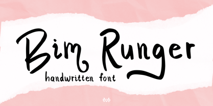 Introducing Bim Runger is a realistic handwritten font come with alternative and ligature and will be perfect for book, title branding, product packaging, invitation, quotes, label, poster, logo etc. Feature Uppercase & Lowercase Number & Symbol International Glyphs Multilingual support Alternative Ligature Thanks so much for checking out my shop and feel free to drop us a message any time and follow my shop for upcoming updates
 - Box Office by Device,
$29.00 Designed originally for the BBC's listings magazine "Radio Times", this dingbat font has been extended to include the US rating as well as the UK ones and a selection of symbols for use on DVD film packaging and satellite listings. The font used is Paralucent, and an ideal accompaniment. Note: the icon for sexual content comes in two versions, one with genitalia and one without.
 - Katieya by Gatype,
$14.00 Katieya is a handwritten font set. Great for logos, name tags, handwritten quotes, product packaging, merchandise, social media & greeting cards. It saves a lot of time in designing a product. This font will add a fun and friendly touch to any of your projects! This font is PUA coded which means you can easily access all the glyphs and strokes and much more. Have fun using Katieya.
 - Fort Collins by Letterhend,
$13.00 Fort Collins is a pair of fonts that bring the classy yet casual feel in the same time. The condensed sans combined with the natural hand writing script are the perfect match for you who needs a typeface for headline, logotype, apparel, invitation, branding, packaging, advertising etc. This typeface is comes in uppercase, lowercase, punctuation, symbols & numerals, stylistic set alternate, ligatures, etc also support multilingual.
 - Happiness Mood by madeDeduk,
$12.00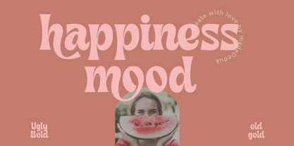 Introducing Happiness Mood Retro Fonts, comes with 2 styles clean and stamp style. Use this font for any branding, product packaging, invitation, quotes, t-shirt, label, poster, logo etc. Feature Uppercase & Lowercase Number & Symbol International Glyphs Multilingual support Feel free to drop us a message any time and follow my shop for upcoming updates Shoot me on email at: dedukvic@gmail.com Hope you enjoy it.
 - Stony Island NF by Nick's Fonts,
$10.00Among many of Alf Becker’s contributions to Signs of the Times magazine was 1 1935 offering named Chicago Modern Thick and Thin, which provided the inspiration for this face. It’s a perfect choice for friendly headlines with an Art Deco vibe. Both versions include the complete Unicode Latin 1252, Central European 1250 and Turkish 1254 character sets, as well as localization for Lithuanian, Moldovan and Romanian. - John Alden NF by Nick's Fonts,
$10.00The ATF syndicate released the inspiration for this quaint charmer in its 1884-1885 series of specimen books under its current name. Its warmth and unassuming naivete make it perfect for headlines seeking to evoke simpler times. Both versions of this font include the complete Latin 1252, Central European 1250 and Turkish 1254 character sets, along with localization for Lithuanian, Moldovan, Romanian and Turkish. - Ubik by Présence Typo,
$36.00Ubiquity: the possibility to be in several places at the same time; this could be the definition of a typeface like Ubik. Its applications are numerous and various: books, magazines, posters but also architecture and signs. Ubik is a grotesk sans serif with a “nordic taste”: shapes pure and somewhat square. The nonexistent contrast between thin and thick strokes gives it a discreet rustic look. - Mikratos by Just Font You,
$19.00 Mikratos is a digital futuristic font inspired by the interfaces in sci-fi movies and retro games visual. Developed to be the solid time-jumper between vintage retro-futurism and also the futuristic nowadays trend in the graphic design and visual industry. Perfectly fit for logo, branding, gaming, esport design, poster, music video, album artwork, cover, book, packaging, merchandise, apparel, fashion, and many more.
 - CA BND Trash by Cape Arcona Type Foundry,
$39.00 Based upon CA BND (the clean version) CA BND Trash is a rough and dirty version of our favorite DIN-like font. We recommend it for use in zombie movies title design, headlines for ads of a soft-drink manufacturer (who hopes to be cooler, if he uses rough typefaces), or for emocore, hardcore, softcore or "whatever-core" bands. Uhhh, its the time for the living dead.
 - Koscar Liners by madeDeduk,
$14.00 Introducing Koscar Liners is a realistic handwritten font and will be perfect for book, title branding, product packaging, invitation, quotes, label, poster, logo etc. Feature Uppercase & Lowercase Number & Symbol International Glyphs Multilingual support Alternative Ligature Thanks so much for checking out my shop and feel free to drop us a message any time and follow my shop for upcoming updates Hope you enjoy it.
 - Resolute NF by Nick's Fonts,
$10.00 Morris Fuller Benton’s Eagle, designed for ATF in 1934, which did yeoman-like duty on many WPA posters of the time. This version, unicase as was the original, has been designed to set tight, so that it creates dense and commanding headlines. All versions of this font include the Unicode 1250 Central European character set in addition to the standard Unicode 1252 Latin set.
 - Desk Drawer JNL by Jeff Levine,
$29.00Desk Drawer JNL is a collection of twenty-six images representing the kinds of small items lying around inside a desk at any given time… From a thumbtack to a spring clip… from a postage stamp to a roll of tape… even some shirt pins or some gummed labels… the center drawer of a desk can house just about anything that fits inside it! - Marchello by madeDeduk,
$17.00 Marchello simply amazing with Regular, Extrude & Shadow styles, so you can save much time for create design. Marchello inspired from retro style 70's and perfect for poster design, book covers, merchandise, fashion campaigns, newsletters, branding, advertising, magazines, greeting cards, album covers, and quote designs and more. Feature - UPPERCASE - lowercase - Number & Symbol - International Glyphs - Alternative lowercase - Ligature - Swash If you need anything else please contact : dedukvic@gmail.com
 - Mongondow by Letterena Studios,
$10.00 Mongondow is a unique, modern, and classic display font perfect for elegant and luxury logos, book or movie title designs, fashion brands, magazines, clothes, lettering, quotes, and so much more. . Add it to your fonts library, and it will become your favorite in no time at all! This font is PUA encoded, which means you can access all of the glyphs and swashes with ease!
 - ITC Braganza by ITC,
$29.99ITC Braganza is the work of British designer Phill Grimshaw, an elegant typeface steeped in historical inspiration. Reminiscent of the handwritten manuscript styles of the 16th century, the name Braganza refers to Catherine, Duchess of Braganza, who was a prominent figure in Portugal at the time. The vertical script style displays the elegance and refinement which distinguished the Royal Courts of the 16th century. - Colombard by Kitchen Table Type Foundry,
$15.00 The other day I drank a glass of white wine, which was partly made with Colombard grapes. When I created this font, I needed a bit of a ‘posh’ name, so I settled on Colombard. Colombard is a nice, handwritten font. Quite elegant, but cheeky at the same time. It comes with extensive language support and a full set of Discretionary Ligatures for double letter combinations.
 - Castel by HansCo,
$12.00 Castel is a handwritten font made with natural watercolor texture. The solid texture makes it look modern and simple, strong and feminine at the same time. Some purposes you can use Castel for are logos, product branding, wedding invitations, quotes, flyers, magazine, Instagram templates or for text overlay to any background image. Thank you for your purchase! I hope you have fun with Castel. Enjoy!
 - So Prolix by Sudtipos,
$29.00 A tribute to calligraphy, with the thinness of modern times. So Prolix is presented as a calligraphic typography with uniform sketches and very particular features. Its harmonious and soft rhythm will impregnate every word with a great personality. Elegant, strong and harmonious, So Prolix irradiate its own style on every character. Rescuing particular features, So Prolix is even a modern typography and useful, giving distinction to words.
 - Franklin Gothic Hand Demi Shadow by Wiescher Design,
$39.50 Franklin Gothic Hand Demi Shadow is another one in my series of hand-drawn fonts from way back in time – before computers changed the way we worked in advertising. This one was especially used for what we called "pork-belly-ads": ads for food-stores! I think it is very useful for all kinds of advertising that demands a lot of bang! Your powerful typedesigner Gert Wiescher
 - Cardamon by Linotype,
$50.99 “My goal in creating the Cardamon family,” says Brigitte Schuster of her first design, “was to make an unobtrusive serif typeface which, at the same time, has a determined and straightforward demeanor.” “I wanted to design a typeface with sharp edges and corners,” explains Schuster. “I was influenced by the angularities in Vojtěch Preissig‘s “Antiqua” and “Cursive” in addition to Oldřich Menhart‘s “Menhart” typeface.”
 - Lodestone Pro by Red Rooster Collection,
$60.00 Lodestone is a sans serif decorative typeface, and was created by Steve Jackaman (ITF) in 2017. The original design was known as ‘Marvin,’ and was created by Face Photosetting (London) in the early 1970’s. Since the name ‘Marvin’ was in use by another foundry at time of publication, ‘Lodestone’ was born. Lodestone has a clean, retro feel, and is electrifying at display sizes.
 - Kaktis by Ingrimayne Type,
$5.00 The Kaktis collection features eleven typefaces that have spikes or spines. Some have short spikes, some long, some sparse spines and others abundant spikes. They are novelty fonts with limited uses, but there can be times when a typeface of this sort may be appropriate, perhaps for a sharp rebuke or a pointed reminder. These faces were constructed in the mid 1990s using a font distortion program.
 - Karaoke JNL by Jeff Levine,
$29.00Karaoke JNL is one of the many alphabets created by the late Alf R. Becker that was showcased in Signs of the Times magazine from the 1930s through the 1950s. Thanks to Tod Swormstedt of ST Media (and who is the curator of the American Sign Museum in Cincinnati, Ohio) for providing Jeff Levine the research material from which this font design was modeled. - Mastel Gerling by madeDeduk,
$14.00 Mastel Gerling is a modern handwritten Brush. This font perfect for poster design, book covers, merchandise, fashion campaigns, newsletters, branding, advertising, magazines, greeting cards, album covers, and quote designs and more. Feature Uppercase & Lowercase Number & Symbol International Glyphs Multilingual support Alternative Ligature Thanks so much for checking out my shop and feel free to drop us a message any time and follow my shop for upcoming updates
 - Foreign Skies by PizzaDude.dk,
$17.00 Foreign Skies is that hastily written brush font you're going to need, if you're looking for an authentic brush font. I am aware that Foreign Skies doesn't always meet the criteria of a professional signletteres demands of "perfect strokes" - but that is the basic idea! It is super legible, even at small sizes, but at the same time it is uneven, bouncy, clumsy and rough!
 - General Chang JNL by Jeff Levine,
$29.00General Chang JNL is one of a number of fonts redrawn by Jeff Levine from the creative output of the late Alf R. Becker. Becker's alphabets were a monthly feature of Signs of the Times Magazine from the 1930s through the 1950s. Thanks to Tod Swormstedt of ST Media (who also is the curator of the American Sign Museum in Cincinnati, Ohio) for the resource material. - ITC Kristen by ITC,
$29.99ITC Kristen is the work of American designer George Ryan. He describes it as not your average text or display font." The inspiration for the design came from the handwritten menu at a neighborhood restaurant. With time, the forms moved away from the originals and towards something more like a child's scrawl. The result is singularly unique. ITC Kristen remains legible without losing any charm. - Solpera by Storm Type Foundry,
$32.00This type face fills one of the gaps between the world of Roman alphabets and that of linear alphabets. The first to be designed was the set of upper-case letters. The expression of these characters cannot conceal that they were originally intended only for the sculptor's use, as a type face for three-dimensional inscriptions. Their width proportions reflect a dialogue between the contemporary feeling and the legacy of classical Roman inscriptions. The type face was later complemented with a set of lower-case letters and elaborated into further designs. Its clear, concise letter forms end with small serifs which not only make the type face more refined, but above all anchor the individual letter signs visually to the horizontal of the text line. The austere construction of the majority of the letters is balanced by the more exuberant, humanizing forms of the most frequently used letters "a"; "e". (The three variants of the lower-case "e" enable to create rhythmically differentiated texts.) The letters in which a straight stroke is connected with an arch are designed in two ways. That means that the letters "n", "h","m" and the group of letters "b","d","p","q" are conceived in a different way. Thus an interesting tension is created in the structure of the text, which, however, does not endanger legibility. The economizing, slightly narrowed design of this type face predetermines its use for the setting of usual texts. In larger sizes, however, it produces a rather serious, even solemn, impression. - Palsam Pro by Abjad,
$110.00 Since the beginning, Palsam was intended to be a super multilingual family, with a real cursive Arabic companion, and a display cut. The typeface was designed to be used for setting text and titles of contemporary Arabic content, specially magazines, and websites. The Arabic and Latin scripts were designed at the same time, to make a true authentic bilingual typeface. Both scripts have affected each other in several ways through the entire design process, which happened within ten years. Palsam has an inviting, approachable, fashionable and humanist look. Thanks to its low contrast, open apertures, detailed calligraphic strokes, and smooth counters, which also make it easy to read at smaller sizes. The main highlight for Palsam was the Cursive companion. For the first time, the calligraphic Ijaza style was used as a model for designing the Arabic cursive. Since the Ijaza is a hyper combination of Naskh and Thuluth, which makes it perfect to be a companion for the upright Naskh. Moreover this script was used in margins, and to highlight specific content inside a paragraph in older manuscripts. With true cursive companions in five weights, and many opentype features, Palsam grants all the tools needed to set complex information and editorial designs applications. More than 1000 characters are included per weight, including small caps, fractions, old style and lining numbers, ligatures, contextual ligatures, and discretionary ligatures. It supports over 40 languages that use the Latin extended, as well as Arabic, Farsi, and Urdu Languages. The latin script was designed in collaboration with the Slovenian type designer Alja Herlah.
 - Adhesive Serif Letters JNL by Jeff Levine,
$29.00 A few scant examples of die cut gummed letters (R, C, Y and &) provided the design inspiration for Adhesive Serif Letters JNL. Influenced by the Caslon style, this typeface offers clean, legible titling. The sample letters were once manufactured by the Tablet and Ticket Company of Chicago and sold under their brand name of Willson's [named for the founder of the company]. Gummed letter sets were available in a variety of styles and sizes for various sign, merchandising and marking needs.
 - Albert Einstein by Harald Geisler,
$29.00 Harald Geisler wants to make you as brilliant as Albert Einstein. Or at least let you write like him. Or at least write in his handwriting. — The Wall Street Journal Imagine you could write like Albert Einstein. The Albert Einstein font enables you to do exactly that. In an joined effort, creators Harald Geisler and Elizabeth Waterhouse, spend over 7 years on finalising the project. It was made possible with the help of the Albert Einstein Archive, the Albert Einstein Estate, and funding by a successful Kickstarter Campaign of 2, 334 backers. The outcome was worth the effort: a font unprecedented in aesthetic technique and a benchmark for handwriting fonts. To create a result that is true to the original, Harald Geisler developed a method to analyse the movement of the famous writer. Letter by letter, every glyph was digitally re-written to create a seamlessly working font. It is the only font that holds 5 variations for each lowercase and uppercase-letter, number, and punctuation sign. Each based on meticulous detail to the original samples of Albert Einstein’s handwriting. The OpenType contextual alternates feature dynamically arranges the letters automatically as you type to ensure that no repeated letter forms are placed next to each other. Stylistic variants can also be accessed through stylistic sets. The font has 10 fine-tuned weights ranging from extra-light to fine and extra bold to heavy. The result is a vivid handwritten text true to the original. A PDF documentation, showing step by step how the font was made and comparing numerous original samples, is included with the font and can be downloaded here. The work has been recognised internationally, by press, Einstein fans, and designers. Some quotes used in images: “The font is beautiful“ — Washington Post “If you could write like Einstein, would it help you to think like Einstein?” — The Times (London) “Finally, if your colleagues aren’t taking you seriously, then perhaps you could start sending e-mails in a new font that mimics the handwriting of Albert Einstein.” — Physics World “Geisler and Waterhouse are really asking deeper questions about the diminishing (or evolving) role of our flawed, variable penmanship as a conduit of thought in today’s pixel-perfect landscape.” — QUARTZ “Your writing will look imaginative — which is exactly what Einstein would've wanted." — Huffington Post Arts & Culture "Forget Myriad Pro, Helvetica or Futura. The only font you’ll ever need" — Gizmodo “Capture a piece of Einstein's genius in your own writing." — Mashable
 - Tenez by Plau,
$30.00 Big News! Tenez has been selected for the Tipos Latinos Biennial 2016 and Typographica’s Favorite Typefaces of 2015! Tenez is a Grand Slam display didone typeface from Plau. We designed it for a branding project, further developing the resulting logotype into a typeface we felt could solve many designers’ needs. Its origins are rooted in pointed nib calligraphy which can be seen in contemporary Didot and Bodoni inspired typefaces. But Tenez’s shapes are organic (these modern typefaces were originally cut by hand after all) – in fact that was the challenge we set from the start: to make a typeface as organic in construction as possible. This echoes some of late 19th century typefaces and advertising, yet we thought of it for contemporary uses. One of the several unique features of Tenez is its unusual Thin weight, in which the contrast between thin strokes and the black area left by the serifs makes for a typewriter-like personality. The italics provide a perfect counterpoint to the roman weights. Tenez was unapologetically conceived as a display typeface meant to be used large as in magazine openings, drop caps or everywhere there’s a need for elegant impact. The family includes support for almost all Latin languages available, figure sets for almost every conceivable occasion (tables, text, you name it), alternates for the quirky beautiful R (sometimes simpler is better, but not always!) and Q (with a nice big tail for that article opener). Tenez pairs really well with our no-frills sans-serif Motiva Sans and our cute vertical connected script Primot.