10,000 search results
(0.049 seconds)
- Rathya by Andrey Font Design,
$14.00 Rathya is a sweet and delicate handwritten font. Dainty and joyful, this font will be ideal for writing wedding invitations, cards or any other design that may need a romantic, personalized touch! This font is PUA encoded which means you can access all of the glyphs and swashes with ease!
 - Bullaina by Balevgraph Studio,
$14.00 Bullaina is a dainty and flowing handwritten font. Sweet and joyful, this font will be ideal for writing wedding invitations, cards or any other design that may need a romantic, personalised touch! What's Included : - Uppercase, Lowercase, Numerals & Punctuations - Ligature & Alternate - Works on PC & Mac - Simple installations - Multilingual support - PUA Encoded
 - Betty Finty by Stringlabs Creative Studio,
$29.00 Betty Finty is a friendly and modern script font with a unique style. It will add a romantic touch to any crafting project! Fall in love with its authentic feel and use it to create gorgeous wedding invitations, beautiful stationary art, eye-catching social media posts, and cute greeting cards.
 - Amanilla by AEN Creative Studio,
$15.00 Amanilla is a romantic and sweet serif display font. No matter the topic, this font will be an incredible asset to your fonts’ library, as it has the potential to elevate any creation. This font is PUA encoded, which means you can access all of the glyphs and swashes with ease!
 - Delmonte Belarina by Letterena Studios,
$9.00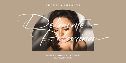 Delmonte Belarina is a romantic and sweet calligraphy typeface with characters that dance along the baseline. It will add a luxury spark to any design project that you wish to create! This font is PUA encoded which means you can access all of the amazing glyphs and ligatures with ease!
 - Valentine Soul by Sakha Design,
$14.00 Valentine Soul is a romantic and delicate handwritten font. Dainty and joyful, this font will be ideal for writing wedding invitations, cards or any other design that may need a dreamy, personalized touch! This font is PUA encoded which means you can access all of the glyphs and swashes with ease!
 - Maron Barista by Zeenesia Studio,
$15.00 Maron Barista is a beautiful and smooth sans serif font created by a romantic and lovely look. It is perfect for greeting cards, wedding invitations, posters, logotypes, product branding, and much more. This font is PUA encoded, which means you can access all of the glyphs and swashes with ease!
 - Youth Line by Sakha Design,
$14.00 Youth Line is a sweet and delicate handwritten font. Dainty and joyful, this font will be ideal for writing wedding invitations, cards, or any other design that may need a romantic, personalized touch! This font is PUA encoded which means you can access all of the glyphs and swashes with ease!
 - Stayling Quarters by TM Type,
$12.00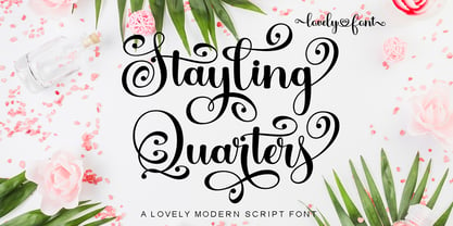 Stayling Quarters is a romantic and sweet calligraphy typeface with characters that dance along the baseline. It will add a luxury spark to any design project that you wish to create! This font is PUA encoded which means you can access all of the amazing glyphs and ligatures with ease!
 - Justin Honey by Romie Creative,
$13.00 Justin Honey is a beautiful modern calligraphy font with a special heart character. It will add a romantic touch to any craft project! Fall in love with its authentic feel and use it to create gorgeous wedding invitations, beautiful stationery art, eye-catching social media posts, and cute greeting cards
 - Lettera by Resistenza,
$39.00 Lettera – Delivering 20th-century penmanship vibes, this monoline script font accomplished with rounded nib carries the soul of a romantic naive hand. Connected letterforms Illustrate a charming revival of handwriting. With 400 glyphs including alternates, swashes and ending forms, this typeface is perfect to create beautiful decorative custom headlines and wordmarks.
 - Resonance Love by Andrey Font Design,
$10.00 Resonance Love is a romantic and natural handwritten font, featuring beautiful hearts as ornaments. It is ideal for valentine-themed greeting cards, weddings, and any crafting projects that require a warm touch. This font is PUA encoded which means you can access all of the glyphs and swashes with ease!
 - Kataleya by Larin Type Co,
$14.00 Kataleya - this is a beautiful handwritten font filled with charm and romance. It will fit perfectly into any project, and thanks to alternative substitutes, you can make your design unique, try playing substitutes, and you will get different options for your design. All characters in this font support PUA encoding.
 - Miss You by Beary,
$15.00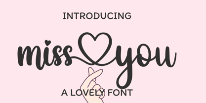 miss you is a romantic and sweet calligraphy typeface with characters that dance along the baseline. It has a casual, yet elegant touch. This font is PUA encoded which means you can access all of the glyphs and swashes with ease! Files Include : - Multilingual Support - Ligature Character - Alternates Character Thanks
 - Poetically Dark by Pitt's Hand,
$10.00 Poetically Dark is a font created to recall a certain type of dark and romantic writing from another century. Well-groomed letters, but written instinctively, as if in the throes of a creative frenzy. In a clash between the refined taste of the past and the ever-present speed of communication.
 - Banknote 1948 by Ingo,
$39.00 A very expanded sans serif font in capital letters inspired by the inscription on a bank note Old bank notes tend to have a very typical typography. Usually they carry decorative and elaborately designed markings. For one thing, they must be practically impossible to forge and for another, they should make a respectable and legitimate impression. And in the days of copper and steel engravings, that meant nothing less than creating ornate, shaded or otherwise complicated scripts. Designing the appropriate script was literally in the hands of the engraver. That’s why I noticed this bank note from 1948. It is the first 20 mark bill in the then newly created currency ”Deutsche Mark.“ All other bank notes of the 1948 series show daintier forms of typography with an obvious tendency toward modern face. The 1949 series which followed shortly thereafter reveals the more complicated script as well. For whatever reason, only this 20 mark bill displays this extremely expanded sans serif variation of the otherwise Roman form applied. This peculiarity led me in the year 2010 to create a complete font from the single word ”Banknote.“ Back to those days in the 40’s, the initial edition of DM bank notes was carried out by a special US-American printer who was under pressure of completing on time and whose engravers not only engraved but also designed. So that’s why the bank notes resemble dollars and don’t even look like European currency. That also explains some of the uniquely designed characters when looked at in detail. Especially the almost serif type form on the letters C, G, S and Z, but also L and T owe their look to the ”American touch.“ The ingoFont Banknote 1948 comprises all characters of the Latin typeface according to ISO 8859 for all European languages including Turkish and Baltic languages. In order to maintain the character of the original, the ”creation“ of lower case letters was waived. This factor doesn’t contribute to legibility, but this kind of type is not intended for long texts anyway; rather, it unfolds its entire attraction when used as a display font, for example on posters. Banknote 1948 is also very suitable for distortion and other alien techniques, without too much harm being done to the characteristic forms. With Banknote 1948 ingoFonts discloses a font like scripts which were used in advertising of the 1940’s and 50’s and were popular around the world. But even today the use of this kind of font can be expedient, especially considering how Banknote 1948, for its time of origin, impresses with amazingly modern detail.
 - Gridlite PE Variable by Rosetta,
$290.00 The two great technical constraints a type designer can tackle are low resolution, which limits detail and dictates proportions between negative and positive shapes, and uniform width, which restricts each letter to a fixed horizontal space. Wrestle with both at once, and each letter becomes a black-and-white chessboard that challenges every design decision. Sometimes battling these constraints gets in the way of a good idea, but other times, tinkering with fewer options can make the job irresistibly easy and lead straight to a grid addiction. Gridlite, an experiment with a modular negative space, is the side effect of such an addiction. It’s simplified, monospaced, and variable: foreground and background alike are ready to be animated, typed, scaled up, scaled down, rounded, or otherwise deformed. Gridlite is primarily a variable font with axes that control the size of the elements, their shape, and the background (one for the rectangular field and one for the compact envelope around the letters). The fonts cover Cyrillic, Greek, and Latin scripts. Small caps are included, for no apparent reason ... and there is a monospaced elephant, too.
 - Muggsy by Missy Meyer,
$10.00 I do a lot of taller, narrower handwriting fonts; this time around, I was inspired to make a wider, shorter handwriting font! MUGGSY has everything you expect from one of my fonts: clean and smooth curves, a full set of alternates, and a feeling of fun! MUGGSY has two uppercase-height alphabets (with a few lowercase-style letters like a and e in the lowercase set), plus a full set of 63 "smallternates" -- the same letters, numbers, and ampersand sized down to 75%, and beefed up in weight so they can be mixed in with the full-size letters. Plus 30 double-letter ligature sets, and a few additional alternates for variety! You also get a ton of punctuation, and my usual 300+ extended Latin characters for language support, for a total of over 600 glyphs! And just because you may want things a bit heavier, I've also made Muggsy Heavy, a bolder weight of Muggsy with all of the same alternates and extras. Enjoy, my fonty friends!
 - Circle Two Letter by Fauzistudio,
$12.00 Cilcle TwoLetter Monogram Logo Font Family with OpenType magic that can adjust to front and back letters, there are 10 frame variations that you can access at numbers 0-9 how to activate it simply by adding a number in front of your initials, typing something (0AB - 9AB) it will automatically compose . you can use it on any Logo project it is perfect to add to your collection. Cilcle TwoLetter font FAMILY – includes 9 weights (Thin, Extra light, Light, Regular, Medium, Semi Bold, Bold, Extra Bold, Black) : Cilcle TwoLetter Thin Cilcle TwoLetter Extralight Cilcle TwoLetter Light Cilcle TwoLetter Regular Cilcle TwoLetter Medium Cilcle TwoLetter Semibold Cilcle TwoLetter Bold Cilcle TwoLetter Extra Bold Cilcle TwoLetter Black Hope you enjoy. Intuisi Creative
 - Pentagram Two Letter by Fauzistudio,
$9.00 Pentagram TwoLetter Monogram Logo Font Family with OpenType magic that can adjust to front and back letters, there are 10 frame variations that you can access at numbers 0-9 how to activate it simply by adding a number in front of your initials, typing something (0AB - 9AB) it will automatically compose . you can use it on any Logo project it is perfect to add to your collection. Pentagram TwoLetter font FAMILY – includes 9 weights (Thin, Extra light, Light, Regular, Medium, Semi Bold, Bold, Extra Bold, Black) : Pentagram TwoLetter Thin Pentagram TwoLetter Extralight Pentagram TwoLetter Light Pentagram TwoLetter Regular Pentagram TwoLetter Medium Pentagram TwoLetter Semibold Pentagram TwoLetter Bold Pentagram TwoLetter Extra Bold Pentagram TwoLetter Black Hope you enjoy. Intuisi Creative
 - Celan by Craft Supply Co,
$20.00 Introduction to Celan Bold Serif Font The Celan – Bold Serif font stands out with its robust and masculine appearance. It features thick, strong lines and minimal white space. This design choice gives it a dominant presence, making it ideal for impactful titles. Characteristics of the Font Celan is characterized by its bold, assertive strokes. The limited white space between letters enhances its solidity. This quality makes the font appear more masculine and forceful. Its serif design adds a touch of classic elegance. Ideal Uses of Celan – Bold Serif This font is perfect for powerful titles that need to command attention. Its boldness makes it suitable for headers in various mediums like posters, websites, and magazines. The strong character of the font conveys confidence and authority.
 - JAF Herb by Just Another Foundry,
$59.00 Herb is based on 16th century cursive broken scripts and printing types. Originally designed by Tim Ahrens in the MA Typeface Design course at the University of Reading, it was further refined and extended in 2010. The idea for Herb was to develop a typeface that has the positive properties of blackletter but does not evoke the same negative connotations – a type that has the complex, humane character of fraktur without looking conservative, aggressive or intolerant.
 - Woven by Ingrimayne Type,
$9.00 Woven is a geometrical typeface based on a simple tessellation or tiling pattern. The template for the letters has both vertical and horizontal symmetry and the tiling pattern has four-fold rotational symmetry. Variations of this pattern are popular with quilters and most have a woven look to them. To fit the letters into the template results in some distorted letters but it is the pattern that matters, not the individual elements of that pattern. With proper spacing, a block of text will fit together both horizontally and vertically. Woven is intended to be used with alternating letter sets and the OpenType feature of contextual alternatives does this automatically in applications that support it. The upper-case could be used alone but it unlikely that the lower-case characters could be used by themselves. The typeface is hard to read and would make a challenging font for word-search puzzles.
 - Ador by Fontador,
$24.99 Ador is a humanist sans serif especially designed for contemporary typography and comes up with 8 weights from ultralight to black plus true italics and 343 ligatures. A large x-height not only creates space in the letters for extra-bold styles, but also lends Ador an open and generous character in the more narrow and semi-bold versions. The nice balance between sharp ink trapped and soft, dynamic shapes helps to work in small sizes. Diagonal stress, angled finials and the 4 degree true italic styles give Ador a dynamic look. The font contains 981 glyphs including small caps, tabular, old style, fractions … and a wide range of flexibility for Latin language support for every typographical needs. Ador is a contemporary sans serif typeface, special for logotypes, brands, magazines and editorial.
 - ZT Klotin by Khaiuns,
$14.00 ZT Klotin is a serif display font characterized by a strong, Classic vibe, with straps, special alternate glyphs, and soft Curves. Perfect for branding, weddings, social media, product design, stationery, and advertising. ZT Klotin is flexible enough to add these classic elements to almost any project requiring a special class touch. ZT Klotin features over 178 unique ligature and alternatives, ZT Klotin is crafted to be Soft and interwoven to create a stunning display of its subtle hypnotic curves, making it the perfect choice for impactful editorial layouts and bold Bold creations. FEATURE — 644 Glyphs — Uppercase & lowercase letters, numbers — Old-style figure — 40 Discretionary Ligatures & Standard Ligatures, — 178 Alternatives (Uppercase & Lowercase) — Symbols, punctuation marks I hope you have fun using ZT Klotin Thanks for using this font ~ Khaiuns X zelowtype
 - Print Shop Relics JNL by Jeff Levine,
$29.00 Pointing hands, floral embellishments, a World War II "Victory" emblem and an old telephone are but a few of the classic images redrawn from vintage source material for Print Shop Relics JNL. Lovers of pre-digital clip art from the letterpress era will find these embellishments useful, charming and helpful.
 - Circus Stars by Vladislav Ivanov,
$20.00 Circus stars is Vladislav Ivanov font with a retro touch, inspired by the look of old circus and movie posters. It works well with normal size text, but it works even better for large displays, short words, or even just to incorporate a few or single characters in a design.
 - Chase by Device,
$39.00 Type that preserves the over- and under-inked textures of true old-fashioned wood faces, now available without ink on your fingers straight from your keyboard. Based on samples taken from early and mid Nineteenth century Clarendons, the font carefully preserves all the battered idiosyncracies of vintage print shop type.
 - Gundrada ML by HiH,
$12.00 Gundrada ML was inspired by the lettering on the tomb of Gundrada de Warenne. She was buried at Southover Church at Lewes, Sussex, in the south of England in 1085. The Latin inscription on her tomb, STIRPS GUNDRADA DUCUM, meaning “Gundrada, descendant of the Duke” may have led to the speculation that she was the daughter of William, Duke of Normandy and bastard son of Robert the Devil of Normandy and Arletta, daughter of a tanner in Falaise. In 1066 William defeated Harold at the Battle of Hastings and was crowned William I of England. More commonly known as William the Conquerer, he commissioned a string of forts around the kingdom and charged trusted Norman Barons to control the contentious Anglo-Saxon population. William de Warenne, husband of Gundrada, was one of these Barons. There has also been the suggestion that Gundrada may have been the daughter of William’s wife, Matilda of Flanders, by a previous marriage. According to the Dictionary of National Biography (Oxford University Press, Oxford, England 1921-22), both of these contentions are in dispute. Searching the past of a thousand years ago is like wandering in a heavy fog: facts are only dimly in view. Regardless, I know that I found these letterforms immediately engaging in their simplicity. Unadorned and unsophisticated, they have a direct honesty that rests well in the company of humanistic sans serifs like Franklin Gothic or Gill Sans, appealing to a contemporary sensibility. The lettering on the tomb is in upper case only. Although Gundrada does not sound Norman French to me, her husband certainly and her father probably were Norman French. Nonetheless, the man that carved her tombstone was probably Anglo-Saxon, like most of the people. For that reason, we are quite comfortable with a fairly generic lower case from an Anglo-Saxon document of the time. The time was a time of transition, of contending language influences. This font reflects some of that tension. Features 1. Multi-Lingual Font with 389 glyphs and 698 Kerning Pairs. 2. OpenType GSUB layout features: onum, dlig, liga, salt & hist. 3. Tabular Figures and Alternate Old-Style Figures. 4. Alternate Ruled Caps (line above and below, matching to brackets). 5. Central Europe, Western Europe, Turkish and Baltic Code Pages. 6. Additional accents for Cornish and Old Gaelic. 7. Stylistic alternates A, E, y and #. 8. Ligatures ST, Th, fi and fl. 9. Historic alternate longs. The zip package includes two versions of the font at no extra charge. There is an OTF version which is in Open PS (Post Script Type 1) format and a TTF version which is in Open TT (True Type)format. Use whichever works best for your applications.
 - Olivine by URW Type Foundry,
$35.00 In an era of typographic neutrality, Pria Ravichandran adds spirit and flavour to the humanist sans, a genre that is known for legibility. Introducing Olivine. Olivine is a versatile type family that performs admirably across sizes. It is designed with maximum care ensuring legibility across various sizes, angles and distances. The sturdy shapes and the exaggerated ink traps fade to produce an even typographic colour and a lively texture in smaller text sizes. In larger display settings, the details become self-conscious and highlight the spectacular quality of the design. Olivine is neither experimental nor minimal, striking a balance between formality and friendliness. Olivine is clean as well as organic at the same time. Consisting of seven weights in roman and italics, the type-family address typographic hierarchy for texts of all kinds and sizes. Distinctive, yet neutral letterforms add personality to the type family. The counter-forms are large and open giving the design plenty of internal space which is balanced against the generous spacing of the characters. These features of Olivine make the reading process enjoyable in digital as well as the print medium. No squinting to read this type-family! If you are looking to add some flavour into your design, try Olivine. It is a trend-setting typeface that we predict is going that extra mile. Try before you buy, Olivine Medium and Medium Italic are available free for unlimited commercial usage.
 - Turnkey by wearecolt,
$19.00 Turnkey is a modern grotesque typeface, it could be described as a neo-grotesque with hints of geometric shapes. A workhorse typeface designed to be versatile for both small and large sizes, ink traps have been used as a design feature above 26pt and a technical feature when printing small body text. The combination of 36 weights and styles allows you the freedom to create. Each weight includes extended support for over 90 languages (Including Cyrillic), fractions, tabular figures, arrows, ligatures, alternate glyphs, and more. Demo licenses are available from colttypeco.com In addition to a standard style set, the Turnkey family also has an italic set plus soft versions of both. Turnkey Soft is a slightly rounded version of the standard and italic, which looks more friendly, warm, and soft. It's corporate but with a personality. Current instances are: Turnkey Standard - Thin, Thin Italic, Extra Light, Extra Light Italic, Light, Light Italic, Regular, Regular Italic, Medium, Medium Italic, SemiBold, SemiBold Italic, Bold, Bold Italic, Extra Bold, Extra Bold Italic, Heavy, Heavy Italic. Turnkey Soft - Thin, Thin Italic, Extra Light, Extra Light Italic, Light, Light Italic, Regular, Regular Italic, Medium, Medium Italic, SemiBold, SemiBold Italic, Bold, Bold Italic, Extra Bold, Extra Bold Italic, Heavy, Heavy Italic When used as body type, Turnkey pairs well with: Take Note, Stroom and Markout. Turnkey is perfect for; headings, titles, body copy, logos, magazines, editorial design, corporate branding, brand identity, websites, blogs, apps, games, ebooks, publications, and signage. Turnkey can be found in the Typodarium 2024 OpenType features: Access All Alternates, Glyph Composition / Decomposition, Discretionary Ligatures, Denominators, Fractions, Kerning, Standard Ligatures, Localized Forms, Mark Positioning, Mark to Mark Positioning, Numerators, Proportional Figures, Scientific Inferiors, Stylistic Set 1, Stylistic Set 2, Stylistic Set 3, Subscript, Superscript, Tabular Figures. Support for 95 languages: Belarusian, Russian, Ukrainian, Afrikaans, Albanian, Asu, Basque, Bemba, Bena, Breton, Catalan, Chiga, Colognian, Cornish, Croatian, Czech, Danish, Dutch, Embu, English, Esperanto, Estonian, Faroese, Filipino, Finnish, French, Friulian, Galician, Ganda, German, Gusii, Hungarian, Inari Sami, Indonesian, Irish, Italian, Jola-Fonyi, Kabuverdianu, Kalenjin, Kamba, Kikuyu, Kinyarwanda, Latvian, Lithuanian, Lower Sorbian, Luo, Luxembourgish, Luyia, Machame, Makhuwa-Meetto, Makonde, Malagasy, Maltese, Manx, Meru, Morisyen, North Ndebele, Norwegian Bokmål, Norwegian Nynorsk, Nyankole, Oromo, Polish, Portuguese, Quechua, Romanian, Romansh, Rombo, Rundi, Rwa, Samburu, Sango, Sangu, Scottish Gaelic, Sena, Serbian, Shambala, Shona, Slovak, Soga, Somali, Spanish, Swahili, Swedish, Swiss German, Taita, Teso, Turkish, Upper Sorbian, Uzbek (Latin), Volapük, Vunjo, Walser, Welsh, Western Frisian, Zulu
 - Fortune by Gleb Guralnyk,
$14.00 Introducing Fortune Font set. This typeface has an old school look with classic western shapes. Fortune Variable Font has three predefined weights (Thin, Regular & Bold) and Variable font with flexible weight. All of the small letters has one or two alternates with bottom expanded shape*. Fortune Variable Font supports most of the European languages. *Make sure that "Contextual & Stylistic Alternates" features are supported & enabled in your software. Also please consider that this feature is available only for English alphabet.
 - Oun by Ezzazebra,
$15.00 Inspired from Cambodia’s alphabet, Khmer. I tried to explore the visual of the original character in Latin characters. Inspired by 2 gothic fonts, Old London (for the modern/straight feel) and Berliner (for the dynamic between thin and bold line). The letters are made with pencil in a millimeter block book, then scanned into clean vector format. And the result can be use for Display or a Headline with traditional or ethnic theme, including film, game, event, etc.
 - Code Saver by Dharma Type,
$9.99 Code Saver — Next-generation monospaced font — 1. Code Saver is a monospaced font family for coding and tabular layout. 2. Code Saver is a clean, natural and simple monospaced font family. 3. Code Saver consists of 6 style, Regular, Medium, Bold and their 11° Italic. 4. Code Saver has 93.33% condensed width for more usable space. 5. Code Saver has good distinguishability and legibility especially numerals. 6. Code Saver brings a fresh sensitivity to boring old existing monospaced fonts.
 - Vanitha by Arterfak Project,
$18.00 Vanitha is a bold script font, inspired by vintage logos and old-school sign painting. This font is made with hand drawings and still pays attention to the calligraphic form so that it looks modern and unique. Vanitha is a display font, which you can use as logos, logotypes, merchandise, sports themes, flags, banners, stickers, labels, posters, and others. This font is also equipped with stylistic alternates to beautify your typographic design. Thank you for your support!
 - Woodline by Jeff Levine,
$29.00 Most folks might picture wood type lettering as the fancy styles of the 1880s which so perfectly evoked images of the Old West. Occasionally there is an exception to that rule, as an online image of some vintage wood letters with an Art Deco influence inspired a revival as a digital type face. Wood Lined JNL features a bold alphabet with an engraved line throughout the characters, and is available in both regular and oblique versions.
 - Futura BT by Bitstream,
$39.99 Futura is the fully developed prototype of the twentieth century Geometric Sanserif. The form is ancient, Greek capitals being inscribed by the Cretans twenty-five hundred years ago at the time of Pythagoras in the Gortyn Code, by the Imperial Romans, notably in the tomb of the Scipios, by classical revival architects in eighteenth century London, which formed the basis for Caslon’s first sanserif typeface in 1817. Some aspects of the Geometric sanserif survived in the flood of Gothics that followed, particularly in the work of Vincent Figgins. In 1927, stimulated by the Bauhaus experiments in geometric form and the Ludwig & Mayer typeface Erbar, Paul Renner sketched a set of Bauhaus forms; working from these, the professional letter design office at Bauer reinvented the sanserif based on strokes of even weight, perfect circles and isosceles triangles and brought the Universal Alphabet and Erbar to their definitive typographic form. Futura became the most popular sanserif of the middle years of the twentieth century. Ironically, given its generic past, Futura is the only typeface to have been granted registration under copyright as an original work of art, and, further irony, given the key part played by the Bauer letter design office, the full copyright belongs to Renner and his heirs. This decision in a Frankfurt court implies that a further small group of older typefaces may also be covered by copyright in Germany, particularly those designed for Stempel by Hermann Zapf. This situation appears to be limited to this small group of faces in this one country, although protection of designers’ rights in newer typefaces is now possible in France and Germany through legislation deriving from the 1973 Vienna Treaty for the protection of typefaces. Mergenthaler’s Spartan is a close copy of Futura; Ludlow’s Tempo is less close. Functional yet friendly, logical yet not overintellectual, German yet anti-Nazi... with hindsight the choice of Futura as Volkswagen’s ad font since the 1960s looks inevitable.
 - Reina by Lián Types,
$37.00ATTENTION! See the newest version of Reina here. Reina Neue is now a family of 45 styles and it's also a Variable Font! Have a look. For the traditional version of Reina, you may stay here ;) --- Reina is Sproviero’s didone of the year. We recommend seeing its user’s guide . Inspired in the sweet letters of calligraphy and typography masters of our past; such as Didot, Bodoni and the incredible Herb Lubalin, its aim was to incorporate the decorative accolades from blackletter and copperplate styles of calligraphy into a Modern Roman typeface. Reina reflects sovereignty due to the enveloping atmosphere and the sensation of greatness that can be felt when using it. It has an unique way of standing over paper and screen, being its swashes responsible of an extreme elegance. Similar to what Lian did in his last font Breathe , Reina was designed to be playful yet formal: While none of its alternates are activated it can be useful for short to medium length texts; and when the user chooses to make use of its open-type decorative glyphs, it can be useful for headlines with dazzling results. TECHNICAL Reina is a family with many members. In order to achieve better results when printing, Lian took his time to design the necessary styles: Reina 72 Pro, prepared for display sizes; Reina 36 Pro, for medium sizes; and Reina 12 Pro, the best for text or decorative words in small size. Each of these members have variants inside, which are open-type programmed: The user decides which glyph to alternate, equalizing the amount of decoration wanted. Reina Engraved Pro has the same features than the variants mentioned above. The family also contains variants which were made exclusively for decoration. These are: Reina Words, a set of the most common words used in english, german, italian, french and spanish; Reina Capitals, which consists in a big set of ornamented capitals; and Reina Fleurons, those little friends which always help to embellish our work. - Streetcar JNL by Jeff Levine,
$29.00 An ebay purchase of a vintage Speedball lettering pen set yielded an extra bonus… numerous alphabets on paper rendered in both pen and ink and via pencil sketches. One such design in rough pencil layout is a classic serif typeface often found on many passenger and freight trains, trolley cars and busses. This “Railroad Roman” was scanned from the original sketches and then re-drawn digitally, all along retaining the charm and attractiveness often found in hand lettering. The end result is Streetcar JNL, which is available in both regular and oblique versions.
 - ITC Mudville by ITC,
$29.99ITC Mudville was Christopher Wolff's entry in the 1998 U&lc Type Design Competition, for which he won an Honorable Mention (Display). Mudville evolved from variations on hand-lettering that Wolff had done on a variety of projects over the years. The underlying shapes of the letters are formal roman letterforms, but the actual strokes retain the look of letters sketched casually on a layout. Mudville straddles the line between inline and outline type designs. It recalls some of the styles of popular lettering used in display advertising in the '20s.