10,000 search results
(0.046 seconds)
- FS Siena by Fontsmith,
$80.00 Eclectic FS Siena is a typeface with history, and not just in the sense of having its origins in classical Roman lettering. Fontsmith founder Jason Smith first committed it to tracing paper while still at college, instinctively redrawing letterforms based on Hermann Zapf’s Optima according to ‘what felt right’. When Krista Radoeva took up the challenge to edit and extend the typeface, she and Jason were determined to preserve its subtly nonconformist and eclectic spirit. Like a great dish, there are individual components throughout the character set that all add flavour, and need to be balanced in order to work together. The smooth connection of the ‘h’ ‘m’ ‘n’ and ‘r’ contrasts with the corners of the ‘b’ and ‘p’. The instantly recognisable double-storey ‘a’ – the starting point of the design – contrasts with the single-storey ‘g’ and the more cursive ‘y’. And only certain characters – ‘k’, ‘w’, ‘v’ and ‘x’ in the lowercase and ‘K’, ‘V’, ‘W’, ‘X’ and ‘Y’ in the caps – have curved strokes. Transitional FS Siena is a contrasted sans-serif typeface, blending classical elegance and modern simplicity. Its construction and proportions are descended from classical broad-nib calligraphy and humanist typefaces, with a high contrast between the thick and thin strokes. The angle of the contrast, though, is vertical, more in the character of pointed-nib calligraphy and modernist typefaces. This vertical stress helps to give FS Siena a strong, cultured presence on the page. Idiosyncratic italics The italics for FS Siena were developed by Krista to complement the roman upper and lower-case alphabets first drawn by Jason. Many of the letterforms are built differently to their roman counterparts: there’s a single-tier ‘a’, a looped ‘k’ and connections more towards the middle of stems, such as in the ‘m’, ‘n’ and ‘u’. These distinctions, along with generally much narrower forms than the roman, give the italics extra emphasis within body copy, where the two are side-by-side. In editorial, especially, the combination can be powerful. To cap it all… In his original draft of the typeface, Jason found inspiration in Roman square capitals of the kind most famously found on Trajan’s Column in Rome. In keeping with those ancient inscriptions, he intended the capitals of FS Siena to also work in all-upper-case text, in logotypes for luxury consumer brands and property developments, for example. A little added space between the upper-case letters lets the capitals maintain their poise in a caps-only setting, while still allowing them to work alongside the lower-case letterforms. The caps-only setting also triggers a feature called case punctuation, which adapts hyphens, brackets and other punctuation to complement the all-caps text.
 - Somes Slab by Ie Fonts,
$10.00 Somes Slab Small Caps Extra-Light Display IMPROVED VERSION 2.0 + SWASH Somes Slab is a slab serif small caps designed by Ivan Yelizarow in 2019, inspired and named after The Matiu/Somes Island in Wellington, New Zealand. Its distinctive feature is a combination of wavy curves with slab serifs that makes it ideal for titling, headlines, subheads, spotlighting a short few-paragraph text that needs detachment. Best at Display sizes. Complete classification: Wavy Squircle Slab-Serif Small Caps Extra-Light Display.
 - FXMachina by Comicraft,
$19.00 YES! Seemingly insoluble lettering challenges can now be resolved by Comicraft’s uneFXpected and eFXceptional new font, FXMACHINA! Generate Enormous Threatening Sound Effects or Sinister Spikey Logos and Titanic Title Lettering with this Nefarious Machination designed by John Roshell. Crossover Events between Parallel Universes will instantly become Darker and more Secretive with the application of this Apocalyptic Omega/Alphabet. It’s like a Celestial Intervention! FXMachina features upper and lowercase characters, Western & Central European accents, and “Spike Mode” in Opentype Stylistic Alternates.
 - Albemarle by Scriptorium,
$18.00Albemarle is a distinctive text font based on hand lettered text from the turn of the century. It's designed to work well at text sizes, but to have some of the flair and personality of a calligraphic font. The result is both attractive and readable and doesn't look much like any other text font. We've been working on expanding the Albemarle family so that it now includes not just Albemarle, but also three swash variations and a new italic version of the font. - PF Baseline Pro by Parachute,
$79.00 An ultra modern typeface which combined with the proper text font can revive any dull-looking document. The wide simple forms combined with the selective application of a few distinct characteristics has resulted a stylish typeface which shines in the top 10 of our most wanted list. The powerful new “Pro” version comes complete with Greek and Cyrillic and includes a number of stylistic alternates as well as 2 groups of stylistic alternate sets, the last group being unicase characters.
 - Red Top by Studio K,
$45.00 Red Top is the UK name for the tabloid press, the scandal sheets of journalism, scourge of royalty, errant politicians and public figures, and celebrants of sex, celebrity and astrology: all human life is there as they used to say in the now defunct News of the World. For the budding media moguls amongst you – or for designers who want to make their headlines shout a little louder – here at last is Red Top the font. Splash it all over!
 - PF Wonderland Pro by Parachute,
$79.00 Alice in Wonderland. Innocent, emotional, almost childish, looks like it just came out of a fairy tale. The long stems, quirky serifs and loose characters, as well its youthful energy, establish an emotional attachment to this typeface. So perfect for children's books. Designer Dimitris Foussekis completed this font with a matching series of 62 pictograms the so-called ‘Wonderbats’. Now, the brand new ‘Pro’ version has been expanded to include all European languages by supporting simultaneously Latin, Greek and Cyrillic scripts.
 - Deco Donut by Just My Type,
$20.00 On the very northern edge of South Tucson lies an Old Pueblo institution, Le Caves Bakery, Home of the Vegetable Donut. That’s what they were called when Le Caves opened; now you’d say Vegan Donut, or No Animal Products Used. Radical concept in the Brave New World of 1935. I started with the letters from their sign and extrapolated the rest of the font from those. Deco Donut Fat is extrapolated from Deco Donut. If you want a donut, type a 0 (zero).
 - Jingle Doodles by Wiescher Design,
$9.99 Jingle Doodles is for those Christmas occasions, and for those alone! I sell them very cheap because it's Christmas time. Your red-nose-reindeer-type-designer Gert Wiescher Ho-Ho-Ho!
 - TOMO Pillo by TOMO Fonts,
$15.00 TOMO Pillo! a blocky style fat face with attitude. Bold, heavy and fun! all at the same time! You will only need this font to make your designs stand out fresh!
 - Plenti by MADType,
$19.00 Plenti is the fat font to add to your visual communication toolbox. Friendly, square, and quirky all at the same time. It is itching to get used on posters and websites.
 - Holiday Penguins by Deniart Systems,
$24.00 It's always holiday time with this frolicking bunch of penguins. Whether celebrating the end of year holidays or prancing around on vacation, these 52 Holiday Penguins are always having a blast.
 - Greatest Hits JNL by Jeff Levine,
$29.00Greatest Hits JNL is Jeff Levine's serif version of his 50s style font, Doowop JNL... complete with the same fun look and "good-time-rock-and-roll" feeling as the original! - Hajdamaka by AndrijType,
$30.00 This script has almost no historic roots. It is named after hajdamakas, Ukrainian guerilla fighters from past times. It is lively and somehow saucily forms the vibrant lines of a text.
 - Rockwell WGL by Monotype,
$92.99Rockwell font appeared with Monotype Design Studio in 1934, a time which saw the return to popularity of slab serif fonts. Rockwell's strong and harmonious characters make this font particularly flexible. - Timelord by Comicraft,
$19.00 VWORP! VWORP! This font will travel through the four dimensions of time and space to materialise on your hard drive. TIMELORD was created for Telos publishing's line of DOCTOR WHO novellas.
 - Grande Parade JNL by Jeff Levine,
$29.00Grande Parade JNL is a decorative version of Winnetka JNL, which was based on antique wood type. The look and feel of this design combines old-time typography and festive charm. - Crypton by Type Innovations,
$39.00 Crypton is a modern geometric design by Alex Kaczun. It’s an alternate style variation based on his popular Contax Pro family of fonts. The look is clean, smart and sophisticated—the chiseled end strokes reflect the rage of the 1980s; lettering that represented something to do with electronics, computers and outer space. It’s a futuristic sans-serif exploration of shape and form. This display font is not intended for text use. It was designed specifically for display headlines, logotype, branding and similar applications. The entire font has an original look which is strong and dynamic—it can be widely used in publications and advertising. Crypton is a futuristic, techno-looking and expressive typeface with the appearance of machined-like parts—round geometric shapes and sharp edges. This attractive display comes in roman with lower case and lining figures. The large Pro font character set supports most Central European and many Eastern European languages.
 - Stevens Titling by Linotype,
$29.99 Stevens Titling refers to the classic Roman alphabet as it appears on the Trajan column and numerous other monuments. With its realistic brush strokes, it shows the letterforms as they might have been sketched on the marble before the stonecutter reached for his hammer and chisel. The four fonts that constitute the Stevens Titling suite are named after animals — badger, boar, sable and wolf –, each known for the specific character of its hairs when used to make painting brushes. Sable Brush is the most formal and elegant, with solid forms which show no obvious trace of the handdrawn brush stroke; it comes with a set of small capitals for those classical titles preferred by Hollywood. In fact, each of these fonts would do a great job as a film title and poster font. The Badger Brush variant is compact and firm; Boar Brush is dramatic, and in Wolf Brush each part of the letter is made up of realistic, dry strokes.
 - Capital by Fenotype,
$19.00 Capital is a multifunctional super family with modernist roots. It is comprised of two distinct subfamilies: Gothic and Serif. Both share the same structure and proportions and come in seven weights – thin, light, regular, bold, extra bold and black, along with corresponding italics. Both Capital families are equipped with a full set of Cyrillic characters, making them a versatile choice for multinational use. All Capital fonts come with the following Open Type features: Small Caps, Old Style Figures, Fractions, Numero-sign & Ligatures. Features specific for Gothic roman versions only are Circle Numerals, Titling alternate for the R character and Arrows. The Gothic italics have a Titling alternates feature where the true italic forms are omitted and replaced with simpler stroke endings. Both Capital gothic and Serif families are true workhorse fonts that can carry out almost any typographic task. Combine them both for the best results – multi-pack available for a no-brainer price.
 - Roijer by PeGGO Fonts,
$39.00 “Röijer” was born from a branding exercise done with “high care”, graphically developed thanks to the valuable help of designers Marcela Aguilera & Pedro Gonzalez, each letterform and every type design process was worked as a typographic jewel, as a strong bond between classical and fresh concepts (with a Lombardic and Art Nouveau touch). Röijer puts a dual capital model in your hands; a classic Roman and a fresh contemporary alternative, on each letter: the first located in a lowercase box looks formal and sober, while the uppercase box shows a glamorous and more daring look, ideal to being use at specific moments only. Röijer combine elegance and audacity in a very magistral way. It has 2 variants with 541 glyphs each one; a normal and a volumetric one, all with an ornaments set and a decorative objects set. Ideas that be useful not only for branding design but also for titling, headline composition, label design, fashion and luxury stuff.
 - Axion STN by Type Innovations,
$39.00 Axion STN is an original design by Alex Kaczun and is a stencil interpretation of his Axion RX-14 font. It is but one of several alternate designs based on his original Axion family of fonts. The wide gap within this stencil treatment works well with and compliments the spacing in the font, creating a tension within this modern grotesque and adding a class of destinction and interest. This display font is not intended for text use. It was designed specifically for display headlines, logotype, branding and similar applications. The entire font has an original look which is strong, dynamic, machine generated and can be widely used in publications and advertising. Axion STN is a futuristic, techno-looking and expressive typeface with an appearance of machined parts with sharp and rounded edges. This attractive display comes in roman with lower case and lining figures. The large Pro font character set supports most Central European and many Eastern European languages.
 - Orchidea Pro by Mint Type,
$40.00 Orchidea Pro is a typeface balancing on the verge of sans and serif. Called a stressed sans or a serifless serif, it does not feature any serifs, but resembles a serif typeface by build, and features unilateral nibs that speed up the reading and create a particular distinction in the form. Such solution results in a contemporary-looking yet elegant type, virtually unique in texture, that exists in the same stylistic space as flared serif families. Orchidea Pro will fit particularly well for use in magazines of any theme, as well as in branding for beauty-related products. The typeface comes in 8 weights + corresponding real italics, each supporting numerous Latin-based languages as well as major Cyrillic languages. It is packed with OpenType features like ligatures, small caps, 5 sets of digits, 4 stylistic sets in romans and 1 in italics, superiors and inferiors, fractions, ordinals, respective punctuation varieties including all-cap punctuation, as well as language-specific alternates.
 - Dhealova by Motokiwo,
$15.00 Dhealova is a sweet and romantic font. It's a pretty script that very recommended for weddings, fashion, posters, and much more. This font contains uppercase, lowercase, numbers, punctuation, ligature, contextual alternates, stylististic alternates, and multilingual support.
 - Ridiculous Script by Motokiwo,
$13.00 Ridiculous Script is a lovely modern calligraphy font with a romantic flow. It's bouncy, beautiful, and flexible script font that recommended for wedding and sweet projects. Features: - Uppercase & Lowercase - Numeral & Punctuation - Multilingual Support - Easy to use
 - Canadia by BonjourType,
$15.00 Canadia is a cursive and lovely handwritten font. This versatile script font has a wide spectrum of applications ranging from greeting cards to headlines and is guaranteed to add a romantic feel to your next project.
 - Oldsman No. 1 by Serebryakov,
$49.00 Oldsman No. 1 is an uppercase font family. It was specially designed for logotypes and experimental editorial design projects. Geometric, rhythmic, modern... Try it!
 - Artz by Hackberry Font Foundry,
$24.95Artz is a highly stylized sans serif with a Deco look in Narrow, Plain and Wide. It has oldstyle numbers and many special characters. - Mobius Infinity by WAP Type,
$15.00 Font with detailed letters that work great as logos or intricate, attention grabbing titles. Mobius Infinity is a special font for your logo & branding
 - Colaneira by Forberas Club,
$16.00 Colaneira is handwritten font. Will be nice if you application this font for cute, special moment, beauty, tees, simple word quotes, wedding party, invitation.
 - Degaule by Forberas Club,
$16.00 Degaule is handwritten font. Will be nice if you application this font for cute, special moment, beauty, tees, simple word quotes, wedding party, invitation.
 - Gelatique by Forberas Club,
$16.00 Gelatique font create with carefully monoline style. Can be use for wedding party, invitation, memorable moment, love story and many more with special moment.
 - Tomiley by Forberas Club,
$16.00 Tomiley font create with carefully monoline style. Can be use for wedding party, invitation, memorable moment, love story and many more with special moment.
 - Ding Pro by RodrigoTypo,
$25.00 Ding pro! is a typographic family that contains many alternatives from ligatures to styles like Rough, Hand, UltraLight-Heavy, special for children-Youth titles.
 - Jumpalitan by Forberas Club,
$16.00 Jumaplitan font special for retro modern style. Will be good if you use for something like logotype, retro logo, typeface, simple and clean design.
 - FG Petra by YOFF,
$12.95FG Petra looks like usual handwriting yet very pretty! It has a large 'K' in lowercase; I think that is what makes it special. - Rainee by Forberas Club,
$16.00 Rain is modern handwritten. Recommended to use this font for signature, wedding party, invitation, memorable moment, love story and many more with special moment.
 - Ratumba by Forberas Club,
$16.00 Ratumba font create with carefully. Can be use for wedding party, invitation, cute, tag, memorable moment, love story and many more with special moment.
 - Melody Cinta by Forberas Club,
$16.00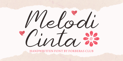 Melody Cinta is modern handwritten. Recommended to use this font for wedding party, invitation, memorable moment, love story and many more with special moment.
 - Sweet Rolling by Forberas Club,
$16.00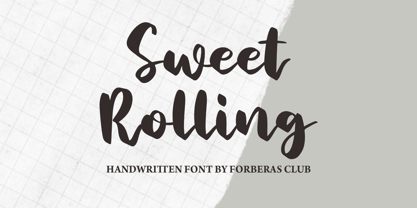 Sweet Rolling is modern handwritten. Recommended to use this font for wedding party, invitation, memorable moment, love story and many more with special moment.