10,000 search results
(0.024 seconds)
- Dx Slight by Dirtyline Studio,
$39.00 Dx Slight a new fresh & modern Sans with a Ultra Condensed style. The font it’s look good in posters, it is ideally suited for setting titles. However, the font has gained wide popularity among designers, and now you can find Dx Slight on the covers of magazines, on restaurant signs and on the main pages of websites. Dx Slight Display Typeface is the part of a strong and modern display family. This typeface both impressive at display sizes and easily readable in text size, while the sharp shapes of the triangular sans and the distinctive letter shapes show their strength in logo design and impressive editorial use. Dx Slight comes with elegant style, strength, and contrasts, with features an extended Latin character set of 366 glyphs covering over 88 languages. It has been designed as a variable font to give lots of options and access to unique type looks, however, it also includes nine weights, three axis H-height and Slant to give just as much access to creativity to those without access to variable supporting software. Its distinctive character and many variables make it a versatile, stylish workhorse, great for interfaces and design.
 - Graphit by HVD Fonts,
$40.00 Graphit is a typeface designed by Lit Design Studio & curated by HvD Fonts. It combines clear, geometric shapes with edgy yet finely-crafted details. Graphit features uncompromising characters such as G, Q, f, k and 1. It works well both for impactful headlines and for reading sizes. The type family consists of six weights plus matching italics. In early 2018, Livius Dietzel & Tom Hoßfeld started developing the typeface’s essential character and released a free font named after the studio, Lit. Just a few months later, Hannes von Döhren had a look at the typeface and suggested expanding it into a family – then publishing it with HvD Fonts. They drew every single letter from scratch, and also decided to give the font a new name — Graphit. The family features six low-contrast weights, ranging from Black to Thin. Every character has been crafted to give it a distinctive and individual feel. Medium, Regular and Light are optimized for usage in copy text. For smaller font sizes & longer body copy, the alternate character set features a double-story a and a simplified Q, f, r and t for improved legibility. All fonts are manually hinted for optimal performance on digital devices.
 - Boister Black Pro by CheapProFonts,
$10.00 I loved the look of this font so much that I couldn't resist reworking it - although it probably had the most basic character set I've ever used as a starting point. But here it is in its complete, professional, multilingual state. I hope this wonderful swashbuckling font now finds many new users and uses. Celebrate! ALL fonts from CheapProFonts have very extensive language support: They contain some unusual diacritic letters (some of which are contained in the Latin Extended-B Unicode block) supporting: Cornish, Filipino (Tagalog), Guarani, Luxembourgian, Malagasy, Romanian, Ulithian and Welsh. They also contain all glyphs in the Latin Extended-A Unicode block (which among others cover the Central European and Baltic areas) supporting: Afrikaans, Belarusian (Lacinka), Bosnian, Catalan, Chichewa, Croatian, Czech, Dutch, Esperanto, Greenlandic, Hungarian, Kashubian, Kurdish (Kurmanji), Latvian, Lithuanian, Maltese, Maori, Polish, Saami (Inari), Saami (North), Serbian (latin), Slovak(ian), Slovene, Sorbian (Lower), Sorbian (Upper), Turkish and Turkmen. And they of course contain all the usual "western" glyphs supporting: Albanian, Basque, Breton, Chamorro, Danish, Estonian, Faroese, Finnish, French, Frisian, Galican, German, Icelandic, Indonesian, Irish (Gaelic), Italian, Northern Sotho, Norwegian, Occitan, Portuguese, Rhaeto-Romance, Sami (Lule), Sami (South), Scots (Gaelic), Spanish, Swedish, Tswana, Walloon and Yapese.
 - Novel Sans Hair Pro by Atlas Font Foundry,
$50.00 Novel Sans Hair is the new package of 24 ultra light weights of Novel Sans Pro, the humanist grotesque typeface family within the largely extended award winning Novel Collection, containing Novel Pro, Novel Sans Pro, Novel Sans Hair Pro, Novel Sans Condensed Pro, Novel Mono Pro, Novel Sans Rounded Pro and Novel Sans Office Pro. Novel Sans Hair has a carefully attuned character design and a well balanced weight contrast. Classic proportions and the almost upright italic makes Novel Sans Pro being a modern humanist with the calligraphic warmth of a real italic. Many similarities with the other typeface families within the Novel Collection enable designers to combine the families and reach highest quality in typography. Novel Sans Hair [1020 glyphs] comes in 24 styles and contains small caps, an extra set of alternate glyphs, many ligatures, lining figures [proportionally spaced and monospaced], hanging figures [proportionally spaced and monospaced], small caps figures [proportionally spaced and monospaced], positive and negative circled figures for upper and lower case, superior and inferior figures, fractions, extensive language support, arrows for uppercase and lowercase and many more OpenType™ features.
 - Oh, "Heartfont," the name alone conjures images of love letters penned in the wee hours, secret admirers typing away on their vintage typewriters, and the digital equivalent of a heart-shaped box of ...
- Aphrodite Slim by Typesenses,
$57.00 Aphrodite Slim Pro is not just a lighter version of its sister Aphrodite Pro. Aphrodite Slim Pro has duplicated the quantity of characters of its partner, and that means more than 500 new glyphs, reaching a total of more than 1000. More delicate and meticulous, Aphrodite Slim Pro is once more a new typography with deep calligraphic ideals: We immersed ourselves into the world of each calligraphy ductus and each calligraphy masters by studying from decoration to lettering books. This was the key for the logic of Aphrodite Slim’s behavior. The new concept of Aphrodite Slim Pro was to join diverse styles of calligraphy in one in order to achieve an autonomous expressiveness, in fact, this is what calligraphy aims to, and we agreed to bring those ideals to the world of typography: It is justifiable to be inspired in hundred-year-old calligraphies, but it is even better if the results you obtain have a plus. A personal plus. During the creation process we were wondering whether it was possible to mix certain strokes of such rigid styles as uncial, (Li·n’s favourite style), with strokes of the copperplate, (Sav’s favourite style), and also to take and mix cualities of cancelleresca cursiva, formata and moderna; finally giving our creation a roman-transition italic look. So Aphrodite Slim takes ideals and aspects from those formal styles, following its own logic though, and emphasizing the fact of being a decorative typography. Calligraphy masters of our past are who we are in debt with. They are the cause we have lovely letters now. They have been spontaneous at the moment of creation, what differs from the type-designers of nowadays, whose spontaneity is more limited. Digital faces that we are used to see these days are a result of long hours of optical adjustments, grids, macros and inspirations of other existing typography, but without personal contributions. Aphrodite Slim wants to refute this. Its mission is to rescue de spontaneity of the artesanal lettering in order to obtain unique words; those which only calligraphy masters of our past or lettering artists of our present could give us. We have worked hard to achieve this, making Aphrodite the most universal font we could: It was necessary to study the most common words, focalizing more in the ones referring to “sensitivity”, of four of the most spoken languages in the world. Aphrodite Slim has an enormous quantity of decorative characters and special ligatures for phrases and words in English, French, Spanish and German. (See English, Français, Español, Deutsch PDF in the gallery section). We promise there is no existing type that decorates/ligates glyphs and words like Aphrodite Slim does: It is the first time a font like this really considers its purpose. -The way glyphs are ligated is insane- : Aphrodite Slim rescues some ideals of persons like Jan van den Velde (Italian cancilleresca writing of XVI Century) who understands ascenders and descenders as possibilities to beautify the lines of writing with curved strokes that seem to be dancing above and below of the words. This master also creates ascenders and descenders even where they are not necessary, on letters that do not actually need them: Aphrodite Slim takes this ideal. The font counts with a wide range of glyphs that seem not to be satisfied with its more primitive form and prefer to extreme their parts to be decorative. It also existed masters of calligraphy like José de Casanova of XVII Century, who, with a magnificant skill and a really personal mark, had the particularity of ligating words that were actually separated with spaces. This is another innovative feature in Aphrodite Slim. An investigation of the most common beginnings and endings words of the English language was done. Having that feature activated (discretionary ligatures), common words will start to ligate or to be decorated even when they are separated by spaces. Impossible to forget Francesco Periccioli of XVII Century and our experience us designers to face with works of him: His letters, that today are included in the group of cancellerescas modernas, have been a direct inspiration to the oldstyle figures and historical forms variables in Aphrodite Slim. Giovanni Antonio Tagliente (XVI Century) and his particular way of making tails and diagonals longer than usual, qualities that our creation reflects too. Finally, our adventures in Biblioteca Nacional and Barrio San Telmo, Buenos Aires, were essential for us to make Aphrodite Slim more complete and interesting: Sav did an excellent work when studying how the decorative miscellanea and swirls of early XX century were. She also investigated what particularities made those roman titling characters look antique so she could rescue some ideals for the oldstyle figures and historical forms variables. This also leaded her to create the ornaments variable in Aphrodite Slim. We are really proud of presenting Aphrodite Slim Pro, a typography that was the result of days and nights of working hard, because we do love what we do; and we are glad we are living in a present that gives us the possibility to spread this kind of art, because that is the way we consider our job: Aphrodite Slim Pro is Art. Hope you can appreciate the enormous work this type has. Features. Aphrodite Slim Pro is the most complete variable. It includes more than 1000 glyphs. Thanks to the Open-Type programming, it counts with a easy way to change/alternate glyphs if the application in which the font is used supports this. The variables contained in Aphrodite Slim Pro are also offered separately. Aphrodite Slim Text: It is the variable for lines and paragraphs. Thus it is the least ornamental and the most accurate to achieve a satisfying legibility. It has the Standard Ligatures feature in order to improve the possible conflicts some glyphs could have by others. Aphrodite Slim Contextual: It is the one that makes emphasis in decorating. It has the particularity of ligating/decorating words of common use in English, French, Spanish and German. It also has the quality of ligating common beginnings and endings of the common words in English. Aphrodite Slim Stylistic: With similar features of Slim Contextual. It includes a set of decorative numbers for a display use. Aphrodite Slim Swash: This one has special beginnings and endings to decorate words. Aphrodite Slim Endings: It makes words look as a signature. Aphrodite Slim Historical: It adds an antique look to the written word. It also has the special historical ligature function. Aphrodite Slim Titling: This one is the most decorative. Its copperplate inspired ornaments give words a special color, in order to handle the quantity of decoration, it comes with the standard ligature feature, which has the most common ligatures plus others that make decorative swirls not to be conflictive. Aphrodite Slim Ornaments: A set of 52 ornaments. Aphrodite Slim Pro includes all this features plus the Stylistic Set 1; Stylistic Set 2 and the possibility of Slashed Zero. We recommend you to check out the gallery in order to see all these features in action.
 - Grippo by Canada Type,
$24.95 The first Grippo sketches were done in the 1980s, but only now does it see the light of day as a complete series of interchangeable, layerable fonts. The original single-font concept was simple enough: Double the stems so they become sturdy handles. But then we elected to add more playfulness and versatility to the idea. By separating the main idea’s layers and producing them as individual fonts, layerability is achieved, and endless possibilities of play and variation arise. In 2D or 3D, colourful or demure, in titling or as initials, Grippo is a great eye-catcher that emphasizes the big fun aspect of your design. Each font of the Grippo suite comes with a few built-in alternates, a glyphset of over 385 characters, and support for the majority of Latin-based languages.
 - Farfa by Eurotypo,
$44.00 The Farfa fonts were designed for institutional use, commissioned by the City of Fara in Sabina, Italy. This project started from the study of the manuscripts found in the Abbey of Farfa, penned in a variant of the lower case of “Carolingian” typical style of that area. The Capital, ligatures and Small Caps, however, are based on the uncial writing that often appears in those codes and manuscripts. Farfa Abbey is a territorial abbey in northern Lazio, central Italy. It is one of the most famous abbeys of Europe. It belongs to the Benedictine Order and is located about 60 km from Rome, in the commune of Fara Sabina The origin of the Abbey is still unknown. Archaeological discoveries seem to prove that the first monastic establishment was built on the ruins of a pagan temple. The Vandals destroyed the first monastery in the fifth century. Only a few documents from the sixth-century prove the early presence of the monastic community. It had the heritage of Charlemagne (S VIII), the Lombard chiefs, and later the Carolingians, succeeded in withdrawing Farfa from obedience to the Bishops of Rieti, and in securing many immunities and privileges for the monastery. Farfa was at this period the most important monastery in Italy both from the point of view of worldly possession and ecclesiastical dignity.
 - Show Poster JNL by Jeff Levine,
$29.00 In the 1960 edition of Samuel Welo’s “Studio Handbook for Artists and Advertisers” is an example of poster lettering with the accompanying blurb “call this Chrysler”. This casual brushstroke design was slightly modified and then reworked into what is now Show Poster JNL and is now available in both regular and oblique versions.
 - Gold Standard by FontMesa,
$30.00 Gold Standard got its start from a few letters found on an old Gold Certificate from 1882. From those few letters spelling out the word GOLD, the rest of the alphabet was designed to match. The lowercase design was based on lettering found on an old silver certificate from approximately the same year.
 - Arizona Airways NF by Nick's Fonts,
$10.00A 1947 timetable for—who’d a-thunk it?—Arizona Airways provided the pattern for this unusual, yet endearing, face. Its Art-Deco-meets-Apache vibe ensures that your headlines will be warmly received. Both versions include the complete Unicode Latin 1252, Central European 1250 and Turkish 1254 character sets, as well as localization for Lithuanian, Moldovan and Romanian. - The "Narnia BLL" font, as its name evokes, brings to mind the magic and adventure of the fantastical world created by C.S. Lewis. This typeface, though not officially recognized as a part of the Narn...
- Caesar, as a font, would evoke a strong sense of classical elegance and authority, taking its name from one of history’s most formidable leaders, Julius Caesar. This would likely be a serif typeface,...
- Sagittarius by Hoefler & Co.,
$51.99 A typeface with lightly-worn futurism, Sagittarius is equally at home among the beauty and wellness aisles, or the coils of the warp core. The Sagittarius typeface was designed by Jonathan Hoefler in 2021. A decorative adaptation of Hoefler’s Peristyle typeface (2017), Sagittarius’s rounded corners and streamlined shapes recall the digital aesthetic of the first alphabets designed for machine reading, a style that survives as a cheeky Space Age invocation of futurism. Sagittarius was created for The Historical Dictionary of Science Fiction, where it first appeared in 2021. From the desk of the designer: Typeface designers spend a lot of time chasing down strange valences. We try to figure out what’s producing that whiff of Art Deco, or that vaguely militaristic air, or what’s making a once solemn typeface suddenly feel tongue-in-cheek. If we can identify the source of these qualities, we can cultivate them, and change the direction of the design; more often, we just extinguish them without mercy. Sometimes, we get the chance to follow a third path, which is how we arrived at Sagittarius. During the development of Peristyle, our family of compact, high-contrast sans serifs, I often found myself unwittingly humming space-age pop songs. Nothing about Peristyle’s chic and elegant letterforms suggested the deadpan romp of “The Planet Plan” by United Future Organization, let alone “Music To Watch Space Girls By” from the ill-advised (but delicious) Leonard Nimoy Presents Mr. Spock’s Music from Outer Space, but there they were. Something in the fonts was provoking an afterimage of the otherworldly, as if the typeface was sliding in and out of a parallel universe of high-tech spycraft and low-tech brawls with rubber-masked aliens. It might have had something to do with a new eyeglass prescription. But I liked the effect, and started thinking about creating an alternate, space-age version of the typeface, one with a little more funk, and a lot more fun. I wondered if softer edges, a measured dose of seventies retrofuturism, and some proper draftsmanship might produce a typeface not only suitable for sci-fi potboilers, but for more serious projects, too: why not a line of skin care products, a fitness system, a high-end digital camera, or a music festival? I put a pin in the idea, wondering if there’d ever be a project that called for equal parts sobriety and fantasy. And almost immediately, exactly such a project appeared. The Historical Dictionary of Science Fiction Jesse Sheidlower is a lexicographer, a former Editor at Large for the Oxford English Dictionary, and a longtime friend. He’s someone who takes equal pleasure in the words ‘usufructuary’ and ‘megaboss,’ and therefore a welcome collaborator for the typeface designer whose love of the Flemish baroque is matched by a fondness for alphabets made of logs. Jesse was preparing to launch The Historical Dictionary of Science Fiction, a comprehensive online resource dedicated to the terminology of the genre, whose combination of scholarship and joy was a perfect fit for the typeface I imagined. For linguists, there’d be well-researched citations to explain how the hitherto uninvented ‘force field’ and ‘warp speed’ came to enter the lexicon. For science fiction fans, there’d be definitive (and sometimes surprising) histories of the argot of Stars both Trek and Wars. And for everyone, there’d be the pleasure of discovering science fiction’s less enduring contributions, from ‘saucerman’ to ‘braintape,’ each ripe for a comeback. A moderated, crowdsourced project, the dictionary is now online and growing every day. You’ll find it dressed in three font families from H&Co: Whitney ScreenSmart for its text, Decimal for its navigational icons, and Sagittarius for its headlines — with some of the font’s more fantastical alternate characters turned on. The New Typeface Sagittarius is a typeface whose rounded corners and streamlined forms give it a romantically scientific voice. In the interest of versatility, its letterforms make only oblique references to specific technologies, helping the typeface remain open to interpretation. But for projects that need the full-throated voice of science fiction, a few sets of digital accessories are included, which designers can introduce at their own discretion. There are alternate letters with futuristic pedigrees, from the barless A popularized by Danne & Blackburn’s 1975 ‘worm’ logo for NASA, to a disconnected K recalling the 1968 RCA logo by Lippincott & Margulies. A collection of digitally-inspired symbols are included for decorative use, from the evocative MICR symbols of electronic banking, to the obligatory barcodes that forever haunt human–machine interactions. More widely applicable are the font’s arrows and manicules, and the automatic substitutions that resolve thirty-four awkward combinations of letters with streamlined ligatures. About the Name Sagittarius is one of thirteen constellations of the zodiac, and home to some of astronomy’s most inspiring discoveries. In 1977, a powerful radio signal originating in the Sagittarius constellation was considered by many to be the most compelling recorded evidence of extraterrestrial life. Thanks to an astronomer’s enthusiastically penned comment, the 72-second transmission became known as the Wow! signal, and it galvanized support for one of science’s most affecting projects, the Search for Extraterrestrial Intelligence (SETI). More recently, Sagittarius has been identified as the location of a staggering celestial discovery: a supermassive black hole, some 44 million kilometers in diameter, in the Galactic Center of the Milky Way. <
 - Intramural JL - 100% free

- Compass TRF by TipografiaRamis,
$29.00 Compass TRF is a reevaluation of an existing Compass typeface dated 2002. Compass is a geometric contrast serif typeface - "contemporary Didone". New Compass consists of four styles—regular, italic, alternate and flourish initials with small caps. Compass TRF is recommended for use as display typeface. It is suggested that flourish initials font to be used for decorative purpose only, not basic typesetting. Compass TRF generated as OpenType single master format with Western CP1252 character set.
 - Balboa by Parkinson,
$20.00 Balboa is a display design combining elements of early sans serif and grotesque types with contemporary types. It evolved from ATF Headline Gothic, Banner (a headline typeface I drew for the San Francisco Chronicle), and Newsweek No.9, a Stephenson Blake-like grotesque I designed for Roger Black's 1980 redesign of Newsweek Magazine. There are nine styles, including the three new styles that have been added in 2014: Medium, Light and Ultra Light.
 - Ratherbe by Zane Studio,
$15.00 Ratherbe is a new modern brush font with an irregular baseline. A contemporary approach to design, natural handmade, suitable for use in designs for clothing, invitations, book titles, stationery designs, quotes, branding, logos, greeting cards, T-shirts, packaging designs, posters, and more. Complete with upper and lower case letters, and multi-language support, numbers, punctuation and several ligature. Thank you very much for searching and letting me know if you have questions.
 - Maga by DSType,
$40.00 Maga shares the skeleton with one of our first typefaces (Quaestor, from 2004), but we didn't want to simply expand an existent design, so we took a step forward—not just with improved features and new weights, but also making the italics more usable than its predecessor. The balance between the counters and the space between letters makes this a very space-saving typeface with plenty of legibility, yet stylish enough for contemporary magazine design.
 - Primavera Sans by UICreative,
$23.00 Introducing our new product the name Primavera Sans Serif Font Family comes with 9 different weights. Modern Sans Serif font that feels beautiful classy, elegant, and modern. This font is perfectly suited for a wide variety of projects, such as signature, stationery, logo, wedding, typography quotes, magazine or book covers, website headers, clothing, branding, packaging design, and more. Also for fashion-related branding or editorial design and displays both masculine and feminine qualities.
 - Sanchez by Latinotype,
$- CHECK OUT Sánchez Niu (new, nova, neue, next) Sánchez, designed by Daniel Hernández, is a serif typeface belonging to the classification slab serif, or Egyptian, that bears a strong resemblance to the iconic Rockwell, but with rounded edges— offering contrast and balance to the square structure. Sánchez & Sánchez Condensed comprises 12 variants, ranging from extra light to black, each of the same x-height. Regular and Italic variants are available for free. Download specimen pdf
 - Geometra by T4 Foundry,
$21.00 Geometra is a new font family from Swedish type designer Bo Berndal and the T4 font foundry. Somewhere between a slab serif and a sans it has a crisp, geometric feel and is both 20’s retro and modern. Its soft curves and openness makes it very readable in smaller print. The powerful serifs give the font lots of character in larger sizes. Geometra comes in three weights, regular, semibold and bold.
 - Phosery by Genetype,
$14.00 Introducing Phoenix Display Serif Typeface: Elevate Elegance to New Heights Evoke a sense of regal charm with Phoenix Display Serif – a font that embodies luxury and grace in every serif. Crafted for the most sophisticated projects, from upscale branding to premium stationery, Phoenix Display Serif adds an aura of elegance to your designs. Illuminate your creativity with a touch of grandeur – experience Phoenix Display Serif and reignite the art of luxury typography.
 - Voodo Dolls by Gassstype,
$25.00 Hello Everyone, introduce our new product Font Voodo Dolls This Is Horror Display Typeface .This is a Textured Natural Style and Strong style with a Cool style and dramatic movement. This font Voodo Dolls is great for your next creative project such as logos, printed quotes, invitations, cards, product packaging, headers, Logotype, Letterhead, Poster, and perfect for logos & branding, events or anything that need handwritting taste. You can activate 8 Ligatures glyphs OpenType panel.
 - Starlight by Jos Gandos,
$15.00 Starlight is a new modern & fresh calligraphy script with natural style. This font will make your design look elegant, natural and stylish. Starlight is perfect for any awesome projects such as photography, watermark, quote design, social media posts, poster, advertisements, logos, branding, invitation, product designs, label, stationery, wedding designs, product packaging, special events or any project that need handwriting taste or just simply design with stylish text overlay to any background image.
 - Sempione by CAST,
$45.00 Sempione is a spanking new sanserif family suitable for publishing and advertising that looks great in small and large sizes. Its two main styles, Grotesk and Modern, are inspired by the early grots and 20th-century sanserifs. They come in seven weights with the matching italics, Grotesk Cursive and Modern Slanted. The considerable variety of letterforms and styles, along with some peculiar stylistic sets, will be appreciated by designers looking for more freedom of choice.
 - Billy Magie by Sarid Ezra,
$17.00 Introducing, new font, Billy Magie - a stylish stencil serif with ligatures and alternates! Billy Magie is a stylish and bold stencil serif with a bunch of ligatures and alternates that will make your presentation looks amazing and sophisticated! This font will make your project looks more clean and modern. You can use this font for logo, poster, event, or your social media post. Billy Magie also support Multi Language. and already PUA Encoded!
 - Luftayah by Popkern,
$20.00 Luftayah is a modern display typeface, designed by Anna Seslavinskaya in 2018. The typeface was inspired by the sociological concept of the “melting pot”, by a fusion of different cultures, isolated in a geometric form. Two traditions, Kufic script and German fraktur blend into a new symbiotic form. Luftayah adapt it for use in display contexts, as headings and book blurbs, through the use of a range of unusual combined characters and ligatures.
 - Big Band JNL by Jeff Levine,
$29.00 Big Band JNL is a classic Art Deco typeface in every sense of the word. Large, bold and innovative in its sectional construction, the font is based on a lettering example found in a 1941 Speedball® Lettering Pen instruction book. The basic alphabet was used for the model, with a new set of numbers and additional characters created by Jeff Levine in order to make this font fully functional in today’s digital designs.
 - Rimogles by UICreative,
$23.00 Introducing our new product the name is Rimogles Modern Serif Font Family comes with 9 different weights. Modern Serif font that feels beautiful classy, elegant, and modern. This font is perfectly suited for a wide variety of projects, such as signature, stationery, logo, wedding, typography quotes, magazine or book covers, website headers, clothing, branding, packaging design, and more. Also for fashion-related branding or editorial design and displays both masculine and feminine qualities.
 - Easy Calm by Gassstype,
$23.00 Hello Everyone, introduce our new product Font Easy Calm is a Thin Display Typeface.This is a Textured Natural Style and classy style with a clear style and dramatic movement. This font Easy Calm is great for your next creative project such as logos, printed quotes, invitations, cards, product packaging, headers, Logotype, Letterhead, Poster, Design this font is great for your creative projects such as watermark on photography, and perfect for logos & branding, invitation,advertisements.
 - Nautica by Resistenza,
$59.00 Nautica is a new script typeface based on Copperplate’s ductus. High in contrast, it is a very original type with a strong character. With over 1000 glyphs and extensive language support, Nautica offers full professional typographic features. Ligatures and swashes are more inspired by brush pen strokes. Nautica provides three weights and one set of useful icons and knots to improve your graphics. Nautica works very well with Turquoise ; check it out.
 - Alea by astype,
$28.00 Alea is based on the drawings of Maria Balle. The floral, organic look of these bastard script initials will play well together with nearly all Didone designs and will give them a special note. Alea works perfectly with the Adana fonts also available from astype. The Opentype features Superior, Inferior & Numerator will activate the filling objects. Use these features on a new layer and choose your color to get up to three color layers.
 - Meduza Collection FJ by Frncojonastype,
$30.00 fj Meduza is a new typographical system designed by Franco Jonas Hernández, born as an exploring process from the classic model from —modern or didones style— typhography from XIX century. fj Meduza also explores the posibilities of Optical Adjustments —from 8 or 10 to 72 pts— offering a version to compose preferent reduced sizes —newspapers— and another version to titles with long-standing. Ideally for Branding, Headlines and especially complex editiorial contexts.
 - Aaron Script by Seniors Studio,
$23.00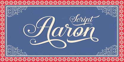 Aaron Script is highly legible Script typeface, a simply beautiful, classic, elegant and fun script font. With almost 400 glyphs and contain with opentype features. Stylistic alternates, Ornament, swash and more. Can be used for various purposes.such as logos, wedding invitation, t-shirt, letterhead, signage, news, posters, badges etc. To enable the OpenType Stylistic alternates, you need a program that supports OpenType features such as Adobe Illustrator CS, Adobe Indesign & CorelDraw X6-X7.
 - Histeagin by Yahya Type,
$22.00 Histeagin – A New Serif Font with Fancy Curves, More Alternative Character, and Multilingual Support. Histeagin – this style works well for branding projects, logo, wedding designs, social media posts, advertisements, product packaging, product designs, label, photography, watermark, invitation, or whatever project you’re working on. WHAT’S INCLUDED? Uppercase & lowercase letters Numbers, punctuation Ligature & Huge Stylistic alternate Multilingual support. Still got a question? Send me a message and I’ll be happy to answer! qura.yahya@gmail.com
 - Australis Pro Swash by Latinotype,
$29.00 Australis Swash is a new variant that adds to the family of Australis Pro and it brings a touch of whimsy and mannerism to the shape of the cursive letters. Its purpose is purely playful because Australis Swash has some useful Opentype features as standard ligatures, discretionary ligatures and contextual alternates to use them in headlines or as a base for brands and lettering in general. Designed by Francisco Gálvez Pizarro in 2013.
 - Newsweekly by UICreative,
$23.00 Introducing our new product the name Newsweekly Editorial Serif Display Font comes with 2 different weights. Modern Sans Serif font that beautiful classy, elegant, and modern. This font is perfectly suited for a wide variety of projects, such as signature, stationery, logo, wedding, typography quotes, magazine or book covers, website headers, clothing, branding, packaging design, and more. Also for fashion-related branding or editorial design and displays both masculine and feminine qualities.
 - Gymphow by UICreative,
$23.00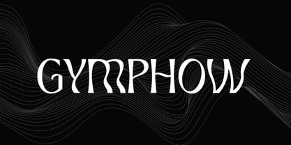 Introducing our new product the name is Gymphow Modern Serif Font Family comes with 9 different weights. Modern Sans Serif font that feels beautiful classy, elegant, and modern. This font is perfectly suited for a wide variety of projects, such as signature, stationery, logo, wedding, typography quotes, magazine or book covers, website headers, clothing, branding, packaging design, and more. Also for fashion-related branding or editorial design and displays both masculine and feminine qualities.
 - Amber Taste Pro by Gleb Guralnyk,
$14.00 Hi, introducing an Amber Taste Pro font. It's a vintage typeface with classic shape. Seven weights variations from thin to bold is available. Actually this font set is a remastered version of my best selling font Amber Taste with lots of improvements. Pro version has much more characters, including multilingual west european support. All the contours was cleaned up and several glyphs has a new more organic shape. Thank you and have a nice day!
