10,000 search results
(0.08 seconds)
- Full Slab by Bülent Yüksel,
$19.00Full Slab is the younger brother of original Full Sans, FullNeue and Full Tools. Ideally suited for advertising and packaging, editorial and publishing, logo, branding and creative industries, poster and billboards, small text, wayfinding and signage as well as web and screen design. Full Slab provides advanced typographical support for Latin-based languages. An extended character set, supporting Central, Western and Eastern European languages, rounds up the family. The designation “Full Slab LC 50 Book” forms the central point. The first figure of the number describes the stroke thickness: 10 Thin to 90 Bold. Full Slab LC comes 5 weights and italics also Full Slab SC comes 5 weights and italics total 20 types. The family contains a set of 485 characters. Case-Sensitive Forms, Classes and Features, Small Caps from Letter Cases, Fractions, Superior, Inferior, Denominator, Numerator, Old Style Figures just one touch easy In all graphic programs. Full Slab is the perfect font for web use. You can enjoy using it. - Augustus - Unknown license

- Growing Script free - Personal use only

- Snickles - 100% free

- Spargo by Greater Albion Typefounders,
$8.50 Spargo is inspired by 20s and 30s American typefaces, often seen on share certificates and other securities. Spargo is offered in six all capitals display typefaces. Bring a touch of inter-war America to your next design project!
 - Abstract by Los Andes,
$29.00 Abstract is a contemporary and eclectic serif typeface inspired by today's life and created in times of pandemic. This family includes a true italic variant —that has its own personality— alternates, lining and old style figures, numerators and denominators & Cyrillic support.
 - Anabelia by Rockboys Studio,
$23.00 The Anabelia is a handcrafted monoline font. It has a vintage and classic feel with an old, handmade look. Included in this download are various styles which gives you the opportunity to create unique designs, every time you use it!
 - Exquisito by Epiclinez,
$18.00 What makes a design creative? The typeface! Exquisito is a font that'll get your audience's attention. Whether you want to make the audience smile, laugh, or think, Exquisito will help you show off your creative side. The time to stand out from the crowd is now!
 - Some Assembly by Open Window,
$14.95 Some Assembly is a sans serif printer font which ran into a few problems when it came time to print. Offered with a wide range of distressed styles. It is a pleasantly styled geometric face which is highly legible and its various styles provide dynamic alternatives.
 - Apocrypha by Device,
$39.00 Inspired by an example of eroded Portuguese cast-iron ecclesiastical lettering mounted on marble, Apocrypha has been designed to evoke an age-worn imperfection; once elegant, but now eroded and distorted by time. Mix the characters in the upper and lower-case keystrokes for authentically uneven results.
 - Due Giorni by Eurotypo,
$80.00 “Due Giorni”, two days in italian language, express a measurement of time, it can be little or a lot, depending on who or what it is used for. “Due Giorni” is a script font very expressive, fresh, agile and dynamic, hand-drawn with connected forms on slanted angle of 23º This font contain 542 glyphs with plenty OpenType features: Standard and discretionary ligatures, stylistic alternates, swashes, Old style figures, small caps, case sensitives and ornaments. It come also, with three kind of capitals: Roman Capitals, Small Caps (different proportions) and Swashes. Roman Capitals are inspired on the beautiful inscription found in the Augustorium’s house in Ercolano, Naples.those letters have been carefully drawn and sculpted. Swashed Cursive Capitals are similar to 18th century penmanship. “Due Giorni” is a versatile font that may give you the chance to create original logos and headlines, specially by many stylistic sets, ligatures and alternates that can be combined with them.
 - Atrium by Alex Jacque,
$20.00 Atrium, designed by Alex Jacque, is a strong, linear, geometric sans-serif display typeface based off century-old pen art by W.E. Dennis. Atrium's stubbornly geometric letterforms are set off with a few softening flourishes on a few glyphs. It's sharp corners, straight verticals and horizontals make Atrium pack some punch when used in headlines, pull quotes, and logotypes. Atrium was released in 2012 in OpenType format and comes in three different weights: light, regular, and bold, with a regular and oblique version of each for a total of 6 styles in the family.
 - FS Irwin by Fontsmith,
$80.00 New York vibes FS Irwin was born in New York while Senior Designer, Fernando Mello, was studying an intensive 5 week typeface design course at the Cooper Union. His brief was to design a perfectly clear typeface that could communicate well, without loud or overtly mannered design features. Fernando was influenced by the subway font in New York: ‘It is very in your face and clear, always in bold. It doesn’t shout much but at the same time is very present and unique. The design is completely different but it was this spirit I wanted to capture for FS Irwin.’ And the vibe of the city: ‘In a similar way to London, New York is so mixed and so cosmopolitan. I was amazed by the different styles and identities I saw there, and tried to encapsulate this essence to create something new, relevant and very now.’ Incisive quality Rather than focusing on quirks or distinctive characteristics, the key to FS Irwin is the quality of its design and spirit of simplicity. The design, proportions and details are usable and authentic and it is suitable for countless situations, without running the risk of being instantaneously noticeable. Families like this can be used on nearly anything, from more playful designs to serious corporate IDs. ‘Extensively tested and precisely drawn text-oriented typefaces are what I enjoy designing the most. There is a beauty and a different approach, a different way of making them interesting, sellable and usable rather than adding flicks or unexpected details.’ Inscriptions and calligraphy FS Irwin’s origin lies in Fernando’s studies in inscriptional lettering and writing-calligraphic exercises at the Cooper Union. Mello started the process by digitising his explorations and adapting them into a more workable sans serif structure. The traditional forms of writing which gave the basis to Latin type as we know it today were the perfect place to start. This influence can be seen in the proportion of the capitals and in slight writing-calligraphic details in the lowercase, such as the slightly angled, chiselled spurs and their open terminals.
 - Hounslow by Device,
$29.00 Hounslow is closely related to Acton in structure, and takes the latter’s simple block construction into the third dimension. Three variants – open, solid and shadow – can be freely mixed in one setting for effect. Originally designed solely in the italic variant, an upright was added by request. A further unreleased set with a range of line weights was later commissioned by the New York Times magazine, and used extensively in their television supplement.
 - Pisak by Cuda Wianki,
$20.00How many times have you been looking for a handwritten yet not childish font without result? We have a nice solution for you-our brand new PISAK! :) Thanks to extra thin condensed letters PISAK is easy readable and ideal for text writing. Its subtle irregularity makes it warm and friendly good for unoficial designs. If you like the shape of the letters but you need a more official and regular version see our Lalalo font. - Mighty Origin by Handpik,
$13.00 Hello, this time we would like to introduce a new product. namely "Mighty Origin", a Serif display font that has a classic, feminine, and elegant style wrapped with a beautiful Alternate stylist. The Mighty Origin font is perfect for various projects like logos & branding, invitations, stationery, wedding designs, social media posts, advertisements, printed quotes, product packaging, product designs, labels, photography, watermarks, special events or anything else. Feature Uppercase Lowercase Numeral Functional Ligature Alternate Multilingual
 - Red Sauce by Olivetype,
$18.00 It's time to get down and red. Freshly released, Red Sauce is a fun and stylish typeface with a cool and playful vibe to it. Use our new typeface to give your design the style it deserves. From badges and logos to posters and t-shirts, Red Sauce has you covered. So what’s included : Basic Latin Uppercase and Lowercase Numbers, symbols, and punctuations Ligatures Multilingual Support. Simple Installations Works on PC & Mac
 - Belgan Aesthetic by Handpik,
$13.00 Hello, this time we would like to introduce a new product. namely "Belgan Aesthetic", a Serif display font that has a classic, feminine, and elegant style wrapped with a beautiful Alternate stylist. The Belgan Aesthetic font is perfect for various projects like logos & branding, invitations, stationery, wedding designs, social media posts, advertisements, printed quotes, product packaging, product designs, labels, photography, watermarks, special events or anything else. Feature Uppercase Lowercase Numeral Functional Ligature Stylistic Multilingual
 - Daiquiri by Wiescher Design,
$39.50 Daiquiri is a revival of a handlettered font in two weights, from an ad for Puerto Rico Rum dating back to the forties or fifties. I found the ad on a French antique market on my last visit for Mardi Gras in Nice. The ad read "Breeze through the heat, be a Daiquiri fan". That's why they had this "fan" in the illustration! Did they want you to rotate like a fan when you had enough Daiquiris? Or did they just do it for that little "Jeu des mots"? Anyway I found the handlettering very pretty, so I took those few letters and made a whole font out of them. I think Daiquiri has that touch that brings those happy and uncomplicated times back when advertising was still fun. I started something like 20 years later in advertising and things had gotten more stringent. We already had to satisfy those marketing guys with their scholarly attitude. They have taken all the fun out of the job, for the creators as well as for the consumers. I would like to see more uncomplicated ads like this again, yours Gert Wiescher
 - TT Norms Pro Serif by TypeType,
$39.00 Introducing TT Norms® Pro Serif, version 1.100! The updated font now has new OpenType features and localization for the Serbian and Bulgarian languages. TT Norms® Pro Serif is a functional serif based on our studio's main bestseller—the versatile sans serif TT Norms® Pro. Together, they form an ideal font pair. Although these typefaces are made for each other, they can easily be used independently and paired with other fonts. So, TT Norms® Pro Serif is a self-sufficient and elegant serif, neutral at the same time. It is easy to recognize due to its gentle proportion dynamics, open aperture, slanted oval axis, and low stroke contrast. Another distinctive feature of this font is brutal serifs that adjust in length according to the weight of the font. As well as TT Norms Pro, there are Italic font styles in TT Norms® Pro Serif. However, for this serif, we have designed true italics instead of simple slanted font styles. Their key feature is the ability of the lowercase letterforms to change in reference to the roman font styles. They become more rounded, moving towards handwritten shapes. The nature of the italics turned out sharper than that of the roman font styles. It can be used to place accents that would attract attention without interfering with the process of reading. TT Norms® Pro Serif is capable of solving multiple design tasks. It is highly readable, which makes it convenient for small point sizes. This serif's application range is broad and diverse: it can be used for websites, printed materials, and packaging design. The font is well-suited for projects in the domains of culture, art, history, or literature and can be implemented into the designs of signs, posters, or premium products and services. TT Norms® Pro Serif, version 1.100, consists of: 24 font styles: 11 roman, 11 italic, and 2 variable fonts (one for the roman font styles and another—for italics); 1380 glyphs in each font style; 31 OpenType features, including options for localization.
 - Paradigm Pro by Shinntype,
$59.00 Originally released in 1995 as a three font family, Paradigm forcefully addressed the emaciating effect that digitization was then exerting upon traditional serifed typography. Investigating the new media of a much previous era, Nick Shinn deconstructed the first roman type, designed by Sweynheym and Pannartz in 1467, and gleaned, from its minuscules, the low contrast and discreet serif treatment (portrayed by a novel convex effect), which he subsequently applied to both capitals and lower case of a classically proportioned Venetian invention. In 2008 the glyphs, metrics and hinting of the 1995 fonts were refined, Extra Bold and Light weights added, a full range of OpenType features instituted, and the number of characters per style increased almost threefold. A major upgrade to a unique typeface.
 - Secession by HiH,
$14.00 Secession is a very readable typeface, suitable for short blocks of text. If you have grown weary of the standard sans-serif faces one sees all the time, you may want to use Secession as a fresh and distinctive substitute. Like Kunstler Grotesk, Secession is one of a number of typeface designs that attempts to reconcile Germany’s blackletter tradition with the international familiarity of roman letterforms in a simple, robust design suitable for meeting the demands of a modern industrial economy, while rejecting the extraneous ornamentation of the departing Victorian era. Unlike Kunstler Grotesk, Secession was designed with a lower case. Secession Bold was originally jointly released as Halbfette Secession by Bauer & Company of Stuttgart and H. Berthold AG of Berlin around 1898. The rest of the family was designed by HiH. The basic family of four: Text, Oblique, Bold and BoldOblique are available in two versions: one set with the standard contemporary lining or ranging numerals for spreadsheets and tables and one set of old-style figures (with OSF in font name) for use with text. The two versions of the basic family, Secession and Secession OSF were released in July 2006. Cousins include ExtraBold, SCOSF Text, and two multi-lingual versions of the text weight. Secession ML includes the Latin Extended-A character set in unicode format plus 17 ligatures and a few strays. Secession GreekML has all the characters of the ML version plus the unicode Greek set and 17 Greek ligatures. Release of the cousins took place in August and October of 2006. Click on BUYING CHOICES. Click on GLYPHS and use drop-down menus and slider to see the all the glyphs for the various fonts. Similar: Birmingham (Ref 100 Ornamental Alphabets, Solo); Spartana (Art Nouveau Display Alphabets, Solo)
 - Century 751 by Bitstream,
$29.99The year 1914 marked the appearance of Washington Ludlow's first typograph machine. This remarkable invention permitted typesetters to quickly cast a full line of lead type in one operation using supplied brass matrices, a procedure which was for the time a major technological improvement over the usual hand-set foundry type methods. Casting type the Ludlow way necessitated the creation of an entire range of new Ludlow typefaces, a development which made Ludlow not only a major manufacturer of printing machinery, but also one of the world's leading sources of professional type design. Renowned typographers such as Douglas C. McMurtrie and Ernest F. Detterer created original faces at Ludlow's request. Robert Hunter Middleton was Ludlow's design director for over fifty years, and during his distinguished career produced an entire library of typefaces representing virtually every known typographic style. He is recognized as one of the most prolific type designers of all time. Today, new Ludlow computer fonts are in preparation, including optically-correct versions of many classic Ludlow typefaces, drawn directly from the originals in the Ludlow company library. - Bebas Neue Pro by Dharma Type,
$14.99 Thank you for waiting. Finally, Bebas Neue has got lowercases! Bebas Neue is a world wide, the most popular font family with all caps released in 2010. Bebas Neue has been used from by big companies to by startup designers for many projects. In spite of the fact that Bebas Neue has only Uppercases, it became very popular font for these 10 years. At the same time, we received many requests for adding lowercases. To be honest, we had been developing whole new Bebas Neue with lowercases secretly for long time. Thinner Uppercase from thin to regular weights were redesigned for Pro. New lowercases were designed to match the Uppercases very carefully. You can access Tabular figures by using OpenType tnum features. Almost all European languages are supported by Pro. One more big thing is... Bebas Neue Pro has Italics! Please don't use sloped Bebas Neue. Pro has proper Italics! Bebas Neue “Pro” can extend your possibilities. Be the first to use this professional and premium Bebas Neue!
 - Auster by Resistenza,
$39.00 Auster, A Sans with Flair! Auster packs sensational personality in its fine-tuned forms. Confident and quirky, yet comfortable to read, this distinctive san serif family stands out from the crowd. The curves cinch and strokes flair in unconventional places making Auster an unashamed rebel sure to turn heads. Originally designed during the TipoBrda Workshop in Slovenia. Resistenza spent 3 years developing this 2 style (roman & Italic), 20 weight family. The subtle reverse contrast characters were first painted with a flat brush, then polished in pencil on tracing paper before being carefully digitized, to include language support and all the opentype features you expect in a quality contemporary font. More About Opentype Features: https://bit.ly/opentype-rsz
 - Ballyhaunis NF by Nick's Fonts,
$10.00Lewis F. Day, in his 1910 classic Alphabets Old and New, filed this work by Laurence Schall under the category of Celtic-inspired, and surely it is both. This font included a few special extras, including a Celtic cross in the florin position, a Celtic knot is the dagger position, a shamrock as the asterisk, and a double shamrock in the double-dagger position. Both versions of this font include the Latin 1252 and Central European 1250 character sets. - Bodebeck by Linotype,
$29.99 The Swedish designer/typographer Anders Bodebeck designed the Bodebeck type family in 2002. The family, which includes five different styles, is primarily intended for use as a titling, or display face, and belongs to the neo-transitional style of typefaces. Transitional style type first appeared in England during the late 1750s, when John Baskerville released his first sets of type. Bodeck bears similarities to another, later transitional style typeface as well - Eric Gill's Perpetua (originally released by the British Monotype Corporation in 1928). Like these two previous English stonecutters turned masters of typography, Anders Bodebeck has given us a modern re-interpretation of classic letterforms. Bodebeck, which is fitted with old style figures, is available in the following styles: Regular, Italic, Bold, Bold Italic, and Extra Bold."
 - Fish Fresh by Gerald Gallo,
$20.00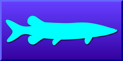 Fish Fresh contains 83 freshwater fish silhouette designs.
 - Schindler’s Font - Personal use only

- Willgray by NicolassFonts,
$35.00 The Willgray family offers three options: A, B, and C, each equipped with 20 fonts. This versatile family is ideal for a wide range of applications, including signage, packaging, brand identity, software, editorial design, and web and screen design.
 - Delgos by Typebae,
$10.00 Delgos is a display font family. It is very suitable for logos, headlines, posters and various other designs that require an assertive touch. What's Included? 20 Font, 9 Weight Slanted & Outline All Caps, Numbers & Punctuation Multilingual Support PUA Encoded
 - Austin Pen by Three Islands Press,
$29.00 Empresario Stephen F. Austin (1793-1836) is considered by many the “Father of Texas” for leading the first Anglo-American colony into the then-Mexican territory back in the 1820s. A few years later, while on a diplomatic mission to Mexico City, Austin was arrested on suspicion of plotting Texas independence and imprisoned for virtually all of 1834. During this time he kept a secret diary of his thoughts and musings—much of it written in Spanish. Austin Pen is my interpretation of Austin’s scribblings in this miniature prison journal (now in the collection of the wonderful Dolph Briscoe Center for American History, in the Texas city that bears his name). The little leather-bound book is filled with notes in ink and pencil—some of the faded penciled pages traced in ink years later by Austin’s nephew Moses Bryan. A genuine replication of 19th century cursive, Austin Pen has two styles: a fine regular weight, along with a bold style that replicates passages written with an over-inked pen. Each is legible and evocative of commonplace American penmanship of two centuries ago.
 - Picturama Founder by Mans Greback,
$59.00 Picturama Founder is a beautiful script font that elegantly bridges the gap between time-honored formality and contemporary innovation. Every curve and connection in this formal calligraphy type speaks of finesse, flowing with an unmatched grace reminiscent of vintage labels or classic vinyl covers. Yet, there's a modern twist that sets it apart: its bold stance and innovative touches redefine what we expect from formal script.
 - VTC Horoscope by Vintage Type Company,
$18.00 VTC Horoscope is a modern & minimalist rendition of a Victorian-esque style typeface. Much like the typefaces of that time, this font has high stroke contrast, smooth serifs, and a slightly extended x-height, however it ditches the flourishes & fluff for weight & legibility. VTC Horoscope makes the perfect font for packaging design, big bold headlines, vintage inspired projects, or anywhere you want to spark curiosity and attention.
 - Matao Serif by Identitype Co,
$15.00 Mataö is a bold and gorgeous and is great for headlines and elegant designs with a vintage and classic flair. Mataö's contrasting lines and curved terminals give a sleek, elegant look to logos, holiday cards, wedding invitations, quotes, advertisements, and more. Mataö is a versatile typeface that's full of character and one you'll come back to time and again. Make your awesome design layout with Mataö.
 - Superfly - Personal use only

- immoral - Unknown license

- Mirfak by Herofonts,
$25.00 Mirfak™ is a new take on a work from Adrian Frutiger made in 1964. In the first place, it was a specific alphabet made for only one book. Only lowercases, capitals, numbers and a few mathematical signs where created. Covering only English language, used only once and unknown by most, we considered this Slab Serif as an hidden gem that needed a modernization. Mirfak™ is a result of a project whose goal was to take a beautifully designed Slab Serif and update it so that its technical standards surpass the status quo, leaving us with a truly superior slab serif family. Entirely coded from scratch with Metafont™, this family is not only an update but an expansion of the original concept, covering now most used languages on earth. Modernized and unique, Mirfak’s 3 weights, light to bold, can give a full range of expression for interfaces and corporate design; in print, on screen and in multiple languages.
 - Comp Sans 226 by Type Associates,
$24.95 Once upon a time, in the days BC (that's Before Computers) there lived a very talented group of men and women whose job it was to render ads by hand. So skillful were these people that some say it was possible to actually identify the typefaces that the layout artists were emulating. Their renderings were swift and slick, no time for detail as it was necessary to do a whole bunch of variations, usually within ridiculous deadlines. Their only tools: bullet-tip markers and bond paper - often mistakes resulted but no time to re-do and white paint was totally unacceptable - just let the slipups be. Here's a simulation of their craft, we don't really know what typeface this was supposed to represent… any ideas?
 - ITC Franklin by ITC,
$40.99 The ITC Franklin™ typeface design marks the next phase in the evolution of one of the most important American gothic typefaces. Morris Fuller Benton drew the original design in 1902 for American Type Founders (ATF); it was the first significant modernization of a nineteenth-century grotesque. Named in honor of Benjamin Franklin, the design not only became a best seller, it also served as a model for several other sans serif typefaces that followed it. Originally issued in just one weight, the ATF Franklin Gothic family was expanded over several years to include an italic, a condensed, a condensed shaded, an extra condensed and, finally, a wide. No light or intermediate weights were ever created for the metal type family. In 1980, under license from American Type Founders, ITC commissioned Victor Caruso to create four new weights in roman and italic - book, medium, demi and heavy - while preserving the characteristics of the original ATF design. This series was followed in 1991 by a suite of twelve condensed and compressed designs drawn by David Berlow. ITC Franklin Gothic was originally released as two designs: one for display type and one for text. However, in early digital interpretations, a combined text and display solution meant the same fonts were used to set type in any size, from tiny six-point text to billboard-size letters. The problem was that the typeface design was almost always compromised and this hampered its performance at any size. David Berlow, president of Font Bureau, approached ITC with a proposal to solve this problem that would be mutually beneficial. Font Bureau would rework the ITC Franklin Gothic family, enlarge and separate it into distinct text and display designs, then offer it as part of its library as well. ITC saw the obvious value in the collaboration, and work began in early 2004. The project was supposed to end with the release of new text and display designs the following year. But, like so many design projects, the ITC Franklin venture became more extensive, more complicated and more time consuming than originally intended. The 22-font ITC Franklin Gothic family has now grown to 48 designs and is called simply ITC Franklin. The new designs range from the very willowy Thin to the robust Ultra -- with Light, Medium, Bold and Black weights in between. Each weight is also available in Narrow, Condensed and Compressed variants, and each design has a complementary Italic. In addition to a suite of new biform characters (lowercase characters drawn with the height and weight of capitals), the new ITC Franklin Pro fonts also offer an extended character set that supports most Central European and many Eastern European languages. ITC Franklin Text is currently under development.


