10,000 search results
(0.054 seconds)
- Jaro Handwriting by SoftMaker,
$15.99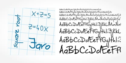 Digitized handwriting fonts are a perfect way to give documents the “very special touch”. Invitations look simply better when handwritten than when printed in bland Arial or Times New Roman. Short handwritten notes look authentic and appealing. There are numerous occasions where handwritten text makes a better impression. Jaro Handwriting is a beautiful typeface that mimics true handwriting closely. Use Jaro Handwriting to create stunningly beautiful designs easily.
 - Tolomeo Handwriting by SoftMaker,
$7.99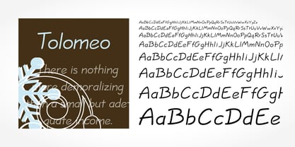 Digitized handwriting fonts are a perfect way to give documents the “very special touch”. Invitations look simply better when handwritten than when printed in bland Arial or Times New Roman. Short handwritten notes look authentic and appealing. There are numerous occasions where handwritten text makes a better impression. Tolomeo Handwriting is a beautiful typeface that mimics true handwriting closely. Use Tolomeo Handwriting to create stunningly beautiful designs easily.
 - Jacques Handwriting by SoftMaker,
$7.99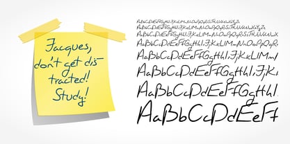 Digitized handwriting fonts are a perfect way to give documents the “very special touch”. Invitations look simply better when handwritten than when printed in bland Arial or Times New Roman. Short handwritten notes look authentic and appealing. There are numerous occasions where handwritten text makes a better impression. Jacques Handwriting is a beautiful typeface that mimics true handwriting closely. Use Jacques Handwriting to create stunningly beautiful designs easily.
 - Armand Handwriting by SoftMaker,
$7.99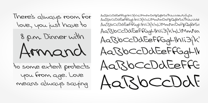 Digitized handwriting fonts are a perfect way to give documents the “very special touch”. Invitations look simply better when handwritten than when printed in bland Arial or Times New Roman. Short handwritten notes look authentic and appealing. There are numerous occasions where handwritten text makes a better impression. Armand Handwriting is a beautiful typeface that mimics true handwriting closely. Use Armand Handwriting to create stunningly beautiful designs easily.
 - Bonema by Typebae,
$15.00 Bonema is a retro-style font that encapsulates the spirit of the psychedelic era. The letters are decorated with elaborate, sparkling patterns that give off a surreal, free-spirited vibe. The fascinating and intriguing personality of the typeface will undoubtedly transport viewers to another time and place. Features: Full Set of standard alphabet and punctuation PUA Encoded - no special software is needed to access extra characters Multilingual Character
 - Danielle Handwriting by SoftMaker,
$7.99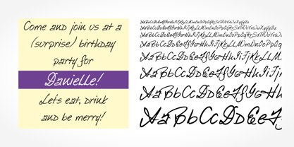 Digitized handwriting fonts are a perfect way to give documents the “very special touch”. Invitations look simply better when handwritten than when printed in bland Arial or Times New Roman. Short handwritten notes look authentic and appealing. There are numerous occasions where handwritten text makes a better impression. Danielle Handwriting is a beautiful typeface that mimics true handwriting closely. Use Danielle Handwriting to create stunningly beautiful designs easily.
 - Alpharain by Supfonts,
$18.00 Alpharain is a modern and at the same time absolutely incredible Serif with reverse contrast. A bright font will give the mood to your project Thanks so much for checking out my shop, and please get in touch if you have any questions! Alpharain Font Features: - Full Set of standard alphabet and punctuation - Handwritten ligatures - PUA Encoded - no special software needed to access extra characters - Multilingual Characters AÁĂÂÄÀĀĄÅÃÆBCĆČÇĊDÐĎĐEÉĚÊËĖÈĒĘẼFGĞĢĠḠHĦIIJÍÎÏİÌĪĮĨJKĶLĹĽĻŁMNŃŇŅÑ OÓÔÖÒŐŌØÕŒPÞQRŔŘŖSŚŠŞȘẞTŤŢȚUÚÛÜÙŰŪŲŮŨVWẂŴẄẀXYÝŶŸỲỸZŹŽŻ aáăâäàāąåãæbcćčçċdðďđeéěêëėèēęẽfgğģġḡhħiıíîïìijīįĩjȷkķlĺľļłmnńňņñoóôöòőōøõœpþ qrŕřŗsśšşșßtťţțuúûüùűūųůũvwẃŵẅẁxyýŷÿỳỹzźžż
 - Enrico Handwriting by SoftMaker,
$15.99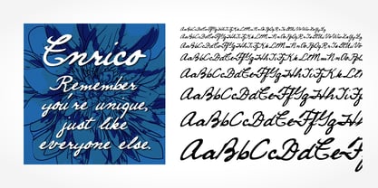 Digitized handwriting fonts are a perfect way to give documents the “very special touch”. Invitations look simply better when handwritten than when printed in bland Arial or Times New Roman. Short handwritten notes look authentic and appealing. There are numerous occasions where handwritten text makes a better impression. “Enrico Handwriting” is a beautiful typeface that mimics true handwriting closely. Use Enrico Handwriting to create stunningly beautiful designs easily.
 - Dino Moose by madeDeduk,
$12.00 Introducing Dino Moose is a playful font and will be perfect for book, titlebranding, product packaging, invitation, quotes, t-shirt, label, poster, logo etc. Feature 3 font files Uppercase & Lowercase Number & Symbol International Glyphs Multilingual support Feel free to drop us a message any time and follow my shop for upcoming updates Shoot me on email at: dedukvic@gmail.com if you have any questions Hope you enjoy it.
 - Fiery Sun by Epiclinez,
$19.00 Fiery Sun is a fun and bold display font. Carefully handcrafted to fit most of your projects, this font is going to become your favorite in no time! Its organic-style is suitable for creating any branding, product packaging, quote, t-shirt, label, poster, logo that you wish to develop. Fiery Sun contains 194 glyphs. Supporting more than 66 languages, from English to Zulu. I hope you enjoy it. Thanks
 - Roller Hesoon by TypeClassHeroes,
$16.00 Retro and refined you can explore and combine creating rhythm for comfortable reading. Roller Hesoon supports more than 100 Latin-based languages and has extensive Cyrillic and Greek support for languages like Russian, Bulgarian, Ukrainian, and many more. Feature Uppercase & Lowercase Number & Symbol International Glyphs Multilingual support Alternative Ligature Cyrillic & Greek Feel free to drop us a message any time and follow my shop for upcoming updates. Hope you enjoy it.
 - Christon Hunington by HansCo,
$15.00 Christon Hunington is a Vintage typeface font, it will add an old-time charm to any design project. It was made with the intention of being used for product Logo like a Pomade, Coffee, Barber shop or packaging label. It’s great also for Branding, Logo designs, Lettering, Logotype, Craft, Posters and much more. Features : Uppercase & Lowercase Numbers & Punctuation Multilingual Alternate character & ornament How to access alternate / ornament ? : https://hanscostudio.com/tutorial/ Enjoy!
 - Carlo Handwriting by SoftMaker,
$15.99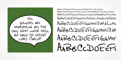 Digitized handwriting fonts are a perfect way to give documents the “very special touch”. Invitations look simply better when handwritten than when printed in bland Arial or Times New Roman. Short handwritten notes look authentic and appealing. There are numerous occasions where handwritten text makes a better impression. Carlo Handwriting is a beautiful typeface that mimics true handwriting closely. Use Carlo Handwriting to create stunningly beautiful designs easily.
 - Bjarne Handwriting by SoftMaker,
$15.99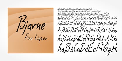 Digitized handwriting fonts are a perfect way to give documents the “very special touch”. Invitations look simply better when handwritten than when printed in bland Arial or Times New Roman. Short handwritten notes look authentic and appealing. There are numerous occasions where handwritten text makes a better impression. Bjarne Handwriting is a beautiful typeface that mimics true handwriting closely. Use Bjarne Handwriting to create stunningly beautiful designs easily.
 - Estelle Handwriting by SoftMaker,
$15.99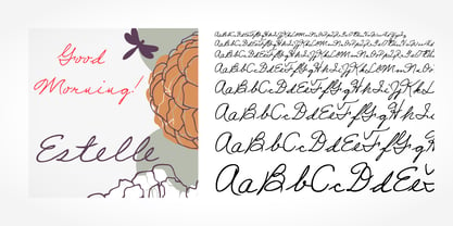 Digitized handwriting fonts are a perfect way to give documents the “very special touch”. Invitations look simply better when handwritten than when printed in bland Arial or Times New Roman. Short handwritten notes look authentic and appealing. There are numerous occasions where handwritten text makes a better impression. “Estelle Handwriting” is a beautiful typeface that mimics true handwriting closely. Use Estelle Handwriting to create stunningly beautiful designs easily.
 - Giovanna Handwriting by SoftMaker,
$7.99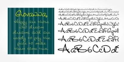 Digitized handwriting fonts are a perfect way to give documents the “very special touch”. Invitations look simply better when handwritten than when printed in bland Arial or Times New Roman. Short handwritten notes look authentic and appealing. There are numerous occasions where handwritten text makes a better impression. Giovanna Handwriting is a beautiful typeface that mimics true handwriting closely. Use Giovanna Handwriting to create stunningly beautiful designs easily.
 - Varga by ITC,
$29.00Varga is a robust, geometric script font designed by Alan Meeks in 1991. It suggests the style of the 1930s and 40s, a time when script fonts were making an appearance in advertisements everywhere. In spite of its bold character, the figures have a dynamic, cheerful look. Setting the lower case letters close together lets the figures flow together harmoniously. Varga is perfect for ads, certificates and headlines. - Iron Warrior by Cyberian Khatru,
$15.00 Since the advent of computer lettering in comicbooks, it has become commonplace to use letterforms with a mechanical look for mechanical sound effects. In my time as a hand-letterer of comicbooks I used hand-drawn letterforms for all sound effects, including mechanical ones. The advantages of computer lettering now allow me to use more mechanical looking effects where appropriate. Iron Warrior is the result. For more information: homepage.mac.com/
 - Epistula by JOEBOB graphics,
$30.00 Containing over 100 ligatures, Epistula is a loosely written font, resembling my own natural way of writing. It has a nice flow and the pointy tail-ends give it a certain speed. Creating Epistula has been a long process, but returning to the drawing board a few times has – in my humble opinion – paid off. This font comes in two weights: regular and medium. Because sometimes one flavour just isn’t enough…
 - Kaufmann LT by Linotype,
$29.99Kaufmann font was designed in 1936 for the American Type Founders by Max R. Kaufmann, a letterer, typographer, and one-time art director for McCalls magazine. Kaufmann is a connecting script typeface with a smooth, slightly whimsical look. Its monoweight is unusual in a script type but allows for a nice texture on the page when it is combined with sans serif text type. The bold Kaufmann is fine display type. - Tombouctou by Hanoded,
$15.00 Tombouctou is the French name for Timbuktu, a city in central Mali. I have been to Timbuktu several times; usually arriving after a three day boat trip up the Niger river. Timbuktu is a smallish city, literally in the middle of nowhere, with a treasure trove of UNESCO listed sights. Tombouctou font is a handmade brush font. It is nice and elegant and will give your designs an ‘oriental’ touch.
 - TE Heading by Tharwat Emara,
$20.00 It is known as the THARWAT M EMARA HEADING (NASKH) Font for its extensive use in the copying and transmission of books because it helps the writer to write more quickly than any other font since the Islamic times and then THARWAT M EMARA HEADING(NASKH) font wrote the "HEADING" And the advantages of THARWAT M EMARA HEADING (NASKH)font are clarifying the letters and show their beauty and splendor
 - HS Squos by Helipad Space,
$18.00 Introducing, HS Squos! A Futuristic San Serif with the professional touch. It looks modern and clean that can be used for all your project needs.This font can be used at any time and on any project. So, HS Squos Font can't wait to give its touch to all your design projects such as magazine, book, poster design, personal branding, promotional materials, logotype, product packaging, etc. Thank You HS
 - Black Borough by sizimon,
$25.00 Black Borough is brush font, hand-painted with extra attention to quick-strokes and dry textures. Very cool for logos, name tag, handwritten quotes, product packaging, merchandise, social media & greeting cards. And very easy to make design t-shirts and other products. Very save time in making the design of a product. It contains a full set of lower & uppercase letters, a large range of punctuation, numerals, and multilingual support.
 - Molaste by madeDeduk,
$14.00 Molaste is a retro font come with 80's retro style serif. You can explore and combine creating rhythm for comfortable reading. Vintage and refined use this font for any branding, product packaging, invitation, quotes, headline, label, poster, logo etc. Feature Uppercase & Lowercase Number & Symbol International Glyphs Multilingual support Alternative Ligature Feel free to drop us a message any time and follow my shop for upcoming updates Hope you enjoy it.
 - Dario Handwriting by SoftMaker,
$7.99 Digitized handwriting fonts are a perfect way to give documents the “very special touch”. Invitations look simply better when handwritten than when printed in bland Arial or Times New Roman. Short handwritten notes look authentic and appealing. There are numerous occasions where handwritten text makes a better impression. Dario Handwriting is a beautiful typeface that mimics true handwriting closely. Use Dario Handwriting to create stunningly beautiful designs easily.
 - Bleeding Ink by Mvmet,
$20.00 Bleeding Ink is a rough hand-drawn display font but still fun and playful in the same time. It works great for creating cool designs that scream for attention. It’s ideal for anything ranging from t-shirts, book designs, restaurant menu, blog writing, greeting cards to stickers, or anything that needs a casual touch. Fall in love with its incredibly cool style, and use it to create lovely designs!
 - HS Broxy by Helipad Space,
$18.00 Introducing, HS Broxy! An Experimental Display Font with the contrast geometric touch. It looks authentic and personality that can be used for all your project needs.This font can be used at any time and on any project. So, HS Broxy Font can't wait to give its touch to all your design projects such as magazine, book, poster design, movie, personal branding, promotional materials, logotype, product packaging, etc. Thank You HS
 - Backbone by 38-lineart,
$17.00 Backbone is a unique blackletter font. It’s suitable for use in various projects such as gothic letters, tattoos, headlines, posters, magazines, newspapers, t-shirts, labels, and any other designs that you wish to create. Get inspired by Black metal and It will add an edgy feel to any crafting project! Bold and spooky, Ideal for any October project or Halloween party, this font will become your top choice in no time!
 - Josh Handwriting by SoftMaker,
$15.99 Digitized handwriting fonts are a perfect way to give documents the “very special touch”. Invitations look simply better when handwritten than when printed in bland Arial or Times New Roman. Short handwritten notes look authentic and appealing. There are numerous occasions where handwritten text makes a better impression. Josh Handwriting is a beautiful typeface that mimics true handwriting closely. Use Josh Handwriting to create stunningly beautiful designs easily.
 - Geetype by G-Type,
$46.00 Inspired by a piece of cigarette pack lettering designed by the renowned poster and type designer A.M. Cassandre (perhaps best known for his Peignot typeface), Geetype evokes a 1920s & 30s mood and is an unusual, eye-catching single weight display face. Think vintage hand lettered poster campaigns, Hollywood's golden era and a time when smoking was positively encouraged. Think Greta Garbo, another 'g' with strong, emotional screen presence.
 - Marvellous Script by Lone Army,
$10.00 Marvellous Script - A Perfectly Magical bouncy Script hand lettered Creative and Casual, together or apart, make tons of gorgeous typographic designs, just in time for all your Christmas labels, cards, and branding too! Perfect for DIY projects, greeting cards, labels, quotes, posters, invitations, wall art, branding, packaging, websites, photos, photo & photography overlays, signs, window art, tags and so much more! Marvelous has an alternate beginning and ending set as well
 - Bodyhand by Bodyhand,
$10.00 The main problem with handwritten fonts is the limited use in body text. Bodyhand is specifically designed to remedy this, for example when designing children's books with a larger amount of text or in similar contexts. Bodyhand is especially adapted to read comfortably even when used in small font size and requires approximately the same space as the fonts we usually use in body text, such as Times or Helvetica.
 - Funkadelity by PizzaDude.dk,
$18.00 Funkadelity is a funky breed between 60ies poster typography and 80ies grafitti. Maybe even inspired a bit by comic book lettering! Funkadelity wants to burn off the dance floor and show off the fancy dance moves - at the same time, it want to show off the smooth and clean lines of the letters. Originally handdrawn, but I digitally remastered every single letter, leaving the curves smooth and clean!
 - Theo Handwriting by SoftMaker,
$15.99 Digitized handwriting fonts are a perfect way to give documents the “very special touch”. Invitations look simply better when handwritten than when printed in bland Arial or Times New Roman. Short handwritten notes look authentic and appealing. There are numerous occasions where handwritten text makes a better impression. “Theo Handwriting” is a beautiful typeface that mimics true handwriting closely. Use Theo Handwriting to create stunningly beautiful designs easily.
 - Volker Handwriting Pro by SoftMaker,
$15.99 Digitized handwriting fonts are a perfect way to give documents the “very special touch”. Invitations look simply better when handwritten than when printed in bland Arial or Times New Roman. Short handwritten notes look authentic and appealing. There are numerous occasions where handwritten text makes a better impression. “Volker Handwriting Pro” is a beautiful typeface that mimics true handwriting closely. Use Volker Handwriting Pro to create stunningly beautiful designs easily.
 - Brouet Handwriting by SoftMaker,
$15.99 Digitized handwriting fonts are a perfect way to give documents the “very special touch”. Invitations look simply better when handwritten than when printed in bland Arial or Times New Roman. Short handwritten notes look authentic and appealing. There are numerous occasions where handwritten text makes a better impression. Brouet Handwriting is a beautiful typeface that mimics true handwriting closely. Use Brouet Handwriting to create stunningly beautiful designs easily.
 - Navila Mandres by madeDeduk,
$16.00 Navila Mandres is a realistic hand drawn font come with alternative and ligature and will be perfect for book, title branding, product packaging, invitation, quotes, label, poster, logo etc. Feature Uppercase & Lowercase Number & Symbol International Glyphs Multilingual support Alternative Ligature Thanks so much for checking out my shop and feel free to drop us a message any time and follow my shop for upcoming updates Hope you enjoy it.
 - Annexia by Koshemare Studio,
$10.00 Annexia is a serif font with a several styles from Light to Bold. Serifs and stretched letters connect two times the past and the future, creating a perfect present. This font doesn't have a specific mood. Depending on the tasks, it can show itself in different ways. The font is perfect for both text, headlines, and branding. The font was designed by Pavel Bruev and released by Koshemare studio in 2021
 - HS Novano by Helipad Space,
$18.00 Introducing, HS Novano! A Modern San Serif with the clean touch. It looks modern and clean that can be used for all your project needs.This font can be used at any time and on any project. So, HS Novano Font can't wait to give its touch to all your design projects such as magazine, book, poster design, personal branding, promotional materials, logotype, product packaging, etc. Thank You HS