10,000 search results
(0.018 seconds)
- Heller Sans JNL by Jeff Levine,
$29.00 Heller Sans JNL is based on the main letterforms of an experimental alphabet designed by Steven Heller; noted author of over 170 books on design and visual culture. Some modifications were made in turning his design into a digital font. In his own words, here is the background to this typeface: “I recently recovered this from the junk heap. It is a yellowing photostat of my first and only typeface design (1969-70). Total folly! At the time I was smitten by Art Moderne lettering. I called it “Klaus Boobala Bold” because I liked the K and B. I’ve lost the letters S through Z, which were made. The letters were drawn with compass, Techno pen (that frequently clogged). as well as a triangle and T-square. The inline and outline made no real logical sense. I based the design, in part, on Kabel, Avant Garde and it was a product of whatever I could accomplish with those tools. The caps-only alphabet was photographed and produced as a film negative that was cut in foot-long strips and spliced to fit on a Typositor reel. Sadly, the negatives made for the font were too brittle and the splice snapped apart in the Typositor. I worked on it for well over a month and used the face only once. I realized with this attempt, like so many other times I attempted different challenges, that type design — indeed mechanical drawing — was not my strong suit.” Heller Sans JNL is available in both regular and oblique versions.
 - Palsam Pro by Abjad,
$110.00 Since the beginning, Palsam was intended to be a super multilingual family, with a real cursive Arabic companion, and a display cut. The typeface was designed to be used for setting text and titles of contemporary Arabic content, specially magazines, and websites. The Arabic and Latin scripts were designed at the same time, to make a true authentic bilingual typeface. Both scripts have affected each other in several ways through the entire design process, which happened within ten years. Palsam has an inviting, approachable, fashionable and humanist look. Thanks to its low contrast, open apertures, detailed calligraphic strokes, and smooth counters, which also make it easy to read at smaller sizes. The main highlight for Palsam was the Cursive companion. For the first time, the calligraphic Ijaza style was used as a model for designing the Arabic cursive. Since the Ijaza is a hyper combination of Naskh and Thuluth, which makes it perfect to be a companion for the upright Naskh. Moreover this script was used in margins, and to highlight specific content inside a paragraph in older manuscripts. With true cursive companions in five weights, and many opentype features, Palsam grants all the tools needed to set complex information and editorial designs applications. More than 1000 characters are included per weight, including small caps, fractions, old style and lining numbers, ligatures, contextual ligatures, and discretionary ligatures. It supports over 40 languages that use the Latin extended, as well as Arabic, Farsi, and Urdu Languages. The latin script was designed in collaboration with the Slovenian type designer Alja Herlah.
 - The "Flower Ornaments" font embodies a delightful blend of artistic creativity and nature-inspired elegance, intended to infuse text with a touch of botanical beauty. This font stands out not just as...
- The Pea Marcie font, brought to life by Fonts For Peas, embodies a captivating charm that instantly warms the heart. It's a font that seems to have been crafted with love, bearing the marks of a tale...
- TA Bankslab by Tural Alisoy,
$33.00 The building of the Northern Bank of St. Petersburg's Baku branch was built in 1903-1905. It was the first Art Nouveau-style building in Baku, Azerbaijan. Later the bank was transformed into the Russian-Asian Bank. After the oil boom in Baku in the 19th century, branches of many banks and new banks were opened in the city. The branch of the Northern Bank of St. Petersburg was among the first banks that was opened in Baku. N.Bayev was the architect of the building for the branch of the Northern Bank of St. Petersburg located at Gorchakovskaya 3 in 1903-1905. The building currently houses the Central Branch of the International Bank of Azerbaijan. My purpose in writing this is not to copy and paste the information from Wikipedia. What attracted me to the building was the word "Банкъ" (Bank) written in Cyrillic letters, which was also used in Azerbaijan during the Soviet era. The exact date of the writing is not known. Every time I pass by this building, I always thought of creating a font of this writing someday. I had taken a photo of the building and saved it on my phone. I did a lot of research on the font and asked a lot of people. However, some did not provide information at all and some said they did not have any information. I was interested in the history of this font but I do not know if this font really existed or it was created by the architect out of nowhere. If there was such a history of this font, I wanted to recreate this font and make it available. If not, I had to create it from scratch in the same way, using only existing letters on the building. Finally, I made up my mind and decided to develop the font with all letters I have got. It was difficult to create a font based on the word, Банкъ. Because in the appearance of the letters, the midline of the letters on A, H, K was very distinct, both in the form of inclination and in more precise degrees. The serif part of the letters, the height of the upper and lower sides, differed from each other. I don't know whether it was done this way when the building was constructed or it happened over time. I prepared and kept the initial version of the font. I took a break for a while. I started digging on the story of the font again. Meanwhile, I was researching and got inspired by similar fonts. Unfortunately, my research on the font's history did not yield any results. I decided to continue finishing up the font. After developing the demo, I created the font by keeping certain parts of these differences in the letters. In addition, I had to consider the development of letters in the Cyrillic, as well as the Latin alphabet, over the past period. Thus, I began to look at the appearance of slab-serif or serif fonts of that time. In general, as I gain more experience in developing fonts, I try to focus on the precision of the design for each font. In recent years, I specifically paid attention to this matter. YouTube channel and articles by Alexandra K.'s of ParaType, as well as, information and samples from TypeType and Fontfabric studios on the Cyrillic alphabet were quite useful. I gathered data regarding the Latin alphabet from various credible sources. I do not know if I could accomplish what I aimed at but I know one thing that I could develop the font. Maybe someday I'll have to revise this font. For now, I share it with you. I created the font in 10 styles. 7 weight from Thin to Extra Black, an Outline, Shadow, and Art Nouveau. The Art Nouveau style was inspired by the texture in the background used for the text on the building. The texture I applied to capital letters adds beauty to the font. If you like the font feel free to use it or simply let me know if your current alphabet doesn't support this font.
 - TA Bankslab Art Nouveau by Tural Alisoy,
$40.00 TA Bankslab graphic presentation at Behance The building of the Northern Bank of St. Petersburg's Baku branch was built in 1903-1905. It was the first Art Nouveau-style building in Baku, Azerbaijan. Later the bank was transformed into the Russian-Asian Bank. After the oil boom in Baku in the 19th century, branches of many banks and new banks were opened in the city. The branch of the Northern Bank of St. Petersburg was among the first banks that was opened in Baku. N.Bayev was the architect of the building for the branch of the Northern Bank of St. Petersburg located at Gorchakovskaya 3 in 1903-1905. The building currently houses the Central Branch of the International Bank of Azerbaijan. My purpose in writing this is not to copy and paste the information from Wikipedia. What attracted me to the building was the word "Банкъ" (Bank) written in Cyrillic letters, which was also used in Azerbaijan during the Soviet era. The exact date of the writing is not known. Every time I pass by this building, I always thought of creating a font of this writing someday. I had taken a photo of the building and saved it on my phone. I did a lot of research on the font and asked a lot of people. However, some did not provide information at all and some said they did not have any information. I was interested in the history of this font but I do not know if this font really existed or it was created by the architect out of nowhere. If there was such a history of this font, I wanted to recreate this font and make it available. If not, I had to create it from scratch in the same way, using only existing letters on the building. Finally, I made up my mind and decided to develop the font with all letters I have got. It was difficult to create a font based on the word, Банкъ. Because in the appearance of the letters, the midline of the letters on A, H, K was very distinct, both in the form of inclination and in more precise degrees. The serif part of the letters, the height of the upper and lower sides, differed from each other. I don't know whether it was done this way when the building was constructed or it happened over time. I prepared and kept the initial version of the font. I took a break for a while. I started digging on the story of the font again. Meanwhile, I was researching and got inspired by similar fonts. Unfortunately, my research on the font's history did not yield any results. I decided to continue finishing up the font. After developing the demo, I created the font by keeping certain parts of these differences in the letters. In addition, I had to consider the development of letters in the Cyrillic, as well as the Latin alphabet, over the past period. Thus, I began to look at the appearance of slab-serif or serif fonts of that time. In general, as I gain more experience in developing fonts, I try to focus on the precision of the design for each font. In recent years, I specifically paid attention to this matter. YouTube channel and articles by Alexandra K.'s of ParaType, as well as, information and samples from TypeType and Fontfabric studios on the Cyrillic alphabet were quite useful. I gathered data regarding the Latin alphabet from various credible sources. I do not know if I could accomplish what I aimed at but I know one thing that I could develop the font. Maybe someday I'll have to revise this font. For now, I share it with you. I created the font in 10 styles. 7 weight from Thin to Extra Black, an Outline, Shadow, and Art Nouveau. The Art Nouveau style was inspired by the texture in the background used for the text on the building. The texture I applied to capital letters adds beauty to the font. If you like the font feel free to use it or simply let me know if your current alphabet doesn't support this font.
 - A10 STAR Black by Mogtahid,
$90.00 As a former typographer / lino and calligrapher, Abdallah NASRI had recourse to the nature of the idea of an "INTERCHANGEABLE" collection for types who in reality offer a police collar parallel to the complex typeface of the variable. Our fashion is outlined by a simple calculation defined by superimposed geometric circles where we used only its ¼ to fill the need for the angles of each of our letters. Always with the idea of having in the same allocated space, the same letter nested as many times as fat example from Hairline to Ultrabold. It was in this way that I was able to obtain a large number of styles, with a very interesting kerning which prompted me to extend the font to other languages with +1000 characters and +600 glyphs. I have always been treasured by the all in "1". I assure you that I sought to obtain the maximum of Visibility for a use S / Titling TV, WEB Pages and Typography Typo; once the difficult thing was done, I was rewarded by a font that has countless typographic openings for the world of graphics with 10 styles of weights in hand, and again I am happy to have personalized the charm of each letter by new details; I do not regret the time spent on thinking about it so that it is useful and at the same time pleasant as a working tool, finally profitable in all sectors and more multilingual, without forgetting that it is a family of inter change c ' is to say: All the types occupy the same height of the body and it is their fats which differs in the same space width of each of the letters, therefore no interference in spacing. Here, an additional alternative, a participation of a septuagenarian in the service of the love of modern digital typography. • TEST: At 50% screen in a body of 12 pixels, the A10 STAR Alphabet subjected to a test, has a clear Readability / Visibility. • P.S: A10 STAR integrates Diacriticism in all its forms. Texte d'origine : Abdallah NASRI a eu recours en étant ancien typographe/lino et calligraphe à la nature de l'idée d'une collection "INTERCHANGEABLE" pour les types qui en réalité offre un collier de police parallèle à la fonte complexe du variable. Notre mode est esquissé par un calcul simple défini par des ronds géométrique superposés où on a utilisé seulement son ¼ pour garnir le besoin des angles de chacune de nos lettres. Toujours dans l’idée à avoir dans le même espacement alloué, la même lettre imbriquée autant de fois de graisse exemple du Hairline à Ultrabold. C’est de cette manière que j’ai pu obtenir un grand nombre de styles, avec un crénage très intéressant ce qui m’a incité à étendre la police à d’autres langues avec +1000 caractères et +600 glyphes. J’ai toujours été prisé par le tout en « 1 ». Je vous assure que j’ai cherché à obtenir le maximum de Visibilité pour une utilisation S/Titrage TV, Pages WEB et Maquette typo ; une fois le difficile fait, j’ai été récompensé par une police qui possède d’innombrable ouverture typographique pour le monde du Graphisme avec comme atout en main 10 styles de graisses, et encore je suis content pour avoir personnalisé le charme de chaque lettre par des détails nouveaux ; je ne regrette pas le temps passé dessus à réfléchir pour qu’il soit utile et à la fois agréable comme outil de travail, enfin profitable tous secteurs confondus et en plus multilingue, sans oublié que c’est une famille d’inter change c’est-à-dire : Tous les types occupent la même hauteur du corps et c'est leurs graisses qui diffère dans un même espace largeur de chacune des lettres, donc aucune interférence dans l’espacement. Voilà, une alternative supplémentaire, une participation d’un septuagénaire au service de l’amour de la typographie numérique moderne. • TEST : A 50% d'écran dans un corps de 12 pixels, l'Alphabet A10 STAR soumise a un test, présente une nette Lisibilité / Visibilité. • P.S : A10 STAR intégre la Diacritique dans toutes ses formes.
 - Cesium by Hoefler & Co.,
$51.99 An inline adaptation of a distinctive slab serif, Cesium is an unusually responsive display face that maintains its high energy across a range of different moods. The Cesium typeface was designed by Jonathan Hoefler in 2020. An energetic inline adaptation of Hoefler’s broad-shouldered Vitesse Black typeface (2000), Cesium is named for the fifty-fifth member of the periodic table of the elements, a volatile liquid metal that presents as a scintillating quicksilver. From the desk of the designer, Jonathan Hoefler: I always felt that our Vitesse typeface, an unusual species of slab serif, would take well to an inline. Vitesse is based not on the circle or the ellipse, but on a less familiar shape that has no common name, a variation on the ‘stadium’ that has two opposing flat edges, and two gently rounded sides. In place of sharp corners, Vitesse uses a continuously flowing stroke to manage the transition between upright and diagonal lines, most apparent on letters like M and N. A year of making this gesture with my wrist, both when drawing letterforms and miming their intentions during design critiques, left me thinking about a reduced version of the typeface, in which letters would be defined not by inside and outside contours, but by a single, fluid raceway. Like most straightforward ideas, this one proved challenging to execute, but its puzzles were immensely satisfying to solve. Adding an inline to a typeface is the quickest way to reveal its secrets. All the furtive adjustments in weight and size that a type designer makes — relieving congestion by thinning the center arm of a bold E, or lightening the intersecting strokes of a W — are instantly exposed with the addition of a centerline. Adapting an existing alphabet to accommodate this inline called for renovating every single character (down to the capital I, the period, and even the space), in some cases making small adjustments to reallocate weight, at other times redesigning whole parts of the character set. The longer we worked on the typeface, the more we discovered opportunities to turn these constraints into advantages, solving stubbornly complex characters like € and § by redefining how an inline should behave, and using these new patterns to reshape the rest of the alphabet. The New Typeface The outcome is a typeface we’re calling Cesium. It shares many of Vitesse’s qualities, its heartbeat an energetic thrum of motorsports and industry, and it will doubtless be welcome in both hardware stores and Hollywood. But we’ve been surprised by Cesium’s more reflective moods, its ability to be alert and softspoken at the same time. Much in the way that vibrant colors can animate a typeface, we’ve found that Cesium’s sensitivity to spacing most effectively changes its voice. Tighter leading and tracking turns up the heat, heightening Cesium’s sporty, high-tech associations, but with the addition of letterspacing it achieves an almost literary repose. This range of voices recommends Cesium not only to logos, book covers, and title sequences, but to projects that regularly must adjust their volume, such as identities, packaging, and editorial design. Read more about how to use Cesium. About the Name Cesium is a chemical element, one of only five metals that’s liquid at room temperature. Resembling quicksilver, cesium is typically stored in a glass ampule, where the tension between a sturdy outer vessel and its volatile contents is scintillating. The Cesium typeface hopes to capture this quality, its bright and insistent inline restrained by a strong and sinuous container. Cesium is one of only three H&Co typefaces whose name comes from the periodic table, a distinction it shares with Mercury and Tungsten. At a time when I considered a more sci-fi name for the typeface, I learned that these three elements have an unusual connection: they’re used together in the propulsion system of nasa’s Deep Space 1, the first interplanetary spacecraft powered by an ion drive. I found the association compelling, and adopted the name at once, with the hope that designers might employ the typeface in the same spirit of discovery, optimism, and invention. —JH Featured in: Best Fonts for Logos
 - Coming Together by Font Aid,
$20.00 Coming Together contains over 400 glyphs and is supplied as a single, cross-platform OpenType font. All glyphs are accessible using OpenType-savvy applications, Unicode-savvy utilities, the Character Map utility on Windows, and FontBook on Mac OS X. Nearly 400 designers contributed to “Coming Together”: Adam Humphries, Aditi Dilip, Adrien Midzic, Afraa Gutub, Al Insan Lashley, Alan Lima Coutinho, Alaric Garnier, Alejandro Cabrera Avila, Alejandro Lo Celso, Alejandro Paul, Alessandro Segalini, Alex Cameron, Alex Coblentz, Alexander Trubin, Alexandre Freitas, Alexey Murashko, Alicia Jabin, Aline Horta, Allison Dominguez, Amanda Postle, Amy Brown, Amy Papaelias, Anderson Maschio, Andrea Emery, Andres Perez, Andrew Boardman, Andrew Jesernig, Andrey Furlan, Andrij Shevchenko, Ann Tripepi, Antonio Gutierrez, Antony Kitson, Anushree Kapoor, Anya Cam, AP303 Estudio Design, Becky Krohe, Beejay, Ben Mitchell, Benjamin K. Shown, Benjamin Varin, Brad McNally, Brad Nelson, Bradley Trinnaman, Brady Baltezore, Brandon Horne, Breck Campbell, Brian J. Bonislawsky, Brian Jaramillo, Brian Jongseong Park, Brian Mueller, Brock French, Bruce Rodgers, Bruno Pugens, Bryan Angelo Lim, Buro Reng, Caitlin Martin-Frost, Calou, Carlos Fabián Camargo Guerrero, Carlos Vidal, Cayo Navarro, Cesar Puertas, Chank Diesel, Charles Williams, Chris Lozos, Chris Trude, Christophe Badani, Christy Lai, Claes Källarsson, Claire Coullon, Claudio Piccinini, Colby Cook, Craig Eliason, Cristina Pegnataro, Curve Doctor, Dan DiSorbo, Dan Liggins, Dan Rubin, Daniel Justi, Daniele Capo, Dav(id Hubner), Dave Bailey, Dave Cohen, David Jonathan Ross, David Sudweeks, David Thometz, Dawn Mercurio, Delve Withrington, Diana van de Blaak, Didier Mazellier, Diederik Corvers, Dino Santos, Dmytro Pobiedash, Donald Beekman, Dries Wiewauters, Duncan Bancroft, Ed Hoskin, Eddy Ymeri, Edineide Oliveira, Eduardo Manso, Eduardo Rodríguez Tunni, Eero Antturi, Eli Castellanos, Elias Bitencourt, Elias Stenalt Werner, Elman Padilla, Emery Miller, Emily Leong, Emily Maher, Enrico Limcaco, Eric Frisino, Eric Stine, Erik Brandt, Espen, Evan Moss, Evangeline Rupert, Fabiane Lima, Fabio Foncati, Fabrizio Schiavi, Farbod Kokabi, Felipe Lekich, Francisco Martin, Frank Riccio, Frans van Bellen, Gary Holmes, Gautam Rao, Gayle Hendricks, Gene Buban, Georg Herold-Wildfellner, George Aytoun, Gerd Wiescher, Giles Edwards, Gist Studio, Glen Barry, Glenn Parsons, Goro Mihok, Grace Engels, Grant Alexander, Grant Hutchinson, Greg Smith, Gunnar Swanson, Gustavo Machado, Hans Nieuwstraten, Harold Lohner, Hilary Salmon, Hillary Fayle, Hrant H Papazian, Hugo Gallipoli, Ian Drolet, Ian Lynam, Ilona Kincses, Isac Corrêa Rodrigues, Ivette Chacon, Ivo Federspiel, Jacques Le Bailly, Jae-hyoung Choi, Jaime Vasquez, James Edmondson, James Grieshaber, James L. Stirling, James Lukens-Gable, James Martin, James Ockelford, James Puckett, Jarbas Gomes, Jarett Knuth, Jason Adam, Jason Robinson, Javier Suzuki, Jay Chu, Jayson Zaleski, Jean Francois Porchez, Jeff Fisher, Jeff Jarvis, Jeffrey Vanlerberghe, Jelmar Geertsma, Jennifer Clarke, Jennifer Rutherford, Jens Kutilek, Jerry Allen Rose, Jess Latham, Jesse Ragan, Jessica Page, Jesvin Yeo Puay Hwa, Jim Ford, Jim Lyles, Jim Rimmer, Jin Ping, Jo De Baerdemaeker, Joachim Muller-Lance, Joanna Abbott Moss, Joe Francis, Joe VanDerBos, Joel Vilas Boas (J85), John Downer, John Flanagan, John Foley, John Langdon, John Lopez, John Lyttle, John Skelton, Johnny Dib, Jonathan Hughes, Jonathan Pierini, Jos Buivenga, Jose Luis Coyotl Mixcoatl, Juan Acosta, Judd Crush, Judith Lee, Julie Johnson, Julie Oakley, Julie Thomas, Juliet Shen, Jumin Lee, Jurgen Weltin, Justin Callahan, Justin Chodzko, Karel Piska, Karen MacKay, Karin Eberhardt, Karin van Soest, Karla Perez, Katie Parry, Katie Snape, Katri Haycock, Katy Brooks, Kelley Garrard, Kelly Redling, Kent Lew, Kevin D’Souza, Kevin J. Boynton, Kevin McDermott, Kim Arispe, Kokin, Kristen Caston, Kristen Hartman, Kristian Möller, Kristians Šics, Kyle Jones, L Bollinger, Lan Huang, Larry Van Dyke, Laura Ricker, Laura Worthington, Laurel Wilson, LeAndrea James, Lijklema Design, Linda McNeil, Lise Barreto, Louie Crumbley, Louis Duchesne, Luke Dorny, Luke Stouffer, Madison Cramer, Måns Björkman, Marc Salinas Claret, Marcus Leis Allion, Marcus Parker, Marcus Sterz, Marie-Anne Verougstraete, Mark Simonson, Martin Majoor, Matheus Barbosa, Mathias Forslund, Matt Desmond, Matt McInerney, Matt Millette, Matthew Jerauld, Max Kisman, Michael Browers, Michael Bundscherer, Michael Cina, Michael Doret, Michael G. Adkins, Michael Hernan, Michael Paul Young, Michael Wallner, Miguel Catopodis, Mikael Engblom, Mike Jarboe, Mike Petschek, Miriam Martincic, Moira Sheehan, Monica Pedrique, Nacho Gallego, Naomi Atkinson, Natanael Gama, Nathanael Ng, Neil Fox, Neil Patel, Neil Summerour, Neil Woodyatt, Ngoc Ngo, Nguyen Pham, Nicholas Curtis, Nicole Hudson, Nicole Sowinski, Nicolien van der Keur, Nina Stössinger, Noah Scalin, Ojasvi Mohanty, Oleg Macujev, Olivia Choi, Ong Fang Zheng, Pata Macedo, Patrick Gallagher, Patrycja Zywert, Paul Hunt, Paul Langman, Pedro Moura, Pedro Paz, Per Ohlsson, PJ Onori, Premm Design Ltd, Rae Kaiser, Rafael Carozzi, Rafael Cordeiro, Rafael Neder, Randy Jones, Ray Larabie, Raymond Forbes, Ressa McCray, Ricardo Esteves, Ricardo Martins, Riccardo Sartori, Richard Kegler, Richard Miller, Rob Keller, Roballo, Rose Coplon, Roy Rub, Rudo van der Velden, Russell McGorman, Ryan Rushing, Ryan Thorpe, Sander Neijnens, Sara Cross, Scott Boms, Scott Fisk, Sergio Jimenez, Shi-Min Chin, Sílvio Gabriel Spannenberg, Soohyen Park, Sorin Bechira, Stanley Friesesk, Stefan Hattenbach, Stefan Kjartansson, Stephen Lay, Steve Harrison, Steve Marsh, Steve Matteson, Steve Mehallo, Steve Zelle, Steven Bonner, Steven Wulf, Stuart Brown, Stuart Ford, Stuart Sandler, Sue Zafarana, Sulekha Rajkumar, Susan Surface, Tanya T Stroh, Taylor Loman, Ted Ullrich, Teja Ideja, Tena Letica, Terrance Weinzierl, Theo França, Thiago Martins, Tiffany Wardle, Tim Whalen, Titus Nemeth, Tom Plate, Tom Rickner, Tomato Košir, Tomi Haaparanta, Travis Kochel, Troy Leinster, Tyler Heron, Type Mafia, Vanessa Robertson, Veronika Burian, Victor Esteves, Victor Zuniga, Viktor Nübel, Viviana G, Wellinton Reis, Wilson Thomas, Wolfgang Homola, Xavier Dupre, Xerxes Irani, Zvika Rosenberg These designers represented the following countries: Argentina, Australia, Austria, Belgium, Brazil, Canada, Columbia, Croatia, Czech Republic, El Salvador, England, Finland, France, Germany, India, Ireland, Italy, Japan, Latvia, Lebanon, Mexico, New Zealand, Peru, Poland, Portugal, Scotland, Siberia, Singapore, Slovenia, Spain, Sweden, Switzerland, The Netherlands, Ukraine, United States, Venezuela, Vietnam
 - Leather by Canada Type,
$24.95 Over the past few years, every designer has seen the surprising outbreak of blackletter types in marketing campaigns for major sports clothing manufacturers, a few phone companies, soft drink makers, and more recently on entertainment and music products. In such campaigns, blackletter type combined with photos of usual daily activity simply adds a level of strength and mystique to things we see and do on a regular basis. But we couldn't help noticing that the typography was very odd in such campaigns, where the type overpowers all the other design elements. This is because almost all blackletter fonts ever made express too much strength and time-stamp themselves in a definite manner, thereby eliminating themselves as possible type choices for a variety of common contemporary design approaches, such as minimal, geometric, modular, etc. So extending the idea of using blackletter in modern design was a bit of a wild goose chase for us. But we finally found the face that completes the equation no other blackletter could fit into: Leather is a digitization and major expansion of Imre Reiner's forgotten but excellent 1933 Gotika design, which was very much ahead of its time. In its own time this design saw very little use because it caused problems to printers, where the thin serifs and inner bars were too fragile and broke off too easily when used in metal. But now, more than seventy years later, it seems like it was made for current technologies, and it is nothing short of being the perfect candidate for using blackletter in grid-based settings. Leather has three features usually not found in other blackletter fonts: - Grid-based geometric strokes and curves: In the early 1930s, blackletter design had already begun interacting back with the modern sans serif it birthed at the turn of the century. This design is one of the very few manifestations of such interaction. - Fragile, Boboni-like serifs, sprout from mostly expected places in the minuscules, but are sprinkled very aesthetically on some of the majuscules. The overall result is magnificently modern. - The usual complexity of blackletter uppercase's inner bars is rendered simple, geometric and very visually appealing. The contrast between the inner bars and thick outer strokes creates a surprising circuitry-like effect on some of the letters (D, O, Q), wonderfully plays with the idea of fragile balances on some others (M, N and P), and boldly introduces new concepts on others (B, F, K, L, R). Our research seems to suggest that the original numerals used with this design in the 1930s were adopted from a previous Imre Reiner typeface. They didn't really fit with the idea of this font, so we created brand new numerals for Leather. We also expanded the character set to cover all Western Latin-based languages, and scattered plenty of alternates and ligatures throughout the map. The name, Leather, was derived from a humorous attempt at naming a font. Initially we wanted to call it Black Leather (blackletter...blackleather), but the closer we came to finishing it, the more respect we developed for its attempt to introduce a plausible convergence between two entirely different type categories. Sadly for the art, this idea of convergence didn't go much further back then, due to technological limitations and the eventual war a few years later. We're hoping this revival would encourage people to look at blackletter under a new light in these modern times of multiple design influences.
 - The BN BenWitch Project font, crafted by Ben Nathan, stands as a distinctive typeface that draws its inspiration from the eerie and unsettling atmosphere reminiscent of horror movies and supernatural...
- Anselm Sans by Storm Type Foundry,
$63.00One of the good practices of today’s type foundries is that they release their type families as systems including both serif and sans serif type. Usually, the sources of inspiration need to be well tried with time and practice, since production of a type family is such a laborious and complex process. From the beginning, it needs to be clear that the result will be suited for universal use. Such systems, complete with the broad, multi-lingual variations permitted by the OpenType format, have become the elementary, default instrument of visual communication. Non-Latin scripts are useful for a wide scope of academic publications, for packaging and corporate systems alike. And what about outdoor advertisement designated for markets in developing countries? Cyrillics and Greek have become an integral part of our OpenType font systems. Maybe you noticed that the sans serif cuts have richer variety of the light – black scale. This is due to the fact that sans serif families tend to be less susceptible to deformities in form, and thus they are able to retain their original character throughout the full range of weights. On the other hand, the nature of serifed, contrasted cuts does not permit such extremes without sacrificing their characteristic features. Both weights were drawn by hand, only the Medium cut has been interpolated. Anselm Ten is a unique family of four cuts, slightly strengthened and adjusted for the setting in sizes around 10 pt and smaller, as its name indicates. The ancestry of Anselm goes back to Jannon, a slightly modified Old Style Roman. I drew Serapion back in 1997, so its spirit is youthful, a bit frisky, and it is charmed by romantic, playful details. Anselm succeeds it after ten years of evolution, it is a sober, reliable laborer, immune to all eccentricities. The most significant difference between Sebastian/Serapion and Anselm is the raised x-height of lowercase, which makes it ideal for applications in extensive texts. Our goal was to create an all-round type family, equally suitable for poetry, magazines, books, posters, and information systems. - ITC Stepp by ITC,
$29.99When Hal Taylor saw the 1930 logo for the Stetson Shoe Company of Weymouth, Massachusetts, he didn't run out and buy a pair of loafers. Instead, he seized on this striking example of an Art Deco logotype as the basis for a new typeface design. “I was impressed with the delicate and sophisticated letter forms,” Taylor recalls, “particularly the enlarged cap S -- in any other case it would have seemed unbalanced, but in the context of this logo, it worked perfectly.” All the letters in the original all-caps Stetson Shoe logo were rendered with condensed proportions except the O, which was a perfect circle. While the prominent O added visual interest to the logo, Taylor knew that such a character would limit his typeface to display applications. For versatility's sake, he drew his O for ITC Stepp with the same proportions as the rest of the alphabet. Taylor also gave the logotype's inverted S a more traditional design, but kept the original as an alternate character in the OpenType font. Taylor's toughest challenge during the design process was creating a lowercase. “A good type design tells you what it wants to be,” he says, “and after a little while the Stepp caps began to tell me what the lowercase should look like.” Taylor's lowercase is slightly more conventional than the caps. The jaunty g" and almost upside-down "s" add subtle charm, while the capital letters provide the broader gestures of Stepp's personality. Together, they create a versatile and distinctive typeface design. One of Hal Taylor's first jobs was as a photo-lettering typographer in Philadelphia, setting headlines and creating custom lettering. This was followed by a stint doing finished lettering for John Langdon, whose ambigrams appear in Dan Brown's best-selling novel, Angels & Demons. Today, Taylor works as a graphic designer in the publishing industry, but he still finds time to create an occasional hand-lettered book jacket, and draw handsome typeface designs. ITC Stepp is available in four weights, ranging from Light to Ultra Bold. All four weights have companion italics, and the lightest three weights also offer a suite of small caps." - Stud by Typodermic,
$11.95 Listen up, partner! If you want to give your message some real grit, you need to saddle up with Stud. This ain’t no wimpy, delicate typeface that’ll have you tip-toeing around your message like a city slicker. No way, pal. Stud is a cowboy typeface with brawny serifs that’ll have you shouting your message from the rooftops. With wide characters and robust letterforms, Stud is the epitome of solid confidence. It’s the kind of typeface that’ll have your audience sitting up straight, paying attention, and hanging on your every word. And let me tell you, there ain’t no other typeface out there that can do that. But that’s not all, folks. Stud comes equipped with some serious firepower. Some character combinations are automatically swapped for custom pairs in OpenType-aware apps. That means your message is going to be more powerful than a bull at a rodeo. So if you want to make a real impact, make sure to turn off your application’s “standard ligatures” function to disable the effect. It’s time to get tough with Stud. Saddle up and let your message ride into the sunset with confidence, power, and a powerful style that’ll leave your competition eatin’ dust. Most Latin-based European writing systems are supported, including the following languages. Afaan Oromo, Afar, Afrikaans, Albanian, Alsatian, Aromanian, Aymara, Bashkir (Latin), Basque, Belarusian (Latin), Bemba, Bikol, Bosnian, Breton, Cape Verdean, Creole, Catalan, Cebuano, Chamorro, Chavacano, Chichewa, Crimean Tatar (Latin), Croatian, Czech, Danish, Dawan, Dholuo, Dutch, English, Estonian, Faroese, Fijian, Filipino, Finnish, French, Frisian, Friulian, Gagauz (Latin), Galician, Ganda, Genoese, German, Greenlandic, Guadeloupean Creole, Haitian Creole, Hawaiian, Hiligaynon, Hungarian, Icelandic, Ilocano, Indonesian, Irish, Italian, Jamaican, Kaqchikel, Karakalpak (Latin), Kashubian, Kikongo, Kinyarwanda, Kirundi, Kurdish (Latin), Latvian, Lithuanian, Lombard, Low Saxon, Luxembourgish, Maasai, Makhuwa, Malay, Maltese, Māori, Moldovan, Montenegrin, Ndebele, Neapolitan, Norwegian, Novial, Occitan, Ossetian (Latin), Papiamento, Piedmontese, Polish, Portuguese, Quechua, Rarotongan, Romanian, Romansh, Sami, Sango, Saramaccan, Sardinian, Scottish Gaelic, Serbian (Latin), Shona, Sicilian, Silesian, Slovak, Slovenian, Somali, Sorbian, Sotho, Spanish, Swahili, Swazi, Swedish, Tagalog, Tahitian, Tetum, Tongan, Tshiluba, Tsonga, Tswana, Tumbuka, Turkish, Turkmen (Latin), Tuvaluan, Uzbek (Latin), Venetian, Vepsian, Võro, Walloon, Waray-Waray, Wayuu, Welsh, Wolof, Xhosa, Yapese, Zapotec Zulu and Zuni.
 - Connected Neon by Ditatype,
$29.00 Connected Neon is a mesmerizing display font that encapsulates the vibrant glow of neon lights, fusing it with a unique twist of connected letterforms. With its bold and uppercases design, this typeface commands attention, drawing the viewer into a captivating visual experience. The defining feature of Connected Neon lies in its elegant lines that seamlessly connect each letter, creating a unified and harmonious composition. These delicate lines flow effortlessly from one character to the next, accentuating the connectivity between them. As a result, the letters appear to dance with an electric energy, forming an enchanting tapestry of illuminated artistry. The neon-inspired style of Connected Neon is a nod to the retro-futuristic aesthetics of the 80s, reminiscent of the vibrant signage that adorned the bustling city streets. The font's luminous glow radiates with an otherworldly aura, casting a vivid hue that is both nostalgic and contemporary, evoking a sense of vibrant energy and modernity. Each character in Connected Neon has been meticulously crafted to strike the perfect balance between legibility and decorative flair. The bold letterforms boast a sleek, sans-serif design, ensuring clarity even in the midst of the dynamic interplay of lines. The seamless connections between letters create a sense of continuity and fluidity, enhancing the visual appeal without compromising readability. Enjoy the various features available in this font. Features: Multilingual Supports PUA Encoded Numerals and Punctuations Connected Neon is ideal for a range of creative projects that demand a touch of charismatic flair. From eye-catching headlines on posters and advertisements to striking branding elements, this font adds a touch of electrifying allure to any design. Whether you're designing a captivating logo, crafting an attention-grabbing title, or bringing a digital artwork to life, Connected Neon will effortlessly infuse your creations with a radiant glow and a sense of interconnectedness. Find out more ways to use this font by taking a look at the font preview. Thanks for purchasing our fonts. Hopefully, you have a great time using our font. Feel free to contact us anytime for further information or when you have trouble with the font. Thanks a lot and happy designing.
 - Anselm Serif by Storm Type Foundry,
$63.00 One of the good practices of today’s type foundries is that they release their type families as systems including both serif and sans serif type. Usually, the sources of inspiration need to be well tried with time and practice, since production of a type family is such a laborious and complex process. From the beginning, it needs to be clear that the result will be suited for universal use. Such systems, complete with the broad, multi-lingual variations permitted by the OpenType format, have become the elementary, default instrument of visual communication. Non-Latin scripts are useful for a wide scope of academic publications, for packaging and corporate systems alike. And what about outdoor advertisement designated for markets in developing countries? Cyrillics and Greek have become an integral part of our OpenType font systems. Maybe you noticed that the sans serif cuts have richer variety of the light – black scale. This is due to the fact that sans serif families tend to be less susceptible to deformities in form, and thus they are able to retain their original character throughout the full range of weights. On the other hand, the nature of serifed, contrasted cuts does not permit such extremes without sacrificing their characteristic features. Both weights were drawn by hand, only the Medium cut has been interpolated. Anselm Ten is a unique family of four cuts, slightly strengthened and adjusted for the setting in sizes around 10 pt and smaller, as its name indicates. The ancestry of Anselm goes back to Jannon , a slightly modified Old Style Roman. I drew Serapion back in 1997, so its spirit is youthful, a bit frisky, and it is charmed by romantic, playful details. Anselm succeeds it after ten years of evolution, it is a sober, reliable laborer, immune to all eccentricities. The most significant difference between Sebastian/Serapion and Anselm is the raised x-height of lowercase, which makes it ideal for applications in extensive texts. Our goal was to create an all-round type family, equally suitable for poetry, magazines, books, posters, and information systems.
 - TT Bells by TypeType,
$29.00 TT Bells useful links: Specimen PDF | Graphic presentation | Customization options About TT Bells: TT Bells combines the elegant softness of antiqua with a complex and daring temper reflected in straight stroke terminals and arrowheaded serifs. The family is based on broad nib, which was typically used for old style fonts and creates these hallmark terminals and serifs. We've taken the best from old style fonts created before the digital age and added sharp and contemporary geometric shapes to the traditional style. That’s how TT Bells refers the spectators and font enthusiasts to the origins and, at the same time, reminds us that we live in the digital era when geometry and screens rule the world. TT Bells is suited for different types of text–from the shortest headings to large text arrays. When the font size is decreased, the boldness and sharpness of the font soften, it becomes more classic. The font family is created according to the traditional TypeType formula (Thin, Light, Regular, Bold, Black & Italics). FOLLOW US: Instagram | Facebook | Website TT Bells OpenType features: tnum, onum, pnum, numr, dnom, frac, case, ordn, subs, sups. TT Bells language support: Acehnese, Afar, Albanian, Alsatian, Aragonese, Arumanian, Asu, Aymara, Banjar, Basque, Belarusian (cyr), Bemba, Bena, Betawi, Bislama, Boholano, Bosnian (cyr), Bosnian (lat), Breton, Bulgarian (cyr), Cebuano, Chamorro, Chiga, Colognian, Cornish, Corsican, Cree, Croatian, Czech, Danish, Embu, English, Erzya, Estonian, Faroese, Fijian, Filipino, Finnish, French, Friulian, Gaelic, Gagauz (lat), Galician, German, Gusii, Haitian Creole, Hawaiian, Hiri Motu, Hungarian, Icelandic, Ilocano, Indonesian, Innu-aimun, Interlingua, Irish, Italian, Javanese, Judaeo-Spanish, Judaeo-Spanish, Kalenjin, Karachay-Balkar (lat), Karaim (lat), Karakalpak (lat), Kashubian, Khasi, Khvarshi, Kinyarwanda, Kirundi, Kongo, Kumyk, Kurdish (lat), Ladin, Latvian, Laz, Leonese, Lithuanian, Luganda, Luo, Luxembourgish, Luyia, Macedonian, Machame, Makhuwa-Meetto, Makonde, Malay, Manx, Maori, Mauritian Creole, Minangkabau, Montenegrin (lat), Mordvin-moksha, Morisyen, Nahuatl, Nauruan, Ndebele, Nias, Nogai, Norwegian, Nyankole, Occitan, Oromo, Palauan, Polish, Portuguese, Quechua, Rheto-Romance, Rohingya, Romansh, Rombo, Rundi, Russian, Rusyn, Rwa, Salar, Samburu, Samoan, Sango, Sangu, Scots, Sena, Serbian (cyr), Serbian (lat), Seychellois Creole, Shambala, Shona, Slovak, Slovenian, Soga, Somali, Sorbian, Sotho, Spanish, Sundanese, Swahili, Swazi, Swedish, Swiss German, Swiss German, Tagalog, Tahitian, Taita, Tatar, Tetum, Tok Pisin, Tongan, Tsonga, Tswana, Turkish, Turkmen (lat), Ukrainian, Uyghur, Vepsian, Volapük, Võro, Vunjo, Xhosa, Zaza, Zulu.
 - Ahakin by Twinletter,
$15.00 We’re excited to share with you our newest typeface family, the Ahakin San Serif. This new set of fonts will give your designs luxury and uniqueness for all kinds of project needs. This pack comes in 18 different styles which makes it perfect for a wide variety of projects. Each style has been uniquely created to maximize beauty and character. This font is specially designed for a variety of display design and branding projects, but will also look great as headlines, text, banners, posters, or anything else. of course, your various design projects will be perfect and extraordinary if you use this font because this font is equipped with a font family, both for titles and subtitles and sentence text, start using our fonts for your extraordinary projects.
 - Ohayou Christmas by Hatftype,
$15.00 Ohayou Christmas - Christmas Display Font is a font with distinctive handwritten characters perfect for branding projects, logos, wedding designs, media posts, advertisements, product packaging, product designs, labels, photography, watermarks, invitations, stationery, and any project who need handwritten dishes. Features : • Character Set A-Z • Numerals & Punctuations (OpenType Standard) • Accents (Multilingual characters) • Ligature Multilingual Support : Afrikaans, Albanian, Asu, Basque, Bemba, Bena, Catalan, Chiga, Cornish, Danish, English, Estonian, Faroese, Filipino, Finnish, French, Friulian, Galician, German, Gusii, Icelandic, Indonesian, Irish, Italian, Kabuverdianu, Kalenjin, Kinyarwanda, Low German, Luo, Luxembourgish, Luyia, Machame, Makhuwa-Meetto, Makonde, Malagasy, Malay, Manx, Morisyen, North Ndebele, Norwegian Bokmål, Norwegian Nynorsk, Nyankole, Oromo, Portuguese, Romansh, Rombo, Rundi, Rwa, Samburu, Sango, Sangu, Scottish Gaelic, Sena, Shambala, Shona, Soga, Somali, Spanish, Swahili, Swedish, Swiss German, Taita, Teso, Vunjo, Zulu There it is! I really hope you enjoy it.
 - Morning Vintage by Din Studio,
$29.00 Have you been looking for a script font? Do you dream of creating headings that stand out and inspire creativity, imagination, modernity, and endless fun? Get ready to transcend to a world of magic, laughter, and butterflies. Your projects will spark delight and engage everyone who sees it! Morning Vintage-A Script Font Morning Vibes is a handcrafted font inspired by designs and illustrations from urban styles. An excellent choice to add the right amount of street and retro vibes. Perfect for social media branding projects, fashion designs, printed quotes, packaging, or even as a stylish text overlay to any background image. Morning Vintage includes Multilingual Support to make your branding reach a global audience. Features: Ligatures Stylistic Set Swashes PUA Encoded Numerals and Punctuation Thank you for downloading premium fonts from Din Studio
 - Eleven Planet by Arendxstudio,
$13.00 Eleven Planet - Groovy Font is a font with distinctive handwritten characters perfect for branding projects, logos, wedding designs, media posts, advertisements, product packaging, product designs, labels, photography, watermarks, invitations, stationery, and any project who need handwritten dishes. Features : • Character Set A-Z • Numerals & Punctuations (OpenType Standard) • Accents (Multilingual characters) • Outline Version Multilingual Support : Afrikaans, Albanian, Asu, Basque, Bemba, Bena, Catalan, Chiga, Cornish, Danish, English, Estonian, Faroese, Filipino, Finnish, French, Friulian, Galician, German, Gusii, Icelandic, Indonesian, Irish, Italian, Kabuverdianu, Kalenjin, Kinyarwanda, Low German, Luo, Luxembourgish, Luyia, Machame, Makhuwa-Meetto, Makonde, Malagasy, Malay, Manx, Morisyen, North Ndebele, Norwegian Bokmål, Norwegian Nynorsk, Nyankole, Oromo, Portuguese, Romansh, Rombo, Rundi, Rwa, Samburu, Sango, Sangu, Scottish Gaelic, Sena, Shambala, Shona, Soga, Somali, Spanish, Swahili, Swedish, Swiss German, Taita, Teso, Vunjo, Zulu There it is! I really hope you enjoy it
 - Piambis by Aga Silva,
$24.99 Piambis Family has been featured in "Slanted #28 Contemporary Typefaces 2016/17" This handwritten font family that boasts great variety of glyphs - many of which are fancy alternates for standard letters (click on text written in Piambis below, then click on “Glyphs”). This font is designed so the letters are available via standard programs ie. Word. It is recommended however that you use professional software such as Photoshop or Illustrator to make your work easier as there are over 1600 glyphs in each of the fonts included in Piambis family. About the family: The chief difference between the files in the family are finishes to the capital letters (in all languages) and appearance of the lowercase “f”. The fonts support all languages that use latin script - yes - Vietnamese (Tiếng Việt) and Pinyin is also available.
 - Bauhaus Bugler by Breauhare,
$35.00 Bauhaus Bugler’s design never appeared in Harry Warren’s 6th grade class newsletter The Broadwater Bugler but its design came about during that same period in 1975. Because of this, it has been officially designated an honorary Bugler font! Its theme of broad curves that leap over and under conjure visions of fashion and high-end department stores with their dress boxes and shopping bags, plus hair products, cosmetics, couture, and other stylish personal merchandise of the highest caliber. Bauhaus Bugler also has an art deco flavor, especially when all capitals are used. It comes with two alternate versions of the upper and lower Y to give users more freedom of choice. Put Bauhaus Bugler in your “haus” today! Be sure to check out Bauhaus Bugler Soft also! Digitized by John Bomparte.
 - Kakao by Umka Type,
$19.00 Kakao - A Display Font : Kakao is a carefully crafted display font. It has Extended Latin and Cyrillic characters. It created for poster, web, brand and social media designs. It supports 91 Languages: Belarusian, Russian, Afrikaans, Albanian, Asu, Basque, Bemba, Bena, Breton, Catalan, Chiga, Colognian, Cornish, Croatian, Czech, Danish, Dutch, Embu, English, Esperanto, Estonian, Faroese, Filipino, Finnish, French, Friulian, Galician, German, Gusii, Hungarian, Indonesian, Irish, Italian, Kabuverdianu, Kalenjin, Kamba, Kikuyu, Kinyarwanda, Latvian, Lithuanian, Lower Sorbian, Luo, Luxembourgish, Luyia, Machame, Makhuwa-Meetto, Makonde, Malagasy, Maltese, Manx, Meru, Morisyen, North Ndebele, Norwegian Bokmål, Norwegian Nynorsk, Nyankole, Oromo, Polish, Portuguese, Quechua, Romanian, Romansh, Rombo, Rundi, Rwa, Samburu, Sango, Sangu, Scottish Gaelic, Sena, Serbian, Shambala, Shona, Slovak, Soga, Somali, Spanish, Swahili, Swedish, Swiss German, Taita, Teso, Turkish, Upper Sorbian, Uzbek (Latin), Volapük, Vunjo, Walser, Welsh, Western Frisian, Zulu
 - Mandevilla by Laura Worthington,
$29.00 Mandevilla is a semi-serif that is ideal for titling, display, and logos. Enrich your design with the expansive selection of 210 swashes and alternates. Create with Mandevilla’s decorative default uppercase set or explore the unadorned and non-stylized titling set. Mandevilla includes a 3/4 size capital letters set, listed as small caps. Used with capitals letters, they maintain a sense of a word shape as they are smaller and less ornamented than the initial cap and are serif-free. Thirty-eight complementing ornaments complete the package. See what’s included! http://bit.ly/2bGS00B *NOTE* Basic versions DO NOT include swashes, alternates or ornaments These fonts have been specially coded for access of all the swashes, alternates and ornaments without the need for professional design software! Info and instructions here: http://lauraworthingtontype.com/faqs/
 - Comic Impact by Hatftype,
$15.00 Comic Impact - Comic Display Font is a font with distinctive handwritten characters perfect for branding projects, logos, wedding designs, media posts, advertisements, product packaging, product designs, labels, photography, watermarks, invitations, stationery, and any project who need handwritten dishes. Features : • Character Set A-Z • Numerals & Punctuations (OpenType Standard) • Accents (Multilingual characters) • Ligature. Multilingual Support : Afrikaans, Albanian, Asu, Basque, Bemba, Bena, Catalan, Chiga, Cornish, Danish, English, Estonian, Faroese, Filipino, Finnish, French, Friulian, Galician, German, Gusii, Icelandic, Indonesian, Irish, Italian, Kabuverdianu, Kalenjin, Kinyarwanda, Low German, Luo, Luxembourgish, Luyia, Machame, Makhuwa-Meetto, Makonde, Malagasy, Malay, Manx, Morisyen, North Ndebele, Norwegian Bokmål, Norwegian Nynorsk, Nyankole, Oromo, Portuguese, Romansh, Rombo, Rundi, Rwa, Samburu, Sango, Sangu, Scottish Gaelic, Sena, Shambala, Shona, Soga, Somali, Spanish, Swahili, Swedish, Swiss German, Taita, Teso, Vunjo, Zulu. There it is. I really hope you enjoy it.
 - P22 Underground by P22 Type Foundry,
$24.95 Underground Pro expands on the historical design by Edward Johnston, licensed exclusively to P22 from the London Transport Museum. The overall design of Underground Pro is kept as intended by Johnston and remains within his system of proportions. Additional OpenType features, such as Small Caps and Petite Caps, are included in all 6 weights. A Titling option that mimics London Transport signage is offered in the medium weight. The addition of many Unicode ranges for unprecedented language support makes this the most expansive P22 font family ever. Each Pro font weight collectively contains over 5000 glyphs, covering most Latin based languages, with separate Greek (polytonic) and Cyrillic versions. The outlines of the original Regular and Bold have been subtly redrawn and expanded, they are now available as Medium and Heavy respectively.
 - Albiona Inked by Device,
$39.00 Albiona Inked is a vintage distressed version of Albiona that evokes the urgency of teletext printers, typewriter ribbons and authentic hot-metal type on rougher paper. A contemporary slab-serif, it revisits aspects of Robert Besley’s classic Clarendon, designed around 1842 for Thorowgood and Co. and named after the Clarendon Press in Oxford. Subsequently extended by Stephenson Blake in the 1950s, Albiona adds the inwardly-curved stroke terminals of the same foundry ’s Grotesque series, and includes italics and old-style and tabular numerals. The original Clarendon’s ball serifs and calligraphic eccentricities have been rationalised and streamlined for functional contemporary uses. The family consists of five weights plus italics and a stencil, and its clean readable style is perfect for both extended text as well as headline setting. A rounded “soft” version is also available.
 - Magnolia by Umka Type,
$19.00 Magnolia - An Elegant Display Font : Magnolia is a carefully crafted display font. It has Extended Latin and Cyrillic characters. It created for poster, web, brand and social media designs. It supports 91 Languages: Belarusian, Russian, Afrikaans, Albanian, Asu, Basque, Bemba, Bena, Breton, Catalan, Chiga, Colognian, Cornish, Croatian, Czech, Danish, Dutch, Embu, English, Esperanto, Estonian, Faroese, Filipino, Finnish, French, Friulian, Galician, German, Gusii, Hungarian, Indonesian, Irish, Italian, Kabuverdianu, Kalenjin, Kamba, Kikuyu, Kinyarwanda, Latvian, Lithuanian, Lower Sorbian, Luo, Luxembourgish, Luyia, Machame, Makhuwa-Meetto, Makonde, Malagasy, Maltese, Manx, Meru, Morisyen, North Ndebele, Norwegian Bokmål, Norwegian Nynorsk, Nyankole, Oromo, Polish, Portuguese, Quechua, Romanian, Romansh, Rombo, Rundi, Rwa, Samburu, Sango, Sangu, Scottish Gaelic, Sena, Serbian, Shambala, Shona, Slovak, Soga, Somali, Spanish, Swahili, Swedish, Swiss German, Taita, Teso, Turkish, Upper Sorbian, Uzbek (Latin), Volapük, Vunjo, Walser, Welsh, Western Frisian, Zulu
 - Halley by Umka Type,
$19.00 Halley - A Fun Font : Halley is a carefully crafted handmade font. It has Extended Latin and Cyrillic characters. It created for poster, web, brand and social media designs. It supports 91 Languages: Belarusian, Russian, Afrikaans, Albanian, Asu, Basque, Bemba, Bena, Breton, Catalan, Chiga, Colognian, Cornish, Croatian, Czech, Danish, Dutch, Embu, English, Esperanto, Estonian, Faroese, Filipino, Finnish, French, Friulian, Galician, German, Gusii, Hungarian, Indonesian, Irish, Italian, Kabuverdianu, Kalenjin, Kamba, Kikuyu, Kinyarwanda, Latvian, Lithuanian, Lower Sorbian, Luo, Luxembourgish, Luyia, Machame, Makhuwa-Meetto, Makonde, Malagasy, Maltese, Manx, Meru, Morisyen, North Ndebele, Norwegian Bokmål, Norwegian Nynorsk, Nyankole, Oromo, Polish, Portuguese, Quechua, Romanian, Romansh, Rombo, Rundi, Rwa, Samburu, Sango, Sangu, Scottish Gaelic, Sena, Serbian, Shambala, Shona, Slovak, Soga, Somali, Spanish, Swahili, Swedish, Swiss German, Taita, Teso, Turkish, Upper Sorbian, Uzbek (Latin), Volapük, Vunjo, Walser, Welsh, Western Frisian, Zulu
 - Reigner by Umka Type,
$19.00 Reigner - A Display Font : Reigner is a carefully crafted display font. It has Extended Latin and Cyrillic characters. It created for poster, web, brand and social media designs. It supports 91 Languages: Belarusian, Russian, Afrikaans, Albanian, Asu, Basque, Bemba, Bena, Breton, Catalan, Chiga, Colognian, Cornish, Croatian, Czech, Danish, Dutch, Embu, English, Esperanto, Estonian, Faroese, Filipino, Finnish, French, Friulian, Galician, German, Gusii, Hungarian, Indonesian, Irish, Italian, Kabuverdianu, Kalenjin, Kamba, Kikuyu, Kinyarwanda, Latvian, Lithuanian, Lower Sorbian, Luo, Luxembourgish, Luyia, Machame, Makhuwa-Meetto, Makonde, Malagasy, Maltese, Manx, Meru, Morisyen, North Ndebele, Norwegian Bokmål, Norwegian Nynorsk, Nyankole, Oromo, Polish, Portuguese, Quechua, Romanian, Romansh, Rombo, Rundi, Rwa, Samburu, Sango, Sangu, Scottish Gaelic, Sena, Serbian, Shambala, Shona, Slovak, Soga, Somali, Spanish, Swahili, Swedish, Swiss German, Taita, Teso, Turkish, Upper Sorbian, Uzbek (Latin), Volapük, Vunjo, Walser, Welsh, Western Frisian, Zulu
 - Creation by Allmo Studio,
$21.00 Creation is a script with upright style typeface that looks firmer and looks more vintage and has an attractiveness when you see it. Each letter shape has been designed to have a character that is easily recorded in the mind. This font has retro and classic characters, clean lines and smooth curves give any project an extra touch of class. A script modern and brush typeface that has own unique style & vintage look. This typeface is perfect for an large point sizes, for example in magazine layouts, packaging, book, title design, fashion brand, clothes, lettering, quotes design and many other ways to your work. We make all the caracters is PUA encoded and multilingual. Product Content: Features: A-Z Character Set a-z Character set Numerals & Punctuations Multilingual Thanks, Alamsa
 - Chronica Pro by Mostardesign,
$25.00 Chronica Pro is a new contemporary font family focusing on balance and quality for high professional use. Designed with a lot of attention to details and versatility, Chronica Pro could satisfy all kinds of demands such as editorial design, brand creation, graphic design, signage as well as on screen, apps, web sites, ebooks, etc. With its 18 fonts, Chronica Pro can be defined as a humanist spirit in a geometric body and supports international communication extending to Central, Western and Eastern European languages. This typeface contains professional OpenType : alternate letters, case sensitive forms, proportional figures, tabular figures, numerators, superscripts, denominators, scientific inferiors, subscript, ordinals, fractions, arrows, ligatures. Chronica Pro has been also designed with a high level of Pro kerning to meet the needs of complex editorial design.
 - Rheadra by Umka Type,
$15.00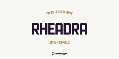 Rheadra - A Display Font : Rheadra is a carefully crafted display font. It has Extended Latin and Cyrillic characters. It created for poster, web, brand and social media designs. It supports 91 Languages: Belarusian, Russian, Afrikaans, Albanian, Asu, Basque, Bemba, Bena, Breton, Catalan, Chiga, Colognian, Cornish, Croatian, Czech, Danish, Dutch, Embu, English, Esperanto, Estonian, Faroese, Filipino, Finnish, French, Friulian, Galician, German, Gusii, Hungarian, Indonesian, Irish, Italian, Kabuverdianu, Kalenjin, Kamba, Kikuyu, Kinyarwanda, Latvian, Lithuanian, Lower Sorbian, Luo, Luxembourgish, Luyia, Machame, Makhuwa-Meetto, Makonde, Malagasy, Maltese, Manx, Meru, Morisyen, North Ndebele, Norwegian Bokmål, Norwegian Nynorsk, Nyankole, Oromo, Polish, Portuguese, Quechua, Romanian, Romansh, Rombo, Rundi, Rwa, Samburu, Sango, Sangu, Scottish Gaelic, Sena, Serbian, Shambala, Shona, Slovak, Soga, Somali, Spanish, Swahili, Swedish, Swiss German, Taita, Teso, Turkish, Upper Sorbian, Uzbek (Latin), Volapük, Vunjo, Walser, Welsh, Western Frisian, Zulu
 - Vintagepix by Umka Type,
$15.00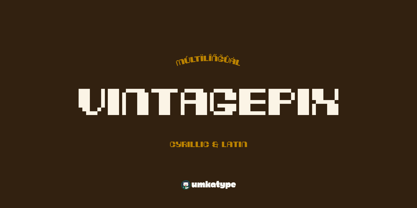 Vintagepix - A Display Font : Vintagepix is a carefully crafted display font. It has Extended Latin and Cyrillic characters. It created for poster, web, brand and social media designs. It supports 91 Languages: Belarusian, Russian, Afrikaans, Albanian, Asu, Basque, Bemba, Bena, Breton, Catalan, Chiga, Colognian, Cornish, Croatian, Czech, Danish, Dutch, Embu, English, Esperanto, Estonian, Faroese, Filipino, Finnish, French, Friulian, Galician, German, Gusii, Hungarian, Indonesian, Irish, Italian, Kabuverdianu, Kalenjin, Kamba, Kikuyu, Kinyarwanda, Latvian, Lithuanian, Lower Sorbian, Luo, Luxembourgish, Luyia, Machame, Makhuwa-Meetto, Makonde, Malagasy, Maltese, Manx, Meru, Morisyen, North Ndebele, Norwegian Bokmål, Norwegian Nynorsk, Nyankole, Oromo, Polish, Portuguese, Quechua, Romanian, Romansh, Rombo, Rundi, Rwa, Samburu, Sango, Sangu, Scottish Gaelic, Sena, Serbian, Shambala, Shona, Slovak, Soga, Somali, Spanish, Swahili, Swedish, Swiss German, Taita, Teso, Turkish, Upper Sorbian, Uzbek (Latin), Volapük, Vunjo, Walser, Welsh, Western Frisian, Zulu
 - Brushpen by Umka Type,
$19.00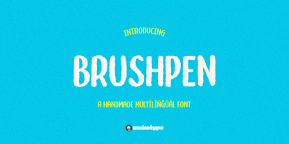 Brushpen - A Handmade Multilingual Font : Brushpen is a carefully crafted display font. It has Extended Latin and Cyrillic characters. It created for poster, web, brand and social media designs. It supports 91 Languages: Belarusian, Russian, Afrikaans, Albanian, Asu, Basque, Bemba, Bena, Breton, Catalan, Chiga, Colognian, Cornish, Croatian, Czech, Danish, Dutch, Embu, English, Esperanto, Estonian, Faroese, Filipino, Finnish, French, Friulian, Galician, German, Gusii, Hungarian, Indonesian, Irish, Italian, Kabuverdianu, Kalenjin, Kamba, Kikuyu, Kinyarwanda, Latvian, Lithuanian, Lower Sorbian, Luo, Luxembourgish, Luyia, Machame, Makhuwa-Meetto, Makonde, Malagasy, Maltese, Manx, Meru, Morisyen, North Ndebele, Norwegian Bokmål, Norwegian Nynorsk, Nyankole, Oromo, Polish, Portuguese, Quechua, Romanian, Romansh, Rombo, Rundi, Rwa, Samburu, Sango, Sangu, Scottish Gaelic, Sena, Serbian, Shambala, Shona, Slovak, Soga, Somali, Spanish, Swahili, Swedish, Swiss German, Taita, Teso, Turkish, Upper Sorbian, Uzbek (Latin), Volapük, Vunjo, Walser, Welsh, Western Frisian, Zulu
 - Daft Script by Hanoded,
$15.00 I really like creating script fonts. Why, I hear you say? Well, creating script fonts lets me be me. I am not trying to create classy, connected fonts for you to write love letters with: there are already too many of those available and quite frankly, I just don't like them. I prefer the messy script fonts - uneven, no real baseline and with a bit of splatter or rough edges for good measure. Daft script is one of these messy script fonts: it was handmade and it comes with two alternates for the lower case glyphs that cycle as you type. This is an all-caps font, so that means you have 4 options per letter! I also love languages (I speak 6), so Daft Script comes with fantastic language support, including Vietnamese and Sami.
 - Attention Christmas by Arendxstudio,
$18.00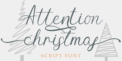 Attention Christmas - Script Font is a font with distinctive handwritten characters perfect for branding projects, logos, wedding designs, media posts, advertisements, product packaging, product designs, labels, photography, watermarks, invitations, stationery, and any project who need handwritten dishes. Features : • Character Set A-Z • Numerals & Punctuations (OpenType Standard) • Accents (Multilingual characters) • Ligature • Alternate Multilingual Support : Afrikaans, Albanian, Asu, Basque, Bemba, Bena, Catalan, Chiga, Cornish, Danish, English, Estonian, Faroese, Filipino, Finnish, French, Friulian, Galician, German, Gusii, Icelandic, Indonesian, Irish, Italian, Kabuverdianu, Kalenjin, Kinyarwanda, Low German, Luo, Luxembourgish, Luyia, Machame, Makhuwa-Meetto, Makonde, Malagasy, Malay, Manx, Morisyen, North Ndebele, Norwegian Bokmål, Norwegian Nynorsk, Nyankole, Oromo, Portuguese, Romansh, Rombo, Rundi, Rwa, Samburu, Sango, Sangu, Scottish Gaelic, Sena, Shambala, Shona, Soga, Somali, Spanish, Swahili, Swedish, Swiss German, Taita, Teso, Vunjo, Zulu There it is! I really hope you enjoy it !!
 - Eterea by Corradine Fonts,
$60.00 Eterea is a formal font inspired in the monumental inscriptions of classic Rome, but not strictly sticking to the ancient roman typographic characteristics. Its unique look is the result of mixing diverse typographic styles, but mostly having traces from the 16th century transitional style. It bears a big difference of proportion between upper and lower case, additionally to the upper case having much more ornamental traces. Eterea has four different flavors of capitals which change very slightly in the cursive versions. In the italic versions, the lower case (actually small capitals) changes substantially its characters to make its reading more flowing and is not simply an inclined version of the letters. Eterea is a very expressive font, ideal for titles and short texts of sober and elegant appearance.
 - Juvenilia by Umka Type,
$19.00 Juvenilia - A Display Font : Juvenilia is a carefully crafted display font. It has Extended Latin and Cyrillic characters. It created for poster, web, brand and social media designs. It supports 91 Languages: Belarusian, Russian, Afrikaans, Albanian, Asu, Basque, Bemba, Bena, Breton, Catalan, Chiga, Colognian, Cornish, Croatian, Czech, Danish, Dutch, Embu, English, Esperanto, Estonian, Faroese, Filipino, Finnish, French, Friulian, Galician, German, Gusii, Hungarian, Indonesian, Irish, Italian, Kabuverdianu, Kalenjin, Kamba, Kikuyu, Kinyarwanda, Latvian, Lithuanian, Lower Sorbian, Luo, Luxembourgish, Luyia, Machame, Makhuwa-Meetto, Makonde, Malagasy, Maltese, Manx, Meru, Morisyen, North Ndebele, Norwegian Bokmål, Norwegian Nynorsk, Nyankole, Oromo, Polish, Portuguese, Quechua, Romanian, Romansh, Rombo, Rundi, Rwa, Samburu, Sango, Sangu, Scottish Gaelic, Sena, Serbian, Shambala, Shona, Slovak, Soga, Somali, Spanish, Swahili, Swedish, Swiss German, Taita, Teso, Turkish, Upper Sorbian, Uzbek (Latin), Volapük, Vunjo, Walser, Welsh, Western Frisian, Zulu