7,844 search results
(0.024 seconds)
- Biro Script Plus by Ingo,
$50.00 An authentic script from the tip of the ball point pen. This hasn’t been seen yet: A typeface which truly looks as if it were handwritten. Calligraphy is, actually, the art of fine writing. And actually, written scripts as typeface for the computer are 100% nonsense. And yet, an obvious thought: Create a typeface which truly derives from everyday handwriting. And since we, if we write at all, utilize practically only a ball point pen anymore, then a modern cursive writing form must look like just that. As a counterpart to the artistic ”handwritings“ which have long been available as typeface, the thought of digitalizing a truly ”ugly“ handwriting is appealing. After all, time and again there is the need for a text to look ”handwritten“. Biró Script is written freehand with a ball point pen. Finally a truly individual script! Biró Script includes more than 300 authentic ligatures in addition to the customary alphabet. By the way, the most convincing effect is obtained with a font size of about 18 to 22 points, at which the thickness of the stroke is now about the same as that of a real ball point pen. There's a difference between the anglo-american forms of some characters (esp. the numerals 1 and 7, but also capitals I and F) and how it's written in the rest of the world. For those of us who aren’t used to the world-wide usual forms, Biró Script includes a US version with the appropriate characters.
 - Alfie by Monotype,
$29.99 Alfie™ is lively, friendly, inviting and easy on the eyes. What more could you want in a script? How about four flavors of the same design? Alfie Script is a delightful connecting script with a touch of comfortable elegance. Use it for everything from social announcements to headlines and packaging. Alfie Casual is a little more laid-back with letters standing on their own. It works great in short blocks of text copy, subheads and navigational links. Alfie Informal has spirited serifs and its own demeanor, while Alfie Small Caps does a fine job of supporting its other siblings. There’s an immediacy to words and messages set in these lighthearted confections. Jim Ford was practicing drawing with a new brush pen when the inspiration for Alfie came to him. He had filled several pages in a notebook with letters and, at one point, realized that there might be a typeface among them. As it turned out, there were four. The process, however, wasn’t choosing one design and modifying it. The makings of all the designs were on the pages. It was just a matter of culling out the right collection of characters to build the foundations for the four flavors of Alfie. Because they share the same family roots, each design in the Alfie family can be paired and intermixed. Ford admits that there’s a hint of Emil Klumpp’s 1950s Murray Hill typeface (https://www.myfonts.com/fonts/bitstream/murray-hill/) in the Alfie family. Just enough to give the design a 50s vibe. (Some fashions never go out of style.)
 - FF DIN Slab Variable by FontFont,
$419.99 FF DIN: the famous, faithful and first revival of DIN 1451. FF DIN originates in the lettering models from the German standard DIN 1451, and is considered the perfect standard typeface due to methodical and engineered design. FF DIN Slab is a robust compliment to the FF DIN family. Designed by Antonia Cornelius and Albert-Jan Pool, it offer designers tools to create greater rhythm and design depth. FF DIN Slab’s proportions have been meticulously aligned with its Sans origins, offering the perfect balance between positive and negative space. The serifs are assertive, sturdy and balanced, they are engineered to emphasis a strong horizontal flow through text, a grounded utility and assurance in headlines. The result of this attention to detail is a typeface that harmonizes beautifully with other FF DIN styles. Pushing font technology to its limits, FF DIN Slab is also available as a Variable font. Allowing creatives to design hyper specific variations which thrive in any design space, and even seamlessly animate movement from one state to the next. FF DIN Slab distinctively carries on its parent’s DNA, speaks the same native language — but with a strong peculiar dialect. It expands the DIN family worthily — independent but integrated — and opens totally new possibilities of uses with the whole DIN family.
 - Mon Nicolette by Sudtipos,
$49.00 This is a digital revival by Cristóbal Henestrosa based on an experimental typeface named Charter, designed – yet never fully accomplished – by the prominent William Addison Dwiggins. It is an upright italic, unconnected script typeface, whose main features are a pronounced contrast, condensed forms and exaggerated ascenders. While Dwiggins worked on this project from 1937 to 1955, he only completed the lowercase and a few other characters. However, it was used to set a specimen in 1942 and a short novel in 1946. The sources that Cristóbal used for Mon Nicolette were the original sketches by WAD as well as printing trails kept at the Boston Public Library, and a copy of the 1946 edition of The Song-Story of Aucassin and Nicolette. This gorgeous typeface can be used successfully in headlines, subheads and short passages of text from 12 points onwards, in applications such as fashion magazines, soft news, advertising, poetry, albums, and book covers. This project started ten years ago, while Cristóbal was studying the Type@Cooper Extended Program at New York City. A previous version was selected to be part of the Biennial Tipos Latinos 2018, and now Mon Nicolette is finally ready for commercial distribution with Sudtipos… and we are very proud of it! Festina lente.
 - Bordonaro Spur by Estudio Calderon,
$35.00 Bordonaro Spur - Bordonaro Script’s partner - is a typography strongly influenced by old beer labels and includes some serifs based on Frederic W. Goudy’s Copperplate, but with some softened spurs adding an elegant and soft texture to the text. It is ideal to be used on large bodies and has a set of special ligatures ideal to be used in branding. Psss...Check out the NEW Bordonaro Spur with Rounded corners , same version but soft! FEATURES Co = company1 Co = company2 Estd = established Inc = incorporated Ltd = limited Mc = mac Rd = Road St = street And also from Adobe CC you can activate Style Sets (SS) and get ideal ligatures for ordinal numbers: 1st = st 2nd = nd 3rd = rd 4th = th Bordonaro Script and Bordonaro Spur are two typographic styles that were designed under the same characteristic features with the idea of combining them to obtain better results, for that reason, we recommend merging them in a creative way and you will realize everything you can design with them. The banners designs are based on old brands of beer labels, coffee packaging, sports logos and in some cases we use Copperplate Gothic but only as a complementary font in order to harmonize the layout of the elements in each banner.
 - FF DIN Slab by FontFont,
$50.99FF DIN: the famous, faithful and first revival of DIN 1451. FF DIN originates in the lettering models from the German standard DIN 1451, and is considered the perfect standard typeface due to methodical and engineered design. FF DIN Slab is a robust compliment to the FF DIN family. Designed by Antonia Cornelius and Albert-Jan Pool, it offer designers tools to create greater rhythm and design depth. FF DIN Slab’s proportions have been meticulously aligned with its Sans origins, offering the perfect balance between positive and negative space. The serifs are assertive, sturdy and balanced, they are engineered to emphasis a strong horizontal flow through text, a grounded utility and assurance in headlines. The result of this attention to detail is a typeface that harmonizes beautifully with other FF DIN styles. Pushing font technology to its limits, FF DIN Slab is also available as a Variable font. Allowing creatives to design hyper specific variations which thrive in any design space, and even seamlessly animate movement from one state to the next. FF DIN Slab distinctively carries on its parent’s DNA, speaks the same native language — but with a strong peculiar dialect. It expands the DIN family worthily — independent but integrated — and opens totally new possibilities of uses with the whole DIN family. - Neacademia by Rosetta,
$70.00 Neacademia is a Latin and Cyrillic type family inspired by the types cut by 15th century punchcutter Francesco Griffo for Venetian printer Aldus Manutius. Beyond the letterforms themselves, however, the digital fonts themselves are based on the techniques and methods Griffo employed. The family comprises four distinct variants optimised for specific point sizes, as was traditional in metal type. While the display sizes maintain a visual link to calligraphic roots, text sizes exhibit more typographic qualities, following the hand of the carver. Likewise, Neacademia maintains its even colour on the page by carefully employing alternative letterforms, rather than leaning on a multitude of kerning pairs. A geeky little detail you’ll likely need to point out with a magnifying glass to your type friends, but creating a neat texture that works in readers favour nonetheless. Neacademia’s historically sensitive eye is put to work for modern typographers’ needs. It incorporates Griffo’s italic capitals and harmonizes them with the lowercase and the romans — where the original Aldine italics had no capitals of their own and simply re-used the uprights. It was designed with specific allowances for letterpress photopolymer printing. Printed digitally, it can tolerate – and even benefit from – low resolution, rough paper, and low-grade presswork. In many ways, it feels like using metal type again!
 - Strawberry Swirl by Krafted,
$10.00 Imagine a world filled with swirls of strawberry, pops of pink, and pure joy to go around for everyone... Are you trying to make an elegant, sweet, and stylish statement with your invitations, social media, website, or printed materials? Then grab some cotton candy, crack a smile, and get ready for a swirly day of wonders! Introducing Strawberry Swirl - A Modern Script Font. This gorgeous & stylish font can be used for a host of different content needs and projects. Use it for your headings, logos, business cards, printed quotes, invitations (wedding, birthday, engagement, etc.), packaging, resumes, and even your website or social media branding. Enchant & delight your audience, clients, or guests with this versatile, stylish, and elegant font. What you’ll get: - Multilingual & Ligature Support - Full sets of Punctuation and Numerals Compatible with: - Adobe Suite - Microsoft Office - KeyNote - Pages Software Requirements: The fonts that you’ll receive in the pack are widely supported by most software. In order to get the full functionality of the selection of standard ligatures (custom created letters) in the script font, any software that can read OpenType fonts will work. We hope you enjoy this font and that it makes your branding sparkle! Feel free to reach out to us if you’d like more information or if you have any concerns.
 - Crucifix by Canada Type,
$39.95In June of 2004, Canada Type released Crucifix, a condensed three-tiers typeface that tried to bridge the gap between traditional blackletter forms and the traditional European gothics. The main goal of Crucifix was to have as many as 4 different variations on each letter form, so the original release consisted of three fonts: a main font with a standard character set, a small caps set, and a unicase variation. Now Canada Type presents the next generation of this typeface: Crucifix 2.0 and Crucifix Pro. This new version takes advantage of both Unicode and OpenType technologies to make Crucifix as versatile as ever. The PostScript Type 1 and the True Type version boast extended Latin character set support, including Western, Eastern and Central European, Turkish and Baltic, as well as two non-Latin scripts: Cryillic and Greek. The OpenType version, Crucifix Pro, goes even further by including all of above in one font, along with proper automation to accommodate on-the-fly ligatures, small caps, numerators, denominators, some fractions and a ton of stylistic and contextual alternates - all programmed to work with the latest OpenType-enabled programs. Unique, stark, and with more than 900 characters, Crucifix has that clinical sharpness and special dramatic wonder to make it perfect for mystery, gothic, and horror design settings. - Zombik by Alit Design,
$14.00 Presenting the 🎃 The Zombik Typeface 🦇 by alitdesign. The Zombik typeface is designed for the needs of design concepts themed about Halloween and events in October and November. The Zombik font has a horror character with a character shaped like dripping blood, making the horo or Halloween themed design concept even better and unique. The Zombik font also gets a bonus character of 150 Halloween-themed illustrations that make creating designs even easier. Simply by downloading The Zombik font, creating a Halloween themed design is very quick and easy. The Zombik Typeface is perfect for magazine cover designs, brochures, flyers. Instagram ads, Canva Design and so on with halloween and dark concepts. besides that this font is very easy to use both in design and non-design programs because everything changes and glyphs are supported by Unicode (PUA). The Zombik Typeface contains 473 + 150 bonus glyphs with many unique and interesting alternative options. Language Support : Latin, Basic, Western European, Central European, South European,Vietnamese. In order to use the beautiful swashes, you need a program that supports OpenType features such as Adobe Illustrator CS, Adobe Photoshop CC, Adobe Indesign and Corel Draw. but if your software doesn't have Glyphs panel, you can install additional swashes font files.
 - Nortnoh by Alit Design,
$21.00 Introducing the "Northnoh Metal Modern Typeface" – where the raw power of brutalism meets the modern edge of dead metal aesthetics. Unleash the untamed spirit of your designs with this bold and brave font that boasts a prickly character, exuding strength and attitude. Designed for those who dare to be different, this typeface is a true representation of fearless creativity. With 862 meticulously crafted glyphs, the "Northnoh Metal Modern Typeface" ensures a comprehensive arsenal for your typographic adventures. Explore a world of possibilities with included ligatures and alternatives, allowing you to customize and enhance your text with a touch of unique flair. The font's distinctive personality is perfect for projects that demand an unconventional and daring approach. Whether you're working on album covers, posters, branding, or any other design where a fierce statement is required, the "Northnoh Metal Modern Typeface" rises to the occasion. Embrace the rebellious spirit of dead metal while enjoying the ease of use and versatility this typeface offers. Its multilingual support broadens the horizons of your creativity, making it a global tool for expression. Unleash the brutal beauty of "Northnoh Metal Modern Typeface" and let your designs scream with individuality. Elevate your projects to new heights with a font that challenges the norm and breaks free from the conventional boundaries of typography.
 - Rankday by Alit Design,
$14.00 Presenting the 🎃 Rankday Typeface 🦇 by alitdesign. Rankday typeface is designed for the needs of design concepts themed about Halloween and events in October and November. The Rankday font has a horror character with a character shaped like dripping blood, making the horor Halloween themed design concept even better and unique. The Rankday font also gets a bonus character of 150 Halloween-themed illustrations that make creating designs even easier. Simply by downloading the Rankday font, creating a Halloween themed design is very quick and easy. The Rankday Typeface is perfect for magazine cover designs, brochures, flyers. Instagram ads, Canva Design and so on with halloween and dark concepts. besides that this font is very easy to use both in design and non-design programs because everything changes and glyphs are supported by Unicode (PUA). The Rankday Typeface contains 607 + 150 bonus glyphs with many unique and interesting alternative options. Language Support : Latin, Basic, Western European, Central European, South European,Vietnamese. In order to use the beautiful swashes, you need a program that supports OpenType features such as Adobe Illustrator CS, Adobe Photoshop CC, Adobe Indesign and Corel Draw. but if your software doesn't have Glyphs panel, you can install additional swashes font files.
 - The crots by Alit Design,
$15.00 Presenting the 🎃 The Crots Typeface 🦇 by alitdesign. The Crots typeface is designed for the needs of design concepts themed about Halloween and events in October and November. The Crots font has a horror character with a character shaped like dripping blood, making the horo or Halloween themed design concept even better and unique. The Crots font also gets a bonus character of 150 Halloween-themed illustrations that make creating designs even easier. Simply by downloading The Crots font, creating a Halloween themed design is very quick and easy. The Crots Typeface is perfect for magazine cover designs, brochures, flyers. Instagram ads, Canva Design and so on with halloween and dark concepts. besides that this font is very easy to use both in design and non-design programs because everything changes and glyphs are supported by Unicode (PUA). The Crots Typeface contains 557 + 150 bonus glyphs with many unique and interesting alternative options. Language Support : Latin, Basic, Western European, Central European, South European,Vietnamese. In order to use the beautiful swashes, you need a program that supports OpenType features such as Adobe Illustrator CS, Adobe Photoshop CC, Adobe Indesign and Corel Draw. but if your software doesn't have Glyphs panel, you can install additional swashes font files.
 - Paradise Point by Swell Type,
$20.00 Surf's up! Take an unforgettable adventure to the sparkling shores of Paradise Point. Ride our 25 majestic weights, from tranquil tall & thin to thunderous wide & heavy. Expand your horizons with the versatile Variable font to select any spot between. One-of-a-kind activities: Drop in a thrilling Inline weight for stylistic flair. Overlay with the matching Heavy for striking color effects. Discover hidden wonders! Stylistic Alternates will take you to the scenic heights of uppercase in a friendly lowercase style. Or immerse your text in interlocking Discretionary Ligatures for an authentic Tiki Type island experience. Enchanting views: Two versions of each letter and number automatically rotate for a natural, hand-drawn appearance. The Light weights have round ends to simulate a single pen stroke, which matches the center of the Inline weights for a perfect pairing. Explore! If you venture into unknown territory, each weight of Paradise Point contains 775 glyphs for stress-free support of over 200 languages. An all-inclusive getaway: Each weight of Paradise Point includes the features above, and can set readable body text as well as create striking logos and headlines. Use it for restaurant menus, surf and skate brands, or any design project where you want to convey lively, friendly, stress-free fun.
 - GAMECUBEN - Unknown license

- MB TyranT - Personal use only

- DIN Next Slab by Monotype,
$56.99 Now even more design possibilities with the popular DIN Next. With its technical and neutral character, DIN Next has earned a permanent place in contemporary typography. Now, DIN Next Slab expands the font family further, offering new design potential. Now comes the next step, DIN Next Slab, also produced under the direction of Akira Kobayashi. On a team with Sandra Winter and Tom Grace, Kobayashi is creating the new font variant based on the optimized shapes of DIN Next. The expansion will make the popular font all the more flexible and versatile. Apart from that, the geometric slab serifs underline the technical and formal nature of the font and emphasize a central design element of DIN Next. However, the team did have some challenges to overcome. While it is relatively easy to imagine DIN Next Light with slab serifs, the amount of available space quickly disappears when it comes to the Black styles. Winter explains that many tests and trials were necessary to find a compromise between space, letters and the serif shapes. Experiments with modified contrast in the weight or only one-sided serifs were quickly abandoned. The central, technical and powerful character of the font changed too much. Nevertheless, it was necessary to simplify slightly the shape of some letters, such as the ‘k’ or ‘x’, for example. These changes, first developed in the Black styles, were applied to all weights in order to lend the font a consistent appearance. Like DIN Next, DIN Next Slab also has seven weights, which cover the range from Ultralight to Black, each with matching italic. There are various character sets in all of the styles and the four middle weights have small capitals available. DIN Next Slab harmonizes perfectly with the styles of DIN Next: the basic letterforms and weights are identical. Both versions of the font can work together perfectly, not just in headlines and body text, but also within a text; they complement each other very well as design variations. With the new DIN Next Slab, Monotype expands the DIN Next super family consistently. With DIN Next Slab, you can underscore the technical and formal nature of the understated font not only in headlines, but in texts, as well. In this way, you have new and diverse potential for application, thanks to the way the different styles of DIN Next combine perfectly.
 - Dry Cowboy by Chank,
$99.00 Yee haw! Send me a shot of sarsparilla and let's celebrate a new cowboy font! This time we're pleased to introduce a new, more legible counterpart to Chank's Drunk Cowboy font. The resultant new font has a bit less of a drawl to it and is known as Dry Cowboy. Now you have a choice for smaller text setting when using Drunk Cowboy as the headline font. Wrangle the two together and put a little giddyup in your designs.
 - Chaviera Pro by Handpik,
$10.00 Hello, this time we would like to introduce a new product. namely "Chaviera pro ", a Sans-serif display font that has a classic, feminine, and elegant style wrapped with a beautiful Alternate stylist. The Chaviera font is perfect for various projects like logos & branding, invitations, stationery, wedding designs, social media posts, advertisements, printed quotes, product packaging, product designs, labels, photography, watermarks, special events or anything else. Feature Uppercase Lowercase Numeral Functional Ligature Stylistic Multilingual INCLUDE WITH 6 VARIATION WEIGHT
 - Megapolis by Artisticandunique,
$9.00 Megapolis - Sans Serif Font Family - Multilingual support - 16 Styles With its elegant and clean structure with 16 styles and multilingual supports, you can easily use the sans serif font feature in many areas. From body text to big headlines, from classic to modern and bold styles, you can develop your projects. Ideal for books and magazines, magazine covers, editorials, headlines, websites, logos, branding, advertising and more. You can create your unique designs with this font. Have a good time.
 - Retroovy Vibes by IbraCreative,
$17.00 Retroovy Vibes is a playful and groovy font that encapsulates the spirit of fun and nostalgia. Inspired by the retro era, this font oozes a sense of carefree charm and vibrant energy. Retroovy Vibes is the perfect choice for projects that aim to evoke a sense of lightheartedness and a vintage vibe. Its bouncy and whimsical appearance makes it ideal for posters, album covers, and party invitations, injecting a dose of retro coolness to any design.
 - Moire by Microsoft Corporation,
$39.00Moire™ Regular is a block-style sans serif font designed by Jim Ford in the spirit of typefaces popular during the 1950's. The Moire Regular font is slightly more streamlined for a more contemporary voice than its predecessors. Moire Regular is useful for all modern display settings in signs, publications, reports and presentations. The Moire Regular font will also reproduce well in on-screen uses from User Interfaces to web graphics. Character set: Latin 1. - Retro Packaging JNL by Jeff Levine,
$29.00 A vintage rubber stamp alphabet and star printing set had a package header with Art Deco-inspired lettering describing the product. Sold by a company called Elvin [circa late 50's-early 1960s], these Japanese-made sets were one of many distributed by independent toy importers and made in various configurations including [at times] tiny animal stamps. The type design on this particular item was the model for Retro Packaging JNL, available in both regular and oblique versions.
 - Antikka by Okaycat,
$9.50Antikka draws some inspiration from the style of the Art Deco movement of the 1920s and 30s. The vision behind making Antikka was to revitalize the style of this bygone era -- making it funky and relevant to our 21st century times. Antikka is a minimal font, clear and geometric, yet highly stylized. Comfortable in a business setting - or just about anywhere. Antikka arrives as the business casual of fonts - giving it a wide range of use. - Metropolia by Samuelstype,
$24.00 Say hello to Metropolia! Drawing up the first roughs of this design I was aiming for a slightly asymmetrical feel. I later realized that this gave it a strong art deco influence. A slight tilt brings it a forward movement and a distinct flavour. Designed primarily for headline use, this is not your workhorse font but rather a playful and versatile addition to your font toolbox. A set of alternate capitals will be handy for headline or logo ornaments.
 - Clintone by Jinan Studio,
$12.00 Hello World, Introducing, Clintone! a display font with 2 style (textured & solid) suitable for your design project needs, such as; logotype, branding, packaging, social media posts, quotes, overlays on images, tagline logos, posters, print needs, website banners, and more. Features A set of uppercase and lowercase glyphs Number, symbol, and punctuation Multilingual Support Alternates Thank you a million times for downloading and using this font for your projects. Enjoy this font and happy creating! Jinan Studio
 - Exterminate by Comicraft,
$19.00 THIS FONT IS ONLY THE BEGINNING... WE WILL PREPARE MORE. WE WILL GROW STRONGER. WHEN THE TIME IS RIGHT EXTERMINATE WILL EMERGE AND TAKE ITS RIGHTFUL PLACE AS THE SUPREME FONT IN THE UNIVERSE! This ragged & worn font is great for titles, sound effects, and the speech of certain genetically engineered universe-conquering sci-fi supervillains. Remastered Exterminate includes Western & Central European language support, automatic alternates, stylistic alternates & Crossbar I Technology™, improved spacing & kerning, and a Color Font
 - Retro Thunders by Lettersiro,
$25.00 This is our newest product, inspired by retro style. We call this font "Retro Thunders". Retro Thunders is perfect for any retro project, poster, logo, label, clothing, music album cover, and many others. Comes with solid and extrude style, you can use this font easily, and make save a lot of your time in creating. Retro Thunders also contains: - Opentype Features : swash, ligatures, stylistic alternate, ss01, ss02 , ss03 - 8 end swashes - Basic Latin Language Support (AÀÁÂÃÄÅCÇDÐEÈÉÊËIÌÍÎÏNÑOØÒÓÔÕÖUÙÜÚÛWYÝŸÆßÞþ )
 - Basic Choice by PizzaDude.dk,
$14.00 I don't know what is it with me and bad copy machines these days...my previous font also had that look, like it was made using a poor copy machine! :) Basic Choice comes in a regular, solid and distressed version - use these versions as they are, or play around and use them as layers. Each letter has 6 different versions, and they automatically cycle as you type. It makes the text look scrambled and random at the same time!
 - Castella by Maulana Creative,
$14.00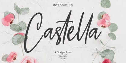 Castella is simply casual script font, with light felt-tip stroke, slant and fun character. It has Opentype features ligatures of character, To give you an extra creative work. Castella script font support multilingual more than 100+ language. This font is good for logo design, Social media, Movie Titles, Books Titles, a short text even a long text letter and good for your secondary text font with sans or serif. Make a stunning work with Castella font. Cheers, MaulanaCreative
 - Modesto by Parkinson,
$25.00 Modesto is a loose-knit family based on a signpainters lettering style popular in the late-19th and early-20th centuries. It evolved from the lettering I used for the Ringling Bros. and Barnum & Bailey Circus Logo. The Modesto family was not planned. It just happened, a few fonts at a time over about fifteen years. In 2014 four new Italic fonts were added. There is a downloadable MODESTO USER MANUAL PDF in the Gallery section for this family.
 - Sunsetstill by Maulana Creative,
$16.00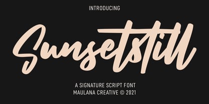 Sunsetstill is a casual signature script font. With bold felt-tip stroke, slanted and fun character with a bit of ligatures. To give you an extra creative work. Sunsetstill font support multilingual more than 100+ language. This font is good for logo design, Social media, Movie Titles, Books Titles, a short text even a long text letter and good for your secondary text font with sans or serif. Make a stunning work with Sunsetstill font. Cheers, MaulanaCreative
 - Zoltana by Typogama,
$19.00 Zoltana is a lively decorative typeface family designed for elaborate titling or text layouts, with an elaborate form and filled with delicate details, this font aims to grab attention and fill the viewer with a sense of wonder. Thanks to an extensive glyph palette, this single typeface offers a range of letterforms through alternate letters, small capitals, ligatures or swash letters and includes a selection of typographic fleurons that can be used in the layouts or individually.
 - 2010 Dance Of Death by GLC,
$30.00 This font was inspired from the medieval Dances of Death patterns, as a modest tribute to the famous engraver Hans Holbein's Alphabet of Death. We have tried to keep the spirit of the time -- its sarcastic humor mixed with its objective and frozen realism. The font, consisting in two complete capital alphabets: Initials and caps, and a lot of separate figures added, is especially improved by strong enlargements, 72 pts and more, and has very good results when printed.
 - Anthem Park by Maulana Creative,
$14.00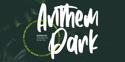 Anthem Park is a handwritten script font. With medium felt tip stroke, Condensed and fun character with a bit of ligatures. To give you an extra creative work. Anthem Park font support multilingual more than 100+ language. This font is good for logo design, Social media, Movie Titles, Books Titles, a short text even a long text letter and good for your secondary text font with sans or serif. Make a stunning work with Anthem Park font. Cheers, MaulanaCreative
 - Mustardmoster by Maulana Creative,
$14.00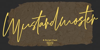 Mustardmoster is a casual script font, with light felt-tip stroke, slant and fun character. It has Opentype features ligatures of character, To give you an extra creative work. Mustardmoster script font support multilingual more than 100+ language. This font is good for logo design, Social media, Movie Titles, Books Titles, a short text even a long text letter and good for your secondary text font with sans or serif. Make a stunning work with Mustardmoster font. Cheers, MaulanaCreative
 - La Jefa by Lauren Ashpole,
$15.00 A short font for short people* La Jefa is very, very loosely based on a Christmas card I received years ago from my boss at the time. Designed to capture that personalized touch, it's a hand lettered font with a short x-height and ample spacing. Although all of the letters are lowercase, the uppercase provides a unique set of characters that can be mixed in for a more natural handwritten feel. *also people of tall or average height
 - Litore by Enfeeltype,
$22.00 This font represents the wonders of the sea, with an engraved design that brings waves to mind when reading. Litore is a clean and elegant font with clear strokes and a modern style. Life is just one big journey, and the path you choose has a great impact on your future and overall happiness. So if you're looking for inspiration on what represents beauty in life and love, Litore is the perfect font to spend some time with.
 - Afterword JNL by Jeff Levine,
$29.00 At the end of the 1931 gangster film “The Public Enemy” a hand lettered card offers up an afterword on the demise of Tom Powers (James Cagney’s character in the film) and how a “public enemy” is neither a man nor a character but a problem society must deal with. The text is in an Art-Deco influenced sans serif, and has been digitally recreated as Afterword JNL, which is available in both regular and oblique versions.
 - ZsaZsa Galore by Chank,
$39.95Chank created Zsazsa Galore as a fresh alternative to Mister Frisky, another jerky, hypercaffeinated interpretation of the traditional roman alphabet. The difference this time is that the new font has no descenders. Every letter comes to rest hard on the baseline. It sits there firmly rooted with branches wiggling around in the air. It was released as the Chank Font of the Month in October 1999 and it was named after Zsa Zsa Gabor because she is beautiful.

