10,000 search results
(0.044 seconds)
- Blog Cube by Say Studio,
$17.00 Blog Cube - Display Typeface Blog Cube is a bold and strong display typeface from rectangle shape that is perfect for your work such as posters, logos, branding, covers, banners, t-shirts and headers, or even large-scale artwork. Creative & Decorative Typography Web Design, Try this font on any surface it will look Stunning!. happy creating. hope you like it! well, Blog Cube also has an Outline style, is a strong and bold typeface, it has multilingual language, it is useful for your coolest and coolest project up next. Thanks, Have a wonderful day Say Studio
 - Amster by PampaType,
$60.00 Amster is an energetic & refined type created by Francisco Gálvez, with a sharp idea on how elegance & legibility can meet harmoniously. Amster can build a text that is highly readable as well as friendly. It has five weights of roman & cursive both with smallcaps and fully-equipped with all OT sorts and even a wonderful set of illuminated initials. Amster is a very versatile typeface, allowing for a wide range of uses: screen to print, small text to display, science to poetry. Amster speaks more than 200 languages.
 - Starting Color by Sensatype Studio,
$15.00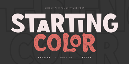 Starting Color is A Modern Playful and Unique Ligature Font. This font specially crafted for your design projects such as urban poster, unique design, modern for t-shirt designs, product packaging, merchandise, and so many more with easy to use but unique results are so playful. Enjoy to Design any your needs with unique, urban, and playful feel. What will you get: Starting Color Font (Regular, Outline, Rough) All Characters (from A to Z) Numbers and Punctuation Works on PC & Mac Simple installations PUA Encoded Thanks and have a wonderful day. :)
 - Mochaik by Say Studio,
$15.00 Mochaik - Psychedelic Display Font Here's a lettering style that just might be exactly on your wavelength. Add just the right dose of vintage freak-a-delia to your retro graphics with this original psychedelic-style design. Great for music posters, album graphics, book titles, etc. Evoke a warpy, wavy, whimsical vibe that harks back to the carefree 1960s or early 1970s era with Sixties Flashback; it's pure hippie, trippy fun! Whats Includes : - Mochaik Regular, Outline, Italic - Multilingual Support If you want any Question, let me know Have a wonderful Day, Saystudio
 - Vintage Heirloom by PeachCreme,
$23.00 Introducing our new gorgeous calligraphy font, Vintage Heirloom! A beautiful script for those who wish to enhance their designs with elegance and style. Vintage Heirloom includes a full set of uppercase and lowercase regular letters, numerals, punctuation, and 52 ligatures. There are three different swashes for each lowercase letter so you can easily give your designs a natural, yet sophisticated, hand-calligraphy look. Vintage Heirloom is a wonderful choice for wedding invitations, save-the-date cards, feminine branding, upscale packaging, websites, and any other projects requiring a handwritten and luxurious touch.
 - Diary Lituhayu by Gie Studio,
$11.00 Introducing Diary Lituhayu fonts, a handwritten original work of art that you can have for your extraordinary business design needs. Will be a wonderful asset to your font library and perfect for many projects such as logos & branding, stationery, logo designs, social media posts, advertisements, product packaging, product designs, label, watermark, product branding and others. Diary Lituhayu includes Multilingual Options to make your branding globally acceptable. Features: Multilingual Support for 83 Country Stylistic alternates collections Ligature collections PUA Encoded Numeral and Punctuation Thank you for your visit and downloading premium fonts from Gie Studio
 - Frozenflare by Balpirick,
$15.00 FROZENFLARE is a Sweet and Soft Handbrushed Font. It is suitable for svg designs, mug decorations, pottery, shirts, hats, tote bags, card making, wall art, interior prints, and various other creations. Whatever the topic, this font will be a wonderful asset to your font library, as it has the potential to enhance any creation. This font only has all uppercase letters, but if accessed with lowercase letters it will automatically become uppercase. also multilingual support Enjoy the font, feel free to comment or feedback, send me PM or email. Thank you!
 - Ongunkan Archaic Etrusk by Runic World Tamgacı,
$50.00 Etruscan was the language of the Etruscan civilization, in Italy, in the ancient region of Etruria (modern Tuscany, western Umbria, northern Latium, Emilia-Romagna, Veneto, Lombardy and Campania). Etruscan influenced Latin but was eventually completely superseded by it. The Etruscans left around 13,000 inscriptions that have been found so far, only a small minority of which are of significant length; some bilingual inscriptions with texts also in Latin, Greek, or Phoenician; and a few dozen loanwords. Attested from 700 BC to AD 50, the relation of Etruscan to other languages has been a source of long-running speculation and study, with its being referred to at times as an isolate, one of the Tyrsenian languages, and a number of other less well-known theories. The consensus among linguists and Etruscologists is that Etruscan was a Pre–Indo-European,and a Paleo-European language and is closely related to the Raetic language spoken in the Alps, and to the Lemnian language, attested in a few inscriptions on Lemnos. Grammatically, the language is agglutinating, with nouns and verbs showing suffixed inflectional endings and gradation of vowels. Nouns show five cases, singular and plural numbers, with a gender distinction between animate and inanimate in pronouns. Etruscan appears to have had a cross-linguistically common phonological system, with four phonemic vowels and an apparent contrast between aspirated and unaspirated stops. The records of the language suggest that phonetic change took place over time, with the loss and then re-establishment of word-internal vowels, possibly due to the effect of Etruscan's word-initial stress. Etruscan religion influenced that of the Romans, and many of the few surviving Etruscan language artifacts are of votive or religious significance.
 - Atocha by Sudtipos,
$49.00 It was expected that Joluvian’s third type font would be inspired by the city where he currently resides: Madrid, Spain. His previous creations had originated in Venezuela (Zulia) and The Philippines (Salamat), both, places where he had once lived. Joluvian believes “now is the time to pay tribute and show gratitude towards a city that has bestowed me with so many fortunes.” He considers that Madrid’s people, streets, scents, flavor and sounds are gift enough to awaken the creative urgency in any artist. This time around, it is being expressed through the crafts of the Typographic industry. Since his arrival in Spain, Joluvian has been attached to the city’s central area, specifically to the renowned Atocha Street and its railroad station. It was precisely on that street that Joluvian and Mauco Sosa, his friend and partner, decided to establish the Patera Studio: a charming creative space that birthed the concept for this new font which they proudly named Atocha Script. The artists where still in the final phases of their previous script, Salamat, when the idea for Atocha came about. This dynamic is actually very typical of the artistic process, in which every finished product spawns the need to create its next level offspring. “Working on Atocha and Atocha Caps has been a very pleasant journey. We have given our best efforts, for we wanted to offer a typeface that was both versatile and user-friendly on a number of applications, showing a wide scope of alternatives in our glyphs,” says the artist. The illustrations were created by Mauco, to ensure visual integration that would showcase the work of both members of the Patera Studio and their complementing aesthetic voices. Atocha, as Salamat and Zulia before, was digitized by Alejandro Paul.
 - CoffeeBreak by Andinistas,
$36.00 The coffee made typography. CoffeeBreak is a typefamily designed by Carlos Fabian Camargo G. Its purpose is to communicate similar feelings to the ones you get when you first try the best roasted Colombian coffee early in the morning. That is the reason of the waiting, accompanied, or when you only want to be, nuances your design with its fonts full of flavor, texture and passion. For each time, every time, it gives you hints of flavor to design your day. It unleashes your artistic streak mixing possibilities as you wish, to your taste or the taste of your friends or that special someone. From handwriting to every warm drop of your first mug of the morning, we've always got something for you. Eye catching, modern, beautiful, cool and adventurous styles in the CoffeeBrwak shop ready for you to purchase. - CoffeeBreak A & B: 2 typographic tools with countless swashes and ligatures ideal for use at the beginning, in the middle or end of words that need italics, flavored dancers and rhythm masterfully expressed in gestural strokes for his calligraphic experimental logic. - Coffee Break Script 1 & 2: write them you can easily with decorative letters advocating a return to the artisan product ingenuity of the primacy of man over machine so your upper and lower case letters travel in a single line. - CoffeeBreak Words & WordsBold: It contains words specially designed to attract attention. - CoffeeBreak Dingbats: They are figurative silhouettes with textures that add warmth and a highly communicative environment. All are easily activated glyphs using the Glyphs panel in Illustrator, InDesign and Photoshop. Special thanks: Ilustrations: Eduardo Gomes. Photos: Karen Salvatierra. Texts: Javier Lineares- Description: Ernesto Googolplex. French translation: Marta Cano
 - Alfarooq by Eyad Al-Samman,
$20.00 Alfarooq is the most widely known epithet for the Islamic figure Umar ibn al-Khattab (c. 586 - 644) who was a leading companion and an adviser to the Islamic prophet Muhammad (peace be upon him) who later became the second Muslim Caliph after Muhammad’s death (pbuh) in 632. Muslims widely know Umar ibn Al-Khattab (may Allah be pleased with him) as Alfarooq (i.e., he who knows and distinguishes between truth and falsehood). Alfarooq is a unique, wide, and headline Arabic display typeface. The main trait of this typeface is the novel design of its letters' tails and its dots which renders it as one of the modern stylish typefaces used for headlines and titles. This can be noticed in different letters such as Ain, Ghain, Jeem, Khah, Seen, Sheen, and others. In addition, Alfarooq font has an Arabic character set which supports Arabic, Persian, Kurdish, and Urdu letters and numerals with a limited range of specific Arabic ligatures. This typeface comes in two ultra-bold styles (i.e., Alfarooq and Alfarooq-Pro) and more than 430 distinctive glyphs with a single weight for each style. Alfarooq typeface effectively offers diverse typographic and digital usages including mainly the very large and wide poster-size works. Due to its strong baseline-stroke, Alfarooq typeface is appropriate for heading and titling works in Arabic, Persian, Kurdish, and Urdu newspapers, magazines, and other printed materials. It is also elegantly suitable for signs, book covers, advertisement light boards, street and city names, products- and services names, and titles of flyers, pamphlets, and posters. The wide style of Alfarooq font’s characters gives it more distinction when it is used in greeting cards, covers, exhibitions' signboards, external or internal walls of malls, and also the exits and entrances of airports and halls.
 - Nsai by AukimVisuel,
$15.00 Nsai is a modern sans serif font family with a geometric twist, created in 2021 by a Congolese type designer, Audry Kitoko Makelele. It is available in two versions (normal and extended) making a total of 36 fonts. There are 9 weights with their true italics. Over 600 glyphs per font provide a wide range of language support, from Latin to Cyrillic, as well as powerful Opentype features such as professional kerning, stylistic variations, very special ligatures, old-fashioned tabular figures, Fractions, denominators, exponents, unlimited indices, arrows and more to satisfy the most demanding professionals. On the one hand, it features rounded curves with very open terminals that make this font family elegant, user-friendly and contemporary and on the other hand very useful for writing titles on any medium. Perfectly suited for graphic design and any display use. It could easily work for web, signage, corporate as well as editorial design. It’s a wonderful, bold and elegant font. This font is guaranteed to make your design stand out from the crowd and leave a lasting impression, as it has the potential to enhance any creation.
 - Fundstueck by Ingo,
$12.00 Inspired by a find a coarse but decorative font was created. "Fundstueck" ist the German term for it. Fonts can be so simple. That is what I was thinking as my attention was turned to this rusty piece of metal. Only a few centimeters in size, I couldn’t imagine which purpose it might truly serve. But my eyes also saw an E, even a well-proportioned E: a width to height ratio of approximately 2/3, black and fine strokes with a 1/2 proportion — could I create more characters on this basis? Thought it, did it. The form is based on a 5mm unit. The strikingly thick middle stroke of E suggests that the emphasis is not necessarily placed on the typical stroke, and likewise with the other characters. But if the font is going to be somewhat legible, then you cannot leave out slanted strokes completely. Eventually I found enough varying solutions for all letters of the alphabet and figures. A font designed in this way doesn’t really have to be extremely legible, which is why I forwent creating lower case letters. Nevertheless, Fundstueck still contains some diverse forms in the layout of upper and lower case letters. Thus, the typeface is a bit richer in variety. By the way — the “lower” letters with accents and umlauts stay between the baseline and cap height. And with that, you get wonderful ribbon-type lines.
 - Adelle Sans by TypeTogether,
$45.00 The Adelle Sans font family by José Scaglione and Veronika Burian provides a more clean and spirited take on the traditional grotesque sans. As is typical with TypeTogether typefaces, the most demanding editorial design problems were taken into consideration during its creation. The combination of lively character and unobtrusive appearance inherent to grotesque sans serifs make it an utterly versatile tool for every imaginable situation. Whether for global branding, screens, signage and advertising, or UI, the keyword behind Adelle Sans’s use is flexibility. To save space and keep legibility high, Adelle Sans is available in eight weights with matching italics and includes a condensed width of seven weights with their matching italics. Each of these 30 styles hits the perfect tone as a headline punch or subdued background hum, and the condensed widths are adept at setting short texts while retaining the expected personality. Rooted in the belief that broad language support is crucial to modern global type design, the Latin-matching variants are yet another push in TypeTogether’s ongoing multilingual efforts. The Latin script may have been first, but Adelle Sans has thus far been expanded into an exhaustive nine script family with extensive language support. Careful research and close collaboration with type experts yielded typographic consistency, legibility, and cultural awareness among all scripts, as well as filling the need for quality editorial typefaces in Arabic, Armenian, Chinese, Cyrillic, Devanagari, Latin Extended, Greek, and Thai, with more planned for the future. In addition to the 30 Latin styles, all other scripts have between seven and fourteen styles, each of which has been engineered to optically match the proportions of its counterparts. And each script comes bundled with the Latin script to ensure an harmonious fit amongst any two or more Adelle Sans families in the same block of text. The full Adelle Sans family delivers consistent, flexible, and personable results in multilingual documents, in apps, and multicultural branding worldwide. Its wide character set includes typographic niceties, small caps, several sets of figures, icons, and support for over 245 Latin-based languages. Be sure to check out the companions for Adelle Sans: Adelle, for a versatile and authoritative slab serif with no shortage of personality; and Adelle Mono, a two-width family flexible enough for developers and graphic designers alike.
 - Vintage Monograms by Intellecta Design,
$16.00 A Monogram is a lettering character made up of the main letters of a name and sometimes all of them. It is a kind of design which dates from the earliest times of our history. It is a distinctive mark that everyone could have themselves, to apply to documents and many purposes. The signatures of ancient Kings were Monograms. Today this brand, for the people of taste, must have the cachet of this era or the evocative feelings of ancient times. Our predecessors knew how to create it by using the capital that preceded Gothic and the other characters. The Vintage Monograms collection contain hundreds of ready to use in alarge of shape of the letters, with styles from Victorian, to Art Nouveau and to mediaeval like in the old manuscripts. Ready to use fonts, Vintage Monograms collection is a classic that features elegant and intricate monograms perfect for branding and personalization. Its ornate designs evoke the timeless style of vintage logos and can be used to add a touch of sophistication to invitations, stationery, and packaging. Monogram brings an air of refinement and exclusivity to any project.
 - Organic Pro by Positype,
$29.00 When I released the original Organic in 2009, I was satisfied with it. It was what was possible from me and the technology at the time. The Organic Pro of 2021 takes those original desires of delivering a highly legible and friendly sans serif, and doubles down on those notions, while exploring what further infusing warmth in a highly structured sans serif can really do for a client. Free of distracting and potentially dating visual traits and cues that could be seen as endemic of a specific time period or ‘type trend’, Organic Pro is its own person—take it or leave it. Inviting warmth, assured reliability, and a head nod of confidence is what you walk away with—a stark contrast to the cold, impersonal geometrics and grotesques proliferating the design annuals currently. Releasing this typeface now, completely redrawing the masters, as well as expanding the weight and language options, should be seen as a laid back challenge that we need to do less with type, let it communicate confidently and warmly when it needs to, and stop forcing one-size-fits-all type trends on everyone.
 - Ongunkan Younger Futhark by Runic World Tamgacı,
$45.00 The Younger Futhark, also called Scandinavian runes, is a runic alphabet and a reduced form of the Elder Futhark, with only 16 characters, in use from about the 9th century, after a "transitional period" during the 7th and 8th centuries. The reduction, somewhat paradoxically, happened at the same time as phonetic changes that led to a greater number of different phonemes in the spoken language, when Proto-Norse evolved into Old Norse. Also, the writing custom avoided carving the same rune consecutively for the same sound, so the spoken distinction between long and short vowels was lost in writing. Thus, the language included distinct sounds and minimal pairs that were written the same. The Younger Futhark is divided into long-branch (Danish) and short-twig (Swedish and Norwegian) runes; in the 10th century, it was further expanded by the "Hälsinge Runes" or staveless runes. The lifetime of the Younger Futhark corresponds roughly to the Viking Age. Their use declined after the Christianization of Scandinavia; most writing in Scandinavia from the 12th century was in the Latin alphabet, but the runic scripts survived in marginal use in the form of the medieval runes (in use ca. 1100–1500) and the Latinised Dalecarlian runes (ca. 1500–1910)
 - Mirey by Nathatype,
$29.00 If you want your designs to be prominent, you will need a unique, prominent, yet professional, legible font. However, it may be hard and take some time to find the right one due to a lot of options available causing difficulty to figure out the suitable one you desire. With Mirey, you can easily create a unique identity for your design. Mirey is a display serif font in thick weights with small lines on the letters’ edges to look formal and classic. In addition, it expresses unique, artistic touches from its combinations with display font characters. This display font has thick lines and strong contrasts, so that it is perfect to attract attention and to show strong impressions. Due to its high legibility level, this font is applicable for a variety of text sizes. In addition, you can enjoy the available features here. Features: Multilingual Supports PUA Encoded Numerals and Punctuations Mirey fits best for various design projects, such as brandings, posters, banners, headings, magazine covers, quotes, invitations, name cards, printed products, merchandise, social media, etc. Find out more ways to use this font by taking a look at the font preview. Thanks for purchasing our fonts. Hopefully, you have a great time using our font. Feel free to contact us anytime for further information or when you have trouble with the font. Thanks a lot and happy designing.
 - Stamen by Wordshape,
$20.00 Stamen is the answer to a big question: What would happen if one tried to create a typeface that was ‘out of time’? If a type designer was to turn off the internet and put away the type specimens and just try to explore limbic, phantom history, what might that look like? No slavish explorations of the past. No gropings toward the future. No exhaustive core sample of the contemporary. Instead, using what one remembers of history and our collective vision of the future (usually a future imagined from the past) and channeling that into something that is, hopefully, new… The Bentons meet Frutiger for a Manhattan on a space station while Matthew Carter sways to the sweet sounds of the chorale that occasionally played through the halls of Stephenson Blake. This smear of implicit history expressed without explicit reference—this is Stamen: a family of 12 typefaces with a ton of alternate characters. The bold weight was designed for the LP “I Thought the Future Would Be Cooler” ( http://ittfwbc.com/ ) by the band YACHT in response to their request for a typeface that was ‘lost in time’, and refers to neither strict historical models nor purely futuristic forms. I built a small family out from there. It works well in text, but just as well for display setting. I think you’ll enjoy using it.
 - ALS SyysScript by Art. Lebedev Studio,
$63.00 Handwriting of a strong Carelian personality revived: It’s autumn time once again, harvesting season, mushroom & berry time – the favourite season of my Karelian aunt Katri. A postcard she sent me more than twenty years ago had inspired me to SyysScript, “Script of Autumn” in Finnish. Katri had a very kind but also energetic personality, and I always thought her handwriting was a mirror of it. By making SyysScript I felt I could revive some of her unforgettable character. My Finnish autumn font has by now become a favourite for many and is branding fine food in both the Eastern and the Western hemisphere – even far beyond the arctic circle. “SyysScript“ is actually a growing family. For enhanced functionality in small sizes I added “SyysScript Eco” a year ago, a style with shortened extensions and simplified letterforms especially suited for packaging. And this autumn, a special one for Finland which is celebrating its 99th birthday, SyysScript grew again: Two long awaited newcomers, “SyysScript FeltTip” and “SyysScript FeltTip Eco” joined the family. They are bolder and softer than the previous styles but keep their positive, lighthearted feel. Use them to make a powerful individual mark on any background. – They are equally well suited for paper, packaging, a screen or even a concrete wall! Language support: Western and Central European, Extended Cyrillic.
 - Sweet Upright Script by Sweet,
$39.00Sweet Upright Script is the first release for Sweet Fonts Collection, published by MVB Fonts. It is an interpreted revival of a vintage, social engraving lettering style that was popular during the 20th Century. It is probably the first digital version of the design. With the advent of the engraving machine (a pantograph device) around 1900, commercial engraving moved from the use of hand-cut plates to the use of masterplates (lettering patterns). Lettering was traced from the masterplate using the engraving machine, letter by letter, onto a coated steel plate, that would then be etched in a chemical bath. The resulting plate was used to print engraved stationery with the raised print distinctive to the process. Many of these lettering styles were used for decades for commercial and social applications (letterheads, wedding invitations, etc.), but as they were merely traced alphabets, were not "fonts". Many remain unavailable in digital form. Over time, a number of the most popular styles were adapted to phototype, which sped up the process of plating for engraving, avoiding the need to trace each letter by hand with the engraving machine. Later, when type went digital, these phototype fonts were revived as digital fonts. As a result, the styles offered by engravers narrowed over time, as has the range of engraving styles revived in digital form. - Blank Manuscript by Aah Yes,
$14.95Blank Manuscript allows you to produce sophisticated musical scoresheets even on basic Word Processors - anything from simple plain staves to complex full-page orchestral scores of your own design, to write in the notation yourself. The basic stuff is really easy and straightforward, but there's some quite advanced things you can do as well. So Copy and Save these Instructions. • The main stuff is simple and tends to follow the initial letter. Treble, Bass and Alto clefs are on upper case T B A (there are more clefs, below). The 5 Lines for the clefs are on L or l. • A small v will give a small vertical line (like a bar line) and a Big U will give a Big Upright - these can start or end a line or piece. • Time Signatures - type the following letters: Think of W for Waltz and it's easy to remember that 3/4 time is on W. Then from that they go up or down together like this: V=2/4 W=3/4 X=4/4 Y=5/4 Z=6/4 Compound Times are on H I J K like this: H=3/8 I=6/8 J=9/8 K=12/8 Common Time and Cut Common symbols can be found on semi-colon and colon respectively (all begin with Co- ). 2/2 3/2 are on lower case a and b, 7/4 and 7/8 are on lower case c and d, 5/8 is on small k (think POL-k-A) • Flat signs are on the numbers. Flat signs on LINES 1 to 5 are on numbers 1 to 5. Flat signs on SPACES 1 to 5 are on numbers 6 to 0 (space 1 being above line 1, space 5 being above the top line of the stave). Sharp signs are on the letters BELOW the long-row numbers. Which is q w e r t for the sharp signs on Lines 1 to 5, and y u i o p for sharp signs on spaces 1 to 5. Doing it this way means it works the same for all clefs, whether Treble, Bass, Alto, Tenor or any other. Sharp and Flat Signs always go in this order, depending on how many sharps or flats your key signature requires: Treble Clef Sharps t i p r u o e Flats 3 9 7 4 2 8 6 Bass Clef Sharps r u o e t i w Flats 2 8 6 3 1 7 = Alto Clef Sharps o e t i w r u Flats 7 4 2 8 6 3 1 • Guitar Chord Boxes are on G and g (G for Guitar) Upper Case G has a thick line across the top Lower case g has an open top, for chords up the fretboard TAB symbols are available: Six-string Tablature is on s & S for Six. Four-string Tablature is on f & F for Four. (Lower case has the "TAB" symbol on it, Upper Case has just the lines to continue.) Five-string tablature, is on lower case "j" (as in BAN-j-O) and of course L or l will continue the 5 lines. •RARE CLEF SIGNS including Tenor Clef, are on various punctuation marks, i.e. dollar, percent, circumflex, ampersand & asterisk, above the numbers 4 to 8. NOTE: The important symbols were kept on the letter and number keys, which are fairly standard all over, but some of the less important symbols are on various punctuation keys, which in different countries are not the same as on my keyboard. If it comes out wrong on your system, all I can say is it's right on the systems we've tried, and they'll be in here somewhere, probably on a different key. CLOSING THE ENDS OF THE LINES and BAR-LINES is done with the 3 varieties of brackets - brackets, brace and parentheses - Left/Right for the Left/Right end of the line. Parentheses L/R () which are above 9, 0 give a clef with a small vertical upright (the same as a bar line). Brace L/R and Brackets L/R (both on the 2 keys to the right of P on my keyboard) will close off a staff line with tall upright bars. Brace gives a double upright - one thick, one thin. Brackets give a single tall upright. A Big Upright is on Big U, (Big U for Big Upright) and a small vertical line is on small v (small v for small vertical). The Big Upright is the maximum height, and the small vertical is exactly the same height as a stave. And there's a tall upright Bar, on Bar (which is to the left of z on my keyboard, with Shift,) which is the same height as the bar on upper case U but twice as broad. • There's a staff intended for writing melodies, which is a little bit higher up than an ordinary treble clef giving a space underneath to put lyrics in - on m and M for Melody line. Lower case has the Treble Clef on, Upper case M has just the higher-up staff lines with no clef. (Use mMMMMMMM etc.) However this clef will be in the wrong place to put in sharp and flat signs, key signatures and so on, so if you use this clef you'll have to write the sharps, flats and key signature yourself. There's also a clef that's smaller (less tall) than the ordinary clef, but with the same horizontal spacing so it will align with other standard-sized clefs - on slash (a plain clef) and backslash (with a Treble Clef). • There are some large brackets for enclosing groups of staves, such as you'd use on large orchestral scores, on Upper Case N O P Q R, which can aid clarity. N and O on the left, Q and R on the right. P is a Perpendicular line to be used on both sides to increase the height of the enclosure, in this way but with the staff lines in between: N Q P P P P P P O R OTHERS —————————————— • Repeat marks are on comma (left) and period/full stop (right). • Hyphen is left as a sort of hyphen - it's a thin line like a single staff line, with the same horizontal spacing as ordinary staff lines - in case you want to draw a line across for a Percussion Instrument, or a Title or Lyric Line. • Space is a Space, but with HALF the width or horizontal spacing as ordinary staff lines, so 2 space symbols will be the same width as a clef symbol or line. • Grave (to the left of 1 on the long row, or hold down Alt and type 0096 then let go) gives a staff line that is one eighth the width of an ordinary staff line. • If you want manuscript in a clef and key which requires a flat or sharp sign in the space underneath the 5 lines, they’re on = equals and + plus . SYMBOLS • Many of these symbols will only be useful if you have worked out in advance which bars will need them, but they are here in case you've done that and wish to include them. • Symbols for p and f (piano and forte) are on 'less than' and 'greater than' < > (above comma and full stop) and m for mezzo is on Question, next to them. They can be combined to make mp, mf, ff, pp, etc. These signs -- and other signs and symbols like Pedal Sign, Coda Sign and so on -- can be found on various punctuation mark keys, including above 1, 2, 3 in the long row, and others around the keyboard. There's a sort of logic to their layout, but in different countries the keys are likely to give different results to what is stated here, so it's probably best to just try the punctuation and see if there's any you might want to use. (But on my keyboard a Coda sign is on circumflex - because of the visual similarity. Pedal sign is on underscore. A "Sign" symbol is on exclamation mark.) They were only included in case you really need them to be printed rather than handwritten. • However, a Copyright symbol is deemed necessary, and also included are a "Registered" symbol and a TradeMark symbol. They are found in the conventional places, and can be accessed by holding down ALT and typing 0169, 0174 or 0153 respectively in the numberpad section and letting go. • Staff lines with arco and pizz. above are on capital C and D respectively ---C for ar-C-o. • An empty circle above a staff line (to indicate sections by writing letters A, B, C or 1,2,3 inside for rehearsal marks) is on n. The actual signs for an A, B, C and D in a circle above the staff line can be produced by holding down ALT and typing 0188, 0189, 0190 and 0191 respectively and letting go. • The word "Page", for indicating page numbers, is on the numbersign key. • The two quotes keys, (quote single and quote double) have symbols representing "Tempo is", and "play as triplets", respectively. • INSTRUMENT NAMES There's a whole lot of Instrument Names built in (over a hundred) which can be printed out above the clef, and you do it like this. Hold down Alt and type in the given number in the numberpad section, then let go. For Piccolo it's 0130, for Flute it's 0131, Cornet is on 0154, Violin is on 0193, and the numbers go up to over 0250, it's a fairly complete set. There's also a blank which is used to align un-named clefs on 0096. Put them at the very beginning of the line for the best results. Here they are: WOODWIND Piccolo 0130 Flute 0131 Oboe 0132 Clarinet 0133 Eng Horn 0134 Bassoon 0135 Soprano Sax 0137 Alto Sax 0138 Tenor Sax 0139 Baritone Sax 0140 Saxophone 0142 Contrabassoon 0145 Recorder 0146 Alto Flute 0147 Bass Flute 0148 Oboe d'Amore 0149 Cor anglais 0152 Pipes 0241 Whistle 0242 BRASS Cornet 0154 Trumpet 0155 Flugelhorn 0156 Trombone 0158 Euphonium 0159 Tuba 0161 French Horn 0162 Horn 0163 Tenor Trombone 0164 Bass Trombone 0165 Alto Trombone 0166 Piccolo Cornet 0167 Piccolo Trumpet 0168 Bass Trumpet 0170 Bass Tuba 0171 Brass 0172 VOICES Vocal 0175 Melody 0176 Solo 0177 Harmony 0178 Soprano 0179 Alto 0180 Tenor 0181 Baritone 0182 Treble 0183 Bass 0197 (see also PLUCKED STRINGS) Descant 0184 Mezzo Soprano 0185 Contralto 0186 Counter Tenor 0187 Lead 0206 BOWED STRINGS Strings 0192 Violin 0193 Viola 0194 Cello 0195 Contrabass 0196 Bass 0197 Double Bass 0198 Violoncello 0199 Violin 1 0200 Violin 2 0201 Fiddle 0252 PLUCKED STRINGS Harp 0202 Guitar 0203 Ac. Gtr 0204 El. Gtr 0205 Lead 0206 Bass 0197 Ac. Bass 0207 El. Bass 0208 Slide Gtr 0209 Mandolin 0210 Banjo 0211 Ukelele 0212 Zither 0213 Sitar 0214 Lute 0215 Pedal Steel 0216 Nylon Gtr. 0238 Koto 0239 Fretless 0244 KEYBOARDS + ORGAN Piano 0217 El. Piano 0218 Organ 0219 El. Organ 0220 Harpsichord 0221 Celesta 0222 Accordion 0223 Clavinet 0224 Harmonium 0225 Synth 0226 Synth Bass 0227 Keyboards 0228 Sampler 0249 PERCUSSION and TUNED PERCUSSION Percussion 0229 Drums 0230 Vibes 0231 Marimba 0232 Glockenspiel 0233 Xylophone 0234 Bass marimba 0235 Tubular Bells 0236 Steel Drums 0237 Kalimba 0240 OTHERS Harmonica 0246 Mouth Organ 0247 FX 0251 Intro 0243 Verse 0245 Refrain 0248 Chorus 0250 un-named 0096 (this is a small spacer stave for aligning clefs without a name) ALSO copyright 0169 registered 0174 TradeMark 0153 Rehearsal marks 0188-0191 (giving A, B, C, D in a circle, an empty circle is on n ) Clef signs for Treble Bass Alto without any staff lines 0253-0255 An Alphabetic List of all signs: a 2/2 time b 3/2 time c 7/4 time d 7/8 time e sharp sign, centre line f Tab sign for 4-string tab g Guitar Chord Box, no nut h half-width stave I sharp sign, third space up j Tab sign for 5-string tab k 5/8 time l Lines - 5 horizontal lines for a stave m Melody Clef - a standard clef but placed higher up, with Treble sign n Stave with an empty circle above o sharp sign, fourth space up p sharp sign, space above stave q sharp sign, bottom line r sharp sign, fourth line up s Tab sign for 6-string tab t sharp sign, top line (fifth line up) u sharp sign, second space up v vertical line (bar-line) w sharp sign, second line up x Fretboard, four strings y sharp sign, first space up z Fretboard, five strings A Alto Clef B Bass Clef C “arco” above stave D “pizz.” above stave E Double Vertical Lines F Four Horizontal lines (for 4-string tab) G Guitar Chord Box with nut H 3/8 time I 6/8 time J 9/8 time K 12/8 time L Lines - 5 horizontal lines for a stave M Melody Clef - a standard clef but placed higher up, plain N Bounding Line for grouping clefs - top left O Bounding Line for grouping clefs - bottom left P Bounding Line for grouping clefs - Perpendicular Q Bounding Line for grouping clefs - top right R Bounding Line for grouping clefs - bottom right S Six Horizontal lines (for 6-string tab) T Treble Clef U tall, thin Upright line V 2/4 time W 3 / 4 time X 4/4 time Y 5/4 time Z 6/4 time 1 flat sign, first line up (the lowest line) 2 flat sign, second line up 3 flat sign, third line up 4 flat sign, fourth line up 5 flat sign, fifth line up (the top line) 6 flat sign, first space up (the lowest space) 7 flat sign, second space up 8 flat sign, third space up 9 flat sign, fourth space up 0 flat sign, space above stave - Anarchy Mono - Unknown license

- NATOKit - Unknown license

- Smudged Alphabet - Unknown license

- Roka by Thinkdust,
$10.00 Roka is a remix of the original 2010 Rika typeface. This time it's got texture and a lot more attitude.
 - Edgar Fernhout by Funk King,
$5.00 Edgar Fernhout is a font inspired by the Edgar Fernhout cover designer by the great typographer and designer, Wim Crouwel.
 - Burger Joint JNL by Jeff Levine,
$29.00Fast food, good times and nostalgic memories are represented by Burger Joint JNL, another retro-design font from Jeff Levine. - Palsam Arabic by Abjad,
$45.00 Since the beginning, Palsam was intended to be a super multilingual family, with a real cursive Arabic companion, and a display cut. The typeface was designed to be used for setting text and titles of contemporary Arabic content, specially magazines, and websites. The Arabic and Latin scripts were designed at the same time, to make a true authentic bilingual typeface. Both scripts have affected each other in several ways through the entire design process, which happened within ten years. Palsam has an inviting, approachable, fashionable and humanist look. Thanks to its low contrast, open apertures, detailed calligraphic strokes, and smooth counters, which also make it easy to read at smaller sizes. The main highlight for Palsam was the Cursive companion. For the first time, the calligraphic Ijaza style was used as a model for designing the Arabic cursive. Since the Ijaza is a hyper combination of Naskh and Thuluth, which makes it perfect to be a companion for the upright Naskh. Moreover this script was used in margins, and to highlight specific content inside a paragraph in older manuscripts. With true cursive companions in five weights, and many opentype features, Palsam grants all the tools needed to set complex information and editorial designs applications. More than 1000 characters are included per weight, including small caps, fractions, old style and lining numbers, ligatures, contextual ligatures, and discretionary ligatures. It supports over 40 languages that use the Latin extended, as well as Arabic, Farsi, and Urdu Languages. PalsamArabic only covers the Arabic script. The latin script was designed in collaboration with the Slovenian type designer Alja Herlah.
 - 99 Names of ALLAH Elegant by Islamic Calligraphy75,
$12.00 We have transformed the “99 names of ALLAH” into a font. That means each key on your keyboard represents 1 of the 99 names of ALLAH Aaza Wajal. The fonts work with both the English and Arabic Keyboards. We call this Calligraphy "Elegant" because we thought this is the most elegant one we have designed. Everything is so clear, nothing overlaps, decorative symbols are not too much nor too little. The first "Alef" has a "fatha", this indicates to pronounce the first letter. So instead of saying "R-RAHMAAN" you say "AR-RAHMAAN" (in the zip file you will find a pdf file explaining the differences in the "harakat", pronunciation and spelling according to the Holy Quran). The "Ye" at the end of names doesn't have the two dots, and we used a decorative small letter "Ye". Purpose & use: - Writers: Highlight the names in your texts in beautiful Islamic calligraphy. - Editors: Use with kinetic typography templates (AE) & editing software. - Designers: The very small details in the names does not affect the quality. Rest assured it is flawless. The MOST IMPORTANT THING about this list is that all the names are 100% ERROR FREE, and you can USE THEM WITH YOUR EYES CLOSED. All the “Tachkilat” are 100% ERROR FREE, all the "Spelling" is 100% ERROR FREE, and they all have been written in accordance with the Holy Quran. No names are missing and no names are duplicated. The list is complete "99 names +1". The +1 is the name “ALLAH” 'Aza wajal. Another important thing is how we use the decorative letters. In every font you will see small decorative letters, these letters are used only in accordance with their respective letters to indicate pronunciation & we don't include them randomly. That means "mim" on top or below the letter "mim", "sin" on top or below the letter "sin", and so on and so forth. Included: Pdf file telling you which key is associated with which name. In that same file we have included the transliteration and explication of all 99 names. Pdf file explaining the differences in the harakat and pronunciation according to the Holy Quran. --------------------------------------------------------------------------------------------------------------------------- Here is a link to all the extra files you will need: https://drive.google.com/drive/folders/1Xj2Q8hhmfKD7stY6RILhKPiPfePpI9U4?usp=sharing ---------------------------------------------------------------------------------------------------------------------------
 - Black Drum by Coniglio Type,
$19.95 Black Drum is a rare revival typewriter face, made digital from analog samples gathered with great care by Coniglio Type. A time and place; type and life. Black Drum is contemporary designer type, made from the struck steel hammers of an Art Deco Period san serif face transferred from a mechanical 1926 custom editor Royal Portable typewriter. Anna Conroy of Type Heritage, LLC, Philadelphia comments on Black Drum and its new place in time today: “Wow! nice lookin’ face Joseph! —Perfect, somewhere between Cable; [Rudolph Koch, 1927] (which was about the first transatlantic telegraph cable) with its raised x-height; and Futura [Paul Renner, 1928]. Yup, it has that great “Monopoly Game” question mark -- and all on a period-piece typewriter! You should have no trouble grafting that sorely needed Euro symbol.” –And he very well did! Author: Joseph Coniglio Producer: Coniglio Type MyFonts debut: October 2021
 - URW Grotesk by URW Type Foundry,
$102.99 URW Grotesk was designed exclusively for URW by Prof. Hermann Zapf in 1985. At the same time, Zapf designed URW Antiqua to go with URW Grotesk. At that time, we were working with a large German publishing house (Axel Springer) on type design solutions to replace certain of their newspaper fonts. Test pages of large German newspapers (e.g. Bildzeitung) were printed with URW Grotesk and URW Antiqua font families. For reasons not disclosed to us, the project was dropped and Springer never used URW Grotesk and URW Antiqua for that purpose. Anyway, Zapf finished his designs and URW produced both families. Zapf’s intention for the two typefaces was to design two highly legible, open and classical fonts that could be used for any kind of typography, especially books, newspapers, magazines, etc. However, we realized later on, that URW Grotesk is very well suited for multi media applications on screen.
 - URW Antiqua by URW Type Foundry,
$89.99 URW Grotesk was designed exclusively for URW by Prof. Hermann Zapf in 1985. At the same time, Zapf designed URW Antiqua to go with URW Grotesk. At that time, we were working with a large German publishing house (Axel Springer) on type design solutions to replace certain of their newspaper fonts. Test pages of large German newspapers (e.g. Bildzeitung) were printed with URW Grotesk and URW Antiqua font families. For reasons not disclosed to us, the project was dropped and Springer never used URW Grotesk and URW Antiqua for that purpose. Anyway, Zapf finished his designs and URW produced both families. Zapf's intention for the two typefaces was to design two highly legible, open and classical fonts that could be used for any kind of typography, especially books, newspapers, magazines, etc. However, we realized later on, that URW Grotesk is very well suited for multi media applications on screen.
 - Braga Huis by Juru Rancang Studio,
$15.00 Braga Huis typeface is a font family that is inspired by the famous street in Bandung that was made to embodies the atmosphere and the environment of Netherland-Indie city at its golden time, whereby all the elements were designed to give the impression of structural, artistic, and advance. Braga Huis typeface has a strong Art Deco character, where the impression is depicted from the strong lines, curvy passion so it is very appropriate to describing the future atmosphere from the perspective of the 19th century. Braga Huis typeface has 3 font styles consisting of uppercase, lowercase and various alternative options that can be customize to your taste, poster is one of the media form of presentation that we believe is very appropriate for this type of font. But whatever the medium is, honestly we say; using Braga Huis typeface will make your artwork will never be cracked by time.
 - Vtg Stencil France No1 by astype,
$40.00 The Vtg Stencil fonts from astype are based on real world stencils from several countries. In the case of French stencils the challenge was special, because of the varieties of different widths and weights between the stencil sets – so I made France No. 1, No. 3 and No. 5. The most unique and eye-catching elements of typical French stencils are the figures 1, 2, 3, 7 and a specially 5. The figure 5 changes in style on smaller stencil sizes, its bobble getting replaced by something like a “breve”. The letters J and Q can differ in style too. While the local stencil lettering styles are gradually disappearing in other countries, there are regions in France, such as Normandy and Brittany, where these stencils are still in use today. They are used for technical lettering, which is what stencils were originally intended for, but also for ads and information signs in a more artistic or patriotic context. Over the time, these stencil letters became a globally recognized landmark of French design and French taste. All styles offering an extended Latin character set. » pdf specimen «
 - Helvetica Monospaced by Linotype,
$42.99 Born in 1831, Hermann Berthold was the son of a calico-printer. On completion of his apprenticeship as a precision-instrument maker and after practical experience gained abroad in galvanography, Hermann Berthold founded his "Institute for Galvano Technology" in Berlin in 1858. Very quickly he discovered a method of producing circular lines from brass and not, as customary at that time, from lead or zinc. The soldering normally necessary could also be dispensed with. The lines were elastic and therefore highly durable. They produced outstandingly fine results. Most of German's letterpress printers and many printers abroad placed their orders with Berthold. His products became so popular that the print trade popularized the saying "As precise as Berthold brass". In 1878 Hermann Berthold was commissioned to put an end to the confusion of typographic systems of measurement. With the aid of Professor Foerster he succeeded in devising a basic unit of measurement (1m = 2,660 typographic points). This was the birth of the first generally binding system of typographic measurement. It is still used in the trade. Hermann Berthold served as the head of the Berthold type foundry until 1888.
 - Electric Cable by Harald Geisler,
$39.00 ''Sometimes, you fall in love with someone, and, sometimes, you fall in love with something. I fell in love with the work of Harald Geisler. Harald and I met through our work on a couple of Kickstarter projects (Typographic Wall Calendar and The Montserrat Typeface). We sympathised immediately with each other, and that lead us to start a new project. The electricity we felt was captured in Electric Cable (that’s what we named it), a typeface designed in our own image and likeness. Electric cable is connected, and that power leads it to write unexpected things. It’s a letter for the flâneur: it carries within itself a high voltage that makes it lively. It has energy and spark. That’s exactly what we would like in a person. It is a display typeface, current and contemporary. It is based on the connection of two friends who felt the need to create a common language even without speaking the same language. In editorials use, your words will become strikingly beautiful. Electric Cable features geometric, humanistic qualities,and also some script, but ,above all, it has a sense of humor.’’ Julieta Ulanovsky (Usage tip: Use the “
 - EraMax 123 by Our House Graphics,
$15.00 EraMax 123 is a multi-layered display geometric sans serif, meant to be set BIG, for large, colourful statements. It's the perfect face for packaging, posters & branding, where a strong, colourful voice is needed... Did I mention posters? The "Max" in EraMax comes from the ultra bold weight, but also, and mainly as a tip of the hat to Peter Max, the designer and artist, known for creating so many images which have come to be emblematic of the sixties and seventies. The bold gradient effects in some of his posters were the inspiration behind the dotted and striped layers. This font's vintage flavour truly stand out in a retro setting, but also has a modern flavour that lends it the flexibility to work well in a more contemporary context. This is the second of what is to be an extended family of typefaces based on the original hand painted signage found in the T. H. & B Railway station in Hamilton Ontario, a classic Art Moderne building, designed by the New York architectural firm of Fellheimer and Wagner for the Toronto Hamilton and Buffalo Railway line and completed in 1933.
 - Daffadowndilly NF by Nick's Fonts,
$10.00Here’s another offering based on the work of Alf Becker, long-time contributor to Signs of the Times magazine. This only comes from the 1940s, and is a light and bouncy single-stroke face that’s sure to pep up any project it graces. This font contains the complete Latin language character set (Unicode 1252) plus support for Central European (Unicode 1250) languages as well. - SteamCourt by insigne,
$22.00 Think smart. Think regal. Think SteamCourt, a new font designed specifically for the card game SteamCourt. A bit of background if you will: In early 2014, some friends from my college days banded together to form their own game company. Their first launch? A current Kickstarter they named SteamCourt. I love Kickstarter. It’s a fantastic platform, a great way for individuals to introduce the public to their visions. I've started a couple of them myself--both including fonts designed specifically for the projects. The first is Chatype, a font created exclusively for the city of Chattanooga. The second: Cabrito, a font developed as part of the children’s typeface book, The Clothes Letters Wear. It’s wonderful to work with so many others who come alongside to help you vision become reality. Naturally, hearing of my friends' project, I contacted them about adding a new face to their venture as well. I gave them carte blanche. They wanted steampunk. It was a great challenge, the result of which is now SteamCourt, an unforgettable display typeface that draws from the mix of Victorian regals, metallic and brass engineering, cogs, clocks and blackletter typography. It evokes a time of skillfully forged metalwork and an era of intrigue and excitement, filled with audacious feats of engineering and innovation and the perilous journeys of the airship. While influenced by the era of blackletter, SteamCourt is an unmistakable departure from the style of two centuries past, yet it still shines in its given display roles with a distinct regal twist. The serifs are asymmetrical, yet the characters are all specially and delicately balanced. It’s an eye-catching alternative to blackletter with modern steampunk touches. The game’s signature typeface has sizeable language support on top of 90 alternate characters as well. In addition to a generous number contextual alternates, SteamCourt features stylistic alternates that allow for buyers to customize its visual appearance for their preferences, helping to make it a superior option for packaging, branding and enormous typesetting logotypes as well as shorter textual content. Check out the game, but grab the font, too, to be a part of that crib created as a companion for the new game in court. It'll be the ace up your sleeve for many rounds of design ahead.


