10,000 search results
(0.06 seconds)
- Hernandez Bros by Latinotype,
$29.00 Hernández Bros, is a typeface designed by Daniel and Eli Hernández. Born in the year 2021, in the midst of the Covid pandemic, from a collaborative spirit where everything called them to work together as family, in order to obtain better results in such trying times. The Hernández siblings, started a ping pong of drawings based on Bulfinch found in the 1912 ATF catalogue. From this exercise, Hernández Bros was designed, a modern Sans Serif, with 8 weights ranging from Extralight to Black. This is an elegant font, with beautiful and harmonious contrasts, which makes it ideal for titles, brands, editorial design, magazines among others.
 - Sans Beam by Stawix,
$35.00 After releasing Amsi in 2015, this year Sans Beam is now ready to launch with the design that support many different usability from Headline to Body text, and specifically designed to be compatible with other font families of Stawix Foundry. This typeface has been designed under the simple idea of ‘Choose. Play. Repeat.’ on the limited space of typographic layout, in which most of the time faces the problem of choosing appropriate font weight that would serve the right intention. This typeface is designed to erase those problems, preventing impossibility in designer’s layout in both Body Text and Headline, which comes in 15 different weights.
 - Apéro by Resistenza,
$39.00 A cheerful handwritten font family composed by 8 fonts. 5 slab weights, 2 slab effects and a sans serif. Handmade, friendly and classy, this family is inspired in one of our favorite traditions in Torino, “ L'Aperitivo ”. The social event every afternoon! Before dinner friends meet in the local bar and spend the time together eating, drinking, talking, laughing and eating and drinking again. Handwritten to get a friendly and human feeling. Letterforms specially designed to take the charming mood of this event. The sans serif has been inspired in some letterings found in old local liquor labels. Check out also ‘Modern Love Slanted’ Turquoise Nautica
 - ITC Roswell by ITC,
$40.99Roswell was designed by Jim Parkinson, who acknowledges the 'spacey' ancestry of its name. Yes, Roswell, New Mexico. There was a big anniversary of 'the incident' in the news while I was designing in Roswell. "The incident" is of course the alleged UFO crash in Roswell. "I thought the name was acceptable as a serious font name, while, on another level, having a strangely humorous edge," says Parkinson. Roswell looks great in large sizes on a poster or in a magazine layout. It started out as "a variation on American gothic forms like Railroad Gothic", says the designer, but Roswell is an original design with eccentricities of its own." - Conrad by Linotype,
$29.00The award-winning Conrad was created by Japanese type designer Akira Kobayashi. Its design was based on the fifteenth-century type by Conrad Sweynheym and Arnold Pannartz, two German printers active in Rome at that time. They produced a unique, slightly unbalanced yet attractive type. Kobayashi says of his typeface, “I have designed a couple of typefaces inspired from the past, but this time the original print acted merely as a reference. The distinctive lowercase ‘a’ and some other letters were inspired by Sweynheym and Pannartz’s second roman type, but I revived the type in a more informal way. Here I used the historical type as a springboard. The resulting type looks different, taking on a rather temporary and lively look. I assume that the Conrad is the first revival of the Sweynheym and Pannartz type, though it does not closely resemble the original.” Conrad won first prize for the text typeface category in Linotype’s Third International Typeface Design Contest (2000) as well as the Certificate of Excellence in Type Design from the Type Directors Club (2001). - 1066 Hastings by GLC,
$38.00 In 1066, William, duke of Normandy, was invading England. He was demanding the crown for himself, against King Harold the Saxon. He killed Harold and reached the crown at Hastings, the well-known battlefield. A few years later, in Bayeux (Normandy, French)was displayed a large tapestry (almost 70 m long) who was telling the story of the conquest. Along the tapestry was written a comment in Latin, using Roman capitals influenced a little by English or Scandinavian style (as it is visible in the Eth character). We have created the font, inspired from this design, adapted for contemporary users, making difference between U and V, I and J, which has not any relevance for ancient Latin scribes, and naturally with Thorn, Oslash, Lslash... and usual accented characters did not exist at the time. We also have reconstructed the K, German double s and Z, always using patterns of the time. We have scrupulously respected the poetic irregular and distressed original forms with two or three alternate for each characters, including reconstructed numerals.
 - ITC Berranger Hand by ITC,
$29.99Controlled casualness is the watchword in this new handwriting script from the prolific young French designer Éric de Berranger, who also designed the sans serif type family ITC Octone. ITC Berranger Hand has its roots in chancery calligraphy, yet its surface looks like contemporary informal lettering that was written quickly with a felt-tip pen on slightly absorbent paper. The counters of some letters appear to almost fill in from ink spread, yet Berranger Hand is admirably readable at small sizes. The capital letters are restrained, without swashes, so they can be used together in all-caps combinations. - Kurstiva by Typogama,
$19.00 Kurstiva is a narrow, sans serif typeface family available in ten weights ranging from a hairline, thin weight to a dark, black style. Conceived as a contemporary text face, this typeface aims to convey a strong personality while remaining very legible. Functional and compact in smaller sizes, Kurstiva reveals it’s finer details and character in larger sizes found in titles or logos. With an extended character set covering most Latin based languages, a wide range of monetary symbols and a complete arrow collection, this family was designed to adapt to a variety of a settings or tasks.
 - Copenhagen Grotesk by David Engelby Foundry,
$- From Weimar to København/Copenhagen, picking up some decadent traits on its journey. The design of Copenhagen Grotesk is inspired by the great German grotesque type design history, although it will not fall into ranks in all aspects. Indeed, Copenhagen Grotesk will not be put into one single time pocket of style, so you'll notice that there's a hint of art deco style in its capital letters. The visual expression is first and foremost firmly rooted in the style of Scandinavian design, so feel free to use Copenhagen Grotesk for functional typographic design in relation to multiple media types.
 - Club Type by Club Type,
$37.00 Perhaps the greatest tragedy in all English history began in 1642 when, for five years, families and friends were divided by violent struggle. Respect for the monarchy was as great then as it is today; but it was squandered by Charles I and Civil War ensued. Out of Cromwell's eventual victory came a period of absolute rule just as arbitrary. In communicating the affairs of Court, Mercurius Aulicus can claim to be England's first regular newspaper, printed at Oxford and reprinted in London almost throughout the entire war. This typeface family echoes the calligraphic scripts of newspaper cartoons of the time.
 - Nouveau Years JNL by Jeff Levine,
$29.00 Sheet music at the beginning of the 20th Century reflects both the musical and artistic tastes of the times in often colorful ways. It seemed to be a favorite thing amongst songwriters of that era to come up with very wordy song titles. The cover of the sheet music for 1907’s “Every Little Bit Added to What You’ve Got Makes Just A Little Bit More” checks in at fourteen words, but the hand lettered title (done in an Art Nouveau style) made it worthy of transposition into a digital type face. Nouveau Years JNL is available in both regular and oblique versions.
 - Bauer Bodoni by Linotype,
$45.99 Giambattista Bodoni (1740-1813) was called the King of Printers; he was a prolific type designer, a masterful engraver of punches and the most widely admired printer of his time. His books and typefaces were created during the 45 years he was the director of the fine press and publishing house of the Duke of Parma in Italy. He produced the best of what are known as "modern" style types, basing them on the finest writing of his time. Modern types represented the ultimate typographic development of the late eighteenth and early nineteenth centuries. They have characteristics quite different from the types that preceded them; such as extreme vertical stress, fine hairlines contrasted by bold main strokes, and very subtle, almost non-existent bracketing of sharply defined hairline serifs. Bodoni saw this style as beautiful and harmonious-the natural result of writing done with a well-cut pen, and the look was fashionable and admired. Other punchcutters, such as the Didot family (1689-1853) in France, and J. E. Walbaum (1768-1839) in Germany made their own versions of the modern faces. Even though some nineteenth century critics turned up their noses and called such types shattering and chilly, today the Bodoni moderns are seen in much the same light as they were in his own time. When used with care, the Bodoni types are both romantic and elegant, with a presence that adds tasteful sparkle to headlines and advertising. The Bauer Bodoni was done by Heinrich Jost for Bauer Typefoundry in 1927. This version has finer details of the original Bodoni types. It works well for headlines, logos, advertising.
 - Christmas Carol by Mans Greback,
$79.00 Christmas Carol is a classic typeface that embraces the holiday spirit. The flowing script's formal nuances evoke the joyful melody of your favorite festive tunes, making it an ideal choice for capturing the essence of familiar warmth and merriment. Infused with a touch of nostalgia, Christmas Carol brings a traditional yet beautiful aesthetic to your seasonal greetings and designs. Whether you're crafting invitations for a celebratory dinner or creating a banner for a winter wonderland event, this typeface wraps your words in the comfort of yuletide cheer. Using the Star version, use parenthesis characters ( ) [ ] { } to make surrounding stars. Example: (reindeer) [sleigh] Use underscore _ to make a swash, or multiple underscores to make them longer. Example: Santa Claus______ The Christmas Carol font family consists of four styles: Regular Script, the decorated Star 1 and Star 2, as well as a Xmas symbol version. Beyond its seasonal charm, Christmas Carol is crafted with precision and quality, offering a suite of OpenType features that include stylistic alternates, contextual ligatures, and additional flourishes, ensuring your creations are as unique as a snowflake. It supports a wide range of languages, covering the all Latin-based scripts, from the frosty tips of Scandinavia to the diverse cultures of Southeast Asia. Designed by Mans Greback, a designer renowned for his dedication to craftsmanship and detail, Christmas Carol is more than a font—it's a celebration of the birth of Jesus Christ.
 - Ciseaux Matisse by Harald Geisler,
$65.74 Ciseaux Matisse was inspired by the exhibition Drawing With Scissors, which I visited at the Kunsthalle Schirn in my hometown of Frankfurt am Main in 2003 and the book Jazz published in 1947 by Henri Matisse. Admittedly, before that time I wasn’t a fan of Matisse’s work, neither his late nor the early work. That definitely changed after the exhibition. While his motifs have been overused on postcards and mouspads, in front of the originals you forget those tiny pictures. Some of the works were massive—larger than 24ft. By cutting directly into the color Matisse created shapes with strong dynamics. Years later, in 2007, I used that inspiration to cut an exclusive font for a newspaper that I designed at that time (see Gallery Pictures). Later I developed that font into the four styles featured here. The cut-out style is a paper cutout; boxed is the paper background. Both linear and boxed linear have no curved outlines, so they are more aggressive. As drawing with scissors implies, all characters are cut by hand. With only uppercase letters, this font is designed for editorial use: headlines, slogans in ads, or musical usage in posters and flyers that need the little touch of the jazz scissors. In special cases the lowercase letters contain alternate shapes to the uppercase forms.
 - Farao by Storm Type Foundry,
$21.00Originally designed in 1998 as a 3-font family, updated in 2016 by new italics, small caps and many OpenType functions, resulting in a set of highly visible poster typefaces. If a text is set in a good Egyptienne, we can observe a kind of sparkle in the lines. Slab-serifs are cheerful typefaces, possibly due to the fact that they developed simultaneously with Grotesque typefaces. The design principle originating from the first half of the 19th century does not have such firm and long-established roots as for example, the Venetian Roman typefaces, hence it’s much more prone to a “decline”. We know of Egyptiennes with uneven color, with letters falling backwards (this often happens in the case of “S”), and especially with slightly bizarre modeling of details. In the course of time, however, it was realized that such things could be quite pleasant and tempting. After a century and a half, we find that such Egyptiennes could refresh uniform computer typography. The forms of many twisted letters resemble the gestures of a juggler: others, rectangularly static ones, reflect the profile of a rail or a steel girder – things which, in their times, were new and were observed by the first creators of Egyptiennes. These typefaces are ideal for circus posters and programs for theatre performances, just as for printing on cement sacks. - Parma by Monotype,
$29.99Giambattista Bodoni (1740-1813) was called the King of Printers; he was a prolific type designer, a masterful engraver of punches and the most widely admired printer of his time. His books and typefaces were created during the 45 years he was the director of the fine press and publishing house of the Duke of Parma in Italy. He produced the best of what are known as modern" style types, basing them on the finest writing of his time. Modern types represented the ultimate typographic development of the late eighteenth and early nineteenth centuries. They have characteristics quite different from the types that preceded them; such as extreme vertical stress, fine hairlines contrasted by bold main strokes, and very subtle, almost non-existent bracketing of sharply defined hairline serifs. Bodoni saw this style as beautiful and harmonious-the natural result of writing done with a well-cut pen, and the look was fashionable and admired. Other punchcutters, such as the Didot family (1689-1853) in France, and J. E. Walbaum (1768-1839) in Germany made their own versions of the modern faces. Even though some nineteenth century critics turned up their noses and called such types shattering and chilly, today the Bodoni moderns are seen in much the same light as they were in his own time. When used with care, the Bodoni types are both romantic and elegant, with a presence that adds tasteful sparkle to headlines and advertising. Parma was designed by the monotype Design Team after studying Bodoni's steel punches at the Museo Bodoniana in Parma, Italy. They also referred to specimens from the "Manuale Tipografico," a monumental collection of Bodoni's work published by his widow in 1818. - Balpoine by Krntype Studio,
$18.00 Introducing Balpoine! a wonderful Handwritten, monoline font display. made with a unique and high curve style that makes it look different Balpoine is an eye-catching, and clean handwritten font. balpoine comes with an accent language and ligatures. This font is suitable for handwriting logos, Wedding invitation cards, T-shirts, merchandise, quotes, social media posts, advertising, and a lot more!
 - Maxhild by ahweproject,
$9.00 Maxhild is a cool, graffiti-style display font. Add this font to your urban and casual creations, and you will love the outcome. Whatever the topic, this font will be a wonderful asset to your font library, as it has the potential to enhance any creation. This font is suitable for designs such as t-shirts, sportswear, logos, advertisements, clothing, and more.
 - Take Five by Wiescher Design,
$39.50 Take Five is a very jazzy typeface. It is more Swing than Bebop but it also evokes memories of the Cool Jazz era. Take Five can be used for jazzy covers or children's birthdays as well as jumble sales leaflets. Take Five is pretty versatile; no wonder - it is a descendant of my Bodoni Classic typeface family. Your jazzy designer Gert Wiescher
 - Damonte by IbraCreative,
$17.00 Damonte is an extraordinary adventure style font that embodies a sense of exploration and wonder. Its distinct letterforms are inspired by rugged landscapes and daring expeditions, making it a perfect choice for projects that seek to evoke a spirit of adventure and discovery. With its unique and captivating design, Damonte adds a touch of mystique to logos, book covers, and outdoor-themed designs.
 - Comic Toon 3 D by Adita Fonts,
$20.00 Comic Toon 3D is a cool and fun Color font 3D Style. It is the perfect font for titles or words needing a more dramatic emphasis. Whatever the topic, this font will be a wonderful asset to your font library, as it has the potential to enhance any creation. COMPATIBILITY Windows Apple/Mac Linux Easily convert to webfont Silhouette Other cutting machines
 - Modern Monarch by RagamKata,
$16.00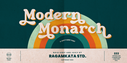 Modern Monarch is a retro display serif font that exudes a classic charm and bold character. With its design inspired by retro styles, this font brings an elegant touch and evokes a sense of the past. Modern Monarch Features: • Uppercase And Lowercase • Alternates And Ligatures • Numerals & Punctuation • Accented characters • Multilingual Support • Unicode PUA Encoded Thanks and have a wonderful day .
 - Rameyon by ahweproject,
$9.00 Rameyon is a cool, graffiti-style display font. Add this font to your urban and casual creations, and you will love the outcome. Whatever the topic, this font will be a wonderful asset to your font library, as it has the potential to enhance any creation. This font is suitable for designs such as t-shirts, sportswear, logos, advertisements, clothing, and more.
 - SK Ilke Mono by Salih Kizilkaya,
$9.99 SK Ilke Mono is a "mono geometric sans" font family. Designed by Salih Kızılkaya in 2021, this font is designed for the needs of designers and software developers. Character ranges and proportions of characters have been specially designed so that you can use it comfortably in any area you want to use mono font. SK Ilke offers full support for the Latin alphabet and includes many typographic elements that you will need in your designs. It contains 22 different fonts and 12,760 glyphs in total. Each font of this font family contains 580 glyphs. In this way, it offers you all the typographic elements you will need in your designs and aims to meet all your design needs.
 - Clara Serif by Signature Type Foundry,
$38.00 Clara is a set of alphabets of interconnected serif and sans serif fonts. The connection is not only in the intensity of the strokes, i.e. in the identical brightness of the typesetting, but also in the drawing principles of both alphabets. The typeface aims to offer a sense of calmness for a reader even in smaller scales of the typesetting. In large scales it builds on the purity of the image without additional decorations. The Clara system includes maximum equipment of a Latin font from Thin to Black in all versions of marking fonts, italics, capital letters and four kinds of numbers. The typeface allows typesetting of the vast majority of cultural languages of the world.
 - Xylo by ITC,
$29.99Xylo is a rugged, no-nonsense typeface that was originally designed in 1924 by the Benjamin Krebs type foundry in Frankfurt am Main, Germany. Even back then, Xylo must have been very popular; the design made it at least as far as England. In 1995, after finding its design in an old London printer's reference book, the Letraset Type Studio faithfully converted Xylo into digital format. A time-proven display face, Xylo will convey a feeling of power and strength in any application. Best used big in headlines or logos; Xylo exudes an expressionistic and art deco spirit that just as much at home today as it was during the roaring 20s! - Clara Sans by Signature Type Foundry,
$38.00 Clara is a set of alphabets of interconnected serif and sans serif fonts. The connection is not only in the intensity of the strokes, i.e. in the identical brightness of the typesetting, but also in the drawing principles of both alphabets. The typeface aims to offer a sense of calmness for a reader even in smaller scales of the typesetting. In large scales it builds on the purity of the image without additional decorations. The Clara system includes maximum equipment of a Latin font from Thin to Black in all versions of marking fonts, italics, capital letters and four kinds of numbers. The typeface allows typesetting of the vast majority of cultural languages of the world.
 - Cheltenham Pro by SoftMaker,
$15.99 Where most typefaces are designed by just one individual, quite a few people have been involved in perfecting Cheltenham over the times. In 1896, the architect Bertram Grosvenor Goodhue created the initial design for Ingalls Kimball at the Cheltenham Press. Just a few years later, Morris Fuller Benton devised a full family of Cheltenhams for ATF. This is the basis of the design we have today. In 1975, Tony Stan revived this classic typeface and did what was customary at the time: increase the x-height and make the Cheltenham family more regular. SoftMaker updated the design yet again in 2012. The result is Cheltenham Pro, a typeface that is exceptionally readable and holds up even in adverse printing conditions. SoftMaker’s Cheltenham Pro typeface family contains OpenType layout tables for sophisticated typography. It also comes with a huge character set that covers not only Western European languages, but also includes Central European, Baltic, Croatian, Slovene, Romanian, and Turkish characters. Case-sensitive punctuation signs for all-caps titles are included as well as many fractions, an extensive set of ligatures, and separate sets of tabular and proportional digits.
 - Lovingly Friends by My Creative Land,
$35.00 Introducing “Lovingly Friends” - a community of fonts that get along together as good as best friends do. All of the fonts - Sans, Serif, Notes, Script and Extras are packed with stylistic alternates and ligatures, you can combine them the way you like - they will look balanced together as well as individually. Script and Engraved fonts also have a Shadow style - to add more personality to your designs. You can download the Specimen & Instructions pdf here http://bit.ly/2x975US Since the Christmas is not that far away (time flies!), the Extras font has a set of Winter Holidays elements - so you could create and send your best wishes to your friends in no time. While all the fonts are fully unicode mapped so you can use them in ANY application, they are still best used in an OpenType aware application. If the application you are using doesn’t support OpenType features, you can use Character Map (Windows) or Font Book (Mac) to select the glyphs you need. Hope you enjoy the fonts as much as I enjoyed creating them! P.S. The flowers used in the preview images are from Liza Glanz 4 in 1 Elegant Watercolor Collection https://crmrkt.com/do4Wpb
 - Sublime Lettering by Redy Studio,
$17.00 Sublime Lettering Font is a handwritten font with a bold look that makes lovely text. It’s especially useful for making signatures or watermarks in photography studios. Everyone is looking for a luxury signature font with a handwritten texture. We’ve spent a lot of time creating this font. It is unique in uppercase letters that dominate the writing and is equipped with a swash in lowercase letters which makes it beautiful if combined into 1 word. We love to combine it into one word because it looks similar to the original handwriting but more professional and luxurious. Sublime Lettering features: A full set of upper & lowercase characters Numbers & punctuation Ligatures A full set of upper & lowercase characters (Alternates) Lowercase ending swashes Swashes PUA Encoded Characters – Fully accessible without additional design software. Feel free to give me a message if you have a problem or question. Thank you so much for taking the time to look at one of our products.
 - Emilio by Narrow Type,
$35.00 Emilio is a modern serif family available in 14 styles. It's an elegant typeface with friendly and warm personality which seeks a balance between traditional and modern. Emilio is inspired by the visuality of the 1980s and the typefaces that were widely used in advertising at the time, such as Times and Garamond. However, Emilio offers a contemporary take on the serif font family, adding new elements such as reductive, calligraphy-inspired details or the "K" and "R" legs shape. If you want a more traditional look, you can achieve it with the stylistic alternatives available. Of course, the typeface also provides standard and discretionary ligatures and many other Open Type features. In addition, it offers support for most Latin languages. The big headlines and titles are where Emilio shines the most, but due to large x-height and decent contrast will work for smaller text as well. Emilio is the ideal typeface for editorial design, posters, covers, branding and much more.
 - Surf Bum by Jeff Levine,
$29.00 The term “Surf Bum” was a slang phrase used to casually describe anyone who spent as much of their time as possible at the beach catching waves in the 1960s. The Revell Company was a well-established maker of plastic model kits such as military airplanes, monsters from Universal horror films and other such items when it hooked up with custom car designer Ed “Big Daddy” Roth to develop a model kit line capitalizing on the surfing fad that was sweeping the West Coast at the time. A number of crazy-looking hot rods, dune buggies and what-have-you were turned out, and one such kit (“Surfite”, with Figure) featured a futuristic one-person dune buggy. It was on the box for the model that the words “with Figure” appear in a casual, brush design type face. Those few letters were the inspiration for creating a new retro type face entitled Surf Bum JNL, which is available in both regular and oblique versions.
 - Simplicity Angela by Ahmad Jamaludin,
$15.00 Say hello to Simplicity Angela! Simplicity Angela is an elegant modern calligraphy font inspired by delicate inky hand lettering, a gorgeous wedding calligraphy for trending minimal branding designs. This beautiful font is for those who are needing elegance for their designs and is particularly well suited for wedding invitations, cards and feminine branding. I have wanted to create such combination a long time and can’t believe that it is here. I’m super excited and hope you’ll like it too. Now all you need for perfect wedding invitation design is in one product. I think this decision will help you to save your time What's included? - More than 100 beautiful swashes in this font - Works on PC & Mac - Simple Installations - Accessible in the Adobe Illustrator, Adobe Photoshop, Adobe InDesign, even work on Microsoft Word. - PUA Encoded Characters - Fully accessible without additional design software. Multilingual Support : ÁĂÂÄÀĀĄÅÃÆĆČÇĊÐĎÉĚÊËĖÈĒĘĞĢĠ ÍÎÏÌĪĮĶĹĽĻŁŃŇŅÑ ÓÔÖÒŐŌØÕŔŘŖŚŠŞŤŢÚÛÜÙ ŰŲŮẂŴẄẀÝŶŸỲŹŽŻ áăâäàāąåãæćčçċďđéěêëėèēęíîïìīįĺľļłńňņñóöòőōøõŕřŗśšşßúûüùűūųůẃŵẅẁýŷÿỳźžż I hope this font is suitable for your project.
 - Ongunkan Old Latin by Runic World Tamgacı,
$40.00 The Latin, or Roman, alphabet was originally adapted from the Etruscan alphabet during the 7th century BC to write Latin. Since then it has had many different forms, and been adapted to write many other languages. According to Roman legend, the Cimmerian Sibyl, Carmenta, created the Latin alphabet by adapting the Greek alphabet used in the Greek colony of Cumae in southern Italy. This was introduced to Latium by Evander, her son. 60 years after the Trojan war. There is no historical evidence to support this story, which comes from the Roman author, Gaius Julius Hyginus (64BC - 17AD). The earliest known inscriptions in the Latin alphabet date from the 6th century BC. It was adapted from the Etruscan alphabet during the 7th century BC. The letters Y and Z were taken from the Greek alphabet to write Greek loan words. Other letters were added from time to time as the Latin alphabet was adapted for other languages.
 - Découpe by Sudtipos,
$39.00 Sudtipos is proud to announce the release of Découpe, a display typeface program of eight fonts, designed by María Carla Mazzitelli and born during her Masters in Typography at the University of Buenos Aires (FADU-UBA). Inspired by gestural graphic expressions –like paper cut-outs (découpes) and spontaneous handwriting– from the most diverse postmodern and contemporaneous artists of the design world, Découpe has been created specifically to be used in big sizes. A little bit irreverent and effervescent from time to time, this gestural sans serif family reveals its contrasts and asymmetrical shapes when it breaks through display functions. From Light to Extra Bold, it reaches the most extreme weights, looking for power and impact. This program is meant to catch the eye in typographic compositions, to shout it out loud and clear. Definitely, to be seen. *Découpe has been recently selected to be part of different typography exhibitions such as Tipos Latinos and the Type Directors Club.
 - Lower Pixel by IbraCreative,
$11.00 Lowres Pixel is an adorable and charming pixelate font that evokes a sense of playful nostalgia. Drawing inspiration from retro video games and pixel art, each letter in Lower Pixel is intricately crafted with pixelated precision. With its blocky and endearing appearance, this typeface brings a sense of whimsy and innocence to any design. Whether used for digital artwork, game interfaces, or quirky branding, Lower Pixel injects a delightful pixelated vibe that instantly captures attention and exudes a sense of cuteness. Its unique aesthetic transports us to the pixelated landscapes of classic games, making it a perfect choice for projects that seek to infuse a touch of vintage charm and childlike wonder
 - Catchphrase by Mix Fonts,
$13.00 Mix Catchphrase is a fun and playful handwritten font that tries its best to be a serious serif (although it fails at being serious, in case you were wondering). With its clean handwriting style and serif details, this font is perfect for adding a quirky, DIY feel to your projects. Use Mix Catchphrase to give your designs a creepy edge, perfect for Halloween or any other ghoulish occasion. With the right styling and color palette, this rough and rugged font is sure to bring personality and character to all of your projects. Add some fun to your designs with Mix Catchphrase. MIX CATCHPHRASE includes the following characters: ABCDEFGHIJKLMNOPQRSTUVWXYZ abcdefghijklmnopqrstuvwxyz 0123456789 !@$#%^&*()`~♥✿•· ÷×+−±≈=≠≥≤[]<>‹›:;'”,.|/?{}<>“”‘’-–—_ …©®™<>«»°¹²³ªº¡¿₱¢€£¥¶§№† ÁÀÂÄÃÅĂĀĄÆĆĈČÇÐĐÉÈÊËĖĒĘĜĤIÍÌÎÏĪĮĴŁŃÑŇ ÓÒÔÖÕØŌŐŒŔŘŚŜŠȘŤȚÚÙÛÜŮŰŪŲẂẀŴÝŶŸŹẐŽŻÞ áàâäãåăāąæćĉčçðđéèêëėēęĝĥıíìîïīįĵłńñň óòôöõøōőœŕřśŝšșťțúùûüůűūųẃẁŵýŷÿźẑžżþß
 - Mirage Against Sh by Sohel Studio,
$16.00 Mirage Againts is a Modern elegant serif typeface with Unique alternative , multilingual support with perfect kerning. This typeface is perfect for an elegant & luxury logo , classy editorial design, women's magazine, fashion brand , cosmetic brand, fashion promotion , modern advertising design, invitation card, art quote, home decoration , book/cover titles, special events, Tote bag, T-shirt, Advertising and much more. Mirage Against Features: · Uppercase And Lowercase · Alternates · Numerals & Punctuation · Accented characters · Multilingual Support · Unicode PUA Encoded While using this product, if you encounter any problem or spot something we may have missed, please don't hesitate to drop us a message. We'd love to hear your feedbacks in order to further fine-tune our products. Thanks and have a wonderful day .
 - Trustee by Look Minus Today,
$14.00 Trustee Modern Retro Bold Serif . That has a unique style & luxurious look. is great for logos, editorial, web design, craft projects, shirts, decoration, wedding invitations, packaging, stickers, social media, quotes, magazines and more!. The unique sharp serifs mixed with thin strokes give off a bold mid century architectural vibe. Trustee features: · Alternates And Ligatures · Uppercase And Lowercase · Numerals & Punctuation · Accented characters · Format File: OTF,TTF,WOFF,WOFF2 · Multilingual Support · Unicode PUA Encoded While using this product, if you encounter any problem or spot something we may have missed, please don't hesitate to drop us a message. We'd love to hear your feedbacks in order to further fine-tune our products. Thanks and have a wonderful day
 - Torjus by Brenners Template,
$19.00 Torjus is so rigid and stiff typeface. While designing a more dry and stiff handwriting typeface, I tried to remove the Bezier curves. Rhythms were also created by dramatically simplifying the paths used in the Glyphs and emphasizing individual contrasts. 60 predefined Ligatures to bring your passion and inspire you to wonder. Ligatures : Ba, Be, Bo, Ca, Ce, Co, Da, De, Do, Ea, Fa, Fe, Fo, Ga, Ge, Go, Ha, He, Ho, Ja, Je, Jo, Ka, Ke, Ko, La, Le, Lo, Ma, Me, Mo, Na, Ne, No, Oa, Pa, Pe, Po, Ra, Re, Ro, Sa, Se, So, Ta, Te, To, Va, Ve, Vo, Wa, We, Wo, Ye, Yo, ee, ff, ll, oo, rr.