10,000 search results
(0.038 seconds)
- Exphany by Danil Reyman,
$12.00 The font is made in the direction of Tribal aesthetics. He is restrained, but at the same time very cityistic, has an aggressive mood.
 - Galpon Pro by RodrigoTypo,
$25.00 Galpon Pro, is an improved version of Galpon, this time it contains Lowercase, Signs and also is in different weights, ideal for entertaining titles!
 - Erotica by Lián Types,
$49.00 “A picture is worth a thousand words” and here, that’s more than true. Take a look at Erotica’s Booklet; Erotica’s Poster Design and Erotica’s User’s Guide before reading below. THE STYLES The difference between Pro and Std styles is the quantity of glyphs. Therefore, Pro styles include all the decorative alternates and ligatures while Std styles are a reduced version of Pro ones. Big and Small styles were thought for better printing results. While Big is recommended to be printed in big sizes, Small may be printed in tiny sizes and will still show its hairlines well. INTRODUCTION I have always wondered if the circle could ever be considered as an imperfect shape. Thousands of years have passed and we still consider circles as synonyms of infinite beauty. Some believe that there is something intrinsically “divine” that could be found in them. Sensuality is many times related to perfectly shaped strong curves, exuberant forms and a big contrasts. Erotica is a font created with this in mind. THE PROCESS This story begins one fine day of March in 2012. I was looking for something new. Something which would express the deep love I feel regarding calligraphy in a new way. At that time, I was practicing a lot of roundhand, testing and feeling different kinds of nibs; hearing the sometimes sharp, sometimes soft, sound of them sliding on the paper. This kind of calligraphy has some really strict rules: An even pattern of repetition is required, so you have to be absolutely aware of the pressure of the flexible pen; and of the distance between characters. Also, learning copperplate can be really useful to understand about proportion in letters and how a minimum change of it can drastically affect the look of the word and text. Many times I would forget about type-design and I would let myself go(1): Nothing like making the pen dance when adding some accolades above and below the written word. Once something is mastered, you are able to break some rules. At least, that’s my philosophy. (2) After some research, I found that the world was in need of a really sexy yet formal copperplate. (3) I started Erotica with the idea of taking some rules of this style to the extreme. Some characters were drawn with a pencil first because what I had in mind was impossible to be made with a pen. (4) Finding a graceful way to combine really thick thicks with really thin hairlines with satisfactory results demanded months of tough work: The embryo of Erotica was a lot more bolder than now and had a shorter x-height. Changing proportions of Erotica was crucial for its final look. The taller it became the sexier it looked. Like women again? The result is a font filled with tons of alternates which can make the user think he/she is the actual designer of the word/phrase due to the huge amount of possibilities when choosing glyphs. To make Erotica work well in small sizes too, I designed Erotica Small which can be printed in tiny sizes without any problems. For a more elegant purpose, I designed Erotica Inline, with exactly the same features you can find in the other styles. After finishing these styles, I needed a partner for Erotica. Inspired again in some old calligraphic books I found that Bickham used to accompany his wonderful scripts with some ornated roman caps. Erotica Capitals follows the essentials of those capitals and can be used with or without its alternates to accompany Erotica. In 2013, Erotica received a Certificate of Excellence in Type Design in the 59th TDC Type Directors Club Typeface Design Competition. Meet Erotica, beauty and elegance guaranteed. Notes (1) It is supossed that I'm a typographer rather than a calligrapher, but the truth is that I'm in the middle. Being a graphic designer makes me a little stubborn sometimes. But, I found that the more you don't think of type rules, the more graceful and lively pieces of calligraphy can be done. (2) “Know the forms well before you attempt to make them” used to say E. A. Lupfer, a master of this kind of script a century ago. And I would add “And once you know them, it’s time to fly...” (3) Some script fonts by my compatriots Sabrina Lopez, Ramiro Espinoza and Alejandro Paul deserve a mention here because of their undeniable beauty. The fact that many great copperplate fonts come from Argentina makes me feel really proud. Take a look at: Parfumerie, Medusa, Burgues, Poem and Bellisima. (4) Some calligraphers, graphic and type designer experimented in this field in the mid-to-late 20th century and made a really playful style out of it: Letters show a lot of personality and sometimes they seem drawn rather than written. I want to express my sincere admiration to the fantastic Herb Lubalin, and his friends Tony DiSpigna, Tom Carnase, and of course my fellow countryman Ricardo Rousselot. All of them, amazing.
 - Alright, imagine a font that captures the eerie yet whimsical vibe of a Tim Burton movie, entangling the gothic with the playful in each curve and stroke. That's "Scars Before Christmas" by Juan Casc...
- WildForest by Enfeeltype,
$15.00 This font was born out of love with nature, designed to preserve and instill an even greater appreciation for our world. WildForest is a modern typeface born from the wild. This font was born out of love with this nature, and its intention is to capture the spark of something beautiful, yet wild and full of life. This font was designed with a careful eye on the details and has accents that recall the spirit of nature, made in a style that will be loved by both professionals and amateurs. Made with care and precision, WildForest appeals to both professional designers and amateur designers alike. Worthy of any article or design, WildForest embodies a typeface that is truly unique.
 - Madang by Aiquitype,
$15.00 Introducing Madang Font is a sophisticated fusion of classic elegance and modern flair. With its meticulously crafted letterforms, it exudes a timeless charm that effortlessly captivates the eye. The balance between its refined strokes and contemporary elements encapsulates a sense of versatility, making it a perfect choice for a wide range of creative projects. Whether used in headlines or body text, Madang Font's graceful presence lends an air of distinction and refinement to any design, establishing itself as an essential asset for discerning typographers and designers alike. What’s Include ? 1. Uppercase, Lowercase, Number and Punctutation 2. Ligature and Alternates 3. Multilingual Support 4. Installed on Mac and Windows 5. PUA Encode Enjoy our Font.
 - Jumble by Laura Worthington,
$29.00 Jumble is friendly and cute treat for the eyes. Jumble draws you in with its thick, curvy strokes, jaunty counters, and a whimsical variety of counterforms with no two alike. For even more variety, Jumble includes 104 alternates for plus a handful of ligatures. Jumble conveys humor and warmth without being silly; its lack of straight lines and sharp edges makes it perfect for evoking tasty treats like frosted cakes or pies, or child-friendly toys and games. See what’s included! http://bit.ly/1RDnJjY This font has been specially coded for access of all the swashes, alternates and ornaments without the need for professional design software! Info and instructions here: http://lauraworthingtontype.com/faqs/
 - Louisalkan by FadeLine Studio,
$15.00 This is a handwritten script font with a natural, elegant and simple style. Made with slowly and carefully to provide the natural and modern elements. The great thing about this font is you can find some style when you use it, examples such as natural handwriting style, unique, simple, elegant, and luxury. Very suitable to meet your various design needs that are trending now and using this font can make your design more alive! With a style like this, this font will be suitable in use for logo's, branding projects, homeware designs, product packaging, mugs, quotes, posters, shopping bags, logo's, t-shirts, book covers, name card, invitation cards, greeting cards, and all your other lovely projects.
 - CA Texteron by Cape Arcona Type Foundry,
$40.00 CA Texteron is a modern text font family to cover the most common typographical needs with a minimum of weights. It is aiming for a serious but unconventional look, which is achieved by combining round and edgy forms in the same font, often in the same glyph, and by using Humanist and modern form-principles at the same time. It merges classical type-design with an experimental spirit. CA Texteron combines elements of the dynamic renaissance principle with the static neo-classic style, which makes it hard to classify. The result is a post-modern hybridization. The Regular weight works best in text size, and with more letter-space also for footnotes. The low contrast makes it robust and legible even in very small sizes. Bold, Italic and Small Caps are intended for emphasis. Bold, Bold Italic and Heavy make good headlines, that reveal the unconventional details. The Italic is not just a slanted version of the Regular weight but has individual forms and typical italic characteristics.
 - Bum Steer JNL by Jeff Levine,
$29.00 In older American slang, a "bum steer" is a bad tip, some bad advice or being sent in the wrong direction (to name a few examples). Bum Steer JNL was modeled from some playful hand lettering found on a piece of early 20th Century sheet music entitled "When Uncle Joe Plays a Rag on His Old Banjo". It's very possible that "Hobo" (a popular type design of the time) was a strong influence on the sheet music's style of title lettering. It seems that songwriters in those bygone days were prone to cramming as many words from a line of their song into the title itself. Another such example of a wordy song title which coincidently is in keeping with the theme of a "bum steer" (pun intended) is a novelty number from 1915: "Cows May Come and Cows May Go but the Bull Goes on Forever" (words by Vincent Bryan, music by Harry Von Tilzer). [It's kind of self-descriptive, don't you think?]
 - Linotype Xmas Pi by Linotype,
$40.99You need traditional christmas symbols to illustrate your text? How about using these historic designs that had been used in good old typography. xmas is not too far and always comes in winter time. Happy Xmas. - Futura Maxi by Monotype,
$29.00 First presented by the Bauer Type Foundry in 1928, Futura is commonly considered the major typeface development to come out of the Constructivist orientation of the Bauhaus.movement in Germany. Paul Renner (type designer, painter, author and teacher) sketched the original drawings and based them loosely on the simple forms of circle, triangle and square. The design office at Bauer assisted him in turning these geometric forms into a sturdy, functioning type family, and over time, Renner made changes to make the Futura fonts even more legible. Its long ascenders and descenders benefit from generous line spacing. The range of weights and styles make it a versatile family. Futura is timelessly modern; in 1928 it was striking, tasteful, radical - and today it continues to be a popular typographic choice to express strength, elegance, and conceptual clarity. The PL Futura Maxi font family was created by Victor Caruso in 1960 to add more display weights to Paul Renner's 1927 Futura family. Typefaces in the same style like Futura are: Avenir, Metromedium, Neuzeit Grotesk,
 - Kompakt by Linotype,
$29.99 Kompakt is one of the early typefaces of type designer Hermann Zapf, whose Palatino has long been a standard in almost every area of application. Kompakt consists of a single weight and was designed in 1952, two years after Palatino. It was produced by the foundry D. Stempel AG in Frankfurt am Main, Germany, where Zapf was at the time in the artistic department. The figures of this extremely strong and heavy typeface are decidedly those of a broad tipped pen. When enlarged, the sharp outlines of the characters can be clearly seen. The unique dynamic of the alphabet is a result of its strong serifs, which on the lower case letters almost connect the letters in a line. Together with the slight slant to the right, this gives Kompakt the character of handwriting, making it look like it is always striving to go forward. Kompakt is an excellent choice for advertisements, especially for posters which should display a hint of nostalgia, and should be used only in headlines.
 - Bronto by W Type Foundry,
$29.00 Bronto is a typeface that mutated many times: it went from being morphologically conventional, to have soft features, to finally have some inverted contrasts that made it more dynamical; but all this without losing sight of the meaning of a typefamily, and the aim pursued by this work: Bronto doesn’t behave as a piece of art, but as a tool. In some weights, this typeface possesses fluffy characteristics and is boldly bighead, while in other versions is slightly contrasted and controlled; this in order to maintain the essential features of the typefamily along the versatility and usability of the 20 variations that composed it. Bronto it’s inspired in neo humanists typographies of the 20th century, and in Chilean lettering. This kind of work was made by the spontaneity of the paintbrush, which gave an inverted contrast to some characters. This typeface has plenty of OpenType features, specially an extensive set of ligatures in all weights. Bronto is well suited for motion graphics, letterings, web, advertisings, magazines and books.
 - Nilakandi by Locomotype,
$19.00 Nilakandi is an elegant display script font. The sturdy and thick construction feels so strong which is the result of a combination of classic typeface and modern calligraphy. The OpenType features are very rich with many alternative fonts on stylistic sets so you will easily mix and match typography in each of your designs. With nearly 600 glyphs, Nilakandi supports many languages. Don't waste time, it's time you put Nilakandi in your font collection folder.
 - Showgirl JNL by Jeff Levine,
$29.00 Showgirl JNL was inspired by a photo of a 1940s-era Minsky's Burlesque theater. The neon letters on the marquee spelling out the word 'burlesque' exuded a wonderful period look.
 - TE Start2 by Tharwat Emara,
$30.00 Start 2 is a mixture of modern style with traditional functionality. It is flexible and has many beautiful and wonderful features. This font will work for modern and important designs.
 - Summary Notes by Ali Hamidi,
$10.00 Summary Notes is a simple and neat handwritten font ready to impress your audience and make your branding shine. Make your projects stand out with this humble and wonderful font!
 - Kwaliteit by Fabulous Rice,
$20.00Kwaliteit is the result of a love story. The love story between a font designer and an old embossing label machine. The big bold letters produced by such machines are wonderful to convey a big bold message (big bold messages are fun!), but sometimes you just can't walk around with one of those antique label machines… That's why this font can come in handy! Its uses are numerous… be the boss of emboss! - Inglenook Corner NF by Nick's Fonts,
$10.00This whimsical wonder is based on the lettering of Laurence Schall, as presented in Lewis F. Day's 1910 classic, Alphabets Old and New. The typeface radiates a charm reminiscent of the works of many talented artists (including Howard Pyle and Arthur Rackham) who illustrated children's books around the turn of the twentieth century. The Opentype version of this font supports Unicode 1250 (Central European) languages, as well as Unicode 1252 (Latin) languages. - Mahendra by BBA Key,
$12.00 Mahendra Script is a new fresh and modern font in handmade calligraphy, with decorative characters and dancing lineage! So wonderful on invitations, greeting cards, branding material, business cards, quotes, posters, and more. If you do not have programs that support OpenType features like Adobe Illustrator and CorelDraw X Versions, you can access all alternates using Font Book (Mac) or Character Map (Windows). If you have any questions, please feel free to contact me via email.
 - Sculptura CT by CastleType,
$29.00 A wonderful, very condensed, 3D font. A few years ago, I was commissioned to digitize the letters from this typeface for the words 'LEGENDS OF RODEO' and liked the look of it so much that I went ahead and digitized the rest of the alphabet. This CastleType revival is very clean-cut and contains uppercase, numerals, and punctuation. Sculptura was originally designed by the Swiss designer, Walter J. Diethelm (1913-1986) in 1957.
 - Balloon Duwoor by Sealoung,
$12.00 Balloon Duwoor is a cute and playful display font. It looks wonderful on a variety of designs, both formal and informal. Whether you’re using it for crafting, digital designS, presentations or greeting cards, it’s perfect! What's Included: - glyphs - Works on PC & Mac - Simple installation - Can be accessed in Adobe Illustrator, Adobe Photoshop, Affinity Design. - Fonts include multilingual support. Thank you very much, this font will make your project easier. Saiful Anwar - Sealoung studio
 - Guild of Professional Actors - Unknown license

- MapleOaks by Ingrimayne Type,
$14.95 In the early days of PostScript fonts, I designed a font of leaves called XLeafMeAlone. In 2006 I decided to revisit this topic and the result was two sets of new leaf fonts: MapleOaks and MoreLeaves. MapleOaks contains almost 100 images of maple, oak, and sycamore leaves, and MoreLeaves has almost 100 images of leaves of various other species. There are four MapleOak fonts. They have identical images; only the orientation of the images is different. In MapleOaksUR the tips of the leaves point to the upper right, in MapleOaksDR the tips point down to the right, etc.
 - Anthracite by Fabulous Rice,
$15.00 A title is something strong. Something that leaves its mark through time, in the memories and in the hearts. A title tells things about the content, its purpose, its meaning, its point. For your needs in strong titlecase letters comes Anthracite. Looking almost like they were carved out of raw wood in the 1820s, the letters of Anthracite will not only imprint well but they will also impress. Its carving gives a feeling of relief, or shades, of textures that will be unique every time you use it. The perfect font if you want to stand out and be read.
 - Xcetera by Typogama,
$19.00 Work for the Xcetera typeface started with the desire to create a classical serif design but using the less contrasted stroke thickness found in a host of sans serif designs. My aim was to retain some of the clarity found in modern strokes yet use the serifs to aid in letter recognition and legibility. The result is a form of hybrid design that is surprising clear in small point sizes yet offer a lot of personality in larger formats. Suited for both display and text settings, Xcetera aims to be both functional and fun while looking to explore new possibilities for the classical typeface style.
 - Geller Sans by Ludka Biniek,
$29.00 Geller Sans typeface have been developed based on his serif predecessor’s proportions. He’s quite handsome, quite organised. Looking at thin–extraheavy styles he has enough of charm to stand out in advertisement. In text styles you can relay on him. He’s able to meet demand of complex design tasks. Geller Sans has been fitted with wide range of OpenType features. As Geller Serif, he has bullets & dingbats, for easier entry-point making. Entire font family comes in 4 width (Regular, Narrow, Condensed, Compressed). Each width finds its best application in different typographic fractions what makes Geller Sans easy to apply in editorial graphic design. Who’d like to challenge him?
 - Hideout by Monotype,
$50.99 Jim Ford's Hideout typeface is definitely walking on the wrong side of the law. Inspired by the flared serif lettering of antique tobacco tins, its sturdy shapes are confident, eye-catching, and hark back to the Wild West. Large sizes bring Hideout's details to life, emphasising the delicate nicks in its Ks and Rs. For designers that need to soften some of its swagger, a set of decorative alternatives offer a little Art Deco elegance, adding some refinement to its chunky letterforms. With its 14 weights, Hideout is an adaptable design that works especially well when used for display – for example in book covers, packaging, posters, restaurant menus, or editorial. Don't miss the ghost weights, which hint at the kinds of weathered lettering found on faded and peeling Wanted posters.
 - Rochalle by Liartgraphic,
$20.00 Meet our newest product, this product we call Rochalle font. Rochalle font is a cute typeface font A little unique and firm touch. The Rochalle font is great to use on: fashion magazines, logos, and photography, landing pages, flyers, What is included? -multilingual support - alternative - . fastener Thank you, greetings Ali Sifak Muftar
 - Paris Stencil JNL by Jeff Levine,
$29.00 Vintage French tin stencils with various phrases were the model for Paris Stencil JNL. The type design is available in both regular and oblique versions.
 - Legende by profonts,
$41.99 Legende was originally designed by Friedrich Hermann Ernst Schneidler. In reminiscence to the good old times, Ralph M. Unger redrew and digitized this font in 2003. His work is based on artwork taken from old font catalogues.
 - Metalmark Stencil JNL by Jeff Levine,
$29.00 A lot of interesting variations in lettering style can be found in sets of antique tin or brass marking stencils. One such set was the model for Metalmark Stencil JNL, a bold sans with a chamfered look.
 - Mimolette by The Ampersand Forest,
$20.00 Every designer has a favorite geometric sans serif. For a century, they've been a staple for text that needs to be clear, strong, architectural, and objective. Mimolette offers a sans serif family that's great for text and display alike—the panache of Neutraface, the readability of Avenir, the sleekness of Avant Garde, the strength of Mark, the architecture of Gotham, and the classic lines of Futura—but she's entirely her own creature, and she's designed to offer maximum versatility and beauty at an affordable price. And she's got some nifty features, too! Her italic is a true italic, not just an oblique. Are the uberpointy diagonals (AMVW) not working in a particular context? Activate Stylistic Set 01, and they become flat-topped! Want more playful cursive alternatives in the italic? Activate Stylistic Set 02, and you've got them in the A, E, K, Q, R, and k. She's got true small caps in all styles! She's got true fractions in all styles, as well as oldstyle (small cap) and lining numerals, in both tabular and proportional widths. Best of all, perhaps, Mimolette was made with love, as always, by yer pals in the Ampersand Forest.
 - Infantry by Gassstype,
$25.00 INFANTRY - Modern Army Typeface Military Serif Font, first conceptualize was inspired by the classic vintage military stencil design . I wanted a typeface that could be a solid base for any military inspired project INFANTRY Fonts can be used for wallpaper, pattern fills, web page background, surface textures. Perfect for making army posters , scrapbooking,invitation cards, stationary, gift wrap, packaging, buttons, pendants, holiday gifts, print on fabrics and so much more.
 - Rosemarine by ahweproject,
$9.00 Rosemarine is an elegant and clean serif font. Whatever the topic, this font will be a wonderful asset to your font library, as it has the potential to enhance any creation.
 - Kurly by Bogusky 2,
$34.50I was working on an unrelated job with curls and wondered how I could apply them to a font. Well, here it is, all pair-kerned. A little silly but fun. - Algorisma Heart Font by IbeyDesign,
$17.00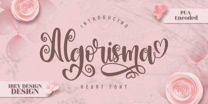 Algorisma Heart Font inspires friendliness and elegance. It is perfect to use for any of your wonderful creations such as branding projects, logos, brochures, business cards, wedding invitations, and many others.
 - Meanwhile Uncial by Comicraft,
$19.00 Aye! Verily ‘twould seem ’tis time for thee to speak in the majuscule language of legendary gods! Yea, thou shalt speak most eloquently in the style and manner of many a pseudo-Shakespearian Bard. Forsooth, thine utterances such as “HAVE AT THEE, VILE VILLAIN!” shall cause all ye creatures of evil to begone from the hallowed halls of Asgard (or other otherworldly domains of the gods). Forsooth, Meanwhile Uncial is a Capital Font, suitable for Gods of Thunder, Mischief or e’en Warriors Three! Meanwhile Uncial contains alternate uppercase characters, auto-ligatures for a more natural, hand-drawn appearance, and Comicraft's magical Crossbar I Technology™, to keep that Mighty Character in its proper place. (Artwork from ELEPHANTMEN #32 by Richard Starkings & Axel Medellin, available on Comixology)
 - Ondine by Linotype,
$29.99 Ondine is one of the early typefaces of Adrian Frutiger. It looks as though it were written with a broad tipped pen, however, Frutiger actually cut the forms out of a piece of paper with scissors. The forms of Ondine are reminiscent of the humanist period, the high point of the Italian Renaissance text typefaces of the 15th century. This movement was centered in Florence, the base of the Humanist movement overall, and the home of a famous type school of the time. The main goal of the educated writers was to faithfully recreate the writing of the admired literary works, whose aesthetic was as important as their content. Ondine displays a regular and open character. Texts set in this typeface give the impression of being hundreds of years old. Ondine should be used in point sizes of 12 and larger and is best for short texts and headlines.
