10,000 search results
(0.036 seconds)
- Geometry pair by Etewut,
$20.00 Welcome to my Geometry Pair. Introducing two fonts Forma & Structure that will make you happy. One of them is a compilation of shadow-based symbols like silhouettes. Another one has a rock of glyphs that don't repeat each other, but looks in the same style. Surprisingly they fit to each other and you can mix them in your works, be it print or web design. Make your graphic works more stylish that highlight your uniqueness from other. Just wonder people who loves funky design and who respect tiny details. Now you have opportunity to grab them both at the same time! There are all caps fonts kerned with microscope with multi language support.
 - Arabetic Sans Serif by Arabetics,
$32.00 The Arabetic Sans Serif type family follows the guidelines of the Mutamathil type style but also illustrates the effects of adding and removing Latin-like serifs on Arabetic scripts legibility. It has only one glyph for every basic Arabic Unicode character or letter as defined in Unicode Standards version 5.1. Arabetic Sans Serif employs variable x-height values. It includes all required Lam-Alif ligatures and uses ligature substitutions and selected marks positioning but it does not use any other glyph substitutions or forming. Text strings composed using types of this family are non-cursive with stand-alone isolated glyphs. Tatweel (or Kashida) glyph is a zero width space. Keying it before any glyph will display that glyph’s isolated form. Keying it before Alif Lam Lam Ha will display the Allah ligature. Arabetic Sans Serif family includes both Arabic and Arabic-Indic numerals; all required diacritic marks, Allah ligature, in addition to all standard English keyboard punctuations and major currency symbols. Fonts are available in regular, italic, bold, and bold italic styles.
 - Nastarkib by Arabetics,
$39.00 An isolated typeface design with a calligraphic flavor. The Nastarkib font family employs visual features from the Urdu Persian Nastaliq Calligraphy. Visual connectivity is accomplished by overlapping glyphs with downward slopes. This font family has four members including normal and bold weights with two styles each, regular and left-slanted italic styles. This font family design follows the guidelines of Mutamathil Taqlidi type style with one glyph for every basic Arabic Unicode character or letter, as defined in the latest Unicode Standards, and one additional final form glyph, for the freely-connecting letters in traditional Arabic cursive text. Nastarkib employs variable x-height values. It includes only the Lam-Alif ligatures. Soft-vowel diacritic marks, harakat, are selectively positioned. Most of them appear by default on the same level, following a letter, to ensure that they would not interfere visually with letters. Tatweel is a zero-width glyph. Keying the tatweel key before Alif-Lam-Lam-Ha will display the Allah ligature. Nastarkib includes both Arabic and Arabic-Indic numerals, in addition to standard punctuations.
 - Arabetic Serif by Arabetics,
$32.00 The Arabetic Serif type family follows the guidelines of the Mutamathil type style but also illustrates the effects of adding and removing Latin-like serifs on Arabetic scripts legibility. It has only one glyph for every basic Arabic Unicode character or letter as defined in Unicode Standards version 5.1. Arabetic Serif employs variable x-height values. It includes all required Lam-Alif ligatures and uses ligature substitutions and selected marks positioning but it does not use any other glyph substitutions or forming. Text strings composed using types of this family are non-cursive with stand-alone isolated glyphs. Tatweel (or Kashida) glyph is a zero width space. Keying it before any glyph will display that glyph isolated form. Keying it before Alif Lam Lam Ha will display the Allah ligature. Arabetic Serif family includes both Arabic and Arabic-Indic numerals; all required diacritic marks, Allah ligature, in addition to all standard English keyboard punctuations and major currency symbols. Fonts are available in regular, italic, bold, and bold italic styles.
 - Ibrani by Arabetics,
$39.00 A completely isolated letters typeface design with an overall Hebrew look and feel. Glyphs were designed with an emphasis on isolation and vertical feel with a visual connectivity measure to help easy reading. The Ibrani (Arabic for Hebraic) font family has two members, regular and left-slanted italic styles. This font family design follows the guidelines of Mutamathil Taqlidi type style with one glyph for every basic Arabic Unicode character or letter, as defined in the latest Unicode Standards, and one additional final form glyph, for the freely-connecting letters in traditional Arabic cursive text. Ibrani employs variable x-height values. It includes only the Lam-Alif ligatures. Soft-vowel diacritic marks, harakat, are selectively positioned. Most of them appear by default on the same level, following a letter, to ensure that they would not interfere visually with letters. Tatweel is a zero-width glyph. Keying the tatweel key before Alif-Lam-Lam-Ha will display the Allah ligature. Ibrani includes both Arabic and Arabic-Indic numerals, in addition to standard punctuations.
 - Urban Constructed - Unknown license

- Nouveau Slab Serif by Jeff Levine,
$29.00 The cover of the 1902 sheet music for "I'll Be Baby in Baby's Place" features the title hand lettered in a wonderful Art Nouveau slab serif style with many eccentric letter forms. This is now available as the digital typeface Nouveau Slab Serif JNL, in both regular and oblique versions.
 - Escondido NF by Nick's Fonts,
$10.00This unusual face features letterforms inspired by an Austrian travel poster designed by Johann Süssenbek in the 1930s, and rendered in a bold chiaroscuro manner. In case you're wondering, Escondido is Spanish for hidden. Both versions of the font include 1252 Latin, 1250 CE (with localization for Romanian and Moldovan). - Becka Brush by Sulthan Studio,
$14.00 Becka Brush is a bold and chunky lettered display font, created with the help of a brush pen. Add it to your most creative ideas and notice how it makes them come alive!
 - Courtold Shadow by Greater Albion Typefounders,
$20.00 Courtold Shadow is another of our June 2017 ‘Wood Type’ collection. There is something alive and energetic about these ‘rushing’ oblique letter forms with their diagonal shadow. Ideal for signage and poster work.
 - Winter Beauty by Typestory,
$12.00 Winter Beauty is a sweet, fancy hand-lettered script. The playful rounded characters make it the perfect font for creating stunning calligraphy art. Add it to your designs and make them come alive!
 - Awesome - Personal use only

- Pantera by Lián Types,
$39.00 ROARRR! THE STYLES -Pantera Pro is the most complete style, and although its default look is mono-rhythmic it gets really playful and crazy like the examples of the posters by just activating the Decorative Ligatures button in the Open-type Panel of Adobe Illustrator. However, I recommend using also the Glyphs Panel because there you'll find much more variants per letter. Pantera Pro is in fact, coded in a way the combination of thicknesses will always look fantastic. -Pantera Black Left, and Pantera Black Right are actually “lite” versions of Pantera Pro: They have very little Open-Type code, so what you see here is what you get. Pantera Black Left has its left strokes thick, while Pantera Black Right has its right strokes thick. -Pantera White is a lovely member in this family that looks lighter and airy, hence its name. With the feature Standard Ligatures activated (liga) the font gets very playful. -Pantera Caps is based on sign painters lettering and since it follows the same pointed brush rules as the other styles, it matches perfectly. -Pantera Claws like its name suggests, is a set of icons that were done by our dear panther. THE STORY It is said that typography can never be as expressive as calligraphy, but sometimes it can get close enough. I tend to think that calligraphic trials, in order to work well as potential fonts, need first to go through very strict filters before going digital: While calligraphy is synonym of freedom (once its rules are mastered), type-design, in the other hand, has its battlefield a little tighter and tougher. When I practice pointed brush lettering, there are so many things happening on the paper. And most of them are delicious. The ones who know my work may see that although many of my fonts are very expressive, my handmade brush trials are much more lively than them. With that in mind, this time I tried to go further and rescue more of those things that are lost in the process of thinking type when first sketches are calligraphic. I wondered if I could create something wild, hence its name Panther, by understanding the randomness that sometimes calligraphy conveys and turning it to something systemic: With Pantera, I created an ordered disorder. Like it happens a lot in many kinds of lettering styles, in order to enrich the written word the scribe mixes the thickness of the strokes and the width of the letters. Like one of my favorite mentors say (1), they make thoughtful gestures Some lively strokes go down with a thick, while some do that with a thin. Some letters are very narrow, meaning some of them will need to be very wide to compensate. Why not?. The calligrapher is always thinking on the following letters, and he/she designs in his head the combination of thicks and thins before he/she executes them. He/she knows the playful rhythm the words will have before writing them. It takes time and skill to master this and achieve graceful results. Going back to the font, in Pantera, this combination of varying thicknesses and widths of letters were Open-Type coded so the user will see satisfactory results by just enabling or disabling some buttons on the glyphs panel. I'm very pleased with the result since it’s not very easy to find fonts which play with the words' rhythm like Pantera does, following of course, a strong calligraphic base. I believe that if you were on the prowl for innovative fonts, this is your chance to go wild and get Pantera! NOTES (1) Phrase by Yves Leterme. In fact, it’s the title of a book by him. EPILOGUE Esta fuente está dedicada a mi panterita
 - Congress Sans by Club Type,
$36.99 This sans serif type was completed in 1985, a descendant of the earlier serifed Congress shown for the first time at the Association Typographique International Congress, which proved to be so popular in 1980 at Kiel; designed to present a style equally appealing in European languages. Many characters are more condensed than is usual, while others have been exaggerated. The concept being to bring an equality of importance to the whole, producing a collection of International characters working together in harmony on the page-a common aim that Europeans wish of any Congress.
 - Sophisto by MAC Rhino Fonts,
$36.00 A successful collaboration between MRF and Psy/Ops Type Foundry. In search for a Sans Serif with a significant and strong character but still ”low-key” enough to be functional for most areas, Sophisto finally grew into an extensive family of 21 parts. Made carefully to fit both text- and display solutions. The buttons, images and patterns makes it even more complete as a family.
 - Knitting And Sewing Doodles by Outside the Line,
$19.00Knitting & Sewing Doodles are just that. If you type all caps you get 15 knitting icons and lower case is 15 sewing doodles. Knitting items include yarn, knitting, needles, ball winder, spinning supplies, stitch counter, etc. Sewing machine, buttons, thread, pin cushion, bobbin, thimble and needles, scissors, label, tape measure, darning egg, zipper, seam ripper, and pins, all in the Outside the Line style. - TheOneRing - Unknown license

- Civilite Vigesimals by Dharma Type,
$14.99 The Civilite is a historic script in the sixteenth century. This 8-bit pixel font is designed with respect for 80s game designers and the pixel font pioneers in middle 90s. Use at size 20 pixels or multiplies of 20 and anti-alias off is recommended. List of our Pixel Font Project. ·Flat10 Antique ·Flat10 Artdeco ·Flat10 Arts&Crafts ·Flat10 fraktur ·Flat10 Holy ·Flat10 Holly ·Flat10 Segments ·Flat10 Stencil ·Flat20 Gothic ·Flat20 Headline ·Flat20 Hippies ·Flat20 Streamer ·Behrensmeyer Vigesimals ·Civilite Vigesimals
 - KatieRose by Trial by Cupcakes,
$16.00 KatieRose was designed by a calligrapher to have an elegant, handwritten feel, without the fussiness of traditional calligraphic scripts. Its fine hairlines and sculptural downstrokes are easily read at display and smaller sizes alike.
 - Sixties Symbols JNL by Jeff Levine,
$29.00The 1960s was the most tumultuous decade of the 20th century. Sixties Symbols JNL collects twenty-six icons and phrases from that time of change and unrest including the peace symbol, a dove, a daisy—even the militant 'power fist' that signified rebellion against mainstream society. There's also a blank lapel button on the Y/y keys and a blank protest poster on the Z/z keys for your own special message. For the more daring, the left and right brace Keys {and } have the 'one finger salute' the radical hippie factions displayed generously. Use that one with discretion! - Hallock by Arabetics,
$39.00 A text typeface design with completely isolated letters and extra emphasis on vertical feel and visual connectivity to aid easy reading. The Hallock font family is named after Homan Hallock, a New York based American type designer and typographer who created the first documented unified and isolated Arabic font design in July 1864. The Hallock font family has two styles, regular and left-slanted italic styles. This font family design follows the guidelines of Mutamathil Taqlidi type style with one glyph for every basic Arabic Unicode character or letter, as defined in the latest Unicode Standards, and one additional final form glyph, for the freely-connecting letters in traditional Arabic cursive text. Hallock employs variable x-height values. It includes only the Lam-Alif ligatures. Soft-vowel diacritic marks, harakat, are selectively positioned. Most of them appear by default on the same level, following a letter, to ensure that they would not interfere visually with letters. Tatweel is a zero-width glyph. Keying the tatweel key before Alif-Lam-Lam-Ha will display the Allah ligature. Hallock includes both Arabic and Arabic-Indic numerals, in addition to standard punctuations.
 - Prushkov by Arrière-garde,
$9.00 Prushkov is the first typeface that I made. Its name comes from the town I lived in at the time. The design was inspired by both geometric typefaces like Futura, and didone fonts like Bodoni. Its aim (perhaps quite bold) is to blend high contrast with mathematical excellence. Prushkov will work well as a display font, both in uppercase and lowercase. It has a wide array of stylistic alternates for all of the capitals and some lowercase glyphs too.
 - Milligan by Greater Albion Typefounders,
$14.50 Milligan is named in honor of the late Spike Milligan, a wonderful comedian who (amongst many other things) wrote and start in the Goon Show. It's a jolly, boisterous display Roman which can bring a sense of liveliness and fun to any project where it's used.
 - TurvyTopsy by Greater Albion Typefounders,
$9.00 TurvyTopsy offers all the fun of delightful hand-drawn irregularity, captured in a typeface. Designing this was a wonderful exercise in ignoring all the rules of precise geometric construction to which we normally work. These irregular forms somehow achieve a delightful character & legibility all of their own.
 - More Antique Stencils JNL by Jeff Levine,
$29.00 More Antique Stencils JNL is another collection of wonderful decorative stencil designs from antique sources. Included in this font are floral, bird and nautical motifs in both singular and border designs as well as an ornate embellishment. This font is a companion to Antique Stencils JNL.
 - Crystal Sky by Set Sail Studios,
$16.00 Add a little sparkle to your designs with Crystal Sky! A clean & modern signature-style font set, perfect for creating authentic hand-lettered text quickly & easily. With exaggerated strokes and an extra bouncy baseline, Crystal Sky has an unmistakable charm; perfect for logos, wedding stationery, cards, gift designs, product packaging and handwritten quotes. ★ New Update • Crystal Sky Hearts! Add some passion to your Crystal Sky text with Crystal Sky Hearts, a new font included in your download! These bonus designs add a beautiful, flowing decorative heart at the beginning, middle & end of your Crystal Sky Script text at the click of a button. Crystal Sky is packed full of great features to give you plenty of customisation options; Crystal Sky Alt • This font includes an entire alternate lowercase glyph set. If you wanted to avoid letters looking the same each time to recreate a custom-made style, or try a different word shape, simply switch to this font for an additional layout option. Crystal Sky Caps • Have you ever noticed that script fonts tend to be a bit tricky when it comes to typing in all-caps? 'Crystal Sky Caps' includes a totally separate set of A-Z letters - designed to work in harmony with each other during those moments when you need to hit your caps-lock button and go a bit wild! ★ New! Crystal Sky Hearts • Simply install this as its own separate font, and type any a-z or A-I character in this font to generate 1 of 35 heart decorations, designed to pair beautifully with the Crystal Sky Script font. (Please see the image above for a use guide).
 - Flat10 Art Deco by Dharma Type,
$14.99 This 8-bit pixel font is designed with respect for 80s game designers and the pixel font pioneers in middle 90s. Use at size 10 pixels or multiples of 10 and anti-alias off is recommended. List of our Pixel Font Project. ·Flat10 Antique ·Flat10 Artdeco ·Flat10 Arts&Crafts ·Flat10 fraktur ·Flat10 Holy ·Flat10 Holly ·Flat10 Segments ·Flat10 Stencil ·Flat20 Gothic ·Flat20 Headline ·Flat20 Hippies ·Flat20 Streamer ·Behrensmeyer Vigesimals ·Civilite Vigesimals
 - Flat20 Streamer by Dharma Type,
$1.00 This 8-bit pixel font is designed with respect for 80s game designers and the pixel font pioneers in middle 90s. Use at size 10 pixels or multiples of 10 and anti-alias off is recommended. List of our Pixel Font Project. ·Flat10 Antique ·Flat10 Artdeco ·Flat10 Arts&Crafts ·Flat10 fraktur ·Flat10 Holy ·Flat10 Holly ·Flat10 Segments ·Flat10 Stencil ·Flat20 Gothic ·Flat20 Headline ·Flat20 Hippies ·Flat20 Streamer ·Behrensmeyer Vigesimals ·Civilite Vigesimals
 - Flat10 Antique by Dharma Type,
$9.99 This 8-bit pixel font is designed with respect for 80s game designers and the pixel font pioneers in middle 90s. Use at size 10 pixels or multiples of 10 with anti-alias off is recommended. List of our Pixel Font Project. ·Flat10 Antique ·Flat10 Artdeco ·Flat10 Arts&Crafts ·Flat10 fraktur ·Flat10 Holy ·Flat10 Holly ·Flat10 Segments ·Flat10 Stencil ·Flat20 Gothic ·Flat20 Headline ·Flat20 Hippies ·Flat20 Streamer ·Behrensmeyer Vigesimals ·Civilite Vigesimals
 - Flat20 Hippies by Dharma Type,
$14.99 This 8-bit pixel font is designed with respect for 80’s game designers and the pixel font pioneers in middle 90’s. Recommended use at 20 pixels or multiples of 20 and anti-alias off. List of our Pixel Font Project. ·Flat10 Antique ·Flat10 Artdeco ·Flat10 Arts&Crafts ·Flat10 fraktur ·Flat10 Holy ·Flat10 Holly ·Flat10 Segments ·Flat10 Stencil ·Flat20 Gothic ·Flat20 Headline ·Flat20 Hippies ·Flat20 Streamer ·Behrensmeyer Vigesimals ·Civilite Vigesimals
 - Flat10 Arts And Crafts by Dharma Type,
$9.99 This 8-bit pixel font is designed with respect for 80s game designers and the pixel font pioneers in middle 90s. Use at size 10 pixels or multiples of 10 and anti-alias off is recommended. List of our Pixel Font Project. ·Flat10 Antique ·Flat10 Artdeco ·Flat10 Arts&Crafts ·Flat10 fraktur ·Flat10 Holy ·Flat10 Holly ·Flat10 Segments ·Flat10 Stencil ·Flat20 Gothic ·Flat20 Headline ·Flat20 Hippies ·Flat20 Streamer ·Behrensmeyer Vigesimals ·Civilite Vigesimals
 - Flat20 Headline by Dharma Type,
$1.00 This 8-bit pixel font is designed with respect for 80’s game designers and the pixel font pioneers in middle 90’s. Recommended use at 20 pixels or multiples of 20 and anti-alias off. List of our Pixel Font Project. ·Flat10 Antique ·Flat10 Artdeco ·Flat10 Arts&Crafts ·Flat10 fraktur ·Flat10 Holy ·Flat10 Holly ·Flat10 Segments ·Flat10 Stencil ·Flat20 Gothic ·Flat20 Headline ·Flat20 Hippies ·Flat20 Streamer ·Behrensmeyer Vigesimals ·Civilite Vigesimals
 - Serca by Adam Ladd,
$25.00 Serca is a structured geometric sans serif font family with normal and condensed proportions. It is professional and precise, open and legible. The modern, clean design lends itself to being a workhorse for a variety of applications—branding, advertising, websites, mobile apps, logos, magazines, etc.—able to be used in both small body text and large headlines alike. The vast range of weights gives plenty of options to choose from.
 - Flat20 Gothic by Dharma Type,
$14.99 This 8-bit pixel font is designed with respect for 80s game designers and the pixel font pioneers in middle 90s. Use at size 20 pixels or multiples of 20 with anti-alias off is recommended. List of our Pixel Font Project. ·Flat10 Antique ·Flat10 Artdeco ·Flat10 Arts&Crafts ·Flat10 fraktur ·Flat10 Holy ·Flat10 Holly ·Flat10 Segments ·Flat10 Stencil ·Flat20 Gothic ·Flat20 Headline ·Flat20 Hippies ·Flat20 Streamer ·Behrensmeyer Vigesimals ·Civilite Vigesimals
 - Telefonica - Personal use only

- Maeva by Autographis,
$39.50 Maeva is a non-joining wide formal 60s script, directly designed and carefully finished by hand on screen, trying to keep the script alive – preventing it from looking mechanical – by drawing each letter from scratch.
 - Nawin Arabic by Letterjuice,
$43.00 Nawin is an informal Arabic typeface inspired by handwriting. The idea behind this design is to create a type family attractive and ownable for children but at the same time a design that keeps excellent letter recognition for reading. Handwriting has been a great source of inspiration in this particular typeface. By emulating the movements of the pen, we have obtained letter shapes that express spontaneity. A bright group of letters create a lively and beautiful paragraph of text. To get closer to handwriting and the variety of letter shapes that we draw while writing, this typeface offers a large number of alternative characters, which differ slightly from the default ones. Because we have programed the «Contextual Alternate» feature in the fonts, these alternate characters appear automatically as you set a text on your computer. The proportions and letter shapes are flexible, escaping from tradition to increase expressivity and personality in the design. For instance, variability on vertical proportions between letters Alef and initial Lam, create movement in text and avoid the cold mechanical feel of repetition. Nawin is quirky and elegant at the same time. Letter recognition is relevant when reading continuous text. For this reason, we have added another contextual alternate feature with alternate characters that help to avoid confusion when letters with similar or the same shape repeat inside one word. For instance, this is the case of medial «beh and Yeh» repeated three times continuously in the same word. The alternate characters change in shape and length, facilitating distinction to the reader. Since this typeface is inspired by handwriting and the free movement of the hand while writing, we considered ligatures a good asset for this design. The typeface has a wide range of ligatures that enhance movement and fluidity in text making look text alive.
 - Dynatype by Alphabet Soup,
$60.00 Suddenly...it’s the World of Tomorrow! With the push of a button Dynatype automates your typesetting experience. Dynatype is actually Two fonts in One–without switching fonts you can instantly change from Dynatype’s “regular” style to its alternate connecting version with the simple push of a button. For more details download “The Dynatype Manual” from the Gallery Section. What is Dynatype? Dynatype is the upright, slightly more formal cousin of Dynascript. It shares many of the characteristics of it’s slightly older relation, but is drawn entirely from scratch and has it’s own unique character. Dynatype may be reminiscent of various mid-century neon signage, and of sign writing, Speedball alphabets and even baseball scripts. Its design also takes some cues from a historical typographic curiosity that began in Germany in the ‘20s and which lasted into the ‘60s—when Photo-Lettering gave it the name "Zip-Top". Basically it was believed to be the wave of the future—that by weighting an alphabet heavier in its top half, one could increase legibility and reading speed. The jury’s still out on whether or not there’s any validity to this notion, but I think you’ll agree that in the context of this design, the heavier weighting at the top of the letters helps to create some uniquely pleasing forms, and a font unlike any other. Typesetters across the planet will also be able to set copy in their language of choice. Dynatype’s 677 glyphs can be used to set copy in: Albanian, Basque, Catalan, Cornish, Croatian, Czech, Danish, Dutch, Esperanto, Estonian, Faroese, Finnish, French, Galician, German, Hungarian, Icelandic, Indonesian, Irish, Italian, Kalaallisut, Latvian, Lithuanian, Malay, Maltese, Manx, Norwegian Bokmål, Norwegian Nynorsk, Oromo, Polish, Portuguese, Slovak, Slovenian, Somali, Spanish, Swahili, Swedish, Turkish, and Welsh—and of course English. Sorry! Off-world languages not yet supported. PLEASE NOTE: When setting Dynatype one should ALWAYS select the “Standard Ligatures” and “Contextual Alternates” buttons in your OpenType palette. See the “Read Me First!” file in the Gallery section.
 - Pumpkinos Horror by Sipanji21,
$12.00 Pumpkinos is an incredibly unique horror display font. Add this font to your favorite Halloween themed ideas and notice how it makes them come alive. Pumpkinos is perfect for posters, packaging, banners, advertising, apparel, and more.
 - Love Flowers by Epiclinez,
$15.00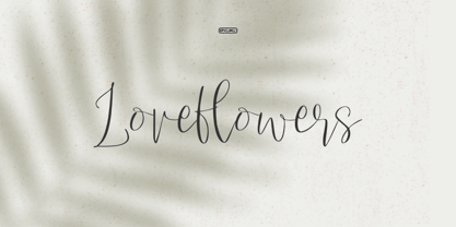 Love Flowers is a lovely and timeless handwritten font. It is a nice choice for creating eye-catching logos, branding, and quotes. Every letter has a unique and beautiful touch, to make your design come alive.


