10,000 search results
(0.063 seconds)
- Lust Text by Positype,
$29.00 Yes, finally. This one took the most time and the most restarting. Years went into imagining what Lust Text should look like and how it should structurally behave in order to truly improve upon a setting that includes any of the Lust typefaces. I approached it as much from the side of the type designer, as I did a potential user. The flow, the warmth, the personality needed to be there, but all of the excess had to be removed responsibly. In the process, and in need of inspiration, I looked backward to historical artifacts and precedent. In each early Lust Text approach, the solution was lackluster and/or vanilla and not actually a ‘Lust’ typeface. The exercise was not in vain though. By exploring past examples, I found my footing drawing for media now and how it might be used later—all the while, producing seamless, elegant curves and restrained indulgence (that sounds almost silly to say, but I like it). The Lust Collection is the culmination of 5 years of exploration and development, and I am very excited to share it with everyone. When the original Lust was first conceived in 2010 and released a year and half later, I had planned for a Script and a Sans to accompany it. The Script was released about a year later, but I paused the Sans. The primary reason was the amount of feedback and requests I was receiving for alternate versions, expansions, and ‘hey, have you considered making?’ and so on. I listen to my customers and what they are needing… and besides, I was stalling with the Sans. Like Optima and other earlier high-contrast sans, they are difficult to deliver responsibly without suffering from ill-conceived excess or timidity. The new Lust Collection aggregates all of that past customer feedback and distills it into 6 separate families, each adhering to the original Lust precept of exercises in indulgence and each based in large part on the original 2010 exemplars produced for Lust. I just hate that it took so long to deliver, but better right, than rushed, I imagine.
 - PF DIN Stencil Pro by Parachute,
$65.00 DIN Stencil Pro on Behance. DIN Stencil Pro: Specimen Manual PDF. Despite the fact that over the years several designers have manually created stencil lettering based on DIN for various projects, there had never been a professional digital stencil version of a DIN-based typeface until 2010 when the original DIN Stencil was first released. The Pro version was released in 2014 and adds multiscript support for Cyrillic and Greek. DIN Stencil Pro was based on its original counterpart DIN Text Pro and was particularly designed to address contemporary projects, by incorporating elements and weights which are akin to industries such as fashion, music, video, architecture, sports and communications. Traditionally, stencils have been used extensively for military equipment, goods packaging, transportation, shop signs, seed sacks and prison uniforms. In the old days, stencilled markings of ownership were printed on personal possessions, while stencilled signatures on shirts were typical of 19th century stencilling. Two companies dominated the market in the mid-twentieth century: the Marsh Stencil Machine Company in the United States and the Sächsische Metall Schablonen Fabrik in Germany. Ever since the late 1930s, it was the German Sächsische Metall Schablonen Fabrik which used heavily the new DIN 1451 standard font (introduced in 1936), attempting to overthrow the reign of the Didot-style modern roman which was at the time the most common stencil letter in Germany. These letters were manufactured mainly as individual zinc stencils which could be ordered in sizes between 10 and 100mm. The DIN Stencil family manages to preserve several traditional stencil features, but introduces additional modernities which enhance its pleasing characteristics which make it an ideal choice for a large number of contemporary projects. Furthermore, the spacing attributes of the glyphs were redefined and legibility was improved by revising the shape of the letterforms. The DIN Stencil Pro family is an enhanced version of the popular DIN Stencil. It consists of 8 diverse weights from the elegant Hairline to the muscular Black and supports Latin, Cyrillic, Greek, Eastern European, Turkish and Baltic. The new version 3.0 includes several additions such the recently unicode encoded character of the German uppercase Eszett (ẞ), the Russian currency symbol for Rouble (₽), Ukrainian Hryvnia (₴), Azeri and Kazakh letterforms.
 - ITC Stepp by ITC,
$29.99When Hal Taylor saw the 1930 logo for the Stetson Shoe Company of Weymouth, Massachusetts, he didn't run out and buy a pair of loafers. Instead, he seized on this striking example of an Art Deco logotype as the basis for a new typeface design. “I was impressed with the delicate and sophisticated letter forms,” Taylor recalls, “particularly the enlarged cap S -- in any other case it would have seemed unbalanced, but in the context of this logo, it worked perfectly.” All the letters in the original all-caps Stetson Shoe logo were rendered with condensed proportions except the O, which was a perfect circle. While the prominent O added visual interest to the logo, Taylor knew that such a character would limit his typeface to display applications. For versatility's sake, he drew his O for ITC Stepp with the same proportions as the rest of the alphabet. Taylor also gave the logotype's inverted S a more traditional design, but kept the original as an alternate character in the OpenType font. Taylor's toughest challenge during the design process was creating a lowercase. “A good type design tells you what it wants to be,” he says, “and after a little while the Stepp caps began to tell me what the lowercase should look like.” Taylor's lowercase is slightly more conventional than the caps. The jaunty g" and almost upside-down "s" add subtle charm, while the capital letters provide the broader gestures of Stepp's personality. Together, they create a versatile and distinctive typeface design. One of Hal Taylor's first jobs was as a photo-lettering typographer in Philadelphia, setting headlines and creating custom lettering. This was followed by a stint doing finished lettering for John Langdon, whose ambigrams appear in Dan Brown's best-selling novel, Angels & Demons. Today, Taylor works as a graphic designer in the publishing industry, but he still finds time to create an occasional hand-lettered book jacket, and draw handsome typeface designs. ITC Stepp is available in four weights, ranging from Light to Ultra Bold. All four weights have companion italics, and the lightest three weights also offer a suite of small caps." - TT Chocolates by TypeType,
$39.00 Introducing the third reincarnation of TT Chocolates! The popular typeface was updated to stay up-to-date with the latest requirements and trends in design! TT Chocolates is an elegant Humanist sans serif with a dense typesetting and well-balanced proportions similar to the classical tradition. This font's nice and friendly nature makes it seem like something close and familiar. It has earned a reputation among designers as the perfect font for confectionery, but the application range of the TypeType's "sweetest" typeface goes well beyond that! In 2023, we decided to do a full-scale font update referring to extensive sans-serif market research. We figured out where the trends are headed and what users want—this information helped us enhance TT Chocolates. Specifically, we introduced a new Condensed font version, a narrow font style with the authentic proportions of the standard version. At the same time, TT Chocolates Condensed boasts a more expressive personality than the base subfamily, which allows designers to solve even more creative tasks using only one typeface. The third version of TT Chocolates has become even more modern and advanced. A large number of characters, various OpenType features, and stylistic sets make the font suitable for multiple purposes and tasks. TT Chocolates is a perfect match for both branding and layouts. The font's dynamic shapes make it easy to read in small point sizes, allowing the eye to move effortlessly across the line. This typeface can also be used in web design due to the TrueType manual hinting option. TT Chocolates 3.000 includes: 29 font styles: 14 roman, 14 italic, and one variable font; Condensed version consisting of 14 new font styles; Carefully crafted contours; Optimized font rhythm and completely new kerning; Enhanced italics in basic subfamily; Variable font with three axes of variation: width, weight, and slant; 32 OpenType features, counting in 13 new ones; 901 characters in each font style—the character set has grown compared to the previous version, which had 629 characters in each font style; 230+ languages support, including the new ones: 35 Cyrillic-based and 16 Latin-based. Elevate your design's appeal with TT Chocolates!
 - Bradley Texting by Monotype,
$57.99Bradley Texting: a clear, friendly and easily legible calligraphy font, also suited to electronic devices With Bradley Texting, Richard Bradley has published another calligraphic typeface that recalls the style of Bradley Hand and Bradley Type. In this case, however, Bradley has advanced the style with clearer forms for display on electronic instruments and on other formats. Two other font families paved the way to the newly introduced Bradley Texting. In the mid-1990s, Bradley published Bradley Hand, with its rough contours. Since these coarse forms do not cut a good figure in the larger font sizes, Bradley Type followed, with smooth letters. During the development of Bradley Type, the idea for a further font came about ? one in the style of the two other calligraphic typefaces, but with simpler, easily legible forms and suited to electronic devices like mobile phones or tablets. The letters for Bradley Texting began with a marker on paper. Looking back, Bradley describes one of the biggest challenges as having the calm required to draw the relaxed-looking letters repeatedly while still making them fit the general style.The somewhat narrow and dynamically designed letters have round line ends, like those left by a felt-tipped pen. As a hand-written print font, the individual letters are not connected to one another. Nonetheless, they demonstrate the influence of a written font, such as the extended ends and the flowing transitions. Clear forms with open counters and a large x-height guarantee Bradley Texting good legibility in the smaller font sizes. Bradley Texting is also effective under more challenging conditions, such as on mobile phones, e-book readers or tablets; the fonts friendly and lively character comes through. With Regular, Semibold and Bold, Bradley Texting is adequately equipped for use as a headline or text font in various sizes. The selection of characters covers the Western European languages and German typographers will be happy to note the presence of the upper-case ß. Use the dynamic and clear forms of Bradley Texting anywhere you need a friendly character with a personal accent. Bradley Texting is persuasive in the print realm, in advertisements or on posters, as well as on electronic devices. - Rabenau by Linotype,
$29.99 Rabenau (formerly Lucinde), the distinctly warm and legible type family For 30 years the graphic designer Axel Bertram worked at creating his typefaces: He developed complete new alphabets for magazines and typewriters as well as for the constant demand for typefaces for use by commercial artists. He has developed wall charts the size of advertising posters as teaching aids for training commercial and graphic artists to write in a clean, classic cursive script. In the eighties he used the American Chyron computer to design a screen font for television. In the mid-nineties he discovered for himself the fabulous possibilities offered by the Fontographer font software program and explored them playfully. From the results of these experiments, Axel Bertram selected a design for further development. From 2003 onwards the calligrapher and type designer Andreas Frohloff collaborated with him on the further development and production of the 16 fonts of the Rabenau™ typeface family.The Rabenau font was inspired by many factors: From the fonts used as book covers to typewriter fonts and even printed material from England dating from the beginning of the nineteenth century (e.g. those used by the skilled printer William Bulmer), Rabenau's relatively high contrast is offset by some organic tapers, subtley rounded bracketed serifs, and a fairly generous x-height. This makes for a typeface that looks especially good in print. Its broad repertoire of weights and styles - Condensed, Poster, and Shadow - give it added versatility, and make it ideal for setting both display and text in the same typeface. Throughout the heavier weights, the contrast is maintained. The Poster Italic sparkles, and will make a fine display type for dynamic headlines, or logotypes. This family of sixteen fonts works beautifully together. All Rabenau font styles have a large set of ligatures and thus cover typical letter combinations in many European languages. Besides the standard ligatures for ff, fi and fl, letter connections are also available for tt, th and fj or ffi, ffl and ffk. The range is completed with lovely arched transitions for the characters st, ck or ct. The latter gives the font that certain something, both in continuous text and above all in headlines.
 - Ana by LetterPalette,
$35.00 Ana is a chromatic typeface consisting of 26 uppercase Latin characters, inspired by arabesque patterns from the nineteenth century. Programmed to enable users to easily create multicolored drop caps and initials, this decorative display typeface features a different ornament for every letterform, which fits perfectly with its glyph shape. This ornament is usually more luxurious on the left side of the letter, while on the right it is scarce, so that the body text can be placed close to the initial. These initials are valuable for use in large sizes, like posters, magazines, packaging design, fairy tales, and so on. The final forms of the initials consist of 5 parts which can be individually colored. There are 5 font files named Ana Layer A, Ana Layer B, and so on. A font user can manually create a multicolored initial with these font files, if there is no possibility to use the Contextual Alternates option. To do that, it is necessary to make 5 layers in the page layout software. Then, the corresponding character should be placed on each layer, so that Ana Layer A is on the lowest layer and Ana Layer E is on the highest one. Note that the glyph shapes are contained in the lower case positions. In contrast, the font file named Ana is programmed, so it is possible to create a multicolored initial with the Contextual Alternates command. There is no need for additional layers, everything happens on a single layer. First, the Contextual Alternates command (usually under OpenType menu) should be disabled. Then, using lower case key, type the desired character 5 times and apply color to them. Select them all and turn on the Contextual Alternates. Also, the font file Ana comes with a set of ‘black’ initials that can be used just like any other non-color typeface. The ornamental versions are contained in the uppercase positions, while the letters without the ornaments are in the lower case. With the font file Ana Monochrome one can only get the monochrome initials. Ornamental letters are contained in the upper case positions, while the letterforms without the ornaments are in the lower case.
 - KG Dancing on the Rooftop - Personal use only

- KG Party on the Rooftop - Personal use only

- Janda Capslock - Personal use only

- Learning to Trust - Personal use only

- KG Love You Through It 2 - Personal use only

- She Paints Me Blue - Personal use only

- KG Small Town Southern Girl - Personal use only

- Just Me Again Down Here - Personal use only

- Standard Request by Bogstav,
$18.00 Standard Request is 100% handmade, and was inspired by both grafitti and comic book lettering. When viewed at large sizes, the handmade look and feel really stands out - at the same time, Standard Request, is super legible even at really small sizes. I've added 5 slightly different versions of each letter, and they automatically cycle as you type!
 - Short Message by Arendxstudio,
$14.00 Short Message is a 3 font combination that is suitable for all your design projects that aim to convey your message to your loved ones, with the font packages offered will definitely satisfy you Short Message came with opentype features such stylist ligatures good for logotype, poster, badge, book cover, tshirt design, packaging and any more.
 - EFCO Colburn by Ilham Herry,
$15.00 Colburn is a squarish typeface inspired by lettering found on vintage tins, Colburn is a display typeface that captures the essence of nostalgia while offering modern versatility. Colburn's variable font technology ensures seamless transitions between different styles, empowering you to create dynamic and harmonious compositions. From packaging and posters to websites and branding materials. PDF SPECIMEN
 - Kelphyn by Creative17studio,
$11.00 Hello, now I tell you. its time for "Kelphyn". Yes you heard right. Kelphyn is a serif font family that allows you to try out new, innovative designs that suit your taste. Created to support all forms of design, art and ideas. especially for modern magazine designs, website layouts and supporting branding layouts. Grab it fast here Free updates
 - Novella by FontHaus,
$19.95 Novella has always been one of Fonthaus' more popular period (Art Nouveau) fonts. The style of Novella captures the essence of typography that was popular at the turn of the 20th century (1890-1905). Its curvilinear lines are organic and floral, complimenting the work of Louis Comfort Tiffany, Charles Rennie Mackintosh and Gustav Klimt among others of the time.
 - ITC Humana Serif by ITC,
$29.99ITC Humana font is the work of British designer Timothy Donaldson, an extended and versatile font family with a large array of variations. Donaldson first created ITC Humana Script with a broad-tipped pen and then went on to design the corresponding roman. ITC Humana is the perfect font for anything requiring both clarity and a touch of personality. - Mirabelle by Magpie Paper Works,
$14.00 Mirabelle from Magpie Paper Works is a family of four hand-lettered fonts designed to coordinate with each other or stand alone as display faces. Each font was created with a felt-tipped pen & ink, and includes a full set of capital and lowercase letters, as well as multi-lingual support, currency figures, numerals, and punctuation.
 - ITC Nora by ITC,
$29.99ITC Nora was designed by James Montalbano when he was on a 1930s sign-lettering kick, poring over showcard manuals to find inspiration for new typeface designs. A few letters led him to create this informal, goofy" script, which falls between the many formal scripts and the completely extravagant. ITC Nora displays a free-flowing openness and elegance." - Bulgatry by Hishand Studio,
$15.00 Elegant look font of Bulgatry. a modern serif font family that drawn inspiration from the elegant of Bali, classy, modern but classic at the same time. just have a look at this beautiful handcrafted serif typeface. Perfect logo, branding, invitations, stationery, wedding designs, social media posts, and much more. Complete with - ligatures - alternates - regular - italic - icon - kerning - multilingual support
 - Abecedarian by The Type Fetish,
$10.00 Chank claims to have the fastest type design, we think we have the youngest. Samuel was merely four years old when he wrote out his first face. We are expecting many more brilliant typefaces from this upcoming designer. Please note that this font has no numbers or punctuation symbols; Samuel just did letters at that time.
 - SomaSkript Tall by ArtyType,
$19.00 Somaskript Tall shares the same concept as Somatype Skwosh, namely a desire to ignore traditional rules and re-scale along one axis only. This time the starting point was Somaskript and the end result is a condensed & uniquely elegant display face, vertically extended by the process but with legibility very much intact and its personality preserved.
 - Arfindes Orthem by madeDeduk,
$12.00 Introducing Arfindes Orthem is a brush handwritten font and will be perfect for all your project design book, title branding, product packaging, invitation, quotes, label, poster, logo etc. Feature Uppercase & Lowercase Number & Symbol International Glyphs Multilingual support Alternative Ligature Feel free to drop us a message any time and follow my shop for upcoming updates Hope you enjoy it.
 - Academica Sans by Storm Type Foundry,
$53.00 Academica Sans was drawn with the aim of following the artistic features of Josef Týfa's fonts. It has the same proportions as the famous Academica, so both fonts can be successfully combined. It is suitable for all types of literature from scientific to poetry, but also for corporate identity and websites. It has a calm and timeless character.
 - Summer Sunshine by Figuree Studio,
$18.00 This time for Summer Sunshine! Made with love and joy, inspired by the warmth of summer. Comic look, so it will make your design more beautiful, cute, fun, and colorful. Features: Character Set A-Z (All-caps) Numerals and Punctuation (OpenType Standard) Accents (Multilingual characters) PUA Encode I hope you can enjoy the font :) Regards Figuree Studio
 - Viking Initials by Wiescher Design,
$19.50 Viking Initials are pure brute-force blackletter initials of the time just before the Nazis started to rule, somehow these initials are typical for that period. I made one alphabeth-set with rough edges on the uppercase keys and a second set with sharp edges on the lowercase keys. For you to choose. Your historical designer Gert Wiescher
 - Akturi by ProtoType,
$18.00 Akturi is a modular, techy and futuristic faux monospace display typeface, aiming to be used for all galactic space travel providers, mysterious coders and developers, and game designers creating strangely beautiful and gripping dystopian worlds. Featuring 471 characters, 7 stylistic sets and 7 weights, this display type offers plenty of customisability, versatility and support for 81 languages.
 - Megren by Azzam Ridhamalik,
$18.00 Introducing Megren, an experimental display typeface combining a simple and clean sans serif typeface with an elegant copperplate script typeface. Consists of 1 font file with copperplate script typeface on the uppercase and sans serif on the lowercase. The combination of different typefaces looks modern and fashionable but also gives a nostalgic retro vibes at the same time.
 - Tequila Sunrise by TypeClassHeroes,
$12.00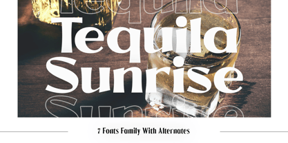 Introducing Tequila Sunrise, access your OpenType features to access the large selection of alternate letters and ligatures. Use this font for any branding, product packaging, invitation, quotes, t-shirt, label, poster, logo etc. Feature 7 Weight Uppercase & Lowercase Number & Symbol International Glyphs Multilingual support Alternative Ligature Feel free to drop us a message any time Hope you enjoy it.
 - SpeedSketch by Greater Albion Typefounders,
$16.00 It’s surprising - it can take more time and effort to make something deliberately and artfully imperfect than it does to make a more conventional design. We certainly found this to be the case when designing ‘SpeedSketch’. Perhaps a more accurate name would have been ‘SlowDraw’ but that wouldn’t really capture the essence of the finished design.
 - Anbery by Craft Supply Co,
$20.00 Anbery – Handwriting Font is a playful script typeface that exudes a carefree and fun-loving vibe, perfect for adding a touch of whimsy to your display designs. With its charming, handwritten style, Anbery captures the essence of spontaneity and creativity, making it an ideal choice for projects that aim to convey a sense of playfulness and joy.
 - Roncial by Fontron,
$35.00Roncial is an Ultra Bold font with a hint of serif. This is one of the fonts originally designed before the advent of digital and started out being a bolder, slightly serifed version of Folio Extra Bold which was one of the boldest fonts at the time (old metal set). It is available as Roman and Italic. - Music Nouveau JNL by Jeff Levine,
$29.00 The interesting hand lettered sans design of Music Nouveau JNL was found as the title of a vintage piece of early 20th Century sheet music for a song written by famed composer Irving Berlin and called "They Were All Out of Step but Jim". Judging by the cover art, it was a novelty song about a soldier.
 - Quam by Typogama,
$29.00 Quam is a contemporary sans serif typeface, designed to be used as either a display or text font. With a range of alternates, true small capitals and variable numerals, this design aims to be versatile and functional. An added function is the inclusion of the full Cyrillic encoding to allow the application of a wide range of scripts.
 - Lorcan Mist by Here East Fonts,
$16.00 LORCAN MIST is a powerful super modern editorial unicase font with vintage vibes, designed with love and care for amazing projects. It's great for social media, headlines, large-format print, editorial, branding, posters, fashion designs and websites — it's designed not to take too much attention but at the same time be a powerful accent. It's mysterious, elegant and sexy.
 - Switzal by Four Lines Std,
$15.00 "Switzal Font" speaks a universal language of happiness and optimism. It transcends age, culture, and borders, making it perfect for projects that aim to connect with a wide audience. Let your imagination run wild as you create eye-catching headlines, captivating slogans, or playful branding. "Switzal" font is your ticket to infuse a dose of happiness into your designs.


