10,000 search results
(0.024 seconds)
- PiS Coalfield by PiS,
$26.00 Written with a blunt graphite pen, PiS Coalfield features a scruffy scribbled look, loosely inspired by the expressive handwriting on various posters by Sister Corita Kent, an influential pop artist experimenting with serigraphs in the '60s. There is one set of regular and 4 sets of alternate glyphs for each basic letter programmed to cycle through automatically with the contextual alternate feature (which makes 5 possible versions of each letter). You can also hand-pick the 4 alternate sets if you prefer that of course! A super-lively handwritten look is guaranteed, readability is given in display but also in smaller sizes too! Use it for your organic tofu brand, children’s books or that hip sweet coffee shop around the corner!
 - Crox Narrow by NumidiaType,
$25.00 Crox™ Narrow is the second family of Crox™, designed for long texts and gaining paragraph spaces. It's available in 19 styles, including upright and italic, and the majority of glyphs are compressed to make a different spacing between characters. The basic English characters are provided as both numerator and denominator sets in the narrow version too; this feature may assist with the creation of fractions with letters and numbers, such as in advanced scientific fraction form scripting. Within each style, all weights support over 25 professional OpenType features, with significant coverage of western languages. and include multi-alternative characters in Styles 1, 2, 4, 10, and 11, which were initially intended for advanced usage. Specimen Crox™ is a trademark of Yassine Abdi.
 - Bonsai by Three Islands Press,
$29.00 Years ago, I developed an interest in the Japanese art of dwarfed potted trees, bonsai. I bought some books on the subject from Brooklyn Botanic Garden. In one -- Handbook on Bonsai: Special Techniques (seventh printing, February 1976) -- the type was bad. Old worn lead type, I suspect, spread wide in the tops of characters and disappearing on the bottoms. Two decades later, I came across my Brooklyn Botanic Garden collection and was struck again by this interesting type. Inspired, I made a typeface. Didn't take me long to decide on a name for it, either: a name with a double-meaning, based both on its look and its inspiration. Bonsai, the typeface, has two styles, a roman and a true italic.
 - Arcus by CarnokyType,
$- Arcus OpenType is a geometrically constructed font. The grounding principle is the round curve. The homogeneous character of this font is guaranteed by using this principle not only in drawings of particular letters but in the shaping of diacritical signs, too. The scope of the typeface weight is from Extra Light to Extra Bold while the complete font family includes 6 weights and their respective, well turned italics. This font contains a wide range of alternative signs, small capitals, lining and oldstyle numerals, fractions, superiors, inferiors, ligatures and discretionary ligatures; all this is within the frame of OpenType functions. This font type is not made for the typography of extensive texts. Best it can be used for headline display typeface or in creating logotypes and corporate identities.
 - Linotype Sangue by Linotype,
$29.99Linotype Sangue is part of the Take Type Library, selected from the contestants of Linotype’s International Digital Type Design Contests of 1994 and 1997. This prize-winning font was designed by the German artist Gabriele Laubinger. The most distinguishing characteristic of Linotype Sangue is the contrast between the wide, rounded capital letters and the tall, narrow and pointed lower case. Another factor which makes this font so unique is the way Laubinger worked with stroke contrasts, using heavy strokes in the top third of the characters and diminishing to extremely light strokes at the bottom. Linotype Sangue makes a mysterious, secretive impression. It is best used for headlines and displays and shorters texts with point sizes of 12 and larger. - Catholic Girls by Scholtz Fonts,
$21.00Catholic Girls is a timeless, handwriting-based, semi-calligraphic font that is highly readable yet has an informality combined with a quiet elegance. Above all else, Catholic Girls is well-behaved, ladylike, and can be expected to behave correctly and make the right impression in a wide range of situations. This "hand" is based on the style of handwriting taught at many Catholic Girls' Schools. It is feminine, elegant and readable. Use "Catholic Girls" for a great variety of applications, including: ? party invitations, wedding stationery, social event media, ? marketing material for seminars, property developments, leisure & lifestyle promotions, fashion, interior design, restaurants, florists, cosmetics ? publishing: magazines, books, children's books, greeting cards, ? packaging: girls' clothing, girls' toys, household consumables, cosmetics, fashion items, interior decor products - Donchenko Serif by Donchenko,
$15.00 Donchenko Serif is a leisurely, elegant, minimalist serif typeface that combines references to medieval half-uncials with Art Nouveau motifs. Its styles are well readable and at the same time have individual features, which makes this typeface stand out from the rest. Donchenko Serif is a "universal soldier". It's great for any challenge. It is also good for typing books or articles, designing corporate identity and promotional materials, or creating display cases. A wide range of Latin, Greek, Cyrillic and special characters provides extensive language support for all European languages. Font Donchenko Serif Regular was developed by designer Oleksandr Donchenko in Lviv (Ukraine) in the first half of 2022. His daughter - Sofia Donchenko - took part in the development some letters. Donchenko Serif - Good font for good people!
 - Linotype Gotharda by Linotype,
$29.99Linotype Gotharda is part of the Take Type Library, chosen from contestants of Linotype’s International Digital Type Design Contests of 1994 and 1997. This display font started as an experiment of the Croatian-German designer Milo Dominik Ivir. He wanted to design a font with characteristics of both sans serif and Gothic faces. From the Gothic he took the heavy strokes, the narrow letters, the exaggerated overmatter and the high x-height. The modern standard forms of the letters s, a, x and z, the clear capitals and the lack of serifs are the characteristics taken from sans serif faces. The result is a font with a constructed, old German feel. Linotype Gotharda is intended exclusivley for headlines in large point sizes. - Qualion Text by ROHH,
$39.00 Qualion Text™ is a modern geometric sans serif typeface with humanist and calligraphic inspirations. It is a text family designed for excellent legibility. Qualion Text™ is a sibling of Qualion™ & Qualion Round™, geometric family with lots of swashes and ornaments. Letter shapes and proportions has been adjusted to fit paragraph text and small sizes: - typeface is narrower now in order to fit more text in the design space - larger stroke contrast - pronounced ink traps and tapering - elegant true italics made even more calligraphic - adjusted spacing and kerning - adjusted font weights The main purpose of the family is clean and legible paragraph text, however it is very attractive choice for branding, headlines and display use, too. The italic styles as well as thin, bold and black upright styles have very strong character and look great in display sizes. Italics are very fluent, calligraphic, subtle and elegant, from the other side bold and black uprigths are very modern, powerful and unique thanks to the pronounced ink traps. Qualion Text™ family consists of 20 styles - 10 weights with corresponding true italics. Both have extended language support, as well as broad number of OpenType features, such as small caps, case sensitive forms, standard and discretionary ligatures, swashes, stylistic sets, contextual alternates, lining, oldstyle, tabular and small cap figures, slashed zero, fractions, superscript and subscript, ordinals, currencies and symbols.
 - DT Skiart Serif Mini by Dragon Tongue Foundry,
$9.00 ‘Skiart Serif Mini’ is now available online. Originally inspired by the san serif font ‘Skia’ by Mathew Carter for Apple. ‘Skiart’ was designed to feel more like a serifed font, but without any serifs. It took a step between sans serif and serif fonts. Next on the path towards a serif font comes Skiart Serif Mini, with tiny serifs added. This is a true serif font, all be it on the small side. It remains fully readable and feels as clean and normal as any of the best body copy serifs, and yet still has the strong solid bones of all the other Skiart font familys. If compared to one of the more commonly used serifs like ‘Times New Roman’, the ‘Skiart Serif Mini’ lowercase is more open with a taller x-height, increasing its readability and friendliness. The serifs are smaller and less distracting. They are not pretending to be ligatures. Where ‘Times’ makes its p q b d forms out of a barely touching oval and stem, the ‘Serif Mini’ forms are much more firmly attached, appearing clearly as single letters. The standard setting for the g’s are round single storied, (the italic a’s are also), feeling warmer and more inviting in the ‘Serif Mini’ font. Much more friendly than the stuffy double storied versions in fonts such as ‘Times’ etc.
 - Spaghetti Cyrillic by Ira Dvilyuk,
$17.00 The Spaghetti playful cute font includes the main & alternative uppercase, and main & alternative lowercase, and the full set of double letters in an upper and lowercase, and a large range of numerals and punctuation. The Spaghetti font will be perfect for use in all your fun design projects be it logos, labels, packaging design, blog headlines. Also, it will look great on mugs, cards, kids books headlines, or other typographic projects. Spaghetti cute playful font contains the Cyrillic glyphs too. The Cyrillic part of the font contains a full set of uppercase lowercase, and the Spaghetti Symbols is an additional font with 52 hand-drawn doodles, catchwords, arrows, and swashes and can help to make your design more original. Combine and arrange swashes and illustrations to create your own designs and make borders, frames, dividers, logos, and more (just use A-Z and a-z keys in the included Spaghetti Symbols font). A different symbol is assigned to every uppercase or lowercase standard character so you do not need graphics software just simply type the letter you need. Multilingual Support for 31 languages: Latin glyphs for Afrikaans, Albanian, Basque, Bosnian, Catalan, Danish, Dutch, English, Estonian, Faroese, Filipino, Finnish, French, Galician, Indonesian, Irish, Italian, Malay, Norwegian Bokmål, Portuguese, Slovenian, Spanish, Swahili, Swedish, Turkish, Welsh, Zulu. And Cyrillic glyphs support for Russian, Belorussian, Bulgarian and Ukrainian languages. Thanks!
 - Petite Annagri Cyrillic by Ira Dvilyuk,
$19.00 The font pair Petite Annagri Cyrillic will look gorgeous on wedding stationery, love stories, branding materials, monoline logos, business cards, Insta quotes, elegant fashion sketches, and much more. Petite Annagri script font contains the Cyrillic and Greek glyphs too. Petite Annagri is a pretty monoline cursive font, plus a Symbols font with 36 lovely monoline swirls, flourishes, and illustrations. Petite Annagri script font contains a full set of uppercase and lowercase letters. Petite Annagri Symbols is a font with over 36 hand-drawn monoline elements, illustrations, and swashes that can help you to make your design unique and matchless. Combine and merge swashes, flourishes, and illustrations to create your own designs and make borders, frames, dividers, logos, and more. To make the swirl or flourishes in the beginning or in the end of the word just type the letter (A-Z or a-z and 0-9 keys) and choose the included Petite Annagri Symbols font. See preview images. Multilingual Support for 33 languages: Latin glyphs for Afrikaans, Albanian, Basque, Bosnian, Catalan, Danish, Dutch, English, Estonian, Faroese, Filipino, Finnish, French, Galician, Indonesian, Irish, Italian, Malay, Norwegian Bokmål, Portuguese, Slovenian, Spanish, Swahili, Swedish, Turkish, Welsh, Zulu. Also, the Greek language is supported. And Cyrillic glyphs support for Russian, Belorussian, Bulgarian and Ukrainian languages Kazakh. Works perfectly on the Canva platform. For Cricut & Silhouette recommended.
 - Bfrika by Holland Fonts,
$30.00Bfrika is an 'Africa inspired' typeface and a contribution for the typographic issue 'National Typographica' of I-Juici Magazine, in South Africa. This geometrical decorative design represents bold simplicity, directness and rythm. The name evolved from text for the spread in the magazine. The B replaces the A. Africa be free. Bfrika. The concept behind Bfrika is to generate an unpredictable visual rhythm in an attractive decorative presentation. Filling up the white space around the letters accentuates form over function, thus creating an interference of visual impressions with its legibility. This visual rhythm is amplified by its redundancy in a text, only pausing at a break or a word space. Based on the concept of separate printing forms in letterpress, Bfrika Two Tone and Bfribat Two Tone separate the letter from the outside form in two fonts. Placing two text frames exactly on top of each other and assigning each part of these font to a frame in a different color, offers a quick way to add color. Originally Bfrika was designed for I-Jusi magazine #17, National Typografika, South Afrika 2001. Bfribat and both two tone fonts were created for Building Letters, a fund raiser for orphanages in Kenya and Uganda (www.buildingletters.org) and are also available for Mac and PC at www.hollandfonts.com and will be distributed in 2004 through associated foundries. - Broadside Text by Device,
$39.00 Broadside Text is a companion to Broadside, and is optimised for use at smaller sizes. More open counters, more generous letter-spacing and additional fractions increase legibility. The original Broadside family is suitable for headlines and larger sizes, and also comes with condensed and extended versions. Broadside is a versatile, authoritative and functional family inspired by the sans serifs seen on ’40s and ’50s patriotic posters and period advertising. It is available in seven weights across condensed, normal and extended widths, each with reweighed italics. The type from this period was very often hand-drawn, and so differs considerably from poster to poster. Many American examples of this period use a Photo-Lettering style called Murray Hill and its derivatives, although their UK counterparts, designed by such luminaries as Abram Games or Tom Eckersley, are more stylistically diverse. Even though no single model is available to base a digitisation on, there are certain recurring stylistic quirks that give the type its unique flavour, and so the most interesting examples from several sources were be combined for the final family. Alternate short descenders, allowing for tighter line spacing, can be toggled on or off in the Opentype panel of Indesign or Illustrator. Tabular and lining numerals and a single-story ‘a’ are also available in all weights and styles.
 - Garash by Dharma Type,
$14.99 Very decorative script inspired by old lettering in Eastern Europe. Eye-catching for picture books, toys for children. There is another font which called Garash Script.
 - Tenner by Suomi,
$35.00 All-caps script with swashes in upper case, and ligatures. And outline with same metrics, so the oulines fit snuggly on top of the book-variant.
 - Thumper by Kern Club,
$10.00 Nostalgia styled font designed by Samborghini Uppercase Character Set A-Z Lowercase Character Set a-z Tons of alternate characters Numerals & Simple punctuation OTF file format
 - Texarkana JNL by Jeff Levine,
$29.00 Texarkana JNL is based on classic condensed wood type from the 1800s, and is embellished with stars on the top and bottom for a decorative look.
 - Fango by Typo5,
$16.95A heavy one. For major impact use it only in caps, however typing randomly upper and lower case has interesting results too. Play with it please. - Creepy Night by Seemly Fonts,
$12.00 Creepy Night is an incomparable display font. Masterfully designed to become a true favorite, this font has the potential to bring each of your creative ideas to the highest level!
 - Party Noid by PizzaDude.dk,
$20.00Party Noids goes all the way - from cartoonish to romantic, from funny to serious. Write in all caps, all lowercase or mix upper and lowercase to create ounces of fun! - KG A Little Swag by Kimberly Geswein,
$5.00 Cute bunting style lettering. Best when used with multiple layers to create a stacked, dimensional look. Use the parentheses to create end pieces and _ (underscore) to connect the end pieces.
 - Contribute by Fontscafe,
$39.00 The Contribute font is one that takes you back to the days of the fountain pen. To those who are old enough to remember, fountain pens were tiresome to fill and use – but also a pleasure to own, something to cherish that became so much a part of your daily life, a symbol of etiquette and sometimes even a style statement! Our Contribute fonts will definitely remind you of that, and everything else to do with a touch of vintage class. This 30s-like font is sure to become one of your favorite cursive fonts, be it for use on a poster or a web page. This font is ideal for those situations where you need your viewer to connect on a more personal level than formal. Think ‘writing a letter rather than typing it out’, and you will know what we mean!
 - Sparkling Sunday by Prestige Artsy Studio,
$19.99 Introducing the newest addition to your font collection — Sparkling Sunday! This font is the perfect combination of vintage and modern, with bold and chunky letters that are sure to make a statement. The font is inspired by the 80s and 90s era, with a touch of modern typography. Each letter is carefully crafted with attention to detail, giving it a unique and eye-catching look. The font is perfect for posters, flyers, logos, and any design that needs a retro touch. It comes in a regular style and an extra including 26 retro graphics to allow versatility in your designs. Simply install the file as a separate and you will get to type them using the alphabets A-to-Z to access them. Get ready to take your designs to the next level with this cute Sparkling Sunday Duo.
 - Retro Voice by BlessedPrint,
$20.00 Retro Voice is variable serif font meticulously crafted by BlessedPrint to evoke the nostalgic charm of the 80's. Drawing inspiration from trendy vintage magazine headlines, this font family boasts regular and italic versions. Retro Voice's variable font format provides you with boundless opportunities to fine-tune your typography. With the ability to adjust width, weight, and contrast, you can create a wide range of visual styles that cater to various design projects. No need to fumble with glyph panels; simply type a "+" after the letter to access alternate characters. This feature extends to all characters, thanks to our PUA encoding. Each character within Retro Voice has undergone a meticulous design process. Every curve, line, and thickness was refined to perfection through a precise and rigorous mathematical verification, resulting in a font that radiates luxury and elegance.
 - Allrounder Antiqua by Identity Letters,
$40.00 Timeless Renaissance looks, gently updated. For novels and billboards alike. Allrounder Antiqua is an old-style serif member of the Allrounder superfamily. A timeless typeface based on classical proportions, Allrounder Antiqua is perfectly suitable for advanced book and editorial design well as packaging and branding. True: its main purpose is to set flawless body copy and to generate an evenly textured page—but its refined shapes work fantastically in display applications, too. Some details, such as the small and sharp bowl of the lowercase a, are fully appreciated in large sizes only. If you need a sophisticated serif typeface for packaging, food, fashion, consumer goods, or lifestyle branding, Allrounder Antiqua is up for it. It's also apt as an outstanding corporate typeface, be it for a more conservative venture or the latest hipster start-up. This classy serif typeface comes in four weights with corresponding true italics. Just like its sans-serif counterpart, Allrounder Grotesk, Allrounder Antiqua is equipped with plenty of Opentype Features like small caps, six sets of figures, case-sensitive forms, superiors, fractions and many ligatures. You will find alternate letters with swashes within this extended character set, as well as all the accented glyphs necessary to support more than 200 Latin-based languages. Historical Background The (French) Renaissance-influenced typeface started as Moritz Kleinsorge's graduation project within the "Expert Class Type design" course of the Plantin Institute for Typography, located in the famous Museum Plantin-Moretus in Antwerp, Belgium. There, Moritz Kleinsorge decided to create a revival of Robert Granjon's "Ascendonica Romain", described as "a beautiful face; typical of Granjon's mature style" in the inventory list of available material. "To touch punches and matrices cut by Robert Granjon back in 1567 was an invaluable inspiration", Moritz explains. Over time, the typeface moved away from being a true revival. Rather, it evolved into a Granjon-inspired typeface. That typeface is now available as Allrounder Antiqua. Perfect Pairing: Allrounder Antiqua + Allrounder Grotesk Allrounder Grotesk is the ideal complement to Allrounder Antiqua. They both share common vertical metrics and a common color. This allows you to pair both typefaces within the same layout—even within the same paragraph—without creating visual disruption. Head over to the Family Page of Allrounder Grotesk to get more information about this typeface. Design Trick: Bilingual Design With the Allrounder Superfamily Combining Allrounder Grotesk with Allrounder Antiqua is an ideal approach for bilingual designs, wherein both languages get the same emphasis yet are distinguished with two different typefaces. It's also best practice to set headlines in a different typeface than the body text if they harmonize with each other. Allrounder Grotesk and Allrounder Antiqua provide you with the perfect pair for this purpose.
 - Brushed by d[esign],
$4.62 Let this free-flowing brush script add a little hand painted goodness to your works. Cheaper than a bucket of paint, use Brushed to add brush painted letters to your works or manipulate the many glyphs in this font using image editing software to create art as shown above.
 - Mix Stitch by Mix Fonts,
$13.00 Mix Stitch, is an embroidery lesson disguised as a font, fit for handmade and DIY themed projects. Can be used to emulate embroidery in images, or as a guide to teach kids how to write. So many uses for this fun font, I don't even know where to begin.
 - Helion by Fonthead Design,
$19.00Helion is a font designed by Ethan Dunham that has a sleek sci-fi feel to it. While it appears to be monocase, many of the lower case letters are different, though the x-height equals the cap height. You can use this to add variation to your headlines. - Pratfall by Jeff Levine,
$29.00 For 138 years, the Milton Bradley Company (of Springfield, Massachusetts) has been the leading producer of board games, toys and educational/instructional materials. The company was acquired by Hasbro in 1984. It was merged with the also-acquired Parker Brothers in 1991 and became Hasbro Games until both brand ID's were dropped in 2009. “The Moving Picture Game” was a 1920s-era board game created by Howard R. Garis (credited as ‘the author of the Uncle Wiggily game’) and capitalized on the still-new motion picture industry. On top of the storage box is the game’s name – hand lettered in a free-flowing Art Nouveau sans serif that more closely resembles the titles found within animated cartoons or in the ‘bubble letters’ a school child doodles on notebook paper. Recreated as a digital typeface, Pratfall JNL (named after the slips, trips and falls taken by silent era film comedians) is available in both regular and oblique versions.
 - RAN by URW Type Foundry,
$35.99 RAN Reformed Typeface for Beginners by Georg Salden - a headstrong and courageous approach to an improved handling of handwriting. Diverse and sometimes irreconcilable theories exist about how beginners are supposed to learn writing and reading. This has led to fierce discussions among experts already. We don’t want to pour more oil on the fire, but hope to create a new awareness for this topic, which is important to everyone of us. For beginners the combination of single characters (sounds) to whole words is essential during the acquirement of reading and writing. In this process they develop the skill to recall entire terms from memory. Therefore, after current practice, every word shall be written in a single stroke without lifting the pen in between. Georg Salden contradicts this postulate and warns, that coercively holding the pen down within a word can easily lead to exaggerated loop formations and a general meandering of the written text. The intellectual process in connecting single sounds to words while writing would happen anyway and the prohibition to lift the pen would often lead to tensions. To still support the necessary connections in general and to simplify the connecting, he teaches to write all round letters like a, e, g, o with inclusion of the connecting stroke, so that the spacing and combining with the next character arise by themselves. By settling the stroke at certain points and with a clear and logical writing method, a conscious and careful contact with the various strokes arises. All this automatically leads, together with a certain deceleration, to an increase of beauty and readability in the handwriting. The repeatedly discussed topic »connected or unconnected« appears to be solved in the most comfortable way as, depending on the particular character combination, both solutions are possible.
 - Salvador by Homelessfonts,
$49.00 Homelessfonts is an initiative by the Arrels foundation to support, raise awareness and bring some dignity to the life of homeless people in Barcelona Spain. Each of the fonts was carefully digitized from the handwriting of different homeless people who agreed to participate in this initiative. A biography/story of each homeless person captures their story, to help raise awareness and bring some dignity to the life of homeless people. Monotype is pleased to donate all revenue from the sales of Homelessfonts to the Arrels foundation in support of their mission to provide the homeless people in Barcelona with a path to independence with accommodations, food, social and health care. Salvador was born in a small village in the province of Seville, Spain where he lived until 2002. During many years he worked in restaurants, construction, and in the fields, until he decided to go try his luck in Palma de Mallorca. There he worked in hotels and in construction, until the economic crisis erupted and he was left without work or benefits of any kind and he began to live in the street: “The street has few good things, but it teaches you to be more selfless, to share with others what you have, even if it isn’t much.” In 2006, a friend encouraged him to come along to Barcelona and bought his plane ticket. Once there, things did not go much better and he had to continue living in the street. A year ago he left behind that life and now he explains his experience in guided tours to school groups: “I like it because I see that many of them are interested and they ask questions. It is good that they learn.”
 - Glis by BXS Type,
$10.00 The Glis font is a unique expression of authenticity, meticulously hand-drawn to bring a touch of charming personality to your designs. With rounded and slightly irregular strokes, Glis is more than just typography; It's a visual experience that adds artisanal charm and a sense of warmth to your creations. Each character is carefully designed to convey a relaxed and welcoming aesthetic, providing a visually captivating approach to your typographic compositions. Try Glis to infuse a dose of originality and softness into your designs. **Uppercase
 - Brume by Creativemedialab,
$16.00 Brume font is a bold, attractive and beautiful font. "Easy to read, modern and elegant look but stylist", this will be the first words that your client says to your design using this font. Comes with uppercase and lowercase. It has many alternates character with nice curve that you can arrange to create a nice logo lettering, or use it as a display face on a poster and add a few alterations to it to make a beautiful eye catching words. Brume font is best for logo lettering, headlines, product packaging, t-shirt design, wedding theme, poster, book cover, wedding invitation, Christmas and more To access alternate: In Adobe Photoshop go to Window - glyphs In Adobe Illustrator go to Type - glyphs
 - Billie Sight by Din Studio,
$29.00 Looking for the perfect font to use on invitations or branding? Hoping to travel your audience to a world of gorgeous, elegant, versatile, yet modern? Then, you go to the right path. Introducing Billie Sight- A Signature Font Billie Sight is a modern and elegant handcrafted signature font to embrace your audiences or guests. Every stroke and curve was created to capture the essence of elegance and style. Perfect for social media posts and ads, printed quotes, t-shirt designs, packaging, or even as a modern text overlay to any background image. Billie Sight includes Multilingual Options to make your branding globally acceptable. Features: Standard Ligatures Stylistic Sets Multilingual Support (84 language) PUA Encoded Numerals and Punctuation Thank you for downloading premium fonts from Din Studio
 - Zany Route by Putracetol,
$22.00 Zany Route is a delightful and rounded typeface designed to rev up the fun in transportation-themed projects. With its playful and engaging style, it's the perfect addition to any creative project. Whether used on its own or combined with any of its eleven thematic variations, Zany Route is sure to transport your designs to a world of joy and adventure. This font offers eleven distinct variations inspired by transportation, including planes, cars, gears, motorcycles, trucks, and more. It's the ideal choice for designs related to transportation, catering to children and crafters alike. Zany Route is your ticket to logos, children's themes, crafting, invitations, packaging, posters, titles, businesses, greeting cards, stickers, children's books, magazines, and any designs connected to the world of transportation.
 - Egal by Koral Creative,
$30.00 Introducing EGAL, the highly sophisticated and premium font inspired by the symbol of equality, the equals sign (=). Meticulously crafted with the utmost attention to detail, EGAL is the epitome of luxury typography, perfect for elevating your brand's image. Egal is a contemporary display font inspired by old sans fonts, designed to provide a premium feel to any project. It is designed to fit any logo or branding project and supports over 70 languages, including Cyrillic. With 395 glyphs, Egal is the perfect choice for anyone looking to add a stylish and sophisticated touch to their project. The word "egal" itself is derived from the French word for "equal", emphasizing the font's intent to provide a sense of balance and harmony to any project.
 - Pirouette by Linotype,
$40.99Pirouette is based on a logo that Japanese designer Ryuichi Tateno created for a packaging design project in 1999 (a shampoo container!). Tateno's logo experimented with complex, overlapped swash letterforms. He continued to develop these outside of the initial packaging project, until they took on a life of their own. Eventually, Tateno designed a full typeface out of the logo, Pirouette, which was the first place display face in Linotype's 2003 International Type Design Contest. The Pirouette typeface contains six different fonts. The basic font is Pirouette Regular. This is an engraver's italic lowercase paired with elaborate swash capitals. The swash capitals have two visual elements in their forms: thick strokes and thin strokes. Pirouette Text includes the same lowercase as Pirouette Regular, but the uppercase letters are much shorter and simpler. This "text" font can be used to set longer amounts of copy. Pirouette Alternate contains different lowercase glyphs and additional ligatures, which can be used as substitutes for the lowercase forms in the Pirouette Regular and Pirouette Text fonts. Pirouette Ornaments contains swashes and other knick-knacks that can either be added onto the end of a letter, or used as separate decorative elements or swooshes (accolades) on a page. Pirouette Separate 1 and Pirouette Separate 2 are two fonts that can be layered over top of one another in software applications that support layering (e.g., most Adobe and Macromedia applications, as well as QuarkXPress). Pirouette Separate 1 contains the thick stroke elements from Pirouette Regular's uppercase letters, as well as the same lowercase glyphs that can be found in Pirouette Regular and Pirouette Text. Pirouette Separate 2 contains only the thin stroke elements from Pirouette Regular's uppercase letters. By layering Pirouette Separate 1 and Pirouette Separate 2 over one another, you can give the uppercase letter's thick and thin stroke elements different colors and create unique, more calligraphic designs. The Pirouette family, Tanteno's first commercial typeface, was greatly influenced by the calligraphic and typographic work of the master German designer, Prof. Hermann Zapf, especially his Zapfino typeface. - Janda Spring Doodles by Kimberly Geswein,
$5.00 Doodles ranging from cute animals to Easter eggs to flowers of various types.
 - Vibration by Funk King,
$5.00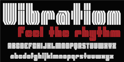 Vibration is a modular font. Use it to give energy to your designs.