10,000 search results
(0.022 seconds)
- Hermit by Davide Romito,
$106.00 Hermit was born like a modern and personal reinterpretation of Gothic-style alphabets, where improvisation and personal taste have led the design towards a new aesthetic mix between gothic and modern typefaces, creating new glyphs with tweaked strokes to achieve a good level of legibility. Hermit is a modern gothic font designed for brave designers and for epic designs, available in three weights and variable fonts. It is good to use for Branding and Editorial projects with texts not too small, Advertising, Packaging, Labeling, and Book or Magazine titles.
 - Aluvemskrew by Ilhamtaro,
$99.00 ALUVEMSKREW is a fairly simple Blackletter font, not too many strokes or ornaments. The font is clean enough so that it has better legibility than other Blackletters. Even so, this font still has a vintage style so it is suitable for creating classic or retro designs, such as for liquor branding, studio tattoos or classic motorcycles. To enable the OpenType Stylistic alternates, you need a program that supports OpenType features such as Adobe Illustrator CS, Adobe Indesign & CorelDraw X6-X7. Guides to access all alternates glyphs : http://adobe.ly/1m1fn4Y Cheers!
 - Sunday Chillin by Hoperative Design,
$15.00 Sunday Chillin is a gorgeous and retro-styled script font crafted to add tons of stylish character to your designs. This font is PUA encoded, which means you can access all of the glyphs and swashes with ease! This font can be used for logos, branding, invitations, stationery, wedding designs, social media posts, and much more! Sunday Chillin Features : Ligature Kerning Uppercase and Lowercase Number and Punctuation Stylistic Alternates Stylistic set 01 Stylistic set 02 Stylistic set 03 Swash PUA encoded which means you can access all glyphs Multilingual Support Thanks, Hoperative Design
 - Stick Figure by Putracetol,
$24.00 The Stick Figure - Groovy Fun Font is a display typeface that embodies cuteness and uniqueness to the fullest. With its super thick and groovy letterforms featuring playful bubble-like endings, this font exudes a sense of fun and whimsy. It distinguishes itself further with a wide array of ligatures, adding extra character and distinction. Perfect for children's themes or any design that aims to convey joy and excitement, Stick Figure is a fantastic choice for logos, branding, headlines, titles, books, packaging, quotes, posters, children's toys, stickers, and more.
 - Jensen Arabique by CastleType,
$39.00 This elegant typeface was suggested to me by type critic Daniel Will-Harris. Jensen Arabique is based on a set of capital letters drawn by Gustav Jensen that included the word "ARABIQUE" at the top of the first page, therefore the name. Daniel Will-Harris has this to say about Jensen Arabique: "I found an example of this unexecuted Gustav Jensen typeface in a type sample book from 1933, and Jason Castle lovingly digitized it with all its rare and unusual curves intact." Uppercase with alternates, numerals and some punctuation.
 - Saeta Pro by DBSV,
$90.00 About family “SaetaPro” Wind games… The name is taken from an old paper toy made by someone who makes paper planes with teasing messages. But there are also songs with a strong feeling in flamenco style. It is also a way of expression in order to give way to emotion and interpersonal communication. They are wind games that people have been playing for a long time ago!!! This series is composed and includes twelve fonts with 632 glyphs each, with true italics, true Sloping and supports of course: Latin, Greek & Cyrillic.
 - Hippie Vintage by Putracetol,
$22.00 Hippie Vintage’s bold, groovy, clean and unique with vintage fell. Hippie Vintage is very versatile sans font that works great with vintage themes. Hippie Vintage is a vintage sans serif font with beautiful ligatures, tons of alternative glyphs and multilingual support. Helps to create layout design in 60s or 70s design projects. Come with open type feature with a lot of alternates, its help you to make great lettering. Hippie Vintage best uses for heading headlines, cover, poster, logos, quotes, product packaging, merchandise, social media & greeting cards and many more.
 - Jeullyta by Tigade Std,
$10.00 The name Jeullyta is taken from the Indonesian language but with modified pronunciation. The correct one is Jelita which means "Gorgeous". I named this font Jeullyta because it is gorgeous, from the initial process until the end product. It is a strong yet nice looking script font and can be considered a brush font too with the shadow on the body of each glyph. This font is suitable to be used for: Posters Advertisement Book Cover and much more It comes with hundreds of stylistic alternate glyphs to enhance the feel of your design. Enjoy!!
 - Drowsy Lunch by PizzaDude.dk,
$15.00 The inspiration for this font (as well as the name!) comes from a London cafe I visited years ago. I was fascinated with the handwritten menu - irregular and awkward, yet refreshingly charming. I did my best to recall that particular look by adding 4 slightly different versions of each lowercase letter. The name of the font comes from the speed of the waiter...or the lack of it! But luckily he took his time, otherwise I wouldn't have had the time to really look at the handwritten menu! :)
 - Lokomotiv by Hanoded,
$15.00 The 1930 Geneva Motor Show (Salon International De l'Automobile Et Du Cycle) showcased a lot of new cars, but one item in particular took my interest: the amazing art deco poster announcing the show. Lokomotiv font was based on this poster. It is a very deco-ish font, futuristic, angular, with bold squares, rounds and triangles. As I had to work with just a handful of glyphs, and needed to fill an entire font, I made up the missing ones myself. Lokomotiv, by the way, is German for Locomotive.
 - Molly Louie by Pelavin Fonts,
$18.00 Conceived on a cold evening to the hot Jazz of the Eri Yamamoto Trio at Arthur’s Tavern in the Village, font Molly Louie is best described by the person for whom it was named. “Very intricate, like a whole little world in each of them” and “The solid is nice too, like little cut up sandwiches.” The detailed and solid versions facilitate a variety of two-color applications. You might not use this decorative display font at smaller sizes, but you are encouraged to let your imagination guide you.
 - Goodness Cakes by Allouse Studio,
$16.00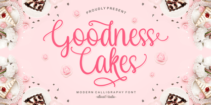 Proudly Presenting, Goodness Cakes a Modern Calligraphy Font. Goodness Cakes is perfect for product packaging, branding project, megazine, social media, wedding, or just used to express words above the background. Goodness Cakes come with ligatures, tons of swashes and alternates, and also Multi-Lingual Support. We highly recommend using a program that supports OpenType features and Glyphs panels like many of Adobe apps and Corel Draw, so you can see and access all Glyph variations. Enjoy the font, feel free to comment or feedback, send me PM or email. Thank You!
 - Reaper BT by Bitstream,
$50.99Thomas Oldfield’s typeface, Reaper, is reminiscent of inscribed Greek letterforms but he claims that its origin is much simpler than that. “I recall”, Tom says, “that I just began the design by making the uppercase ‘I’ and continued using it to make up the other characters.” The cap only typeface has alternate cap forms in the lowercase positions, including a vastly scaled downed O and Q that make for some unusual text settings. Contrary to what the name might have you believe, there’s a lot of life in this quirky typeface. - Linea 72 by OLOF Type Foundry,
$25.00 Linea 72 is a typical seventies display typeface that was designed by Roland Hirter back in the phototypesetting days, when typefaces were really drawn by hand. In this static environment each work step took its time. With the decision to digitize this typeface his son Thomas Hirter also chose to develop it further with todays technical possibilities. That’s why the font now includes over 600 glyphs and ten stylistic sets, offering different stylistic alternates of several letters. Linea 72 comes in the two original styles Regular and Kontur.
 - Royal Victor by Putracetol,
$28.00 Royal Victor is a bold display font with beautiful ligatures, tons of alternative glyphs and multilingual support. It’s bold, groovy, clean and unique with vintage fell. Royal Victor is very versatile font that works great in large and small sizes. Helps to create layout design in 60s or 70s design projects. Come with open type feature with a lot of alternates, its help you to make great lettering. Royal Victor best uses for heading headlines, cover, poster, logos, quotes, product packaging, merchandise, social media & greeting cards and many more.
 - Boondock by Canada Type,
$24.95Boondock is another Imre Reiner design resurrected from the ashes of hot metal type for digital use. This wild paint font is a revival of the fascinating Bazaar brush type from 1956. Boondock has some very unique characters that combine to form a statement of casual but loud strength, seriousness and raw primal emotion. Great for short sudden-impact spurts, like book cover titles, single sentence headers, movie posters and music sleeves. Redrawn from original specimen by Patrick Griffin, and expanded with some built-in extras too add to the convenience of this digital version. - Royal Loudes by Letterhend,
$14.00 Bold and powerful, Royal Loudes is a top-of-the-line display font that commands attention. Its impeccable quality is evident in its flawless execution, with each letter carefully crafted to perfection. Available in three unique styles - regular, rough, and stamp - this font offers a dynamic range of options to suit any design need. Features : Uppercase & lowercase Numbers and punctuation Alternates & Ligatures Multilingual PUA encoded We highly recommend using a program that supports OpenType features and Glyphs panels like many of Adobe apps and Corel Draw, so you can see and access all Glyph variations.
 - Palmerson by Uncurve,
$30.00 Palmerson is an aesthetic vintage font, inspired from the past typography, elegant signage, gold leaf , sign painting and old label product. Palmerson comes with tons of alternates characters to make more eye cacthy . Two different size uppercase and one lowercase it's make more choice to combine and find some more great typography. Palmerson Font is suitable for authentic logos, headings, sign painting, posters,letterhead, branding, magazines, album covers, book covers, movies, apparel design, flyers, greeting cards, product packaging, and more. Finally BOOM..!! you get a great design for your project.
 - Kyhota by Ingrimayne Type,
$14.95 The six typefaces of the Kyhota group all have an “Old West” look to them. KyhotaOne has very thick slab serifs compared to KyhotaTwo. KyhotaBarbed is more condensed than either and has little barbs on the verticals, something that was a feature of a number of nineteenth century typefaces in this style. KyhotaFezdaz is condensed, without barbs, and with the slab serifs replaced with a flare serif. KyhotaBigBottom and KyhotaBigTop play with the weighting of the serifs, with one (either top or bottom) very thin and the other very thick.
 - Overly Sweet by Bogstav,
$16.00 Usually I prefer desserts that aren't overly sweet, but a week ago I lost my sense of tasting - due to Corona, and when I wanted something sweet...I preferred it overly sweet...of course because I hardly could taste the overwhelming sweetness! But now, I have my sense of tasting (and smelling!) back, and everything is back to normal. And since I completed this easy-recipe-inspired handmade font while suffering from Corona, I thought I'd name it Overly Sweet. And...well. because, the font is somewhat overly sweet (without being over the top sweet!)
 - Playmax by OhType!,
$16.00 It is difficult to classify a typography that is made from different line fragments but precisely that is what makes it stand out from the rest, a construction that took months and multiple corrections that now make up a set of glyphs with is own identity based on the game between blacks and whites, standing out especially in large formats, posters, headlines, logos and titles. Playmax is a typeface with which you can find endless forms of customization, from its basic structure to the number of effects it supports.
 - Heavy Rain by Mans Greback,
$59.00 Heavy Rain is a decorative roman typeface. Drawn and created by Mans Greback during 2020 and 2021, this medieval serif font has a distinct classic style and a historical character. It gives antiquity to any graphic project, and with its ornamental capitals it accentuates your message. In addition to the decorated uppercase, it is provided in a regular, simplified text style. Heavy Rain is built with guaranteed top-notch quality. It has extensive lingual support, covering all Latin-based languages. It contains all characters and symbols you'll ever need, including all punctuation and numbers.
 - Morrello by Putracetol,
$28.00 Morrello is a bold retro decorative serif font with beautiful ligatures, tons of alternative glyphs and multilingual support. It's bold, groovy, clean and unique with vintage fell. Morrello is very versatile font that works great in large and small sizes. Helps to create layout design in 60s or 70s design projects. Come with open type feature with a lot of alternates, its help you to make great lettering. Morrello best uses for heading headlines, cover, poster, logos, quotes, product packaging, merchandise, social media & greeting cards and many more.
 - Nd Tupa Nova by Notdef Type,
$29.00 Tupã is a Brazilian indigienous god of thunder. This typeface is a geometric Sans Serif based on vertical and diagonal strokes. The heavy weights are great for impact layouts and the light weights are perfect to make sutil and strong messages. Tupã has a wide character set, including Cyrillic, with Small Caps, Ligatures, regular and tabular numbers and a lot of alternates. This Font is great for tight leading, including when diacritics are involved, there are alternates and case sensitives symbols to make all blocked. And yes!, there's a Variable Font too.
 - Elastic Heart by Putracetol,
$22.00 ELASTIC HEART is a display vintage font with beautiful ligatures, tons of alternative glyphs and multilingual support. It’s bold, groovy, clean and unique with vintage fell. ELASTIC HEART is very versatile font that works great in large and small sizes. Helps to create layout design in 60s or 70s design projects. Come with open type feature with a lot of alternates, its help you to make great lettering. ELASTIC HEART best uses for heading headlines, cover, poster, logos, quotes, product packaging, merchandise, social media & greeting cards and many more.
 - Artificial Flavour by Kitchen Table Type Foundry,
$15.00 I do groceries a couple of times a week. When I am shopping for food, I always read the ingredients list; I don’t want too much sugar, nor palm oil, trans fats or a lot of E numbers. It used to be quite hard finding products that didn’t contain artificial flavours or colouring, but it is getting better. Artificial Flavour is an anti-ode to the time we couldn’t get enough of the stuff - it is a handmade, all caps font which comes with extensive language support and a sweet set of alternates.
 - Autumn Field by IKIIKOWRK,
$17.00 Introducing Autumn Field - Handwriting Type created by ikiiko. Autumn Field is rough and exotic handwriting style with unique line curves. Autumn Field is also combine with a ton of stylistic to choose. This typeface is perfect for an elegant logo, poster font, magazine layout, headline font, header page, beauty product, packaging product, quotes, or simply as a stylish text overlay to any background image. What's included? Uppercase & Lowercase Number & Punctuation Alternates & Stylistic Multilingual Support Enjoy our font and if you have any questions, you can contact us by email : ikiikowrk@gmail.com
 - Clonoid by Dharma Type,
$19.99 Inspired by and tribute to arcade game logos in 80s and 90s. Clonoid can give futuristic, sci-fi and mechanical impression by its geometric framework but its rounded bowls and semi-rounded edges can make natural and soft impression too. And its orthodox letterform make it possible to use this font for all uses. Clonoid family consists of 12 styles, 6 weights (ExtraLight, Light, Regular, SemiBold, Bold and Black) & italics and it’s available in OpenType format. We released 4 big Sci-Fi families in 2013. Check it out! Clonoid Controller Geom Graphic Space Colony
 - P22 Woodcut by P22 Type Foundry,
$24.95 P22 Woodcut features the look of letters carved out artists' printing blocks, as seen in the Expressionist woodcuts of Heckel, Schiele, Kirchner and Munch. P22 Woodcut Sans has the exact same spacing as Woodcut, but is featured without the distinctive top and bottom bracket lines. P22 Woodcut Extras is a collection of 64 decorative embellishments designed to complement the Woodcut fonts or to be used with other fonts. Modern "dingbat" imagery has also been integrated into this set which includes ancient symbols and a sampling of useful illustrations.
 - Antia Notario by Putracetol,
$16.00 Antia Notario is a modern vintage serif font with beautiful ligatures, tons of alternative glyphs and multilingual support. It’s bold, groovy, clean and unique with vintage fell. Antia Notario is very versatile font that works great in large and small sizes. Helps to create layout design in 60s or 70s design projects. Come with open type feature with a lot of alternates, its help you to make great lettering. Antia Notario best uses for heading headlines, cover, poster, logos, quotes, product packaging, merchandise, social media & greeting cards and many more.
 - Fielke by IKIIKOWRK,
$17.00 Introducing Fielke - Decorative Type, created by ikiiko. Fielke is elegant type with a beautiful decorative shape. This type is crafted with the touch of craftmanship. Fielke also clean have a ton of stylistic alternatives to choose. This typeface is perfect for an elegant logo, interior magazine, beauty product, packaging product, quotes, or simply as a stylish text overlay to any background image. What's included? 2 Weight : Regular & Italic Number & Punctuation Alternates Multilingual Support Enjoy our font and if you have any questions, you can contact us by email : ikiikowrk@gmail.com
 - Antique by Storm Type Foundry,
$26.00The concept of the Baroque Roman type face is something which is remote from us. Ungrateful theorists gave Baroque type faces the ill-sounding attribute "Transitional", as if the Baroque Roman type face wilfully diverted from the tradition and at the same time did not manage to mature. This "transition" was originally meant as an intermediate stage between the Aldine/Garamond Roman face of the Renaissance, and its modern counterpart, as represented by Bodoni or Didot. Otherwise there was also a "transition" from a slanted axis of the shadow to a perpendicular one. What a petty detail led to the pejorative designation of Baroque type faces! If a bookseller were to tell his customers that they are about to choose a book which is set in some sort of transitional type face, he would probably go bust. After all, a reader, for his money, would not put up with some typographical experimentation. He wants to read a book without losing his eyesight while doing so. Nevertheless, it was Baroque typography which gave the world the most legible type faces. In those days the craft of punch-cutting was gradually separating itself from that of book-printing, but also from publishing and bookselling. Previously all these activities could be performed by a single person. The punch-cutter, who at that time was already fully occupied with the production of letters, achieved better results than he would have achieved if his creative talents were to be diffused in a printing office or a bookseller's shop. Thus it was possible that for example the printer John Baskerville did not cut a single letter in his entire lifetime, for he used the services of the accomplished punch-cutter John Handy. It became the custom that one type founder supplied type to multiple printing offices, so that the same type faces appeared in various parts of the world. The type face was losing its national character. In the Renaissance period it is still quite easy to distinguish for example a French Roman type face from a Venetian one; in the Baroque period this could be achieved only with great difficulties. Imagination and variety of shapes, which so far have been reserved only to the fine arts, now come into play. Thanks to technological progress, book printers are now able to reproduce hairstrokes and imitate calligraphic type faces. Scripts and elaborate ornaments are no longer the privilege of copper-engravers. Also the appearance of the basic, body design is slowly undergoing a change. The Renaissance canonical stiffness is now replaced with colour and contrast. The page of the book is suddenly darker, its lay-out more varied and its lines more compact. For Baroque type designers made a simple, yet ingenious discovery - they enlarged the x-height and reduced the ascenders to the cap-height. The type face thus became seemingly larger, and hence more legible, but at the same time more economical in composition; the type area was increasing to the detriment of the margins. Paper was expensive, and the aim of all the publishers was, therefore, to sell as many ideas in as small a book block as possible. A narrowed, bold majuscule, designed for use on the title page, appeared for the first time in the Late Baroque period. Also the title page was laid out with the highest possible economy. It comprised as a rule the brief contents of the book and the address of the bookseller, i.e. roughly that which is now placed on the flaps and in the imprint lines. Bold upper-case letters in the first line dramatically give way to the more subtle italics, the third line is highlighted with vermilion; a few words set in lower-case letters are scattered in-between, and then vermilion appears again. Somewhere in the middle there is an ornament, a monogram or an engraving as a kind of climax of the drama, while at the foot of the title-page all this din is quietened by a line with the name of the printer and the year expressed in Roman numerals, set in 8-point body size. Every Baroque title-page could well pass muster as a striking poster. The pride of every book printer was the publication of a type specimen book - a typographical manual. Among these manuals the one published by Fournier stands out - also as regards the selection of the texts for the specimen type matter. It reveals the scope of knowledge and education of the master typographers of that period. The same Fournier established a system of typographical measurement which, revised by Didot, is still used today. Baskerville introduced the smoothing of paper by a hot steel roller, in order that he could print astonishingly sharp letters, etc. ... In other words - Baroque typography deserves anything else but the attribute "transitional". In the first half of the 18th century, besides persons whose names are prominent and well-known up to the present, as was Caslon, there were many type founders who did not manage to publish their manuals or forgot to become famous in some other way. They often imitated the type faces of their more experienced contemporaries, but many of them arrived at a quite strange, even weird originality, which ran completely outside the mainstream of typographical art. The prints from which we have drawn inspiration for these six digital designs come from Paris, Vienna and Prague, from the period around 1750. The transcription of letters in their intact form is our firm principle. Does it mean, therefore, that the task of the digital restorer is to copy meticulously the outline of the letter with all inadequacies of the particular imprint? No. The type face should not to evoke the rustic atmosphere of letterpress after printing, but to analyze the appearance of the punches before they are imprinted. It is also necessary to take account of the size of the type face and to avoid excessive enlargement or reduction. Let us keep in mind that every size requires its own design. The longer we work on the computer where a change in size is child's play, the more we are convinced that the appearance of a letter is tied to its proportions, and therefore, to a fixed size. We are also aware of the fact that the computer is a straightjacket of the type face and that the dictate of mathematical vectors effectively kills any hint of naturalness. That is why we strive to preserve in these six alphabets the numerous anomalies to which later no type designer ever returned due to their obvious eccentricity. Please accept this PostScript study as an attempt (possibly futile, possibly inspirational) to brush up the warm magic of Baroque prints. Hopefully it will give pleasure in today's modern type designer's nihilism. - The font named "Ebola," created by the talented and imaginative font designer Susan Townsend, embodies a unique blend of artistic expression and powerful thematic elements. At first mention, the name...
- Dynatype by Alphabet Soup,
$60.00 Suddenly...it’s the World of Tomorrow! With the push of a button Dynatype automates your typesetting experience. Dynatype is actually Two fonts in One–without switching fonts you can instantly change from Dynatype’s “regular” style to its alternate connecting version with the simple push of a button. For more details download “The Dynatype Manual” from the Gallery Section. What is Dynatype? Dynatype is the upright, slightly more formal cousin of Dynascript. It shares many of the characteristics of it’s slightly older relation, but is drawn entirely from scratch and has it’s own unique character. Dynatype may be reminiscent of various mid-century neon signage, and of sign writing, Speedball alphabets and even baseball scripts. Its design also takes some cues from a historical typographic curiosity that began in Germany in the ‘20s and which lasted into the ‘60s—when Photo-Lettering gave it the name "Zip-Top". Basically it was believed to be the wave of the future—that by weighting an alphabet heavier in its top half, one could increase legibility and reading speed. The jury’s still out on whether or not there’s any validity to this notion, but I think you’ll agree that in the context of this design, the heavier weighting at the top of the letters helps to create some uniquely pleasing forms, and a font unlike any other. Typesetters across the planet will also be able to set copy in their language of choice. Dynatype’s 677 glyphs can be used to set copy in: Albanian, Basque, Catalan, Cornish, Croatian, Czech, Danish, Dutch, Esperanto, Estonian, Faroese, Finnish, French, Galician, German, Hungarian, Icelandic, Indonesian, Irish, Italian, Kalaallisut, Latvian, Lithuanian, Malay, Maltese, Manx, Norwegian Bokmål, Norwegian Nynorsk, Oromo, Polish, Portuguese, Slovak, Slovenian, Somali, Spanish, Swahili, Swedish, Turkish, and Welsh—and of course English. Sorry! Off-world languages not yet supported. PLEASE NOTE: When setting Dynatype one should ALWAYS select the “Standard Ligatures” and “Contextual Alternates” buttons in your OpenType palette. See the “Read Me First!” file in the Gallery section.
 - Used Cars JNL by Jeff Levine,
$29.00Used Cars JNL is based on one of the many unique alphabets created by the late Alf R. Becker for Signs of the Times magazine from the 1930s through the 1950s. Special thanks to Tod Swormstedt of ST Media (who is also the curator of the American Sign Museum in Cincinnati, Ohio) for providing the reference material for this design - Toyprint JNL by Jeff Levine,
$29.00Toyprint JNL is based on scanned print samples of a toy rubber stamp set imported from Japan circa the 1930s. No kerning and a very limited character set, but fun and nostalgic nonetheless. NOTE: Large size rendering of the type will give the appearance of cut paper rather than rubber stamp impressions due to the nature of the scans for this font. - Extra C by Tipastype,
$28.00 It is an Extra Condensed, Extra Light, Extra experimental and Extra display font. Extra C is a fun font that doesn't take itself too seriously. Ideal for those who need a font with great character and personality but at the same time a delicate touch in their graphic pieces. EXTRA C has 4 static weights in addition to a variable version.
 - Kharinniswa by Putracetol,
$36.00 Kharinniswa is a bold serif font with tons of beautiful alternative glyphs and multilingual support. This font is bold, clean, traditional, unique, fun and simple. Come with open type feature with a lot of alternates, its help you to make great lettering. Kharinniswa best uses for heading headlines, cover, poster, logos, quotes, product packaging, merchandise, social media & greeting cards and many more.
 - Harimau Dua by Hanoded,
$15.00 A while back I created a nice font called Harimau. It is a childish font, with a happy feel to it. Harimau had some unusual glyphs, most notably the 'g' and the 'j', which, for some designers, were a little too unusual. Therefore I have created a new font based on the old Harimau: it is similar, but comes with 'normal' glyphs.
 - The Crusthed by ahweproject,
$9.00 The Crusthed is a bold retro-style display font. With a retro and groovy vibe, this font is suitable for a wide pool of design ideas. This font reads as strong, confident, and dynamic and can add tons of nostalgic character to your designs. This font is PUA encoded, which means you can access all glyphs and swashes with ease!