10,000 search results
(0.02 seconds)
- Zagora by CastleType,
$19.00 Based on an art deco design, with alternate characters and numerals. Named for a little town in Morocco on the border of the Sahara desert, with a billboard at the edge of a great expanse of sand that points the way to Timbuktu (several days by camel).
 - Aouar by Bryantamanh,
$12.00 Introducing Aouar. Minimalist, modern, elegant sans display font. Inspired by a minimal luxury theme with desert landscape feels that makes the font has a unique personality, you can use it for branding, social media, posters, packaging, & more. Aouar font OpenType feature, ligatures, alternates, and Multilingual support.
 - Sleuth JNL by Jeff Levine,
$29.00 The movie trailer for the1936 film "After the Thin Man" is filled with text lettered in this classic Art Deco condensed typeface. Sleuth JNL seems the appropriate name for this digital revival, as the romantic comedy centers around detective Nick Charles' and his wife Nora's adventures.
 - Fourth Reign by Mans Greback,
$39.00 Fourth Reign is a royal medieval typeface. With diamonds, borders and ornaments, this decorative typeface brings us to glorious worlds in the golden times of epic knight sagas. Fourth Reign is the typeface of queens and kings. Use it for a Middle Ages game, a fantasy headline, or as a logotype for anything of historical theme. To make heraldic symbols, copy these icons: 🐉 🐎 👑 🗡 🦁 🦅 🦌 + ♖ × ✝ ⚓ * ⚔ † ‡ Alternatively write %A %B %C ... etc to create the heraldry. (Download required.) Dragon, Horse, Crown, Sword, Eagle, Deer, Cross, Anchor are some of the logos. Use [ ] for side borders. Example: [Magic⚔Thrones] The Fourth Reign family consists of four styles: The regular Plain style, and the beautiful Borders, Diamonds and Combo styles. The font is built with advanced OpenType functionality and has a guaranteed top-notch quality, containing stylistic and contextual alternates, ligatures and more features; all to give you full control and customizability. It has extensive lingual support, covering Greek and Cyrillic, as well as all Latin-based languages, from North Europe to South Africa, from America to South-East Asia. It contains all characters and symbols you'll ever need, including all punctuation and numbers.
 - Mirabel by Canada Type,
$24.95 Mirabel is based on the handwriting of Beverly Bouwsma (Philip's mother), which she developed in the 1930s in, as she puts it, an act of teenage rebellion. In the 1960s, Philip gave her a broad-edged Osmiroid fountain pen which she took to immediately and has used ever since, along with the computer fonts he made from her script. Since Beverly Bouwsma mixed loops and straight ascenders, two interchangeable fonts have emerged, a formal package that sacrifices some flamboyance for classical balance and legibility, but retains the quality of the writing and celebrates the personality of its creator. The Mirabel fonts are available in all popular font formats, and the character sets cover a wide range of codepages, including Central and Eastern European languages, Esperanto, Turkish, Baltic, Celtic/Welsh.
 - Brutman by Sardiez,
$36.00 The purpose of Brutman was to create a typeface that reimagined the incise style for the 21st century. Its roots emerge from the humanistic style, adopting the structures of the roman capitals for the upright version and some features of the chancery style for the italics. On the other side, its contours are forged by the frankness of the brutalist style, which can be seen in the asymmetrical flared terminations, the sharp shoulders and the diagonal cuts that emulate the stress of the broad nib pen. The result is a typeface that combines a sleek character with a historical flair. It conveys a feeling of modernity and sophistication when it comes to shine in big sizes, but on the functional size has sharp shapes that make it perform very well on small ones.
 - HayStackMF - Unknown license

- Ganz Grobe Gotisch - Personal use only

- Behrensschrift iF Plus by Ingo,
$29.00 Peter Behrens’ renowned art nouveau type from 1902 – with ornaments. Newly revised and neatly digitalized by Ingo Zimmermann In 1902, Peter Behrens (1869–1940), architect, designer and typographer, created a new ”German“ type which became very successful very quickly for the Rudhard’sche Gießerei (foundry which later became Gebr. Klingspor AG) in Offenbach am Main. It served, for example, as the official German type for the world expositions in 1904 and 1910. Behrens himself writes about the development of this type ”...For the actual form of my type, I took the technical principle of the Gothic script, the stroke of the quill feather. The proportions of height and width and the boldness of the strokes of the Gothic letters were also decisive for me in producing a German character. A cohesive character could be hoped for by avoiding all non-necessities and by strictly carrying out the design principle of holding the quill at an angle…“ By the way, when “long s” is activated, the typographically correct “round s” is automatically placed at the end of the word so that you need only pay attention to the correct s on syllable endings within words. When using “long s,” you must ensure the correct use of the rules for the Fraktur font: “round s” is always at the end of the word, also in compound words. For those of you who want to be even more correct, read the corresponding article in >> Wikipedia. Peter Behrens also drew matching ornaments for his typeface – we have likewise carefully revised these decorative touches and arranged them into a font. The "Behrens-Schrift" fits best on all topics that have something to do with art history or the time around 1900.
 - Safe Font by Galapagos,
$39.00Some typefaces are more deserving of the reference "original typeface design" than are others. Such a typeface is Steve's Safefont GD. It is indeed safe to say that this design has caused some controversy. However, the management of Galapagos Design Group believes that the message of the typeface, even before its characters are used to form words in print, is important enough-and the design itself compelling enough-to warrant the risk of any unintended offense it might cause. Safefont GD is made up of condoms, in various shapes and sizes. The design originated as a lampoon of contemporary-punk- and -garagefont- designs of the nineties. It soon evolved into the quintessence of socially conscious design. Steve suggests this typeface could be "useful as a public service font aimed at important health and social issues." In addition, Safefont GD lends itself to a wide range of fun uses. - Harliton by Krafted,
$10.00 Looking to make a statement with your design? Bold, memorable projects deserve bold, memorable fonts. Introducing Harliton - A Condensed Font. Offline or online, Harliton makes your brand noticed. Whether you’re making ads, merch, apps, or websites, this font will fit right in. Give it a go and see how a great font transforms your project. What you’ll get: Multilingual & Ligature Support Full sets of Punctuation and Numerals Compatible with: Adobe Suite Microsoft Office Keynote Pages Software Requirements: The fonts that you’ll receive in the pack are widely supported by most software. In order to get the full functionality of the selection of standard ligatures (custom-created letters) in the script font, any software that can read OpenType fonts will work. We hope you enjoy this font and that it makes your branding sparkle! Feel free to reach out to us if you’d like more information or if you have any concerns.
 - Holiday And Party Words by Outside the Line,
$19.00 Handwritten or printed holiday and party words for all your flyers and party invitations. Font includes Happy Birthday, Merry Christmas, Happy Holiday, New Year, Holidaze, Joy, Greetings, Ho, Ho, Ho, Fa, La, La, Glad Tidings, Jingle, Yule tide, Happy Kwanzaa, Happy Hanukkah, Easter, Valentine’s Day, 4th of July, Labor Day, Engagement, Wedding, Baby, Open House, Party, Shower and Event. Just add an icon from Party Doodles or Holiday Doodles or Holiday Doodles Too and you have a years worth of flyers!
 - Nevins Hand by Scriptorium,
$24.00Nevins Hand is our first release of a new collection of fonts based on the designs of Peter Nevins, a San Francisco poster artist who does hand-lettered fonts in the Art Nouveau tradition. - CA Magic Hour by Cape Arcona Type Foundry,
$19.00 You remember the time when the Concorde was the fastest passenger plane on earth? When it was possible to travel from Paris to New York in 3 3/4 hours? Those were cool times. Times when cocktails tasted good and you didn’t think of an eventual headache afterwards. Times when you didn’t have to think how to dress because there was only one way. Straight from that time comes CA Magic Hour. A vintage font from a time from which we could learn a lot today. Optimistic and straight forward, it will speed up your designs.
 - Timesquare by Campotype,
$25.00 The initial idea of timesquare typeface inspired by Helvetica when presenting the board information on a subway escalator in Time Square, Manhattan, New York. This confirms strength the legend of Helvetica is not lost amid rampant nice fonts in the site. Therefore it should not appropriate that this timesquare fonts come to rival the greatness of Helvetica. Fonts timesquare thrive (since 2008 for self used) of the basic forms of Helvetica to timesquare born in different shapes and sizes. The greatest challenge during development timesquare is both shape similarity to Helvetica directly, as well as to other fonts inspired by Helvetica. Timesquare's main characteristics are the wide character, modern touch and individually, can work well on a wide variety of applications in books, brochures and magazines as well as applications in advertising. This typeface has been developed on the Latin character sets. Hopefully useful.
 - Servus Slab by Dada Studio,
$29.00 This family is very special to me. I started working on it right after my first son was born. I decided to name the typeface "Servus" which means "Hello" in my country. The whole idea of the family symbolizes a child’s growth. It starts with Thin and Narrow weights - just like a newborn baby - then it slowly grows to Black and Wide. As You can guess, my son is quite chubby now! And I can assure You that I put all my love into details. Servus consists of 9 weights which gives us 18 fonts with matching italics. Lights and Bolds, due to their strong personality, are perfect for display uses. At the same time, Regulars create a harmonious structure that provides good legibility in long texts. Servus covers all latin languages. It contains a wide set of numerals, small capitals, fractions, ligatures and other OpenType goodies.
 - Widy by Pasternak,
$12.00 Wide font family is a geometric sans serif font, which features 9 styles. It’s based on the Futura developed by Paul Renner and neo sans-serif fonts. At the same time, it has significant stylistic differences. Massive lengthy letters are among the unique features of this font. They will help you come up with the perfect composition. The letters have optical compensation, while a circle is the main figure of the fonts. Due to wide fonts, your project will have modern and fresh design. The composition will keep its contrast regardless of a background you’ve chosen. The Widy family includes 9 styles: Thin, Extra Light, Light, Semi Light, Regular, Medium, Semi Bold, Bold and Extra Bold. Each of them also has Italic variation. The fonts are perfect for both graphic design projects (posters, brand identities, logotypes) and simple interface design, which needs the necessary style.
 - Yamatoshi by Cititype,
$16.50 Yamatoshi is a handwritten script font inspired by Japanese calligraphy culture. Suitable to energized your design with free spirit vibe. Seems like it was written effortlessly that makes Yamatoshi stands out for its natural charm.
 - Hot Sunday by Epiclinez,
$18.00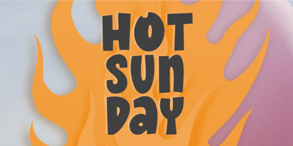 Introducing Hot Sunday, a fresh and playful font ideal for creative headlines. Whether you're designing a logo or crafting an eye-catching poster, this font will energize your designs with its fun personality. Thank You.
 - Khatt Algharraf by Mans Greback,
$59.00 Dive into the mesmerizing strokes of Khatt Algharraf, an Arabic typeface that seamlessly blends the age-old beauty of Middle Eastern calligraphy with the dynamism of modern design. With every curve and contour, it tells tales of ancient deserts and bustling souks, yet its sharp, crisp features make it strikingly contemporary.
 - Obvia Expanded by Typefolio,
$29.00 'Obvia' appeared as a result of direct observation on typefaces classified as geometric and the plan to explore for the first time width axes Condensed, Narrow (soon), Normal and new Wide and Expanded. The idea behind 'Obvia's design was to create a distancing from geometrically pure shapes, in this case, square shapes. Then some details were added, such as subtle inktraps, concave endings of the stems and carefully drawn alternate characters, giving a 'geohumanist' tone to the font. This first family of 'Obvia' has 9 weights ranging from Thin to Black, delivering a strong typographic identity, from the paper to the pixel.
 - Caleb Mono by Brenners Template,
$19.00Caleb Mono Font Family It is originally inherited from Caleb Grotesk. And, It is a reinterpretation of the proportional and grotesque sensibility of Glphs with a more modern and rarity feeling. Monospace fonts are a great choice for any designer who wants to create a retro, and minimalist feel. The disadvantages of ambiguous readability due to its wide width and mechanical placement are clearly present, but still attractive and elegant. To overcome these shortcomings, this font family gave variable side bearing values to each glyph and adjusted the width of the glyphs themselves. It is designed with a more human sensibility. - Obvia Condensed by Typefolio,
$29.00 'Obvia' appeared as a result of direct observation on typefaces classified as geometric and the plan to explore for the first time width axes Expanded, Wide, Normal, Narrow and Condensed The idea behind 'Obvia's design was to create a distancing from geometrically pure shapes, in this case, square shapes. Then some details were added, such as subtle inktraps, concave endings of the stems and carefully drawn alternate characters, giving a 'geohumanist' tone to the font. This first family of 'Obvia' has 9 weights ranging from Thin to Black, delivering a strong typographic identity, from the paper to the pixel.
 - The Amsterday by Jinan Studio,
$15.00 Introducing The Amsterday, a captivating and versatile Bold Retro Script Font that effortlessly transports your designs back in time while adding a touch of modern flair. This typeface exudes nostalgia and is perfectly suited for a wide range of creative projects, especially those with a vintage theme in mind. The Amsterday timeless elegance and a multitude of alternate characters make it a go-to choice for designers looking to infuse their work with a sense of yesteryear charm. Features A set of uppercase and lowercase glyphs Number, symbol, and punctuation Multilingual Support Alternates & Ligatures Extrude Version
 - News Gothic BT by Bitstream,
$29.99 The standard American sanserif of the first two thirds of the twentieth century, prepared for ATF by Morris Fuller Benton in 1908 under the name News Gothic, with a matching lightface known as Lightline Gothic. Linotype’s Trade Gothic follows News Gothic except for its widely-spaced straight-sided boldface based on ATF Alternate Gothic No.3. Linotype matches News Gothic Bold, a boldface version that originated at Intertype, with Trade Gothic Bold No.2. Ludlow Record Gothic follows News Gothic more loosely. News Gothic BT™ font field guide including best practices, font pairings and alternatives.
 - Brisa Pro by Sudtipos,
$59.00 The dynamic design duo of Koziupa drawing and Paul digitizing strikes again. This time they cover the space from light nonchalance to eerie darkness, and everything in between. Quicker than lightning and just as poignant, Brisa Pro shows unprecedented determination, presence of spirit, and finality of confidence. Brisa Pro is the teenager leaving home, the lover leaving one last note on the refrigerator door, the prophet announcing the imminence of doom, the rebel scratching anger on the wall, the bereaved clawing torment into life, and the bogeyman dropping a line to keep your eyes wide open through the night.
 - Cerulea by Cerulean Stimuli,
$36.00 Cerulea is a unicase from the world of the sky. Drawing inspirations from Art Nouveau, Classical Roman, and Uncial styles, Cerulea's wide, spacious bowls, sharp points, and subtle wandering curves evoke airiness, flight, and fantasy. Seven weights, and true italics for each, range from zephyrous to thunderous. Vary the mood every time you choose between the serious capital form of a letter, the more fanciful lowercase form, or another variant in the stylistic sets. The more than 800 glyphs cover pan-European Latin, Greek, Cyrillic, fractions, circled numbers, planet and zodiac symbols, card suits, chess pieces, ornaments, and more.
 - Obvia Narrow by Typefolio,
$29.00 'Obvia' appeared as a result of direct observation on typefaces classified as geometric and the plan to explore for the first time width axes Condensed, Narrow, Normal, Wide and Expanded. The idea behind 'Obvia's design was to create a distancing from geometrically pure shapes, in this case, square shapes. Then some details were added, such as subtle inktraps, concave endings of the stems and carefully drawn alternate characters, giving a 'geohumanist' tone to the font. This first family of 'Obvia' has 9 weights ranging from Thin to Black, delivering a strong typographic identity, from the paper to the pixel.
 - Megabold by Justin Penner,
$25.00 Megabold is the overweight champion of type. Designed to consume as much space as possible while retaining a modicum of legibility, Megabold is ideal for posters, logos and bold headlines. Simple yet immense letterforms make it friendly but at the same time, unstoppable. Express your own slant with left and right oblique styles ranging from 2–16 degrees, or fine-tune precisely with the included variable font ¹. ¹ Variable fonts are widely supported by web browsers, but not all desktop applications support them fully yet. Adobe Illustrator, Photoshop and InDesign support variable fonts if you’re using the latest versions.
 - Holly by Factory738,
$15.00 It's time to celebrate when the air turns crisply chilly and we start planning festive projects for Christmas. Holly, a modern and fun Christmas typeface perfect for sleigh rides and carol singing. All of the necessary elements, such as numbers, punctuation, and multilingual letters, are included. Whatever your imagination conjures up, these ligatures will come in handy. 5 Styles (Dancer, Comet, Cupid, Donner, Rudolph) Basic Latin A-Z and a-z Numerals & Punctuation Stylistic Ligatures Multilingual Support for ä ö ü Ä Ö Ü ... Free updates and feature additions Thanks for looking, and I hope you enjoy it.
 - Ultimatum by Comicraft,
$19.00 FINALLY! We’re telling you for The Last Time! This is not a Threat! This is not a Negotiation! Refusal to cooperate with the terms of this font will be considered an Act of War! There can be no Dispute! The Crisp, Sharp hooks and corners of this typeface are Not To Be Reasoned With! Gosh Darn it, we have grown tired of asking and this is merely a formality precedent to the outbreak of hostilities. It’s a little corporate, it’s a little bureaucratic, but our lawyers insisted that we propose a settlement of compromise. Ipso Facto.
 - Whatchamacallit by Comicraft,
$19.00 We popped the Doohickey into the Framistat and out popped this Whatchamacallit! Is it fat? is it thin? Is it tall? Is it short? Is it light? Is it heavy? Is it condensed?! is it expanded?! Yes, yes, yes and yes -- It’s all of the above and more! Our resident mad scientist John “Mr. Fontastic” Roshell has developed a single contraption that can handle any design emergency, from crimelords to supervillain team-ups to alien invasions. Whatchamacallit is a friendly and readable sans-serif, inspired by some of our all-time favorites -- Gill Sans, Futura, Venus and Antique Olive. But, like its machinery-contraption namesakes Doohickey and Framistat, Whatchamacallit has a lively personality -- the strokes are a little wavy, the ends a bit bulbous, and the circles are like little loaves of bread, rising in the Whatchamacallit's oven... delicious!
 - Stonetype by Kustomtype,
$20.00 Stonetype is a typeface that was used by stonemasons in the 70s & 80s of the last century. When I was starting as a stonemason, these were the first characters I had to draw, by hand, back then on grave monuments and memorial plaques. The idea was born to digitize all the material, to be saved for eternity. By digitizing all and fine tuning, plus the addition of some main characters, Stonetype has now grown into a user-friendly typeface that can, now still, be used by stonemasons, to improve their creation process times. But Stonetype can also easily be used in modern and contemporary designs. Stonetype is the perfect fit for graphic design, editorial design, magazines, posters, logotypes, brands and corporate design. Stonetype is designed by Coert De Decker in 2019 and published by Kustomtype Font Foundry.
 - Franklin Gothic Raw by Wiescher Design,
$19.50 When drawing a new font, there is a time when the final form is found – almost – but the curves are not slick and clean yet, that's what I call the "raw" form. Raw – no sweeteners added! In this family I tried to redefine this moment in type development for the eternally beautiful "Franklin Gothic". I call the design "Franklin Gothic Raw", not to be confounded with "rough". The family can be used like any good normal typeface, you hardly see any difference to a conventionally cut "Franklin Gothic" in small sizes. The charm of the design becomes obvious the bigger it becomes, then it enhances your design with its imperfections in the outline. "Franklin Gothic Raw" is therefore an extremely versatile family. I created the cuts, that I considered necessary for the seasoned designer who knows what he's doing. Enjoy!
 - Baker Half by Ingrimayne Type,
$9.00 One of the odder things I remember from high school (50+ years ago) is the tile floor of hexagons in the bathroom. There is something fascinating with the way hexagons fill the plane. BakerHalfDozen is made of white letters that fit on black, hexagonal tiles. BakerHalfWhite switches the letters to black on white tiles, and BakerHalfBare eliminates the tiles. There are no true lower-case letters, but some letters have alternate shapes. To make the tiles line up right, alternate lines must be indented half a space. Use the {} characters (brackets) to do this.
 - Budge by Flavortype,
$12.00 Budge, a new carefully crafted layered Italic Typeface. The ideas of this fonts come from a wide range of reference and deserts and beverages are our main focus for this font family. Budge will give a versatile, fun, cute and beauty feel to your projects. Budge was created with beautiful swashes, and also comes with 3 Layer : Regular, Shadow and line. Perfectly fitted layers to give you more contrast, and a bolder look. Every glyphs for alternates is curated for the best and without eliminating the characteristic of this fonts. Budge also comes with a Sans Serif as Font Pair that completes the needs for your design. Our creation on the display give you a reference of what it looks like on your projects such as branding, headers, logotypes, posters, magazines, packaging, food menus, and more. It shows that Budge clearly can accommodate various design style. Type Specimen here : http://tiny.cc/y9mfnz
 - Canari Script by Redy Studio,
$17.00 Canari – Modern Calligraphy Fonts Canari, modern calligraphy font is of great interest to all graphic designers and die-hard fans of handwriting. Canari comes with 105 extravagant ligatures, so you can give your work the personal touch it deserves. It is great for expressive projects such as using it for a logo design, wedding invitation design, social media headers, product packaging, and much more! If you are looking for a condensed font that is perfect for use as social media headers or logos then Canari would definitely be the perfect choice for you. Just take a look at this example above and you will definitely fall in love with this font! Canari features: A full set of upper & lowercase characters Numbers & punctuation 105 Extravagant ligatures Multilingual symbols PUA Encoded Characters – Fully accessible without additional design software. Feel free to give me a message if you have a problem or question. Thank you so much for taking the time to look at one of our products.
 - Caslon Classico by Linotype,
$29.99The Englishman William Caslon (1672-1766) first cut his typeface Caslon in 1725. His major influences were the Dutch designers Christoffel van Dijcks and Dirck Voskens. The Caslon font was long known as the script of kings, although on the other side of the political spectrum, the Americans used it as well for their Declaration of Independence. The characteristics of the earlier Renaissance typefaces are only barely detectable. The serifs are finer and the axis of the curvature is almost or completely vertical. The overall impression which Caslon makes is serious, elegant and linear. Next to Baskerville, Caslon is known as the embodiment of the English Baroque-Antiqua and has gone through numerous new interpretations, meaning that every Caslon is slightly different. Caslon Classico appeared in 1993 and was designed by Franco Luin, the designer of various interpretations of classic typefaces. Luin kept his design true to the original and Caslon Classico consists of two cuts with corresponding italic and small caps characters. - Mezalia Sans by Arrière-garde,
$9.00 Mezalia Sans is a logical continuation of the Mezalia family. Its shapes are based on medieval calligraphic style: the Bastarda. This time the evolution is taken a step further, as these classic shapes are merged with the straightforwardness of a modern sans-serif. This results in an original, strong yet very much usable typeface, that can hold its own in a wide range of applications. Mezalia Sans has two distinct styles: straight and cursive (true italic if you will, although the word is not really correct here), which come in ten weights, from thin to black. This wide range ensures that whether you are looking for delicate or bold strokes (or a combination of both) you will be satisfied. Every style also contains a set of small caps (with matching punctuation). Old-style, proportional and tabular numerals are included too, along with ligatures, symbols and language support in Adobe Latin 3 range.
 - Salloon by Ingrimayne Type,
$8.95 The original version of Salloon was what has become Salloon-Wide. It was designed a year or two before 1990. The narrower version, which is now the regular version of the face, was constructed a few years later. There never has been a true lower-case set of letters for these fonts, but the narrower version introduced a second set of caps by removing the side bumps from the letters. Although Salloon may look like an old font, no historic font closely resembles it. Fonts with bold, thick stems such as Salloon invite interior decoration. The five striped versions and the shattered version of the font were produced a year or two after the construction of the narrower Salloon when the arrival of a font distortion program made it easy to cracked and stripe fonts. In 2019 an outline style and two highlighter styles were added to be used in layers with the Salloon-Regular and one highlighter style was added to be used with Salloon-Wide.

