7,956 search results
(0.268 seconds)
- Lonely Together by Dumadi,
$20.00 Lonely Together is a unique handwritten-style font created with brush tools. if you have a project in the form of romantic nuances, invitation cards, social media designs, branding, valentine events, crafting designs, and more.
 - Sightseeing Boat JNL by Jeff Levine,
$29.00 The free form hand lettering comprising the titles and credits for the 1966 romantic comedy “The Glass Bottom Boat” were the model for Sightseeing Boat JNL, which is available in both regular and oblique versions.
 - Carter Sans by ITC,
$40.99 Carter Sans: a wonderfully accomplished humanist sans serif with a beautiful twist Matthew Carter has been involved in designing typefaces since before many of us were in diapers. With dozens of great typefaces to his name, he has finally put his name to one. His newest typeface, Carter Sans™, brings together those decades of wisdom, experience, and technical expertise. The result is a humanist sans with flared strokes and terminals, a feature that has more in common with the chisel rather than the broad nib pen. Subtle detail, elegant curves, and graceful proportions make for an exceptional and distinctive sans serif typeface, that Carter himself describes as a 'humanist stressed sans.' This imbues the letterforms with a dynamism sometimes lacking in humanist sans serifs. Use it to striking effect in all-caps settings, or for extended texts. Carter Sans was recently used to great effect by Michael Bierut and Joe Marianek of Pentagram, in their work for the Art Directors Club.Carter Sans italics are unfussy, with the only remnants of cursiveness in letters like e and f. It sets beautifully with the roman. Award winning type designer Dan Reynolds (Malabar™ et al.) collaborated with Carter to produce a type that looks just magnificent in print; it would also make a fine choice for that letterpress project! Certainly a welcome addition to anyone's type library.
 - Kuschelfraktur by Catharsis Fonts,
$36.00 Kuschelfraktur is a unique, eye-catching take on the theme of blackletter that replaces the broad nib with a brush pen and achieves stroke modulation through stencil-like gaps. It combines the texture and dignity of blackletter with the human warmth of informal handwriting. Kuschelfraktur offers five separate sets of capital letters and several additional customization option via stylistic alternates. The degree of ornamentation in the blackletter capitals can be increased (SS02) or decreased (SS07), while SS04 and SS05 offer two simpler approaches to capital letters that bridge from blackletter to Roman letters (Antiqua). The default single-storey �a� can be replaced with a two-storey version in SS01, and SS08 offers a single-storey capital �A� for the simple capitals. Finally, SS03 restores some of the more unique letter shapes of the Fraktur style of blackletter. The old-style figures can be replaced with lining and/or tabular figures. All these stylistic sets are accessible via OpenType from the main font, Kuschelfraktur, whereas the spin-off fonts (Traditional, Verziert, Text, Schlicht, Antiqua) offer convenient access to those sets even in environments without OpenType support. I am grateful to the helpful souls on the TypeDrawers and Typographie.info forums for encouragement and constructive feedback, and to the Glyphs team for their fantastic type editor. Kuschelfraktur is dedicated to my son Marius.
 - FS Rome by Fontsmith,
$50.00 Trajan The original template for this one-weight, all-caps font was the inscription on Trajan’s Column, carved in AD 113 to celebrate the emperor Trajan’s victory in the Dacian Wars. College student Jason Smith copied the stone lettering from the cast on display in London’s Victoria & Albert Museum. In Roman times, the signmaker would paint letters onto stone with a wide brush for the stone mason to chisel out later. The signwriter would end each stroke with a flick of his brush, which the mason would also carve into the stone. Ecce (as they would have said in Rome): the serif was born. Hand-crafted “I first drew this typeface when I was 17,” says Jason. “I drew it with a very sharp 9H pencil on polydraw film. “Then, using a Rotring pen, I inked the letters in and scraped back the serifs so they were perfectly sharp. These letters were then reduced on a PMT camera. I’d designed my first typeface, although it wasn’t digitised till much later.” Digitised Years after Jason had drawn the original typeface, its transfer into digital form made further refinements necessary. The serifs and weights needed thickening slightly, creating a crisp, new version whose delicate elegance is best appreciated in larger sizes. A classically-inspired font, timeless and perfectly-proportioned, to reflect the refinement of premium brands.
 - LTC Italian Old Style by Lanston Type Co.,
$39.95LTC Italian Old Style is not to be confused with the English Monotype font also called Italian Old Style, which is an earlier design from 1911 based on William Morris’s Golden Type that is based on Nicholas Jenson’s Roman face. Goudy went back to Jenson’s original Roman and other Renaissance Roman faces for his inspiration and the result is what many consider to be the best Renaissance face adapted for modern use. Bruce Rogers was one of the biggest admirers of Italian Old Style and designed the original specimen book for Italian Old Style in 1924 using his trademark ornament arrangement. These ornaments are now contained in the pro versions of the Roman styles—Regular Pro and Light Pro. With most digitizations of old metal typefaces, one source size is often used as reference (as was Goudy’s method for his own cuttings of his Village foundry types) so that all sizes refer to one set of original artwork. The original hot metal fonts made by Lanston Monotype (from Goudy’s drawings) and other manufacturers used two or three masters for different size ranges to have optimal relative weights—smaller type sizes would need proportionally thicker lines to not appear thin and larger sizes would require thinner lines to not appear to bulky. The variations in size ranges can also be affected by the size of the cutter head in making the master patterns. The light weights of LTC Italian Old Style were digitized from larger display sizes (14, 18, 24, 30, 36 pt) and the regular weights were digitized from smaller composition sizes (8,10,12 pt). The fitting for the regular weights is noticeably looser to allow for better setting at small sizes. Very few font revivals take this approach. Italian Old Style, originally designed by Frederic Goudy in 1924, was digitized by Paul Hunt in 2007. In 2013, it has been updated by James Grieshaber and is now offered as a Pro font. The newly expanded Pro font includes all of the original ligatures, plus small caps and expanded language coverage in all 4 Pro styles. - FF Meta Variable by FontFont,
$344.99The FF Meta® design is a sans serif, humanist-style typeface that was designed by Erik Spiekermann for the West German Post Office (Deutsche Bundespost). It was subsequently released in 1991 by Spiekermann's company FontFont The FF Meta family, initially released as a commercial font in 1991, now comprises over sixty fonts. The FF Meta 2 family was released in 1992, the FF Meta Plus family in 1993, and in 1998 a facelift of the complete font family reclassified the FF Meta series and combined them into family-sets named FF Meta Normal, FF Meta Book, FF Meta Medium, FF Meta Bold and FF Meta Black. These are all available in Roman, italic, small caps and italic small caps. Between 1998 and 2005, further light stroke weights and a condensed family were introduced by Tagir Safayev and Olga Chayeva and were named: FF Meta Light and FF Meta Hairline. The last addition to the growing FF Meta font family is FF Meta Serif released by FSI in 2007. FF Meta Variable Roman is a single font file that features two axes: Weight and Width. For your convenience, the Weight and Width axes have preset instances. The Weight axis has a range from Hairline to Black. The Width axis provides a range of condensed values. This Roman (upright) font is provided as an option to customers who do not need Italics, and want to keep file sizes to a minimum. FF Meta Variable Italic is a single font file that features an italic design with two axes: Weight and Width. For your convenience, the Weight and Width axes have preset instances. The Weight axis has a range from Hairline to Black. The Width axis provides a range of condensed values. This Italic font is provided as an option to customers who do not need Roman (uprights), and want to keep file sizes to a minimum. FF Meta Variable Set is a single font file that features three axes: Weight, Width and Italic. For your convenience, the Weight and Width axes have preset instances. The Weight axis has a range from Hairline to Black. The Width axis provides a range of condensed values. The Italic axis is a switch between upright and italic - Andovine by Stringlabs Creative Studio,
$25.00 Andovine is a strong and powerful display font with a vintage feel. Fall in love with its raw authenticity. Andovine is a handbrush font with authentic style. This font is made with a brush pen with very careful techniques, so the results are charismatic and have enchanting characteristics.
 - Printed Moments by PeachCreme,
$23.00 MODERN CASUAL SCRIPT FONT VOL.35 Printed Moments is a new stylish font with a modern flair. It includes a full set of uppercase and lowercase letters, multilingual symbols, numerals, punctuation, and 134 ligatures. The font has a smooth ball pen texture. It has beginning and ending lowercase ligatures.
 - Cherrydorry by Motokiwo,
$15.00 Cherrydorry, a chic and elegant handwritten font with classy ligatures. It also support multilingual characters and absolutely PUA encoded. I recommend this font for logos, business cards, fashion design, beauty design, magazine, or a movie. With natural handwriting and a lovely pen stroke, Cherrydorry will blend into your design.
 - Williamson by Stringlabs Creative Studio,
$25.00 Williamson is a luxurious and playful script with a contemporary vibe. Get inspired by its minimalist elegance. Williamson Path is a flowing and elegant handwritten font, created with the help of a brush pen. Get inspired by its unique and beautiful style and add it to your favorite designs!
 - Black Hat by Trustha,
$17.00 Black Hat is a bold handwritten font. Inspired by a round black hat. Written with a brush pen with fast movements. Comes with two fonts, makes it easy to choose a font that suits the project being worked on. Suitable for branding, advertising, headlines, packaging design, and more.
 - Hallywood by Stringlabs Creative Studio,
$25.00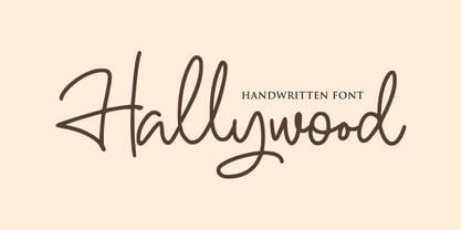 Hallywood is a sweet handwritten font. It’s perfect for logos, wedding invitations, signatures, advertising and much more! Hallywood is a flowing and elegant handwritten font, created with the help of a brush pen. Get inspired by its unique and beautiful style and add it to your favorite designs!
 - Zenghief by Stringlabs Creative Studio,
$25.00 Zenghief is a script font with Modern hand brush style. The Zenghief font made with digital hand brush pen strokes that making this font look authentic and unique concept. This font is perfect for fashion brand, wedding invitation, business card, logo brand, Japanese font style, and then calligraphy.
 - After Breaking by Stringlabs Creative Studio,
$25.00 After Breaking is a nostalgic script with a personal feel. Get inspired by its authentic charm! After Breaking is a flowing and elegant handwritten font, created with the help of a brush pen. Get inspired by its unique and beautiful style and add it to your favorite designs!
 - Rainclouds by Hanoded,
$15.00 I was doodling away with a sharpie pen on a rainy day. Hey… wait a minute. A rainy day, a font called Rainclouds… Yep, that’s right, it is called Rainclouds for that reason! ;-) Rainclouds is a fat marker font with a lot of texture and a lot of mouth.
 - Lid by One Fonty Day,
$15.00 Lid is a handwritten, versatile typeface. The non-cursive script is uncomplicated, unpretentious and easy to read. The typeface comes in three different styles; Pen, Brush and Marker. Each style has a different touch, but all three styles come together perfectly. Most of the european languages are supported.
 - Bungler by Bogstav,
$17.00 This font is a strange mixture of sweet strawberry cake and horrifying terror! :) Meaning that the font can be used for something pretty scary (such as a horror poster) or something quite innocent (like products for children) It resembles fat brushstrokes, but clearly it was drawn with a pen.
 - Simple Stencil JNL by Jeff Levine,
$29.00 A brass hand-punched shipping stencil from the 1950s inspired Simple Stencil JNL. The rounded ends of the characters are reminiscent of technical lettering templates, especially since there are a combination of solid letters and those with stencil "breaks" as many of those pen and ink templates possessed.
 - Mough by Krntype Studio,
$16.00 a bold marker display font. Font with round and fat style. Mough imitate round marker pen in a clean way, this font fits perfectly into any background. Mough is perfect for many design such as merch, T-shirts, titles, book covers, social media posts, websites, events, and many more
 - Oyukis Ghost by Hanoded,
$10.00 Oyuki's Ghost is a scary typeface made with a steel pen and Chinese Ink. The name comes from a painting by Maruyama Okyo (1733–1795), which depicts his mistress who died young. Maruyama Okyo claimed she haunted him in his sleep. The font comes with extensive language support.
 - Cracksmoon by Zamjump,
$15.00 Cracksmoon was hand-drawn with a marker pen and converted to font - and like the marker, it has natural edges and realistic shapes. Includes bonus ligatures and style swashes. Perfect for designs where you need a font that's a little rougher around the edges. Including : Alternate Multilingual support
 - Regua by Tipos do aCASO,
$2.90Play like a child with letter forms, fill the gaps of a stencil with a ballpoint pen and work this to generate a digital type. Régua (Ruler, in Portuguese) is the result of a typographical joke with the upper cases made by Buggy, a Brazilian typographer, in 1998. - James Black by Motokiwo,
$15.00 James Black, a signature milli pen font with classy handwriting style. This is a perfect font for business, for your personal feels, for everything about you smart people! You will get a casual handwritten font with some ligatures that will give you more taste of high class personality.
 - Potpourri by Linotype,
$29.99 Potpourri was based on an energetic alphabet written by expert calligrapher Gottfried Pott. To create the elegant yet rugged strokes, Pott cut a pen with a unique fringed tip — from a drinking straw! He then produced an huge series of drafts before deciding on the final alphabet for digitization.
 - Shopie by Hendra Pratama,
$19.00 Shopie is a handmade script made with a marker pen. It is useful for a variety projects such as quotes, book covers, t-shirt designs, magazine titles and much more. Features: 370 Glyphs Uppercase Lowercase Symbols & Punctuation Support more than 62 Languages Support OpenType Features Support PUA Unicode
 - P22 Avocet by IHOF,
$29.95 A light chancery script font influenced by both the hand-held pen and the typefounder’s machinery. The curves are reminiscent of the beak of the avocet, a wading bird. This font was originally engraved in metal and copper matrices made for casting into hot metal type for letterpress printing.
 - Snooty Fox NF by Nick's Fonts,
$10.00This casually elegant typeface is based on an unnamed offering from Pen & Brush Lettering and Practical Alphabets, published by Blandford Press, Ltd., London, in 1929. Good taste dictates that, because of the ornate and unusual letterforms of the uppercase letters, the font never be used as all caps. - Hylandia by Monotype,
$15.99 Delicate but spirited, Hylandia is a cursive script with gorgeous looping letterforms drawn with a light touch using a thin brush pen. This font has a sensitive sense of delicacy and care, with clear roots in calligraphy and tradition. Hylandia is available with some ligatures and alternate forms.
 - Selfish Jeans by Bogstav,
$16.00 The song "Selfish Jean" by Travis inspired me to name this font, and a runny pen made me draw the letters. Actually, I started making the font while listening to that particular song - and the whole atmosphere about that situation, suited me perfect to make this handmade font! :)
 - Maiden Sans by Deltatype,
$29.00 Maiden Sans is a humanist sans-serif based typeface which contains nine weights, from thin to black. Designed to use as body text to headline. The design of Maiden Sans typeface can easily be recognized at the terminal with reverse pen-head style and a bit sweet link!
 - Fasteam by IbeyDesign,
$17.00 Fasteam Brush Stroke Font is an incredibly relaxed and beautiful handwritten font, created with the help of a lovely brush pen. Fall in love with its incredibly versatile style and use it to create gorgeous wedding invitations, beautiful stationary art, eye-catching social media posts, and much more.
 - Anachrony by Cerulean Stimuli,
$24.00 Reminiscent of circuitry and wrought iron, Anachrony constructs the forms of an Old English Blackletter with the strokes of a Modern Geometric Sans, and lands in the vicinity of Art Deco. For such an unusual chimera, the Anachrony family is legible and versatile. Its glyphs cover pan-European Latin, Greek, and a wealth of symbols including arrows, zodiac, planets, chess, suits, and circled numbers. It is also packed with Opentype features: Small Capitals: Of similar proportions to the default numerals, tall enough to be a suitable choice in place of regular capitals. All Caps Forms: In addition to the four usual types of numerals, there are numerals and currency symbols that match the capitals. Swash: A leading curly swash on capitals, and fancy looped ascenders in the lowercase that are handled by over a hundred standard ligatures where they would collide. Style Set 01: Romanized forms. Especially recommended for all caps. Plainer A/M/T/V/W/Y, J/Q reined in to the baseline, and alternate g. Style Set 02: Masthead forms. Old-fashioned capitals with descenders and that lower left dealy. Also f/x/z/ß in a more traditional fraktur mode. Style Set 03: Mild embellishments. Tall bifurcated ascenders and descenders. Style Set 04: Extravagant swash descenders. Style Set 05: Final swashes for the end of a word. Style Set 06: Converts capital letters into the corresponding connected Roman numerals. Seemed like it could be useful sometime. Easy swooshes: Standard ligatures allow you to type two to seven commas in a row to append an assortment of sweeping or ending swashes. Catchwords: In Anachrony Royale, turn on Discretionary Ligatures for a variety of decorative articles and prepositions.
 - Yalta Sans by Linotype,
$29.00 Yalta Sans combines the warmth of a traditional humanist design, the clarity of a grotesque and the modernity of a square sans. Several design traits contribute to this melding of diverse typographic concepts. Characters find their foundation in stroke-based shapes rather than constructed forms. Curve stokes are also slightly squared and counters are open. Curved strokes join verticals at nearly right angles to create a strong horizontal stress, aiding the reading process. The resulting design is exceptionally legible while still inviting. Although Yalta Sans is clearly differentiated from its calligraphic ancestors, many details of the design emulate the distinctive characteristics of typefaces from the Renaissance. Tapering horizontal stokes also give Yalta Sans a dynamic relationship with linear grotesque while its angled stroke terminals echo the work of a calligraphic brush Yalta Sans italics are cursive designs that are in keeping with humanistic letterforms and are markedly narrower than the Roman characters. Lining and old style figures, small caps and a suite of ligatures also make for a remarkably versatile typeface family.
 - Sebastian Pro by Storm Type Foundry,
$32.00Sans-serif typefaces compensate for their basic handicap – an absence of serifs – with a softening modulation typical of roman typefaces. Grotesques often inherit a hypertrophy of the x-height, which is very efficient, but not very beautiful. They are like dogs with fat bodies and short legs. Why do we love old Garamonds? Beside beautifully modeled details, they possess aspect-ratios of parts within characters that timelessly and beauteously parallel the anatomy of the human body. Proportions of thighs, arms or legs have their universal rules, but cannot be measured by pixels and millimeters. These sometimes produce almost unnoticeable inner tensions, perceptible only very slowly, after a period of living with the type. Serifed typefaces are open to many possibilities in this regard; when a character is mounted on its edges with serifs, what is happening in between is more freely up to the designer. In the case of grotesques, everything is visible; the shape of the letter must exist in absolute nakedness and total simplicity, and must somehow also be spirited and original. - Interval Next by Mostardesign,
$25.00 Interval Next is a modern sans serif font family that is the successor of the successful Interval Sans Pro. Designed by Olivier Gourvat, Interval Next typeface consists of 16 fonts in 8 weights — Ultra Light, Light, Book, Regular, Medium, Semi Bold, Bold, Black— and has 4 styles. This super family combines a humanist mind with its contrasted shapes and a modern look with its open counters. With its four versatile styles (Condensed, Narrow, Roman and Wide) Interval Next has a creative palette able to meet the modern typographic demands. Its OpenType features will provide you almost unlimited multilingual support as well as small caps, case sensitive forms, proportional and tabular figures, slashed zero, numerators, superscripts, denominators, scientific inferiors, circled figures, subscript, ordinals, fractions, arrows and f-ligatures. Also extremely functional for professional editorial design, Interval Next has a pro kerning and would be extremely suitable for mobile applications, e-books, web sites, headlines, posters, signage and many more. Interval Next covers a large spectrum of languages such as West European, East European and the Cyrillic.
 - Kade by Re-Type,
$45.00 Kade is a display/semi display sans family of fonts based on vernacular lettering photographed over the last ten years in and around the harbors of Amsterdam and Rotterdam. Hence the name Kade that translates into English as ‘quay’, also the name of its designer. Kade grew slowly from many different ideas and elements. The letters reflects the industrial method in which they are cut for the side of ships from large steel plates. Frequently subtleties of curves are compromised due to the cutting tools and the fact engineers are in control. Kade’s italics have an experimental character and were produced in an unorthodox manner by rotating 8 degrees, rather than slanting the roman characters, a method sometimes employed in shipyards. Kade constructed character is ideal for contemporary editorial works, architecture magazines, museums communication and posters. The six distinct styles are published in OpenType format, featuring small caps and four sets of numbers (proportional old style, tabular old style, proportional lining and tabular lining), as well as matching currency symbols and a complete set of fractions.
 - Westerland Grotesk by SG Type,
$21.90 Introducing Westerland Grotesk, a sans serif font family that seamlessly harmonizes classic simplicity with contemporary sophistication. Its slight contrast, which can be found throughout the weights, gives it a unique and warm character while maintaining the sleekness of a true grotesque. The family consist of eight weights in roman & italic, coming up to a total of 16 styles. This variety enables a range of uses, from elegant lightness with the thinner weights to loud expressiveness with the bolder ones. Language Support Afrikaans, Albanian, Asu, Basque, Bemba, Bena, Breton, Catalan, Chiga, Colognian, Cornish, Croatian, Danish, Dutch, Embu, English, Esperanto, Estonian, Faroese, Filipino, Finnish, French, Friulian, Galician, German, Gusii, Hungarian, Icelandic, Indonesian, Irish, Italian, Kabuverdianu, Kalenjin, Kamba, Kikuyu, Kinyarwanda, Lithuanian, Luo, Luxembourgish, Luyia, Machame, Makhuwa-Meetto, Makonde, Malagasy, Manx, Meru, Morisyen, North Ndebele, Norwegian, Bokmål Norwegian, Nynorsk, Nyankole, Oromo, Portuguese, Quechua, Romansh, Rombo, Rundi, Rwa, Samburu, Sango, Sangu, Scottish, Gaelic, Sena, Shambala, Shona, Soga, Somali, Spanish, Swahili, Swedish, Swiss, German, Taita, Teso, Turkish, Uzbek (Latin), Volapük, Vunjo, Walser, Welsh, Western, Frisian, Zulu Open Type Features Standard Ligatures, Alternates, Fractions, Superscript Figures
 - Axios Pro by TipoType,
$24.00 In Axios Pro the rational language of the early XX century geometric sanserifs is complemented with an structure deeply attached to the renaissance typefaces; the uppercase proportions proceed form the roman canon while its lowercase was constructed following the humanist ductus. This blend produce a typeface of modern, clean and contemporary appearance that has implicit on its core a classic vibe, nourishing the text with a timeless elegance.In use, the form and function balance of its design allow it freely travel through a diverse range of fields and possibilities like short text settings, brands, headlines or signage systems with grace and naturality. Axios Pro is available in variable font format and in 20 different individual styles (10 weights), with a set of more than 1000 glyphs per style, supports over 200 latin languages and including an extensive repertoire of opentype features like small caps, ligatures, stylistic alternates, proportional and tabular figures, swashes, borders and many other resources to please your typographic urges. Designed by Rodrigo López Fuentes & Sergio Leiva Whittle
 - Oz Handicraft BT WGL by Bitstream,
$50.99Oswald Cooper is best known for his emblematic Cooper Black™ typeface. Although he was responsible for several other fonts of roman design, Cooper never drew a sans serif typeface. But that didn’t stop George Ryan from creating one. Ryan saw a sans serif example of Cooper’s lettering in an old book and decided that it deserved to be made into a typeface. Ryan’s initial plan was to make a single-weight typeface that closely matched the slender and condensed proportions of the original lettering. While the resulting Oz Handicraft™ typeface proved to be very popular, Ryan was not satisfied with the limited offering. So, between other projects – and over many years – Ryan worked on expanding the design’s range. The completed family includes light, semi bold and bold weights to complement the original design, plus a matching suite of four “wide” designs, which are closer to normal proportions. Fonts of Oz Handicraft include a Pan-European character set that supports most Central European and many Eastern European languages.