7,886 search results
(0.017 seconds)
- Corpus Typewriter by Brent Galloway,
$14.00 Corpus Typewriter is an authentic typewriter font, sampled from a real vintage typewriter. Each letter and number has three alternative characters, giving you a large variety of options to get an authentic, vintage look.
 - Rebel Train Goes by Dharma Type,
$14.95 Based on retro vinyl records in the middle of 20th century. There are three other fonts designed by in the same concept. -Word From Radio -African Elephant Trunk -Moon Star Soul -Rebel Train Goes
 - Realite by Roman Melikhov,
$20.00 Realite font is suitable for creating minimalistic logos, wordmarks, titles, taglines. Each letter of the font has two or three alternates. You can mix default characters and alternate characters to get the best combination.
 - Mastone by Konstantine Studio,
$10.00 Mastone was inspired by the bubble typography trends nowadays in the graphic design industry. A fresh mix of y2k culture, streetwear visuals, and brutalism yet an experimental touch of bubble throw-up graffiti styles.
 - Hexadot Thin by Konst.ru,
$6.00Font with hexagonal dots for texts, names, logotypes, titles, headers, topics etc. Big sizes of this font can be used for posters, t-shirts and other surfaces. Also good for the three-dimensional inscriptions. - Tonal by PintassilgoPrints,
$16.00 Tonal is a fat typeface, geometrical in its peculiar way. Available in three styles, it's a unicase alphabet and offers an alternative glyph for each letter, providing flexibility to your designs. Use it big!
 - Gmuender Antiqua Pro by RMU,
$40.00 Inspired by the former hot-metal fonts of Imprimatur, Gmuender Antiqua Pro is a fresh designed versatile and multilingual serif font family. All five styles contain three different forms of numbers and small caps.
 - Hyperizo by AbtoCreative,
$15.00 Hyperizo is a futuristic style font in three weights. It's the perfect font for logo, game, packaging, poster, web use, etc. The family contains a set of 231 characters, supporting multilingual and OpenType features.
 - Hexadot Light by Konst.ru,
$6.00Font with hexagonal dots for texts, names, logotypes, titles, headers, topics etc. Big sizes of this font can be used for posters, t-shirts and other surfaces. Also good for the three-dimensional inscriptions. - Hexadot by Konst.ru,
$-Font with hexagonal dots for texts, names, logotypes, titles, headers, topics etc. Big sizes of this font can be used for posters, t-shirts and other surfaces. Also good for the three-dimensional inscriptions. - Otter by Hemphill Type,
$19.99 With a keen eye for detail and friendly nature, the otter was the perfect inspiration for this playful sans serif typeface. The family of otters consists of 6 styles to be treated with care.
 - Freie Initialen-AR by ARTypes,
$35.00Freie Initialen are derived from initials made for the Stempel Garamond series. The type was issued in 1928 in three sizes (36, 48, and 60 pt); the AR version follows the 60-pt design. - Bunyan Pro by Canada Type,
$39.95 Bunyan Pro is the synthesis of Bunyan, the last face Eric Gill designed for hand setting in 1934 and Pilgrim, the machine face based on it, issued by British Linotype in the early 1950s — the most popular Gill text face in Britain from its release until well into the 1980s. Gill’s last face doesn't date itself anywhere near as obviously as Gill’s other serif faces, which were all really products of their time, heavily influenced by the richly ornamental and constantly changing aesthetic trends of the interwar period. When compared to Gill’s previous work, Bunyan seems like a revolution in the way he thought and drew. It’s as if he was shrugging off all heavy burden of what was popular, and going back to the basics of older standards. Bunyan had no bells and whistles, doesn't risk functionality with contrasts that are too high or too low, and didn't venture far outside the comfortable oldstyle rhythm Gill grew up with. By interbellum standards, this was utter austerity, a veritable denial of deco excess. Surprisingly, even without all the cloying trivialities, Bunyan still stood indisputably as an aesthetically pleasing, space saving design that could have been made only by Eric Gill. Bunyan Pro comes in three weights and their italics. The main font is intended for use between 8 and 14 points. The medium and the bold are great for emphasis but also have good merit in larger sizes, so can make effective display types as well. All six fonts include small caps, ligatures, alternates, six sets of figures, and three original Gill manicules. We tried to keep the best features of the handset (Bunyan) and machine (Pilgrim) versions while building a text face that can function in today’s immersive reading media. Deciding on which useful letterpress features to preserve for aesthetic importance was hell on our eyeballs — which lead to complex and painstaking ways of ironing out irregularities and inconsistencies related to metal technologies, in order to provide something with authenticity. The result is a unique typeface based on a Gill design that, to a much greater extent than any of his other faces, works well as a text face that can be used for entire books and magazines. For more information on Bunyan Pro’s character set, features, development process and some print tests, please consult the PDF in the gallery section of this page.
 - Sitcom by GroupType,
$19.00 If there was an American Typeface Hall of Fame, Bank Gothic, designed by the great Morris Fuller Benton would hold a place of special distinction considering this design has survived so many trends in typographic fashion since being introduced in 1930. It's just as desirable today as it was over eighty years ago; arguably more. Today, Bank Gothic is a very popular choice as a titling face for science fiction books, posters and countless television and movie titles. It is also a popular typeface for use in computer games and digital graphics. GroupType’s 2010 revival of this American classic is true to the design, the period, and Benton’s aesthetic. GroupType worked with some of the most talented and experienced type designers that were historically grounded and sensitive to this design project. Fortunately, Mr. Benton has left us a large selection of other great typefaces for insight and guidance. GroupType’s new revival includes the original three weights in regular and condensed style but also a new small cap and lowercase in each font necessary for 21st century typography.
 - Bank Gothic by GroupType,
$29.00 If there was an American Typeface Hall of Fame, Bank Gothic, designed by the great Morris Fuller Benton would hold a place of special distinction considering this design has survived so many trends in typographic fashion since being introduced in 1930. Its just as desirable today as it was over eighty years ago; arguably more. Today, Bank Gothic is a very popular choice as a titling face for science fiction books, posters and countless television and movie titles. It is also a popular typeface for use in computer games and digital graphics. GroupType’s 2010 revival of this American classic is true to the design, the period, and Benton’s aesthetic. GroupType worked with some of the most talented and experienced type designers that were historically grounded and sensitive to this design project. Fortunately, Mr. Benton has left us a large selection of other great typefaces for insight and guidance. GroupType’s new revival includes the original three weights in regular and condensed style plus two new distressed fonts. All have a new small cap and lowercase in each font necessary for 21st century typography.
 - Headline Gothic by BA Graphics,
$45.00A nice readable Headline and Sub head face, great for movie credits. - Whimsies by Typephases,
$25.00The Whimsies series goes further in our fixation with invented little people: the three dingbats of this series contain mostly imaginary situations, drawn first with ink on paper. All but a tiny fraction of the illustrations (a total of 114) have been drawn from one's imagination, with no previous models. The themes depicted here are varied and often humorous, though the humour is on the darker side, you are warned. The themes have a definite retro - victorian feel, with top hats, moustaches, long coats, walking canes and the like. Together with their close relatives, our Illustries, Bizarries, Ombres, Absurdies and Genteta dingbats (we give this bizarre collective the common name of Whimbats) you can use the Whimsies in an endless variety of projects, ranging from small spot illustration to whole pages, page spreads or posters applications. You can use them as they come in the digital font, or customize them easily in your favourite graphics program. A touch of texture or color will give them a completely new look. The vectorial nature of digital fonts means you can enlarge them to any size, with no loss of crispness in their outlines. - Essonnes by James Todd,
$40.00 Made up of sixteen individual weights and spread over three different optical sizes, Essonnes is designed to bring utility back to the Didot genre. It’s a common belief among designers that Didones don’t work for text. This wasn’t true in 1819 and it isn’t true today. Like its forbearers, Essonnes is a truly optical family—not just a study in adjusting contrast. The text and display weights have been designed from the ground up for their intended roles. This means that everything from the height of the uppercase & lowercase letters have been specifically tuned for their intended purpose. Like many typefaces, Essonnes started after falling in love with a piece of history. In this case, it was the eccentric forms of Pierre Didot’s Type and the evolution of the High contrast Didone throughout the 19th century. It was out of curiosity and love for these forms that led to the first draft of what would become Essonnes back in 2011. These unique situations—screens, modern printing methods, the previous 200 years of typographic innovation since the original design, my own life experiences—have led to a typeface that, while based on history, is not stuck in it.
 - Karacho by alphabeet.at,
$20.00 Karacho is a ‘fat style’ geometric display typeface with two counter-styles, a stylistic set of lowercase letters, and multilayer options: the font design is separated in three layers for building individually colored font variants.
 - Michel by sugargliderz,
$20.00 The design of this typeface was influenced by the typefaces left by Firmin-Didot. There are three weights, and all weights can be used in large font sizes to create a gorgeous and attractive impression.
 - TG Hagia by Tegami Type,
$20.00 TG Hagia is contemporary serif font inspired by Modern Culture. This font is highly recommended for use as display and body text. Tg Hagia is available in three widths namely regular, semi-bold and bold.
 - SolKing by Fo Da,
$15.00 Solking is an Arabic typeface of a three weights : Sharp, Curved and Rounded . the main focus is on blending traditional and modern rules in the formulation and design of the Kufi type in new style .
 - Artiste by ITC,
$29.00A casual, open brush script style designed with a shadow effect for a three-dimensional impression by British designer Martin Wait. This typeface looks best with tight letter and word spacing in large display settings. - Volianchy by MJType,
$25.00 Introducing Volianchy is a modern sans serif font designed for the discerning user in mind. This typeface draws inspiration from contemporary design trends, while retaining a timeless essence that ensures its relevance in any era.
 - Script Love by Okaycat,
$29.95 Script Love is a connected cursive script appearing as hand written in three weights: fine pen, pen & marker. Script Love features extended characters, containing West European diacritics & ligatures, making it suitable for international environments & publications.
 - Brown Love by sizimon,
$18.00 Introducing our latest product Bethany Script! handwritten fonts companion designed to convey elegance and style. Bethany is perfect for fashion, e-commerce brands, trend blogs, or any business that wants to appear classy and chic.
 - Glazed Donuts by DainType,
$15.00 The letters are reminiscent of shiny and tasty glazed donuts. There are three type families, and you can mix them all up to create a decently fun typography. Great for promotional material or package design.
 - Unikled by Ingrimayne Type,
$12.95 Unikled a decorative calligraphic family inspired by the uncial style. The upper and lower cases are largely different and can be treated as two separate alphabets. It is available in two weights, plain and bold.
 - FlagDay by Ingrimayne Type,
$8.00 These four variations on letters designed as flags are almost unreadable, but may be of some use as a patriotic display font. The four are all transformations of fonts from the FourJuly group. The solid and outline styles can be layered with the main fonts to easily create multiple-colored letters.
 - El Camio by Lord Typo,
$14.00 El Camio is a throwback display font paying homage to the classic automotive typography of the 50's and 60's. It is an extremely versatile display font that can be used for anything from branding, logo design, beer labels, shirt graphics, playful editorial spreads and much much more. BUY ME!
 - Strings by Bluestudio,
$18.00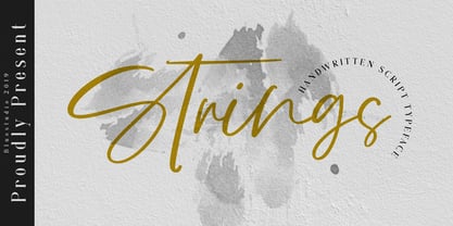 Strings is a handwritten script font that is suitable for all your design project needs such as logo design, branding, covers, posters, magazines, wedding invitations, greeting cards, quotes and more. Multilingual support - spread your message globally AÀÁÂÃÄÅCÇDÐEÈÉÌÍÎÏIÌÍÎÏNÑOØÒÓÔÕÖUÙÜÚÛWYÝŸÆßÞþ Encoded PUA Characters Fonts are fully accessible without additional design software. Happy designing!
 - Antoine by Anastasia Kuznetsova,
$19.00 Introducing Antoine — is a vintage retro display typeface. The three font combinations I launched are very compatible if for the victorian classic design concept. As for if the font was worn by itself, without combinations are also brave!! In addition to many get unique character, luxury, brave and elegant. You also have a collection ornament, very suitable if in the gradient. This font is also very easy to use with other design programs or with out design program. Antoine Typeface is perfect for beverage label design project. coffee label. logotype design, badges, classic wedding concept. victorian design concept and so on. gig poster, letterhead, droop cap, titles, and any artworks. Now it’s your time to go crazy and explore the uniqueness of this typeface!! I invite you to familiarize yourself with the preliminary images and hope that you will be imbued with my vision of this creative font, which, I am sure, will be suitable for all the interesting projects you are working on. Fonts can be opened and used in any software that can read standard fonts, even in MS Word. No special software is required to get started. It is recommended to use it in Adobe Illustrator or Adobe Photoshop. Made with love and magic ♡ Thank you for reading it, and do not hesitate to send me a message if you have any questions! ~ Anastasia
 - Psych Handlettering by Mysterylab,
$14.00 Here's a font system distilled from the lettering styles of a thousand vintage psychedelic rock albums and posters from the swingin' sixties. All of the grooviness, but perhaps twice the legibility of some of the more "far out" examples from the genre. This family features an extensive character set and multilingual glyphs, so you can say "Trippy, Man." in many languages. The three versions allow you to harmonize letter bodies and highlight strokes with the color palette of your project Once loaded on your system, the three versions of the font show in your menu as the following three "weights": Psych Handlettering Bold, Psych Handlettering Incised, and Psych Handlettering Highlight. The 3-alphabet collection works together seamlessly to allow you to assign one color to the body of the letter, and a second color to the inset highlight lines. Just copy your text block, paste in place, reassign the font to the "highlight" version, choose a complimentary color, and off you go.
 - Fishwrapper by E-phemera,
$25.00 Fishwrapper is a three-member font family (Regular, Bold, and Italic) designed to replicate the look of authentic vintage newspaper typography. The fonts are rough and are meant to be used at newspaper sizes. All three fonts have a complete alternate alphabet built in: using the contextual alternates feature will automatically substitute alternate versions of most glyphs, so that identical characters do not appear side by side, thus helping to create the look of metal type. Fishwrapper Regular has a complete set of small caps built in. Each font features assorted rule lines and other decorative material, many accessible through the discretionary ligature OpenType feature (three em dashes in a row, for example, will become a rule line), as well as fractions and a full international character set. Used in conjunction with some of E-phemera's vintage headline fonts, the Fishwrapper family is intended as a complete vintage newspaper and job-printing type solution.
 - Perva by Eller Type,
$30.00 Perva is a suite of three eye-catching fonts inspired by display types from the 19th century. This unconventional family has three different font styles that can be used individually or combined to build a playfulness multi-typeface design system. It is suitable for titling, posters headlines, book covers, packaging, social media, and branding. Perva brings together a Slab serif font, a.k.a Antique or Egyptian; a Reverse-contrast or Italian; and an Old English Blackletter. The design is inspired by the display types listed as “Typographic monstrosities” in Thomas C. Hansard’s book Typographia (1825). What he found absurd was understood here as interesting and enjoyable to introduce a contemporary approach of the types widely sold by foundries such as Bruce’s New York Type-Foundry and Caslon Foundry. Each of the three fonts holds around 400 glyphs, covering the languages of Northern, Western, Central, and Southern Europe. Opentype features include case-sensitive forms and a couple of alternates for the Blackletter style.
 - KG Skinny Love by Kimberly Geswein,
$5.00 This textured outline is clear and easy to read while still having personality.
 - Newmark by Jonahfonts,
$40.00 Very suitable for a wide range of applications including texts, packaging and headings.
 - Fetrina by Youthlabs,
$17.00 Fetrina is inspired by 90s trends which are made to still look modern, Fetrina uses contrasting circles to emphasize flexibility and flexibility in designing, Fetrina is suitable for brand headlines, marketing materials and other design needs.
 - Nema by Hurufatfont,
$29.00 Nema is a sans serif family built in calligraphic structure. It consists of 14 styles including 7 weights and italics. Even if the character structure is constructed in classical geometric proportions, some letters were treated flexibly.
 - Vagabundo by Juraj Chrastina,
$39.00 Vagabundo is a hand brushed family with three styles and some extra goodies. You can combine different weights with icons, ornaments and banners to get a nice original design. You can download the instruction PDF here.