10,000 search results
(0.054 seconds)
- Sirba by TypeTogether,
$49.00 Sirba, a serif typeface family with a friendly personality, was conceived especially for the demands in complex text environments like dictionaries, academic texts, annual reports, novels and magazines. It has many design features that were particularly designed with Sirba’s purpose in mind. Because of its open counters, the large x-height and its short ascenders and descenders, this typeface conveys a pleasant reading experience and high legibility even in small sizes. Sirba is a low-contrast typeface, contemporary but with a classical touch, revealing its beauty in design details, such as the asymmetrical bottom serifs, curved bracketing and calligraphically reminiscent terminals. Furthermore, the capitals appear integrated into the text, thanks to the low cap height, and the constant width of all tabular numbers between the weights make this typeface very usable in annual reports and tables. Sirba is available in the four classic styles plus a special heavy (Black) version, which is particular in that its proportions are designed so the counters remain big enough when set in very small text sizes. This means that Sirba Black’s spacing and letter width are rather generous in comparison to other typefaces of that colour. This ensures excellent legibility. During the design of the typeface family, much attention was given to the italic and regular as counterparts of each other. The italic distinguishes itself just enough while reading without creating strange spots within the text when looking at the text as a whole.
 - P22 Wedge by IHOF,
$24.95 Wedge’ is the outcome of a search for the essence of a formal alphabet for text — for 26 letters of the simplest form consistent with ease of reading.. Noted New Zealand architect Bruce Rotherham (1926–2004) was inspired by Herbert Bayer’s ‘universal alphabet’ created at the Bauhaus in 1927. While he admired Bayer’s pure geometry, Rotherham felt it was ‘virtually unreadable’. The Bauhaus-inspired inclination for architectural publications to use sans serif faces provoked Rotherham to consider how a readable Roman book face might be approached using some of Bayer’s same principles of simplification, but also retracing the evolution and use of the Roman form in an analytic manner. The Wedge alphabet was started in 1947 when Rotherham was an architecture student at the University of Auckland. It was worked on and refined over several decades but never commercially released, until now. Over sixty years after it was first conceived, Wedge is available from P22.
 - F2F Mekanik Amente by Linotype,
$29.99The Face2Face (F2F) series was inspired by the techno sound of the mid-1990s, personal computers and new font creation software. For years, Alessio Leonardi and his friends formed a unique type design collective, which churned out a substantial amount of fresh, new fonts, none of which complied with the traditional rules of typography. Many of these typefaces were used to create layouts for the leading German techno magazine of the 1990s, Frontpage. Leonardi and his fellows would even set in type at 6 points, in order to make it nearly unreadable. It was a pleasure for the kids to read and decrypt these messages! F2F Mekanik Amente appears as if it had once been a normal font whose letters were horribly attacked by a pair of scissors. This font could be a very creative choice for headlines. F2F Mekanik Amente is one of 41 Face2Face fonts included in the Take Type 5 collection from Linotype GmbH. Leonardi designed 11 of these himself." - Sunflowers - Unknown license

- Gardenparty - Unknown license

- Grrrrrr - Unknown license

- Winkie - Unknown license

- Feosa by Intellecta Design,
$14.95Note: The Lined style is no longer available due its complexity and the resulting memory and performance issues. - Double Geometry by Zefrar,
$9.99 Double Geometry is designed using 2 lines to form a geometric style, inspired from geometry theme and forms.
 - Floresco by Intellecta Design,
$21.90Note: The Lined style is no longer available due its complexity and the resulting memory and performance issues. - Scrap Casual by Illustration Ink,
$3.00This hand lettered font has clean lines and a casual appeal. Add a warm friendly touch with style. - Frutisis by Intellecta Design,
$21.90Note: The Lined style is no longer available due its complexity and the resulting memory and performance issues. - Bamberg by Solotype,
$19.95A compressed wood poster type from the mid-1800s. Certainly handy for excessive copy on a single line. - Biza by Intellecta Design,
$9.00Note: The Lined style is no longer available due its complexity and the resulting memory and performance issues. - Boliche by Intellecta Design,
$12.00Note: The Lined style is no longer available due its complexity and the resulting memory and performance issues. - Aequitas by Fenotype,
$25.00 Aequitas is an expressive Roman Display typeface with three weights. Aequitas is great for fashion, branding, packaging or editorial use. Each weight of Aequitas is equipped with Swash & Titling Alternates.
 - Countless Blessings by Epiclinez,
$14.00 Countless Blessings is a fun and casual handwritten font. Defined by all-round characters and a flexible style, this font will make each of your designs look readable and trend
 - JH Hadi by JH Fonts,
$70.00 JH Hadi is an Arabic Naskh typeface, including three weights; it is typical for long running text, headlines, branding & signage... The diacritic positioning is fine tuned per the publishers requirements.
 - Outlast by BoxTube Labs,
$24.00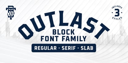 Introducing Outlast - A competitive sports font with three distinct and unique styles. Outlast was designed for creating powerful logotypes, sports branding, posters, apparel design, magazines headlines, labels and much more.
 - Comic Hand by Tom Chalky,
$16.00 Need to grab attention? Look no further than these three lovingly legible handwritten typefaces oozing with personality and style. Full of charismatic imperfections, this powerful trio is ready for battle!
 - Chervonec Uzkj BT by Bitstream,
$50.99Possessing a distinctive Russian appearance, Chervonec Uzkj, or Chervonec Condensed, is a hybrid semi-serif designed by Russian designer Oleg Karpinsky. The typeface family includes three weights with drawn italics. - My Left Foot by Rocket Type,
$14.00 Don’t let the name fool you! My Left Foot was made by hand. Alts, ligatures and Vietnamese all included in this whimsical typeface. Go ahead and dip your toes in!
 - Buddies by Sudtipos,
$59.00 Buddies, designed by Guille Vizzari, is a script font that was initially born as a piece of lettering. It is the result of an experiment between brush pen and pencil, and in this way, Buddies takes the imprint of the brush, the freshness of sign painting, and some (or a lot) of quirks by the author. The font at times enjoys dancing in titles and short lines of text, pouring rhythm and movements through its lowercase various x-height sets. Buddies also has a vast uppercase set with daring and atypical shapes that surprisingly function beautifully for composing short all-caps texts; messages are brought to life with awesome personality, ideal for packaging, fashion or even editorial. Buddies is a friendly font, a humble invitation to the brush letters universe, but from an unpredictable point of view.
 - Rekita by Twinletter,
$13.00 Introducing “Rekita Font” – Your Gateway to Playful Typography! Rekita Font is a captivating typeface designed to infuse playfulness and creativity into your projects. With its whimsical and charming characters, this font is your perfect companion for any design that seeks a touch of lightheartedness. Whether you’re crafting children’s books, eye-catching posters, or engaging social media graphics, Rekita Font effortlessly adds a fun and youthful vibe to your work. It’s a versatile choice that breathes life into your designs and sparks joy in your audience. Embrace the lively spirit of Rekita Font and unlock a world of creative possibilities. Elevate your design game, grab attention, and leave a lasting impression with this delightful typeface. Discover the magic of Rekita Font and let your creativity run wild with playful typography today! – PUA Encoded Characters – Fully accessible without additional design software.
 - Zulu-Ndebele Pattern by Scholtz Fonts,
$19.00Zulu-Ndebele Pattern is the first ever font to be based solely on the traditional decorative patterns of the Zulu and Ndebele tribes of Southern Africa. The designer has lived in KwaZulu (Place of the Zulu), for over 50 years and has made a life-long study of traditional Zulu beadwork and carving, and of Ndebele wall decoration. There are 52 pattern units that may be combined in many ways to create borders, backgrounds and an unlimited number of designs. The pattern units correspond to the upper and lower case letters. The reason that the Zulu and Ndebele patterns have been grouped together is that the true tribal areas are contiguous and the there has been much artistic cross-fertilization between the two cultures. Many of the patterns that are used by the two tribes are identical. - Kuryin by Twinletter,
$13.00 Introducing “Kuryin Font” – Where Playful Typography Meets Creativity! Unleash your design’s full potential with Kuryin Font, a lively and whimsical typeface that adds a touch of playfulness to your projects. Kuryin Font is your go-to choice for designs that need a fun and vibrant personality. Its unique, playful characters are perfect for children’s books, captivating posters, and standout branding that grabs attention. With Kuryin Font, your designs will instantly exude a sense of joy and creativity, drawing your audience in. Whether you’re crafting a cheerful invitation or crafting a memorable logo, this font infuses a playful spirit into your work. Elevate your creative projects and let your imagination run wild with Kuryin Font. Embrace the whimsical charm of this typeface today and watch your designs come to life! – PUA Encoded Characters – Fully accessible without additional design software.
 - Semilla by Sudtipos,
$79.00 I spend a lot of time following two obsessions: packaging and hand lettering. Alongside a few other minor obsessions, those two have been my major ones for so many years now, I've finally reached the point where I can actually claim them as “obsessions” without getting a dramatic reaction from the little voice in the back of my head. When you spend so much time researching and studying a subject, you become very focused, directionally and objectively. But of course some of the research material you run into turns out to be tangential to whatever your focus happens to be at the time, so you absorb what you can from it, then shelf it — like the celebrity bobblehead that amused you for a while, but is now an almost invisible ornament eating dust and feathers somewhere in your environment. And just like the bobblehead may fall off the shelf one day to remind you of its existence, some of my lettering research material unveiled itself in my head one day for no particular reason. Hand lettering is now mostly perceived as an American art. Someone with my historical knowledge about lettering may be snooty enough to go as far as pointing out the British origins of almost everything American, including lettering — but for the most part, the contemporary perspective associates great lettering with America. The same perspective also associates blackletter, gothics and sans serifs with Germany. So you can imagine my simultaneous surprise and impatience when, in my research for one of my American lettering-based fonts, I ran into a German lettering book from 1953, by an artist called Bentele. It was no use for me because it didn't propel my focus at that particular time, but a few months ago I was marveling at what we take for granted — the sky is blue, blackletter is German, lettering is American — and found myself flipping through the pages of that book again. The lettering in that book is upbeat and casual sign making stuff, but it has a slightly strange and youthful experimentation at its heart. I suppose I find it strange because it deviates a lot from the American stuff I'm used to working with for so long now. To make a long story short, what’s inside that German book served as the semilla, which is Spanish for seed, for the typeface you see all over these pages. With Semilla, my normal routine went out the window. My life for a while was all Bezier all the time. No special analog or digital brushes or pens were used in drawing these forms. They're the product of a true Bezier process, all starting with a point creating a curve to another point, which draws a curve to another point, and so on. It’s a very time-consuming process, but at the end I am satisfied that it can get to pretty much the same results easier and more traditional methods accomplish. And as usual with my fonts, the OpenType is plenty and a lot of fun. Experimenting with substitution and automation is still a great pleasure for me. It is the OpenType that always saves me from the seemingly endless work hours every type designer must inevitably have to face at one point in his career. The artful photos used in this booklet are by French photographer and designer Stéphane Giner. He is very deserving of your patronage, so please keep an eye out for his marvelous work. I hope you like Semilla and enjoy using it. I have a feeling that it marks a transition to a more curious and flexible period in my career, but only time will tell.
 - Bleeker by Typodermic,
$11.95 Are you ready to infuse some laid-back vibes into your design game? Look no further than Bleeker! This hand-lettered typeface is like a breath of fresh air, with casual letterforms and relaxed line-treatment that make your message feel effortlessly conversational. But don’t let the carefree nature of Bleeker fool you—this font is also smart and sophisticated. Thanks to custom letter pairings, it looks totally natural in OpenType-savvy applications. And let’s be honest—who doesn’t want to look natural and effortless while still being totally cool? So if you’re yearning for a typeface that feels like a sunny day and a good conversation rolled into one, give Bleeker a try. It’s the perfect blend of whimsy and sincerity that your designs have been craving. Most Latin-based European writing systems are supported, including the following languages. Afaan Oromo, Afar, Afrikaans, Albanian, Alsatian, Aromanian, Aymara, Bashkir (Latin), Basque, Belarusian (Latin), Bemba, Bikol, Bosnian, Breton, Cape Verdean, Creole, Catalan, Cebuano, Chamorro, Chavacano, Chichewa, Crimean Tatar (Latin), Croatian, Czech, Danish, Dawan, Dholuo, Dutch, English, Estonian, Faroese, Fijian, Filipino, Finnish, French, Frisian, Friulian, Gagauz (Latin), Galician, Ganda, Genoese, German, Greenlandic, Guadeloupean Creole, Haitian Creole, Hawaiian, Hiligaynon, Hungarian, Icelandic, Ilocano, Indonesian, Irish, Italian, Jamaican, Kaqchikel, Karakalpak (Latin), Kashubian, Kikongo, Kinyarwanda, Kirundi, Kurdish (Latin), Latvian, Lithuanian, Lombard, Low Saxon, Luxembourgish, Maasai, Makhuwa, Malay, Maltese, Māori, Moldovan, Montenegrin, Ndebele, Neapolitan, Norwegian, Novial, Occitan, Ossetian (Latin), Papiamento, Piedmontese, Polish, Portuguese, Quechua, Rarotongan, Romanian, Romansh, Sami, Sango, Saramaccan, Sardinian, Scottish Gaelic, Serbian (Latin), Shona, Sicilian, Silesian, Slovak, Slovenian, Somali, Sorbian, Sotho, Spanish, Swahili, Swazi, Swedish, Tagalog, Tahitian, Tetum, Tongan, Tshiluba, Tsonga, Tswana, Tumbuka, Turkish, Turkmen (Latin), Tuvaluan, Uzbek (Latin), Venetian, Vepsian, Võro, Walloon, Waray-Waray, Wayuu, Welsh, Wolof, Xhosa, Yapese, Zapotec Zulu and Zuni.
 - Cantoni by Debi Sementelli Type Foundry,
$59.99 I have a new baby sister! Check her out in her crib: Cinque Donne The Cantoni Font family is a hand lettered font with a variety of standard and alternate characters that play together well. And with a total of 1265 glyphs, you can play for as long as you like. Now Cantoni and Cantoni Pro also come in BOLD! Additional features include: Roman numerals, Fractions, Ordinals, Ornate and Old Style numbers, Greek symbols, a set of Flourishes, Ornaments and DIY Wedding Words and Images. It also includes Western and Central European, Romanian and Turkish language support. Named after my large Italian family, the unique variety of letters based on my own fluid upright style of brush lettering, reminds me of every family I know. There are creative and conservative siblings, crazy in a good way cousins, affable aunts and corny joke telling uncles who somehow come together and form one cohesive unit. In the same way, using the Open Type features to insert a “wild t”, begin a name with a “flashy f” or end a word with a “rambling r”, the font comes to life. The party starts. The fun begins. And soon they're all laughing and dancing up and down the baseline. Like a family gathering to celebrate a special occasion, there is a palpable sense of joy expressed through the letters and images, not unlike the sharing of good food, memorable stories and lots of laughter. While Cantoni Basic gets the party started, the Cantoni Font Family Total Design offers a complete package of options for your unique creations. On behalf of the whole Cantoni family, thanks for joining in the fun. I'll see you on the dance floor. Enjoy! Debi Check out my other script fonts Belluccia and Dom Loves Mary offered through the Correspondence Ink Foundry here at MyFonts!
 - Kayto by Majestype,
$20.00 Kayto Script is the second collaboration of Erwin Indrawan as the calligrapher and Dexsar Harry Anugrah of Majestype as the typeface designer. Today the resurgence of calligraphy has reached the summit, with social media as the vehicle, we are now familiar with many styles of calligraphy. One of the popular styles is brush lettering, especially the pointed brush calligraphy. Kayto Script is an exploration in pointed brush calligraphy. It’s an interpretation of modern brush calligraphy that combines cursive writing with the East Asian calligraphy flair. Kayto is made with a real brush and held perpendicular to the paper so the brush can twist and turn freely to follow the movement of the hand. This technique gives a natural gesture and energetic look to the strokes. Kayto has a unique rhythm of brush pressure to generate the thick-and-thin strokes... the beating heart of brush calligraphy. Instead of the mechanical thick-and-thin strokes like the regular calligraphy, Kayto is written with a lot of variety of pressure that is somewhat melodic but still conform with the discipline. The result is a script that feels personal and characterized with lively energy. And just like handwriting, every letter in Kayto script is crafted with many varieties of glyphs and ligatures to make an unlimited combination of personalized lettering. Because of its natural letterforms, Kayto Script is best suited to complement anything that is earthy or has nature as the ground. Erwin, the calligrapher, has used Kayto in many of his watercolor illustrations. Another ideas are wedding names on invitations or place cards, logo for any natural products, inspirational quotes, business cards and the list goes on... but in the end, if you wish for something personal and truly one of a kind then Kayto script the one you want. Also, Kayto offer a free version called "Kayto Doodles" designed by Adiet Pramudya.
 - Mantika Book Paneuropean by Linotype,
$67.99Mantika Book expands the Mantika super family: a contemporary serif font with a soft, yet robust character and a classic lookMantika Book, an Antiqua, is the third member of the Mantika super family, which consists of the Mantika Sans and Mantika Informal. Designer Jürgen Weltin has gone back to the roots of his font, which he had originally derived from a Renaissance Antiqua. These origins are recognizable in the first member of the Mantika family, Mantika Sans, in the form of carefully suggested line use and a contrast in the weights that recalls the Antiqua. This solid sans serif, optimized for use in text, also has a particularly energetic and dynamically designed italic. Mantika Informal also brings to mind a cursive font at first glance; ultimately, however, it is not easily categorized. Its light, organic shapes combine the informally flowing style of cursive handwriting with the open and airy form and contrast of a humanist sans serif. The shapes in the serif Mantika Book are also based on the Renaissance Antiqua, just like the other members of the Mantika super family. However, the contrast in the weights is somewhat stronger than is conventional for this genre, and the serifs are characteristically asymmetrical, with slanted ends. Lightly grooved stems with an implied curvature in the lower-case letters as well as dots whose shape flirts with a fountain pen lend the Mantika Book a dynamic and particularly friendly character. Details like the open "g" or the contoured foot of the "k" emphasize this dynamism. The letters of Mantika Book have the same large x-height as the other members of the super family, but are equipped with somewhat longer ascenders and descenders. - Golden Ticket by E-phemera,
$12.00Golden Ticket is a digitization of hand-drawn poster lettering by Otto Heim from 1925. The regular style is meant to be used on its own, but the other three styles are meant to be used one on top of another in three different colors to create a 3D effect. For best results, put the base style on the bottom, with the fill style directly on top of that in a different color, and the highlight style directly on top of that in a third color. - Movella by Greater Albion Typefounders,
$8.00 Remember those 1970s science fiction dramas which had such charming futuristic sets and backdrops? Remember the intriguing future lettering and signage the set designers would devise-often coupled with interesting futuristic spellings? Movella is a family of three typefaces inspired by that design ethos. The three faces- regular, italic and the 3D solid form are all capitals faces which combine a feeling of retro-futuristic design with easy legibility. Take your next project into the age of the Apollo Launches, sci-fi action drama and fun!
 - Sunrise by Haksen,
$18.00 Sunrise a serif hand-drawn font with a retro look! There are three fonts included : Sunrise Regular Sunrise Outline Sunrise Extrude You can use these three fonts to create your own retro quotes and words! Font Features : Regular version Character set A-Z in uppercase and lowercase Alternates Character Ligatures Numerals & Punctuation Accented Characters Multiple Languages Supported Sunrise is perfect for : shirts, retro designs, procreate, stickers, logos, branding, greeting cards, Cricut projects, posters, magazines, social media, prints and more! Have a great day, Haksen
 - Baguet Script by Melvastype,
$29.00 Baguet Script is a modern brush script family. It has three weights in italic and upright styles. The letters has soft terminals and slight bounce. Baguet Script has two sets of uppercase letters, one is more simple and the other is flashier. It has also three different types of matching initial and end swashes for lower case letters and multiple options for ascenders and descenders. So if you are looking for soft, friendly and modern script with lots of options and versatility check Baguet Script.
 - Limited Edition by KA Designs,
$10.00 If you are looking for a versatile modern retro font, look no further! Limited Edition was designed to bring together modern design and that popular 1960's retro style that everyone loves. This font includes interlocking letter pairs that are sure to make all of your designs stand out! There are three styles available - Regular, Outline and Shadow. Layer all three to create your own custom design! Limited Edition is perfect for branding, logos, editorial, magazines, signs, print, t-shirt design, stickers and more!
 - Vin Sans Pro by Mint Type,
$35.00 Vin (translated from Ukrainian as “he”) is a superfamily consisting of three robust typefaces with pronounced vertical stems and rounded corners. All three typefaces feature very large x-height for even more expression and assertiveness. Vin Sans Pro is a quite narrow rigid sans-serif typeface with extra-large x-height and rounded corners. It is perfect for any kind of short copy with lots of attention guaranteed. Be sure to check other two typefaces of Vin superfamily: Vin Slab Pro and Vin Mono Pro .
 - Tilda Script by Roman Polishchuk,
$25.00 Tilda Script Family is a clean and lining script with regular and non-connect versions in four weights. With this family you can craft solid logotypes with a unique look, set posters and ads, and even run longer lines of copy on packaging. Tilda Script is a versatile family with extensive language support and advanced typographic features including:Ligatures, Stylistic Alternates, Stylistic Sets.
 - Hayride JNL by Jeff Levine,
$29.00 Based in part on the hand-lettered title for a piece of vintage sheet music, Hayride JNL gets both its inspiration and name from Michael Todd's 1948 production "Mexican Hayride". The original design was in outline form, and the letters with straight-lined shapes had slight curves to them. For Hayride JNL, those lines were straightened and the letters made solid in appearance.
 - FF Sale by FontFont,
$41.99 British type designer Tony Booth created this script FontFont in 1996. The family contains 4 weights: Light Italic, Regular, Medium Italic, and Bold Italic and is ideally suited for advertising and packaging and poster and billboards. FF Sale provides advanced typographical support with features such as ligatures, alternate characters, and case-sensitive forms. It comes with proportional lining and tabular lining figures.


