7,493 search results
(0.103 seconds)
- Tailpen by Yumna Type,
$25.00 It is a tough task to create a visual identity without using a characteristic, multipurpose font to represent your brand in order to look different, yet unexaggerating. For that reason, let us welcome Tailpen, the perfect balance of simplicity, charm, and boldness to live up your brand identity. Tailpen is a display font in simple, inclined square letter shapes to show charming, real, attractive nuances. It is greatly legible due to the simple shapes in high contrasts with which you can apply this font for various text sizes. It also gives you a clipart as a bonus and you can make use of the available features here as well. Features: Multilingual Supports PUA Encoded Numerals and Punctuations Tailpen fits best for various design projects, such as brandings, posters, banners, headings, magazine covers, quotes, printed products, merchandise, social media, etc. Find out more ways to use this font by taking a look at the font preview. Thanks for purchasing our fonts. Hopefully, you have a great time using our font. Feel free to contact us anytime for further information or when you have trouble with the font. Thanks a lot and happy designing.
 - 13_Roshi - Personal use only

- PackardClipperNF - 100% free

- LittleRickeyNF - Unknown license

- IndochineNF - 100% free

- PonsonbyNF - 100% free

- DrumagStudioNF - 100% free

- 13_Fletcher - Personal use only

- PointsWest - 100% free

- BuenosAiresNF - 100% free

- MarchMadnessNF - 100% free

- 13_Ghosts - Unknown license

- 13_Misa - Unknown license

- Johto by Superpencil,
$32.00 Finally, a font that’s ready for your pixel adventures. Johto is a hand-crafted, pixelated font that captures the excitement of 1990s Tokyo for today’s developers, designers, and video-game makers. We all love the pixelated games we played as kids. Now, as programmers, video makers, and creators of side projects that make our hearts pound with passion, there is nothing more satisfying than imagining ourselves in the shoes of the people that inspired us. We want to feel like we're right back there in the excitement of 1990s Tokyo, as an artist or engineer. Johto was created because of our disappointment with the pixel fonts we found online. And for people like us, who care deeply about the quality of our work - especially the work we do for ourselves - we realized we needed a high-quality pixel font to give our work the look it deserves. With over six hundred characters plus support for dozens of languages, including Japanese, tons of fun hand-crafted ligatures to get the look right, Johto is an authentic nostalgia trip. It has all those missing details you didn't notice, but your brain did.
 - Angulosa M.8 by Ingo,
$38.00 At first glance, »Angulosa M.8« is one of those fonts that a technician or engineer would probably draw. And yet it differs fundamentally from typefaces constructed in this way. The right angle forms the basic element of the »Angulosa M.8«, but that's about it with the pure mathematics. Serif-like upstrokes and downstrokes on some letters improve readability, and carefully used slants makes the appearance a little friendlier. The proportions are not based on any mathematical principle, but are derived from freehand writing of the letterforms with a broad quill. In terms of style, »Angulosa M.8« belongs most closely to the modernist, constructivist typeface attempts, such as those undertaken at the Bauhaus in the 1930s. The styles of »Angulosa M.8« range from "Condensed" to "Expanded", from "Light" to "Black", plus the respective oblique form, which in this font is slanted to the left. All variants can be adjusted continuously in the variable font: the font width ranges from 50 to 150, font weight from 300 to 900, upright [0] and italic [1]. The »Angulosa M.8« supports all European languages including Eastern and Central European, Turkish, Greek and Cyrillic.
 - Lipa Agate by TypeTogether,
$49.00 Lipa is the name of the Slovenian national tree 'Linden'. The typeface Lipa Agate by Croatian designer Ermin Međedović, is part of a bigger type collection, comprising various type groups into one coherent system which Ermin developed over the past 10 years. Lipa Agate is the first to be released; a sans serif designed and engineered to be used in the smallest text sizes, best under 10pt, and in very bad printing conditions. It is perfect for phone books, classified ads, directories or any other job requiring economy without jeopardising legibility. To achieve this, Lipa Agate employs a range of tools, such as deep ink-traps, narrow proportions and a tall x-height. Contemporary editorial design requires a high amount of flexibility to respond to various design situations in a consistent fashion. Lipa Agate — with its 3 levels of condensation, 4 weights and 2 sets of different x-heights, 'High' and 'Low', which share the same width — fulfils these requirements wonderfully. That's a total of 24 fonts! To make this clean and honest workhorse face complete, its large character set also includes small caps, arrows, info-numerals and much more.
 - BF Corpa Gothic Pro by BrassFonts,
$39.00 BF Corpa Gothic™ Pro is a kind of “Neue”-Edition of the beloved typeface designed by Guido Schneider. Inspired by hand-drawn geometric fonts from 1920s posters, this sans serif typeface is slightly condensed, and it appears compact and captivates with its expressive shapes and unique details, despite its pronounced Grotesque character. With its rather constructed, technical – but also vivid – appearance, the BF Corpa Gothic™ Pro is not only suitable for headlines and display applications, but is also pleasant to read in short and middle length text. The type family is engineered for exciting, professional but unusual designs. It is equipped with OpenType Features like 4 figure sets (LF, TF, OSF, SC), nice ligatures, many currency symbols, fractions, alternates, special characters, arrows and symbols – and small caps. 9 style sets give you the option to individualize and adjust the typeface to the requirement of your design, without changing the general visual feeling. In this way you can also switch the simply slanted styled Italic into a “real Italic”. Each of the 16 fonts (Upright and Italic) contains more than 940 glyphs and supports up to 220 Latin-based languages.
 - Pliego by Huy!Fonts,
$35.00 Pliego is a textface designed to offer a comfortable continuous reading, with humanist proportions, an even texture, and informal calligraphic details noticeable only at big sizes, that gives it a contemporary feeling. Pliego has been named after Pliegos de Cordel, the Spanish word for the popular books that were common during the XVI, XVII and XVIII centuries. These were rough, cheap books that basically consisted in a folded sheet attached to a string, hence the name. Their content was varied, from popular tales to ballads and songs, but also crimes and mysteries. They were cheaply made, roughly printed and bound. The name Pliego evokes the idea of a rough look, angular edges, informal taste, but classical look. To cover today’s needs, Pliego includes five weights with matching italics. Designed and engineered for continuous reading, the Book, Regular and Medium weights will perform at their best under 14 points. However, don’t be scared to use for headlines and titles: because of its quirky details and calligraphic flavour, Pliego’s personality is accentuated when enlarged. With an extensive Latin character set, Pliego covers a wide amount of Latin-based languages, including Latin Plus encoding and Vietnamese support.
 - Neue Frutiger Tamil by Linotype,
$99.00 Neue Frutiger Tamil was created by Pria Ravichandran and a team of designers and font engineers from the Monotype Studio, under the direction of Monotype type director Akira Kobayashi. The family is available in 5 weights from Light to Bold to support the Tamil script. The typographic forms of Neue Frutiger Tamil are familiar and friendly. The Tamil shows traces of elements that is reminiscent of the calligraphic influences found in the 20th-century designs. Reflecting the modern typographic needs of the Tamil script, this type family is in the upright style. These two factors ensure that the two scripts, Tamil, and Latin pair elegantly. The result, Neue Frutiger Tamil, is an eclectic contemporary type family that bridges the past and the present. Neue Frutiger Tamil embodies the same warmth and clarity as Adrian Frutiger's original design, but allows brands to maintain their visual identity, and communicate with a consistent tone of voice, regardless of the language. It is part of the Neue Frutiger World collection, offering linguistic versatility across environments – suited to branding and corporate identity, advertising, signage, wayfinding, print, and digital environments.
 - Premium Sans by ZeeshanFoundry,
$40.00 Premium Sans is a professional typeface which is aspired to solve the major typographic challenges in editorial, print, Graphic design, Commercial designs and other form of templates and documents such as pdf or ms word. It has four weights light, regular, semi bold, bold. Each with an italic profile, so in total it has 8 typefaces. We created this typeface to have attention of reader in Graphic commercial designs and as well as on editorial designs. The X-height plays a great role in readability of a typeface, so we tried to give it a reasonably high x-height with accordance to ascenders and descenders. We've engineered it in such a way that it can easily be paired with script, slab serif and serif typefaces. Premium sans is made on minimum required character set which will be handy while typing currency symbols like cents, dollars or euro and also be very useful when typing the characters consisting of diacritic. We've designed it in such a way that either you write a long content for editorial purposes or you create a typographic or graphic/commercial design it will look nice and fine which is the uniqueness of this font.
 - Rangkings by Letterhend,
$16.00 Rankings is a luxury serif with unique alternates and swashes. This display typeface has a classic style yet still looks great for modern design. Rankings is great for headlines, logotypes, apparel, invitations, branding, packaging, advertising, and more. Rankings features : uppercase & lowercase numbers and punctuation multilingual ligatures alternates swashes PUA encoded We hope you enjoy the font, please feel free to comment if you have any thoughts or feedback. Or simply send me a PM or email me at letterhend@gmail.com
 - Mojacalo AH - Unknown license

- Alexandria - 100% free

- Grow Fat - Unknown license

- Neftali Pro by TipoType,
$25.00 2015 First Prize TipoType award. Neftali is a type family designed for continuous reading in long texts & editorial design, created as an interpretation of Pablo Neruda’s “Poema 20”. This work delivers a subtle experimentation of Baroque and Roman styles, rescuing features from some of the most successful chilean typefaces such as “Australis”, “Berenjena” and “Biblioteca”, along with its particular calligraphic details, medium weights, accentuated strokes, and wide curves that seek to project Pablo Neruda’s particular way of reciting. This typeface contains uppercase, lowercase, small caps, oldstyle, and tabular numbers; in addition to a true italic for every weight; and calligraphic details designed to compose his poems. A typography to talk about everything, except love… (Special thanks to: Francisco Gálvez & Patricio Truenos; without the help of the latter, this project wouldn’t have had an ending)
 - Humilde Regular by MrLetters,
$15.00 Introducing Humilde Script a new fresh & modern script with a handmade calligraphy style, decorative characters So beautiful on invitation like greeting cards, branding materials, business cards, quotes, posters, and more!! If you have any question, don't hesitate to contact me by email hello.mrletters@gmail.com Thanks and happy designing :-) Thank You for purchase!
 - FG Jennie by YOFF,
$14.95 Jennie in a box - a very well flowing scriptfont that's appealing for almost any task.
 - Sweet Rum by Gleb Guralnyk,
$14.00 Hi! Introducing a vintage typeface set named "Sweet Rum". Thank you & have a great day!
 - Agress by Gleb Guralnyk,
$13.00 Hello! Presenting a graffiti style font with multilingual support. Thank you & have a great day!
 - Dimelike by Balpirick,
$15.00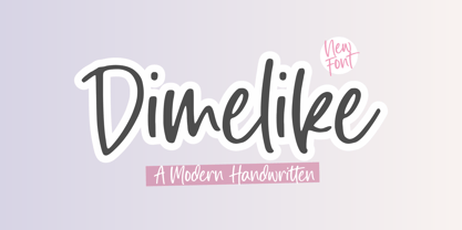 Dimelike is a Modern Handwritten Font. Dimelike feels equally charming and elegant. It looks stunning on wedding invitations, thank you cards, quotes, greeting cards, logos, business cards and every other design which needs a customized touch. - also multilingual support Enjoy the font, feel free to comment or feedback, send me PM or email. Thank you!
 - Charming Font - Unknown license

- Stay Gladin by IM Studio,
$19.00 Stay Gladin Script Font Trio is a new modern script font with an irregular baseline. Stylish and feminine. Stay Gladin Script looks beautiful in wedding invitations, thank you cards, quotes, greeting cards, logos, business cards and more. Perfect for use in ink or watercolor. Includes start and end letters, alternatives and support for many languages. Thanks You.
 - DOOMED - Unknown license

- Sliced AB - Unknown license

- FacetsNF - 100% free

- JunebugStompNF - 100% free

- UppenArmsNF - 100% free

- Skolar Sans PE by Rosetta,
$70.00 Any prototype you can imagine, Skolar Sans can materialise. This industrious type family is more than just a versatile partner for our award-winning Skolar collection: it is a true sans-serif type system envisioned for the age of responsive design. We developed Skolar Sans to accommodate contemporary typographers and the challenges they confront: an ever-changing spectrum of outputs and devices, in which serious typography can get lost. Skolar Sans is engineered to cope with complex editorial texts and data-rich layouts alike. Its construction is designed for easy reading, and its subtle personal style and a touch of flourish. From gently thin to black, the finely-tuned weight variants will fit any composition from wide-screen dashboards to compact mobile editorial designs. Its four subtly graded width variants allow you to fit any page context with comfort. The 72 styles; 36 weight and width variants in uprights and true italics with ligatures, arrows, scientific figure variants, and fleurons. The two variable fonts (one for uprights and one for the italics) allow user precise navigation of the Skolar Sans design space and streamline delivery. The linguistic scope of Skolar Sans PE is an exact match to Skolar PE: Latin, Cyrillic, and Greek (including polytonic) scripts and support for hundreds of languages and transliterations.
 - Vox Round by Canada Type,
$39.95 Vox Round is the softer version of the Vox family. The original brief for Vox was a extensive monoline typeface that can be both precise and friendly, yet contain enough choice of seamlessly interchangeable variants for the user to be able to completely transform the personality of the typeface depending on the application. Basically, a sans serif with applications that range from clean and transparent information relay to sleek and angular branding. When the first version of Vox was released in 2007, it became an instant hit with interface designers, product packagers, sports channels, transport engineers and electronics manufacturers. This new version (2013) is the expanded treatment, which is even more dedicated to the original idea of abundant application flexibility. The family was expanded to five weights and two widths, with corresponding italics, for a total of 20 fonts. Each font contains 1240 glyphs. Localization includes Cyrillic and Greek, as well as extended Latin language support. Built-in OpenType features include small caps, caps to small caps, four completely interchangeable sytlistic alternates sets, automatic fractions, six types of figures, ordinals, and meticulous class-based kerning. This kind of typeface malleability is not an easy thing to come by these days.
 - Ingeo by Blancoletters,
$40.00 Between the most rigid geometric letterforms and the most expressive calligraphy works there are, undoubtedly, countless combinatory possibilities. Ingeo is just one of them. Located very close to a geometric approach it shows, however, a clear willingness to accommodate in its structure the calligraphic traits of our alphabet. In Ingeo geometry grows from the inside, meaning that all its counters are based on geometric shapes. Around them, contours are later defined. The solid mass resulting from that interaction is modulated in specific areas in a way that evokes the way a writing hand finishes a letter and starts the following one. Ingeo seeks to accommodate calligraphic features in its geometric structure without any complexes, in the same way a computer engineer writes a song or a poet admires the orbits of planets and satellites. In this vast and unmapped realm between seemingly opposing concepts is where Ingeo finds its playground. There, that interaction is pushed to its limits and the resulting letterforms are later confronted with typographical conventions to assess whether they survive. Ingeo comes with 695 glyphs in its character set with support for more than 270 languages. Among these glyphs you can find 5 stylistic sets, 19 useful science-related icons as well as 7 different designs for ampersands.


