10,000 search results
(0.051 seconds)
- FingerSpeller BF by Bomparte's Fonts,
$40.00 Many years ago I studied American Sign Language in an effort to better communicate with some friends of mine within the deaf community. I found ASL to be a beautifully expressive language from a vibrant and active culture. Out of that attempt came this stylized depiction of the manual alphabet used in finger-spelling. Until recently it had only existed in analog form, born of pen and ink on paper. So now I'm glad to say it’s turned digital. Typing a period (.) will reveal the sign for “I Love You” (a combination of the letters I, L and Y), which fits nicely within the shape of a heart. Holding down the shift key while again typing period (greater symbol) will reveal the heart in its filled-in form, which can serve as an underlay. Use these in an application that supports layering in order to create different color combinations. There’s a stylistic alternate letter “S” and an “OO” ligature which can be accessed in OpenType-savvy apps.
 - Linotte by JCFonts,
$30.00 Linotte is a rounded sans in 7 styles designed by Joël Carrouché. Small irregularities give the typeface a warm and naive look, while the simple geometric construction provides good legibility in long texts and small sizes. Linotte is an ideal choice for food or kids related products, or anything that needs to convey a human and friendly feeling. Originally released in 2014, Linotte was updated in 2021 with Greek and Cyrillic support, two new styles, and other small additions. Linotte Semibold is 100% free for personal and commercial use. The fonts, provided in OpenType format, include diacritics for most European languages, a set of arrows & icons, and a variety of advanced features like stylistic alternates, case-sensitive forms, sub and superscript, automatic fractions, etc.
 - Zawiya by Eyad Al-Samman,
$3.00 The word Zawiya in Arabic language means Angle in English language. "Zawiya" is a Kufic modern square-shaped Arabic typeface. The typeface has only right-angled angles which makes it full of open and closed squares and free from any curves or arches. This font comes in two different weights. I am originally an engineer and I have liked to draw geometric shapes since my early childhood. I decided to design a typeface that embodies both of the technical and artistic human that I have inside me. The main characteristic of "Zawiya" Typeface is in its modern and attractive right-angled and square-shaped styles for its all-Arabic characters. The character "Faa" is one of its most distinguished characters that I myself adore it so much. "Zawiya" Typeface is suitable for books' covers, advertisement light boards, titles in magazines and newspapers, posters, greeting cards, cards, covers, satellite channels, exhibitions' signboards and external or internal walls of malls or metro's exits and entrances, geometric instruments and tools, technical devices, computers and laptops, IT and electric devices and also calculators. It is advisable to use the font in fields related to sciences such as geometry, mathematics, physics, chemistry, astronomy, industry, economy, and other fields. It can also decorate surfaces of calculators, geometric tools, rulers, pens, computers, cars, ships, trucks, and other related electric and electronic devices. It is sharp design qualifies it to be printed in public signs in streets, airports, hospitals, schools, malls, hotels, mosques, and other public places. It can also be used in titles for Arabic news and advertisements appeared in different Arabic and foreign satellite channels.
 - Creepy Tales by Ditatype,
$29.00 Creepy Tales is a spine-chilling display font that will send shivers down your spine. With its big letters and bold weight, this font demands attention and exudes fear. The horror theme is brought to life with meticulously crafted dripping ink details on each letter, adding a nightmarish and eerie touch to the font. Each letter in this font is bold and impactful, making a powerful statement in your designs. The large size of the letters further intensifies the font's haunting presence. The dripping ink details in this font give the font an organic and unsettling appearance, as if the letters are oozing with dread. These haunting details add a sense of macabre and create an atmosphere of suspense, immersing the viewer into a world of dark and chilling horrors. For the best legibility you can use this font in the bigger text sizes. Enjoy the available features here. Features: Multilingual Supports PUA Encoded Numerals and Punctuations Creepy Tales fits in headlines, logos, movie posters, flyers, invitations, branding materials, print media, editorial layouts, headers, and any project that requires a terrifying touch. Find out more ways to use this font by taking a look at the font preview. Thanks for purchasing our fonts. Hopefully, you have a great time using our font. Feel free to contact us anytime for further information or when you have trouble with the font. Thanks a lot and happy designing.
 - Noricks by Arterfak Project,
$27.00 Introducing Noricks, the handy bold serif typeface. Designed with satisfying large serif, and inspired by the newspaper headline and classy fashion logos. In this font, you can find strong and mild looks at the same time that makes Noricks can be used for many purposes. Work perfectly for logo, headline, title, or any design which needs emphasis from typography. Noricks is more complete with ligatures and a lot of special characters that you can apply and get the classy looks. What you’ll get : Uppercase Lowercase Numbers & symbols Punctuation Stylistic alternates Stylistic set Ligatures Accented characters Enjoy!
 - Hastynga by Golden Wraith Fonts,
$10.00 Golden Wraith Fonts designed the digital typeface Hastynga It began as an effort to find a solution to the digital aesthetic. By distorting digital fonts into a fluid style of writing with a variation in direction between strokes from one letter to the next, Hastynga allows for simulated text imperfection. Its layout creates textual tension, energetic movement, and vibrant vitality.
 - Restages by Nathatype,
$29.00 Large font sizes are often hard for the eyes to see and difficult to read. As a consequence, you have to give a lot of extra effort just to find out the right, legible font type with a great weight for your brand. Restages is a capitalized display serif font with less thickness for an effortless readability. This font type is perfect for formal contents because of its stylish, elegant characters to strengthen the impressions delivered. Furthermore, this font is truly legible due to its simple, regular serif forms to ease readers to recognize each letter correctly. Make use of the font features available here. Features: Stylistic Sets Multilingual Supports PUA Encoded Numerals and Punctuations Restages fits best for various design projects, such as brandings, posters, banners, logos, magazine covers, quotes, headings, printed products, invitations, name cards, merchandise, social media, etc. Find out more ways to use this font by taking a look at the font preview. Thanks for purchasing our fonts. Hopefully, you have a great time using our font. Feel free to contact us anytime for further information or when you have trouble with the font. Thanks a lot and happy designing.
 - Staylucky by Nathatype,
$29.00 It can be a tough challenge to find a perfect font for your aesthetic projects to create an everlasting nuance. Handwriting fonts have prominent displays and nuances, but they often rely on old-fashioned script fonts. Therefore, Staylucky is here to give you the best. Staylucky is a script font created to be a visually attractive handwriting which is perfect to express modern, elegant nuances with personalized designs to amaze readers and to protrude your messages. It is made in cursive styles in which the letters are interconnected. Details on each letter show high contrast and curvy wipes on each edge. Its complicated forms made it more suitable to apply for big, short texts. You can also enjoy the available features here as well. Features: Ligatures Stylistic Sets Multilingual Supports PUA Encoded Numerals and Punctuations Staylucky fits best for various design projects, such as brandings, invitations, greeting cards, name cards, quotes, printed products, merchandise, social media, etc. Find out more ways to use this font by taking a look at the font preview. Thanks for purchasing our fonts. Hopefully, you have a great time using our font. Feel free to contact us anytime for further information or when you have trouble with the font. Thanks a lot and happy designing.
 - Kungfu Brush by Ditatype,
$29.00 Kungfu Brush is a captivating game-themed display font designed in uppercase, infusing the essence of martial arts and the artistry of brush strokes. It features a distinct brush-style accent that brings a sense of handcrafted artistry to each letter. Inspired by the fluid movements of martial arts, the font captures the energy and elegance of brush strokes. This unique feature adds a touch of creativity and authenticity, making this font stand out from conventional display fonts. Designed with fairly low contrast, Kungfu Brush prioritizes a balanced and harmonious visual experience. The subtle differences in stroke width across the letters create a smooth and comfortable reading experience. With its uppercase design, Kungfu Brush exudes power and strength. Each letter commands attention and showcases the boldness of martial arts. The font's uppercase style adds a sense of authority and captures the spirit of determination found in the martial arts realm. You can also enjoy the available features here. Features: Multilingual Supports PUA Encoded Numerals and Punctuations Kungfu Brush fits in headlines, logos, posters, titles, branding materials, print media, editorial layouts, website headers, and any projects that aim to capture the essence of combat, adventure, and discipline. Find out more ways to use this font by taking a look at the font preview. Thanks for purchasing our fonts. Hopefully, you have a great time using our font. Feel free to contact us anytime for further information or when you have trouble with the font. Thanks a lot and happy designing.
 - Cheer Forever by Ditatype,
$29.00 Cheer Forever is a delightful display font that merges the timeless simplicity of a sans serif with playful brush-style accents. With its uppercase letterforms and unique design, this typeface adds a touch of cheerfulness and character to your projects. The defining feature of Cheer Forever lies in its combination of a clean and geometric sans serif base with brush-inspired accents. The uppercase letters maintain a sleek and straightforward appearance, while the brush-style elements bring an element of spontaneity and liveliness. This fusion of styles creates a harmonious balance, resulting in a font that is both contemporary and playful. Inspired by the joyful nature of brush calligraphy, Cheer Forever captures the essence of creativity and self-expression. The brush-inspired accents add a touch of whimsy and personality to each letter, as if they were hand-drawn with a brushstroke. This unique style injects a sense of fun and positivity into your designs. Enjoy the various features available in this font. Features: Ligatures Multilingual Supports PUA Encoded Numerals and Punctuations Cheer Forever fits in logos, titles, headlines, and any design that aims to make a bold statement with a touch of playfulness. It is also particularly well-suited for designs related to children's products, event promotions, and any theme that calls for a touch of creativity. Find out more ways to use this font by taking a look at the font preview. Thanks for purchasing our fonts. Hopefully, you have a great time using our font. Feel free to contact us anytime for further information or when you have trouble with the font. Thanks a lot and happy designing.
 - Ametis by Larin Type Co,
$20.00 Ametis is a modern elegant serif display font. In this font you will find many ligatures and alternates that give great potential for creating logos, branding, arranging wedding invitations, business cards, packaging and much more. This font will help to realize all your ideas and will not leave indifferent even the most sophisticated. Try it, change alternates and ligatures and you will see how many options you can get by creating in a classic style or a more elegant style. Lowercase completely duplicate uppercase, they have the same alternates and ligatures, but differ in size from uppercase. This font is easy to use has OpenType features.
 - The Imaginations by Asd Studio,
$14.00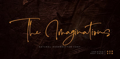 Introducing the new font The Imaginations, simple, natural, and natural handwritten font. This font suitable for use in a variety of design fields, such as event advertisements, product promotions, book titles, activity titles, logos, adventure, and others. This font can when paired with serif font types will make your design project more beautiful and perfect. Features: - Uppercase - Lowercase - Number & punctuations - Multilingual - Ligatures and alternates character - PUA encoded I highly recommend using a program that supports OpenType featuresand Glyphs panels such as Adobe Illustrator, Adobe Photoshop CC, Adobe InDesign, or CorelDraw, so you can see and access all Glyph variations. This font is encoded with Unicode PUA, which allows full access toall additional characters without having special design software. Mac users can use Font Book, and Windows users can use Character Map to view and copy one of the extra characters to paste into your favorite text editor / application. I hope you enjoy the font, thank you.
 - Cute Smile by Asd Studio,
$10.00 Introducing the new font Cute Smile, simple, natural, and cute font. This font suitable for use in a variety of design fields, such as event advertisements, product promotions, book titles, activity titles, logos, adventure, and others. This font can when paired with serif font types will make your design project more beautiful and perfect. Features: - Uppercase - Lowercase - Number & punctuations - Multilingual - Ligatures and alternates character - PUA encoded I highly recommend using a program that supports OpenType featuresand Glyphs panels such as Adobe Illustrator, Adobe Photoshop CC, Adobe InDesign, or CorelDraw, so you can see and access all Glyph variations. This font is encoded with Unicode PUA, which allows full access toall additional characters without having special design software. Mac users can use Font Book, and Windows users can use Character Map to view and copy one of the extra characters to paste into your favorite text editor / application. I hope you enjoy the font, thank you.
 - Hi Ashoka by Asd Studio,
$9.00 Introducing the new font Hi Ashoka - Fancy and Sweety Display Font. This font suitable for use in a variety of design fields, such as event advertisements, product promotions, mug design, book titles, activity titles, logos, and others. This font can when paired with serif font types will make your design project more beautiful and perfect. Features: - Uppercase - Lowercase - Number & punctuations - Multilingual Accents - Regular and Italic version - PUA encoded I highly recommend using a program that supports OpenType featuresand Glyphs panels such as Adobe Illustrator, Adobe Photoshop, or CorelDraw, so you can see and access all Glyph variations. This font is encoded with Unicode PUA, which allows full access toall additional characters without having special design software. Mac users can use Font Book, and Windows users can use Character Map to view and copy one of the extra characters to paste into your favorite text editor/ application. I hope you enjoy the font, thank you.
 - Royalbrick by Bake me a font,
$20.00 Royalbrick is a contemporary display unicase typeface. It is a part of upcoming type family — light and condensed style. The font was inspired by factory stamps’ typography on bricks made in 19-20 century on Russian manufactures — this kind of bricks was also called “royal bricks”. It has a unique image with “squashed” stems and dynamic expanding strokes, and there are also some kind of ancient Cyrillic’s vibes in it’s letterforms. It is an excellent example of combining national character with modern trends and expressive graphics. Royalbrick consist of extended Latin and Cyrillic, figures, two sets of punctuation (normal and "thin" with ss01), few ligatures and stylistic alternatives and a special set for letters with accents — ss02 named "Downstairs Accents". The font has 292 glyphs.
 - Eurostile Candy by Linotype,
$40.99Eurostile Candy is a fun spinoff from Akira Kobayashi's Eurostile Next family. As the name implies, it is based on Eurostile but with many striking new features. Most obviously, the corners and joints have been rounded off to give it a more friendly and softer feel. On top of those changes, the main skeleton of many characters have been modified. Any extra strokes have been removed - such as in the a, s, or t - and joints have been simplified to create even more square shapes - like in the n and r. With these contemporary and futuristic-styled alterations, Eurostile Candy is a cool new design great for many display projects. - Oak Street by Three Islands Press,
$39.00 There's a little restaurant in an old house on a sidestreet in town (Rockland, Maine, USA) called Cafe Miranda. The staff is friendly, the setting intimate, and the appetizer a basket of hot bread fresh from a brick oven. Its ample menu features such entries as "Quasi-Cassoulet" and "Gentle Sole." It's among my favorite local places to dine out. But the menu got photocopied once too often, and Cindy's personable handlettering got faded and broken. So I took matters into my own hands. And here's what I delivered to the newly computerized folks at the little restaurant on Oak Street. You, too, can travel in rather heavy felt-tip style.
 - Hyggemand by Hanoded,
$16.00 Hyggemand is not a real word: it is a combination of Hygge (meaning ‘fun’ or ‘coziness’ in Danish) and Mand (which means man in Danish). Combined it means something like ‘Nice Man’. I just like the sound and look of this name, so if I offend Danish languages purists, then I apologise for this monstrosity! ;-) Hyggemand is a happy kids font that comes with extensive language support and a set of alternates for the lower case glyphs. If you want the cute Huggeman face, you will find it as a stylistic alternate for the asterisk.
 - Fightever by Ditatype,
$29.00 Fightever is an expressive script font that embodies the boldness and energy of a brushstroke. With its interconnected letters and dynamic design, this typeface brings a sense of movement and liveliness to your projects. The defining feature of Fightever lies in its connected brush style, where each letter flows seamlessly into the next. This interconnectedness creates a sense of continuity and fluidity, resembling the strokes of a brush gliding effortlessly across the canvas. The result is a script font that feels organic and natural, with each letter forming a harmonious composition. Fightever captures the essence of artistic expression. The font exudes a sense of raw energy and passion, as if every letter is infused with the brushstroke's vibrant movement. This dynamic style adds a touch of personality and uniqueness to your designs. Enjoy the various features available in this font. Features: Alternates Multilingual Supports PUA Encoded Numerals and Punctuations Fightever perfect for logos, branding materials, invitations, or any design project that calls for a touch of handcrafted charm. This font will also work on designs related to art, fashion, hand-lettering, or any project that requires a personal touch, this font will bring an authentic and expressive feel. Find out more ways to use this font by taking a look at the font preview. Thanks for purchasing our fonts. Hopefully, you have a great time using our font. Feel free to contact us anytime for further information or when you have trouble with the font. Thanks a lot and happy designing.
 - C Elle F by TeGeType,
$19.00 The "C Elle F" is a typographic family, as a stencil letter, originally intended for cutting and engraving to carry out marking and signaling work. But of course, the very characteristic shape of these letters evokes much more. This typographic family can therefore be used for communication in various fields, commercial, import-export, military, etc.
 - Altair by Zetafonts,
$39.00 Altair is a sans serif type family derived from Zetafonts's Digitalino typeface. The original bold design by Francesco Canovaro has been expanded in a seven weights family, suitable for a wide range of design uses, from body copy to display text and ranging from a thin weight to the ultra one. Altair's main originality lies in the calligraphic roots of its design, that gives it a friendly, confident look that is perfect for corporate voices, new technology startups, news blogs and any other case where a solid design must be given an emotional context.
 - MFC Chaoxiang Monogram by Monogram Fonts Co.,
$269.00 The inspiration source for Chaoxiang Monogram is another hand-drawn treasure from a vintage embroidery publication which plays on the anglo-version of chinese letters with stabbing strokes and the charm of the orient. While the original intent of this monogram style is uncertain, the possibilities of its use are up to your imagination. This is one of many monogram designs from the early 1900’s which fall into a two letter format bound within a framing element. Download and view the MFC Chaoxiang Guidebook if you would like to learn a little more.
 - ITC New Baskerville by ITC,
$34.99 ITC New Baskerville is one of many contemporary type families based on the work of John Baskerville (1706-1775), a writing master and printer from Birmingham, England, whose types were cut by the punchcutter John Handy. Baskerville produced a masterpiece folio Bible for Cambridge University, and today, his types are considered to be fine representations of eighteenth-century rationalism and neoclassicism. ITC New Baskerville is a late 20th-century interpretation of Baskerville’s style, designed by John Quaranda. It makes an excellent and very readable text face; its sharp, high-contrast forms make it suitable for elegant advertising settings as well. ITC New Baskerville® font field guide including best practices, font pairings and alternatives.
 - Apple Pie by FontMesa,
$25.00 You might call this a Bodoni Ornate font that Bodoni never made, close examination of this old 1800s font and it's plain to see that the top half of the letters is very Bodoni in appearance. Apple Pie is a revival of and old font from the William Hagar Type Foundry, which I've been able to date back to 1850. The William Hagar type specimen book from the 1850s only shows this font as a caps only typeface plus numbers, later in 1869 MacKellar Smiths and Jordan offered this font with a lowercase. Over a two year period I was able to collect enough letters to begin production of this old decorative font, the type specimen books only showed a small line of text for this font so I would search through old documents on eBay and also shows relating to Ephemera. I could have easily developed a new font based on a very small sample of letters but I wanted to wait and find as many letters as possible, I was unable to find the Q, X, Z and ten lowercase letters so those missing letters are of my own design. New to this font is the addition of an all Caps Greek character set, accented letters for Eastern Central and Western European countries is also within this font. Fill fonts are available for the Apple Pie font, you will need an application that works in layers such as Adobe Photoshop, Adobe Illustrator or Corel Graphics in order to use the Fill fonts. Some Fill fonts may be used as stand alone fonts but the versions for Apple Pie look best when layered behind the parent or main Apple Pie fonts. Be sure to check out the left and right hands located on the Less Than and Greater Than keys.
 - Daily Routines by Fikryal,
$23.00 The “Daily Routines” Handwritten Display Font is a delightful and charismatic typeface that effortlessly captures the essence of casual elegance. With its carefully crafted strokes and artful imperfections, this font exudes a sense of handmade authenticity that is both inviting and versatile. Designed with meticulous attention to detail, “Daily Routines” showcases a harmonious blend of playful curves and well-balanced letterforms, making it a perfect choice for projects that seek to strike a harmonious balance between approachability and sophistication. Its smooth and flowing lines lend a sense of fluidity and ease, evoking a feeling of effortlessness and natural rhythm. The irregularities in each letter lend a unique charm, reminiscent of handwritten notes penned with care. The “Daily Routines” Handwritten Display Font is specifically tailored for projects that demand a warm and friendly touch, such as invitations, greeting cards, product packaging, and branding materials. It easily conveys a sense of personal connection, making it ideal for conveying heartfelt messages or highlighting the human element in design. Whether utilized for digital or print media, this font ensures legibility and readability, even in smaller sizes. Its captivating appearance adds a touch of personality to any text, making it stand out while retaining a sense of tasteful subtlety. Embrace the captivating allure of the “Daily Routines” Handwritten Display Font to infuse your designs with a genuine and endearing character, elevating them to new levels of aesthetic appeal and resonating with your audience on a profound level. If you have any questions please don’t hesitate to contact me follow my Instagram: fkryall Thank you
 - Yuki by Thinkdust,
$10.00 Yuki is a full and rounded font that also manages to be compact, so when you need to make a big impact in a small space and still maintain a friendly feel, Yuki is here to do the job. In two different styles, each with bold alternatives, Yuki’s best function is to grab attention without taking up too much space. The lined form allows it to look even more streamlined in this performance, cutting shapes into more easily digestible pieces, while the bold forms create even more smoothness. Use Yuki for quick, impactful statements without being aggressive.
 - Tautier by Sihan Wu,
$25.00 Tautier is a display font based on the specimen of Enge Mediaeval-Antigua, published in 1900 from the Bauer Type Foundry. It is intentionally redrawn to keep its overall narrow proportions. Based on the existing basic alphabets, Tautier is redrawn to appear more classical and friendly, as you can notice in the rounded corners around the beaks, as well as the lachrymal terminals in lowercases. Tautier is a display typeface suitable for large applications, for example, headlines for editorial design, branding, webpages, and environmental design. It currently comes as a single-styled typeface disposed to extend with an italic version.
 - Sashay Script by Ivan Angelic,
$19.99 Sashay Script is an elegant yet friendly script font. It is a rich smooth voice that gives an immediate human connection to any design. Do you need to display: speech; thought; emotions; desires…Sashay Script says it all in a clear legible script. It struts down the runway with panache, accompanied by: 13 Icons, 42 Ligatures and 21 Alternates. Although it is clearly a font that represents handwriting, it is very versatile and usable in that it is: easy to read; has good flow and looks great in both paragraph form or as a standalone word or line. As a bonus, since each and every letter was crafted from the ground up, Sashay Script can be used at larger sizes without losing any of its elegance as its edging is well groomed, without the raw edges that can be the terror of handwritten fonts at larger sizes. Sashay Arrows & Underlines was designed to match with Sashay Script. Often a font such as Sashay is used descriptively and the flow and line-weight of the 68 arrows and underlines match Sashay Script in look and feel. Please take a look at the gallery posters that show both Sashay Script and Sashay Arrows & Underlines, in use. We just know you'll have a perfect project for this little model of a font 'Sashaying' down the font runway.
 - Cumhuriyet World by Fontuma,
$34.00 Cumhuriyet means “the form of government in which the nation holds the sovereignty and uses it through deputies elected for certain periods”. The reason why I gave this name to the font is that 2023 is the centennial anniversary of the Republic of Turkey, which was founded by Atatürk. This typeface, which is sans serif, consists of three families: ▪ Cumhuriyet: Font family with Latin letters ▪ Cumhuriyet Pro: Font family including Latin, Arabic and Hebrew alphabets ▪ Cumhuriyet World: Font family including Latin, Cyrillic, Greek, Arabic and Hebrew alphabets Cumhuriyet World is a family of multi-purpose typefaces designed in a geometric style. This font is suitable for use in printed products, media and digital media, as well as in every field that is the subject of writing.
 - Garbata by Zetafonts,
$39.00 Garbata was designed in 2020 by Francesco Canovaro, looking for an approach to sans serif design that ignored the over-exploited grotesque and modernist models. It takes its skeleton from old style typefaces like Windsor or Cooper, keeping the quirky sloped shapes of some letters and adding to the historical smooth shapes a flat brush calligraphic sensibility. The result of these different historical influences is a humble yet distinctive sans serif typeface, developed in a wide range of weights, with finely-tuned differences between the medium, text-oriented cuts (with wider tracking and more regular design) and the more extreme, display-oriented weights. This play on subtlety allows Garbata to be surprising in all uses: humble and readable when set in body text, it shows all its elegant, whimsical qualities in logo design and display use. Equipped with all advanced OpenType features you expect from a production typeface, Garbata comes with an extended character set covering over two hundred languages with latin and Cyrillic glyphs. Designed with an Italian sensibility mixing craftsmanship and artistry, Garbata is ready to help you make your designs timeless, elegant and unusual.
 - HWT Konop by Hamilton Wood Type Collection,
$24.95 HWT Konop is a monospaced (fixed-width) typeface that is also square! Designed by Mark Simonson (Proxima Nova) as square characters that can be arranged vertically or horizontally and in any orientation. To a traditional letterpress job printer, a font like this wouldn’t make much sense. But to a modern letterpress printer it is an unusual and creative design toolkit. The bold gothic style is reminiscent of gothic wood types but more geometric. Since the characters are meant to be used in any orientation, the usual optical adjustments, such as making verticals thicker than horizontals and making tops smaller than bottoms are set aside. This results in a quirky but charming design. To provide more design options, Simonson came up with a modular system consisting of three sizes: 12-line, 8-line, and 6-line. These three sizes can be used together like Lego® bricks, with endless arrangements possible. And the sidebearing match so that characters always align when different sizes are used together. The digital version of Konop replicates the wood type version as much as possible, including the three different size designs. It includes OpenType stylistic sets that allow most characters to be rotated in place, 90° left, 90° right, or 180°, just like the wood type version. Extra characters not available in the wood type version are included with the digital fonts. The set of 3 is priced just $5 more than one single font, so order via "Package Options" HWT Konop is named for Don Konop, a retired Hamilton Manufacturing employee, who worked from 1959 to 2003. In addition to serving on the Two Rivers Historical Society Board from 2004 to present-day, he was also instrumental as a volunteer in helping with the museum’s move to its current home in 2013.
 - Vintage Glader by Ditatype,
$29.00 Vintage Glader is a beautifully crafted script font that exudes a timeless elegance and sophistication. Designed with a fairly thick weight, this font makes a bold statement while maintaining a classic script style. Its well-balanced proportions ensure a consistent and harmonious look across all letters, making it both visually appealing and highly readable. One of the defining characteristics of Vintage Glader is its contrasting strokes, which add a dynamic rhythm to the text. This contrast not only enhances the overall aesthetic but also contributes to the font's excellent legibility, making it suitable for a wide range of design applications. Adding to its charm, Vintage Glader swinging ends on some letters, lending a playful yet refined touch to the script. In addition, enjoy the features here. Features: Ligatures Stylistic Sets Multilingual Supports PUA Encoded Numerals and Punctuations Vintage Glader fits in headlines, invitations, logos, posters, flyers, branding materials, greeting cards, print media, and many more designs. Find out more ways to use this font by taking a look at the font preview. Thanks for purchasing our fonts. Hopefully, you have a great time using our font. Feel free to contact us anytime for further information or when you have trouble with the font. Thanks a lot and happy designing.
 - Bouncy Manuscript by Asd Studio,
$17.00 Introducing the new font Bouncy Manuscript Font. This font suitable for use in a variety of design fields, such as event advertisements, vintage design, product promotions, mug design, book titles, activity titles, logos, and others. This font can when paired with serif font types will make your design project more beautiful and perfect. Features: - Uppercase - Lowercase - Number & punctuations - Multilingual Accents - 2 StylisticSet - Ligature - PUA encoded I highly recommend using a program that supports OpenType featuresand Glyphs panels such as Adobe Illustrator, Adobe Photoshop, or CorelDraw, so you can see and access all Glyph variations. This font is encoded with Unicode PUA, which allows full access toall additional characters without having special design software. Mac users can use Font Book, and Windows users can use Character Map to view and copy one of the extra characters to paste into your favorite text editor/ application. I hope you enjoy the font, thank you.
 - Universo by PeGGO Fonts,
$12.00 Universo and Universo Stencil by Mauro Andrés and Peggo Fonts is a display font family for “Caos Sagrado” specially designed for informative fanzine and magazines. Its name “Universo” comes from the quote “we have to talk about the horrible things of Universe” with the main idea of supporting and help to expose social problems. Inspired on Retro-Futuristic fonts and poster design and old scientific publications that is becoming a new design trend nowadays, and strongly influenced by the Italian type designer Aldo Novarese’s work, developed in the 50’s. "Universo CS" and "Universo CS Stencil" were produced between mid-September and October 2018 by Mauro Andrés under the creative direction of Victoria Rivas and those versions were publicly showed at “Impresionante” (a massive independent printing expo in Chile) with a printed specimen. That phase of the project was updated and completed in March 2019 and was lastly finished between November 2019 and April 7, 2020, developing it in six styles, under the co-production of Peggo Fonts. "Universo" and "Universo Stencil" are both suitable for headlines and short text lines, music and concert posters, books and magazines covers, branding, logotype and graphic design. All stylistic alternates are accessible via OpenType features or character map.
 - Stay Calm by Nathatype,
$29.00 A typography can often be a deniable, yet crucial factor in designs’ displays and nuances. Additionally, it may be hard to find prominent, elegant, catchy fonts, whereas customers can easily forget designs without the right typography and remember nothing about your brands. Even the most interesting designs will look dull and too ordinary with inappropriate fonts. Therefore, we would like to introduce you to the Stay Calm, the perfect font option to create prominent designs. Stay Calm is an elegant, prominent display serif font to attract everybody's attention. It has bigger and thicker font proportions than the other ordinary serif fonts as its character to ease people to see it in big text sizes. Such unique characters as curvy thin lines and big, protruding dots, make this font suitable to create unique, interesting designs and applicable for bigger text sizes. You may also enjoy the available features here. Features: Ligatures Multilingual Supports PUA Encoded Numerals and Punctuations Stay Calm fits best for various design projects, such as brandings, posters, banners, headings, magazine covers, quotes, invitations, name cards, printed products, merchandise, social media, etc. Find out more ways to use this font by taking a look at the font preview. Thanks for purchasing our fonts. Hopefully, you have a great time using our font. Feel free to contact us anytime for further information or when you have trouble with the font. Thanks a lot and happy designing
 - Goldplay by Latinotype,
$26.00 Goldplay is based on Isidora Sans design yet features rounded shapes. Its rounded, soft terminals give it a friendly and expressive look, and its modern and contemporary style as well as its classic proportions make it an excellent choice for headlines, logotypes, branding, books, magazines, motion graphics, and use on web and Tv. One of its key features is a large x-height which make it look elegant and classy. Goldplay comes in 2 versions—each in 7 weights, from Thin to Black, and matching italics, resulting in a total of 28 fonts. The standard sans serif version—fresh, clean and contemporary—is a perfect choice for editorial and corporate design, headlines, books, magazines or any other piece of graphic design. The Alt semi-serif display version—more expressive and modern—is ideal for logotypes, branding, packaging, and use on web and Tv. Goldplay contains a set of 540 characters that support over 200 Latin-based languages.
 - Koomerang by Type Associates,
$21.95 I arrived this concept as a means to fulfil a need for a simple yet radical semi-sans with rounded terminals. My concept called for a modular approach so a single weight font family resulted, the monoline stroke weights being one-eighth of the cap height and the x-height five-eights, the descent two units. Within these constraints I found it was simple to devise an alphabet which met my need for quirkiness whilst retaining its legibility. As for the outline, shadow and contour variants - well they just seem to work. If you are wondering - and you don't hail from the "Land Downunder" - Canberra is our nation's capital; Bondi - "water breaking over rocks" a beautiful beach in Sydney; Uluru is the name given to the world's largest pebble, (formerly known as Ayers Rock); Kakadu is a national park in the "Top End" and Koomerang means "hill of clouds" - all place names in their respective Australian indigenous languages. Come on down - the natives are friendly.
 - Geogrotesque Sharp by Emtype Foundry,
$69.00 Geogrotesque Sharp is a superfamily of seven widths and 99 styles, that puts together the work of a decade. Some design aspects has been simplified but without losing its soul, we have removed ink traps and rounded corners. This update lead Geogrotesque to another dimension, becoming more usable and less idiosyncratic. A Variable Font version is included with the family, or as a separate style. Despite being more web oriented, this new format has gained popularity in recent years, so we thought it was the right moment to launch a variable Geogrotesque. For more info visit emtype website or see the Geogrotesque Sharp PDF.
 - Laca by Nova Type Foundry,
$30.00 Laca is a semi-sans serif inspired by retro Portuguese packaging of soaps. Laca is the Portuguese word for hairspray. The starting point was to design a typeface that would bring a familiar feeling of closeness and warmth but giving it a modern look ensuring it works well on modern platforms. It’s a lively typeface that brings texture and personality to the text. Perfect for branding and for all communications. There is an upright italic version available through the stylistic set that brings even more friendliness to the font. The result is a versatile typeface that has many OpenType features that brings stylistic alternates to the designer.
 - Cherston by Larin Type Co,
$15.00 Cherston this is a beautiful font family that includes 10 styles. Display Sans with sharp corners, rounded and rough style, made in three weights, light, regular and bold. This family also includes handwritten script fonts, it fits perfectly with this family, you can use it as an additional or main one. In this font, all the letters are uppercase, you will find a variety of ligatures and alternates that will help you create a unique design for your project, try to change the ligatures and alternatives and you will see how many options you can choose.