10,000 search results
(0.048 seconds)
- Modern Monarch by RagamKata,
$16.00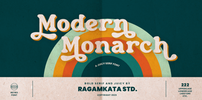 Modern Monarch is a retro display serif font that exudes a classic charm and bold character. With its design inspired by retro styles, this font brings an elegant touch and evokes a sense of the past. Modern Monarch Features: • Uppercase And Lowercase • Alternates And Ligatures • Numerals & Punctuation • Accented characters • Multilingual Support • Unicode PUA Encoded Thanks and have a wonderful day .
 - Maylane by Raditya Type,
$13.00 Maylane is a beautiful, loving elegant typeface. It is suitable for wedding invitation, quote, greeting and many more. “Maylane” includes the full set of upper and lower case letters, multilingual symbols, numbers, punctuation, stylistic set, and ligature. This font has a smooth texture, so it will be perfect for all types of printing techniques. You can do embroidery, laser cut, gold foil etc.
 - Letter Sketch by Motokiwo,
$15.00 This fun typeface is great for quote, tagline, or headline. Letter Sketch is all caps hand drawn font with two style, rough sketch and filled version. It's have natural drawing feels in each characters and give personal touch to your projects. Letter Sketch Regular : a funky rough pencil sketch font Letter Sketch Bold : the filled version of Letter Sketch Regular
 - Purple Sky by Epiclinez,
$16.00 Purple Sky is a bold and stylish handwritten script font. It is suitable for logos, branding, apparel, social media, and much more. The font Purple Sky contains 198 glyphs. Supporting more than 66 languages, from English to Zulu. It is also PUA encoded, multilingual, and has open-type features such as ligatures. Add a unique touch to your designs with this fantastic typeface.
 - Lined by Oscar Pastarus,
$18.00The Lined font started out with some scribbles - playing with lines and making shapes fold, underlap and overlap, eventually evolving into letters. This is a display/ornamental font and it was made in 2009, it's meant for decorative use and not in large bodies of text. For example it does well used as a headline font. It is proportionally spaced and uppercase only. - FF Beekman Square by FontFont,
$41.99 Dutch type designer Donald Beekman created this display FontFont in 1999. The family has 6 weights, ranging from Light to Bold (including italics) and is ideally suited for film and tv, music and nightlife as well as poster and billboards. FF Beekman Square provides advanced typographical support with features such as ligatures and case-sensitive forms. It comes with proportional lining figures.
 - CalliSans Variable by 38-lineart,
$140.00 Hello. this is the variable version of CalliSans : a revolution in typography. 14 fonts, 7 regular and 7 italic, seamlessly blend calligraphy's grace with sans-serif simplicity. Perfect for projects demanding elegance, from books to digital screens. Make a bold statement with its distinctive style. Timeless yet contemporary, it transcends trends. Your creative secret weapon. CalliSans Pro: where art meets design.
 - Katiki Can by DogHead Studio,
$25.00 Katiki Can is a bold, messy, painty display font inspired by all of the trashcans in the Outer Banks with names of rental homes painted on the side.
 - ITC Tyfa by ITC,
$29.99 Some words from the designer, Frantisek Storm... Designed by Josef Tyfa in 1959, digitalized by F. Storm in 1996. This Roman and Italic are well-known perhaps to all Czech graphic artists and typographers ever since their release. Although this type face in some details is under the sway of the period of its rise, its importance is timeless, in contradistinction to other famous types dating from the turn of the sixties which were found, after some time, to be trite. The italics live their own life, only their upper-case letters have the same expression as the basic design. Thin and fragile, they work excellently, emphasizing certain parts in the text by their perfect contrast of expression. When seen from a distance they are a little bit darker than the Roman face. Tyfa Roman was released in 1960 by Grafotechna in Prague for hot setting. Later on, Berthold produced letter matrices - "rulers" for Staromat devices, used for manual photosetting of display alphabets. In the eighties it was available on dry transfers of Transotype and today it is offered also by ITC. The meticulously executed designs of the individual letters in the 288 point size are arranged into a set of signs on a cardboard of about B2 in size. The yellowed paper reveals retouches by white paint on the ink. Blue lines mark the baseline, the capital line, the ascender and descender lines and the central verticals of the letters. With regard to the format of the flat scanner, the designs had to be reduced, with the use of a camera, to the format A4, i.e. to the upper-case letter height of about 30 mm. These were then scanned in 600 dpi resolution and read as a bitmap template to the FontStudio programme. The newly created bold type faces derive from Tyfa's designs of the letters "a", "n", "p", the darkness of which was increased further, approximately by 3%, to enhance their emphasizing function. The text designs have hairstrokes thickened by one third; the contrast between thin and thick strokes has been modified, in order to improve legibility, in sizes under 12 points. We have used electronic interpolation to produce the semi-bold designs. Josef Tyfa himself recommends to choose a somewhat darker design than the basic one for printing of books.
 - School Project JNL by Jeff Levine,
$29.00 A set of self-adhesive poster board letters once made by the E-Z Letter Stencil Company and sold under the name "Quik Stik" was the model for School Project JNL. Ironically, the line was discontinued because they did not stick very well - the weight of the cardboard caused the letters (which used a rubber cement type of glue) to pull away from the surface they were mounted to. Unlike vinyl self-adhesive letters (which were formulated for indoor or outdoor use) these cardboard sets were relegated to indoors only; further restricting their usability.
 - Charles Wright by K-Type,
$20.00 Charles Wright is a full typeface in the style used for British vehicle license plates. The standard Bold weight is based on the condensed bold ‘2001’ style with an uppercase which conforms to UK registration plate specifications for character heights of 79mm and widths of 50mm. The 9 font family also includes previously unavailable Medium and Regular weights, Obliques , and a newly designed lowercase. For platemakers, the wider '1935' and lighter 'Motorcycle' fonts are also included.
 - Presta by Type Juice,
$19.00 Presta is a variable weight sans serif typeface made up of 12 fonts from thin and condensed to wide and bold. Included in the variable font are over 500 alternate glyphs for creative customization. 12 fonts total 5 font weights Upper / lowercase glyphs Multilingual Over 5000 glyphs
 - Shabon Dama by Abdulrhman Saeed,
$19.99 Shabon Dama is a cheerful fun Arabic typeface, it bridges the gap between formal and fun, thus keeping it readable. It fits well with video games rated for everyone, kids comics and books, and cheerful marketing. Featuring three weights: Light, Regular, and Bold. ARABIC CHARACTERS ONLY.
 - Caldense by Tiago Cândido,
$20.00 The typeface was baptized as "Caldense" in order to honor the city of Caldas da Rainha, a small city in Portugal, the typography's birth place. It has three weights, Regular, Demi Bold and Bold and it is a sans serif and grotesque. Each character was based on a grid and was built in modules, having round edges and straight finishes. The font can be used in titles and normal text while being easy to read.
 - Motownphilly by IKIIKOWRK,
$19.00 Introducing Motownphilly - Classic Handdrawn Type, created by ikiiko. Motownphilly is a handwritten script typeface inspired by the typography styles of Movie titles and the American Classic Show & Orchestra in 1950s. This typeface is designed to give the appearance of an expressive style. Motownphilly has bold, raw lettering lines, with wild strokes. A style commonly used in print ads, magazine, and sign advertisements of the era. This typeface is perfect for an poster, newspaper, magazine ads, and also good for vintage product, food & beverages, quotes, or simply as a stylish text overlay to any background image. What's included? Uppercase & Lowercase Number & Punctuation Alternates Multilingual Support Works on PC & Mac
 - Broadster by IKIIKOWRK,
$19.00 Introducing Broadster - Classic Brush Type, created by ikiiko. Broadster is a decorative sans serif typeface, inspired by typography from classic 60s American advertising & automotive visual styles of the time. This typeface is designed to give the appearance of a formal yet expressive style. The Broadster has bold, contrasting strokes. A style commonly used in print, magazine, and sign advertisements of the era. This typeface is perfect for an formal layout, poster, newspaper, magazine ads, and also good for vintage product, food & beverages, quotes, or simply as a stylish text overlay to any background image. What's included? Uppercase & Lowercase Number & Punctuation Multilingual Support Works on PC & Mac
 - Sheldon by PintassilgoPrints,
$24.00 Sheldon family draws inspiration from the beautiful and eloquent posters of Polish graphic artist Marian Stachurski. Generously sprinkled with stylistic oddities, this is the perfect typeface for having some cool typographic unevenness without losing the ever-handy sans-serifness. Sheldon is an all caps font but holds different characters on upper- and lower-case slots for a more consistent handcrafted feel. Its OpenType Contextual Alternates feature manages to instantly alternate these glyphs. The family includes 3 handy weights, so it can accommodate numerous typographic tasks. It also brings a very cool picture font, which charmingly completes this useful and visually striking font family. Have fun!
 - Binario Soft by Tarallo Design,
$14.99 Binario Soft is a friendly typeface with rounded edges, offering a warm and soft impression. It comes in three weights with matching obliques. Drawn with subtle references to Art Deco, this type is ideal for a clean, warm, and modern look in branding, posters, magazines, and screen-based projects. The light weight is good for short body text. The regular weight exudes confidence, making it suitable for both body and heading text. For impactful headlines, the bold weight is excellent. The clear weight distinction make it easy to create organized text. Binario Soft is a gently rounded version of Binario, which is also available on this vendor’s website.
 - Kawara by Twinletter,
$15.00 Kawara, our newest font, is now available. We produced this display font with a Japanese theme or an Asian font to fulfill the needs of your project with a Japanese theme, but it’s impossible to use an authentic Japanese font because not everyone understands Japanese letters, therefore we present this font as an intermediate alternative. To make your project gorgeous, strong, and bold, we produced this font with the most unique shape imaginable. So, what are you waiting for? Use this font to realize your ambition of having a wonderful project. Logotypes, food banners, branding, brochure, posters, movie titles, book titles, quotes, and more may all benefit from this font. Of course, using this font in your various design projects will make them excellent and outstanding; many viewers are drawn to the striking and unusual graphic display. Start utilizing this typeface in your projects to make them stand out.
 - Halla by Wilton Foundry,
$19.00 Creating Halla was a bit unusual for me since I started out creating the italic version first and that inspired the name Halla, meaning to tilt in Icelandic. It is also a fairly common female name in Iceland. “Halla” is derived from old Norse word “hallr” = 'flat stone, rock' or 'sloping, leaning to one side' Halla is a true italic inspired by handwriting and mechanical type. The combination of Light and Italic makes Halla ideal for advertising, branding, signage, packaging and editorial design.
 - Quadrat Grotesk New by ParaType,
$30.00 Designed for ParaType in 2004 by Vladimir Pavlikov. It is a new version of popular type Quadrat Grotesk by the same author. Letters of the new version in contradistinction to the old one are clean and have no traces of exploitation. Quardat Grotesk New due to its rectangular proportions is extremely readable in small sizes and can be successfully used in Web pages and in documents with long lists where critical aspect is a number of lines rather then length of a line.
 - Golemi Display by Sihan Wu,
$30.00 Golemi Display is a reverse-contrast fat face font inspired by the Caslon Italian specimen from 1821. It is intentionally designed to keep its wood type feel—the overall chunky body with rounded junctures to imitate the old look. However, compared to its prototype, Golemi is redrawn to have smoother shapes with a modern look. Golemi Display is suitable for large applications, such as headlines for editorial design, branding, webpages, and environmental design. It is currently a single styled typeface disposed for extension.
 - Paralex by Tipo Pèpel,
$27.00 Paralex is a complete typeface family of 12 fonts with geometric-slab style. The edges of shapes are rounded to give a smoother appearance. It contains several OpenType functionality, such as initial and final decorative forms, old style numerals and an extensive set of geometric style ornaments. The character set supports Central and Eastern European as well as Western European languages. Despite the robustness of its forms has a warm appearance, and good readability that make it useful for a variety of situations.
 - Sqwared by Monotype,
$25.00 Sqwared is a square sans serif type family... with flares! This typeface has a retro, hand-painted quality – the slight flaring of its verticals evoke the steady brush of a signwriter. Sqwared benefits from large, open counters and a generous x-height that aids clarity and legibility, while a wide footprint gives these fonts a degree of stature and an air of confidence. Each character was drawn while immersed in a late sixties/early seventies vibe, but there’s no reason why Sqwared can’t be used for your contemporary designs. There are 16 fonts altogether, ranging from Thin to Ultra weights in both roman and italic. It has a Latin character set that covers all Latin European languages. Sqwared will dazzle in headlines, add flair and distinction to your logo designs, bring flamboyance to your branding material, and your body text will most definitely be unique! Variable fonts are included in this family, so you can tune the weight of each font to your exact preference. Key features: 8 weights in Roman and Italic Old Style Figures included Full European character set (Latin only) 440 glyphs per font.
 - Gandur New by Blackletra,
$50.00 Gandur is a display textura in three weights, split into two families: Alte — the German word for old — and New. Gandur was inspired by other geometric texturas, specially Max Bittrof’s Element (1933). The design began by adhering to a strict hexagonal grid, but during its development, slowly moved from a purely geometric to a more pen-based design (this is especially true in the heaviest weights). The differences between Alte and New are essentially morphological, with reflections in the character set and OpenType features. Gandur New has a more humanistic, contemporary structure and is more ‘romanized’ then Alte. Gandur New also features small capitals. Gandur Alte, on the other hand, remains truer to historical forms, most notably: S s X x Z z. Gandur Alte also features the long-s, which can be accessed via a Stylistic Set or the glyph palette. (As is historically accurate, a short-s will be used at the end of words automatically when the historical Stylistic Set has been activated).
 - Gandur Alte by Blackletra,
$50.00 Gandur is a display textura in three weights, split into two families: Alte — the German word for old — and New . Gandur was inspired by other geometric texturas, specially Max Bittrof’s Element (1933). The design began by adhering to a strict hexagonal grid, but during its development, slowly moved from a purely geometric to a more pen-based design (this is especially true in the heaviest weights). The differences between Alte and New are essentially morphological, with reflections in the character set and OpenType features. Gandur New has a more humanistic, contemporary structure and is more ‘romanized’ then Alte. Gandur New also features small capitals. Gandur Alte, on the other hand, remains truer to historical forms, most notably: S s X x Z z. Gandur Alte also features the long-s, which can be accessed via a Stylistic Set or the glyph palette. (As is historically accurate, a short-s will be used at the end of words automatically when the historical Stylistic Set has been activated).
 - Le Havre Layers by insigne,
$19.00 With this charming new layered typeface, the possibilities are endless with your vision behind it. Accomplish the effect you've been searching for by layering these exceptional fonts and altering opacity and color, for a unique custom appearance that yells “hello there!” Play around a bit with the potential of Le Havre Layers. Build effects which include realistic 3D appearances reminiscent of the storefronts of old and adding centerlines, dotted centerlines, and shadow variations. Inspired by the affable appearance of vintage signage from the 1930s to the 1960s, Le Havre Layers spacing is altered from Le Havre Titling’s to accommodate shadows and other options properly. With its generous width it sends a message of refinement and grace. The geometric and art deco curves are a beautiful addition to your work. Mix and match with the other members of the Le Havre Hyperfamily. There are many amazing design solutions for you to discover. See what you could build with Le Havre Layers!
 - Busero by Sealoung,
$10.00 Busero is a bold and powerful display font. It celebrates abstract shapes in all their eclectic beauty. Add this font to your creative ideas and notice how it makes them stand out!
 - Yanson by Younestype,
$99.00 This Arabic typeface family was created by Younes Alaboudi. Yanson proudly incorporates a timeless geometric style with humanistic nuances. Featuring three weights from Light to Bold, Yanson supports OpenType features for Arabic.
 - Meksa by Okaycat,
$29.95 Meksa is sleek, minimal & very clean. This wide typeface is perfect for bold headers, impact text, or logo design. Meksa is multilingual, appropriate for international publications. Includes Cyrillic, West European diacritics & ligatures.
 - Realtime Gamer by Creaditive Design,
$12.00 Realtime is a cool, thick lettered and robotic display font. This font is ideal for writing web designs, business cards, or pretty much anything else that requires a techno and bold touch.
 - Pipe Dream by Callout,
$14.00 PipeDream is a thick, slab-serif typeface. It is perfect for short, attention grabbing headlines. Inspired by 1990's computer games this bold face is a force that refuses to be ignored.
 - Gracioso by FadeLine Studio,
$14.00 Introducing! Gracioso is a new cute and funny display font. This font adopts a bold, cute, firm, and trendy style. Very suitable to meet your various design needs that are trending now.
 - Mariosa by Letterara,
$12.00 Mariosa is an elegant font with a romantic appeal; this font is for those who are in need of an elegant and appropriately modern calligraphy script. Get inspired by its bold swashes.
 - Grateful Everyday by Crumphand,
$12.00 Hello, Introducing Bold and Cute Fonts Grateful Everyday. this font rounded good for your Graphic. Frendly use, Easy to Read. What's Character Included ? Uppercase Lowercase Symbols Numerals Multilingual Support Thank You, Regards.
 - AZ Clouds by Artist of Design,
$20.00 AZ Clouds was inspired from a need to develop a sans serif typeface with center accents for a t-shirt design. This font was designed for use as a fun bold headline.
 - CA No Dr. by Cape Arcona Type Foundry,
$30.00 No Dr. was inspired by an old movieposter lettering for the 1962 movie "James Bond: Dr. No". Just like the original Dr. No, No Dr. has a diabolical charm. It was developed into a font family that combines distinctiveness with versatility. It has a good readibility as a textfont but also looks great as a Headline. The two widths and the two weights give you a big choice. Intended to become an interesting alternative to the much used DIN Schrift, it has now developed into a highly functional family of it's own.
 - Viktors Littl Creepy Horror by TypoGraphicDesign,
$19.00 CHARACTERISTICS The dark and sharp character of the typeface is a very unique atmosphere. The letter-forms can with broken trees, rotten and old and branches are associated. The partially pointed edges remind thorns (bushes) a rose. APPLICATION AREA The edgy, contrasty horror and fantasy font »Viktors Littl Creepy Horror« would look good at display size for headlines in magazines or websites, movie posters, music covers or webbanner. TECHNICAL SPECIFICATIONS Headline Font / Display Font / Fancy Font »Viktors Littl Creepy Horror« OpenType Font with 354 glyphs - alternative letters and ligatures (with accents & €) & 1 style (regular)
 - Parma Typewriter Pro by No Bodoni,
$35.00 PARMA is a type-writer style face with the form and elegance of a Bodoni. Functional beauty was the aim of mating the two disparate ideas in one type, creating a utilitarian face with graceful features. We�re even converting the keys on our beloved old Olivetti portable to type in Parma Typowriter. And then we�re going to get a Lambretta scooter to go zipping around in and maybe one of those front opening Fiat cars for drives in the countryside. Hey, waiter! Where�s my order of Giambotti? And more Sangiovese for everyone!
 - Attic Antique by Three Islands Press,
$29.00 Attic Antique by Three Islands Press. Flipping through a friend’s old hardbound collection of John Burroughs nature essays a while back, I thought it'd be fun to try to develop a typeface with the same uneven, imperfect look to it. I picked and chose among various printed characters, enlarged them somewhat with a photocopier, then hand-rendered each. Had to custom-make some of the accents and symbols, then added a couple goofy dingbats just for the heck of it. The result: an amazingly legible serif family akin to the Century faces.