7,805 search results
(0.02 seconds)
- Miss Moonling by Youngtype,
$18.00 Miss Moonling is a hand brush font made with brushes and ink. This typeface is ideal for use in thick watercolor designs or handwriting styles, such as blog titles, posters, wedding elements, t-shirts, clothing, book covers, business cards, greeting cards, branding, merchandise etc. Contains full set: - Uppercase - Lowercase - Alternative - Ligatures - Punctuation - Number - Multilingual support. How to access all alternative characters, using Windows Character Map with Photoshop: - https://www.youtube.com/watch?v=Go9vacoYmBw How to access all alternative characters using Adobe Illustrator: - https://www.youtube.com/watch?v=XzwjMkbB-wQ Thank you!
 - Decize by Eurotypo,
$36.00 Decize font is a classic “Didona”, characterized by extreme contrast in thick strokes and thin strokes, by the use of very short serifs, and by the vertical stress of the letters. This version, designed by Carine de Wandeleer, is slightly condensed and is also enriched by a full set of OpenType features of tails, ligatures, alternates and swashes. Decize Italica is a true "italic" This font was designed and carefully drawn to combine with Decize Regular, it has 652 glyphs and the same OpenType features than the regular version.
 - VanderHand by JOEBOB graphics,
$29.00 The 'VanderHand' font is a friendly and easy to use handwritten font. It is so loaded with ligatures it could easily pass for actual handwriting. The font was created with a felt-tip brush pen and so there are natural thick and thin parts in the characters. All writing was done upright with tightly fit characters. As a result this font has a unique 'instant logo' quality. But you should really try this out for yourself. O, and the font was written by Jeroen van der Ham. It's his handwriting. That's why it's called VanderHand.
 - DEMONA The GUNTER by Tony Type Studio,
$5.00 Demona the Gunter is the result of a journey towards self-discovery and part of an ongoing process of exploration. A font featuring a more evolved design while maintaining a charmingly simple style. The extreme contrast between thick and thin strokes gives Demona the Gunter a harmonious and stylish look. It comes in 6 weights with matching regular and italic fonts and includes alternate and ligature versions. The entire character set supports many Latin based languages. Demona the Gunter is perfect for editorial design, movie titles, branding, magazines, logos, headers and more
 - Octagen Condensed by deFharo,
$11.00 Octagen is a family of 16 condensed Sans Serif fonts of geometric construction and neo-Gothic style with short descenders and a humanistic finish in the curves and auctions of the tiny letters to avoid the coldness of the grotesque typographies, providing expressiveness, energy, warmth and docility , resulting in a friendly typography with a lot of personality and readability, specially drawn for the composition of short and medium texts, signage or headlines where horizontal space saving is needed. The typography has 529 glyphs (Latin Extended-A) with advanced OpenType functions, several number games, a complete set of neutral-style alternative lower case letters and the Bitcoin symbol. For Octagen cursive styles I used a set of lowercase letters without terminal finishes, more neutral than the regular versions, this being compensated by the expressiveness of the italics inclination, thus achieving important morphological, coherent differences within the conceptual development of this typographic family.
 - Stancilo by Ardyanatypes,
$15.00 Stancilo is a type of serif font that offers uniqueness in its form. With a distinctive design and superior aesthetics, this font gives each character an elegant and modern touch. Stancilo font has nine different thicknesses, ranging from thin to bold, providing flexibility and variation. Thus, this font can be used for various design purposes, from main headings to body text, with the ability to adjust the desired intensity and emphasis. One of the advantages of Stancilo is the presence of alternate letters and ligatures that provide character variations for each letter. Allows users to combine alternate letters or use special ligatures to create more harmonious combinations and relationships between characters within words. This feature adds a sense of personalization and additional creativity to the design. Furthermore, Stancilo font also supports multiple languages, making it suitable for multilingual design projects. With the support of diverse languages, this font enables effective and comprehensive visual communication in various cultural contexts. Stancilo is a prominent serif font with a unique form, providing nine different thicknesses, alternate letters, and ligatures. These advantages make it suitable for elegant, modern designs and allow for creative exploration in using its letters. With support for multiple languages, this font becomes a versatile and inclusive choice for diverse design projects.
 - Gramers by Dora Typefoundry,
$15.00 Gramers is an elegant and modern minimalist font family, a new roman sans serif font carefully crafted, These font ideas come from various references, from vintage, classic, art deco, to the modern era. Carefully drawn with high contrast between the strokes bold and thin with the aim of making even the simplest sans serif letters look sensual, elegant, and warm. The feeling of versatility and luxury you get in Gramers. As you can see in the display of our creations such as Branding, Header, Logotype, Posters, Magazines, Packaging, Art deco wedding invitations, and others. This shows that Gramers can accommodate various design styles. The flat lines cover five styles (each light, regular, medium, semi thick, Thick), each of which includes nearly 293 glyphs. OpenType features include 103 standard ligatures and a small number of character variants, and multilingual support (including multiple currency symbols). Features: • 5 Font weight • uppercase • Alternative & Ligature Styles • Numbers & Punctuation • Characters with accents • Supports Multiple Languages This type of family has become the work of real love, making it as easy and enjoyable as possible. I really hope you enjoy it! I can't wait to see what you make with Gramers! Feel free to use the #Dora Typefoundry and #Gramersfont tags to show what you've done!
 - Tebel Sans by Ardyanatypes,
$15.00 Tebel Sans is a modern, ultra-bold sans-serif font perfect for all kinds of designs. With nine different thickness variations and two different typefaces (regular and italic), this font is the ideal choice for your designs. Its unique thickness makes your design look like a bold and elegant title. It is also a practical body text, with a large selection of different font families available in Opentype features such as multilingual ligature. Alternative fonts make it even more attractive and valuable for various graphic designs. Tebel Sans has a uniqueness that makes your designs look more powerful and modern. Languages Support :Afrikaans, Albanian, Asturian, Asu, Azerbaijani, Basque, Bemba, Bena, Bosnian, Breton, Catalan, Chiga, Colognian, Cornish, Croatian, Czech, Danish, Dutch, Embu, English, Esperanto, Estonian, Faroese, Filipino, Finnish, French, Friulian, Galician, German, Gusii, Hungarian, Icelandic, Igbo, Indonesian, Irish, Italian, Kabuverdianu, Kalaallisut, Kalenjin, Kamba, Kikuyu, Kinyarwanda, Latvian, Lithuanian, Low German, Lower Sorbian, Luo, Luxembourgish, Luyia, Machame, Makhuwa-Meetto, Makonde, Malagasy, Malay, Maltese, Manx, Meru, Morisyen, North Ndebele, Norwegian Bokmål, Norwegian Nynorsk, Nyankole, Oromo, Polish, Portuguese, Quechua, Romanian, Romansh, Rombo, Rundi, Rwa, Samburu, Sango, Sangu, Scottish Gaelic, Sena, Shambala, Shona, Slovak, Slovenian, Soga, Somali, Spanish, Swahili, Swedish, Swiss German, Taita, Teso, Turkish, Turkmen, Upper Sorbian, Vietnamese, Vunjo, Walser, Welsh, Western Frisian, Yoruba, Zulu
 - Nextir by Ditatype,
$25.00 Nextir is an extraordinary brush sans serif font that commands attention and redefines modern typography. Designed with large letters and a thick weight, its distinctive square letter shapes are the epitome of strength and contemporary style. What sets Nextir apart from the ordinary is its brush detailing. This unique blend of brush strokes and sans serif elements adds a layer of organic texture to the font. The combination of large letters, thick weight, square shapes, and brush detailing creates a font that makes a striking statement with a contemporary edge. When you need a typeface that combines strength with artistic expression, Nextir is the perfect choice to infuse your designs with boldness, modernity, and a touch of handcrafted elegance. You can also enjoy the features here. Features: Multilingual Supports PUA Encoded Numerals and Punctuations Nextir fits in headlines, logos, posters, flyers, branding materials, print media, editorial layouts, and many more designs. Find out more ways to use this font by taking a look at the font preview. Thanks for purchasing our fonts. Hopefully, you have a great time using our font. Feel free to contact us anytime for further information or when you have trouble with the font. Thanks a lot and happy designing.
 - Palmer Lake by Jen Wagner Co.,
$13.00 Features: Palmer Lake Print: Uppercase letters, numbers, & extended punctuation Palmer Lake Script: Lowercase letters, numbers, & extended punctuation Non-English support for the international designer Same stroke thickness with each font, so you don't need to make any time-consuming adjustments to get it looking right! Palmer Lake Print (uppercase font) letters are the same height as the Script lowercase letters, so making quotes is super easy! This is such a fun new duo, perfect for creating quotes, logos, or just adding a hand-written touch to any project! While other fonts usually take some size adjusting to look just right, Palmer Lake duo has the same stroke thickness for both fonts, so you can set each font to the same size and you're done! Plus, the uppercase letters of the Print font are the same height as the lowercase letters of the Script font (see the samples), so lining them up with one another is a breeze! Each font also has alternates for each letter, so when you type uppercase or lowercase for each font, the letters will change slightly. For example, tying in all caps with the Script font will connect each letter, whereas typing all lowercase will disconnect each letter. Test it out for yourself in the box above!
 - Subito - Personal use only

- GALLAECIA - Unknown license

- MondoRedondo - Unknown license

- Pirouette by Linotype,
$40.99Pirouette is based on a logo that Japanese designer Ryuichi Tateno created for a packaging design project in 1999 (a shampoo container!). Tateno's logo experimented with complex, overlapped swash letterforms. He continued to develop these outside of the initial packaging project, until they took on a life of their own. Eventually, Tateno designed a full typeface out of the logo, Pirouette, which was the first place display face in Linotype's 2003 International Type Design Contest. The Pirouette typeface contains six different fonts. The basic font is Pirouette Regular. This is an engraver's italic lowercase paired with elaborate swash capitals. The swash capitals have two visual elements in their forms: thick strokes and thin strokes. Pirouette Text includes the same lowercase as Pirouette Regular, but the uppercase letters are much shorter and simpler. This "text" font can be used to set longer amounts of copy. Pirouette Alternate contains different lowercase glyphs and additional ligatures, which can be used as substitutes for the lowercase forms in the Pirouette Regular and Pirouette Text fonts. Pirouette Ornaments contains swashes and other knick-knacks that can either be added onto the end of a letter, or used as separate decorative elements or swooshes (accolades) on a page. Pirouette Separate 1 and Pirouette Separate 2 are two fonts that can be layered over top of one another in software applications that support layering (e.g., most Adobe and Macromedia applications, as well as QuarkXPress). Pirouette Separate 1 contains the thick stroke elements from Pirouette Regular's uppercase letters, as well as the same lowercase glyphs that can be found in Pirouette Regular and Pirouette Text. Pirouette Separate 2 contains only the thin stroke elements from Pirouette Regular's uppercase letters. By layering Pirouette Separate 1 and Pirouette Separate 2 over one another, you can give the uppercase letter's thick and thin stroke elements different colors and create unique, more calligraphic designs. The Pirouette family, Tanteno's first commercial typeface, was greatly influenced by the calligraphic and typographic work of the master German designer, Prof. Hermann Zapf, especially his Zapfino typeface. - Basilio by Canada Type,
$29.95 In the late 1930s, old Egyptiennes (or Italiennes) returned to the collective consciousness of European printers and type houses — perhaps because political news were front a centre, especially in France where Le Figaro newspaper was seeing record circulation numbers. In 1939 both Monotype and Lettergieterij Amsterdam thought of the same idea: Make a new typeface similar to the reverse stress slab shapes that make up the titles of newspapers like Le Figaro and Le Frondeur. Both foundries intended to call their new type Figaro. Monotype finished theirs first, so they ended up with the name, and their type was already published when Stefan Schlesinger finished his take for the Amsterdam foundry. Schlesinger’s type was renamed Hidalgo (Spanish for a lower nobleman, ‘son of something’) and published in 1940 as ‘a very happy variation on an old motif’. Although it wasn’t a commercial success at the time, it was well received and considered subtler and more refined than the similar types available, Figaro and Playbill. In the Second World War, the Germans banned the use of the type, and Hidalgo never really recovered. Upon closer inspection, Schlesinger’s work on Hidalgo was much more Euro-sophisticated and ahead of its time than the too-wooden cut of Figaro and the thick tightness of Playbill. It has a modern high contrast, a squarer skeleton, contour cuts that work similarly outside and inside, and airy and minimal solutions to the more complicated shapes like G, K, M, N, Q and W. It is also much more aware of, and more accommodating to, the picket-fence effect the thick top slabs create in setting. Basilio (named after the signing teacher in Mozart’s Figaro) is the digital revival and major expansion of Hidalgo. With nearly 600 glyphs, it boasts Pan-European language support (most Latin languages, as well as Cyrillic and Greek), and a few OpenType tricks that gel it all together to make a very useful design tool. Stefan Schlesigner was born in Vienna in 1896. He moved to the Netherlands in 1925, where he worked for Van Houten’s chocolate, Metz department store, printing firm Trio and many other clients. He died in the gas chambers of Auschwitz in 1944. Digital revivals and expansions of two of his other designs, Minuet and Serena, have also been published by Canada Type.
 - ITC Atelier Sans by ITC,
$29.99ITC Atelier Sans began as one of Curtis's renovations. His goal was to create a monoline design with Art Deco “sensibilities,” but without the geometric precision and relatively small x-height of faces like Futura or Kabel. Gentle curves and suggestions of serifs create a crisp, clean and open face that is at once sleek, sensuous and still affable. Available as a two-weight family with complementary italics, ITC Atelier Sans is another successful and usable revival from Nick Curtis. - Trocadero Pro by RMU,
$35.00 In 1927 Albert Auspurg cut Trocadero for the Trennert foundry in Hamburg. This new version is not a mere digitalization, but many letterforms were altered and updated, and missing links in the complete alphabet had been drawn afresh. Out came a beautiful cursive font with a certain charm of its own which covers beside the West European languages also those of Central Europe and Turkish.
 - Foundry Origin by The Foundry,
$90.00 Foundry Origin has an elemental quality hinting at its ‘Egyptian’ roots. Developed out of the desire to create a serif typeface with a difference, Foundry Origin's elegant design and versatile family of weights, with lyrical cursive italic, generous x-height and classical proportions, make it ideal for editorial and information design. A quiet design with a big presence, tipped to become a modern classic.
 - Didgeree Doodle NF by Nick's Fonts,
$10.00The pattern for this delightful little font was originally released as Bernhard Heavy Antique Cursive by the Bauersche Geißerei of Frankfurt am Main and designed, of course, by Lucien Bernhard. Dippy, trippy, under the radar and over the top. The Postscript and Truetype versions contain a complete Latin language character set (Unicode 1252); in addition, the Opentype version supports Unicode 1250 (Central European) languages as well. - LC Merkén by Compañía Tipográfica de Chile,
$30.00 Merkén is a typeface inspired in the Slab Serif fonts designed by Vincent Figgins in the early 20th century: his famous designs; Antique and Egiziano, were the main references when developing this project. The typeface is perfect for headlines, medium length texts, branding and advertising. His original set is strong and spicy but it also has an alternative set which is cursive and kind.
 - Kyrenia by Talavera,
$60.00 Calligraphic font born from mixing chancery cursive strokes with some copperplate gestures. Kyrenia is the italic counterpart of Agony TTW. You can combine Kyrenia’s four different styles to create the illusion of handmade, along with a lot of ligatures and some alternate endings. This four styles are Quill (the basic one), Broad (taller and stiffer), Swash (ornamental and romantic) and Monster (a hypnotic strange blend).
 - Samsara by W Type Foundry,
$15.00 Samsara is a cursive typeface inspired by calligraphy tools. Its shapes and gestures convey an organic-modern style which generates the texture of a brush tip. Samsara not only has a great versatility, but also is suitably to create short texts such as branding and short messages. It comes with OpenType features, stylistic sets, special ligatures, and swashes, which were designed specially to let your imagination fly.
 - Cardamon by Linotype,
$50.99 “My goal in creating the Cardamon family,” says Brigitte Schuster of her first design, “was to make an unobtrusive serif typeface which, at the same time, has a determined and straightforward demeanor.” “I wanted to design a typeface with sharp edges and corners,” explains Schuster. “I was influenced by the angularities in Vojtěch Preissig‘s “Antiqua” and “Cursive” in addition to Oldřich Menhart‘s “Menhart” typeface.”
 - Catchfire by Alan Smithee Studio,
$10.00 Warm and human, yet reliable and precise. Catchfire blends humanist proportions and geometric features. The result is a sans serif typeface with strong personality traits, but that can fulfil everyday needs. It is very legible due to its open counters. It boasts a large character-set, OpenType features, circled numbers, wide range of weights, cursive italics : everything needed to become your new companion for years to come!
 - Kidszones by Krakenbox Studio,
$15.00 Kidszones is a cute and fun display and decorative font. Its cool, playful & childish look makes it a fantastic choice for fashion, signature, album covers logos, branding, magazines, social media posts, advertisement, and many more. Use this display font to add that special cool touch to any design idea you can think of!
 - Arabhella by Krakenbox Studio,
$15.00 Arabhella is a cute and fun display and decorative font. Its cool, playful & childish look makes it a fantastic choice for fashion, signature, album covers logos, branding, magazines, social media posts, advertisement, and many more. Use this display font to add that special cool touch to any design idea you can think of!
 - Floreste by Krakenbox Studio,
$9.00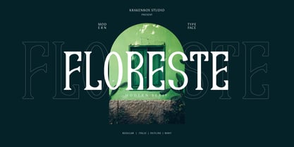 Floreste is a modern display font. Its elegant, classy, and modern look makes it a fantastic choice for fashion, apparel projects, signature, album covers logos, branding, magazines, social media posts, advertisement, and many more. Use this display font to add that special cool touch to any design idea you can think of!
 - Breaze by PizzaDude.dk,
$19.00 You may think cartoon or kids product, when you take a look at Breaze - and you may be right…but I did have retro grafitti in mind, when I drew the letters. Well, actually I may have mixed both cartoon and grafitti! Anyway, it’s a playful font and is suitable for many things!
 - Dragonblood by Hanoded,
$20.00 Dragonblood is quite an unusual font: it was made with Parker ink and a Chinese fur brush. When all the glyphs had been vectorized, and I saw them in a text for the first time, the only appropriate name I could think of was Dragonblood. Dragonblood comes with a realm of diacritics.
 - Clean Notes by The Arborie,
$11.00 Write beautifully and neatly with the Clean Notes font. It gives you the option to write beautiful and legible notes while maintaining a classic handwritten look. It's perfect for use in any note-taking app or computer. Think about using this font in a website or scrapbook to inject personality into any project.
 - Adagio by Monotype,
$15.99 Adagio is a spontaneous, casual kind of font but don’t be fooled into thinking just because it’s all uneven and painted that it’s a pushover. There’s a bold brush pen at the heart of the design as well as a full set of alternate lowercase characters if you’re looking for something extra.
 - Creepy Crawly by Comicraft,
$19.00There are worms in the earth, hairy bugs under the bed and strange bloodshot eyeballs peering at you from out of the closet. Lilou's Creepy Crawly font is perfect for scaring away Trick-or-Treaters, just install our font and print out your signs with the legend: WE EAT LITTLE CHILDREN HERE! - Best Choice by Dharma Type,
$9.99 Best Choice is a family of next-generation monospaced fonts for developing, programming, coding, and table layout. Some desirable features in monospaced fonts are listed below. 1.Easy to distinguish 2.Easy to identify 3.Easy to read Best Choice has very distinguishing letterforms for confusable letters such as Zero&Oh, One&I, and Two&Z. A lot of ingenuity makes this family very distinguishable. Italics have a very large inclination angle to be distinguished from their Roman. For the same reason, Italics are slightly lighter than Romans. Italic is not cursive Italic. It is near the slanted Roman. This is an intentional design to identify Italic letters. Cursive is not suitable for programming font. Very clean and natural letterform is good for reading. Common curvature for tails and hooks makes harmony and a sense of unity. Best Choice supports almost all Latin including Vietnamese and Cyrillic. Try this all-new experiment.
 - Reverse Vintage by Din Studio,
$29.00 Choosing fonts for design projects can be an endless task to do because there’s thousands of fonts out there all that you could use. Wait no more, we will give you the best choice. Reverse Vintage-A Display Font The Reverse Vintage aims to bring out a modern and stylish view. This font is made specifically designed to fit a variety of different content needs and projects. Everything’s well with cursive! The curvature of the Reverse Vintage was fully thought out to easily meld inside your designs. These fonts make a good foundation of what you want it to be. Show your opulence and decadence with this fancy font and blow your audience’s mind away as you put these cursive letters in your projects. Reverse Vintage includes Multilingual Support to make your branding reach a global audience. Features: Ligature Stylistic Alternates Swashes PUA Encoded Numerals and Punctuation Thank you for downloading premium fonts from Din Studio
 - Mutamathil Taqlidi by Arabetics,
$39.00 The Mutamathil Taqlidi type family is the largest size member of the Mutamathil type style. It has one glyph for every basic Arabic Unicode character or letter and one additional, final-position, glyph for each Arabic letter that is normally connected with other letters from both sides in traditional cursive Arabic strings. With each glyph being slightly symmetrical around its vertical axis, this family is only suitable for right to left ordering. The Mutamathil Taqlidi family includes all required Lam-Alif ligatures and uses final position glyph substitutions, ligature substitutions, and marks positioning. Text strings composed using types of this family are non-cursive with stand alone isolated glyphs. The Mutamathil Taqlidi family includes both Arabic and Arabic-Indic numerals, all required diacritic marks, in addition to all standard English keyboard punctuations and major currency symbols. The fonts in this family support the following scripts: Arabic, Persian, Urdu, Pashtu, Kurdish, Baluchi, Kashmiri, Kazakh, Sindhi, Uyghur, Turkic, and all extended Arabic scripts.
 - Predy by Eurotypo,
$55.00 In the era of digital types, the round handmade cursive continues to intrigue many type designers, probably by their beautiful and graceful calligraphic origins. However, what is certainly true, is that all good traditional pen-formed script may be suitable for a wide range of fine graphic works. The Predy typeface is based on the famous style of the 19th Century: The English handwriting made by pen. It is a connected cursive in the tradition of the “ronde”. This typeface is constructed upon their vigorous ascenders with loops, two times the lengths of the descenders with an extremely short x-high. The uppercase is a classical modern roman typeface (Didona) that are accompanying with a set of accurate flourished capitals as alternates of the calligraphic style. Predy font comes with a set of decorative glyphs including old style figures, terminal letters, ligatures, alternates and swashes. This font will lend elegance and sophistication to a wide variety of design projects like wedding, invitations cards, logotypes, packaging and posters.
 - Jellybrush by Sentinel Type,
$25.00Looking like gifted jelly and falling in between cushions and cat food, this plump and inviting letter mixes simplicity with organic style for a wide range of uses. Jellybrush's compact cursive forms and robust friendliness draw on artbrush scripts, blending brush effects with synthetic forms. A versatile workhorse suitable for: * Dairy & beverage * Sweets & soft drink * Five minute food & sauces * Pet food & accessories * Bathroom & kitchen * Cushions, pillows, rubber & swimming pool, etc. Jellybrush is designed to take squishing and outline treatments and still look good. Squish it down in your application of choice, the letter proportions withstand horizontal compression easily. Jellybrush italic is a subtly-slanted fully cursive variant with the character width, counter size and hanging figures required for good text performance. Designed for supplementary text for packaging and advertising comps and any application requiring readable text matching the main font. The font packages contain two (2) formats of Jellybrush, in OpenType & TrueType flavors. - Handsome by Shinntype,
$50.00 Handsome was the first digital typeface to resemble nice, ordinary, fully cursive handwriting. Or neon. In 2005, Handsome Pro was one of the first script typefaces to utilize the OpenType format to simulate the natural quality of writing, by automatically substituting alternate contextual glyphs. The effect follows the conventional “joining rules” of calligraphy, which are a formalization of the way in which letter forms are modified in cursive handwriting for the sake of speed and efficiency—and also perhaps to make life more interesting. For the look of real handwriting, Handsome is most convincing at around 15 pts. At much smaller or larger sizes it works differently. At display size, the feel of the non-nib styles is very slick, more like a speedball Kauffman, owing to the smoothness of the finish. As script fonts go, Handsome has a relatively large x-height, which can be useful if you don't want the “writing” to look too small.
 - Varisse Variable by AVP,
$79.00 Varisse spans over two centuries of type design and draws its inspiration from well-loved classics that are as fresh today as they were when they were created. The range stretches from a quintessential 18th century transitional serif to an uncompromising 20th century sans. Think Baskerville, think Gill. The idea was to create a family that shared similar forms and the same vertical metrics, allowing them to be mixed to provide impact and readability as required. With a generous x-height and a host of options, Varisse Variable is ideally suited to branding, packaging, magazines and editorial. It also provides a wealth of opportunity in website presentation. The variable axes of weight and serif allow selection of styles from sans light to serif heavy with all the options in between.
 - Tatline by Groteskly Yours,
$15.00 Tatline was intended to be a fun side project that developed into something cool and rather unprecedented. It's bold, it's chunky —and it just looks good whether it's a mock movie poster or a key element in a brand identity for a business. With serifs thicker than stems, it looks more down to earth, solid, reliable and firm. And yet there's an almost imperceptible playfulness in the way it looks and behaved on the screen and paper. Tatline would look great on posters and flyers. We've tried creating a coffee brand identity with it —and surprise, looks great again. Maybe it's magic, but we like to think it's just a result of tough work put into creation of Tatline. Try it yourself and let us know what you think!


