10,000 search results
(0.087 seconds)
- Roaring 20s by Thomas Käding,
$5.00 This is a decorative font containing the letters A-Z, numbers 0-9, and enough punctuation to make invitations, playbills, posters, and the like. It is meant to have the feel of the theatre district early last century. "Roaring 20s" comes in three styles: regular/engraved, hollow/white, and black. Enjoy!
 - Heart Strings by Seemly Fonts,
$12.00 Heart Strings, a charming and warm handwritten font, brings a delightful touch to designs centered around Valentine's Day. Its simplicity and distinctive style make it a perfect match for a wide range of creative projects. Let your imagination run wild—there's no limit to the sweetness this font can add! Uppercase
 - Hawkes by Kimmy Design,
$15.00 Hawkes is an extensive handmade typeface family that comes with a bundle of weights, widths and styles, all designed to work cohesively. Here is a breakdown of the Hawkes family. Hawkes Sans: The primary subfamily is a sans-serif typeface that includes nine fonts: three weights (light, medium and bold) and three widths (narrow, regular and wide). Within this set are an array of stylistic features; including small capitals, character style alternatives, discretionary ligatures and contextual alternatives. See details below for more information on OpenType Features. Hawkes Variable Width Sans: The secondary subfamily is the same base sans-serif fonts but combined in variating widths. Essentially, it takes all three widths of each weight and randomly mixes them together. This creates a funky and creative alternative to the more traditional sans-serif set. The variations are for the uppercase, lowercase, small capitals, ligatures and numbers. Hawkes Script: The last subfamily is the script typeface. It’s a quirky script with variations of its own, including ligatures, swashes and contextual alternatives (again, see below for further details.) The script font works great as a complimentary style to the sans-serif, or on it’s own. FEATURES Alright, let’s get into all the extra goodies this typeface has to offer. Small Capitals: Small caps are short capital letters designed to blend with lowercase text. These aren’t just capital letters just scaled down but designed to fit with the weight of both the lowercase and capitals. With Hawkes, small caps can either sit on the baseline (in line with the base of the capital and lowercase) or to be lifted to match the height of the capital letters by applying the discretionary ligature setting in the OpenType panel. These small capitals have a dot underlining them that sit along the baseline. The feature offers a unique display affect that is great for logos, titles and other headline needs. Discretionary Ligatures: A discretionary ligature is more decorative and unique combination than a standard ligature and can be applied at the users discretion (as the name indicates.) The specific styling for these ligatures varies for different fonts. With Hawkes, they are used as an all capital styling feature, or to lift the small capitals to align with the height of the capitals. In the former setting, both lowercase and uppercase letters are first changed to all capitals, then a specialized set of letter combinations are transitioned so small characters are positioned within a main capital letter. These combinations only happen with main characters that include an applicable stem, such as C F K L R T Y. Some of these combinations include two or three characters. When Small Caps is turned ‘on’, this feature will lift the small caps to the height of the capital letter. For more information, please check out the user guide! Stylistic Alternatives: Stylistic alternates are a secondary form of a character, often used to enhance the look or style of a font. For Hawkes, these alternatives provide a slightly more handmade feel. A - the capital and small capital A will lose its pointed apex and become rounded. Think of it more as an upside-down U than an up-side-down V ;-) Oo, G, Ss, Cc- these characters’ topmost terminal becomes a loop. The O is applied automatically, the G S and C need to be turn on individually. Titling Alternatives: This feature does sort of the opposite of what it intends. Instead of being used for titling purposes, this feature makes the text look better in paragraph text settings. Kk Rr h n m - curved terminals on the are straightened e - the counter stroke also gets straightened from a more looping motion y - the shape of y is changed from a rounded character to a sharper apex (think more like a ‘v’ than ‘u’) Contextual Alternatives: Contextual alternates are glyphs designed to work within context of other adjacent glyphs. With Hawkes Sans, there are three slightly different variations per character. The feature rotates the application of each variation. This helps with organic authenticity, so if you have two e’s next to each other, they won’t look identical (reflecting the natural variations in handwriting and lettering.) With Hawkes Variable width fonts, I have created a contextual pattern that randomizes the widths of each character. So, when the feature is turned ‘on’ in the OpenType panel, the widths would alternate in a pattern such as: Narrow, Wide, Regular, Narrow, Regular Wide, Narrow, etc. It happens automatically so the user doesn’t have to think or worry about getting a random seed. With Hawkes Script, contextual alternates allow strokes to connect properly from one character to the next while maintaining a believable, natural flow. Connecting strokes are present for two letters next to each other but are replaced by a shorter stroke when located at the end of a word or sentence. Some characters have in-strokes when located at the start of a word. When a character is preceded by a capital letter that doesn’t connect, it too needs an in-stroke or altered spacing. This feature is complicated and messy, but luckily you don’t really have to think about it! I’ve done all the coding so all you have to do is turn ‘on’ the feature in the OpenType panel and you are off to the races! I’m just letting you know what’s happening behind the scenes. Swashes: These are just for Hawkes Script and provide tail swashes to the start and ends of letters. There are three different options. You can pick the basic option by turning ‘on’ the swash feature in the OpenType panel, or you can pick using the Glyph panel. Stylistic Sets: This feature work in new versions of Illustrator CC and InDesign CC. You can pick specific styling sets instead of turning on an entire feature. For example, let’s say you want to have a loopy S, but not a loopy C or O, you can just turn on the S in the Style Set. It also helps create the little drop box that pops up when you hover over a character, showing you the alternates associated with that character. This makes it easy to pick and choose specific styles you want in a word or headline. ---------- And there it is folks! That’s all the basic info on Hawkes, I know it’s been a lot and I appreciate you hanging on. If you are like me and need more of a visual reference to accessing all these goodies, I’ve made a user guide to help navigate Hawkes and everything it has to offer. Altogether this extensive family boasts 14 total fonts in a wide array of styles, weights and widths, making it a great addition to any handmade type collection. Enjoy!
 - Pata Slab by In-House International,
$10.00 Pata Slab: the ultra-heavy optimism we all need in 2020 Pata Slab is the type equivalent of a catwalk stomp down a city sidewalk, a font that’s assertive, funky and more than a little sexy. Named after a colloquialism for ‘feet’, Pata features ultra-heavy slabs and contrasting hairline centers that rise from its chunky footprint. The resulting, retro-inspired vertiginous curves add instant attitude to any design. Developed in 2020, Pata is a type of its time.Pata is all upside, as it is a typeface with no descenders — one that elevates all characters to grow upward from the baseline (because, c’mon, we could all use something uplifting right now!) All uppercase characters were built to fit precisely inside a square, so they’re all the same width and height. The lowercase alphabet, eñes, cedillas, punctuation, numbers and symbols all follow the same height restrictions. Despite all that confinement, Pata sports standard-height terminals that connect seamlessly so there’s nearly endless options for modular ligatures. The upshot of all this meticulous awesomeness is that laying out, customizing and stacking text super simple. Pata Slab was created by In-House International, designed Alexander Wright in collaboration with Rodrigo Fuenzalida. It's available for Opentype format (.otf) compatible with Mac and PC.
 - The Best We Could Do by Chank,
$39.00 The new font “The Best We Could Do” was created by artist and author Thi Bui who used the font in the graphic novel by the same name. The font is brush-script handwriting font which displays human personality rendered with bold confident strokes full of passion and expression. Chank’s work on this font captured Bui’s distinctive textual style and also saved her a ton of headache and time in inking. A debut memoir that tells the story of one family’s journey from their war-torn home in Vietnam in the 1970s to their new lives in America, the autobiographical book is lauded for its heart-breaking exploration of identity, family, and home. Bui ties her modern life with the multi-generational experiences of her family, weaving together the emotional threads of their relationships to find clarity in her current day. “The Best We Could Do” graphic novel is published by Abrams ComicArts and is available wherever fine books are sold.
 - Marmellata Jar 01 by Fontscafe,
$39.00 When you think of marmalade or jam (that’s Marmellata in Italian), images of a happy breakfast table are conjured up into the mind, with of course the unforgettable emotive response accompanied. These emotions are exactly what our Marmellata fonts can conjure up for your designs as well (we agree, nothing can beat marmalade on a hot toast)! Our Jar 1 is ideal for all designs where you need to send across a feeling of care, childhood, comfort, motherhood or friendship...amongst all those ideas you will get on your own! With that classic breakfast table feel, you are sure to connect on a very comforting level with all those who view your designs using these fonts. May we suggest, these fonts go very well with unusually dull colours, and can add a spark of life to the most mundane of words! Try getting a taste of our Jar 2 if you want even more of the classic taste (sorry, touch!).
 - F2F Czykago by Linotype,
$29.99The Face2Face (F2F) series was inspired by the techno sound of the mid-1990s, personal computers and new font creation software. For years, Alexander Branczyk and his friends formed a unique type design collective, which churned out a substantial amount of fresh, new fonts, none of which complied with the traditional rules of typography. Many of these typefaces were used to create layouts for the leading German techno magazine of the 1990s, Frontpage. Branczyk and his fellows would even set in type at 6 points, in order to make it nearly unreadable. It was a pleasure for the kids to read and decrypt these messages! The three fonts in the F2F Czykago family, F2F Czykago Light, F2F Czykago Semi Serif, and F2F Czykago Trans, were all inspired by the Apple system font Chicago. The F2F Czykago family, along with 38 other Face2Face fonts, is included in the TakeType 5 collection from Linotype. Branczyk designed 16 of these himself." - Bio Sans Soft by Dharma Type,
$29.99 Bio Sans Soft is a super neutral sans-serif family for text designed by Ryoichi Tsunekawa and the whole family consists of 6 weights from ExtraLight to ExtraBold and their matching Italics. The basic concept of this family is the same as Bebas Neue which is the our most popular free font and used all over the world, that is to say, Neutral, Natural, Minimal, Harmless, Super-flat, Transparent and Legible. The basic skeleton of their letterform was designed geometrically and the sophisticated design gives them universality, neutrality and sense of unity for the use in all media, all purposes and their large x-heights makes this family legible and readable even on small size screen. Bio Sans supports almost all European languages: Western, Central, South Eastern Europeans and Afrikaans. And proportional figures, superior figures, inferior figures, denominators, numerators, fractions, ordinals and case-sensitive-forms can be accessed by using OpenType features.
 - Mercedes1937 by scarab13,
$9.00 There is an interesting story about this vintage professional Mercedes typewriter I’ve used to make this font. My grandfather, who was a Yugoslavian partisan during the WWII captured it from a Wehrmacht command building during an attack, and he kept it in a perfect shape for so many years. After I inherited it, I wanted to share it’s uniqueness (as well as it’s story). I’ve intentionally kept it in it’s original condition - I haven’t replaced the ribbon that was some 34 years old (or more) before sampling the font, and it turned out really nice. One more important thing - I have used ONLY it’s original set of characters (Latin with some Balkan-based letters). With it’s untouched originality and uniqueness it fits to our modern culture perfectly. There are no compromises here - there are no popular @,#,$ and other characters you would expect in a font. You will get EXACTLY what’s on this genuine “Mercedes” typewriter with so much soul.
 - Size by SD Fonts,
$34.00 Retro style is hip, so are early 20th century poster fonts. Size is based on these extra condensed letter forms. In the 19th century the need to communicate commercial messages on limited poster space brought up extremely condensed fonts creating a new typographical look. Since not really legible in small sizes these fonts nearly disappeared with the change in the commercial communication in the 20th century. For a couple of years now, these extra condensed fonts have a revival copying the exact historical appearance of its predecessors. Size, though also seeking the inspiration in the historical draft, furthermore aims to interpret this compressed look in a more vivid way by not closing in on the open counters of the round letters, but having its stroke endings slightly curved. Since other characters are defined by straight strokes, Size displays a look more vital and candid, but still distinct, compared to its historical predecessors.
 - F2F Mekanik Amente by Linotype,
$29.99The Face2Face (F2F) series was inspired by the techno sound of the mid-1990s, personal computers and new font creation software. For years, Alessio Leonardi and his friends formed a unique type design collective, which churned out a substantial amount of fresh, new fonts, none of which complied with the traditional rules of typography. Many of these typefaces were used to create layouts for the leading German techno magazine of the 1990s, Frontpage. Leonardi and his fellows would even set in type at 6 points, in order to make it nearly unreadable. It was a pleasure for the kids to read and decrypt these messages! F2F Mekanik Amente appears as if it had once been a normal font whose letters were horribly attacked by a pair of scissors. This font could be a very creative choice for headlines. F2F Mekanik Amente is one of 41 Face2Face fonts included in the Take Type 5 collection from Linotype GmbH. Leonardi designed 11 of these himself." - the King & Queen font - Unknown license

- RubaiyatEngraved - Unknown license

- Intellecta Monograms by Intellecta Design,
$20.90 IntellectaMonograms is an extensive collection of ancient intrincate monograms, of all kinds, mainly Victorian style. To better understand the recherché combinations in these fonts, please take a look at the pdf brochures in the Gallery section.
 - Linotype Xmas Pi by Linotype,
$40.99You need traditional christmas symbols to illustrate your text? How about using these historic designs that had been used in good old typography. xmas is not too far and always comes in winter time. Happy Xmas. - Spooky Strikes by Aldedesign,
$45.00 Spooky Strikes Halloween is a crafty and distinctive display font. With a combination of pixel-art and scary horror themes, this font has the potential to bring each of your creative ideas to the highest level!
 - Racerboy by Gassstype,
$27.00 Here comes a New Font,Introducing Racerboy is a Racing Themes Display Font .Racerboy has 2 is Normal and Slant styles is perfect for the purposes of designing templates, brochures, videos, advertising branding, logos and more.
 - Marguerita by ITC,
$29.00Marguerita is the work of designer David Quay, a pseudo-Latin, 1950s concept based on a copperplate script. The capitals are meant as initials only. Marguerita is idea when a cheerful, light-hearted effect is desired. - Bolgen by Blankids,
$25.00 Introducing of our new product the name is Bolgen Handlettering Serif font. Bolgen inspired by Sketch Style Lettering this font is a fun theme very good for display, tshirt design, craft, quote sign, logotype and etc
 - Trampoline by Tour De Force,
$25.00 Trampoline is neat handwriting typeface inspired by requests I'm receiving as designer from people who would like to display dose of human touch in their products and editorials by having an typeface with personality and individuality.
 - Mondeline by Blankids,
$24.00 Introducing of our new product the name is Mondeline a clean signature font. Mondeline inspired by signature style this font is a fun theme very good for display, tshirt design, craft, quote sign, logotype and etc
 - Pumpkinos Horror by Sipanji21,
$12.00 Pumpkinos is an incredibly unique horror display font. Add this font to your favorite Halloween themed ideas and notice how it makes them come alive. Pumpkinos is perfect for posters, packaging, banners, advertising, apparel, and more.
 - Right Strongline by Blankids,
$24.00 Introducing of our new product the name is Right Strongline a Signature Font inspired by classy signature style this font is a fun theme very good for display, tshirt design, craft, quote sign, logotype and etc
 - Absinette by Greater Albion Typefounders,
$8.95 Absinette takes us straight back to 19th century France. Its a decorative family of Roman faces in three widths as well as a more elaborate inline style, ideal for posters with an Edwardian or Victorian theme.
 - More Blocks by Beware of the moose,
$9.99 It is not really a font, the are more icons. Based on a grid op seven squares al 127 possibilities – filled and unfilled. Use it decorative or just for fun. There is also a dotted version.
 - Canadian Animals by Okaycat,
$29.50 Canadian Animals is a picture font with highly detailed illustrations drawn by hand. Comes in outline and silhouettes, it is easy to colour in photoshop. These detailed vector illustrations will help you create your ultimate design.
 - Marde Sauve by Hishand Studio,
$15.00 Introducing MARDE SAUVE, an elegant display with aesthetic look. Perfect for who needs touch of elegancy, stylish, classy beautiful bold type, and modernity for their design. Complete with ligatures alternates regular hollow icon kerning multilingual support
 - Pentoon by ZetDesign,
$14.00 Pentoon is a cute cartoon-themed font with a touch of handwriting. This font is very suitable for use in every comic and cartoon project. and very suitable in designing t-shirts, posters, flyers, and others.
 - PIXymbols Gridmaker by Page Studio Graphics,
$20.00Print quad paper and cross-stich chart grids, as large as your printer will allow. These blank grids are in sizes to match four fabric thread counts, plus 1/10", 1/8", and 1/2" grids. - Blood Scratch by Creaditive Design,
$12.00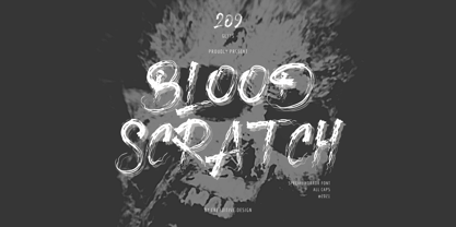 Blood Scratch is a creepy and brushed display font. It is perfectly suitable for any Halloween-related project or crafty idea, creepy film project and horror themes will be nice! The only limit is your imagination.
 - Sign Trade JNL by Jeff Levine,
$29.00Sign Trade JNL is a reworking of Sign Crafter JNL. With a traditional M,N and W replacing the stylized versions of these letters in the previous font, Sign Trade JNL also offers an oblique version. - FM Birthday 1.0 by The Fontmaker,
$20.00 FM Birthday 1.0 consists of 26 birthday related words and phrases -- all custom made and handwritten. Add a personal touch to your greeting cards or party invitation designs with the help of these hand lettered captions.
 - Muirne by Typomancer,
$20.00 Muirne, a cheerful semi-serif inspired by a Celtic calligraphy and figure. Font family contains from Light to Black weights and suitable Italic. With a dozen of alternates to enhance your typesetting with a Celtic touch.
 - Aqrada Display by Hishand Studio,
$15.00 Introducing AQRADA, an elegant display with aesthetic look. Perfect for who needing a touch of elegancy, classy, stylish, beautiful bold type, and modernity for their design. Complete with ligatures alternates regular hollow icon kerning multilingual support
 - Crossbar by Gassstype,
$27.00 Crossbar - Natural Hand Drawn Typeface Introducing of our new product that inspired by Street Tagging, graffiti style with a fun theme very good for graffity poster, Hip Hop music, kids poster, flyer, childrenbook, cartoon, comic etc
 - Baby Gumbout by Mabhal Studio,
$15.00 Baby Gumbout is a cheerful, funny and friendly handwritten font. It will elevate a wide range of design projects to the highest level, be it branding, headings, wedding designs, invitations, signatures, logos, labels, and much more.
 - Teardrop by dgsdesigns,
$8.00 A unique tear drop script with a "nature theme" that will provide a freedom of expression in an elegant approach to all your projects. Ideal for landscape exhibitions, wedding invitations , flyers, gallery exhibitions and much more.
 - Industrial Stencil JNL by Jeff Levine,
$29.00 Samples of vintage machine-punched stencils used for marking crates and cartons were spotted in an online auction. These served as the basis for Industrial Stencil JNL, which is available in both regular and oblique versions.
 - Critter by Adobe,
$29.00Originally created by Craig Frazier, San Francisco designer and illustrator, for The Alphabet Critter Playbook, the clever creatures of Critter tell you their names by the letter they represent. A helpful hint: x" is for xenopus." - Day N Nite by Typefactory,
$14.00 Day n Nite is a playful display font. It has a cheerful look that will elevate your crafting projects to the highest level, be it branding, headings, wedding designs, invitations, signatures, logos, labels, and much more!

