6,517 search results
(0.009 seconds)
- Prosaic Std by Typofonderie,
$59.00 A Postmodern vernacular sanserif in 8 fonts Prosaic designed by Aurélien Vret is a Postmodern typographic tribute to the french vernacular signs created by local producers in order to directly market their products visible along the roads. These signs drawn with a brush on artisanal billboards do not respect any typographic rules. The construction of these letterforms is hybrid and does not respect any ductus. Nevertheless the use of certain tools provokes a certain mechanism in the development of letter shapes. It’s after many experiments with a flat brush, that’s these letterforms have been reconstructed and perfected by Aurélien Vret. This is the starting point for the development of an easily reproducible sanserif with different contemporary writing tools. From non-typographical references of Prosaic towards readability innovation The influence of the tool is revealed in the letterforms: angular counterforms contrasting to the smoothed external shapes. This formal contrast gives to Prosaic a good legibility in small sizes. These internal angles indirectly influenced by the tool, open the counterforms. In the past, to deal with phototype limitations in typeface production, some foundries modified the final design by adding ink traps. In our high resolution digital world, these ink traps — now fashionable among some designers — have little or no effect when literally added to any design. Should one see in it a tribute to the previous limitations? Difficult to say. Meanwhile, there are typeface designers such as Ladislas Mandel, Roger Excoffon, and Gerard Unger who have long tried to push the limits of readability by opening the counters of their typefaces. Whatever the technology, such design research for a large counters have a positive impact on visual perception of typefaces in a small body text. The innovative design of counter-forms of the Prosaic appears in this second approach. Itself reinforced by an exaggerated x-height as if attempting to go beyond the formal limits of the Latin typography. It is interesting to note how the analysis of a non-typographical letters process has led to the development of a new typographic concept by improving legibility in small sizes. Disconnected to typical typographic roots in its elaboration, Prosaic is somewhat unclassifiable. The formal result could easily be described as a sturdy Postmodern humanistic sanserif! Humanistic sanserif because of its open endings. Sturdy because of its monumental x-height, featuring a “finish” mixing structured endings details. The visual interplay of angles and roundness produces a design without concessions. Finally, Prosaic is Postmodern in the sense it is a skeptical interpretation of vernacular sign paintings. Starting from a reconstruction of them in order to re-structure new forms with the objective of designing a new typeface. Referring to typographic analogy, the Prosaic Black is comparable to the Antique Olive Nord, while the thinner versions can refer to Frutiger or some versions of the Ladislas Mandel typefaces intended for telephone directories. Prosaic, a Postmodern vernacular sanserif Prosaic is radical, because it comes from a long artistic reflection of its designer, Aurélien Vret, as well a multidisciplinary artist. The Prosaic is also a dual tone typeface because it helps to serve the readability in very small sizes and brings a sturdy typographic power to large sizes. Prosaic, a Postmodern vernacular sanserif
 - DIN Neue Roman by Vibrant Types,
$43.00 The DIN Neue Roman adds something new to the established concept of the DIN 1451 type’s technical origin. As a serif counterpart it leaves its static appeal to bring some friendliness into this industrial idea. With more contrast than a slab serif and the dynamic stroke of transitional type DIN Neue Roman defies all conventions, but keeps its legibility. To have enough resources for diverse and complex typography this type family offers 7 weights with italics, small caps and all kind of opentype features. Type designer Philip Lammert likes to play with the great potential of contradictions. That brought him to this design combining two essentially different classics. DIN Neue Roman is part of his 2015’s master thesis at the HAW Hamburg which was supervised by Prof. Jovica Veljovic.
 - ITC Atmosphere by ITC,
$29.00The Algerian designer Taouffik Semmad created the fonts in 1997. Taouffik Semmad grew up speaking Algerian-Arabic dialect and French, studied Russian, and is now living in Montreal. This could perhaps explain his current passion, to "find a universal writing", which he admits is a Utopian idea. Created with brush and Chinese ink, the characters of ITC Atmosphere came from Semmad's hand but only after they were fully formed in his mind's eye. - Allergic to Waffles by PizzaDude.dk,
$15.00 Luckily, I am not allergic to waffles - but a guy named Ethan Tremblay is...and if you know the story about that guy, you know the name of this font is from! What can I say? A handmade font full of quirkiness and a rough outline. Comes in both Regular (outline) and Solid. Use both versions as they are, or combine them. I've added 4 different versions of each lowercase letter and multilingual support!
 - Sempione by CAST,
$45.00 Sempione is a spanking new sanserif family suitable for publishing and advertising that looks great in small and large sizes. Its two main styles, Grotesk and Modern, are inspired by the early grots and 20th-century sanserifs. They come in seven weights with the matching italics, Grotesk Cursive and Modern Slanted. The considerable variety of letterforms and styles, along with some peculiar stylistic sets, will be appreciated by designers looking for more freedom of choice.
 - Skunkling by Jason Mark Jones,
$15.00 Skunkling was born out of a contest, where its initial design won first place. It was inspired by a real-life encounter between a spraying skunk and a defenseless designer. Skunkling is carefully designed to be playful and even awkward. Unique letter forms and ligatures allow the letters to fit snugly together. The two "weights" can be used individually or they have the unique capability to be overlaid to create a two-color font.
 - Symbolic Prophecy by Hanoded,
$15.00 I am not one for prophecies of impending disaster and all that, don’t worry! I just liked the name and it seems to suit this handmade font quite well. Symbolic Prophecy was made with a broken bamboo satay skewer and Chinese ink. I quite like using broken satay skewers, as they give a fantastic ‘random’ effect. Use Symbolic Prophecy for your posters, your product packaging and, just maybe, a sign about the end of times… ;-)
 - Smoothread by Dhan Studio,
$14.00 Smoothread is a handwritten brush font, a contemporary approach to design, handmade natural look, suitable for use in title design such as clothing, invitations, book titles, stationery designs, quotes, branding, logos, greeting cards, T-shirts, packaging designs, posters, and more. Smoothread has two weights: Smoothread Regular and Smoothread Slant. They are complete with uppercase and lowercase letters, as well as multi-language support, numbers, punctuation. Ligatures and extra swash characters are also provided.
 - Hesster Mofet by JOEBOB graphics,
$20.00 Hesster Mofet is what I got after writing with an old and weathered calligraphic marker on textured paper. The characters were smoothened for a clean result, but since the original sketches had such a nice rough, edgy feel to them, they were also made into a complete font set. A couple of ligatures and a Hannibal Lecter reference were thrown in the mix as well. You can get both versions at a discount.
 - PAG Novembris by Prop-a-ganda,
$19.99Prop-a-ganda offers retro-flavored fonts inspired by lettering on retro propaganda posters, retro advertising posters, retro packages all the world over. This is perfect font for your retrospective project. PAG Novembris is narrow and serif font with art deco look. “A”, “G”, “H” and “M” have different letter form in uppercase and lowercase, and they give decorative accents on your typography. PAG Novembris is perfect font for your retrospective project. - Spooky Party by Stefani Letter,
$12.00 Spooky Party is a unique and very unique display font. Add to your creative ideas and notice how they make them stand out! This will take all crafts to the next level! Spooky Feast is perfect for logos, quotes, posters, clothing, and any other design that requires a strong and unique touch. To stay up-to-date on my latest work, follow me and let's be friends because there will be many promos.
 - Breda by Eurotypo,
$18.00 Breda is a Geometric Sans-serif; it is constructed from simple geometric shapes such as the circle and rectangle. This family of fonts starts from a very thin single-line face to a strong heavyweight, called Black Face. The Breda font is austere style, functional and clear, emerged from straight lines, primary shapes, which is now jumping into the typographic and graphic design scene. They are presented in six wights with their corresponding italics.
 - Horizona by TypeThis!Studio,
$54.00 Each iteration of Horizona is carefully designed to maintain consistency and the aesthetic integrity of this font. Users can be sure that any symbol they use, and in whatever language, the typeface's whimsical nature will shine through to provide a polished and stylized finish to their product. From branding to signage, editorial to advertising, or even for personal use, Horizona makes a statement in a huge variety of languages, letters, symbols, and numbers. www.typethis.studio
 - Twista by Viktor Nübel Type Design,
$25.00 Twista is a typeface from the realm of impossible constructions, from letters of illusions, the world of M.C. Escher. It takes its place in the tradition of typefaces playing with 3-dimensional drawings on a 2-dimensional surface. iÍt tricks the eye and attracts our gaze. Carefully choose which messages you set in Twista, they might be read with an invisible question mark added at the end. All letters and characters come in two versions.
 - Technical Lettering JNL by Jeff Levine,
$29.00 A set of vintage lettering templates manufactured by Albert Nestler in Germany yielded this Art-Deco flavored typeface with many unusual letter forms. Lettering templates were used for decades by architects and draftsmen prior to other advanced lettering methods to label renderings, blueprints and layouts. Although they are similar to stencils in the fact that the lettering is traced, templates are designed to produce solid lettering with the use of a technical pen.
 - Hello Rough by Good Java Studio,
$19.00 Introducing Hello Rough Hello Rough is the perfect font for all your classical and minimalism designs. The main font file is equipped with ordinary characters. Everything is made with the natural handdrawing. So you can be sure they will work well together! It is suitable for you to use in making t-shirt design, quote, label, packaging, logo type, or long writing. Because we have compiled kerning and matrices that are tailored to your needs.
 - Lumpia Brush Script by Saffatin.co,
$25.00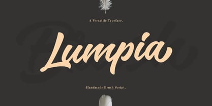 Lumpia Brush is a hand-lettering brush script font with natural nuance. This font is great for any creative project such as logos, printed quotes, invitations, cards, product packaging, headers, Logotype, Letterhead, Poster, Apparel Design, Label, and more. Lumpia Brush comes with uppercase, lowercase, numerals, punctuations, multilingual and alternative glyphs on each character and has with OpenType features, common ligatures and also additional swash. They will help your creativity to customize your designs.
 - Cartoon Cavalcade JNL by Jeff Levine,
$29.00 There are times when a customer might look over a dingbat font and like a few of the images because they suit a particular need, but hesitates on purchasing the font because enough of those images isn't available. For all of the lovers of vintage letterpress cartoon cuts, Cartoon Cavalcade JNL collects sixty two assorted images from many of the Jeff Levine Fonts dingbat collections and places them within one singular file.
 - ITC Ziggy by ITC,
$29.99ITC Ziggy was designed by Bob Alonso, who says it started out as phone doodles in the early 1970s." Alonso rediscovered the sketches years later, thought they revived the feel of the 70s, and decided to digitize the typeface. He liked the form of the letter Z best, so named the font Ziggy. ITC Ziggy reminds its designer of "elephant bellbottoms" and its style as a display face instantly evokes a nostalgia for the 1970s. - Bold Fashion by Mans Greback,
$59.00 Bold Fashion is a heavy slab-serif font of the disco era. Its funk-style design, coupled with soft, rounded serifs, embodies the soul of retro, bringing forth memories of neon lights, bell-bottoms, and roller discos. Each letter is profoundly heavy, yet they prance with a bouncy, comfy rhythm, akin to catchy 70s beats. The swashes adorning the uppercase letters add flair, reminiscent of iconic burger joint signs and groovy vinyl covers.
 - Ports Play by Alandya TypeFoundry,
$19.00 Port Play ... Based on Density Slab Serif, now with other styles, Normal and Expand, equipped with alternative letters that are so wide that they give a strong, clear, masculine feel, and have good legibility. Port Play comes in regular, oblique, outline, and outline oblique styles along with regular and oblique variable files. This font is perfect for every project. suitable for branding logo, badge design, or apparel design. This font also comes with multilingual support.
 - Postman by Juan I. Siwak,
$20.00 Postman is a typeface inspired by old documents, banknotes and leading product brands. It has cursive and elegant capital letters and its lowercase letters are actually small caps of geometric shapes as if they were made of metal and nailed with bolts. It is ideal for classic products that consider nobility and tradition among their virtues. It evokes classic products that lasted over time. Includes OpenType features, like ligatures, alternates, and more.
 - Headlines Core Edition by TypeThis!Studio,
$45.00Headlines font family was designed for optimised headline settings. The condensed letters are designed for clear and straight headlines and also allow longer words and headlines to find the space they need for a well-composed headline. Typeface Features 265 Characters 8 Styles, including Italics Western European Language Support Numbers Symbols Punctuation www.typethis.studio Thank you for checking out Headlines Font Family. If you have any questions, please send an email to hello@typethis.studio - Aliceson by Good Java Studio,
$20.00 Aliceson - Modern Handlettering Aliceson is the perfect font for all your handlettering designs. The main font file is equipped with ordinary characters. Everything is made with the funny brush. So you can be sure they will work well together! It is suitable for you to use in making t-shirt design, quote, label, packaging, logo type, or long writing. Because we have compiled kerning and matrices that are tailored to your needs.
 - Wild Comedy JNL by Jeff Levine,
$29.00 John Sigvard ‘Ole’ Olsen and Harold Ogden ‘Chic’ Johnson were musicians-turned-comedians who rose to fame in the zany 1938 Broadway musical review “Hellzapoppin'”. They reprised their roles in the 1941 film adaptation of the show, and the opening title card of the film has “Hellzapoppin'” hand lettered in a tall, condensed sans serif design with an inline. This is now available as Wild Comedy JNL in both regular and oblique versions.
 - Concerto by profonts,
$41.99 profonts Concerto and profonts Sonata are closely related to each other. In fact, the only difference between the two related fonts is in the upper case characters. Concerto's upper cases are more complex, swashier than those in Sonata. One is a perfect complement to the other, and that is why they are offered together at special rate. Both fonts contain about 370 glyphs covering the complete Latin set for Western and Eastern Europe.
 - Fabriga by LuxTypo,
$50.00 Fabriga speaks a familiar language in a distinctive voice. Ideas around clarity and tone informed all emblematic decisions. Fabriga’s structure and warmth are influenced by how its character set is approached as an ensemble while exploring individual ‘creative’ opportunities as they pose themselves throughout the process. Fabriga sets out to take a supportive role as a font family, understanding that one of its great strengths is its diversity in application and composition.
 - Nonsense Note by Bogstav,
$19.00 There really is no nonsense in this font - but the name comes from my original sketches, where I drew a lot of nonsense! Actually, I couldn't figure out what letters to use from the sketches, so I picked them all!!! That's why each letter has 10 different versions! And what is cool is that they automatically cycles as you type. All you have to do is turn on Contextual Alternates, and the rest is magic!
 - Vincenzo by CastleType,
$29.00 Vincenzo is based on a beautiful condensed typeface from the 1920s or earlier; original designer unknown. This is a "Modern" style with fine slab serifs, vertical stress between thick and thins, and high contrast. What is unique about this design is that the triangular serifs (e.g., E, F, L, T, etc.) do not gradually taper as they join the rest of the letter, as would be the case in Bodoni and similar designs. Uppercase only.
 - Whiskey State by Mans Greback,
$59.00 Whiskey State strides onto the canvas like a cowboy entering a saloon: Tall, confident, and impossible to ignore. The font boasts an impressive height, stretching upwards with the same vigor as plumes of smoke rising from a smoldering campfire. Every letter stands upright and proud, imbued with the spirit of the Old West, yet exuding a contemporary coolness and innovativity. Its serifs aren't just appendages; they are expressions, giving the typeface its unique, assertive character.
 - Sonata by profonts,
$41.99 profonts Sonata and profonts Concerto are closely related to each other. In fact, the only difference between the two related fonts is in the upper case characters. profonts Concerto's upper cases are more complex, swashier than those in profonts Sonata. One is a perfect complement to the other, and that is why they are offered together at special rate. Both fonts contain about 370 glyphs covering the complete Latin set for Western and Eastern Europe.
 - Headlines by TypeThis!Studio,
$54.00 Perfect headlines — now and forever! Headlines is designed for clear and straight headlines and also allow longer words and headlines to find the space they need for a well-composed headline. Unicase styles let your headlines shine uniquely in every respect. It contains a number of special ligatures for certain combinations to fill common visual gaps such as tty, rv. Newsletter: www.typethis.studio *Variable fonts work well in software that supports variable font technology.
 - Search by PintassilgoPrints,
$19.00 Search is a brush script font, seasoned with unconventional choices here and there – 'Hey, they are everywhere!', one may say, and that's okay. This is a contemporary upbeat font with loads of personality and yet some alternates: there are two choices for each letter, delivering that nice, organic, tasty handmade feel. Available in two flavors: with and without a dry brush texture. Isn't it what you've been searching for? We bet! Cheers!
 - Duetto by ParaType,
$25.00 The letterforms of this face represent a "subtraction" of two different faces by weight, style, and shape -- one from another. The shapes of TM Miniature Italic are subtracted from FreeSet Bold with subsequent deconstruction. Though the spots may look amorphous they create images of both external and internal. At the same time none of them is explicit. The alphabet is lower case only. Designed by Boris Popov and licensed by ParaType in 2002 .
 - Lemonade Stand by Sharkshock,
$125.00 Looking for the perfect all-caps display font to accentuate your next project? Lemonade Stand is a stylish yet childlike sans that doesn’t take itself too seriously. The characters are wispy in nature with minimal contrast. They were designed to loosely mimic the strokes of a thin paintbrush. Lemonade Stand is equipped with Basic Latin, Extended Latin, diacritics, and Cyrillic. Feature it in a logo, on packaging, or in a children’s book.
 - Mehighea by Youngtype,
$15.00 Mehighea Regular and Mehighea Clean are modern font sets featuring an organic, dynamic and energetic style. They can be used for a variety of purposes, such as titles, signatures, logos, correspondence, wedding invitations, letterheads, nameplates, labels, newsletters, posters, badges and much more. To enable the OpenType Stylistic alternative, you need a program that supports OpenType features such as Adobe Illustrator CS, Adobe Indesign & CorelDraw X6-X7, Microsoft Word 2010 or a later version. Thank You:)
 - Stupid Questions by Bogstav,
$15.00 First of all: there is no such thing as a stupid question! But now there is a font called Stupid Questions! :) A classic handmade sans font - super legible and somewhat clean. Use your favourite of the 5 different versions, mix them in layers with your favourite colours. I've added 4 different versions of each lowercase letter, and they automatically cycle as you type - a great way to make your text look more natural and organic!
 - Isometrica by Greater Albion Typefounders,
$15.00 Isometrica is the latest in Greater Albion's line of 'Banner' typefaces. Like all of the banner faces they lend themselves to the design of mastheads and logos. Isometrica is also a meeting of architectural drawing and typeface design, given bold two coloured concertina banners with letters appearing page by page. A range of decorative end pieces are also included. Bring your designs to life with lettering that stands up off the page!
 - ITC Static by ITC,
$29.99Static looks almost like it was stamped on paper: the black color is not evenly distributed and the background comes through the letters and consciously irregular forms reinforce the effect. The characters do not all have the same height, nor do they stand straight and regularly on the base line. Static is a robust font with bold, rounded serifs and is best used for headlines and short texts in point sizes of 12 and larger. - FourJuly by Ingrimayne Type,
$7.95 FourJuly contains three patriotic fonts that might be fun to use in July. They are also very hard to read, but perhaps not as hard as the somewhat similar letters in the fonts of FlagDay. FourJuly A has square, blocky letters with star interiors. FourJuly G and FourJuly H add diagonal stripes. FourJuly G and FourJuly H can be layered on top of FourJuly A to create bicolored letters. See the example here.