10,000 search results
(0.04 seconds)
- Dog Eared by Andy Babb,
$19.20 Each character of Dog Eared began its life as a half-inch wide strip of paper, folded and Scotch-taped into formation, and then scanned and recreated digitally. Dog Eared is distinguished from other folded paper style typefaces by its robustness and versatility: each numeral and upper- and lowercase letter has a stylistic alternate. Dog Eared Striped is a traditional single color font, while Dog Eared Solid is a chromatic variant that can be used for a two-toned effect. Layer and multiply Dog Eared Striped and Dog Eared Solid together to achieve even more color variety.
 - Kolesom by Frantic Disorder,
$12.00 Kolesom is bold display font that inspired from classic rusty stuff like old signage and poster. This typeface has various styles of font that includes Clean, Alt, Texture, and Western. I found it perfect for poster design, t-shirt design, and other display design needs. Works best in 100pt and above.
 - RM Signwriter by Ray Meadows,
$19.00 Inspired by the signwriting on traditional old canal boats in the UK, this bold, block serif design has many potential uses. Due to the modular nature of this design there may be a slight lack of smoothness to the curves at very large point sizes (around 100 pt and above).
 - AZ Script by Artist of Design,
$25.00 AZ Script font was inspired from a need to have a "worn look" on bold headline script of letters This font utilizes an "old look" to the line work which is designed to have a "worn feel" to it. Ideal for use as headline or sub-head text in you design.
 - Portada by TypeTogether,
$35.00 For everyone wishing for a modern serif that’s as clear and readable as a sans in restrictive digital environments, meet Portada by Veronika Burian and José Scaglione. Sans serifs are commonly used on small screens to save space and carry a modern tone. Serifs may appear fickle and unsteady, pixel grids change from one product to another, and space is at a premium. Portada now provides a serif option for these restrictive digital environments, putting that old trope to rest. The screen has met its serif match. Portada was created from and for the digital world — from e-ink or harsh grids to Retina capability — making it one of the few serifs of its kind. Portada’s text and titling styles were engineered for superlative performance, making great use of sturdy serifs, wide proportions, ample x-height, clear interior negative space, and its subservient personality. After all, words always take priority in text. It’s not all business, though. Portada’s italics contain an artefact of calligraphy in which the directionality of the instrokes and the returning curves of the outstrokes give the family a little unexpected brio. Yet even the terminals are stopped short of flourished self-absorption to retain their digital clarity. When printed these details are downright comforting. Portada’s titling styles enact slight changes while reducing the individual width of each character and keeping the internal space clear. Titling italics have increased expressiveness across a few characters rather than maxing out the personality in each individual glyph. Digital magazines, newspapers, your favourite novel, and all forms of continuous screen reading benefit from Portada’s features. This family can also cover many of the needs developers have: user interface, showing data intensive apps on screen, even one-word directives and dialogs. And, as a free download, an exhaustive set of dark and light icons is included to maintain Portada’s consistent presence, whether as a word or an image. The complete Portada family (eight text styles, ten titling styles, and one icon set) is designed for extensive, clear screen use — a rare serif on equal footing with a sans.
 - Mildstones by IKIIKOWRK,
$17.00 Proudly present Mildstones - Modern Bold Sans, created by ikiiko. A contemporary bold condensed sans serif typeface created to breathe life into headlines with its eye-catching presence. Mildstones attracts attention and takes any design project to a new level with its striking and fashionable look. Each letter in Mildstones has undergone meticulous design in order to convey a sense of power, assurance, and beauty. The font has a sense of verticality and compactness due to the condensed proportions, which also make it easy to fit into small places while keeping outstanding readability. The Mildstones experience is more than simply a font. It has been meticulously designed to be a dependable and powerful typographic in terms of both aesthetic and readability. This type is very suitable for making a headline news, sport advetorial, logotype, branding, poster, magazine layout, quotes, or simply as a stylish text overlay to any background image. What's Included? Uppercase & Lowercase Number & Punctuation Multilingual Support Works on PC & Mac
 - Nexus Typewriter Pro by Martin Majoor,
$49.00 Nexus (2004) consists of three matching variants – a serif, a sans and a slab – which makes it a highly versatile typeface. Nexus started as an alternative to Seria, a typeface Majoor had designed some 5 years earlier. But soon the design developed into a new typeface, with numerous changes in proportions and in details and with a redrawn italic. Besides the three connected versions (Nexus Serif, Nexus Sans, Nexus Mix) Majoor designed a monospaced version called Nexus Typewriter. The Nexus family is a workhorse typeface system like Scala, with features such as small caps in all weights, four different sorts of numbers and an extensive set of ligatures. All fonts in the Nexus family come in regular, italic, bold and bold italic. Free bonus: there are more than 100 elegant Swash italics and dozens of arrows and other icons. The Nexus family was awarded the First Prize at the Creative Review Type Design Awards 2006.
 - Nexus Mix Pro by Martin Majoor,
$49.00 Nexus (2004) consists of three matching variants – a serif, a sans and a slab – which makes it a highly versatile typeface. Nexus started as an alternative to Seria, a typeface Majoor had designed some 5 years earlier. But soon the design developed into a new typeface, with numerous changes in proportions and in details and with a redrawn italic. Besides the three connected versions (Nexus Serif, Nexus Sans, Nexus Mix) Majoor designed a monospaced version called Nexus Typewriter. The Nexus family is a workhorse typeface system like Scala, with features such as small caps in all weights, four different sorts of numbers and an extensive set of ligatures. All fonts in the Nexus family come in regular, italic, bold and bold italic. Free bonus: there are more than 100 elegant Swash italics and dozens of arrows and other icons. The Nexus family was awarded the First Prize at the Creative Review Type Design Awards 2006.
 - Ador Hairline by Fontador,
$24.99 Ador Hairline is the high contrast version of Ador . A humanist sans serif that falls in the “evil serif” genre, especially designed for contemporary typography and comes up with 7 weights from extralight to black plus true italics and 293 ligatures and initial letters. A large x-height not only creates space in the letters for extra-bold styles, but also lends Ador Hairline an open and generous character in the more narrow and semi-bold versions. The nice balance between sharp ink trapped and soft, dynamic shapes helps to work in small sizes. Diagonal stress, angled finials and the 4 degree true italic styles give Ador Hairline a dynamic look. The font contains 1,026 glyphs and a wide range of flexibility for Latin language support for every typographical need. Ador Hairline is a contemporary sans serif typeface, special for logotypes, brands, magazines, editorial, and advertising uses. Ador Hairline was on the shortlist of Communication Arts 2020.
 - California Kingston by Crumphand,
$25.00 California Kingston display is a typography design product that is specifically created for use in the headlines, titles, or other prominent text elements of a design. This typeface is often characterized by its bold, attention-grabbing appearance and its ability to make text stand out on a page. The main goal of a California Kingston font display is to create an impact and draw the viewer's attention. This is typically achieved through the use of thicker and more pronounced strokes, unique shapes and design elements, and often, a more stylized appearance. California Kingston displays can be used in a variety of design projects, including posters, logos, packaging, advertisements, and more. They are often paired with complementary fonts to create a well-designed and cohesive visual identity. When choosing a California Kingston font display, it is important to consider the project's overall aesthetic and message, as well as the intended audience. It's also essential to ensure that the font is legible and easy to read, even at smaller sizes. Overall, a California Kingston font display is an excellent way to make a bold statement in a design and to capture the viewer's attention.
 - 19-PRA by ILOTT-TYPE,
$29.00 Inspired by the elegance of Herman Zapf’s designs crossed with the readability of early 20th century Gothic fonts by Morris Fuller Benton, 19-PRA is a sans-serif with a visible stroke contrast and a humanist tone of voice. The large x-height seen in fonts like News Gothic and Palatino increases legibility and condensed proportions give excellent readability making it perfect for newspaper and magazine publishing. A typeface that can serve for both body text and titling the uppercase excels for headlines and renders beautiful brand names when tracked out. It sets well with both a serif or sans serif and has various open type features including: 12 standard ligatures, 3 discretionary ligatures, tabular figures, old stye figures as well as European accents.
 - LeDrôle Lettering Pro by Ingo,
$40.00 The Comic-Script by ingoFonts In the past cartoons used to be lettered by hand. Hardly anyone does this today. The reason is, because hardly anyone has nice handwriting these days, so there are practical advantages in having a special font. However the font should still look like it’s been written by hand. Well, most script fonts don’t meet this requirement. The LeDrôle Lettering is a computer font, but closely resembles genuine handwriting. The model for the LeDrôle Lettering is my personal handwriting, as can be seen on the example of the Biró Script, which is also an ingoFont. The habit of capitalization comes from the Romanic and Anglo-Saxon countries. Depending on the purpose they are designed in three significantly bolder weights. In order for the typeface to actually look handwritten, it needs to have clearly visible irregularities. These are not found only in the shapes of the individual letters. Even though LeDrôle Lettering is all in capital letters, the characters of uppercase and lowercase letters are clearly different. Additionally, many alternative shapes are used, which are automatically applied when the OpenType “Ligatures” feature is activated. Thus, there are no identical double letters or numerals, and many character combinations are defined as ligatures with alternative forms.
 - DT Enigmystic by Dragon Tongue Foundry,
$9.00 When reading text, the most informative parts of the written word for a human brain to identify, are the top and bottom edges of each word, and to a lesser degree, the leading and trailing edges. The overall shape has more useful info than the inner workings of each word. DT Enigmystic, is a display font family that gives you just that. The outer edge. At first glance, these letters don't look like standard letters, and yet, they are perfectly readable. And it is a 'somewhat' smart text, in that it will automatically complete the trailing edge of every word, whenever it sees a comma, period or space. Similarly, it will automatically complete the leading edge of every word following a space. When used as display test or as a heading, the first letter will need to be preceeded by a space, to achieve a full enclosed word outline. As with most of my fonts, do use Contextual Ligatures. This allows the letters to come alive. When generated here on this webpage, contextual ligatures are not turned on, and so the words do not appear completely closed at their beginnings and ends. But as can be seen in the poster images, these outlined words do automatically complete themselves when contextual ligatures are active.
 - Ciao Bella by Oddsorts,
$29.00 Oddsorts’ Ciao Bella family pairs the funky elegance of a hand-drawn copperplate script with a bouquet of ornament fonts. Ciao Bella’s expansive range of alternate opening and closing forms, word-connecting ribbons, and swash characters use the power of OpenType to create a genuinely hand-lettered look. Bursting with over 2,000 characters, the Ciao script mates broad linguistic support with expressive possibilities galore in an easy-to-use software experience. But then there are the ornaments! What’s truly innovative about Ciao Bella’s ornaments is that most of the characters come in pairs that can be set in multiple colors without any stacking, layering, or aligning. They work in any application that supports kerning — even most word processors. See the slideshow and Gallery link above to see how they work. Ciao Bella marries the best of the old world — the warm, classic feel of ink on paper — and the new — the amazing capabilities of “smart” OpenType fonts — in a union that’s sure to delight.
 - Aviel - 100% free

- FLUID - Personal use only

- Tamword by Prioritype,
$18.00 Introducing a new script font with a bold and clear style. Yes you can use this font in your projects and make it even more classy. It can be applied to logos, video previews, crafts, apparel products, packaging, photographer watermarks, and any of your other awesome projects. for an overview you can see some of the previews above. Features: -Uppercase -Lowercase -Numeral -Punctuation -Multilingual -Alternate -Ligature -Swash Thanks.
 - Lenga by Eurotypo,
$29.90 Lenga is a kind of beech originally from South America. The explorers who discovered this beech in Tierra del Fuego, thought it looked like a tree from their home country and named it 'Lenga'. Like many of southern hemisphere beeches, the Lenga beech is fast growing and hardy, making it an ideal timber tree. It regenerates easily after fires. The wood has good quality, moderate durable, and easy to work. The Lenga fonts were inspired in the nobility, robustness and flexibility of those trees. They have a distinctive personality within contemporary atmosphere. These fonts are quite appropriate for headlines, subheadings and with its text flow works very well for long texts. Their legibility is suitable for editorial purposes mainly in newspapers and magazines. Lenga comes in 16 styles carefully done in OpenType format. All styles contain standard and discretional ligatures, proportional lining figures, lining old style figures, scientific superior/inferior figures. The complete set supports Western European, Central and Eastern European languages.
 - Octava by ParaType,
$30.00 PT Octava™ was designed at ParaType in 2001 by Vladimir Yefimov. The first (Cyrillic only) version named Scriptura Russica (1996) consisting of three styles (book, italic, bold) was commissioned by the Russian Bible Society. Lately the Latin letters and bold italic were added. Inspired by Lectura, 1969, by Dick Dooijes and Stone Print, 1991, by Sumner Stone. In spite of large x-height the typeface is both space saving and quite legible at small sizes. Expert fonts including small caps (book) and old style figures are available.
 - Alathena by Studio Sun,
$20.00 Alathena was inspired by the French art decade between art nouveau to art deco, comes with 2 style, Alternative swash and Modern deco, with some modified ligatures. Available with 6 Weights, Thin, Extra Light, Light, Regular, Bold, Extra Bold with support 75+ language (Latin Pro), and contains OpenType features. - Matching small caps for all weights. - Old Style Figure. - Full "f" Ligature set. - 20+ Optional (discretionary) ligatures. - Over 400+ Swash Characters. - Automatic Fractions. - Automatic Ordinals. - Extended language support for most Latin-based Western and Central European languages, including all the swash and alternate characters.
 - Claremont by Red Rooster Collection,
$45.00Claremont is a serif font family designed by Les Usherwood (Typsettra). Usherwood originally created four weights – a light, extra bold, light italic, and extra bold italic. Paul Hickson (P&P Hickson) and Steve Jackaman (ITF) digitized the family and created eight new weights, and it was released exclusively for the Red Rooster Collection in 1993. Claremont shares similarities to Bookman Old Style, but also shares properties with slab serif Egyptian-style typefaces. Like all Usherwood typefaces, the family was engineered with great care for maximum legibility and aesthetics. ©1993. International TypeFounders, Inc. - Olymp80 by Konst.ru,
$10.00 Dedicated to the XXII summer Olympic Games. I was inspired by the icons of these games when creating font Olymp80. This is an excerpt from the official report of the Moscow Olympics: "Sports pictographs, as we know, are pictographic drawings symbolising sports. They serve as points of reference and help overcome language barrier. Over the past few years, they have been integrated into the decoration of Olympic cities, and have been depicted in Olympic posters, commemorative medals, postage stamps, tickets, souvenirs, etc. On the OCOG-80’s request, graduates from several art colleges took up the design of the pictographs of the insignia as the theme of their dissertations. With the help of the research institute of industrial aesthetics, the Organising Committee chose the work submitted by Nikolai Belkov, Mukhina Art School graduate from Leningrad. The State Committee for Inventions and Discoveries under the USSR Council of Ministers recognised the new design as a production pattern. Though highly stylised, the new signs are easily comprehensible. They are smoother in outline because they are constructed at an angle of 30-60 (previously the angle was 45-90). Another merit of the new system is that the designs can be adapted for use in four representations: direct (solid, black against a white background), reverse (solid, white against a black background), contour (black contour against a white background), and reverse-contour (white contour against a black background), and permit several colour and shade and size variations." All text and pictures you may see on 1980 Moscow, Volume 2, Part 2, Page 420. Monospaced font for names, logotypes, titles, headers, topics etc. Font includes only uppercase letters with two alternative designs for each letter.
 - Crucial by Jehoo Creative,
$17.00 Sharp and bold are the right words to describe Crucial Typeface. Crucial is a serif typeface that has a pointed tip so that each piece of character gives a bold and elegant impression. Having 8 weights and each weight packaged in an elegant Italic set, this typeface will add boldness and elegance to your designs. Crucial can be used for a variety of design styles. It is suitable for strong-spirited designs as well as for a more striking and classy editorial look. ?There are many useful features in this typeface including aalt, frac, league, lnum, locl, onum, ordn, salt, sinf, ss01, ss02, ss03, subs, sups, kern.
 - Castine by Three Islands Press,
$29.00 There's a cemetery in Castine, Maine, a lovely coastal town perhaps best known for Maine Maritime Academy and a surviving crop of stately old American elms, with headstones dating back into the 18th century -- the standard old headstone shape, often topped by winged skulls. Thanks to a local historical society volunteer, I got my hands on a couple rubbings; these show a particular style of stonecarving that proved captivating to the point of typeface design. Castine has a full character set in both roman and italic styles.
 - Silk Display by Luhop Creative,
$18.00 Silk Display is a serif retro and bold display font. This font is PUA encoded which means you can access all of the glyphs and alternates with ease! It would look great on headlines, magazines, logos, branding and so much more!
 - Slimeha by ahweproject,
$9.00 Slimeha is a bold and modern handwritten font capable of taking any creation to the highest levels! Try it on advertisements, posters, branding materials, logos, etc. Slimeha is PUA encoded, which means you can access all glyphs and swashes with ease!
 - Wingfead by Letterena Studios,
$17.00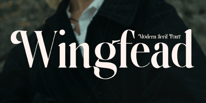 Wingfead is a bold and thick lettered serif font. It is perfect for any branding project such as logos, t-shirt printing, creative products, and more. Wingfead is PUA encoded which means you can access all glyphs and swashes with ease!
 - The Reyden by onlyfontyouandme,
$15.00 The Reyden is a retro and bold display font. This font is PUA encoded which means you can access all of the glyphs and alternates with ease! It would look great on headlines, magazines, logos, branding and so much more!
 - Spring Note by Letterhend,
$7.00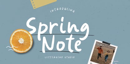 Spring Note is a playful yet usable font that you can use for any of your projects. Perfect for cute quote, branding, and anything. This font already support multi language. Also comes with two style, Regular and Bold! Happy Creating!
 - Sweet Fig by Din Studio,
$29.00 Sweet Fig is a bold script. This font is suitable for any design like branding especially for food packaging, quotes, printing, etc. The design can elevate your design project. Features: Beautiful Ligatures Stylistics Set Many Swashes Multilingual Support Numerals and Punctuation
 - Chicago by Nestype,
$14.00 Chicago Retro is a combination font between 70's Modern or Vintage and the modern era, this font is very versatile, spanning a wide variety of projects, from bold magazine imagery, to wedding invitations, to branding, poster design, and much more.
 - Gearing by Heyfonts,
$15.00 Gearing is a typeface that is widely associated with the extreme music genre of death metal. It is characterized by its dark and aggressive appearance, evoking a sense of brutality and chaos. The font is typically designed with sharp edges, bold and angular letterforms, and intricate or distorted shapes. The death metal font typically features strong upper and lowercase letter variations, often with sharp, exaggerated serifs or thorn-like spikes. These embellishments contribute to its menacing and threatening aesthetic. The letters may also have broken or damaged elements, giving them a weathered or decayed look. Though death metal fonts come in various styles and variations, they often prioritize legibility and impact over ease of reading. This means that certain parts of the letters may be missing or disconnected, making them appear jagged or incomplete. Ligatures, which are unique letter combinations, are sometimes included in the font to add a sense of continuity or artwork to the overall design. In terms of color, death metal fonts are commonly depicted in monochromatic shades such as black, grey, or dark red to maintain their sinister appearance. The color contrast often enhances the sharpness and intensity of the font, making it more visually striking. Due to its association with the underground music scene, the death metal font has become an essential element in album covers, band logos, posters, and merchandise. It effectively conveys the aggressive and rebellious spirit of the genre, becoming instantly recognizable to fans and enthusiasts.
 - Neon Rounded by Joe Hewitt Design,
$12.99 Neon Rounded is a rounded monoline typeface inspired by retro neon light bulbs often used in signage. Neon bulbs were first seen back in 1910 in Paris. They later became popular in 1930s New York, especially on Broadway and the Las Vegas strip. Although Neon Rounded was designed with eye-catching signs in mind, its possible usage is vast. Clothing brands, road signs, logos and advertising. The heavier weights lend themselves to children's books and toys, while the lighter weights provide a more modern, futuristic feel. The typeface contains lower and uppercases in five weights: Light, Regular, Medium, Semi-bold and Bold. There are also alternatives for most letters and all numbers. The glyph set includes all languages covered in Basic Latin, Latin-1 Supplement and Latin Extended-A scripts.
 - Wolverhampton by Greater Albion Typefounders,
$12.50 Wolverhampton is a new Neo-Victorian face from Greater Albion Typefounders. It's something of an example of starting with a small idea and running with it. This family of three typefaces (Regular, Small Capitals and Capitals) was inspired by a line of lettering seen on a late 19th Century enamel advertisement made by Chromo of Wolverhampton (hence the family name). The family grew, topsy-like, from a recreation of these initial fifteen capital letterforms to the three complete typefaces offered here. The three typefaces are ideal for advertising and poster work with a Victorian, Edwardian, or 'Steam-punk' theme. They would also be eminently suitable for signage inspired by the same eras or (as we've seen a number of our other typeface families prove very popular) for book covers of period related novels and historical works. Finally, these slender elegant display faces are just plain fun!
 - Claudio by Motokiwo,
$17.00 Smooth but crazy wilder, say hello to Claudio! The coolest display font with more than 40 stylish ligatures. As an all caps sans serif, Claudio has different vertical size between uppercase and lowercase. You can mix them to create something wild and eye- catching typography on your work. Claudio is flexible font that can be used for classic retro or vintage project and also great for another modern projects with fresh and colorful design. It's give you all control to use Claudio in any style you need. Features: Uppercase (a taller version) Lowercase Numeral and Punctuations 44 Ligatures Multilingual Supports (AÀÁÂÃÄÅÇEÈÉÊËIÌÍÎÏNÑOØÒÓÔÕÖŠUÙÜÚÛÝŸŽÆŒß) PUA Encoded
 - Belgato by Molly Suber Thorpe,
$9.00 Belgato is a vintage-inspired typeface with delicate details. It comes in six weights – plus italics! – for a total of 12 fonts, making it a highly versatile display face. The variable font version allows for ultimateweight and slant customization in print and web. Belgato has Latin, Greek, and Cyrillic alphabets, and supports dozens of languages, making it ideal for multilingual branding, publications, ads, social media, and more! I had so much fun designing this typeface, playing with classic serif letterforms to create an elegant, mid-century modern vibe. Belgato Light is fresh, airy, and delicate – perfect for feminine branding. By contrast, Belgato Black boasts fat curves with thin details, perfectly-suited to bold layouts and retro branding projects. Each Belgato font has 665 glyphs, encompassing: - the Latin alphabet (including hundreds of accented characters) - the Modern Greek alphabet - the Cyrillic alphabet (for Russian, Ukrainian, Bulgarian, and Serbo-Croatian) - discretionary ligatures - stylistic and alternate glyphs - numerals (lining and old style), small figures, and fractions - extensive punctuation, symbols, and diacritical markings Software: No special software is required to use Belgato fonts. You can even use these fonts with Canva! To access Belgato’s variable font features, ligatures, and stylistic alternates, it is best to use software that supports these functions (Adobe programs, Corel Draw, Sketch, etc). Languages: Belgato supports dozens of languages which use the Latin, Greek, and Cyrillic alphabets. Among the most common languages it supports are: English, Bulgarian, Catalan, Croatian, Czech, Danish, Dutch, Filipino, Finnish, Flemish, French, German, Modern Greek, Hungarian, Icelandic, Indonesian, Italian, Luxembourgish, Maltese, Norwegian, Polish, Portuguese, Russian, Serbo-Croatian, Spanish, Swedish, Swiss German, Turkish, and Ukrainian.
 - Fenwick by Typodermic,
$11.95 Introducing Fenwick—a typeface that pays homage to Ontario’s rich heritage. With its unique take on late-nineteenth-century sans-serif typefaces, Fenwick is a perfect addition to any vintage-themed graphic design project. At first glance, Fenwick may resemble old-fashioned gothic typefaces, but upon closer inspection, you’ll notice its inspiration from once-popular serif display fonts and elegant clock digits. Fenwick’s unique design blends the best of both worlds, resulting in a timeless font that captures the essence of a bygone era. For added authenticity, Fenwick features proportional old-style numerals that can be easily accessed in OpenType-friendly applications. The typeface is available in Light, Light-Italic, Regular, Italic, Bold, Bold-Italic, and an engraved all-caps style, giving you the flexibility to use Fenwick in a variety of contexts. Whether you’re designing a vintage-inspired logo or creating a custom poster, Fenwick is the perfect typeface to add a touch of Ontario’s heritage to your project. So why not give Fenwick a try and see how it can elevate your designs to new heights? Most Latin-based European writing systems are supported, including the following languages. Afaan Oromo, Afar, Afrikaans, Albanian, Alsatian, Aromanian, Aymara, Bashkir (Latin), Basque, Belarusian (Latin), Bemba, Bikol, Bosnian, Breton, Cape Verdean, Creole, Catalan, Cebuano, Chamorro, Chavacano, Chichewa, Crimean Tatar (Latin), Croatian, Czech, Danish, Dawan, Dholuo, Dutch, English, Estonian, Faroese, Fijian, Filipino, Finnish, French, Frisian, Friulian, Gagauz (Latin), Galician, Ganda, Genoese, German, Greenlandic, Guadeloupean Creole, Haitian Creole, Hawaiian, Hiligaynon, Hungarian, Icelandic, Ilocano, Indonesian, Irish, Italian, Jamaican, Kaqchikel, Karakalpak (Latin), Kashubian, Kikongo, Kinyarwanda, Kirundi, Kurdish (Latin), Latvian, Lithuanian, Lombard, Low Saxon, Luxembourgish, Maasai, Makhuwa, Malay, Maltese, Māori, Moldovan, Montenegrin, Ndebele, Neapolitan, Norwegian, Novial, Occitan, Ossetian (Latin), Papiamento, Piedmontese, Polish, Portuguese, Quechua, Rarotongan, Romanian, Romansh, Sami, Sango, Saramaccan, Sardinian, Scottish Gaelic, Serbian (Latin), Shona, Sicilian, Silesian, Slovak, Slovenian, Somali, Sorbian, Sotho, Spanish, Swahili, Swazi, Swedish, Tagalog, Tahitian, Tetum, Tongan, Tshiluba, Tsonga, Tswana, Tumbuka, Turkish, Turkmen (Latin), Tuvaluan, Uzbek (Latin), Venetian, Vepsian, Võro, Walloon, Waray-Waray, Wayuu, Welsh, Wolof, Xhosa, Yapese, Zapotec Zulu and Zuni.
 - Rileyson by Club Type,
$36.99 Crisp contemporary Sans-serif family useful for clear, clean corporates, stylish branding letterforms or friendly, casual messaging too, with use of its capital and lower case ligatures, swash capitals, old style numerals and many ornaments.
 - Estragon Pro by Stabenfonts,
$45.00 Estragon is a vivid sans-serif text face with venetian influences, suitable especially for books. It is remarkable for: its light slant, to the right, for most of the verticals, its small sized uppercase letters making it suitable for languages where they are often used (for example German,) and its just lightly inclined true italics. For a wide language support, Estragon contains a lot of accented characters including the polish kreska. It is generously equipped with ligatures, special and alternate characters as well as various kinds of numbers: besides the standard old-style figures to be set as part of text copy there are small-cap and tabular numbers as well as a set of fraction figures. Estragon comes with two weights, uprights and true italics, each with small-caps.
 - Goddess by Device,
$39.00 Decadent, baroque and refined. Sinuous curves, ornate swashes and alternates that can be customized to suit your burlesque ball, bodice-ripping romance novel or high-fashion label. The “Swash” version includes swash capitals that can be toggled on or off using the ‘swash’ option in Adobe apps. The “Title” version includes drop-caps that connect with an underline that runs under the regular characters. These again can be toggled on and off using the ‘swash’ option. Also includes optional stylistic alternates and ligatures.

