10,000 search results
(0.281 seconds)
- FC Basic Font - Unknown license

- Halcion - Unknown license

- Mancunium by K-Type,
$20.00 Mancunium is a sans serif family with a contemporary monolinear character, though designed with the iconic proportions of Roman capitals in mind. In addition to reliable romans, the typeface includes proper, optically corrected italics. Also, uniquely, a set of ‘vertalics’ that contain the more script-like glyphs of the italics with angled stem terminals, but which are unslanted and upright in aspect, and without the slight narrowing of the italics. Each font includes a full complement of Latin Extended-A characters and additional oldstyle numerals. Mancunium is sold in two collections – a Regular/Bold package and a Light/Medium package. Each package contains six fonts - two romans, two italics, and two vertalics.
 - Barbieri by Re-Type,
$45.00 Barbieri is a casual sans type family, based on a German lettering style from the 1960s. The original hand-drawn alphabet was used in a rather peculiar edition of Der Barbier von Bagdad, an opera composed by Peter Cornelius. Our efforts to identify the cover designer have been, so far, unsuccessful. As fans of informal typography and popular lettering styles, we thought these few thin letters deserved a re-incarnation as a complete type family. Andrés Torresi and Marta Sánchez Marco were in charge of the production work. Now Barbieri has 6 weights suitable for packaging, posters, and music covers. It resembles a certain 'Americana' spirit, though with a Germanic twist.
 - Girga by DSType,
$40.00 Triumphant, vigorous and strong. These were the keywords for the design of Girga, named after an Egyptian city in the Sohag Governorate. The power and strength of the Egyptian letterforms were balance with a few sans serif forms so the darkness of the text and the fatness of the overall glyphs could be kept. We never intended to design a revival of the nineteen century egyptian typefaces, but we included a series of features that can be found in many wood letters from that era. With five styles divided in Regular, Italic, Stencil, Engraved and Banner, Girga is full features that allow many design possibilities.
 - Cansum Hand by Bülent Yüksel,
$19.00 Cansum Hand, 24 fonts and 448 glyphs. It was made to brighten your projects, everything more beautiful. Cansum is my daughter name. Mean is life water. The hand drawn sans serif - display type family is intended to be used in applications like: websites, print, motion graphics, logo design, packaging design, t-shirts, food, clothes, living, wedding stationery and more... Cansum Hand for professional typography. As an exclusively OpenType release, these fonts have an extended character set to support Central and Eastern European as well as Western European languages. Alternates, Ligatures, Oldstyle, Fractions, Superior, Numerators, Denominators, Inferior and much more. You can enjoy using it.
 - Mansory by Larin Type Co,
$16.00 Mansory is a modern contrasting and elegant sans serif font, which is presented in an upright and oblique style and also has 4 weights, this gives more opportunities for your design project. Contrasting lines and balanced forms of these fonts will provide recognition and will be easy to read. The regular style is perfect for text, while the heavier ones are perfect for logos, headings or will highlight exactly what you need. Mansory has stylistic alternates and ligatures that are harmoniously combined with the font, with them you can make your project more individual. This font is easy to use and has OpenType features.
 - Banjax Notched by Monotype,
$25.99 Banjax Notched is a dynamically restyled version of the original Banjax humanist sans serif typeface. Banjax Notched is intended for use in titles, headlines, branding and logo designs, whether that be for a book cover, film poster, advertising campaign or sporting events, these fonts will add an extra dimension to your designs. Naturally, Banjax Notched perfectly complements the original Banjax fonts so that you can launch a fully integrated campaign. Key features: • 7 weights in Roman and Italic • Small Caps, Petite Caps and 3 Alternates • Latin Extended and Basic Greek glyphs • 1100 glyphs per font. See more detailed examples at the Banjax Notched microsite.
 - Linotype Minos by Linotype,
$29.99Linotype Minos is part of the Take Type Library, chosen from contestants of Linotype’s International Digital Type Design Contests of 1994 and 1997. This fun font was designed by Swiss artist Christian Goetz, who named it after King Minos of Crete of the Bronze Age. Typical of scripts of this time were the ornamental borders around the characters, found on palaces of Knossos, Phaistos and Mallia. These borders surround every character of Linotype Minos, making it exclusively for headlines in larger point sizes. Single characters can also be used as initials mixed with other alphabets, especially with constructed sans serif and modern serif fonts. - Blue Goblet Florals by insigne,
$32.99 The designer-favorite Blue Goblet family has grown with the addition of Blue Goblet Florals. Blue Goblet Florals are flowing and abstract ornaments that resemble foliage or flowers rendered in Cory Godbey's unique illustration style. These fresh and lively foliage inspired ornaments can be resized easily without any loss of quality, and can easily be converted to outlines and modified. These floral ornaments can be combined to form unique compositions or inserted directly into layouts. Please see the sample .pdf to see all 55 floral ornaments in action, and be sure to check out the original Blue Goblet brush script and Blue Goblet ornaments, frames and vignettes. Blue Goblet Florals is a collaboration between insigne Design and Portland Studios.
 - Creolia by Milan Pleva,
$18.00 Creolia is a bold rounded serif typeface in modern and classy style. OpenType features include old style figures and ligatures. Creolia is ideal for headlines, headers, logos, labels, packaging, postcards, presentations, magazines, invitations, etc. Features: Basic latin alphabet A-Z 56 Ligatures & Alternates 112 Accented characters Numbers, Punctuation, Currency, Symbols, Math symbols & Diacritics Old style figures Enjoy Creolia!
 - Cholens by Mevstory Studio,
$20.00 Cholens is a bold, rounded script typeface in a modern and classy style. OpenType features include old style figures and ligatures. Cholens is ideal for headlines, headers, logos, labels, packaging, postcards, presentations, magazines, invitations, and more. Features: Basic latin alphabet A-Z Ligatures & Alternates Accented characters Numbers, Punctuation, Currency, Symbols, Math symbols & Diacritics Old style figures
 - Fatbun by Keristyper Studio,
$14.00 Introducing Fatbun - playful hand-lettered bold typeface inspired by classic groovy retro display font. This font is good for logo design, Social media, Movie Titles, Books Titles, short text even long text letters, and good for your secondary text font with sans or serif. **Featured:** * Standard Uppercase & Lowercase * Numeral & Punctuation * Multilingual : ä ö ü Ä Ö Ü ß ¿ ¡ * Alternate & Ligature * PUA encoded We recommend programs that support the OpenType feature and the Glyphs panel such as Adobe applications or Corel Draw. so you can use all the variations of the glyphs. Hope you enjoy our fonts!
 - Kevlar by Letterbox,
$50.00 Kevlar was initially inspired by an obscure logo discovered in a 1960s radio-fan magazine. Of immediate interest was that the upper half of the typeface appeared to be a sans while the lower half appeared as a curious blend of a slab serif imbued with a script-like quality. First came Kevlar Bold in 2003, closely followed by its text weight companion Kevlar Regular. The original source of the inspiration as then revisited to develop the third in the set, Kevlar Slab, a truly individual mix of script-like fluency with the heavy weight base of a slab serif.
 - Amberes Grotesk by Two Type Foundry,
$9.00 Inspired by the Art Nouveau movement in Belgium we've created a new and bold typeface. Amberes® is a sans serif font, it can be a loud and proud hero or a humble supporting actor, upgrading your lay-outs in no time. 3 weights plus matching Obliques. The font is distributed in OpenType format, including kerning and other features. This font also includes Latin extended glyphs, so it supports languages such as: Dutch, French, Vietnamese, German, English, Afrikaans, Catalan, Croatian, Czech, Esperanto, Hungarian, Latin, Latvian, Lithuanian, Maltese, Northern Sami, Polish, Serbian, Slovak, Slovene, Sorbian, Turkish and Welsh.
 - Gringo Dingbats by Volcano Type,
$19.00Gringo is a type family that contains 27 different varieties. It is divided into three groups: Sans, Slab, and Tuscan = Europe - Texas. Due to its consistant structure, the single groups can be mixed as you wish. Furthermore every variety comes in Light, Medium, and Bold. There are three widths, from Narrow to Wide. Additionally, there is also a Dingbats font. The concept of Gringo is a fusion and a merging of type cultures to cross borders and create something new. Gringo won 3rd place in the "tdc2 2006 award" by the Type Directors Club New York. - Urban Space by Letterhend,
$15.00 Urban Space is a heavy, bold, standout sans serif. This type of font perfectly made to be applied as a headline, logo, title, quotes which is need a standout font, and the other various formal forms such as invitations, labels, logos, magazines, books, greeting / wedding cards, packaging, fashion, make up, stationery, novels, labels or any type of advertising purpose. Features : lowercase and uppercase numbers and punctuation multilingual ligatures PUA encoded We highly recommend using a program that supports OpenType features and Glyphs panels like many of Adobe apps and Corel Draw, so you can see and access all Glyph variations.
 - El Mariachi by IKIIKOWRK,
$17.00 Introducing El Mariachi - Libre Type, created by ikiiko. El Mariachi is a unique typeface inspired by a Mexican vibe. A simple, bold sans serif typeface combined with attractive ligatures gives this font a strong character. This font is perfect to create layout for vintage design, mexican brand product, movie poster, food packaging, fashion product, and another fun project to a have unique or vintage look. What's included? Uppercase & Lowercase Number & Punctuation Ligature Multilingual Support Get also a good offer & FREEBIE at our site : www.ikiiko.com Enjoy our font and if you have any questions, you can contact us by email : ikiikowrk@gmail.com
 - Gringo Slab by Volcano Type,
$29.00Gringo is a type family that contains 27 different varieties. It is divided into three groups: Sans, Slab, and Tuscan = Europe - Texas. Due to its consistant structure, the single groups can be mixed as you wish. Furthermore every variety comes in Light, Medium, and Bold. There are three widths, from Narrow to Wide. Additionally, there is also a Dingbats font. The concept of Gringo is a fusion and a merging of type cultures to cross borders and create something new. Gringo won 3rd place in the "tdc2 2006 award" by the Type Directors Club New York. - Saltburg by Letterhend,
$17.00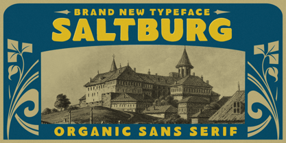 Introducing, Saltburg, an strong and bold sans serif with a touch of vintage look and feel. This type of font perfectly made to be applied especially in logo, headline, signage and the other various formal forms such as invitations, labels, logos, magazines, books, greeting / wedding cards, packaging, fashion, make up, stationery, novels, labels or any type of advertising purpose. Features : uppercase & lowercase numbers and punctuation multilingual alternates swashes and ligatures PUA encoded We highly recommend using a program that supports OpenType features and Glyphs panels like many of Adobe apps and Corel Draw, so you can see and access all Glyph variations.
 - Galberta by IbraCreative,
$17.00 Galberta, a cutting-edge futuristic font, embodies the essence of tomorrow’s typography with its sleek and innovative design. Its geometric, sans-serif characters seamlessly blend bold, crisp lines and subtle curves, exuding a sense of modernity and minimalism. The font’s minimalist aesthetic is complemented by its distinct fusion of sharp angles and graceful arches, creating a visually captivating harmony. Galberta offers a dynamic and versatile typeface that can effortlessly elevate the aesthetics of any design, from sci-fi movie posters to forward-thinking digital interfaces, making it the embodiment of typographic innovation in the digital age.
 - Pila by Alex Jacque,
$20.00 Pila, designed by Alex Jacque in 2014, is a modular, sans-serif stencil typeface that comes in regular and condensed formats. Crafted to be a bold, punchy, no-nonsense stencil typeface, Pila owes its unique look — as well as its name — to its adherence to the rigid modular system it is built upon. Pila is meant to be used at larger point sizes where visual impact is desired. Pila has a broad glyph set with the necessary characters to support a wide number of languages. Through the use of OpenType Pila can automatically create fractions as well as create superscript and subscript numerals.
 - Andove by Locomotype,
$20.00 Andove is a narrow sans font with very tight compression. With a slim character and a fairly large x-height, Andove looks great for very large and eye-catching typesettings. The one-sided serif in ascenders makes this font very unique and stands out to show it is sporty and strong enough. What's even more interesting is Andove has a true italic on each weight so it can be an option for really big headlines and poster title. Andove consists of 10 styles in six weights — Thin to Bold — Upright and True Italics and comes with extended language support including Cyrillic.
 - Centim by Tour De Force,
$25.00 Centim is contemporary sans with sharp top endings of stems that give a bit technical charm to typeface. With a squarish look, it can be used widely in all modern publications or become a part of an corporate identity. In smaller sizes, Centim offers good readability due to its simple and good balanced lines. Centim is available in Regular and Bold weights, as an ideal high-contrasted combination where all characteristics of the typeface are purely effective. Centim is the archaic Serbian word for Centimeter, a word that was mostly used in tailoring during XIX and XX century.
 - Gringo Tuscan by Volcano Type,
$29.00Gringo is a type family that contains 27 different varieties. It is divided into three groups: Sans, Slab, and Tuscan = Europe - Texas. Due to its consistant structure, the single groups can be mixed as you wish. Furthermore every variety comes in Light, Medium, and Bold. There are three widths, from Narrow to Wide. Additionally, there is also a Dingbats font. The concept of Gringo is a fusion and a merging of type cultures to cross borders and create something new. Gringo won 3rd place in the "tdc2 2006 award" by the Type Directors Club New York. - Madre Rose by Letterhend,
$17.00 Madre Rose is a sophisticated sans serif with 3 weight style to choose from, bold, thin and regular. It has many beautiful ligatures which you can play around to match your project, whether for a standout headline, or for a tagline, you name it. The unique letterform makes this font one of a kind! Perfectly to be applied to the other various formal forms such as invitations, labels, logos, magazines, books, greeting / wedding cards, packaging, fashion, make up, stationery, novels, labels or any type of advertising purpose. Features : 3 weight style uppercase & lowercase numbers and punctuation multilingual alternates & ligatures PUA encoded
 - FF OCR-F by FontFont,
$68.99 German type designer Albert-Jan Pool created this sans FontFont in 1995. The family contains 3 weights: Light, Regular, and Bold and is ideally suited for film and tv, small text as well as software and gaming. FF OCR-F provides advanced typographical support with features such as ligatures, alternate characters, case-sensitive forms, fractions, super- and subscript characters, and stylistic alternates. It comes with a complete range of figure set options – oldstyle and lining figures, each in tabular and proportional widths. As well as Latin-based languages, the typeface family also supports the Cyrillic writing system.
 - Mogicka by Keristyper Studio,
$14.00 Mogicka is a classic bold serif font with a stylish shape, It has both a modern and retro look. This font is good for logo design, Social media, Movie Titles, Books Titles, short text even long text letters, and good for your secondary text font with sans or serif. Featured: Standard Uppercase & Lowercase Numeral & Punctuation Multilingual : ä ö ü Ä Ö Ü ß ¿ ¡ Alternate & Ligature PUA encoded We recommend programs that support the OpenType feature and the Glyphs panel such as Adobe applications or Corel Draw. so you can use all the variations of the glyphs. Hope you enjoy our fonts!
 - Fukoya by Keristyper Studio,
$14.00 Fukoya is a bold font with a soft and confident impression, modern with a clean touch. This font is good for logo design, social media, movie and book titles, short text, even long text letters, and good for your secondary text font with the script, sans, or serif. Featured: Standard Uppercase & Lowercase Numeral & Punctuation Multilingual : ä ö ü Ä Ö Ü ß ¿ ¡ Alternates & Ligatures PUA encoded We recommend programs that support OpenType features and the Glyphs panel such as Adobe applications or Corel Draw so you can use all the variations of the glyphs. Hope you enjoy our fonts!
 - Geofota by Keristyper Studio,
$14.00 Geofota is a bold and heavy modern style font inspired by urban street culture. This font is good for logo design, Social media, Movie Titles, Books Titles, short text even long text letters, and good for your secondary text font with sans or serif. Featured: Standard Uppercase & Lowercase Numeral & Punctuation Multilingual : ä ö ü Ä Ö Ü ß ¿ ¡ Alternate & Ligature PUA encoded We recommend programs that support the OpenType feature and the Glyphs panel such as Adobe applications or Corel Draw. so you can use all the variations of the glyphs. Hope you enjoy our fonts!
 - SST by Monotype,
$82.99 Designed for global branding and supporting 93 languages, the SST® typefaces blend the organic readability and controlled structure of modern sans serif designs. In combining these attributes, the SST family is understated, versatile – and sure to be a timeless design. The SST Pan-European family has 17 fonts in total, supporting the W1G character set. It spans six weights from ultra light to heavy, each with an italic complement. In addition, three condensed designs and two monospaced (typewriter) typefaces were drawn to further expand the family’s vast range of uses. SST’s subtle design traits provide a quietly handsome and consistently friendly typographic presence that can be used for just about any typographic application. Broad range branding applicability combined with coverage for almost a hundred languages, makes SST one of the most widely accessible and usable typefaces available. Originally designed in partnership with the global consumer brand, Sony, the SST family is one of the most comprehensive type families available. Since extensive multi-lingual support was a critical design goal from the beginning, Akira Kobayashi, Monotype type director and primary designer on the project, turned to a network of local designers around the world for their individual language expertise. As a result, the details – which could be as subtle as stroke curvature and width – are consistent across Latin, Greek, Cyrillic, Arabic and multiple Asian languages. SST performs equally well in print and on-screen and the designs can be used at very small sizes in packaging and catalogs; while massive print headlines – even complicated wayfinding projects pose no stumbling blocks to the family’s typographic dexterity. While the family is also large enough to manage complicated typographic hierarchy, SST pairs handsomely with typefaces as far reaching as ITC Berkeley Old Style®, Meta®, PMN Caecilia®, Malabar® and Neue Swift®.
 - Cruisader II by ARToni,
$14.00 Cruisader II is a cool, fresh and bold display font. This font reads as strong, confident, and dynamic and can add tons of nostalgic character to your designs.
 - Hamidah by IbeyDesign,
$18.00 Hamidah Modern Calligraphy Font is a gorgeous and bold handwritten font. It reads as strong, confident, and dynamic and can add tons of nostalgic character to your designs.
 - Avestrage by Mokatype Studio,
$24.00Avestrage is a bold stencil serif, build with stylish look, and includes bunch of alternates and ligatures, to make your presentation look satisfying. This font can used for clean design and if you want make it retro look this font is suitable too because this font is very versatile for any design. This font is one weight only, you can create designs such as posters, headlines, merch, web or app interfaces, etc. What's you get : Standard glyphs Ligatures (Opentype features) Web Font International Accent Works on PC & Mac Simple installations Accessible in Adobe Illustrator, Adobe Photoshop, Adobe InDesign, and even works on Microsoft Word. PUA Encoded Characters - Fully accessible without additional design software. Fonts include multilingual support Image used: All photographs/pictures/vectors used in the preview are not included, they are intended for illustration only. Thank You - Anthemis by Blankids,
$17.00 Introducing Anthemis, the bold script font inspired by Bold hand lettering style. Anthemis is good for branding logotype, Packaging, poster, headline, book cover, Flyer, t-shirt design and any more. Anthemis has many alternative character and have opentype features like a stylistic alternatives, stylistic set, ligature and swash so you can mix and match like a you want.
 - Cagile by Java Pep,
$17.00 Cagile is a family font that comes with 4 styles like regular, italic, semi-bold, and semi-bold font. Cagile presents a minimalist but classy look, all characters are can represent what a project purpose that you want. The font is also nice and standout working for wedding invitations, logo, pull quotes & monograms, headlines, title, and more.
 - Lobby Poster JNL by Jeff Levine,
$29.00 The hand lettered cast credits for the 1932 George Arliss film “The Man Who Played God” inspired Lobby Poster JNL, which is available in both regular and oblique versions. A bold and playful Art Deco poster alphabet, its nonconformist character widths and shapes are casual enough for informal designs yet bold enough to get any point across.
 - Scriptissimo Forte by Wiescher Design,
$39.50 Scriptissimo-Forte is the bold version of Scriptissimo. When using the normal cut of Scriptissimo I sometimes had the feeling that I could well use a bolder cut to make a bigger impression, so I simply made that cut for myself. I think you can use it too; try it out. Yours very bold scriptissimo, Gert Wiescher
 - Estandar Rounded by Latinotype,
$- Estandar Rounded is a retro and vintage wayfinding sans serif font, inspired by old signals in central park and Europe. It is a Condensed sans with their tall x-height. The family has 6 Weights, italics and dingbats. It is an extension of Estandar font.
 - Beriot by Boyanurd,
$19.00 Beriot is a sans serif whose basics are condensed in Regular (Normal) weight, getting a lot of form inspiration from the topic also known as Steile Futura which is a letterform that Paul Renner himself explored in the mid-1950s, where shapes are constructed with little stress on modular squares but there are changes in certain parts so they become less modular. The Beriot family is available in 42 weights with matching slanted cuts, divided into 3 subfamilies: Condensed, Normal and Expanded. Each has been designed for a range of text sizes each, and already variable, allowing you to choose and make your own type of weight you like. OpenType Features are available in each of these font styles, including alternative characters, different numbers set and case-sensitive and there are additional symbols that make it the perfect choice for professional types of branding, digital design and editorial.

