10,000 search results
(0.228 seconds)
- Bostage by Keristyper Studio,
$14.00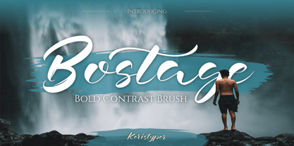 Bostega is a handwritten script display font with bold contrast strokes. This font is good for logo design, Social media, Movie Titles, Books Titles, short text even long text letters, and good for your secondary text font with script, sans, or serif. Featured: Standard Uppercase & Lowercase Numeral & Punctuation Multilingual : ä ö ü Ä Ö Ü ß ¿ ¡ Alternate & Ligature PUA encoded We recommend programs that support the OpenType feature and the Glyphs panel such as Adobe applications or Corel Draw. so you can use all the variations of the glyphs. Hope you enjoy our fonts!
 - Helnore by Owl king project,
$39.00 Helnore is a sans serif font family with tapered accents in some of the letters giving it a modern and bold character, even being quite prominent in thin characters. This font aims to give an elegant impression and also looks so luxurious in short words for a letter-based title and logo. Helnore bring 20 style/Italic and support multi-languages, this font provides a wider range of exploration, which can be useful also for reading sentences and giving variety in each sentence by combining it with several sizes.
 - Nordique Pro by Leksen Design,
$29.00 Inspired by her Swedish and Norwegian heritage, Andrea Leksen created this modern geometric sans serif reminiscent of Scandinavian design and typography. With its tall x-height, Nordique will be best showcased at large sizes, in headlines and other display uses. The Light, Regular, Semibold and Bold versions each contain over 50 ornaments, swashes, alternates and borders to play with—a modern take on the traditional rosemåling and kurbits painting styles. See some of the creative and beautiful ways Nordique Pro can be used in this YouTube clip! Check out Nordique's cousin Nordeco!
 - The Jagret by Ergibi Studio,
$19.00 Jagret is a Soft and Bold serif, The many alternate character on serif makes this typeface unique and stands out rather than the regular sans font, perfectly for headlines, logos, posters, packaging, T-shirts,coffee shops, restaurants, magazine's headers, signs or gift/post cards,cafe's and weddings or any type of advertising purpose.With italic version that you can use as a complimentary! Features Regular & Italic Version Uppercase & Lowercase Number & Symbol Ligatures Multilingual and PUA Encoded If there is a problem, question, or anything about my fonts, don't hesitate to ask! Big Thanks Ergibi Studio
 - Frutiger Next Paneuropean by Linotype,
$99.00Frutiger Next is Adrian Frutiger's and Linotype's completely new interpretation of the well known typeface Frutiger released in 2000. For these revised forms, the areas of application are almost limitless. Frutiger Next can be used for anything from office communications to multimedia to complex printed materials. The Frutiger Next family contains small caps, oldstyle figures, and other figure options in every font. Adrian Frutiger's eponymous typeface has been used for decades, everywhere from airport signage to book text to corporate logos to the smallest web graphics. The Italics in the original version of Frutiger were based very closely on the Roman forms; in Frutiger Next, they have been re-designed to be true Italics. - Applbitz by Joey Maul,
$10.00 Applbitz is a set of three pixel style fonts which include a matching set of food related pix fonts. The regular style is a text font, which is optimal at 14 points when used in flash. Applbitz Pix Base and Pix Top are corresponding food related glyphs, with the top providing a bit of detail. These "friendly" pix characters can also be used in flash using some TLC (and snap to pixel grid). They are fun to add your own color combinations, and are great for a variety of food icons. View the PDF file in the gallery for color suggestions. Special note: to dress the hamburger use "{" and "½" (left brace and one-half) from Pix Top.
 - Piercing by Linotype,
$29.99Piercing is part of a series of typographic experiments from the young Swiss designer Michael Parson. In the Piercing family, which contains three separate weights, Parson has successfully transformed the movements of points and lines into a fabulous display of alphabets. But you can use Piercing as your key to the techno scene: these letters, made up of fine lines terminated by dots, virtually groove with the beat as you set them in text. Like a musical score, they provide a fantastic look just right for your next flyer. Piercing is one of ten experiments in constructed letter design that Parson has included in the Take Type 5 collection from Linotype GmbH." - Westside by Linotype,
$29.99 Westside was designed by Adrian Frutiger in 1989 and is a kind of wood type. It is reminiscent of dusty streets, Wild West heroes and swinging saloon doors. The origins of this kind of typeface can be found in the early 19th century. Called Italian or Italienne, these typefaces quickly became very popular. They are distinguished by square serifs whose width is larger than the stroke width of the characters. When the letters are set together, the heavy serifs build dark horizontal bands. Westside is a particularly decorative typeface which will have a marked effect when used expertly. It is perfect for headlines in larger point sizes, which will highlight its special character.
 - Opera Signature by Larin Type Co,
$16.00 Opera Signature is an elegant font duo that includes a serif font and a script font. Serif font is a contrasting elongated font that is suitable for a wide variety of projects, such as: logos, labels, branding projects, magazines, home goods design, food packaging, wedding invitations, quotes, posters and much more, it also includes ligatures and alternates, with which you will add uniqueness to your project. Script is a handwritten font of modern calligraphy that includes alternates, swash, and initial and final forms for lowercase letters. You can use these fonts individually or together, and they are perfectly combined with each other. This font is easy to use and has OpenType features.
 - Skate by DearType,
$29.00 Skate is a multifunctional font family of a script in five weights and a bold complementary sans. It is a versatile combination that works best in large sizes - think billboards, posters, magazine and website headlines, as well as packaging. The Skate family is edgy and packs quite a punch which also makes it suitable for branding projects that rely heavily on type. Both the script and the sans have Latin Extended and Cyrillic support, while the script also comes with a variety of ligatures and stylistic sets for even more design freedom. The Skate family was inspired by urban culture, so it is a great fit for projects that cater to a bold and youthful audience.
 - Victorian Orchid by Dharma Type,
$19.99 Victorian Orchid is a gorgeous vintage flower. Victorian Orchid is a beautiful, organic serif font family available for both text and display. Its bizarre serifs for A and other diagonal letterforms came from decorative types and letterings in old Victorian era. These unusual serifs support and enhance the horizontal flow of the eyes and vertical alignments. Very eye-catching lowercase g also came from the Victorian era and this is one of the most dramatic letterform of this font. Lowercase such like n and d also have horizontal serifs which designed in the same theory. Victorian Orchid is somewhat organic, humanistic and soft-impression font like Transitional Serif as typified by Times New Roman. But at the same time, this font has horizontal serif and vertical stressed letterform like Modern Serif. They make this font sharp, handsome and neat. In addition, Victorian Orchid has low contrast and the serifs are not too flat and not too coved. By them, Victorian Orchid create strong and casual impression like Slab Serif fonts. Victorian Orchid family consist of 5 weights from Light to Bold including about 500 glyphs, international accented letters, some OpenType features. Italics are "True" italics which designed very carefully to match Romans.
 - Yapari by Power Type,
$15.00 YAPARI is a font inspired by a street typography located in a Makassar city 2005, this writing is poured into a font and then made several variations of width which are Wide, Extended, and Expanded kind of stretched font then have thickness ranging from Thin, Extra Light, Light, Regular, Medium, Semi Bold, Bold, Extra Bold, Ultra. This font is suitable for use for design projects that have a bold impression and can also be used for all lines of media as well as formal and informal
 - Atomette by Device,
$39.00 Atomette is a bouncy sans that is friendly without being flippant, warm yet still stylish. The upper case and lower case options provide letters with less or more animation. Five weights plus an inline provide a neat mini-family to cover all your requirements. Suitable for snack packaging, comic books, toys, celebratory banners, book covers and games. Contains two or three options for each letter, including automatically-substituting letter-pairs to prevent repetition, plus an alternate set of numbers in circles. These can be chosen from the Glyphs palette or toggled on and off in the Opentype panel.
 - Pacaembu by Naipe Foundry,
$60.00 Pacaembu is a sans serif typeface that finds its roots in Brazilian football. This seven weight family began as a study of the stone lettering found in the Paulo Machado de Carvalho Municipal Stadium, affectionately known as the Estádio Pacaembu, a real gem of the Art-Deco style inaugurated in 1940. These art-deco letters, like football itself, were brought to Brazil by Europeans and out there in the tropics found a totally unique personality. Pacaembu is a celebration of Brazilian Football, it’s unique flavours, moves, sights and colors which have been delighting fans for generations.
 - Frau Becker by profonts,
$51.99 Frau Becker is a very dynamic and readable handwriting script that looks great in text sizes. It is a self-confident, expressive and strong character design. How old is Frau Becker? Is she an insurance agent, a surgeon or a designer? We do not know exactly but one thing is for sure: she can be found at any place where special, high-end design in conjunction with a reliable typographic basis is demanded, e.g. for posters, books, ad campaigns or magazines. Frau Becker is different from all other classical scripts – it is outstanding! Due its excellent readability, it is a precious and exceptional text font with styles as regular, bold, and Headline (bold condensed). The character set includes Basic Latin, Basic Latin 1, Latin Eastern Europe, small caps, plenty of ligatures, old style figures, index figures, and some special characters including a skull. Wow!!
 - Guhly by Ingo,
$35.00 A modern Sans Serif — prosaic, designed geometrically, beautiful in large sizes All the dimensions of the font are based on Factor 10. The general principle of construction leads to slim forms and nearly equally wide characters. So the font appears very solid but is actually difficult to decipher in longer texts. Along with the ”normal“ Guhly Regular there are also the two versions Guhly Light and Guhly Bold, whereas in each only the vertical strokes [Guhly Light] or horizontal [Guhly Bold] have been changed in strength. The result is a very individual decorative effect which slightly reflects old circus and western scripts. The lower case characters in the version Guhly Book are, therefore, optimized to be suitable for longer texts in smaller font sizes — because after all, sometimes you should read a bit more than just the headline… The design of a shampoo bottle stands behind the creation of this sans serif display font. Prominent, clearly constructed forms with circular arcs define its appearance. This is a font primarily designed for use with capital letters — for all sorts of advertising purposes, headlines and titles. But lower case letters also belong to a good functional font; so, of course, Guhly includes them and ligatures for the more ”critical“ letter combinations as well as stylistic alternates for the letters K (or k), V (v) and o. As a decorative “encore”, the Guhly family also contains the “normal” weight in two variants: on the one hand the Guhly Cutout – these are letters without counter, as if the letters were cut out and the internal surfaces fell out; and on the other hand the Guhly stencil – as the name suggests, a stencil font with the typical bars that give a stencil the necessary cohesion.
 - Teutonia by HiH,
$10.00 How can Teutonia be called “Art Nouveau” with all those straight lines? It seems like a contradiction. In fact, however, Art Nouveau embraces a rather wide variety of stylistic approaches. Five well-known examples in the field of architecture serve to illustrate the range of diversity in Art Nouveau: Saarinen’s Helsinki Railroad Station, Hoffman’s Palais Stocklet in Brussels, Lechner’s Museum of Applied Arts on Budapest, Mackintosh’s Glasgow School of Art and Gaudi’s Sagrada Familia in Barcelona. Only the last fits comfortably within the common perception of Art Nouveau. Whereas Gaudi would avoid the straight line as much as possible, Macintosh seemed to employ it as much as possible. The uniting factor is that they all represent “new art” -- an attempt to look things differently than the previous generation. Even when they draw on the past -- e.g. Lechner in the use of traditional Hungarian folk art -- the totality of the expression in new. Teutonia clearly shows its blackletter roots in the ‘D’ and the ‘M.’ Roos & Junge of Offenbach am Main in Germany produced Teutonia in a "back-to-basics" effort that has seen many quite similar attempts in the field of topography. In 1883, Baltimore Type Foundry released its Geometric series. In 1910, Geza Farago in Budapest used a similar letter design on a Tungsram light bulb poster. In 1919 Theo van Doesburg, a founder with Mondrian and others of the De Stijl movement, designed an alphabet using rectangles only -- no diagonals. In 1923 Joost Schmidt at Bauhaus in Weimer took the same approach for a Constructivist exhibit poster. The 1996 Agfatype Collection catalog lists a Geometric in light, bold and italic that is very close to the old Baltimore version. Even though none of these designs took the world by storm, they all made a contribution to our understanding of letterforms and how we use them. Teutonia is compact and surprisingly readable at 12 points in print, but does not do as well on the screen. Extra leading is suggested. Four ligatures are supplied: ch, ck, sch and tz. The numerals are tabular.
 - Hazelnut Milk Tea by Fikryal,
$18.00 Introducing this very simple sans serif font that is Hazelnut Milk Tea font. I created this font with the inspiration of simplicity and it is very friendly to look at, with four versions, namely regular, italic, bold, bold italic. Very suitable to be applied in various aspects of design, Also it’s perfect for logo, branding, title, social media posts, advertisements, product packaging, product designs, label, photography, watermark, special event, magazine, web designs, etc. Features : Hazelnut Milk Tea Regular ( Uppercase, Lowercase ) Hazelnut Milk Tea Regular Italic ( Uppercase, Lowercase ) Hazelnut Milk Tea Bold ( Uppercase, Lowercase ) Hazelnut Milk Tea Bold Italic ( Uppercase, Lowercase ) Symbols multilingual support If you have any questions please don’t hesitate to contact me follow my Instagram: @fkryall Thank you
 - Clarenwood JNL by Jeff Levine,
$29.00 Based on some examples of a Clarendon-inspired wood type design, Clarenwood JNL is a bold and effective titling font which harkens back to old times and advertising on a grander scale.
 - Striptease JNL by Jeff Levine,
$29.00 Striptease JNL is the bold, brash, "your-name-in-lights" companion to Showgirl JNL, and was inspired by a scene in an old television show depicting a burlesque house of the 1930s.
 - Campuni by Identity Letters,
$29.00 A charming confidant. Italic, but without the slant. Campuni is a sans-serif typeface that can be described as an “upright italic”: its letters are modeled on the handwritten forms of italics—but without the slant. This gives Campuni a contemporary, charming, and trustworthy character. As with most modern sans-serif typefaces, Campuni’s design is based on low-contrast, almost monolinear strokes with a neat and clear appearance. This is where Campuni’s steep and tapered joints come in: with a bit of contrast, they provide the perfect foundation for a steady rhythm between characters—just like you’d find in meticulous handwriting. Careful spacing ensures that this rhythmic character is preserved on the page and on screen, making for a pleasant reading experience. It’s not just the letterforms that gain from Campuni’s calligraphic heritage, though. This typeface is packed with calligraphy-style swash capitals and end swashes on lowercase letters, as well as discretionary ligatures. These are available via OpenType, allowing you to spice up your logo or headline with a hint of calligraphy in a breeze. Despite its flawless legibility in body text, Campuni is definitely eye-catching in display sizes. (Decrease letterspacing for some additional punch.) Besides logo design, Campuni is a great choice for branding, advertising, packaging, corporate design, or even signage and wayfinding. The range of topics that Campuni excels in varies from food, leisure, retail, e-commerce, music, and travel to games, toys, childcare, and family-themed events. Campuni has got an Extended Latin character set, seven sets of figures, case-sensitive forms, arrows, and a few other advanced typographic features—622 glyphs in total. Its eight weights span from Thin to Black.
 - Pina Colada by Larin Type Co,
$12.00 Pina Colada this beautiful handwritten font duo is a smooth script and playing sans, they perfectly combine and complement each other, they will bring their unique style to any design project and make it unique. It is as sweet as Pina Colada, fall in Love with its incredibly versatile and simple style and use it to create gorgeous wedding invitations, beautiful stationery, greeting cards, attractive social media messages and more! This font is easy to use, has OpenType features, and supports PUA encoding.
 - News Gothic No. 2 by Linotype,
$40.99News Gothic No. 2 is an enhanced version of News Gothic produced by the D. Stempel AG type foundry in 1984. It added more weights to the News Gothic family than were available in other versions, increasing its use in contemporary design and communication. The lighter weights of the original News Gothic were designed by Morris Fuller Benton in 1908 for American Typefounders (ATF). News Gothic typeface is quite similar to Benton's other sans serifs from the early twentieth century, including Franklin Gothic and Lightline Gothic. The bold weights were added to the News Gothic scheme in 1958. The capital letters in News Gothic No. 2, just like those found in News Gothic, have a similar visual width to each other. The lowercase is compact and powerful. These design attributes contributed to Benton's strong handle on the sans serif genre, and for years his types have been popular for newspaper headlines and many other uses. Still a popular presence on the font charts, News Gothic has proven its ability to get the job done right. - Wien Pro by Wannatype,
$36.00 Wien Pro, the sans serif by Ekke Wolf. Typeface lovers looking for a modern, well-developed sans serif font with a touch of retro and warm, individual lettering will get excited about a new addition to the font market. The more than complete Wien Pro front comes in three styles and four different weights. In addition to the upright Wien Pro there is the Wien Pro Oblique with a moderate 6° slant and the Wien Pro Superoblique with an 18° slant. Available weights are light, regular, medium, bold and black. These fonts are equipped with extended Latin alphabet for Central and Eastern Europe and also Cyrillic and Greek alphabet. The set of characters includes nine different sets of numbers, plus its own set for the small caps, as well as alternative characters and groovy ligatures. In addition, all Wien Pro styles are also available as unicase with upper case and lower case x-height alignment. The style, metrics and proportions of Wien Pro combine perfectly with the Liebelei Pro and the script fonts of the Calafati Pro.
 - Westblue by Ditatype,
$29.00 Westblue is a captivating sans-serif display font. Crafted in bold style and intricate brushwork, this font is a versatile choice for designers seeking a perfect combination of impact and creativity. The characters in Westblue command attention with their substantial size and clean, sans-serif lines. What sets this font apart is the meticulously added brushed details, which bring an organic and handcrafted touch to each letter. These details create a sense of dynamism, making Westblue ideal for projects that demand both modernity and a hint of artistic flair. In addition, enjoy the features here. Features: Multilingual Supports PUA Encoded Numerals and Punctuations Westblue fits in headlines, logos, posters, flyers, branding materials, greeting cards, print media, editorial layouts, and many more designs. Find out more ways to use this font by taking a look at the font preview. Thanks for purchasing our fonts. Hopefully, you have a great time using our font. Feel free to contact us anytime for further information or when you have trouble with the font. Thanks a lot and happy designing.
 - Gradl Initialen ML by HiH,
$12.00 Max Joseph Gradl designed Art Nouveau jewelry in Germany. At least some of his designs were produced by Theodor Fahrner of Pforzheim, Germany -- one of the leading manufacturers of fine art jewelry on the Continent from 1855 to 1979. I don't know if he designed for Fahrner exclusively, but every example I found was produced by that firm. I assume it was also the same M.J, who edited a book, Authentic Art Nouveau Stained Glass which was reissued by Dover and is still available. For an artist as accomplished as Gradl was, he is very tough to research. There just does not seem to have been much written about him. The jeweler is visible in most of his typeface designs. They exhibit a sculptural quality as if they were modeled in clay (or gold) rather than drawn on paper. His monograms, especially, reflect that quality. Those shown in plates 112 through 116 in Petzendorfer actually appear to have been designed specifically for fabricating in the form of gold or silver pendents. Of the initial letters that came out of Germany during this period, these by Gradl seem unusually open and lyrical. They seem to be dancing on the page, rather than sitting. Please note that Gradl designed only the decorated initials. All other characters supplied were extrapolated by HiH, including the accented initials. Orn.1 (unicode E004) is based on a jeweled gold clasp designed by Gradl (please check out Gallery Image on Myfonts.com). Also included are an art nouveau girl’s face, a swan and the face from Munch’s “Scream”, from scans of old printer’s ornaments. Gradl Initialen M represents a major extension of the original release, with the following changes: 1. Added glyphs for the 1250 Central Europe, the 1252 Turkish and the 1257 Baltic Code Pages. Added glyphs to complete standard 1252 Western Europe Code Page. Special glyphs relocated and assigned Unicode codepoints, some in Private Use area. Total of 341 glyphs. Both upper & lower case provided with appropriate accents. 2. 558 Kerning Pairs. 3. Added OpenType GSUB layout features: salt, dlig, ornm and kern. 4. Revised vertical metrics for improved cross-platform line spacing. 5. Refined various glyph outlines. 6. Alternative characters: 16 upper case letters (with gaps in surrounding decorations for accents above letter). 8. Four Ornaments: face1, face2, swan and orn1 (silhouette of Gradl clasp) The zip package includes two versions of the font at no extra charge. There is an OTF version which is in Open PS (Post Script Type 1) format and a TTF version which is in Open TT (True Type)format. Use whichever works best for your applications.
 - Bombalurina by Sarid Ezra,
$15.00 Bombalurina Script Family contains 4 styles including alternates, Ligatures, Swash, and also Underline. It comes in Regular, Italic, Bold, and Bold Italic. Bombalurina Script is a signature font that you can use to make a logo for branding, beautiful fashion design, or a handwritten quote. Also already PUA Encoded.
 - Jello Chlour by Jolicia Type,
$5.00 Say hello for our first debut "Jello Chlour " with Modern Elegant Style this is perfect for branding, logos, invitation, masterheads and more. Jello Chlour Features : Multilanguange Ligatures Alternates PUA Encoded Files Includes : Jello Chlour Light Jello Chlour Regular Jello Chlour Semi Bold Jello Chlour Bold Jello Chlour Script
 - Informational Sign JNL by Jeff Levine,
$29.00 A vintage metal sign saying "No Dogs Allowed" was the model for the ultra-bold Art Deco-influenced lettering comprising Informational Sign JNL.
 - Ohanlon by Fontdation,
$18.00 Introducing our new release: Ohanlon. Ohanlon is a bold display sans with a subtle hint of reverse-contrast personality which will gives dramatic feel to your design. Packed with lots of stylistic alternate characters to let you play with various letter combinations. Go wild and experimental by combining the sans with the block or script-ish alternate letters to elevate your design game, or you can even go formal with the standard letters. Oh and also, the slanted/faux-italic version is available too. Suits best for logotype/branding, packaging design, and many other designs that need a direct punch to the face. Ohanlon is a versatile font, whether you'll go vintage or modern, this font will got your needs properly covered.
 - Anasite Malela by Stringlabs Creative Studio,
$25.00 Anasite Malela is a bold script with groovy retro style. This font has a unique feel and you can use it to add that special retro touch to any design idea you can think of!
 - Fibra by Los Andes,
$26.00 The font is actually not a revival of ‘Avant Garde’—by Herb Lubalin—but it takes its spirit. Fibra is a geometric sans serif, yet without the typical structural strictness of these kind of fonts, that represents experimental type design. This can be seen in the contrast between curves and straight lines in some characters such as ’n’ and ‘h’ unlike rounded ones such as ‘a’ and ‘d’; details of some display characters (e.g. three upper terminals in ‘W’ and projection off the stem in ‘A’); and exaggerated terminal in ‘R’. All these features give Fibra a strong personality—a sans serif typeface that ‘gives you the chills’. Fibra was specially designed for display use. The font has a very generous x-height that allows for use in corporate text, thanks to its good readability. Fibra comes with 2 subfamilies—a more ’normal’ Basic family, with a smaller amount of stylistic features, for use in subheadings or any other type of text that requires formality, and an Alt family that shows off the true potential of the font, making it the perfect choice for magazine headlines, posters and logotypes.
 - Stingwire BT by Bitstream,
$50.99Bonislawsky pulls off a beauty in these letterforms rendered with barbed wire. In our view, it couldn't have been done better. Now you can contain the animal in you with style. - Quta by Fo Da,
$15.00 Quta is a sans serif typeface produced by FoDa foundry, that meets all the needs of professionals who search a family of clean geometric font, very well suited for headlines, newspaper and many purposes. With a basic character set in Five weights with their italics. Quta covers many features like: -Five main weights (Light, Regular, Medium, Bold and Extra Bold) -Matching italics for all weights. -language support for many Latin-based scripts -Ligatures and many other OpenType features.
 - Romanica by K-Type,
$20.00 ROMANICA is a relaxed humanist sans with subtly curved corners and slightly flared glyphic terminals that are expressively angled where appropriate. Romanica has the authority of the ages without the harshness of many classically inspired typefaces. All eight fonts include a full complement of Latin Extended-A characters, Welsh diacritics, Irish dotted consonants, and additional oldstyle numerals. ROMANICA is available in three packages - • Basic Family (Regular, Italic, Bold & Bold Italic) • Light (Light & Light Italic) • Medium (Medium & Medium Italic)
 - MC Maxes by Maulana Creative,
$16.00 Maxes is a modern Bold sans Display font. Bold stroke, fun character with a bit of ligatures and alternates. To give you an extra creative work. Maxes font support multilingual more than 100+ language. This font is good for logo design, Social media, Movie Titles, Books Titles, a short text even a long text letter and good for your secondary text font with script or serif. Make a stunning work with Maxes font. Cheers, Maulana Creative
 - Hatrok by Maulana Creative,
$17.00 Hatrok is a modern bold serif display font. With bold contrast stroke, fun character with a bit of ligatures and alternates. To give you an extra creative work. Hatrok font support multilingual more than 100+ language. This font is good for logo design, Social media, Movie Titles, Books Titles, a short text even a long text letter and good for your secondary text font with sans or serif. Make a stunning work with Hatrok font. Cheers, Maulana Creative
 - Palfour by Maulana Creative,
$18.00 Palfour is a classic bold serif display font. With bold stroke, fun character with a bit of ligatures and alternates. To give you an extra creative work. Palfour font support multilingual more than 100+ language. This font is good for logo design, Social media, Movie Titles, Books Titles, a short text even a long text letter and good for your secondary text font with sans or serif. Make a stunning work with Palfour font. Cheers, Maulana Creative
 - MC Magtons by Maulana Creative,
$15.00 Magtons is a classic condensed strong bold sans display font. Bold stroke, fun character with a bit of ligatures and alternates. To give you an extra creative work. Magtons font support multilingual more than 100+ language. This font is good for logo design, Social media, Movie Titles, Books Titles, a short text even a long text letter and good for your secondary text font with script or serif. Make a stunning work with Magtons font. Cheers, Maulana Creative
 - Bitgros by Maulana Creative,
$12.00 Bitgros is a classic bold sans serif Display font. Bold stroke, fun character with a bit of ligatures and alternates. To give you an extra creative work. Bitgros font support multilingual more than 100+ language. This font is good for logo design, Social media, Movie Titles, Books Titles, a short text even a long text letter and good for your secondary text font with script or serif. Make a stunning work with Bitgros font. Cheers, Maulana Creative