10,000 search results
(0.032 seconds)
- Invertigo by Robert Petrick,
$19.95 Invertigo is an experimental font mainly for designers who love to play with type as you will see in my examples. There are many alternate letters for you to work with, and I will be creating new characters which I will add to Invertigo from time to time. If you purchase Invertigo, you will receive updates at no additional charge. It also makes an interesting looking setting somewhere between contemporary and futuristic.
 - Disco Jaw by PizzaDude.dk,
$20.00 The beat is on, the piano plays the funky tunes and the rhythm guitars do their best to get the party started! The party starts with your design - use the Disco Jaw font if you are working with a theme that involves comic, kids, commercial, arts and crafts, posters ... anything that needs a fresh kick! Included are jumpy alternative letters, which makes your text look alive and kicking - and or course, there is multilingual support!
 - Velko by Keristyper Studio,
$14.00 Volka is a modern sans serif font with clean and minimal lines with high contrast looks. This font is good for logo design, Social media, Movie Titles, Books Titles, short text even long text letters, and good for your secondary text font with script, sans or serif. **Featured:** * Standard Uppercase & Lowercase * Numeral & Punctuation * Multilingual : ä ö ü Ä Ö Ü ß ¿ ¡ * Alternate & Ligature * PUA encoded We recommend programs that support the OpenType feature and the Glyphs panel such as Adobe applications or Corel Draw. so you can use all the variations of the glyphs. Hope you enjoy our fonts!
 - Diversa by DSType,
$40.00 Diversa is a typeface that takes a very different path from the most fonts, both in terms of appearance and usability. Diversa is a single typeface with 9 fonts within, containing 2760 glyphs*, divide in 9 stylistic sets, but the main difference is that all the glyphs are kerned with each other, which means you can swap glyphs between stylistic sets and keep them properly kerned - unbracketed serifs, bracketed serifs, engraved, stencil, sans, slab, baroque, stencil sans, stencil slab and a stylistic set that mixes them all in a rotative feature. Diversa: Because uniformity sucks! *requires applications which have Open Type access/features.
 - Broad by Sensatype Studio,
$15.00 BROAD is a Modern Width or Extended Font Sans Serif perfect for Display Needs A Display Sans Serif font that we created special for unique branding needs, with extended character that will add an unique of your typography style. It's so nice to leverage designer or product owner that need solutions to make their design look more unique and standout. BROAD Modern Width Display font ready with: Lowercase and Uppercase characters (as standard or extended character) Numbers and Punctuations Preview as a inspirations that you can do with BROAD font Available for PC and Mac Wish you enjoy our font.
 - Tokyo Style by Sensatype Studio,
$15.00 Tokyo Style is a Modern sans serif display font that special created for Modern needs with unique style. A New Display font that we created special for Unique branding needs, with weird style that ready to add value of your brand. It's so nice to leverage designer or product owner that need solutions to make their design look more unique and urban. Tokyo Style Unique Sans Serif font ready with: All Uppercase characters Numbers and Punctuations Preview as a inspirations that you can do with Tokyo Style font Available for PC and Mac Wish you enjoy our font. :)
 - Heading by Sensatype Studio,
$15.00 Heading is an Unique sans serif display font that special created for Modern needs with unique style. A New Display font that we created special for Unique branding needs, with weird style that ready to add value of your brand. It's so nice to leverage designer or product owner that need solutions to make their design look more unique and urban. Heading Display Sans Serif font ready with: Lowercase and Uppercase characters Numbers and Punctuations Ready with Regular and Italic Style Preview as a inspirations that you can do with Heading font Available for PC and Mac Wish you enjoy our font. :)
 - Olike Variable by Typicaltype,
$36.00 Looking for a contemporary and modern grotesque sans serif font? Look no further than Olike! This versatile font comes with 18 styles, so you can create amazing designs that look both modern and stylish. With its sans serif style, Olike is perfect for any type of project or design. You will find your way to use this family certainly. Theatre posters or party flyers, vintage t-shirt or modern web service, movie titles or magazine header and even infographic – Olike will suit you everywhere. You may use the completed styles or may use a Variable Font. To make it as you want to.
 - Olike by Typicaltype,
$20.00 Looking for a contemporary and modern grotesque sans serif font? Look no further than Olike! This versatile font comes with 18 styles, so you can create amazing designs that look both modern and stylish. With its sans serif style, Olike is perfect for any type of project or design. You will find your way to use this family certainly. Theatre posters or party flyers, vintage t-shirt or modern web service, movie titles or magazine header and even infographic – Olike will suit you everywhere. You may use the completed styles or may use a Variable Font. To make it as you want to.
 - Gimmick Style by Sensatype Studio,
$15.00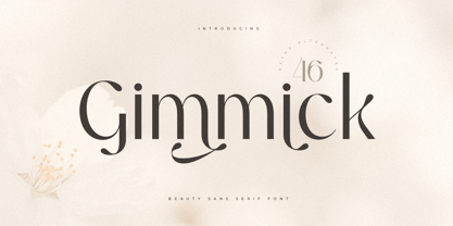 A Luxury Beauty Sans Serif font that we created special for elegant branding needs, with unique shape will be ready to add value of your brand. It so nice to leverage designer or product owner that need solutions to make their design look more stylish and modern. And specially for Gimmick font, We prepared any characters to help you create unlimited variations for your creative needs. Gimmick Luxury Beauty Sans Serif Font ready with: Unique Beauty Characters Preview as a inspirations that you can do with Gimmick font Ready with Lowercase and Uppercase characters Wish you enjoy our font. :)
 - Magnificent SS by Sensatype Studio,
$15.00 Magnificent is A Modern Feminine Vintage Font Magnificent font is a feminine retro modern vintage font with a fancy, playful, unique, and versatile vintage sans serif that you can combine to get a beautiful typography. It is a Sans Serif font with moderate contrast that perfect for branding projects, logo, wedding designs, social media posts, advertisements, product packaging, product designs, label, photography, watermark, invitation, stationery, and any projects, it makes with a high level of legibility. What's Included: Character set A-Z Uppercase & Lowercase Numerals & Punctuation Accented Characters (West Europe) Works on PC & Mac Wish you enjoy our font. :)
 - Daymore by Rillatype,
$15.00 Introducing, Daymore Font duo! Daymore is a duo font that complements each other. By using Daymore, you can simply use one font family without thinking about other fonts to complete the design you need. In the process of making this font, I was careful in choosing what font concept would be able to complement a bold sans serif font so that it could be balanced so that it would produce a blend of firm and strong sans serif fonts, as well as handwritten fonts that flowed naturally. The Daymore font duo is perfect for use as wedding invitations, branding, logos, etc.
 - Upcoming by Sensatype Studio,
$15.00 Upcoming is an Unique sans serif display font that special created for Modern needs with unique style. A New Display font that we created special for Unique branding needs, with weird style that ready to add value of your brand. It's so nice to leverage designer or product owner that need solutions to make their design look more unique and urban. Upcoming Unique Display Sans Serif font ready with: Lowercase and Uppercase characters Numbers and Punctuations Ready with Regular and Italic Style Preview as a inspirations that you can do with Upcoming font Available for PC and Mac Wish you enjoy our font. :)
 - Filosofi 3 finger Italic by Rhd Studio,
$12.00 Filosofi 3 Finger Sans Serif Font that we created special for Display, Logo and Branding A new Serif font that is nice to leverage designer or product owner that need solutions to make their design look more gorgeous and vintage. And specially for this font, We prepared any characters to help you create gorgeous for your creative needs specially for headline, and typography needs. Filosofi 3 Finger Sans Serif font ready with: Stylish Shape to get creative Preview as a inspirations that you can do with this font Ready with All Uppercase characters Wish you enjoy our font. :)
 - The Jakarta by XdCreative,
$29.00 Say hi to "The Jakarta" a stylish display sans typeface is the latest collection from @faldykudo "The Jakarta" basic technical and anatomy comes from the genetics of the "Magnify" family (Geometric classification of typefaces) with several stroke modifications and a combination smooth curves for a minimalist, elegant and modern sans serif. The Jakarta is perfect for the logo, product, headline or any of display design. The Jakarta has a complete characters A-Z, a-z (including stylistic Alternates), Numeral, Punctuations, and standard ligature. thanks, hope you would like and accept "The Jakarta" as part of your family. thank you in advance
 - Demiella by Keristyper Studio,
$14.00 Demiella is an elegant beauty sans serif. Simple letter shapes with playful swash & stylistic, keeping its legibility high. This font is good for logo design, Social media, Movie Titles, Books Titles, short text even long text letters, and good for your secondary text font with sans or serif. Featured: Standard Uppercase & Lowercase Numeral & Punctuation Multilingual : ä ö ü Ä Ö Ü ß ¿ ¡ Alternate & Ligature PUA encoded We recommend programs that support the OpenType feature and the Glyphs panel such as Adobe applications or Corel Draw. so you can use all the variations of the glyphs. Hope you enjoy our fonts!
 - Taronge by Sensatype Studio,
$15.00 Taronge - Urban Display Sans Serif that created special for Logo, Title and more stand out typography for sport and action. It's so perfect to add your style and headline overview for sport, technology, actions, and fighting theme. And specially for this font, we crafted for bold action style and modern feels so enjoy to create any project that will show your main idea out. Taronge - Urban Display Sans Seri ready with: Creative characters prepared to get best results Preview as a inspirations that you can do with Taronge font Ready with All Uppercase characters Wish you enjoy our font. :)
 - Lupio by Tour De Force,
$25.00 Lupio comes as 102nd family in our catalogue. It is geometric sans serif family with humanistic elements. Lupio family contains variable and classic versions, so you can pick which one suits better for you and your project. Classic version is additionally fine tunned to get overall character look more equalised and uniform. When it comes to distinction – in sea of dozen other sans serif famlies, we made Lupio decently recognizable. You won't mistaken him with others. Lupio is designed as working horse family, to be used in all possible situations – from websites to packages, editorial design and applications.
 - Arial Windows compatible by Monotype,A contemporary sans serif design, Arial contains more humanist characteristics than many of its predecessors and as such is more in tune with the mood of the last decades of the twentieth century. The overall treatment of curves is softer and fuller than in most industrial-style sans serif faces. Terminal strokes are cut on the diagonal which helps to give the face a less mechanical appearance. Arial is an extremely versatile family of typefaces which can be used with equal success for text setting in reports, presentations, magazines etc, and for display use in newspapers, advertising and promotions.
- Zirkel by Ondrej Kahanek,
$35.00 Zirkel is a geometric sans serif typeface which includes 16 fonts – eight weights and eight matching italics. Each character is geometrical, but optically corrected for better readability. Featuring austere lines, the font gains its strength in the final layout, which is created by the user. Zirkel Sans is suitable for headlines of all sizes, but it can be used in variety of long text as well. This font supports Western, Central and Eastern European languages, ligatures, alternate characters such as A, V, w, etc., and will find its place in the beginning, centre or end of any word. Geometry rulezz...
 - Reverse Vintage by Din Studio,
$29.00 Choosing fonts for design projects can be an endless task to do because there’s thousands of fonts out there all that you could use. Wait no more, we will give you the best choice. Reverse Vintage-A Display Font The Reverse Vintage aims to bring out a modern and stylish view. This font is made specifically designed to fit a variety of different content needs and projects. Everything’s well with cursive! The curvature of the Reverse Vintage was fully thought out to easily meld inside your designs. These fonts make a good foundation of what you want it to be. Show your opulence and decadence with this fancy font and blow your audience’s mind away as you put these cursive letters in your projects. Reverse Vintage includes Multilingual Support to make your branding reach a global audience. Features: Ligature Stylistic Alternates Swashes PUA Encoded Numerals and Punctuation Thank you for downloading premium fonts from Din Studio
 - Bayshore by Set Sail Studios,
$18.00 Perm your hair, squeeze into your lycra, and retro-fy your text with Bayshore! A totally tubular mono-line script font straight out of the 80's. This hand-drawn font is perfect for creating slick & stylish lettering. Whether it’s for logos, product packaging or merchandise, Bayshore is guaranteed to give your text an unmistakeable retro quality. Bayshore comes as a single font file with added features allowing you to customise your text; End Swashes • Each lower-case character has a separate ‘end-swash’ version, use this for the last letter in a word to give it a custom-feel styling. These end-swashes are accessible via any software with Opentype capabilities, simply by turning on ‘Stylistic Alternates’. Underline Swashes • Four swashes of varying lengths are also available, simply by typing any of the square brackets [ ] { }. These can be used to underline your text and give it a real eye-catching quality.
 - Bihext by Ingrimayne Type,
$10.00 The letters of Bihext fit into the trapezoids formed by bisecting hexagons from the top corner to the bottom corner. Because these trapezoids have two orientations, there are two sets of characters and the typeface was designed assuming that the user would want to alternate these two character sets. The alternating of characters is done automatically with the OpenType feature of contextual alternatives (calt) in applications that support it. The typeface is monospaced with very tightly letter spacing. If the letter spacing seems too tight, consider alternating colors to make the individual letters stand out as an alternative to loosening the letter spacing. Almost certainly the user will need to adjust line spacing if more than one line of text is used. The family includes an outline style that can be used in a layer above the filled style. A decorative, display face, Bihext is too difficult to read to be used for long text.
 - Galvantur by Ivangard Studios,
$12.00 Galvantur is a sans serif font, suitable for a wide range of applications. The main characteristic of this font is the slightly alien feel it can invoke, allowing it to really appear different and stand out, comparative to what other sans serifs may look like. The multiple styles included can further help customize your designs and projects, whether it's a body of text or an attention grabbing title. For example switching a block of text from regular style to oblique, can drastically change the overall appearance and feel of said text. Comes in 7 different styles - Regular, Oblique, Bold, Bold Oblique, Outlines, Bold Outlines and Oblique Outlines. To get an idea of the various styles, please check out the preview pictures or use the preview field to type in text. A full list of the glyphs included in this font can also be seen in the preview images. Galvantur supports Latin and Cyrillic based languages. The font includes a single alternative character for the letter "h". Because of the lack of ligatures and alternates, the font is rather standardized and will work with any and all software/applications.
 - Baline by Xelo,
$12.00 Baline is a modern and dynamic sans-serif typeface that is perfect for branding, marketing materials, and personal projects. With 20 font styles ranging from heavy to light, and variable weights, Baline is a versatile typeface that can adapt to any design project. Its sleek and clean design makes it easy to read, while its contemporary style gives your text a unique and sophisticated look. Baline is perfect for anyone looking to make a statement with their typography. Whether you're a designer, marketer, or just someone who appreciates beautiful typefaces, Baline is the perfect font for you. Try it out today and see how it can elevate your designs to the next level. Versatility: With 20 font styles ranging from heavy to light and variable weights, Baline is a versatile typeface that can adapt to any design project. This makes it a great investment for designers who need a font that can work across multiple mediums and projects. Modern and dynamic: Baline's sleek and clean design makes it easy to read, while its contemporary style gives your text a unique and sophisticated look. This makes it perfect for branding, marketing materials, and personal projects that need a modern and dynamic touch. Professional quality: Baline is a professionally designed font that has been created to the highest standards of typography. This means that you can be confident that your designs will look polished and professional, whether they are used for print or digital projects. Multilingual support: Baline supports multiple languages, making it a great choice for designers who need a font that can handle multilingual projects. Easy to use: Baline is easy to use and install, so you can start using it right away without any hassle. It also comes with a complete set of characters and symbols, so you can use it for a wide range of design projects. Great value: With its range of font styles and professional quality, Baline offers great value for money. It's a smart investment for any designer who wants to elevate their typography game without breaking the bank. Baline font is a great choice for anyone looking for a versatile, modern, and professional-quality typeface that can handle a wide range of design projects.
 - Souffle by Eurotypo,
$48.00 Souffle fonts are carefully hand-drawn made, with different letter shapes, full of ligatures, and stylistic alternates that will provide great flexibility for your designs. They come in three versions: Solid, College and Rayé (rough sketched); Including diacritics for CE languages. They fit perfect for logos and packaging design, posters, children books and many other purposes.
 - FS Millbank by Fontsmith,
$80.00 A sign of something better When designer Stuart de Rozario surveyed the fonts used in signage on London’s public transport systems, he reached a dead end. They seemed staid, sterile, lacking in personality, and ill-suited to use by modern brands. He was pointed in another direction entirely. ‘The driving force behind my thoughts was to design something more current and fresh without compromising legibility and clarity. A font with both personality and function, that’s versatile and large and small sizes, and effortless to read, but which also says something new.’ Speed reading Late for a meeting and can’t find your way? Trying to catch a flight? Lost in a hospital? Reading signs is a different business to reading a book or a newspaper. Text on signs needs to be deciphered quickly and effortlessly. So the legibility criteria for signage letterforms are different to those for normal reading, too. Throughout FS Millbank’s uppercase and lowercase alphabets, characters have been given features for extra definition, including: wide ink traps on the A, K, M, V, W, X and Y; a serifed i, accentuated spurs on the a, d, l u; and different x-height shapes on the b, g, p and q. Distinctive forms and generous, open internal shapes all help the quick reading of sign text, and wide, open terminals and counters allow similar letter shapes to be distinguished easily when viewed at different angles. Running down a corridor, maybe... Positive/negative Standard type tends to glow on the kind of dark backgrounds often used for signage, and look heavier than its true weight. To correct the imbalance caused by this optical trick, special weights of the typeface have to be drawn for these ‘negative’, light-on-dark applications. These are lighter than their comparable positive weights to overcome the ‘glow’ effect. After extensive tests of the negative weights, at all sizes, we achieved the right optical balance. Glowing, glowing, gone. Icons This wouldn’t be a signage typeface without its own set of icons, or symbols, to help people find what they’re looking for. So, to sit alongside the positive and negative fonts, we’ve created a comprehensive set of 172 icons, covering a wide range of applications from transport and user interface to information and directional. Designed within the typeface capital height, they sit on the baseline and are spaced centrally.
 - Beaufort by Shinntype,
$59.00 Engaging the issue of scalability, Beaufort® is configured so that serifs render with great sharpness, independent of type size, limited only by device resolution. This scale of effect empowers the typographer with a design axis stretching from awesomely huge to preciously tiny, further enhanced by weights from Light to Heavy, small caps, and alternate figure styles. In style, Beaufort has a number of affinities. In particular, the bold romans recall a kind of “grotesque with small serifs” style popular with sign painters and package lettering artists in the early 20th century, and still going strong. In proportion, the basic Beaufort is in the vein of the classic oldstyle types that descend from Granjon , via the French Oldstyles, or Elzevirs, to Plantin and Times in the early twentieth century. Designed for optimum clarity, readibility, and word count, these types have a pronounced angle of stress in the lower case, which is quite large and fairly narrow in relation to the caps. None of the caps are exceptionally narrow, and both cases have an evenness of width that makes for a no-nonsense, orthodox appearance. The strength of the capitals distinguishes these types from those of another “optimizing” era, the 1970s and ’80s, when puny caps made for monotonous text. However, strong though they may be, Beaufort’s caps are not as obtrusive in text as those of Times or Plantin.
 - Sweet Upright Script by Sweet,
$39.00Sweet Upright Script is the first release for Sweet Fonts Collection, published by MVB Fonts. It is an interpreted revival of a vintage, social engraving lettering style that was popular during the 20th Century. It is probably the first digital version of the design. With the advent of the engraving machine (a pantograph device) around 1900, commercial engraving moved from the use of hand-cut plates to the use of masterplates (lettering patterns). Lettering was traced from the masterplate using the engraving machine, letter by letter, onto a coated steel plate, that would then be etched in a chemical bath. The resulting plate was used to print engraved stationery with the raised print distinctive to the process. Many of these lettering styles were used for decades for commercial and social applications (letterheads, wedding invitations, etc.), but as they were merely traced alphabets, were not "fonts". Many remain unavailable in digital form. Over time, a number of the most popular styles were adapted to phototype, which sped up the process of plating for engraving, avoiding the need to trace each letter by hand with the engraving machine. Later, when type went digital, these phototype fonts were revived as digital fonts. As a result, the styles offered by engravers narrowed over time, as has the range of engraving styles revived in digital form. - Classic Grotesque by Monotype,
$40.99 Classic Grotesque by Rod McDonald: a traditional font with a modern face. The growing popularity of grotesque typefaces meant that many new sans serif analogues were published in the early 20th century. Setting machines were not compatible with each other but all foundries wanted to offer up-to-date fonts, and as a result numerous different typeface families appeared that seem almost identical at first glance and yet go their separate ways with regard to details. One of the first fonts created with automatic typesetting in mind was Monotype Grotesque®. Although this typeface that was designed and published by Frank Hinman Pierpont in 1926 has since been digitalised, it has never achieved the status of other grotesque fonts of this period. But Monotype Grotesque was always one of designer Rod McDonald’s favourites, and he was overjoyed when he finally got the go-ahead from Monotype in 2008 to update this “hidden treasure”. The design process lasted four years, with regular interruptions due to the need to complete projects for other clients. In retrospect, McDonald admits that he had no idea at the beginning of just how challenging and complex a task it would be to create Classic Grotesque™. It took him considerable time before he found the right approach. In his initial drafts, he tried to develop Monotype Grotesque only to find that the result was almost identical with Arial®, a typeface that is also derived in many respects from Monotype Grotesque. It was only when he went back a stage, and incorporated elements of Bauer Font’s Venus™ and Ideal Grotesk by the Julius Klinkhardt foundry into the design process, that he found the way forward. Both these typefaces had served as the original inspiration for Monotype Grotesque. The name says it all: Classic Grotesque has all the attributes of the early grotesque fonts of the 20th century: The slightly artificial nature gives the characters a formal appearance. There are very few and only minor variations in line width. The tittles of the ‘i’ and ‘j’, the umlaut diacritic and other diacritic marks are rectangular. Interestingly, it is among the uppercase letters that certain variations from the standard pattern can be found, and it is these that enliven the typeface. Hence the horizontal bars of the “E”, “F” and “L” have bevelled terminals. The chamfered terminal of the bow of the “J” has a particular flamboyance, while the slightly curved descender of the “Q” provides for additional dynamism. The character alternatives available through the OpenType option provide the designer with a wealth of opportunities. These include a closed “a”, a double-counter “g” and an “e” in which the transverse bar deviates slightly from the horizontal. The seven different weights also extend the scope of uses of Classic Grotesque. These range from the delicate Light to the super thick Extrabold. There are genuine italic versions of each weight; these are not only slightly narrower than their counterparts, but also have variant shapes. The “a” is closed, the “f” has a semi-descender while the “e” is rounded. Its neutral appearance and excellent features mean that Classic Grotesque is suitable for use in nearly all imaginable applications. Even during the design phase, McDonald used his new font to set books and in promotional projects. However, he would be pleased to learn of possible applications that he himself has not yet considered. Classic Grotesque, which has its own individual character despite its neutral and restrained appearance, is the ideal partner for your print and web project.
 - Capellina by Outras Fontes,
$35.00 Capellina is a responsive type family comprised of four styles – two script fonts and two small caps romans – built to work together in typographic compositions intended to catch the eye. The fonts will work in your app as you can see in the presentation above. They can be seen as some kind of lettering machines programed to take advantage of swashes (specially at the beginning and and at the end of text lines) and to avoid stroke collisions. Because of the Contextual Alternates feature, the letters will change while you’re writing. Just use any OpenType-compatible software, keep this feature activated and the font’s algorithm will do the rest. In Capellina Script and Capellina Rough you can also use the stylistic alternates / stylistic sets feature if you want to explore some extra letterforms.
 - Moontok by Ardyanatypes,
$15.00 Hello, Let's play with Moontok! a handmade font with a fun, sweet, also playful type character that gave extra cuteness and perky at once. Like how it named, the cheerful shape bring imaginations to fluffiness, sweetness, cuties, cookies, coffee latte smells, cheesecake, happy kids, even refresh summer trip Moontok has an OpenType feature that will automatically change each character into stunning ligatures, easy! The alternates tail bring cheerful accent to your wondrous display composition, both make more flexible exploring your needs and also including sexy punctuations Even the font shape has a fun impression, the clear bold line still fit to represent something cool and fresh also making it very easy to read and applied in various design styles such as crunchy poster designs, snacks packaging, logos, promotional artworks, storybooks, business cards, website header, and many more design projects. Moontook has its own charm of cheerfulness itself moreover combined with sharp and funny color. It will so easy to remember, catchy and flawless. wanna play more? jump up to try your words Happy summer times!
 - Heartland by NREY,
$25.00 Heartland font family is a pack of the bold connected script and rounded sans. Font is great to use for logotype, menu and product labels, prints, posters, branding, social media. This pack include 3 fonts: - Heartland Script - Heartland Sans - Heartland Sans Condensed - Heartland Italic Sans - Heartland Bold Sans Download Heartland for your next project today! Thank you and have a great day!
 - Charpentier Renaissance Pro by Ingo,
$42.00 A very legible Renaissance Antiqua This typeface is based on the desire to create an Antiqua like those which might have existed at the beginning of the »printing age« — the basic form oriented on the classical Roman and early Middle Ages models, the ductus defined completely by writing with a wide pen and much individual expression in detail. In the spring of 2005 I had the opportunity to closely examine a few pages in the famous book »Hypnerotomachia Poliphili« from 1499. The script used here from Aldus Manutius is exemplary. Most of the book, however, is not very carefully printed. The characters do not stay on the line; the print is at times too strong and at times much too weak. And on these imperfect pages the true character of the letters is recognizable; that is, that they are cut with lively detail which is a result of the patterns provided by full-time writers. After all, around 1499 script was written as a rule and the printed type was oriented on this pattern. I prefer the typeface on the lightly printed pages. The characters are not placed neatly on the line, but the distinct and emerging lively ductus of the individual characters automatically presents harmonious word formations in the eye of the beholder, with the non-perfect line stepping into the background. Also in Charpentier Renaissance, the strokes of the wide pen are still noticeable. The font has very defined softly bent serifs. The forms are powerful and stand solidly on the baseline. Charpentier Renaissance is very legible and yields a solid and yet still lively line formation. The accompanying italic, like its historical models, has almost no inclination. The lower case characters of Charpentier Renaissance Oblique have such idiosyncratic figures that they can also form a font of their own. Please visit www.ingofonts.com
 - Dropsomaniacal by Proportional Lime,
$9.99 Drop Caps happen. They started off life as decorated initials way back when in the days of illuminated manuscripts. Then printing came and they became the work of the rubricators and then somewhere soon after printing began, at least by the 1490’s, they were printed directly into the text. This then is a collection of over a hundred glyphs from that closing decade of the Incunabula period. All of them are based on examples found in the works printed by Michael Wenssler in Basel. This font also contains a few useful pointing hands and a set of spacing characters.
 - "Child's Play" isn't just a font; it's a joyride back to the days of yore, when the toughest decision of the day was choosing between crayons or markers. This font mimics the erratic yet sincere hand...
- Star Crystals by Deniart Systems,
$20.00 Star bright tonight! Deniart’s StarCrystals typeface is an original design featuring 62 unique snowflake symbols. These geometric starburst snow crystals are sure to add elegance to all your winter designs. This font comes with a PDF guide to put all these special characters right to your fingertips! TIP: pair this one up with our SnowChrystals typeface for an even greater winter snow experience - a virtual snow storm of crystals for all your decorative needs.
 - MTC Quinnie by Martype co,
$15.00 MTC Quinnie a condensed serif typeface with many alternates and ligature features good choice for designers and editorials. The use of many alternates and ligatures in these fonts adds visual interest and variety, allowing designers to create unique and customized typography. One notable aspect of these fonts is the smoothness of their serifs. The serifs, or small decorative flourishes at the ends of letter strokes, are an essential part of serif typefaces.
 - Gilmer by Piotr Łapa,
$30.00 Gilmer is a fresh, geometric, sans-serif font family inspired by iconic typefaces like Futura and Avant Garde. Gilmer has a big x-height value, geometrical letterforms, sharp edges, and very small stroke contrast as the neo-grotesk fonts from the 20th century. The typeface is versatile and can be successfully used in magazines, posters, branding, websites, etc.
 - Wafterby by Paramajan,
$8.00 Wafterby is a handsome sans serif typeface family. It comes in eight weights which have a minimal and clean feel. Its design is based on circle and line geometric shapes. It can be used as a cute minimal-style header display or as a stylish text for magazine, blog, corporate branding, packaging, wedding invitation project, etc.