10,000 search results
(0.058 seconds)
- Madista Calligraphy by Zeenesia Studio,
$15.00 Madista Calligraphy is a modern handwritten, beautiful and romantic script font. It features alternative, ligatures and swashes. This font so beauty and classy, perfect for Lettering project like wedding invitations, beautiful stationary art, eye-catching social media posts, quotes, cute greeting cards and more. I created more than 50 ekstra character to make this font very classy and look so beauty. It completed with numbers and punctuation. Multilingual support, and came with PUA encoded.
 - Open Book by Olivetype,
$18.00 Open Book is a stylish and lovely script font. It is a nice choice for creating eye-catching logos, branding, and quotes. This script font is supporting more than 66 languages, which include: Afrikaans Albanian Catalan Danish Dutch English Estonian Finnish French German Italian Norwegian Portuguese Spanish Swedish Zulu, and more. So what's included : Basic Latin A-Z & a-z. Numbers, symbols, and punctuations Ligatures Multilingual Support. Accented Characters : ÀÁÂÃÄÅÆÇÈÉÊËÌÍÎÏÑÒÓÔÕÖØŒŠÙÚÛÜŸÝŽàáâãäåæçèéêëìíîïñòóôõöøœšùúûüýÿžß Thank you
 - Diverting by Java Pep,
$17.00 Diverting is an aesthetic signature font that comes with more than 30 ligatures set so it can feel like a handwritten style vibe. For switching on the swash under line, you can write type "underscore (_) + (plus) and number 1 until 6". Diverthing font also have alternate subtitutions for uppercase and some lowercase, this font is perfect for branding, advertising, handwritten quotes, social media post, headlines, subtitle, wedding invitations, greeting cards, signature name, logotype, etc.
 - Bobik by Lewis McGuffie Type,
$35.00 Bobik is a display type family with three faces – sans, serif and slab. The family was drawn initially on basic principles described in Jean Alessandrini’s Codex 80 and then further developed, including adding a lowercase and ligatures. With a clean sans, robust slab and dramatic serif, Bobik has a contemporary European feel and is ideal for headlines, editorial and short copy. Each face contains upper and lowercase plus West, Central and East European language support.
 - MC Raktor by Maulana Creative,
$18.00 Raktor is a modern Display serif font with medium-low stroke contrast, fun characters with a few ligatures and alternates to let you unlock extra creative work. Raktor supports more than 100+ languages. This font is good for logo design, social media, movie titles, books titles, short and even long text, lettering. Raktor also works great when combined with other script or serif fonts as a secondary text font. Create stunning work with Raktor!
 - Bigteeth by Maulana Creative,
$13.00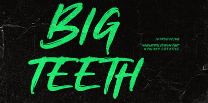 Bigteeth is a horror vibes handwritten font. With slanted medium rough brush stroke, fun character. To give you an extra creative work. Bigteeth font support multilingual more than 100+ language. This font is good for logo design, Social media, Movie Titles, Books Titles, a short text even a long text letter and good for your secondary text font with sans or serif. Make a stunning work with Bigteeth font. Cheers, Maulana Creative
 - Better at Class by Gassstype,
$23.00 Introducing Better at class – Brush Script is a Authentic brush script that is written casually and quickly. Letters are made with procreate. Then scanned and carefully drawn into vector format. That is why Better at class has charming, authentic and relaxed characteristic more natural look to your text with a more natural look to your text. You can activate Ligature OpenType panel, Better At class Perfect for designs,branding projects, Logo design, Quotes product packaging
 - Coral Pro by Scholtz Fonts,
$19.95 Coral Pro is a relaxed and very readable script font. Based on the earlier Coral script. It has been updated, and now has all the features usually included in a fully professional font. Language support includes all European character sets. Coral Pro Black is a bolder script than the original Coral, and has an in-your-face, clear and casual look. It's great used for anything from "schoolgirl diaries" to fashion media.
 - Sinyor Yebri by Maulana Creative,
$13.00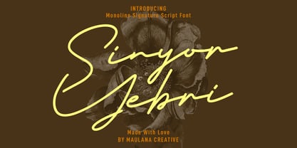 Sinyor Yebri is a modern signature script font. With consist regular mono-line stroke, fun character. To give you an extra creative work. Sinyor Yebri font support multilingual more than 100+ language. This font is good for logo design, Social media, Movie Titles, Books Titles, a short text even a long text letter and good for your secondary text font with sans or serif. Make a stunning work with Sinyor Yebri font. Cheers, Maulana Creative
 - Calipers by Gassstype,
$27.00 Here comes our new font CALIPERS this is a All Caps Display Font that is written casually and quickly.Signature Style and classy style. This font are handmade with brushes on Procreate. Then crafted carefully drawn into vector format.this font is great for your creative projects such as watermark on photography, and perfect for logos & branding, photography, invitation, watermark,advertisements,product designs, stationery, wedding designs,label ,product packaging, special events or anything that need handwritting taste.
 - Noble Jungle by Olivetype,
$18.00 Noble Jungle is an urban-style hand brush font, with a unique brush texture. It is the best choice for creating eye-catching logos, branding, headlines, apparels, and quotes. The font Noble Jungle contains 204 glyphs. Supporting more than 66 languages, from English to Zulu. It is also PUA encoded, multilingual, and has open-type features such as ligatures. Noble Jungle is cool, casual, and carefree.. Handcrafted with passion and love for your awesome projects.
 - Chrymez Font by Maulana Creative,
$11.00 Chrymez is a modern sans serif display font. With Bold stroke, fun character with adding alternates "O". To give you an extra creative work. Chrymez font support multilingual more than 100+ language. This font is good for logo design, Social media, Movie Titles, Books Titles, a short text even a long text letter and good for your secondary text font with signature script typeface. Make a stunning work with Chrymez font. Cheers, MaulanaCreative
 - Cogney by Maulana Creative,
$13.00 Cogney is an all caps modern sans serif font. With sharp bold stroke, fun character. To give you an extra creative work. Cogney font support multilingual more than 100+ language. This font is good for logo design, Social media, Movie Titles, Books Titles, a short text even a long text letter and good for your secondary text font with sans or serif. Make a stunning work with Cogney font. Cheers, Maulana Creative
 - Knocky by Jehoo Creative,
$23.00 Knocky is a display typeface that is complete and versatile with a bold round condensed look with unique flexibility. We've added solid alternatives to letters, numbers, and some symbols, plus an outline style that will make the graphic look unique and stand out. With 8 styles and more than 530 glyphs in each. knocky has multi-language support, it will be perfect for many projects from editorial design to branding, advertising, publicity and digital.
 - Noobys Display by Maulana Creative,
$14.00 Noobys is a fun decorative display font with natural hand drawn, clean stroke, uprights and fun character. To give you an extra creative work. Noobys font support multilingual more than 100+ language. This font is good for logo design, Social media, Movie Titles, Books Titles, a short text even a long text letter and good for your secondary text font with sans or serif. Make a stunning work with Noobys font. Cheers, MaulanaCreative
 - Polyfonics by Maulana Creative,
$12.00 Polyfonics is a natural hand drawn decorative display font, with fill and hollow stroke, uprights and fun character. To give you an extra creative work. Polyfonics font support multilingual more than 100+ language. This font is good for logo design, Social media, Movie Titles, Books Titles, a short text even a long text letter and good for your secondary text font with sans or serif. Make a stunning work with Polyfonics font. Cheers, MaulanaCreative
 - Barchowsky Fluent Hand by Swansbury,
$24.00Swansbury, Inc. provides handwriting instruction to all ages, accompanied by two exemplar fonts, Barchowsky Fluent Hand.otf and Barchowsky Dot.otf. The basis for the design of the characters is the italic of the Renaissance. With the advantage of contextual alternates, Barchowsky Fluent Hand automatically joins lowercase letters so it can be used in any venue where a clean and elegant appearance of handwriting is desired. The fonts allow maximum instructional flexibility. Aside from their use in lesson plans, educators can customize pages for specific student interests, studies and needs. Included are all math symbols that one typically encounters in school curricula. Nan Jay Barchowsky, designer of this font, believes that children should hone their handwriting skills as they learn all subjects, reading, math, history and foreign languages. Both fonts support all Western European languages and Turkish. Barchowsky Dot is for young children or others who need remediation. The letterforms are identical to those in Barchowsky Fluent Hand. Used at a large point size open dots appear within the lines that form the characters indicating where one should start each stroke in a letter or number. Once formations are learned Barchowsky Fluent Hand can be used with the contextual alternates turned off until students are ready to write in the joined-up manner of a true cursive. Specifications: The technology for fonts that automatically join letters, or allow them to be unjoined is relatively new. At present, both fonts work on Windows XP with Service Pack 1 or later (or Vista), using AbiWord, a free word processor (go to abisource.com). They also work well with InDesign 2. Currently there is an unknown factor in later versions of InDesign for Windows that disallows joining. Macs completely support the fonts using InDesign 2 and later, PhotoshopCS and IllustratorCS. If you do not have these applications, there is an inexpensive word processor for Macs. - Barchowsky Dot by Swansbury,
$17.00Swansbury, Inc. provides handwriting instruction to all ages, accompanied by two exemplar fonts, Barchowsky Fluent Hand.otf and Barchowsky Dot.otf. The basis for the design of the characters is the italic of the Renaissance. With the advantage of contextual alternates, Barchowsky Fluent Hand automatically joins lowercase letters so it can be used in any venue where a clean and elegant appearance of handwriting is desired. The fonts allow maximum instructional flexibility. Aside from their use in lesson plans, educators can customize pages for specific student interests, studies and needs. Included are all math symbols that one typically encounters in school curricula. Nan Jay Barchowsky, designer of this font, believes that children should hone their handwriting skills as they learn all subjects, reading, math, history and foreign languages. Both fonts support all Western European languages and Turkish. Barchowsky Dot is for young children or others who need remediation. The letterforms are identical to those in Barchowsky Fluent Hand. Used at a large point size open dots appear within the lines that form the characters indicating where one should start each stroke in a letter or number. Once formations are learned Barchowsky Fluent Hand can be used with the contextual alternates turned off until students are ready to write in the joined-up manner of a true cursive. Specifications: The technology for fonts that automatically join letters, or allow them to be unjoined is relatively new. At present, both fonts work on Windows XP with Service Pack 1 or later (or Vista), using AbiWord, a free word processor (go to abisource.com). They also work well with InDesign 2. Currently there is an unknown factor in later versions of InDesign for Windows that disallows joining. Macs completely support the fonts using InDesign 2 and later, PhotoshopCS and IllustratorCS. If you do not have these applications, there is an inexpensive word processor for Macs. - Bellissima Script Pro by Sudtipos,
$79.00 While in the same vein and spirit as Burgues and Compendium, Bellissima began from an entirely different thread from those fonts. It started with Alex Trochut generously showing me a gorgeous lettering book from his grandfather’s library: Bellezas de la Caligrafía, by Ramón Stirling, 1844. Stirling was one of the Latin calligraphy pioneers who introduced a refined version of English calligraphy in Spain and made it popular in the nineteenth century. Some scans from that book served as initial basis for the caps in my Poem Script. But it was always in the back of my mind that I should do a copperplate, and the Stirling model was the perfect source. My intention was to veer away from Stirling’s exuberant ornamentation, and work within simplified forms of his ideas. As it usually is with most of my projects, Bellissima became its own bird and shaped its own flying patterns. Suddenly there were many ligatures, multiple endings and swashed connections, hundreds of alternates for both uppercase and lowercase. Bellissima has an effusive energy that appeals much beyond its sourcing. It’s intended for these modern times of appreciation for old crafty things like stationery and letterpress, where its origins help it shine brightly. Bellissima Script Pro is a complete font with almost 2000 characters full of alternates, swashes, ligatures & ornaments covering a wide palette of latin languages and Bellissima Script Redux is a random sample of glyphs totally usable with a reduced price.
 - Delagio Script by Mans Greback,
$59.00 Delagio Script is a calligraphic font that combines cursive elegance with a funky, innovative edge. This retro-inspired font is both creative and heavy, making it perfect for designs that require a unique and playful touch. Delagio Script is ideal for projects that seek to convey a sense of fun, humor, and originality. The creation of Delagio Script traces back to a lucky discovery of a vintage magicians' promotional posters. The unique blend of whimsy and elegance in Delagio's lettering were captivating enough to form the base of a typeface that embodied the distinctive charm of entertaining calligraphy strokes. Thus, Delagio Script was born, encapsulating the spirit of serendipity and the magic of a forgotten world. Use underscores _ to make swashes under words. Example: Magician_ The Delagio Script font family features four styles that cater to a wide range of design needs: Thin, Regular, Bold, and their respective Italics. These distinct options allow you to create eye-catching compositions that capture the essence of innovation while remaining rooted in vintage aesthetics. Equipped with advanced OpenType functionality, Delagio Script ensures top-notch quality and provides you with full control and customizability. The font includes stylistic alternates, ligatures, and other features to make your designs truly unique and engaging. Offering extensive lingual support, Delagio Script covers all Latin-based languages, from Northern Europe to South Africa, from America to South-East Asia, and includes all the characters and symbols required for your creative projects, such as punctuation and numbers.
 - AJ Quadrata by Adam Jagosz,
$25.00 Once, Blackletter was a calligraphy style. Full of ligatures, with letters bumping into each other to create an unapologetic picket-fence pattern. Some even claimed that the regularity improved legibility! But then Blackletter was cast into metal, and only a handful of established ligatures survived, while most interletter connections were disentangled. Everyone since followed suit, and hundreds of years later, digital Blackletter fonts were modelled mostly on the metal fonts that prevailed rather than the original handwriting. Up until now! AJ Quadrata is an authentic revival of the textura quadrata hand, and its major inspiration is a 15th-century Latin manuscript of the Bible from Zwolle, the Netherlands. The typeface is delivered in two flavors. The default cut is a modern take on textura quadrata that can be useful for today and tomorrow. The standard ligatures feature employs nearly all letters. The tittle of i retains its original, hasty squiggle form (except for the Turkish localization). Discretionary ligatures include medieval ligatures da, de, do, pa, pe, po (and their mixed-case counterparts!). Stylistic sets allow to use historic letter variants such as long s and rotunda r, closed-counter a, and alternate capitals. AJ Quadrata Medieval is perfect for setting Latin. Default forms of capital F, H and O are swapped with the alternates. The squiggles above i only appear for disamibiguation nearby m, n or u, as in original manuscripts. Discretionary ligatures and historic variants are promoted to the standard ligatures feature to make room in the discretionary ligatures feature for a variety of scribal abbreviations. Dedicated stylistic sets include medieval punctuation and justification alternates — glyphs with elongated terminals used for lengthening lines that end up too short. The Rubrum styles can be layered and colored to create the illuminated effect on the capital letters. Besides a faithful rendition of extended Latin including Vietnamese, numerous synthetic additions are included: polytonic Greek, Armenian, and Cyrillic (with Bulgarian and Serbian/Macedonian localizations). Both flavors of the typeface can be considered a starting point that can be further customized using OpenType features, including Stylistic Sets (some features differ between AJ Quadrata and AJ Quadrata Medieval): ss01 Alt E ss02 Descending F / Roman F ss03 Uncial H / Roman H ss04 Angular O / Round O ss05 Contextual closed-counter a ss06 Diamond-dot i j / Always dotted i, j ss07 Contextual rotunda r / No r rotunda ss08 Contextual long s / No long s ss09 Dotless y ss10 Serbian Cyrillic ss11 Alt Cyrillic de ss12 Alt Cyrillic zhe ss13 Alt Cyrillic sha ss14-ss17 [reserved for future use] ss18 Scribal punctuation ss19 Alt linking hyphen ss20 Justification alternates
 - Lamia by Atelier laia,
$50.00 The Lamia font is inspired by the work of the most famous calligrapher of the Basque Country, Jose Francisco de Iturzaeta Eizaguirre (Getaria1788-Madrid 1853). His writing method was compulsory in Spanish schools since 1835. His "unpolished Spanish font" tried to be more effective than the more commercial English version by avoiding embellishments and excessive rear tearing. More akin with the liberal values imported by the French, his offerings sought uniformity, speed and efficiency to ensure that those in the less-favored echelons of society had an effective communication tool. From his "general collection of characters of European Letters" published in Madrid in 1833, we have chosen the "lower case pancilla reformed" represented in one of the prints. We have tried to reinterpret it by keeping its essence but also ensuring that it is viable for potential contemporary uses which, thanks to its good readability and effectiveness in longer texts, basically means as a decorative or display font. The upper case was generated using the lower case as a reference.
 - Silk Script by Canada Type,
$29.95Silk Script is a revival and elaborate expansion of a 1956 Helmut Matheis script called Primadonna, which strangely remained a metal face and never made the leap into the film age. Silk Script has the unmistakable high contrast and elegance of formal scripts, yet both its majuscules and minuscules show much more complex and visually appealing art than traditional copperplate or Spencerian calligraphy. When set properly, it adds just the needed extra touch of artistic flair to designs that are not visually satisfying with the usual high-contrast elegant scripts. Silk Script comes in two styles, with the Alt font containing form variations on almost every letter, allowing for flexibility and precision in choice typesetting. Plenty of more alternates are available throughout the character sets of both fonts. Both styles also boast expanded character sets that include support for Central and Eastern European languages, as well as Baltic, Celtic, Esperanto, Maltese and Turkish. Silk Script Pro unifies both styles in one font, for 550 characters of sheer elegance and handy OpenType features including stylistic alternates, discretionary ligatures and class-based kerning. - Always by Scholtz Fonts,
$19.00 Always is an elegant script font in six styles. Always makes full use of extravagant ascenders and descenders, giving the font a generous, opulent appearance. To use the font to its best advantage, we suggest that the user allows a generous line spacing. (For example: use multiple line spacing of no less than 1.3 when using the MS Word application). Always comes in six styles, condensed light, light, condensed regular, regular, black and fat, giving the user enough variety for all possible uses. Use a combination of styles for product branding, book covers, greeting cards, wedding media, women’s advertising media. The Always combination will enable you to use different styles of the same font for headings, sub-headings and body text. Always makes use of OpenType features and includes a number of automatic and discretionary ligatures, giving the font a varied, handwritten effect. Always contains over 283 characters - (upper and lower case characters, punctuation, numerals, symbols and accented characters are present) as well as characters for ligatures and alternate characters. It has all the accented characters used in the major European languages.
 - HWT Roman Extended Fatface by Hamilton Wood Type Collection,
$24.95 The design of the first "Fat Face" is credited to Robert Thorne just after 1800 in England. It is considered to be the first type style designed specifically for display or jobbing, rather than for book work. The first instance of Fat Face in wood type is found in the first wood type specimen book ever produced: Darius Wells, Letter Cutter 1828. This style was produced by all early wood type manufacturers. The style is derived from the high contrast, thick and thin Modern style of Bodoni and Didot developed only decades previously. The extended variation makes the face even more of a display type and not at all suitable for text. This type of display type was used to compete with the new Lithographic process which allowed for the development of the poster as an artform unto itself. This new digitization by Jim Lyles most closely follows the Wm Page cut. The crisp outlines hold up at the largest point sizes you can imagine. This font contains a full CE character set.
 - Sol Pro by Canada Type,
$29.95 Based on the classic Sol design by Marty Goldstein and C.B. Smith, published by VGC in 1973, Sol Pro goes above and beyond the call of revival/retooling to include plenty of optical improvements to the original design, more weights, italics, small caps, biform shapes, alternates, and extended language support. This particular design is one of the more prominent forefathers and strong influencers of the soft, streamlined aesthetic that has been going strong in branding and geometric design for more than 40 years now. It cuts all links to melancholy and classic empire shapes, and introduces smooth contrast modulation that communicates sleek, adaptable youth, confidence, knowledge, and modern hi-tech presence. This is not your grandfather's Eurostile. This is your offspring's global hope, optimism, and total awareness. Sol Pro's extended character set and range of weights and widths makes it quite suitable for applications of all sizes, from small collateral to product branding and massive marketing campaigns. The Sol Pro complete family comes in 20 fonts, each containing over 520 characters. Available in single fonts or value-maximizing packages.
 - Dream Big by Positype,
$15.00 Ever sit up late at night and dream in letters—big, expressive, swash letters. Dream Big carries those grandiose thoughts and captures them as natural brush lettering on paper. Nothing manufactured here… each letter is derived from Summerour’s own hand and translated to this typeface—lofty, expressive, and joyful. Each typeface comes with an additional set of stylistic alternates (upper AND lowercase) that harmonize wonderfully when you have the Opentype Ligature feature active. Additionally, special double-letter ligatures have been produced for specific combinations in need of more expressive flair, as well as a few swashes that work with the economical strokes originally produced from the sumi brush. Rather than limit the personality of this script, various styles have been produced to complement the original Regular—a Wide and Narrow cut are included in hopes of helping you find the perfect variation needed for your composition. Dream Big is the fourth release of the Positype Relaxed Script Collection of typefaces—all focused on fluid, effortless script fonts for simple use.
 - Hexa by Hexa,
$19.00 The font HEXA is inspired by the Hexagon. The HEXA fonts are dynamically and uniquely designed typefaces based on the grid systems of the hexagon that extends infinitely. From this image, we have created the HEXA font. Hexa is Latin-based and a completely crafted font that consists of 3 typefaces. Each typeface contains 190 sets of characters. This font family is in all-caps fonts, and we provide different styles of uppercase and lowercase glyphs with the exception of letters c, ç, and comma/ single low-9 quotation mark. In lowercase glyphs, we emphasize the image, character, and identities of Hexa. The font family includes regular, black, and thin. We created the witty expression with Hexa’s regular identity; thin emphasizes the lines; black fills in the blanks. Hexa is a monospaced fonts. So kerning is not applied. We recommend using our fonts for big-sized uses. This typeface is a display font and looks more attractive in larger formats than on main texts. Features: -190 characters -Monospaced fonts -All-caps fonts (different styles provide uppercase and lowercase)
 - #NAME? by OtherwhereCollective,
$29.00 -OC Format Sans is the third incarnation of this geometric grotesk sans serif which fuses the style of Futura with the rhythm and proportions of Akzidenz. It comes in two styles, standard and a new Print family where crisp sharp edges have been made blunt in reference to the ink spread that occurs when printing on uncoated paper stock. It can give digital media a softer more approachable analog aesthetic. Typical of both grotesk and geometric styles the design has an even weight with minimal stroke contrast and the slanted form is an oblique rather than a true italic. The default double-story �a� and �g� give an academic touch, the single story versions of Set 1 are more friendly and approachable while Set 2 changes the look into something more scientific. Made with tireless attention to detail and kerning it's perfect for logotypes and extensive text, supports multiple languages and comes with a plethora of OpenType features including standard and discretionary ligatures, social icons, symbols, and multiple figure styles including roman numerals.
 - Mosquito by Monotype,
$29.99Éric de Berranger likes to multitask, and often works on two typeface families at once. Such was the case with Mosquito, a jaunty sans that was developed at the same time he was creating the more traditional Maxime. Mosquito represented a sort of recreation," says de Berranger. "When I grew tired of working on one design I could work on the other and then come back to the first, full of courage and desire!" Mosquito is built from simple, straightforward shapes, but its distinctive stroke terminals and slight oblique weight stress distinguish the design from more conventional sans serif faces. The relatively large x-height and open counters add to the legibility of the design. The capitals are straightforward (with just a hint of Peignot), while the lowercase has a softer, more inviting demeanor. "I drew Mosquito with the hope that it would be pleasant to look at and to read," says de Berranger. "I think the end result is almost feminine." Mosquito comes in three weights, with complementary italic designs and a suite of small caps, old style figures and alternate characters." - Axios Pro by TipoType,
$24.00 In Axios Pro the rational language of the early XX century geometric sanserifs is complemented with an structure deeply attached to the renaissance typefaces; the uppercase proportions proceed form the roman canon while its lowercase was constructed following the humanist ductus. This blend produce a typeface of modern, clean and contemporary appearance that has implicit on its core a classic vibe, nourishing the text with a timeless elegance.In use, the form and function balance of its design allow it freely travel through a diverse range of fields and possibilities like short text settings, brands, headlines or signage systems with grace and naturality. Axios Pro is available in variable font format and in 20 different individual styles (10 weights), with a set of more than 1000 glyphs per style, supports over 200 latin languages and including an extensive repertoire of opentype features like small caps, ligatures, stylistic alternates, proportional and tabular figures, swashes, borders and many other resources to please your typographic urges. Designed by Rodrigo López Fuentes & Sergio Leiva Whittle
 - Iridium by Linotype,
$29.99Iridium™ was designed by Adrian Frutiger in 1972 for Linotype. It is in the modern" style like Bodoni or Didot, in that it has the sparkle created by a high thick/thin contrast and a symmetrical distribution of weight. But the sometimes harsh and rigid texture of the modern style is tempered by Frutiger's graceful interpretation. Iridium itself is a very hard, brittle and strong metal; yet the Latin and Greek roots of the word mean rainbow, or iridescence. And indeed, this font is infused with a more lustrous and complex spirit than the average rather stark modern typeface - note the stems that gently taper from waist to serif, the nicely curved ovals of the round characters, and the slight bracketing of the serifs. Iridium was originally designed for phototypesetting, and Frutiger himself cut the final master photo-mask films by hand. This digital version has all the craftsmanship of that original and includes the roman, a true italic, and the bold weight. Iridium works particularly well for book and magazine text and headlines." - Backstroke by Eclectotype,
$50.00 Normal and upright italic script fonts line a well-trodden path; left-leaning fonts (or "rightalics" as they're confusingly called), on the other hand, are a rarity. Here at Eclectotype Fonts we don't like to do things too conventionally, so here's Backstroke, a laid back script with a unique voice. With contextual alternates for start and end forms of certain characters, swash versions of L, Q and Z (surely the most used initial caps!), and a handful of stylistic sets, Backstroke is a restrained script. Stylistic sets are: 1. the start forms of i, j, m, n, and p are used always instead of only at word starts. 2. lower case ascenders get a whole lot loopier. 3. alternate versions of G, N and Y. 4. swash L, Q and Z. 5. swaps the default Polish script lslash for a more familiar version While fonts that lean the wrong way may be a bit more difficult to fit into your layouts than boring old regular italics, they will reward you with their individuality. Why not give it a go?
 - Absalon by Michael Nordstrom Kjaer,
$39.00 Absalon has square letter shapes. It has some characteristics semi-sharp and semi-rounded corners and it has a relatively tall x-height for legible text. To create the perfect typesetting the spaces between individual letter forms has been precisely adjusted. The Absalon font family is perfect for the web as well as for print, for display as well as longer text, for motion graphics, on the side of a van, t-shirts, logotypes and so on. The font family consist of 5 weights or 10 styles and it has 410 glyphs. A total of more than 4000 glyphs. The styles are: Light, Light Italic, Regular, Italic, Medium, Medium Italic, Bold, Bold Italic, Extra Bold & Extra Bold Italic. It has OpenType features such as automatic fractions, subscript, superscript, numerators, denomerators, ordinals and the “f” ligature set. Absalon has extended language support (most Latin-based scripts are supported). The name of the font family is Absalon and it is a reference to a Danish bishop in the middle ages. He was a key figure in the founding of Copenhagen, the Capital of Denmark.
 - Billion Miracles by Din Studio,
$29.00 Want to transport your audience to a world of gorgeous, elegant, versatile, yet modern? Looking for a font that makes your projects to spark happiness? Then, you go to the right path. Introducing Billion Miracles- A Monoline Signature Font A modern and stylish handcrafted signature font that’ll make your audience swoon and enhance your projects. Every stroke and curve was created to capture the essence of modernity and style. This gorgeous and stylish font can be used for a host of different content needs and projects. Ideal for social media posts and ads, printed quotes, t-shirt designs, packaging, or even as a modern text overlay to any background image. Billion Miracle includes Multilingual Options to make your branding globally acceptable. Features: Standard Ligatures Stylistic Sets Multilingual Support (84 languages) PUA Encoded Numerals and Punctuation Thank you for downloading premium fonts from Din Studio
 - Debugger by Dharma Type,
$9.99 Debugger is a futuristic, sicentific, digital family of next-generation monospaced fonts for developing, programming, coding, and table layout. Some desirable features in monospaced fonts are listed below. 1.Easy to distinguish 2.Easy to identify 3.Easy to read Debugger has very distinguishing letterforms for confusable letters such as Zero&Oh, One&I, and Two&Z. A lot of ingenuity makes this family very distinguishable. Italics have somewhat large inclination angle to be distinguished from their Roman. For the same reason, Italics are slightly lighter than Romans. Italic is not cursive Italic. It is near the slanted Roman. This is an intentional design to identify Italic letters. Cursive is not suitable for programming font. Octagonal and diagonal letterform is good for sci-fi, digital projects. Common elements for each letterform makes harmony and a sense of unity. Debugger supports almost all Latin languages. Try this all-new experiment.
 - VVE Giallo by vve.type,
$39.99 VVE Giallo brings simplicity, elegance and a certain warmth wherever a contemporary geometric typeface is needed. The balanced characteristics, clear and legible silhouette and simultaneously vivid appearance of VVE Giallo makes it perfect for any needs. VVE Giallo’s characteristic high x-height does not only give perfect legibility but also perfect matching for strong headlines, outstanding logos and also for long texts. By keeping the “o” and “a” perfect circles gives VVE Giallo the minimalist and modernist looking. VVE Giallo has six weights, thin to heavy, give it a full range of expression for branding; in print and on screen. Matching true italics, carefully slanted 10º, are perfectly designed one by one. The family totally consists of 16 styles. lt supports many OpenType features, such as tabular numerals, inferiors & superiors, numerators & denominators, fractions, discretionary ligatures, arrows and etc. It combined more than 500 glyphs.
 - HS Alhuda by Hiba Studio,
$50.00 HS Alhuda is a display typeface. It can be used for titles and graphic projects, which support Arabic, Persian Urdu and Kurdish. It has been created based on modern kufi style. It enjoys flexibility between sharp and curved lines in the structure of characters. This supports with a beautiful appearance and wonderful geometric structure. The sharp endings in the bottom of character also give an aesthetic addition to the character. (8) Weights has been created for this typeface between the heariline weight and heavy weight. Besides, those six additional weights which can be used in headline, has baseline parts are more thicker than the vertical parts. One has a regular form and the others has a stencil form in the middle using various styles. This typeface with its diversity of (14) weights is intended to be an attempt for a good addition to Arabic typography.
 - VLNL Jelly Donuts by VetteLetters,
$30.00 VLNL Jelly Donuts’ Jelly Donuts is the round sibling of VLNL Donuts. Equally funky, just round. Like its counterpart Jelly Donuts is heavily infused by hip 1970s geometric fonts like Blippo, Pump and ITC Bauhaus. It nonetheless has both feet in this modern day and age. Meticulously designed and tightly spaced, VLNL Jelly Donuts is very suitable for logos, headlines and music artwork. We especially recommend using it on big 12" album covers. VLNL Jelly Donuts is deep fried, filled with cream, custard or jam, and ometimes glazed or covered in a variety of sweetness: sprinkles, cinnamon, coconut, chopped peanuts, powdered sugar or maple syrup. As a very sweet and saturated snack should, VLNL Jelly Donuts is fitted with a full set of alternate swoosh caps that can be deployed to liven up your already ‘out there’ designs. You can’t get any more funky than this.
 - Linotype Gianotten by Linotype,
$29.99 It took the Italian designer Antonio Pace more than five years to create Linotype Gianotten™, a successful new interpretation of the classic Bodoni types. To re-draw the 200-year-old characters for the world of modern digital technology, Pace studied Giambattista Bodoni's original punches at the Bodoni Museum in Parma. He felt that previous Bodoni interpretations were not well suited for body texts, so he focused his study of Bodoni's "Manuale Typografico" on the types made specifically for text sizes. Consequently, his Bodoni has strong hairlines, rounded transitions and shorter, fluted serifs - elements that help to achieve readability by providing an overall tranquil effect. This contemporary, highly readable family is an excellent choice for text settings in books, newspapers, and magazines. Incidentally, the name Gianotten has nothing to do with Bodoni, but was chosen by Pace and Linotype to honor Dutch typographer, Henk W. J. Gianotten."