10,000 search results
(0.095 seconds)
- Full English by Hanoded,
$15.00 I have always been fascinated by the ‘Full English Breakfast’. A Full English usually consists of toast, baked beans, sausages, fried eggs, fried tomatoes, fried mushrooms and sometimes blackpudding (a kind of sausage made from pig’s blood). When I lived in England, my friends were always quite happy to stow away a big full breakfast, but I, on the other hand, could not really set myself to eating one. Full English is a hand made stencil font. If you own a pub and you serve breakfast, you could use it for your signs, but I guess this font looks good on anything that needs a bit of attention. For attention, it will get!
 - Angombe by Twinletter,
$15.00 Angombe is a graffiti font that we created by stressing harmony in each letter to create a decent and unique combination of phrases. When you apply this typeface, your project will look to be more appealing, high-quality, classy, and exquisite. Assume that everyone who views your project is astonished and enthralled and that your objectives are readily met. This graffiti font is great for product logos, poster titles, headlines, packaging, film titles, logotypes, gorgeous writing, and trendy graffiti designs, among other things. Of course, if you utilize this font in your numerous creative projects, they will be perfect and outstanding. Use this typeface right away for your one-of-a-kind and remarkable projects.
 - Clara Sans by Signature Type Foundry,
$38.00 Clara is a set of alphabets of interconnected serif and sans serif fonts. The connection is not only in the intensity of the strokes, i.e. in the identical brightness of the typesetting, but also in the drawing principles of both alphabets. The typeface aims to offer a sense of calmness for a reader even in smaller scales of the typesetting. In large scales it builds on the purity of the image without additional decorations. The Clara system includes maximum equipment of a Latin font from Thin to Black in all versions of marking fonts, italics, capital letters and four kinds of numbers. The typeface allows typesetting of the vast majority of cultural languages of the world.
 - Roundkind by Letterhend,
$17.00 Round Kind is a vintage display typeface with the touch of nostalgic feel yet still looks luxury in a modern design concept. This typeface has unique looks and strong character with illustration pack as bonus. This font perfectly made to be applied especially in logo, and the other various formal forms such as invitations, labels, magazines, books, greeting / wedding cards, packaging, fashion, make up, stationery, novels, labels or any type of advertising purpose. Features : Uppercase & lowercase (alternates) Numbers and punctuation Stylistic alternates multilingual PUA encoded Illustration pack in vector We highly recommend using a program that supports OpenType features and Glyphs panels like many of Adobe apps and Corel Draw, so you can see and access all Glyph variations.
 - Zebrawood by Adobe,
$29.00Zebrawood font is a joint work of the typeface designers K.B. Chansler, C. Crossgrove and C. Twombly, who also designed Rosewood, Ponderose and Pepperwood together. Like its relatives, Zebrawood also displays a kind of Wild West character. Its style can be traced back to the Toscanienne typefaces which appeared in advertisements and on signs at the end of the 19th century. Typical of this capital alphabet are the split serifs and robust base forms, which emphasize the typeface's decorative character. Zebrawood is, like Rosewood and Schwennel, meant as a bicolor font, meaning that the weight Zebrawood fill complements the inner spaces of Zebrawood regular. When used carefully in headlines, Zebrawood font will be sure to attract attention. - Areon Flux by DePlictis Types,
$33.00 The future is right here, today, and Areon Flux comes to point that out. It’s a font family consisting in three weights that makes it a notable choice for designers that have to do with techy, futuristic layouts or printing materials. The lettering design appeal as sharp, powerful, distinctive and kind of modular, remembering the upcoming space exploration opportunities that are ready to enlarge our horizons in the next years. Areon Flux family is designed and published in late ‘20/ early ’21 and has an established discount for more that 30% for all the weights buyed together that makes it a versatile fresh and modern display not to be missed by edgy designers.
 - Menor by Twinletter,
$15.00 Menor is a graffiti font with a distinctive and appealing abstract shape that has a unique shape in each character, making this font appropriate for your outstanding project. This font also contains an alternation of enormous letters to beautify your project, so don’t wait. Use this typeface once more to create a lovely and stylish project. This graffiti font is great for product logos, poster titles, headlines, packaging, film titles, logotypes, gorgeous writing, and trendy graffiti designs, among other things. Of course, if you utilize this font in your numerous creative projects, they will be perfect and outstanding. Use this typeface right away for your one-of-a-kind and remarkable projects.
 - Printers Lot JNL by Jeff Levine,
$29.00 Printers Lot JNL is another eclectic mix of cartoons, ornaments, catch words, decorations and embellishments re-drawn from vintage source material used in the days of letterpress printing. For those who like to assemble their own larger borders, a set of elements is on the 2-9 keystrokes, but it must be noted that some manual adjustment is necessary to line up all of the parts in a complete border pattern. From a Happy New Year greeting to whimsical cartoon characters; from singular ornamental design elements to beautiful brackets, this mix of subjects is a great overview of the kinds of cuts found in printers' job case drawers in years gone by.
 - Marhaban Ramadhan by Omotu,
$18.00 Marhaban Ramadhan is an arabic style font. Comes with arabic character letters look. This font very usable for designing all kind of graphics design related to Islamic Contents. Marhaban Ramadhan font is suitable for branding, logotype, apparel, T-shirt, Hoodie, product packaging, quotes, flyer, poster, book cover, advertising, etc. Whats Include? 01. Opentype support 02. Multilingual support 03. PUA encoded 04. Features: uppercase, lowercase, numeral, punctuation, multilanguage, alternates, stylist set, and ligatures. 05. Accessible in the Adobe Illustrator Glyphs panel, or under Stylistic 06. Alternates in the Adobe Photoshop OpenType menu, Adobe InDesign, Corel Draw, even work on Microsoft Word Please message me if you’re unsure of any language support. Thanks for looking, and I hope you enjoy it!
 - Holgada by Graviton,
$24.00 Holgada font family has been designed for Graviton Font Foundry by Pablo Balcells in 2020. It is a geometric sans serif typeface with refined rounded endings that provide a soft and friendly appearance. Its generic shapes make it suitable for any kind of project, text length and size. Thanks to its clear legibility, it can be used in long body texts in very small sizes, in big size headlines and everything in between. The rounded endings not only provide a particular softness when used in body text, but also a distinctive touch when used in display situations such as logos and headlines. Holgada consists of 12 styles, each containing small caps and glyph coverage for several languages.
 - Payu by Twinletter,
$15.00 Payu display font is a unique, intriguing, and quirky typeface that we present to all of you. This font was created to satisfy the demands of beautiful and quick graphics, allowing you to quickly produce attractive and elegant projects. Take a look at the font’s harmony and harmony; your project will shine like a prima donna. This graffiti font is great for product logos, poster titles, headlines, packaging, film titles, logotypes, gorgeous writing, and trendy graffiti designs, among other things. Of course, if you utilize this font in your numerous creative projects, they will be perfect and outstanding. Use this typeface right away for your one-of-a-kind and remarkable projects.
 - Passport MF by Masterfont,
$59.00 Bulk and robust headlines - this font family will make them stand out.
 - Rather Risque by SilverStag,
$14.00 RATHER RISQUÉ is a brand new & creative contrast serif font, my take on a classical serif typeface, with over 165 unique ligatures and alternates for all uppercase and lowercase letters. This serif font was inspired by fashion editorial fonts, I wanted it to be bold but with a contrast thin touches, modern ligatures and unique features. RATHER RISQUÉ serif font comes with over 165 ligatures and alternates, full language support and it will be perfect for any kind of design work. Whether you're making a poster, logo design, full branding or a website, you can use it and get an amazingly creative result. I invite you to check out the preview images, and I hope you will be immersed in my vision for this creative typeface that, I am sure, will work for all kinds of interesting projects you might be working on this year. It also includes full language support, punctuation, numerals and detailed instructions how to use alternate letters most of the apps on your computer, as well as in Canva. If you end up publishing your designs on Instagram, tag me - @silverstagco and I will make sure to showcase your design and work to my audience as well! RATHER RISQUE | A Ligature Serif Font Includes: RATHER RISQUE.otf - Classical Serif Typeface With Modern Alternates & Ligatures 165+ Creative Alternates & Ligatures Numerals & Punctuation Language Support Web Font Kit is included as well Detailed instructions on how to use alternates in most of the apps on your computer and in Canva Happy creating everyone!
 - Whomp by Sudtipos,
$59.00 Whomp takes its inspiration from the work of an American master in sign painting and alphabet manipulation: Alf Becker . In 1932, Becker began designing a series of alphabets to be published in Signs of the Times magazine at the rate of one alphabet per month. Nine years later, 100 of those alphabets were compiled in one book that became an enormous success among sign painters. In the late 1990s and early 2000s, many Alf Becker alphabets were digitized with blurbs that falsely credit an “Alf Becker typeface”. Alf Becker was not really a typeface kind of guy. He was more of a calligrapher and sign painter. His alphabets were either incomplete or full of variations on different letters, and didn't become typefaces until the digital era. This particular Becker alphabet was quite incomplete. In fact, it wasn't a showing of an alphabet, but words on a poster. Alejandro Paul took the challenge of drawing, digitizing, restructuring, and finally building a complete usable typeface from that partial alphabet. He then extended his pleasure by once again playing with the wonderful possibilities of OpenType. Whomp comes with more than 100 alternates, tons of swashy endings and ligatures, all built into the font and accessible through OpenType palettes in programs that support such features. This is the in-your-face kind of font that stands among other Becker-based alphabets as paying most homage to the vision of this great American artist who saw letters as live ever-changing beings. Whomp is right at home when used on packaging, signage, posters, and entertainment related products.
 - ITC Bodoni Seventytwo by ITC,
$29.99Giambattista Bodoni (1740-1813) was called the King of Printers; he was a prolific type designer, a masterful engraver of punches and the most widely admired printer of his time. His books and typefaces were created during the 45 years he was the director of the fine press and publishing house of the Duke of Parma in Italy. He produced the best of what are known as modern" style types, basing them on the finest writing of his time. Modern types represented the ultimate typographic development of the late eighteenth and early nineteenth centuries. They have characteristics quite different from the types that preceded them; such as extreme vertical stress, fine hairlines contrasted by bold main strokes, and very subtle, almost non-existent bracketing of sharply defined hairline serifs. Bodoni saw this style as beautiful and harmonious-the natural result of writing done with a well-cut pen, and the look was fashionable and admired. Other punchcutters, such as the Didot family (1689-1853) in France, and J. E. Walbaum (1768-1839) in Germany made their own versions of the modern faces. Even though some nineteenth century critics turned up their noses and called such types shattering and chilly, today the Bodoni moderns are seen in much the same light as they were in his own time. When used with care, the Bodoni types are both romantic and elegant, with a presence that adds tasteful sparkle to headlines and advertising. ITC Bodoni™ was designed by a team of four Americans, after studying Bodoni's steel punches at the Museo Bodoniana in Parma, Italy. They also referred to specimens from the "Manuale Tipografico," a monumental collection of Bodoni's work published by his widow in 1818. The designers sought to do a revival that reflected the subtleties of Bodoni's actual work. They produced three size-specific versions; ITC Bodoni Six for captions and footnotes, ITC Bodoni Twelve for text settings, and ITC Bodoni Seventytwo - a display design modeled on Bodoni's 72-point Papale design. ITC Bodoni includes regular, bold, italics, Old style Figures, small caps, and italic swash fonts. Sumner Stone created the ornaments based on those found in the "Manuale Tipografico." These lovely dingbats can be used as Bodoni did, to separate sections of text or simply accent a page layout or graphic design." - ITC Bodoni Twelve by ITC,
$29.99Giambattista Bodoni (1740-1813) was called the King of Printers; he was a prolific type designer, a masterful engraver of punches and the most widely admired printer of his time. His books and typefaces were created during the 45 years he was the director of the fine press and publishing house of the Duke of Parma in Italy. He produced the best of what are known as modern" style types, basing them on the finest writing of his time. Modern types represented the ultimate typographic development of the late eighteenth and early nineteenth centuries. They have characteristics quite different from the types that preceded them; such as extreme vertical stress, fine hairlines contrasted by bold main strokes, and very subtle, almost non-existent bracketing of sharply defined hairline serifs. Bodoni saw this style as beautiful and harmonious-the natural result of writing done with a well-cut pen, and the look was fashionable and admired. Other punchcutters, such as the Didot family (1689-1853) in France, and J. E. Walbaum (1768-1839) in Germany made their own versions of the modern faces. Even though some nineteenth century critics turned up their noses and called such types shattering and chilly, today the Bodoni moderns are seen in much the same light as they were in his own time. When used with care, the Bodoni types are both romantic and elegant, with a presence that adds tasteful sparkle to headlines and advertising. ITC Bodoni™ was designed by a team of four Americans, after studying Bodoni's steel punches at the Museo Bodoniana in Parma, Italy. They also referred to specimens from the "Manuale Tipografico," a monumental collection of Bodoni's work published by his widow in 1818. The designers sought to do a revival that reflected the subtleties of Bodoni's actual work. They produced three size-specific versions; ITC Bodoni Six for captions and footnotes, ITC Bodoni Twelve for text settings, and ITC Bodoni Seventytwo - a display design modeled on Bodoni's 72-point Papale design. ITC Bodoni includes regular, bold, italics, Old style Figures, small caps, and italic swash fonts. Sumner Stone created the ornaments based on those found in the "Manuale Tipografico." These lovely dingbats can be used as Bodoni did, to separate sections of text or simply accent a page layout or graphic design." - ITC Bodoni Ornaments by ITC,
$29.99Giambattista Bodoni (1740-1813) was called the King of Printers; he was a prolific type designer, a masterful engraver of punches and the most widely admired printer of his time. His books and typefaces were created during the 45 years he was the director of the fine press and publishing house of the Duke of Parma in Italy. He produced the best of what are known as modern" style types, basing them on the finest writing of his time. Modern types represented the ultimate typographic development of the late eighteenth and early nineteenth centuries. They have characteristics quite different from the types that preceded them; such as extreme vertical stress, fine hairlines contrasted by bold main strokes, and very subtle, almost non-existent bracketing of sharply defined hairline serifs. Bodoni saw this style as beautiful and harmonious-the natural result of writing done with a well-cut pen, and the look was fashionable and admired. Other punchcutters, such as the Didot family (1689-1853) in France, and J. E. Walbaum (1768-1839) in Germany made their own versions of the modern faces. Even though some nineteenth century critics turned up their noses and called such types shattering and chilly, today the Bodoni moderns are seen in much the same light as they were in his own time. When used with care, the Bodoni types are both romantic and elegant, with a presence that adds tasteful sparkle to headlines and advertising. ITC Bodoni™ was designed by a team of four Americans, after studying Bodoni's steel punches at the Museo Bodoniana in Parma, Italy. They also referred to specimens from the "Manuale Tipografico," a monumental collection of Bodoni's work published by his widow in 1818. The designers sought to do a revival that reflected the subtleties of Bodoni's actual work. They produced three size-specific versions; ITC Bodoni Six for captions and footnotes, ITC Bodoni Twelve for text settings, and ITC Bodoni Seventytwo - a display design modeled on Bodoni's 72-point Papale design. ITC Bodoni includes regular, bold, italics, Old style Figures, small caps, and italic swash fonts. Sumner Stone created the ornaments based on those found in the "Manuale Tipografico." These lovely dingbats can be used as Bodoni did, to separate sections of text or simply accent a page layout or graphic design." - ITC Bodoni Brush by ITC,
$29.99Giambattista Bodoni (1740-1813) was called the King of Printers; he was a prolific type designer, a masterful engraver of punches and the most widely admired printer of his time. His books and typefaces were created during the 45 years he was the director of the fine press and publishing house of the Duke of Parma in Italy. He produced the best of what are known as modern" style types, basing them on the finest writing of his time. Modern types represented the ultimate typographic development of the late eighteenth and early nineteenth centuries. They have characteristics quite different from the types that preceded them; such as extreme vertical stress, fine hairlines contrasted by bold main strokes, and very subtle, almost non-existent bracketing of sharply defined hairline serifs. Bodoni saw this style as beautiful and harmonious-the natural result of writing done with a well-cut pen, and the look was fashionable and admired. Other punchcutters, such as the Didot family (1689-1853) in France, and J. E. Walbaum (1768-1839) in Germany made their own versions of the modern faces. Even though some nineteenth century critics turned up their noses and called such types shattering and chilly, today the Bodoni moderns are seen in much the same light as they were in his own time. When used with care, the Bodoni types are both romantic and elegant, with a presence that adds tasteful sparkle to headlines and advertising. ITC Bodoni™ was designed by a team of four Americans, after studying Bodoni's steel punches at the Museo Bodoniana in Parma, Italy. They also referred to specimens from the "Manuale Tipografico," a monumental collection of Bodoni's work published by his widow in 1818. The designers sought to do a revival that reflected the subtleties of Bodoni's actual work. They produced three size-specific versions; ITC Bodoni Six for captions and footnotes, ITC Bodoni Twelve for text settings, and ITC Bodoni Seventytwo - a display design modeled on Bodoni's 72-point Papale design. ITC Bodoni includes regular, bold, italics, Old style Figures, small caps, and italic swash fonts. Sumner Stone created the ornaments based on those found in the "Manuale Tipografico." These lovely dingbats can be used as Bodoni did, to separate sections of text or simply accent a page layout or graphic design." - ITC Bodoni Six by ITC,
$40.99Giambattista Bodoni (1740-1813) was called the King of Printers; he was a prolific type designer, a masterful engraver of punches and the most widely admired printer of his time. His books and typefaces were created during the 45 years he was the director of the fine press and publishing house of the Duke of Parma in Italy. He produced the best of what are known as modern" style types, basing them on the finest writing of his time. Modern types represented the ultimate typographic development of the late eighteenth and early nineteenth centuries. They have characteristics quite different from the types that preceded them; such as extreme vertical stress, fine hairlines contrasted by bold main strokes, and very subtle, almost non-existent bracketing of sharply defined hairline serifs. Bodoni saw this style as beautiful and harmonious-the natural result of writing done with a well-cut pen, and the look was fashionable and admired. Other punchcutters, such as the Didot family (1689-1853) in France, and J. E. Walbaum (1768-1839) in Germany made their own versions of the modern faces. Even though some nineteenth century critics turned up their noses and called such types shattering and chilly, today the Bodoni moderns are seen in much the same light as they were in his own time. When used with care, the Bodoni types are both romantic and elegant, with a presence that adds tasteful sparkle to headlines and advertising. ITC Bodoni™ was designed by a team of four Americans, after studying Bodoni's steel punches at the Museo Bodoniana in Parma, Italy. They also referred to specimens from the "Manuale Tipografico," a monumental collection of Bodoni's work published by his widow in 1818. The designers sought to do a revival that reflected the subtleties of Bodoni's actual work. They produced three size-specific versions; ITC Bodoni Six for captions and footnotes, ITC Bodoni Twelve for text settings, and ITC Bodoni Seventytwo - a display design modeled on Bodoni's 72-point Papale design. ITC Bodoni includes regular, bold, italics, Old style Figures, small caps, and italic swash fonts. Sumner Stone created the ornaments based on those found in the "Manuale Tipografico." These lovely dingbats can be used as Bodoni did, to separate sections of text or simply accent a page layout or graphic design." - The Wickyfest by Colllab Studio,
$14.00 "Hi there, thank you for passing by. Colllab Studio is here. We crafted best collection of typefaces in a variety of styles to keep you covered for any project that comes your way! You want a playful serif font. Something elegant and charming, but still lighthearted , fun and cheerful with a dash of mischief? Introducing The Wickyfest, a playful serif font with a classic tone. If your next project requires a playful touch, you'll love this collection of special characters and features. The Wickyfest style is incredibly well-crafted, resulting in versatile characters that can present a dashing display for your branding designs and ads. For more extravagant projects, try The Wickyfest for children-related graphics, like book covers, movie titles, or posters. Download The Wickyfest Now and make your designs more memorable. String together words that spell out who you are - not just what you do. Sharpen the image of your company or give your online presence a touch of class and charm. Don’t be afraid to let your clients see there’s more to business than just that bottom line. A Million Thanks www.colllabstudio.com
 - Sqwared by Monotype,
$25.00 Sqwared is a square sans serif type family... with flares! This typeface has a retro, hand-painted quality – the slight flaring of its verticals evoke the steady brush of a signwriter. Sqwared benefits from large, open counters and a generous x-height that aids clarity and legibility, while a wide footprint gives these fonts a degree of stature and an air of confidence. Each character was drawn while immersed in a late sixties/early seventies vibe, but there’s no reason why Sqwared can’t be used for your contemporary designs. There are 16 fonts altogether, ranging from Thin to Ultra weights in both roman and italic. It has a Latin character set that covers all Latin European languages. Sqwared will dazzle in headlines, add flair and distinction to your logo designs, bring flamboyance to your branding material, and your body text will most definitely be unique! Variable fonts are included in this family, so you can tune the weight of each font to your exact preference. Key features: 8 weights in Roman and Italic Old Style Figures included Full European character set (Latin only) 440 glyphs per font.
 - Martini at Joe's by steve mehallo,
$19.56 Googie Architecture, also known as "Midcentury Coffee Shop Modern," was born in California during the Atomic Age. Martini at Joe's is based on lettering from several historic Googie sources - many of which no longer exist. The futuristic Martini at Joe's collection was named for Northern California's famous Italian-themed "Joe's" restaurants, some of which are still serving up large portions of charbroiled beef steak, canned buttered veggies and pretty decent martinis. Martini at Joe's contains many fabulous typographic extras – and is available in single font packages or as a 15 font interchangeable Megaset (with "italic-esque" obliques and "retro obliques"). Martini at Joe's is perfect for use as commercial signage, on the menu for your coffee shop, supper club, tiki bar, fish grotto, smorgy, space port or destination casino. It also holds its own in any vintage store, on greeting cards, t-shirts, hi-brow gallery announcements, product skins, your 'zine masthead, on the faceplate of your futuristic microwave oven, tv dinner packaging, at millionaire's conferences or even embellishing the fuselage of your latest jet airline venture. Martini at Joe's: there's no better way to say, "Hold the olive, I'm having a moment."
 - Finest Vintage by Din Studio,
$20.00 Choosing fonts for design projects can be a daunting task because there’s thousands of fonts out there all over the web that you could use. Here it is. A font that can add touch of magic whether you’re looking to create a big, bold logo for your business, work on a poster for an event, or whatever your project may be. Finest Vintage-A Retro Script Font Finest Vintage is a beautiful font, employing the iconic bubble style with strong outlines and fat strokes. This font features thick and angular letters that easy on the eyes and nice to look while it’s also easy to read. It is well suited for making your logos really stand out. The font comes with a range of multilingual glyphs and is one of those bubble fonts styles that’s hard to take your eyes off. Finest Vintage becomes more special with extruding version option. Perfect to create amazing headings, logos, menus, social media graphics, and many more. Our font always includes Multilingual Support to make your branding reach a global audience. Features: Ligatures Stylistic Alternates Swashes PUA Encoded Numerals and Punctuation Thank you for downloading premium fonts from Din Studio
 - Geographica by Three Islands Press,
$29.00 Thomas Jefferys (ca. 1710–1771) was the best-known map maker in 18th-century England, chiefly because he won (and hyped) the title “Geographer to King George III.” Jefferys was really more an engraver/publisher than a geographer, since he mostly relied on the cartographic materials of others. Still, his maps of the North American colonies were well known. Geographica is a legible, four-style serif family modeled after the neat hand-lettered place names and peripheral text on Jefferys’s maps. With its long serifs, tall x-height, and robust curves, Geographica somehow combines classic elegance with a whiff of coastline and sea. The italic styles have the slant and warmth of the hand-drawn source materials. And the typeface comes with a slew of distinctive map-based ornaments—including compass wheels and sailing ships. This evocative serif works well in both display situations and long blocks of text, whether on paper or screen. OpenType features include small capitals, numerous ligatures, and two stylistic sets of titling caps. Geographica offers full support for Central and Eastern European languages—more than 1,200 glyphs in all.
 - Eilis by Agnieszka Ewa Olszewska,
$25.00 Another modern, fun, and experimental display font in my library. Looks like made with a strong gesture. A bit constructive with cursive elements. Contains 2 uppercase sets, and some extra characters. You can play with them and mix them at your will. Contains European languages diacritics and punctuation signs.
 - Boardwalk Avenue by Fenotype,
$30.00 Boardwalk Avenue is an elegant type collection of three styles and two weights of each. It’s divided into Boardwalk Pen, Boardwalk Antiqua and Boardwalk Serif. Boardwalk Avenue’s core is a connected mono linear script that works fantastic when paired with either of the impressive serif styles. All the fonts work great on their own but try putting them all together for a complete display font setup for a project. Here’s a short introduction on what’s included: Boardwalk Avenue Pen is a connected Script. It’s great for headlines, quotes or in packaging. It has a casual hand drawn vibe to it but it’s clean and legible. It’s equipped with automatic Contextual Alternates that keep the connections smooth and versatile. For instance when you type double letter another of them will automatically change to add variation. Or if you type “i” for example, as a first letter after space or after capital letter the code will add starting point to the letter to keep the letterforms more balanced. If you need more ambitious letterforms you can try Swash or Titling Alternates -there’s alternates for every standard letter and seek for even more alternates from the glyph palette. Boardwalk Avenue Antiqua is a high contrast serif with strong character. It’s great for glamorous headlines or as a logotype. Boardwalk Avenue Serif is a low contrast serif with bulky character. It’s great for strong and sturdy headlines or as a logotype.
 - Cybrox JNL by Jeff Levine,
$29.00 Cybrox JNL takes a simple bitmap font and regenerates it into its most distressed form. The design is perfect for "technology-gone-bad" messages, radical headlines and anything with an electronic, techno or digital theme.
 - Getrok by Prioritype,
$19.00 Typeface inspired by the wild style of street graffiti artists. There are two styles, namely regular and extrude. Great for poster design, product packaging, merchandise and so on. Features: Uppercase, Lowercase, Numeral, Punctuation & Multilingual. Thanks.
 - Axeleon Abstract by Sipanji21,
$16.00 Axeleon is great looking with a futuristic, rough, and metal-themed Display font. It will look great in death metal music projects, poster, logo band, band apparel, metal music logo, music album and much more!
 - Future Runes by Greater Albion Typefounders,
$4.50 Future Runes is another in our occasional series of 'retro-science-fiction' based fonts, along with Albia Nova and Cullion. There are design niches for which this piece of fun will be just ideal...Enjoy!
 - Michel by sugargliderz,
$20.00 The design of this typeface was influenced by the typefaces left by Firmin-Didot. There are three weights, and all weights can be used in large font sizes to create a gorgeous and attractive impression.
 - KoreanJeju by Beewest Studio,
$10.00 Korean Jeju Font, is a cool and modern display font and a great companion for your Korean-themed designs. It’s perfect for movie posters, greeting cards, social media content, youtube videos, even logo design, etc.
 - Bomber Squad by Blankids,
$19.00 Introducing of our new product the name is Bomber Squad Graffiti Font inspired by graffiti style with a fun theme very good for graffity poster, Hip Hop music, kids poster, flyer, childrenbook, cartoon, comic etc
 - Horror Story by Vozzy,
$10.00 Introducing a hand crafted label font named Horror Story. All available characters you can see at the screenshot. This font will good viewed on any Halloween theme designs like posters, t-shirts, labels, logos, etc.
 - SK Akropol by Salih Kizilkaya,
$9.99 SK Akropol is a sans serif and condensed font. Designed by Salih Kizilkaya in 2020. There are six different options: Regular, Italic, Medium, Medium Italic, Bold and Bold Italic. Includes 6 fonts and 1122 glyphs.
 - Opportoonity JNL by Jeff Levine,
$29.00Opportoonity JNL is loosely based on lettering from 1940s cartoons. It's the perfect typeface for anything representing fun and carefree situations. There is a slightly limited character set and no kerning on this particular font. - Tacky Song by Bogstav,
$17.00 To be honest - there is nothing tacky about this font! The font has its origins in both comic and graffiti, but can be used in a great variety where something handmade/comic/unusual is needed!
 - C-Nation by URW Type Foundry,
$39.99 Marit Otto about C-Nation: The building typeface. Although the 70ties were very liberating and progressive, still girls played mainly with dolls and sweet things and boys with all kinds of challenging stuff. They did all sorts of basic scientific experiments in mini labs and of course built cool things with Meccano building sets. As a girl I was perfectly happy with the toys I had access to. But at the same time I was very curious about all the adventure toys and discoveries my brother did. It also made me wonder why the grown up people thought that our world could be separated so easily by separating our toys in pink and blue sections. At this day of age Meccano is probably hopelessly old fashioned and far to manual. Children of today are fed by fast images and cool animations on screen, they learn, play, communicate and relax in the same space, the digital space. The special feature of Meccano was that even though it was very basic there was the promise you could create anything. It might even contribute to a logical mind. The typeface I designed refers to the Meccano feel. It is a creative typeface. A bit masculine and bold looking perhaps but after the first impression a subtle and refined female touch is revealed. It has links to architecture and associations with metal constructions like ‘The Eiffel Tower’ and (old railway) bridges. I am convinced that we all think of that as very charming man-made objects.
 - Daybird Script by Letterhend,
$14.00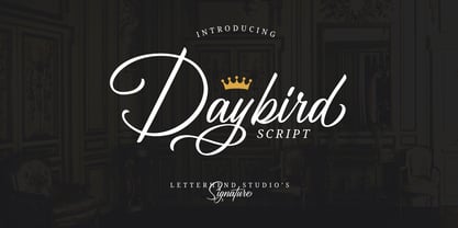 Daybird is an elegant signature that contain lowercase, uppercase, symbol, and also support multi-language. There's a lot of alternates in this font. You can use this font to make a logo for branding, beautiful fashion designs, it's suitable for wedding invitations and authentic signatures. Daybird is also PUA Encoded.
 - Quiron by Pedroglifos,
$12.00 A modern square sans serif that dares to be different. There's a tech-spacey air to Quiron, it will suit all modern display needs. It's low contrast and minimalist nature grants its design an avant-garde look & feel, ready to be part of sophisticated packaging or galactic exploration video game title.