10,000 search results
(0.063 seconds)
- MPI Roman Condensed by mpressInteractive,
$5.00 Roman Condensed is a condensed, classic roman typeface. It has a medium contrast in stroke weight, slightly rounded serifs, and is easy to read. This version is based on a typeface from Showcard Machine Company, which was made specifically to be used with their proof presses.
 - Mixbox by Sabrcreative,
$20.00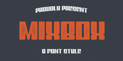 Evoke the spirit of a bygone era in your designs with the enchanting Mixbox Vintage Retro Display Font. This typeface seamlessly merges vintage charm with modern versatility, making it an ideal choice for designers seeking to infuse their projects with a touch of nostalgia and sophistication.
 - Chromium One by ITC,
$29.99Chromium One is the work of British designer David Harris. With their rounded edges and shiny appearance, the characters seem to be made of smooth pieces of chrome joined seamlessly together. The unusual and distinctive Chromium One can be used for a variety of display applications. - Fallaxe Drip Graffiti by Sipanji21,
$13.00 Fallaxe Graffiti is a spectacular, with bold graffiti display font, there are two style font inside, normal style and dripping style. It will elevate a wide range of design projects to the highest level, be it branding, headings, wall art illustration, apparel, labels, and much more!
 - Rollman by Par Défaut,
$9.00 Rollman is a Diplay font family containing 16 Fonts (5 Weight; Left; Right; Straight and Variable), covering many languages using latin and cyrillic alphabet. It's a perfect font for titles. There are also 7 OpenType features (Numerator; Denominator; Fraction; Ordinals; Small Capital; All Access Alternate; Ligature).
 - Galleon by AType,
$19.95When you look at it for the first time, it seems to you that letters are inclined to the right. But it is only an illusion. Why Galleon you ask? I do not know. There is in it something both from the sea and from a wind. - Justin Feryina by Letter Muray,
$16.00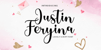 Justin Feryina is a lovely and delicate script font that exudes elegance and class. This font was particularly crafted for those who need a beautiful and refreshing look to their designs. Justin Feryina is PUA encoded which means you can access all glyphs and swashes with ease!
 - Kolkman by Ingrimayne Type,
$8.95 Kolkman is a nondescript, bold, sans-serif typeface. In addition to a standard version, there is a version with shattered letters and another with striped or grayed letters. The shattered and striped versions can be layered on the regular version to get letters with two colors.
 - Grota by Latinotype,
$26.00 Grota is a very expressive font, has a gestural character inspired by the hand lettering . Grota is grotesque, unicase and exceptional. It has six weights ranging from thin to black with their italics. It is ideal for logos, brands, magazines, headlines, books. etc. Photography by Matías Troncoso
 - Valentine's Fleurons by Greater Albion Typefounders,
$3.95 Valentine's Fleurons is a bit of romantic (the emotion, not the era) fun!. Need a few dingbats for that special card you're making for that special person-or for others to give to their special person(s)? You'll find them here in a charming hand-drawn style.
 - II Increments Sans by Increments,
$19.00 Informed by classic grotesk proportions and principles within musical theory, II Increments Sans results in a rhythmic and composed sans-serif. Set within a structured grid, the intonation and harmony between its functional principles and emotive characteristics allow for use at both text and display sizes.
 - Oriental Kaishu by Indian Summer Studio,
$65.00 Classical Oriental brush font Western Latin + Greek + Cyrillic typeface, created using the principles of Chinese traditional Kaishu brush script (Kaisho in Japanese) and Japanese kana. All Caps Fonts There are different oriental styles in this project, first of them was developed in 2005 for orientalist community Oriental.ru.
 - Demillina by AEN Creative Studio,
$12.00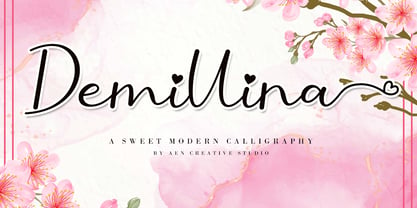 Demillina is a lovely and delicate script font that exudes elegance and class. This font was particularly crafted for those who need a beautiful and refreshing look to their designs. Demillina is PUA encoded which means you can access all of the glyphs and swashes with ease!
 - LGSH Davit by Edik Ghabuzyan,
$30.00 LGSH David has 7 upright weights and their Italics. The typeface supports Latin, Armenian and Cyrillic alphabet systems. It is an easily readable two side easily readable serif font. LGSH David is a contrast style font with very delicate lines which are quite bright and clear.
 - Street Art by Arendxstudio,
$18.00 Street Art is a free-style font that has the characteristics of street art that shows freedom and is filled with unique characters. Features : • Character Set A-Z • Numerals & Punctuations (OpenType Standard) • Accents (Multilingual characters) • Ligatures • Alternates There it is! I really hope you enjoy it.
 - Delphanium by Rockboys Studio,
$23.00 Delphanium is a beautiful light handwritten font with a unique feel and a stunning impact. It will add a luxury spark to any design project that you wish to create! This font was particularly crafted for those who need a beautiful and refreshing look to their designs.
 - Clarendon Semi by Wooden Type Fonts,
$15.00 One of the classic display types of the 19th century, an Egyptian with bracketed serifs. There are many variants of this face and its uses are many, this a modified version lacking the teardrop or ball terminals on a, c, f, g, j, r, f, y.
 - Mister Twiggs by Type Innovations,
$39.00 Mister Twiggs is a comtemporary modern sans created by the American type designer Alex Kaczun. There are absolutely no curves in this elegant typeface. It has sharp corners with extra tall capitals and a narrow waistline. Mister Twiggs comes in 3 flavors: regular, thin and heavy.
 - Assay by Solotype,
$19.95This is our name for Antique Tuscan, of which there were many variations. This font came from a large lot purchased around 1970 from an east coast newspaper shop. Subsequently, we acquired several more versions of the face, but this one had lowercase so we used it. - Oleragie by Hishand Studio,
$15.00 Introducing Oleragie, a classic modern serif with an aesthetic look inspired by the Egyptian and middle east atmosphere. Perfect for those who need a touch of elegance, stylish, classy, beautifully thin, and modernity for their design. Complete with ligatures alternates regular italic icon kerning multilingual support
 - Lettering Project JNL by Jeff Levine,
$29.00 Lettering Project JNL was based on one of the many templates made by the Wood-Regan Instrument Company (also known as Wrico). Their sign making kits allowed anyone using the templates, special ink pens and alignment guides to create professional looking lettering with a minimum of experience.
 - Brag Pro by Eclectotype,
$36.00 The now discontinued Brag & Brag Stencil are hereby available as Pro fonts, with an extended character set (Latin Extended A) and Oldstyle figures. All features of the original fonts are still there, but now you can talk with Brag's signature bold look in many more European languages.
 - Street Power by Arendxstudio,
$17.00 Street Power is a free style font that has the characteristics of street art that shows freedom. It is filled with unique characters. Features : • Character Set A-Z • Numerals & Punctuations (OpenType Standard) • Accents (Multilingual characters) • Ligatures • Alternates There it is! I really hope you enjoy it.
 - The Overcook by Arendxstudio,
$22.00 The Overcook is a free style font that has the characteristics of street art that shows freedom and is filled with unique characters Features : • Character Set A-Z • Numerals & Punctuations (OpenType Standard) • Accents (Multilingual characters) • Ligature • Alternate There it is! I really hope you enjoy it
 - Saturdays Girl - 100% free

- Meet John Henry - Unknown license

- Floralissimo by Wiescher Design,
$39.50 Floralissimo are flowery embellishments that I found in several old publishing books dating back over a hundred years. I thought they might be useful for some of you, so I digitized them. Your digitizing typedesigner, Gert Wiescher
 - Spatchers by PizzaDude.dk,
$16.00 Spatchers is obviously a comic font - very useful when you need a fresh and legible look to whatever you design. I've made 4 slightly different versions of each lowercase letter - and they automatically cycle as you type.
 - Fleurons One by Wiescher Design,
$39.50 Fleurons are embellishments and this is my first fleurons font. I looked at some old ones and made some new ones. They should go very well with my script Nadine!!! Yours in a beautiful mood Gert Wiescher
 - Gravesend Sans by Device,
$39.00 Smart, legible and elegant, Gravesend Sans is a based on the unique typeface used for the iconic grass-green signage for the Southern Railway. In existence from 1923 to 1948, when the network was nationalised, the Southern Railway linked London with the Channel ports, South West England, the South coast resorts and Kent. The same design was also used for the ‘hawkeye’ signs on the London, Midland and Scottish Railway, differentiated by black letters on a yellow background. Reference for each letter was taken from vintage ‘target’ station nameplates and other platform signage. The rarest letters were the Q, seen in Queens Road Battersea, the X, seen in East Brixton, and the Z, used in Maze Hill, site of an infamous train crash in 1958. Being hand-made, the letters often differ in width and thickness. There was no lower case. The Bluebell Railway, a heritage steam line, runs over part of the old Southern Railway network and uses a very similar type. The design of the numbers differed considerably, but here have been taken from the Device 112 Hours font Smokebox. As well identifying platforms, they were used on the front of the steam engine’s smokebox, hence the name, and stylistically are more in keeping with the letters than some of the squarer versions that can be seen in old photographs. William Caslon IV is credited with the first Latin sans-serif type, shown in a 1816 Caslon specimen book. ‘Two Lines English Egyptian’, as it was called, was caps-only, and there are several other correlations between that type design and this one. Includes a selection of authentic arrows and manicules, plus abbreviated ligatures such as ‘St.’ (Saint or Street) ‘Rd.’ (Road) and ‘Jn.’ (Junction). The Cameo version includes many graphic banner elements that can be freely combined.
 - Atocha by Sudtipos,
$49.00 It was expected that Joluvian’s third type font would be inspired by the city where he currently resides: Madrid, Spain. His previous creations had originated in Venezuela (Zulia) and The Philippines (Salamat), both, places where he had once lived. Joluvian believes “now is the time to pay tribute and show gratitude towards a city that has bestowed me with so many fortunes.” He considers that Madrid’s people, streets, scents, flavor and sounds are gift enough to awaken the creative urgency in any artist. This time around, it is being expressed through the crafts of the Typographic industry. Since his arrival in Spain, Joluvian has been attached to the city’s central area, specifically to the renowned Atocha Street and its railroad station. It was precisely on that street that Joluvian and Mauco Sosa, his friend and partner, decided to establish the Patera Studio: a charming creative space that birthed the concept for this new font which they proudly named Atocha Script. The artists where still in the final phases of their previous script, Salamat, when the idea for Atocha came about. This dynamic is actually very typical of the artistic process, in which every finished product spawns the need to create its next level offspring. “Working on Atocha and Atocha Caps has been a very pleasant journey. We have given our best efforts, for we wanted to offer a typeface that was both versatile and user-friendly on a number of applications, showing a wide scope of alternatives in our glyphs,” says the artist. The illustrations were created by Mauco, to ensure visual integration that would showcase the work of both members of the Patera Studio and their complementing aesthetic voices. Atocha, as Salamat and Zulia before, was digitized by Alejandro Paul.
 - Arlette by TypeTogether,
$49.00 Pilar and Ferran based Arlette on the fast stroke of one letter from a Roger Excoffon family, but along the way they abandoned that starting point in favour of experimentation. Many sans serifs are like a svelte black dress: functional, beautiful, and the unfussy outfit for a nice evening get together. The Arlette family isn’t like this. It’s a stunner — an incandescent reimagining of what defines a sans and how it can look. Arlette explores the boundaries of the sans serif landscape and returns with forms developed from gestural vigour. Thinking of it as “painterly” may at first seem to fit, but it underestimates Arlette’s ability to master an unseen world of countless emotions and physical applications: magazines, branding, editorial, teen and young adult works, book covers, and a host of products and packaging whose content will be amplified with Arlette’s voice. Not only does Arlette use its eight weights plus italics to speak in Latin-based scripts, it is also fluent in Thai and has six weights (hairline through bold) with which it meets that challenge, whether in text or display. Arlette Thai’s modern nature is seen in two features for the script. One is the decorative Thai characters that are based on original palm leaf manuscripts. Another is a version of the Latin numerals adapted to the height of the script due to their wide use in Thailand. Arlette Thai has been meticulously developed, including contextual kerning to avoid mark clashes. Arlette’s OpenType capabilities include mathematic and scientific figures, positional forms, pointers, arrows, and oldstyle, lining, and tabular lining numerals. In addition to all this, it’s packed with swashes and swash ligatures in both scripts for enthusiastic typesetting. Because it pushes experimentation without compromising readability, both Arlette Thai and Latin are surprisingly legible in small sizes and arrestingly beautiful when their details can be seen.
 - FS Pimlico by Fontsmith,
$80.00 Born in the 70s Personal influences are unavoidable in type design and usually find their way through into finished fonts. At Fontsmith, one period in particular provides inspiration, according to FS Pimlico designer, Fernando Mello. “Jason and Phil have always known that I’m very into the visual language of the 70s. I know that Jason shares my love of the 70s and Phil will sometimes admit to being a fan, too. I think that’s the reason they were both so supportive in the development of this font. “And, of course, we all share an interest in good-humoured and intelligent design. We like to think it’s a Fontsmith characteristic.” Back from black FS Pimlico started in an unusual place: with a tubby, penguin-like lowercase “a” that Fernando Mello had been sketching. From “a” grew the rest of the alphabet – a bubbly, fat, friendly family with a brush-written quality that became FS Pimlico Black. The black weight certainly isn’t the normal starting point for creating a regular and bold weight, but Fernando pressed on, driven by a glut of influences: brush-writing; Letraset and early digital systems catalogues; the type of Herb Lubalin and Tony di Spigna; 70s clothes and vinyl; and 70s revival disco nights in London’s Pimlico and Vauxhall. Natural or flourished Not often do fonts come along that seem to span the ages. FS Pimlico is at home in an office environment providing a fresh clear identity in communications or providing text that’s clear and easy to read. But it likes to party, too, 70s style. With the OpenType features switched on, a designer can totally change the look of their work, and create point-of-sale, headlines and titles that stand out and get noticed.
 - ITC Aram by ITC,
$29.99Jana Nikolic was finishing her degree program at the Faculty of Applied Arts, in Belgrade, with a final project that would combine her two majors: type and book design. Three stories from William Saroyan's My Name Is Aram would provide the text for the book, to be set in a typeface that Nikolic would design. Nikolic knew something special was happening the moment she put pen to paper. The letters just emerged," she recalls. "I started to explore a few new pens and found one I loved. I was able to make its tip bend with pressure." Like the family Saroyan writes about, the design flowing from Nikolic's pen would be simple but a little quirky. "When there were a whole bunch of little black letters around me," continues Nikolic, "I saw that this was going to be a very interesting typeface family." Nikolic drew Latin and Cyrillic letters, lowercase and capital letters, wide letters and narrow letters. She was surprised at how quickly and easily the design came. "There were no badly written letters," she says. "I hardly had to rework them and they fit together remarkably well." ITC Aram's standard character complement consists of one set of lowercase letters and two sets of capitals: one narrow and the other wide. The wide caps can be used with the standard lowercase, or mixed with the narrow caps for a variation on "cap and small cap" copy. The ITC Aram create the opportunity to mix and combine the letters into playful typographic expressions. Words and sentences that twinkle; text that seems light and alive - one runs the risk of creating work that is both delightful and charming when setting copy in ITC Aram." - Aramus by Hackberry Font Foundry,
$24.95 Aramus is a new serif font in my continuing objective of designing book fonts that I can really use. In many ways, Aramus is a very different direction for me. It comes from a scan of an old display face that has been radically modified to a much smaller x-height than I have been using lately, plus taller ascenders. Many of the characters needed a lot of correction to bring them into my taste. In general, I have decided that many of my fonts create a type color that is too dense. Aramus is an attempt to get away from that look. Although Amitale has been a very successful book family and excellent to work with, I find I still need something more open with a lighter color. Aramus is the first look at the new direction. The original hand-cut serifs vary a lot, different for almost every character. This gives a little looseness and helps the lightness I am looking for. It will be interesting to see where this all goes. This is a normal serif for me in that it has caps, lowercase, small caps with the appropriate figures for each case. This font has all the OpenType features in the set for 2009. I didn't bother with the CE accents (though I can add them upon request. They will be in the final new book family). There are several ligatures for your fun and enjoyment: bb gg ff fi fl ffi ffl ffy fj ft tt ty Wh Th and more. Like all of my fonts, there are: caps, lowercase, small caps, proportional lining figures, proportional oldstyle figures, & small cap figures, plus numerators, denominators, superiors, inferiors, and a complete set of ordinals 1st through infinity. Enjoy!
 - FS Pimlico Variable by Fontsmith,
$249.99Born in the 70s Personal influences are unavoidable in type design and usually find their way through into finished fonts. At Fontsmith, one period in particular provides inspiration, according to FS Pimlico designer, Fernando Mello. “Jason and Phil have always known that I’m very into the visual language of the 70s. I know that Jason shares my love of the 70s and Phil will sometimes admit to being a fan, too. I think that’s the reason they were both so supportive in the development of this font. “And, of course, we all share an interest in good-humoured and intelligent design. We like to think it’s a Fontsmith characteristic.” Back from black FS Pimlico started in an unusual place: with a tubby, penguin-like lowercase “a” that Fernando Mello had been sketching. From “a” grew the rest of the alphabet – a bubbly, fat, friendly family with a brush-written quality that became FS Pimlico Black. The black weight certainly isn’t the normal starting point for creating a regular and bold weight, but Fernando pressed on, driven by a glut of influences: brush-writing; Letraset and early digital systems catalogues; the type of Herb Lubalin and Tony di Spigna; 70s clothes and vinyl; and 70s revival disco nights in London’s Pimlico and Vauxhall. Natural or flourished Not often do fonts come along that seem to span the ages. FS Pimlico is at home in an office environment providing a fresh clear identity in communications or providing text that’s clear and easy to read. But it likes to party, too, 70s style. With the OpenType features switched on, a designer can totally change the look of their work, and create point-of-sale, headlines and titles that stand out and get noticed. - Gundrada ML by HiH,
$12.00 Gundrada ML was inspired by the lettering on the tomb of Gundrada de Warenne. She was buried at Southover Church at Lewes, Sussex, in the south of England in 1085. The Latin inscription on her tomb, STIRPS GUNDRADA DUCUM, meaning “Gundrada, descendant of the Duke” may have led to the speculation that she was the daughter of William, Duke of Normandy and bastard son of Robert the Devil of Normandy and Arletta, daughter of a tanner in Falaise. In 1066 William defeated Harold at the Battle of Hastings and was crowned William I of England. More commonly known as William the Conquerer, he commissioned a string of forts around the kingdom and charged trusted Norman Barons to control the contentious Anglo-Saxon population. William de Warenne, husband of Gundrada, was one of these Barons. There has also been the suggestion that Gundrada may have been the daughter of William’s wife, Matilda of Flanders, by a previous marriage. According to the Dictionary of National Biography (Oxford University Press, Oxford, England 1921-22), both of these contentions are in dispute. Searching the past of a thousand years ago is like wandering in a heavy fog: facts are only dimly in view. Regardless, I know that I found these letterforms immediately engaging in their simplicity. Unadorned and unsophisticated, they have a direct honesty that rests well in the company of humanistic sans serifs like Franklin Gothic or Gill Sans, appealing to a contemporary sensibility. The lettering on the tomb is in upper case only. Although Gundrada does not sound Norman French to me, her husband certainly and her father probably were Norman French. Nonetheless, the man that carved her tombstone was probably Anglo-Saxon, like most of the people. For that reason, we are quite comfortable with a fairly generic lower case from an Anglo-Saxon document of the time. The time was a time of transition, of contending language influences. This font reflects some of that tension. Features 1. Multi-Lingual Font with 389 glyphs and 698 Kerning Pairs. 2. OpenType GSUB layout features: onum, dlig, liga, salt & hist. 3. Tabular Figures and Alternate Old-Style Figures. 4. Alternate Ruled Caps (line above and below, matching to brackets). 5. Central Europe, Western Europe, Turkish and Baltic Code Pages. 6. Additional accents for Cornish and Old Gaelic. 7. Stylistic alternates A, E, y and #. 8. Ligatures ST, Th, fi and fl. 9. Historic alternate longs. The zip package includes two versions of the font at no extra charge. There is an OTF version which is in Open PS (Post Script Type 1) format and a TTF version which is in Open TT (True Type)format. Use whichever works best for your applications.
 - Bangkok Restless by Roland Hüse Design,
$25.00 I have been walking around the streets of Bangkok with my good old film camera taking photos the way like back in the day. I think there is something magical and authentic in it. Guess what, the first day I went out with that camera I stumbled upon a place is called Fotoclub BKK they develop film rolls how cool is that! I shoot all the 36 photos at the Silom area, taking random photos most came out off centred subject, wrong settings, blurry just like the way I wanted! Soon after I was working on a handwritten script that is a perfect match to the overall topic of my stay in Bangkok so I named it after this exceptional adventure I have had here. The font contains all European diacritics and special characters, some double letter ligatures and stylistic alternates for better flow and more organic and natural look. I hope you guys like it and it will add some spiciness to your next creative project! Any feedback or questions, character request please don't hesitate to contact me either in email or on social.
 - Caride Script by Krafted,
$10.00 Look back to learn how to look forward - Joe Girard Find yourself and share your purpose with the Caride Script. With its bold vintage script type, sometimes you need to remind others that we must look to the past to pave a better way for our future. It’s time for you to unleash the old school retro trend again. Leather jackets? Making a comeback. Pompadour hairdos? Definitely cool. 70s music? They’re sampled in the music all over our radio stations! The magnificence of the past will surely help you give a new and fresh breath of life to your projects. This font was designed for you to use in any kind of projects that you might have! They were specifically designed to fit in anywhere you want them to be. We assure you that there will be no awkwardness in the relationship between your text and your designs, they’ll get along well like old-timey partners! The Caride Script is the perfect addition to bring your perspective to the world. Have the world see you and your encompassing view of the human experience with your creations!
 - Elicit Script by Monotype,
$40.99 Elicit Script is a hybrid script family, that can be as casual or formal as the occasion demands. Created by Laura Worthington and Jim Wasco, the design is based on pointed pen Spencerian Script handwriting. “It’s like one of those German italics from the early 20th century, that have beautiful shapes that hold their own,” says Wasco. Elicit Script spans five weights, from Extra Light to Bold, and three styles – Formal, Normal and Casual. This makes it an incredibly versatile script design, easily paired with other typefaces and able to be dressed up or down, depending on what it’s used for. The monoline Casual style offers a more relaxed tone of voice, while Formal sits at the more decorative end of the spectrum. Designers can keep things straightforward, tidy and practical with the typeface’s simple caps, or add in swash caps if they need more exuberance and expression. Generous spacing means Elicit Script works well at smaller sizes as well. Elicit Script Variable Set is a single font file that features two axes: Weight and Contrast. The Weight axis has instances from Extra Light to Bold. The Contrast axis has instances from Casual (low contrast) to Formal (high contrast).

