10,000 search results
(0.047 seconds)
- Milgnite by Letterena Studios,
$10.00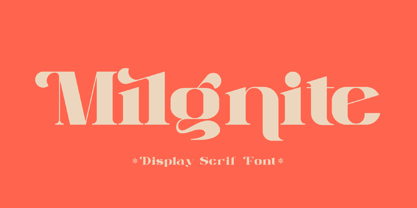 Milgnite is a modern and classic serif font with a unique style and ravishing looks. This typeface is perfect for an elegant & luxury logo, book or movie title design, fashion brand, magazine, clothes, lettering, quotes, and so much more. This font is PUA encoded, which means you can access all of the glyphs and swashes with ease!
 - Bodwars by Sarid Ezra,
$17.00 Bodwars is a sans based font with unique shape that will make your design looks hi-tech and modern. You can use this font for any purpose, especially to make logotype and sci-fi movie poster. You can mix and match the uppercase and lowercase to make your logo more stand out. This font also support multi language.
 - LT Hakuna Matata by Latam Type Foundry,
$15.00 Introducing "LT Hakuna Matata" font collection, inspired by The Classic Movie Lion King. Styles: Normal, Outline, Shadow, Ink. Captures Timon and Pumbaa's essence. Normal exudes joy, Outline adds an artistic touch. Shadow creates depth, Ink offers handcrafted charm. Experience African savannah's energy in typography.- Where typography meets the magic of The Lion King. Enjoy! Thank's for Support!
 - Qebil by Letterena Studios,
$10.00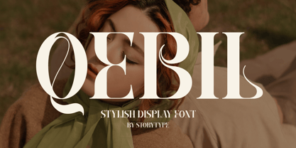 A serif modern and classic typeface that has its own unique style & modern look. This typeface is perfect for an elegant & luxury logo, book or movie title design, fashion brand, magazine, clothes, lettering, quotes, and so much more. This font is PUA encoded which means you can access all of the amazing glyphs and ligatures with ease!
 - Ghakity by Letterena Studios,
$17.00 Ghakity is a modern and classic sans serif font with a unique style and modern look. This typeface is perfect for an elegant & luxury logo, book or movie title design, fashion brand, magazine, clothes, lettering, quotes, and so much more. This font is PUA encoded, which means you can access all of the glyphs and swashes with ease!
 - Picadyll by T4 Foundry,
$21.00 Picadyll is a sanserif that flirts with the 1920s Art Deco tradition but adds a modern touch. The sober letter design brings old movie posters and packaging to mind. Picadyll is a sophisticated and fun font from Swedish type designer Bo Berndal and the T4 font foundry. It is an OpenType creation, for both PC and Mac.
 - Fortela Typeface by Letterena Studios,
$17.00 Fortela Typeface is a modern and classic serif font with its own unique style and modern look. This typeface is perfect for an elegant & luxury logo, book or movie title design, fashion brand, magazine, clothes, lettering, quotes, and so much more. This font is PUA encoded, which means you can access all of the glyphs and swashes with ease!
 - Caliban by Adobe,
$29.00In 1994, John Benson designed the typefaces Caliban, Alexa and Balzano, all with similar characteristics. The typefaces are distinguished by their calligraphic style and their closeness to handwritten script. Caliban looks as though it were written with a broad tipped pen, with reserved yet lively figures which retain their legibility. Caliban is a good typefaces to use in short and middle length texts as well as headlines, wherever a personal touch is desired. - Peepz AF by Andrew Foster,
$29.00 Peepz AF features 100 different faces and has been designed to raise much needed money for Keech Hospice Care, a UK charity that runs two hospice services - one for adults and one for children. Their aim is to help patients enjoy the highest quality of life, while providing vital support for their family and friends throughout their loved one's illness and in their bereavement. All of the charity's services are offered free of charge, every single day of the year. This is all made possible because of the generous support of people like you. Profits from the sale of this font will be donated to Keech Hospice Care.
 - Planina by Creative Toucan,
$10.00 With Planina Font you can make it easier to convey the message in your design. Use for awesome display, labeling, clothing, movie sceen, poster, movie title, gigs, album covers, logos, and much more. Planina comes in 4 styles: Regular, Italic, Outline and Stamp. Inspired by tradition, hardworking people and the 1900s, Planina is ideal for retro and vintage projects, from clear designs to rough look designs. Planina features: -Stylistic alternatives -Ligatures -International characters (Multilingual) -Punctuation & symbols -OpenType Features Multilanguage Support: English, Albanian, Danish, Dutch, Estonian, Croatian, Bosnian, Slovenian, Finnish, French, German, Icelandic, Italian, Norwegian, Portugese, Spanish, Swedish with a lot of other languages; see Full Character List. Note: To access the extra alternate letters, you will need to use the glyphs panel. Many design programs offer this ability, including Adobe Photoshop CC 2015 , Adobe Illustrator, Adobe Indesign.
 - Surfnik by Wing's Art Studio,
$9.00 Surfnik - A Hand-Made Font Influenced by Vintage Surf and Beatnik Culture Surfnik is a hand-drawn font inspired by beatnik and surfing culture of the 1950s and 60s. A fun, loose design that’s typical of pulpy fanzines, movie posters and advertising of the era. From promoting the local surf shop, burger joint or drive-in, it’s a font that evokes a bygone era with a playful, nostalgic feel. Surfnik features an all-caps design that includes unique uppercase and lowercase characters, punctuation, language support and numerals. It also comes with six styles that mix up weights and outlines that look great when creatively combined in titles and headlines. It’s a great choice for when you need a fun and lively look when creating menus, posters, movie titles, album covers and more! Check out the visuals for lots of examples.
 - Spidershank - Unknown license

- Street Punks by Wing's Art Studio,
$10.00 Street Punks: Graffiti Inspired Marker Pen and Paint Brush Font A hand-drawn font inspired by graffiti and skate culture that comes in two pen and paint styles. Plus a shed-load of alternatives for designs that come straight off the pen (or brush). What happens when you combine graffiti, skate culture and 80s movies? You get Street Punks; a gritty, no-nonsense design that's equally at home on a ripped t-shirt or opening a horror movie (with ninjas!) Choose the slick look of marker pens or the textured roughness of paint brushes. Mix them up, play around and have fun. It's up to you! Street Punks comes with a complete set of alternatives and underlines with each style, so you’ll never have to repeat an E or an I; the tale-tell signs that give away other hand-made fonts. It also features all-caps uppercase and lowercase characters, along with numerals, punctuation and language support. It's a font that gives you tools to create some truly unique designs with just a little bit of work. The perfect choice for t-shirts, posters, stickers, movie titles, YouTubers and more! Street Punks: Marker and Paint Marker Regular Marker Alternative Marker Underlines* Paint Regular Paint Alternative Paint Underlines* *Underlines are assigned to keys: ABCDEFGHIJKLMNOP Find more from The Video Store Collection at Wingsart Studio
 - Daitengu by Hanoded,
$15.00 I have always been fascinated by Tengu - a mythical creature from Japan. Tengu are usually depicted with a red face, a very long nose, white moustaches and a funny hat. They used to be regarded as harbingers of war, but over the centuries, their image softened and they became the protective spirits of mountains and forests. Daitengu means ‘greater tengu’ and stems from the Genpei Jōsuiki - an extended version of the ‘The Tale of the Heike’ - an epic account of the struggle between the Taira and Minamoto clans for control of Japan. So, now you know about tengu, end of the history lesson! Daitengu is an epic brush font. I made it with a soft brush and China ink (like most of my brush fonts), but instead of forming the glyphs I saw in my head, I let the brush do the work. A more ‘zen’ approach to brushwork if you will! The result is a messy, organic brush font with a lot of spirit. Comes with diacritics and double letter ligatures.
 - Omnipop by Fenotype,
$20.00 Omnipop is a potent display pack with three styles. All the fonts have firm yet clean and velvety character. Omnipop Brush is a forward leaning brush script with a somewhat heavy complexion. It has a large x-height and it makes nice smooth and even texts. Omnipop Brush is equipped with Standard Ligatures and Contextual Alternates that are automatically on as they should be kept. In addition it has Swash, Stylistic and Titling Alternates for extra show-off. Omnipop Script is a monoline connected script simulating a smooth felt-tip pen. Script is equipped with Standard Ligatures and Contextual Alternates to keep the connections smooth. In addition Omnipop Script has Swash, Stylistic and Titling Alternates and even more extra characters can be found in the glyphs window. Omnipop Sans is a sturdy rounded all caps sans with a sort of geometric vibe to it. Anything you type with Omnipop Sans will look cheery and approachable. Omnipop fonts rock on their own but they also play great together in any order.
 - Mayfest by pentagonistudio,
$17.00 Mayfest Is An Elegant Display serif Inspired By Luxury and Elegant Character. FAQ's : Where are the OTF's? They are included in a download link( in a text file) in your main download file. 1 user 2 computers installation (Desktop License) You may NOT use for broadcast or Cinema/Motion Picture. You may NOT resell this font in any platform without further permission from designer. Do NOT embed font files in app/game/e-pub (for desktop license) You may NOT use the fonts in templates for sale/free. ( web/print/app ) For other license use please contact us. SOFTWARE REQUIREMENTS : Fonts and alternate : No special software required they may be used in any basic program /website apps that allows standard fonts That's it folks! You can go ahead and get cracking :) Follow My Shop For Upcoming Updates Including Additional Glyphs And Language Support. And Please Message Me If You Want Your Language Included or If There Are Any Features or Glyph Requests, Feel Free to Send me A Message. Have a Good Day !
 - Heinemann Special by Heinemann Collection,
$39.00 The Heinemann fonts were initially developed by the in-house design team at Heinemann educational publishing out of the necessity to find the perfect font for use in early primary reading books and literacy products. Basic Heinemann is defined by longer ascenders and descenders, which help children to distinguish between letters; rounded edges on all letterforms, which help the reader focus on the individual letter shape; and modified characters (eg., a and g), which ensure instant recognition of letterforms. Heinemann Special offers further modified characters and kerning pairs ideal for dyslexic or special-needs use (eg., a, d, and b). The Heinemann fonts were developed in partnership with children, literacy advisors, teachers of special needs/dyslexia, and primary-school teachers and are now available in response to hundreds of requests from publishers, designers, and teachers to purchase them. They have been tested in schools and learning institutions over an 8-year period, and they are a favorite for use in both print and electronic products. The modern, clean aesthetic of the fonts ensures that their use can spread beyond educational applications.
 - Sabre by Alias,
$60.00 I generally refer to our typefaces as ‘graphic’ rather than typographic. By that I mean their starting points are usually ways of constructing shapes and systems of shapes. As with other Alias typefaces, Sabre has stone and wood cut letterforms as a starting point. What is interesting about lettercutting is the connection between shape and material. These beautifully crafted letterforms have a particular sharpness which reflects, of course, how they were made. The idea of constructing letters from a kit of parts we first explored in early fonts Elephant and Factory. These are different in that they were very much grid-based, with a geometric structure. For Sabre I also had Fred Smeijers’ stencil construction drawings in mind. These show how a set of components can be the basis for a crafted, elegant typeface. Sabre is quite a loose interpretation of this idea. Sabre’s graphic shape means it works well at large sizes, with a dramatic, angular impact. Its aim is to be typographic enough to function for blocks of small-size text too.
 - Lanche by pentagonistudio,
$19.00 Lanche Is An Modern Elegant Serif Font Inspired By Elegant Serif Typeface FAQ's : Where are the OTF's? They are included in a download link( in a text file) in your main download file. 1 user 2 computers installation (Desktop License) You may NOT use for broadcast or Cinema/Motion Picture. You may NOT resell this font in any platform without further permission from designer. Do NOT embed font files in app/game/e-pub (for desktop license) You may NOT use the fonts in templates for sale/free. ( web/print/app ) For other license use please contact us. SOFTWARE REQUIREMENTS : Fonts and alternate : No special software required they may be used in any basic program /website apps that allows standard fonts That's it folks! You can go ahead and get cracking :) Follow My Shop For Upcoming Updates Including Additional Glyphs And Language Support. And Please Message Me If You Want Your Language Included or If There Are Any Features or Glyph Requests, Feel Free to Send me A Message. Have a Good Day !
 - Pepperwood by Adobe,
$29.00Pepperwood font is a joint work of the typeface designers K.B. Chansler, C. Crossgrove and C. Twombly. These artists also created the typefaces Rosewood, Zebrawood and Ponderosa together and as the names suggest, all of these typefaces are so-called wood types. The origins of this kind of typeface can be found in the early 19th century. Called Italian or Italienne, these typefaces quickly became very popular. They are distinguished by square serifs whose width is larger than the stroke width of the characters. When the letters are set together, the heavy serifs build dark horizontal bands. Pepperwood font has a couple of unique characteristics of its own. Small squares decorate the middle of the letters and the edges of the serifs are not straight, rather, they have small, fine tips. Pepperwood is reminiscent of the Wild West with its shootouts and heroes, but also suggests the glamor of the 1970s with their platform shoes and wild hair-dos. The different weights allow a large range of design possibilities. Used carefully in headlines, Pepperwood font is sure to draw attention. - Black Jack Pro by CheapProFonts,
$10.00 The talented Ronna Penner has created many beautiful script fonts, and Black Jack’s quality was very good so only a few spacing issues had to be addressed. I've added some kerning pairs, and then added all the glyphs needed for the CheapProFonts language coverage. This font was an absolute joy to rework, and with its extended character set I hope it now finds many more users! ALL fonts from CheapProFonts have very extensive language support: They contain some unusual diacritic letters (some of which are contained in the Latin Extended-B Unicode block) supporting: Cornish, Filipino (Tagalog), Guarani, Luxembourgian, Malagasy, Romanian, Ulithian and Welsh. They also contain all glyphs in the Latin Extended-A Unicode block (which among others cover the Central European and Baltic areas) supporting: Afrikaans, Belarusian (Lacinka), Bosnian, Catalan, Chichewa, Croatian, Czech, Dutch, Esperanto, Greenlandic, Hungarian, Kashubian, Kurdish (Kurmanji), Latvian, Lithuanian, Maltese, Maori, Polish, Saami (Inari), Saami (North), Serbian (latin), Slovak(ian), Slovene, Sorbian (Lower), Sorbian (Upper), Turkish and Turkmen. And they of course contain all the usual “western” glyphs supporting: Albanian, Basque, Breton, Chamorro, Danish, Estonian, Faroese, Finnish, French, Frisian, Galican, German, Icelandic, Indonesian, Irish (Gaelic), Italian, Northern Sotho, Norwegian, Occitan, Portuguese, Rhaeto-Romance, Sami (Lule), Sami (South), Scots (Gaelic), Spanish, Swedish, Tswana, Walloon and Yapese. There is no yen currency symbol is this font.
 - Niobium Pro by CheapProFonts,
$10.00 This font has been used for signage and wayfinding in the new Mbombela Stadium built for the FIFA World Cup 2010 - and it looks strangely appropriate there: the font has a certain hand-painted, relaxed charm so fitting of the south African culture. Interesting and bold choice of the architects. :) Anyway, the font has now been updated with our usual multilingual glyphset, and is ready to use around the world by soccer fans and typo fans alike. ALL fonts from CheapProFonts have very extensive language support: They contain some unusual diacritic letters (some of which are contained in the Latin Extended-B Unicode block) supporting: Cornish, Filipino (Tagalog), Guarani, Luxembourgian, Malagasy, Romanian, Ulithian and Welsh. They also contain all glyphs in the Latin Extended-A Unicode block (which among others cover the Central European and Baltic areas) supporting: Afrikaans, Belarusian (Lacinka), Bosnian, Catalan, Chichewa, Croatian, Czech, Dutch, Esperanto, Greenlandic, Hungarian, Kashubian, Kurdish (Kurmanji), Latvian, Lithuanian, Maltese, Maori, Polish, Saami (Inari), Saami (North), Serbian (latin), Slovak(ian), Slovene, Sorbian (Lower), Sorbian (Upper), Turkish and Turkmen. And they of course contain all the usual "western" glyphs supporting: Albanian, Basque, Breton, Chamorro, Danish, Estonian, Faroese, Finnish, French, Frisian, Galican, German, Icelandic, Indonesian, Irish (Gaelic), Italian, Northern Sotho, Norwegian, Occitan, Portuguese, Rhaeto-Romance, Sami (Lule), Sami (South), Scots (Gaelic), Spanish, Swedish, Tswana, Walloon and Yapese.
 - Goudy Text by Monotype,
$29.99The word Text" in Goudy Text™ is short for Textura, and textura is the style of blackletter or gothic writing developed in Northern Europe in the middle ages. The use of space in blackletter is quite different from what we know about Roman letterforms. Lowercase forms in blackletter writing and typefaces must be evenly textured with black and white elements, like the texture of weaving or fabric. Capital letters can provide either an integration of the even texture (by the use of decoration in their construction) or, if they are wide and open and filled with white, they provide bright spots of visual emphasis. Goudy, despite being an American in the twentieth century, understood well the fundamental texture of medieval blackletter and the importance of both density and light. He designed Goudy Text in 1928 for Lanston Monotype after studying the type in Gutenberg's 42-line bible; still one of the best models for designers of blackletter typefaces. The lowercase of Goudy Text has impact and medieval authenticity. The standard caps have some Victorian eccentricities but are mostly well drawn. The alternate, or "Lombardic" caps are spectacular - they set beautifully with the lowercase letters, providing the proverbial shafts of light through the Gothic cathedral's stained glass windows. Use this potent font in sizes 14 point or larger, for Christmas greetings, certificates, wedding invitations, advertising, or music collateral pieces." - Schotis Text by Huy!Fonts,
$35.00 Schotis Text is a workhorse typeface designed for perfect reading on running texts. Its design is based in Scotch Roman 19th-century style but designed from scratch, with a more contemporary and not nostalgic look. It has seven weights plus matching italics, with 1100 glyphs per font, with a very extended character set for Latin based languages as well as Vietnamese, and shows all its potential with OpenType-savvy applications. Every font includes small caps, ligatures, old-style, lining, proportional and tabular figures, superscript, subscript, numerators, denominators, and fractions. The Scotch Romans were one of the most used letters during the 19th and early 20th century, but they don’t have their own place in the main typographical classifications. They appeared at the beginning of the 19th century with Pica No. 2 in the catalog of William Miller (1813) and assumed the British route towards high contrast and vertical axis modern Romans. In fact, they were called just Modern. In opposition to the continental route of Fournier, Didot, and Bodoni, the English way opted for a wider, more legible letter also resistant to bad printing conditions. The name Schotis comes from the misspelling of Scottish that gave the name to a popular dance in Madrid in the 19th-century. It first was called Schotis and today is knows as Chotis.
 - Testament by Canada Type,
$24.95 From the standpoint of calligraphy, a font family of capitals and uncials makes perfect sense. The Roman square capitals, the quadrata, are matched by round capitals of older Greek origin; the word "uncus" means hook-shaped like a beak or talon. Interrelated and often interchangeable, these capital letters served as book hands for both the Latin West and the Greek-speaking East before they evolved into minuscule alphabets. The Testament family is based on the few formal capital manuscripts of the Bible, Virgil and Homer that have survived from the ancient world. Throughout the Middle Ages both uncials and square capitals were used, often together, for headings and initial characters. By their nature the Roman capitals are the voice of Caesar and hold the place of authority, while the uncials speak for the Church in a balanced relationship. In ancient times church and state were not as separate as they are now, and the alphabets were not as different as typographic tradition has made them. In this calligraphic rendering it is clear that they are of the same substance and can be written in the same style, conveying even to the modern eye the eternal and classical quality of epic and scripture. Testament comes in all popular font formats, and includes support for a vaster-than-usual range of Latin-based languages.
 - AM False Etruscan by Alberto Milli,
$30.00I created this font following my love for Etruscans, their culture and their myths. Many times I looked for a false, but similar, Etruscan TrueType font on the Internet, but I didn't find it, so one day I decided to make it myself. - TheSerif by LucasFonts,
$49.00 TheSerif is part of the Thesis superfamily. Although it was conceived to be the perfect secondary font within the Thesis system – for use in headlines, subheads, pull quotes, etc. – TheSerif has also been used successfully as a text font in its own right.
 - Monthly Calendar JNL by Jeff Levine,
$29.00Monthly Calendar JNL is a companion font to Calendar Blocks JNL, and features classic wood type lettering and numerals from the 1800s. A set of large numbers are on their own keys, while the numbers 1-31 reside on the A-Z and a-e keys respectively. The days of the week are on the lower case “f” through “l” keys, while the names of the months are found on the “m” through “x” positions. An open rectangle is on the lower case “y” key, and a solid black rectangle is on the “z”. For those who wish to use the 23/30 and 24/31 configurations, they can be found on the left and right parenthesis. - Elevator Music by PizzaDude.dk,
$16.00 When was the last time you listened to elevator music and found yourself humming along? And perhaps the tune you were listening to, got stuck in your ears for the rest of the day...the rest of the week? That's often what happens with elevator music: maybe you don't notice it - but it is there, and it could most likely be one of your all time favourites! :) My Elevator Music font does somewhat the same: it's nice and pretty harmless - but it works, perhaps even without you noticing! :) I've added 4 slightly different versions of each lowercase letter - and that goes for both Regular and Scratch versions. And they both have multilingual support, because elevator music is universal!
 - Geometry pair by Etewut,
$20.00 Welcome to my Geometry Pair. Introducing two fonts Forma & Structure that will make you happy. One of them is a compilation of shadow-based symbols like silhouettes. Another one has a rock of glyphs that don't repeat each other, but looks in the same style. Surprisingly they fit to each other and you can mix them in your works, be it print or web design. Make your graphic works more stylish that highlight your uniqueness from other. Just wonder people who loves funky design and who respect tiny details. Now you have opportunity to grab them both at the same time! There are all caps fonts kerned with microscope with multi language support.
 - Devils Haircut by PintassilgoPrints,
$24.00 Devils Haircut is an explosive font duo, consisting of two completely different styles, creative and expressive in their own way, with a touch of punk and counter-culture aesthetic. Together they make a decidedly eye-catching pair and a rad option for numerous display moods, from album covers to food packaging, from title screens to editorial pages. Both fonts are all caps with different designs stored on upper- and lower-case slots, so you can reach the alternate forms easily through the keyboard. Or use the Contextual Alternates OpenType feature to instantly cycle the alternate glyphs and get an even more uneven look. Make Devils Haircut yours and fire up your designs, hell yes!
 - Stencil Patterns JNL by Jeff Levine,
$29.00Stencil Patterns JNL collects into one digital file a number of decorative stencil patterns from decades past. These charming illustrations were re-drawn by Jeff Levine using images of vintage oilboard stencils made over fifty years ago. While these are useful as stand-alone embellishments for any print projects, they can also be scaled and printed out onto card or acetate stock for hand-cutting as new stencil templates. A special note of thanks goes to fellow type designer and author, Leslie Cabarga. He supplied the bulk of the images used in designing this font file. There are left and right pointing hands on the parenthesis keys, and a decorative ampersand on its respective key. - M Gentle PRC by Monotype HK,
$523.99 The design concept of M Gentle is inspired by the aesthetics of ribbon gymnastics and the tenderness of orchids. The beauty of the two are combined in one typeface. Keeping the characters in right proportion and standard structure, its horizontal and vertical strokes (橫、豎) are generally straight. The linkage among dots (點), downstrokes and the ticks (剔) to the right represent a sense of movement and fill the typeface with liveliness and humanity. While M Gentle Light shows purity and softness, Medium and Bold fonts have their own personalities. They are all legible and suitable for a wide range of purposes, make the family a popular choice in the advertising industry.
 - Amedina by Bungletter,
$12.00 Amedina is a modern script font that features a classic and elegant touch. Amedina are attractive because they are sleek, clean, feminine, sensual, glamorous, simple and very easy to read, thanks to their many fancy letter joints. I also offer a decent number of stylistic alternatives for some of the letters. Classic style is very suitable to be applied in various formal forms such as invitations, labels, restaurant menus, logos, fashion, make up, stationery, novels, magazines, books, greeting/wedding cards, packaging, labels or all kinds of advertising purposes . . . . . . . . Files include: • Amedina Contains full set: -Uppercase -Lowercase -Alternative -Ligatures -Punctuation -Number -Multilingual support. need help or have questions let me know. I'm happy to help. Thanks & Congratulations on the Design!
 - M Gentle HK by Monotype HK,
$523.99 The design concept of M Gentle is inspired by the aesthetics of ribbon gymnastics and the tenderness of orchids. The beauty of the two are combined in one typeface. Keeping the characters in right proportion and standard structure, its horizontal and vertical strokes (橫、豎) are generally straight. The linkage among dots (點), downstrokes and the ticks (剔) to the right represent a sense of movement and fill the typeface with liveliness and humanity. While M Gentle Light shows purity and softness, Medium and Bold fonts have their own personalities. They are all legible and suitable for a wide range of purposes, make the family a popular choice in the advertising industry.
 - Clauques by Eurotypo,
$24.00 Clauques Family includes four fonts and, in addition, a very useful extra elements. Clauques Script and Clauques Script Light are elegant and youthful fonts with many stylistic variations, swashes and ligatures. Clauques Sans and Clauques Sans Light add a little seriousness. Both are designed to be combined but they also work great on their own. Clauques Ornaments has a lot of beautiful ornaments that work very well with the two styles of fonts. With all this, Clauques Family Font will allow you to create elegant works. This family font is the great choice for any project from logos, magazines and book covers, children’s material, fashion, headlines, cards, posters, websites, packaging and, basically, anywhere you want.
 - AI Wood by Alphabets,
$17.95These six faces are interpreted from examples shown in Rob Roy Kelly's "American Wood Types" They are not merely scanned copies, but have been redrawn from scratch with various optical adjustments. Kelly points out that the true glory of the American Wood Types are the negative spaces, which are, in their dynamic active forms, the antithesis of the anemic flimsy letters produced by type foundries in the 19th century. The Alphabets Wood Types are designed with digital manipulation in mind. Stretch, curve and distort at will! These designs were released prior to similar revivals from Adobe. Each font has two full alphabets (one full height, one smaller) and numerals. However, certain points and accents will not be found. - Dreams Note PS by pentagonistudio,
$14.00 Dreams Note Is A Modern Family Font Serif Including 8 Font Style. Font Features : Dreams Note Thin Dreams Note Extra Light Dreams Note Light Dreams Note Regular Dreams Note Medium Dreams Note Semi Bold Dreams Note Bold Dreams Note Black SOFTWARE REQUIREMENTS : Fonts and alternate: No special software is required they may be used in any basic program /website app that allows standard fonts That's it, folks! You can go ahead and get cracking :) Follow My Shop For Upcoming Updates Including Additional Glyphs And Language Support. And Please Message Me If You Want Your Language Included or If There Are Any Features or Glyph Requests, Feel Free to Send me A Message. Have a Good Day!
 - Amanzi by Scholtz Fonts,
$19.00This African font is modern and fluid. Its name means "water" in the Zulu language, and like the deep rivers that flow through the African jungles, it contains few straight lines. Use it when you want to convey a feeling of strength combined with flexibility. Use it for headings, posters and adverts when you want to create an impact. This African font includes a full character set: - all the upper and lower case letters, as well as all numerals, punctuation and special characters. The numerals are mono-spaced so that they will line up correctly in columns of figures. The letters of the alphabet are spaced according to their width and are carefully kerned to create an attractive appearance. - Punto Poly by Fontador,
$24.99 Punto Poly is the layered type system of Punto for cromatic typesetting. Endless effects can be created by 11 stackable layers and different colors. The dots of Punto Poly are not made up of grid-based dots, they are optical corrected and there is always the same distance between the dots, with the aim to create more harmonic letterforms. The dots also vary gradually in size to reflect the thickening and thinning of strokes, giving the letterforms a sophisticated overall look. Punto Poly comes up with 11 layer system and is perfectly suited for logos, posters, brands and magazines. The language support includes Western, Central and Eastern European character sets, as well as Baltic and Turkish languages.
