10,000 search results
(0.012 seconds)
- Bledso by Olivetype,
$18.00 Bledso is an authentic brush typeface. This all caps font is suitable for posters, magazines, apparels, movie headlines, packaging and more. So what's included : Basic Latin A-Z & a-z Numbers, symbols, and punctuations Ligatures and swashes Accented Characters : ÀÁÂÃÄÅÆÇÈÉÊËÌÍÎÏÑÒÓÔÕÖØŒŠÙÚÛÜŸÝŽàáâãäåæçèéêëìíîïñòóôõöøœšùúûüýÿžß Thank you
 - Caverson by Letterena Studios,
$10.00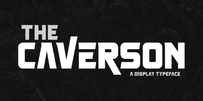 Proudly present Caverson Typeface, a modern and classy slab serif font with a unique style and fancy look. This typeface is perfect for an elegant & luxury logo, book or movie title design, fashion brand, magazine, clothes, lettering, quotes, and so much more. **Uppercase
 - Filmland JNL by Jeff Levine,
$29.00 A hand lettered, dual line sans serif type style was used for the title of “Filmland” – a 1931 movie fan magazine from India. This inspired both the digital typeface’s design and name. Filmland JNL is available in both regular and oblique versions.
 - Suifak by Letterena Studios,
$10.00 Suifak is a modern and classic serif typeface that has its own unique style and fashionable look. This typeface is perfect for an elegant and luxurious logo, book or movie title design, fashion brand, magazine, clothes, lettering, quotes, and so much more.
 - Brock Restar by Letterena Studios,
$10.00 Brock Restar is a modern and classic display typeface that has its own unique style and fashionable look. This typeface is perfect for an elegant and luxurious logo, book or movie title design, fashion brand, magazine, clothes, lettering, quotes, and so much more.
 - The Wildeast by Trustha,
$12.00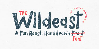 The Wildeast is a fun rough handdrawn font. It has a fun, natural and dynamic style that makes it perfect for branding, poster, book covers, clothing designs, flyer, merchandise, packaging, quote, fashion campaigns, logo, movie, album covers, and offer design and more.
 - Cast And Crew JNL by Jeff Levine,
$29.00 Cast and Crew JNL is a condensed monoline font that lends itself well to any text project where more copy needs to fit into a limited space. A perfect example of this is a movie poster's cast, director, producer and other acknowledgements.
 - Monster Blood by Yoga Letter,
$16.00 "Monster Blood" is a unique horror font with a blood-like melt in every letter. This font is perfect for Halloween moments, movie titles, logos, book covers, horror stories and more. "Monster Blood" comes with lowercase, uppercase, multilingual support, numerals, and punctuations.
 - Trappers And Traders by chrismetcalfe,
$25.00There is something fun about western type. And there is something fun about hand drawn type. Put them together and.... Tada. - Agatized Informal by ULGA Type,
$26.00 Agatized Informal is a rough-edged stencil typeface with chunky letterforms and tight spacing. Designed primarily for display use, it’s ideal for posters, logos, advertising, book cover designs or small chunks of text such as pull-out quotes. The design is something of an enigma, a curious mish-mash of genres – imagine splicing Uncle Buck and Deadpool into a horror movie – it’s big, bold and funny although has a dark side. But what really makes this typeface a joy to drive is its boot full of alternative characters and ligatures. There is a saying: Use sparingly. Not on this street! Make your Glyphs palette burn rubber. Set your OpenType to full throttle: crank up your style and get those liga-tyres screeching. Agatized is a souped-up old campervan spinning doughnuts on the beach. The design started life as a piece of lettering for a book design that didn’t progress past the sketch stage. I liked the rough, dense character shapes, so during some down time I started drawing more characters and the lure of a new typeface pulled me in from there. Although this is a single-weight typeface it has a younger sibling, Agatized Formal, a neater, more dapper brother, smoother round the chops and smartly dressed – certainly no less fun though.
 - Beriot by Boyanurd,
$19.00 Beriot is a sans serif whose basics are condensed in Regular (Normal) weight, getting a lot of form inspiration from the topic also known as Steile Futura which is a letterform that Paul Renner himself explored in the mid-1950s, where shapes are constructed with little stress on modular squares but there are changes in certain parts so they become less modular. The Beriot family is available in 42 weights with matching slanted cuts, divided into 3 subfamilies: Condensed, Normal and Expanded. Each has been designed for a range of text sizes each, and already variable, allowing you to choose and make your own type of weight you like. OpenType Features are available in each of these font styles, including alternative characters, different numbers set and case-sensitive and there are additional symbols that make it the perfect choice for professional types of branding, digital design and editorial.
 - Opal by Linotype,
$29.99 Opal Pro is a text family designed by Hannes von Döhren in 2008. It gives every text a noble character. The typeface has long ascenders that clearly rise above the capital letters and a low x-height. Opal’s letters sport inktraps at stroke junctions, which on one hand create a cutout feeling and on the other hand strengthens the image in larger point sizes. In total, the letterforms have clear emphasis on their verticals and horizontals; they do not fear the weight on their curves. In addition to the Italic and Bold, the Opal type family includes a Script face, whose letterforms include connections, similar to handwriting. On top of that, the typeface possesses swash letters for italic and script, small caps, many ligatures and borders & ornaments. With a little bit of care, designers will be able to create the finest of traditional, elegant work with this family.
 - Entestats by Typephases,
$25.00 Nearly a hundred human heads, in three dingbat files. The whole series comes from the sketchbook: the original ink drawings were then digitized and refined to create vector outlines. Rather than perfectly smooth, geometrical shapes, the Entestats, like their close relatives in the Capsbats series, the Entestats retain a handmade look and feel. The Entestats are ready-made illustrations, though of course they will appreciate being enriched with colours, textures, an imaginative layout... and use them for a variety of projects. Use them small, as spot illustrations or as big as a whole page or page spread. The Entestats and their kin, the Capsbats, are a terrific resource for presentations, packaging, logos, brochures and advertisements, to name a few applications. The book 1000 Heads is a compendium of the drawings featured in the Capsbats and Entestats and it gives a glimpse of the limitless applications of this collection.
 - FS Split Sans by Fontsmith,
$80.00 Quirky and irregular FS Split is no ordinary typeface. Its irregular proportions make it unique, with round letters appearing wide, and straight letters narrow. Other quirks include its eclectic crossbars – the uppercase ‘A’ has an unusually low bar, while the bar on ‘G’ is particularly long. The uppercase has many interesting features in fact, including large counters, closed terminals on certain letters like ‘J’, and a cap-height that lines up with ascenders. The lowercase also holds surprises – the dots on ‘i’ and ‘j’ are unusually large, and some characters, such as ‘g’, feature double-storey counters. An extreme but stylish italic The italic versions of FS Split Sans and Serif are particularly striking. While similar in style to their upright, Roman versions, they take on a larger-than-usual 18-degree angle, making the forward-slant more dramatic. Although the main purpose of any italic is to help words and phrases stand out, this unique execution helps to make the italic variants of FS Split stylish fonts in their own right – they would work brilliantly on magazine covers, in titles and headlines, pull quotes, and even used commercially in logos and corporate branding. Serif and sans: a split personality FS Split Sans and Serif have their differences but also their similarities, contrasting and complementing each other perfectly. This ‘love hate’ relationship inspired the name of the typeface family, and means the two variants provide a versatile, typographic palette for use in graphics and branding. While its proportions are similar to the sans, the serif has a bigger contrast between its weights of bold, regular and light, bracketed serifs, and different styles of terminals, some being straight and others ball-shaped. FS Split Sans has more subtlety and simplicity, with a smaller weight contrast, less flamboyant terminals, and more consistent counter sizes. The two variants are distinct yet alike, so can be used successfully either in isolation or together.
 - FS Split Serif by Fontsmith,
$80.00 Quirky and irregular FS Split is no ordinary typeface. Its irregular proportions make it unique, with round letters appearing wide, and straight letters narrow. Other quirks include its eclectic crossbars – the uppercase ‘A’ has an unusually low bar, while the bar on ‘G’ is particularly long. The uppercase has many interesting features in fact, including large counters, closed terminals on certain letters like ‘J’, and a cap-height that lines up with ascenders. The lowercase also holds surprises – the dots on ‘i’ and ‘j’ are unusually large, and some characters, such as ‘g’, feature double-storey counters. An extreme but stylish italic The italic versions of FS Split Sans and Serif are particularly striking. While similar in style to their upright, Roman versions, they take on a larger-than-usual 18-degree angle, making the forward-slant more dramatic. Although the main purpose of any italic is to help words and phrases stand out, this unique execution helps to make the italic variants of FS Split stylish fonts in their own right – they would work brilliantly on magazine covers, in titles and headlines, pull quotes, and even used commercially in logos and corporate branding. Serif and sans: a split personality FS Split Sans and Serif have their differences but also their similarities, contrasting and complementing each other perfectly. This ‘love hate’ relationship inspired the name of the typeface family, and means the two variants provide a versatile, typographic palette for use in graphics and branding. While its proportions are similar to the sans, the serif has a bigger contrast between its weights of bold, regular and light, bracketed serifs, and different styles of terminals, some being straight and others ball-shaped. FS Split Sans has more subtlety and simplicity, with a smaller weight contrast, less flamboyant terminals, and more consistent counter sizes. The two variants are distinct yet alike, so can be used successfully either in isolation or together.
 - Calligraphica by Monotype,
$49.00Calligraphica was designed because there are very few inline fonts, and even fewer inline calligraphic fonts. The original forms were written with a split pen in a single stroke. The minuscules have a rougher look and the capitals have a smoother shape to imitate hand written calligraphy with more formal, decorative initial caps. The Calligraphica family contains 6 fonts: Calligraphica Regular and Italic are the regular upright roman true italic version of the font. The ascenders on this font are a bit higher than the capital letters--this is standard for most fonts. Calligraphica LX Regular and Italic are similar to the first 2 fonts except their ascenders are longer and reach high above the capital letters--giving these fonts a taller appearance. Calligraphica SX Regular and Italic are similar to the first 2 fonts except their ascenders are shorter and are the same height as the capital letters--giving these fonts a shorter appearance. - Sweet Afton NF by Nick's Fonts,
$10.00 Samuel Welo offered the pattern for this font as a titling font for silent movies. Its rustic charm has held up well, some eighty years on. Both versions of this font support the Latin 1262, Central European 1250, Turkish 1254 and Baltic 1257 codepages.
 - Celliqath by Letterena Studios,
$10.00 Proudly present Celliqath Typeface , created by Storytype, A serif modern and classic typeface that has own unique style & modern look. This typeface is perfect for an elegant & luxury logo, book or movie title design, fashion brand, magazine, clothes, lettering, quotes, and so much more.
 - Locked Monster by Sipanji21,
$18.00 Locked Monster is a display font with a basic graffiti style. It will elevate a wide range of design projects to the highest level, be it branding, headings, wedding designs, tittle, signatures, logos, labels, movie, video, magazine, logotype, crafting, packaging, advertising and much more!
 - ENDEMIC Serif by WAP Type,
$20.00 "Endemic" font is perfect for ethnic movie or game titles. or for titles, cartoon-themed writing, because this font is in the serif category but not too stiff or formal. Features: Uppercase, Lowercase Punctuation & Number, Support in Mac and Windows OS Multilingual Support ÀÁÂÃÄÅÆÇÈÉÊËÌÍÎÏÐÑÒÓÔÕÖØÙÚÛÜÝ
 - CastlesNFairies by PIXLmeister,
$7.00 If you need a fantasy font that will brighten up your book about Drakula or your game about Tricksters or other fantasy characters or your movie needs magic then this font is for you. Any time if you need magic, the font is for you!
 - Ceriel by Holis.Mjd,
$14.00 Ceriel is a font inspired by fairy tale books, this font is drawn so that it will get a natural touch or feel. This font can be used for promotional posters, social media branding, work titles, book titles, movie titles, and in other designs.
 - BD Kickrom Mono by Typedifferent,
$25.00 BD Kickrom Mono is a retro futuristic monospaced, uppercase font with the main characters set on the small keys and variants on the capital characters. It is great for the use as headlines in magazines, logotypes on posters, game titles, movies or music packaging.
 - Jamstreet Graffiti by Sipanji21,
$15.00 Jamstreet Graffiti is a display font with one line graffiti style. It will elevate a wide range of design projects to the highest level, be it branding, headings, wedding designs, tittle, signatures, logos, labels, movie, video, magazine, logotype, crafting, packaging, advertising and much more!
 - Drum Rhythm JNL by Jeff Levine,
$29.00 An ad in the May 3, 1928 issue of “The Film Daily” for the movie “Drums of Love” featured extra bold, sans serif hand lettering in an Art Deco style. This is now available as Drum Rhythm JNL in both regular and oblique versions.
 - Mallory by Letterena Studios,
$10.00 Proudly present Mallory Typeface , created by Storytype, A serif modern and classic typeface that has own unique style & modern look. This typeface is perfect for an elegant & luxury logo, book or movie title design, fashion brand, magazine, clothes, lettering, quotes, and so much more.
 - Jacmax by Stringlabs Creative Studio,
$25.00 Jacmax is display font with horror and scary style. Jacmax has unique design that is combined with decorative horror style. This font is perfect for your horror projects, such as: Movie Posters, Lettering on Cover Books, Album music covers, Logo Brand, and much more.
 - Devil Candle Variable by Mans Greback,
$59.00 Devil Candle Variable is a dark variable typeface. Ideal for the bone-chilling narratives of horror movies, this typeface encompasses the raw essence of Halloween and satanic lore, effectively encapsulating the pulse of terror that courses through the veins of the enchanted and the damned.
 - All Round Gothic by Dharma Type,
$24.99 Originally designed in 2012 by Ryoichi Tsunekawa, All Round Gothic is a font family inspired by classic sans serif fonts such as Avant Garde Gothic and Futura. All Round Gothic is a structured geometric sans, but also creates a sweet and cute atmosphere by removing unnecessary stems. With their bowls shaped by not-perfectly-geometric circles, All Round Gothic makes an organic impression in some degree. As a result, All Round Gothic became a new font family that covers between 1920s Bauhaus and contemporary design trends comprehensively and one of the most suitable family for any purpose such as text, headline, logo, poster, and animations thanks to clean and legible but soft and friendly letterforms. All Round Gothic includes 5 weights and obliques corresponding to each weight. Why don't you try this family if you got a little bored with classic sans serifs. This font is used in Minions movie.
 - Rosso by W Type Foundry,
$29.00 Rosso is a condensed geometric Sans with a retro style, inspired by various typographic styles. It features the Roslyn Gothic structure, which was popularly used for the covers of Philip K. Dick's books in the 1970s. Rosso has 10 variants from Ultra Light to Black with their respective Italics. In addition, it is divided into two Subfamilies, Normal and Alt. The normal one remains faithful to the proportions of Roslyn Gothic and classic geometric fonts, while the Alternative version expands its round shapes, generating a striking and unique rhythm and contrast, classic of Art Deco fonts. In addition, it has alternative glyphs and discretionary ligatures inspired by the work of Herb Lubalin, which add greater possibilities to face any design project. All this makes Rosso a font full of personality, striking and recognizable. Ideal for the construction of logos, eye-catching headlines, movie posters, volumetric posters, etc.
 - All Is Quiet by Kitchen Table Type Foundry,
$15.00 The year 2022 went and 2023 came. I can honestly say that last year was a horrible year and I am happy it ended a couple of days ago. The first week after New Year’s Eve always fills my head with the U2 song ‘New Year’s Day’ - so I named this font after a line from the lyrics. I also happened to watch a fantastic movie called ‘Im Westen Nights Neues’, directed by Edward Berger, but based on a book by Erich Maria Remarque, which, in English, was published as ‘All Quiet On The Western Front’. So there you have it: naming a font in 2 easy steps! ;-) All Is Quiet is a lovely brush font, which I created using my father in law’s Chinese pencil and ink. I can suggest some uses here, but I am convinced you can come up with that yourself.
 - Deadwax by Prioritype,
$166.00 Deadwax - Death Metal Fonts This is it, the death metal font you are looking for with a brutal impression on each character. There are 3 styles where each letter is drawn one by one accompanied by loud music to get the feel. Very cool and suitable for design projects such as logos, clothing brands, posters, horror movies, album covers and many more and ready to be typed. Features: Uppercase, Lowercase, Numeral, Punctuation, Multilingual. Multilingual contained: Afrikaans, Albanian, Asu, Basque, Bemba, Bena, Breton, Catalan, Chiga, Cornish, Danish, Dutch, English, Estonian, Filipino, Finnish, French, Friulian, Galician, German, Gusii, Indonesian, Irish, Italian, Kabuverdianu, Kalenjin, Kinyarwanda, Luo, Luxembourgish, Luyia, Machame, Makhuwa-Meetto, Makonde, Malagasy, Manx, Morisyen, North Ndebele, Norwegian Bokmål, Norwegian Nynorsk, Nyankole, Oromo, Portuguese, Quechua, Romansh, Rombo, Rundi, Rwa, Samburu, Sango, Sangu, Scottish Gaelic, Sena, Shambala, Shona, Soga, Somali, Spanish, Swahili, Swedish, Swiss German, Taita, Teso, Uzbek (Latin), Volapük, Vunjo, Zulu. Thanks.
 - Navarone by Stiggy & Sands,
$24.00 A Roman Stylized Font of War. Navarone is a display sans typestyle that was inspired by the movie titling sequence from the 1962 movie "The Guns of Navarone". It's an all capitals typeface that has alternate caps in the lowercase slots to convey all of the roman stylized lettering of the original inspiration. See the 5th graphic for a comprehensive character map preview. Navarone comes with features for customisation options: - An all capitals typeface with alternate capitals in the lowercase slots - A Basic Ligatures feature that swaps out FI and FL ligatures. Approx. 386 Character Glyph Set: Navarone comes with a glyphset that includes standard & punctuation, international language support, and basic ligatures.
 - Dix by Just My Type,
$20.00 An offbeat not-quite-slab, not-quite-bracketed serif. And its extreme weight and width. Richard Dix started as a surgeon and turned out an actor, one of the lucky few who made a successful transition from silent film to talkies. In 1929 he made the movie western, “Redskins,” and his name appeared on a brilliant poster promoting the film. “Richard DIX”; four upper case and six lower case letters. The font Dix is derived and extrapolated from impressions of those 10 letters. Inspired by the poster for the 1929 film, “Redskin,” and a desire to create a black Edwardian font with an offbeat serif. Usage recommendations Western movie or 19th century-style advertising posters.
 - Rockabilly Romance by Wing's Art Studio,
$16.00 Rockabilly Romance - A 1950s Rock ’n’ Roll Inspired Retro Script Font Rockabilly Romance is a rebellious script font from Wingsart Studio inspired by 1950s Americana. It’s designed to evoke the feel of bustling retro diners, drive-in movies and a Rock ’n’ Roll attitude. It features fast curves with a hand-made free-flowing style, plus an alternative version with added lipstick gloss. Standard features include unique uppercase and lowercase characters, punctuation, language support and numerals. It also includes underlines and lots of special ligatures and alternative characters to experiment with. The Rockabilly Romance font is particularly suited to bold displays such as menu headers, posters, movie titles and album covers. Check out the visuals for more usage ideas.
 - Nouveau Theme JNL by Jeff Levine,
$29.00 As long as there’s been movie theaters, those establishments became the perfect hideaway for couples who wanted to kiss, hug and snuggle without the watchful eyes of disapproving parents or the pesky attention of younger siblings. Such was evident in the [13 word] title of the 1919 composition “Take Your Girlie to the Movies (If You Can’t Make Love at Home)”. On the sheet music for this song, it is hand lettered in the Art Nouveau fashion of the time by a round nib pen, and made a perfect candidate to be redrawn as a digital typeface. The end result is Nouveau Theme JNL, which is available in both regular and oblique versions.
 - Ephemera Sickles by Ephemera Fonts,
$35.00 A debut from the most anticipated vintage digital typefoundry by Gilang Purnama and Ilham Herry, who stucked their mind, body and soul back into the first era of 18th century. They build this intense visual-time machine that no one capable before. Started by the visual branding of the Ephemera Fonts, they bring every letters of it to the another level of journey. They called it Ephemera Sickles. Ephemera Sickles is a ornamented letterhead style typeface-inspired by the era of victorian (1800-1900) and this style was commonly used by engrossers at the turn of the century to embellish official documents, such as diplomas and other certificates. Carefully crafted for every single letters with the soul of Sickels Lettering, Spencerian, and some research from the Penmanship Journal book. The style is named after Charles Sickels, who headed the art department of Electro-Light Engraving Co. in New York City during the early 20th century. There’s no doubt that such a very strong presence typeface like Ephemera Sickles will bring a powerful identity to your visual project. Will be a perfect joint for a logo, visual branding, poster, beer label, packaging, classic bar decor, vintage hotel, et cetera.
 - Inked God Pro by CheapProFonts,
$10.00 This font has that grungy, gritty look, and combines it with some elegant swirls. Weird and wonderful. I have added swirls and decorations to ALL the uppercase letters that did not have them, so there are now wider possibilities to add interesting decorations to your composition. In addition to the expanded language support, of course. ALL fonts from CheapProFonts have very extensive language support: They contain some unusual diacritic letters (some of which are contained in the Latin Extended-B Unicode block) supporting: Cornish, Filipino (Tagalog), Guarani, Luxembourgian, Malagasy, Romanian, Ulithian and Welsh. They also contain all glyphs in the Latin Extended-A Unicode block (which among others cover the Central European and Baltic areas) supporting: Afrikaans, Belarusian (Lacinka), Bosnian, Catalan, Chichewa, Croatian, Czech, Dutch, Esperanto, Greenlandic, Hungarian, Kashubian, Kurdish (Kurmanji), Latvian, Lithuanian, Maltese, Maori, Polish, Saami (Inari), Saami (North), Serbian (latin), Slovak(ian), Slovene, Sorbian (Lower), Sorbian (Upper), Turkish and Turkmen. And they of course contain all the usual "western" glyphs supporting: Albanian, Basque, Breton, Chamorro, Danish, Estonian, Faroese, Finnish, French, Frisian, Galican, German, Icelandic, Indonesian, Irish (Gaelic), Italian, Northern Sotho, Norwegian, Occitan, Portuguese, Rhaeto-Romance, Sami (Lule), Sami (South), Scots (Gaelic), Spanish, Swedish, Tswana, Walloon and Yapese.
 - Ellie Script by Fenotype,
$25.00 Ellie Script is a hand drawn signature style typeface. Ellie is great for branding, headlines, invitation cards, poems, posters or as a logotype. Boasting over 600 glyphs, Ellie is equipped with handy OpenType features - Contextual Alternates and Standard Ligatures are automatically on and they help to keep the connections smooth and text varied to simulate hand writing. In addition Ellie Script is equipped with Swash and Stylistic Alternates that can be used for more customised look and in addition it has Stylistic Alternates that can be used for long end swash to a word. If that isn’t enough there are also Discretionary Ligatures: certain letter pairs like th, lt, or, is are made into more showy. They work best in shorter texts. Ellie has three ampersands and two sets of numerals, and even more alternates can be found from the Character Window. Ellie Script is PUA encoded so you can access the extras in most graphic design softwares. Ellie Script Ornaments is a set of strokes and arrows with the same look so that they can be used to complement layouts with Ellie Script. Have fun!
 - Galapogos BRK Pro by CheapProFonts,
$10.00 A very chunky and rounded font. I have shortened the r and t, increased the size of the dots, and tweaked a little here and there - before expanding the character set substantially. I actually like the font so much that I also used it for the CheapProFonts logo! ALL fonts from CheapProFonts have very extensive language support: They contain some unusual diacritic letters (some of which are contained in the Latin Extended-B Unicode block) supporting: Cornish, Filipino (Tagalog), Guarani, Luxembourgian, Malagasy, Romanian, Ulithian and Welsh. They also contain all glyphs in the Latin Extended-A Unicode block (which among others cover the Central European and Baltic areas) supporting: Afrikaans, Belarusian (Lacinka), Bosnian, Catalan, Chichewa, Croatian, Czech, Dutch, Esperanto, Greenlandic, Hungarian, Kashubian, Kurdish (Kurmanji), Latvian, Lithuanian, Maltese, Maori, Polish, Saami (Inari), Saami (North), Serbian (latin), Slovak(ian), Slovene, Sorbian (Lower), Sorbian (Upper), Turkish and Turkmen. And they of course contain all the usual "western" glyphs supporting: Albanian, Basque, Breton, Chamorro, Danish, Estonian, Faroese, Finnish, French, Frisian, Galican, German, Icelandic, Indonesian, Irish (Gaelic), Italian, Northern Sotho, Norwegian, Occitan, Portuguese, Rhaeto-Romance, Sami (Lule), Sami (South), Scots (Gaelic), Spanish, Swedish, Tswana, Walloon and Yapese.