10,000 search results
(0.032 seconds)
- TT Lakes Neue by TypeType,
$39.00 Introducing TT Lakes Neue in version 2.0! Please note that the TT Lakes font has been removed from platforms, but you can still order it by sending a request to the studio's commercial department: commercial@typetype.org We have released a continuation of the geometric sans serif inspired by Finnish functionalism. The new version provides more opportunities, because we not only increased the character set and improved the font technically, but also reworked its visual character. What changed? Font character. TT Lakes Neue 2.0 has become calmer, as we have removed the display details in the characters of the main set, making the font more versatile. New stylistic sets were created, thanks to which the nature of the font can be controlled, making it more expressive. Changed the forms of the characters "Кк", "ЖЖ", "Дд", "Лл", lowercase "b" and alternative "g". Added alternative forms for all types of the number "1", for the characters "Mm", "DD", "Ll". Added technological character sets, with which the font looks stylish and expressive. You may notice that in these sets, the forms of lowercase characters with arches (r, m, n) are changed, and there are gaps in the places of infusions and connections of all characters. Scope of application. The scope of TT Lakes Neue 2.0 have become even more diverse, because the sans serif has become more neutral in character and more functional. TT Lakes Neue 2.0 is the perfect font for the gaming industry. Suitable for game interfaces of different genres. Technological sets can be used in architectural projects, in the headlines of posters and magazines, on outdoor signs. The font is suitable for logo design, looks great in branding. Character set and technical characteristics. We have significantly improved the set of the font, increasing the number of characters from 736 to 921. The font has become more functional due to the updated technical stuffing and new features, of which there are now 36 instead of 24. Added characters of extended Latin, fractions, arrows. Created new kerning and hinting. Updated variable font. Added new OpenType features. The TT Lakes Neue font has 5 subfamilies: Compressed, Condensed, Regular, Extended, Expanded. In total, there are 91 styles in the font: 9 upright and 9 slanted in each subfamily and 1 variable font. Each style has 921 characters and 36 OpenType features.
 - Camy by Scholtz Fonts,
$9.50 I wanted to create a "handwriting" font which could be used professionally. I have often needed such a font with a variety of weights and styles for a particular project and have had to resort to mixing fonts, creating a rather messy, amateur job. Camy is named for a little village in South West France where I did much of the initial work on this font. Camy is ideal for contemporary display work, comes in ten styles, and has a contemporary appeal with its casual, easy to read letters. Camy was designed as a total professional package for designers looking for a handwritten font suitable for all kinds of contemporary display work: the idea being that once you have the Camy Professional Pack you don't have to waste time searching for other handwritten fonts. The Family: LIGHT -- NARROW - light weight, condensed width, delicate line -- MEDIUM - light weight, delicate line -- WIDE - light weight, expanded width, delicate line NORMAL WEIGHT -- NARROW - of medium weight and condensed width - perfect for limited space -- MEDIUM - of medium weight -- WIDE - of medium weight and expanded width BLACK - for best readability -- NARROW - condensed width for bolder statements in small areas without losing legibility -- MEDIUM - for bolder statements -- WIDE - expanded width for bolder statements FAT -- WIDE - for maximum impact Use a combination of styles for product branding, book covers, invitations, greeting cards. The Camy combination works well for both headings and body text. Camy contains over 250 characters - (upper and lower case characters, punctuation, numerals, symbols and accented characters are present). It has all the accented characters used in the major European languages.
 - Gigasper by Konstantine Studio,
$19.00 Step into the digital realm with Gigasper, where cutting-edge design meets futuristic vibes in a spellbinding dance of pixels and perfection. Immerse yourself in the extraordinary fusion of techno fonts and a dystopian visual concept that redefine the boundaries of creativity. Gigasper is not confined to boundaries; it thrives in breaking them. From sleek tech interfaces to gritty cyberpunk posters, Gigasper adapts effortlessly, ensuring your designs are always ahead of the curve. Its versatility is your canvas, and the possibilities are limitless. Picture a world where pixels pulse with the heartbeat of innovation, and Gigasper is your guide. Embrace the distopian visual concept that weaves a narrative of rebellion and avant-garde aesthetics. This isn’t just a font; it’s a statement – a rebellion against the mundane, an uprising of creativity. Unlock the Future, Embrace Gigasper – Where Techno Meets Tomorrow!
 - Pergamon by URW Type Foundry,
$39.99 The Pergamon series is a creation of Alfons Schneider (1890–1946) and was issued by the foundry of Ludwig Wagner in Leipzig in 1937/1940, though the website of the Klingspor-Museum says that several of the faces were probably produced after the death of Schneider. This digital version is extended with the necessary OT characters and signs, while also the “символы кириллицы” are added. Also, in addition to the members of the family designed by Schneider, regular, italic, bold and bold italic extended versions were produced. The specimens of Ludwig Wagner stated emphatically: “In allen Graden werden beide K K geliefert”, so these two forms are in all the faces, while the two condensed members also have k k, as the specimens said that this alternative character was also in these two faces.
 - Brass by HiH,
$8.00 The Brass Family has a lineage that extends into English history. About five hundred years ago a devout, but anonymous Englishman gave glory to the God he worshipped by designing the capital letters and decorations of these two fonts. Originally recorded in The History Of Mediaeval Alphabets And Devices by Henry Shaw (London 1853), they are described by Alexander Nesbitt in his Decorative Alphabets And Initials (Mineola, NY 1959) as “Initials and stop ornaments from brasses in Westminster Abbey.” I wish I could say I remember seeing them when I was there, but that was forty-two years ago and all I remember was seeing the tomb of Edward the Confessor. One definition of “stop” as a noun is a point of punctuation. I have heard people from the British Isles speak of a “full stop” when referring to a period. Some may remember a 19th century form of communication called a telegram being read aloud in an old movie, with the use of the word “stop” to indicate the end of a sentence or fragment. A full dozen of these stop ornaments are provided. They occupy positions 060, 062, 094, 123, 125, 126, 135, 137, 167, 172, 177 & 190. The Brass Family consists of two fonts: Brass and Brass Too. Both fonts have an identical upper case and ornaments, but paired with different lower cases. Although the typefaces from which the lower cases were drawn are both of modern design, both are interpretations of the textura style of blackletter in use in England when the upper case and ornaments were fashioned for the Abbey. Brass is paired with Morris Gothic, which matches the color of the upper case quite well. Brass Too is paired with Wedding Regular, which is distinctly lighter than the upper case. I find it very interesting how each connects differently. The resulting fonts are unusual and most useful for evoking an historic atmosphere.
 - Flores - Unknown license

- Tant Ingrid by Cercurius,
$19.95 A thin caps-only cross-stitch font, based on a late 19th century embroidery pattern. It is suitable for birthday cards and posters, signs and ads in the Thanksgiving and Christmas season.
 - TXT Groovy Smooth by Illustration Ink,
$3.00Add some retro personality to scrapbooks, greeting cards, invitations, announcements, signs, and more. The round, thick lines of Groovy Smooth lend a playful 70s feel to the letters of this cool font. - Saint Petersburg by Haksen,
$14.00 "Saint Petersburg" fonts were created to look as close to a natural handwritten script as possible by including over 20 ligatures. With built-in OpenType features, this script comes to life as if you are writing it yourself. It's highly recommended to use it in OpenType capable software - there are plenty out there nowadays as technology catches up with design. Other than Photoshop, Illustrator and Indesign, many standard simple programs now come with Opentype capabilities - even the most basic ones such as Apple’s TextEdit, Pages, Keynote, iBooks Author, etc. Even Word has found ways to incorporate it. Your download will receive 4 font files, designed to work as perfect companions or simply as strong standalone typefaces. WHAT'S INCLUDED : 1. Saint Petersburg • A clean, free-flowing script font containing upper & lowercase characters, numerals and a large range of punctuation. 2. Saint Petersburg Alt • This is a second version of Saint Petersburg Script, with a completely new set of upper & lowercase characters. If you wanted to avoid letters looking the same each time to recreate a custom-made style, or try a different word shape, simply switch to this font for an additional layout option. 3. Saint Petersburg Slant • The Slant Version of the point 1. 4. Saint Petersburg Slant Alt • The Slant Version of the point 2. I surveyed mostly common letter combinations and made 20 Discretionary ligatures with following letter combos: aa bb ee ff ll ss tt at et it ot sl st rt ut att ett itt ott utt (in Saint Petersburg & Slant Version) aa bb ee ff ll ss tt at et it ot sl st rt ut att ett itt ott utt (in Saint Petersburg Alt & Slant Version) By using these ligatures, you can give realistic handlettered style, escaping font "pattern" effect.
 - White Block by Nathatype,
$29.00 Looking for a font that will make your branding stand out? Do you sometimes have an appetite for a bit more wholesome typography? Looking for a fabulous, stylish, and adventure font? We've got what you want. White Block-A Display Font White Block is a bold display font with a modern look. This display font is perfect for anything adventurous, and direct. Designed primarily as a captivating font that easy to read but still stylish, A real head-turner for your presentation, designs, branding, quotes, invitation, website illustrations, and much more. Our font always includes Multilingual Options to make your branding globally acceptable. Features: PUA Encoded Numerals and Punctuation Thank you for downloading premium fonts from Natha Studio
 - Prinzess Gravur by RMU,
$35.00 In 1905 Berthold released an engraved blackletter font called Prinzess Kupferstichschrift. Based on an old printed remnant, I revived this beautiful open-face fraktur and enriched it with several OpenType features. As usual in my blackletter fonts, the round ‘s’ lies on the number sign key, and a traditional number sign can be accessed via the Discretionary Ligature feature and typing 'N-r-period'. In this font you have also the possibility to turn I, V, X, L, C, D, and M into Roman numerals by activating the Stylistic Alternates feature. And last but not least, various useful ligatures polish up this font.
 - Aitos by Monotype,
$29.99Kevin Simpson was five years old when the stylized "E" of the Electrolux vacuum cleaner logo caught his eye. This is his earliest recollection of an interest that ultimately became an obsession. Type remains his major preoccupation, and he admits to attempting to work a good typeface design into any project where he can get away with it. Aitos was inspired by a metal sculpture Simpson saw while driving through the French countryside. "The statue was very strong. It was heavily weathered and had obviously been there for some time, yet it also seemed very delicate and light." Aitos, like the statue, is a rugged design. At first glance, it is chunky and bold, perhaps a little jarring. If you look again, however, you'll see it has refined qualities. Aitos commands attention - yet is still affable. - Bostvina by Aluyeah Studio,
$110.00 Bonjour! Bostvina is a fashiontastic display font. This font was carefully crafted and inspired by one of leading fashion brand in the world. In general, it creates a luxurious and elegant look in design. Coming to you with 90+ luxury alternate to create a perfectly beautiful, classy, chic, elegant, glamorous and luxurious design. Use this font for your fashion brand, resort, cosmetics, invitations, wedding, branding, packaging, magazines, boutique, social media, restaurant, spa, greeting cards, headers, headline and many more. Features: OpenType support Multilingual support (15 languages) PUA Encoded Super Easy to Use alternates - It's OpenType support but you can easly call alternates character using special combination like A.2 B.4 D.3 etc so you dont need special software
 - Ingeo by Blancoletters,
$40.00 Between the most rigid geometric letterforms and the most expressive calligraphy works there are, undoubtedly, countless combinatory possibilities. Ingeo is just one of them. Located very close to a geometric approach it shows, however, a clear willingness to accommodate in its structure the calligraphic traits of our alphabet. In Ingeo geometry grows from the inside, meaning that all its counters are based on geometric shapes. Around them, contours are later defined. The solid mass resulting from that interaction is modulated in specific areas in a way that evokes the way a writing hand finishes a letter and starts the following one. Ingeo seeks to accommodate calligraphic features in its geometric structure without any complexes, in the same way a computer engineer writes a song or a poet admires the orbits of planets and satellites. In this vast and unmapped realm between seemingly opposing concepts is where Ingeo finds its playground. There, that interaction is pushed to its limits and the resulting letterforms are later confronted with typographical conventions to assess whether they survive. Ingeo comes with 695 glyphs in its character set with support for more than 270 languages. Among these glyphs you can find 5 stylistic sets, 19 useful science-related icons as well as 7 different designs for ampersands.
 - Shiver Me Timbers NF by Nick's Fonts,
$10.00Avast, me hearties! Here be a serious pirate font, based loosely on several of Victor Hammer’s uncial typefaces, designed between 1925 and 1953, and liberally weathered and corroded for that authentic barnacle-encrusted look. The bullet character is suitable for marking where the treasure is buried, and the section mark is a Jolly Roger. Both versions of the font include 1252 Latin, 1250 CE (with localization for Romanian and Moldovan). - Lavarock by Gassstype,
$25.00 Here comes our new font Lavarock This is a Display Sans that is written casually and quickly. this font are made with brushes on Procreate. Then crafted carefully drawn into vector format. That is why lavarock has textured and strong characteristic more natural look to your text with a more modern look to your text. perfect for homeware designs,branding projects, Logo design, Quotes product packaging, especially and scary themes.
 - Unfollow by Gassstype,
$23.00 Here comes a New font,Introducing Unfollow is Rough Display Font is a Authentic Style and classy style, this font is great for your creative projects such as watermark on photography, and perfect for logos & branding, invitation,advertisements,product designs, stationery, wedding designs,label ,product packaging, special events or anything that need handwritting taste. Unfollow a natural Hand Drawn feel. This handmade font will make your design has a beautiful natural touch for each details. It is perfect for any design project as Invitation,logo, bo ok cover, craft or any design purposes,photos, photography overlays, signs, window art, scrapbooking, tags and so much more! This font is PUA encoded which means you can access all of ligatures and Alternate glypsh.
 - Alltoz by Gassstype,
$23.00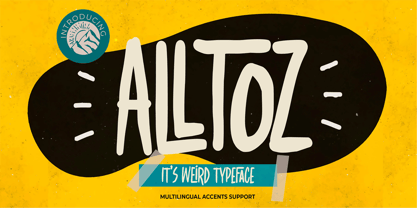 Here comes a New font,Introducing Alltoz it is Weird Typeface Font is a Authentic Natural Style and classy style, this font is great for your creative projects such as watermark on photography, and perfect for logos & branding, invitation,advertisements,product designs, stationery, wedding designs,label ,product packaging, special events or anything that need handwritting taste. Alltoz a natural Hand Drawn feel. This handmade font will make your design has a beautiful natural touch for each details. It is perfect for any design project as Invitation,logo, book cover, craft or any design purposes,photos, photography overlays, signs, window art, scrapbooking, tags and so much more! This font is PUA encoded which means you can access all of Ligatures glypsh.
 - Tenuity by Gassstype,
$25.00 Here comes a New font,Introducing Tenuity it is Weird Typeface Font is a Authentic Natural Style and classy style, this font is great for your creative projects such as watermark on photography, and perfect for logos & branding, invitation,advertisements,product designs, stationery, wedding designs,label ,product packaging, special events or anything that need handwritting taste. Tenuity a natural Hand Drawn feel. This handmade font will make your design has a beautiful natural touch for each details. It is perfect for any design project as Invitation,logo, book cover, craft or any design purposes,photos, photography overlays, signs, window art, scrapbooking, tags and so much more! This font is PUA encoded which means you can access all of ligatures and Alternate glypsh.
 - Narrow Roman Stencil JNL by Jeff Levine,
$29.00 Narrow Roman Stencil JNL was modeled from a vintage brass sign for identification of a ballroom.
 - Revoluzia MF by Masterfont,
$59.00 A revival of old hand painted sign in Old Jaffa, from the mid of 20th century.
 - Desperado by FontMesa,
$20.00 Desperado is a modern bold type style that will work well in sign and truck lettering.
 - Fado by Olga Umpeleva,
$50.00 Fado is a calligraphic typeface based on the broad nib calligraphy. It has a lot of alternates, ligatures, initial and final forms. The font has 3 sets of length and complexity of ascenders and descenders. It allows the user to chose the style: simple, with more complicated forms, with a lot of flourishes, and even mix all 3 styles.
 - PORT118 - Unknown license

- Falena by Typoforge Studio,
$19.00 Falena is a type family designed by Gianluca Boffito. This simple, easy-to-read, geometric-style sans serif family is published by Typoforge Studio and consists of 18 weights (together with italics). It has more than 300 glyphs per style (including special characters). Falena works equally well in long form type settings and for titles, headings, posters. It comes with two sets of original dingbats (set 1 contains 52 ornaments, set 2 contains 52 truly distinctive and stylish icons).
 - Crawling by Mevstory Studio,
$25.00 Crawling Chic & Moderf Serif. Crawling is a modern and chic typeface, best used as a display for headings, logos, branding, magazines, product packaging and invitations. Crawling come with clean lines and smooth curves give any project an extra touch of class. If there's anything else you are unsure of feel free to pop me a message :) That's it! Have fun using Crawling Typeface!!! Feel free to follow, like and share. Thanks so much for checking out my shop!
 - Arkwright by Greater Albion Typefounders,
$11.95 Arkwright, named for a well known fictional shopkeeper who kept his shop open all hours is inspired by traditional British (and transatlantic) shop signage. It is a spiritual companion and ideal companion to our more elaborate Granville family. Arkwright is offered in Regular and bold weights and a more decorative 'Grand' form. These faces are especially suitable for posters, period advertising, Chapter headings and signage. Arkwright and Granville are also offered together in a value pack.
 - Dranskof by PintassilgoPrints,
$29.00 Dranskof is a light-hearted, cheery font. It is inspired by a page from an extraordinary serbian publication for children by the writer, poet and journalist Duško Radović. Dranskof whimsical letterforms are full of joie de vivre, consisting of different glyphs on upper and lower case slots for added flexibility.The contextual alternates feature will instantly alternate glyphs. To literally add a twist here and there, Dranskof is equipped with a spirited set of stylistic alternates, easily accessible through stylistic alternates feature or by the glyphs palette. This is definitely a 'make feel good' font. Enjoy!
 - Labyrindo by URW Type Foundry,
$39.99 Labyrindo is inspired on the classic Labyrinth. The oldest known labyrinth is 3200 years old and is to be found in Greece. The mythological king Minos held the monstrous son of his wife ‘Minotaurus’ prison in a labyrinth. Much later the labyrinth made his appearance in the medieval churches, this time as a pattern on the church floor. During the Italian renaissance the multiple gate labyrinth came in fashion. Paths led trough green hedges in beautiful palace gardens. These hedges where perfectly cut in rectangular shapes. Mainly meant as an aesthetic statement. Besides the origin of the physic labyrinth, it has always been a great source of story-telling and myths. I mention a few personal favourites (film) like, Pan’s Labyrinth (a journey to the underworld), Labyrinth (with David Bowie) and the Shining with Jack Nicholson (where a horrific scene takes place in a labyrinth). Not the most cheerful stories but fascinating and intriguing. A Labyrinth is mind boggling and mysterious but wonderful. I made graphic translation in this typeface.
 - The Philosopher Script by Colllab Studio,
$19.00 "Hi there, thank you for passing by. Colllab Studio is here. We crafted best collection of typefaces in a variety of styles to keep you covered for any project that comes your way! The Philosopher Script is a different take on what a monoline script should be. It’s not like anything else out there and it works in any context The conciseness of The Philosopher Script makes it well-suited not just for those seeking a new direction in design, but also for anyone producing art, looking to add their own style. Professional design and smoothed curves that are inherently better than a standard font. It comes with a vast array of ligatures, alternates, and many other helpful glyphs not found in any other typeface A Million Thanks Colllab Studio www.colllabstudio.com
 - Tiamaria by Galapagos,
$39.00In the 70's I went out with a girl whose father was a card-carrying member of 3 of the biggest unions in the printing arts. He gave me 2 things, a pre-war Linotype specimen book and an ancient 'how to' lettering book that contained 30 or 40 script specimens from lettering artists of the time. Tiamaria is the developed glyphs of one of these specimens. Tiamaria is the name of one of the islands in the Galapagos chain. - Warrior by CastleType,
$59.00 Warrior is a chunky typeface design inspired by a Russian Egyptian-style block alphabet (original designer unknown). Now available in seven weights (Hairline, Extra Light, Light, Medium, Regular, Bold, Black) in addition to three decorative styles: Shaded (3-dimensional), Inline, and Open. With its blocky letters and stable slab serifs, Warrior will add a bold, masculine look to your design. All members of the Warrior family support most European languages including modern Greek, and, of course, languages that use the Cyrillic alphabet.
 - Sqwared by Monotype,
$25.00 Sqwared is a square sans serif type family... with flares! This typeface has a retro, hand-painted quality – the slight flaring of its verticals evoke the steady brush of a signwriter. Sqwared benefits from large, open counters and a generous x-height that aids clarity and legibility, while a wide footprint gives these fonts a degree of stature and an air of confidence. Each character was drawn while immersed in a late sixties/early seventies vibe, but there’s no reason why Sqwared can’t be used for your contemporary designs. There are 16 fonts altogether, ranging from Thin to Ultra weights in both roman and italic. It has a Latin character set that covers all Latin European languages. Sqwared will dazzle in headlines, add flair and distinction to your logo designs, bring flamboyance to your branding material, and your body text will most definitely be unique! Variable fonts are included in this family, so you can tune the weight of each font to your exact preference. Key features: 8 weights in Roman and Italic Old Style Figures included Full European character set (Latin only) 440 glyphs per font.
 - Authenia by Melvastype,
$29.00 Authenia is a casually and quickly written brush script. Letters are made with brush pen on a paper. Then scanned and carefully drawn into vector format. There is just a right amount of texture left so it looks good in small and big sizes. These elements gives Authenia its organic, authentic and laid-back characteristics. Authenia has two sets of lower cases to give some variation and more natural look to your text. You can enable Contextual Alternates on OpenType panel to make these two sets vary randomly. It also has a bunch of stylistic alternates and underlines that makes your text and design even more appealing.
 - Flodyswift by Alcode,
$23.00 Flodyswift is an esthetic typeface with ligatures also complete multilingual glyphs. Flodyswift come with Regular style, it will make this typeface can be used in all design projects and works perfectly for pairing with script typeface or handmade fonts, Headlines, Posters, Packaging, T-shirts, Postcards, Invitation, Wedding Sign, Sign Painting, Signboard, and much more. Try Flodyswift, enjoy the richness of OpenType features and let her fun and elegant excitement make you happy and enhance your creativity! You can use this font very easily. • Multilingual Support And Special Ligatures
 - Eckhardt Dualine JNL by Jeff Levine,
$29.00 While searching online for vintage type inspirations, an image was spotted of an old letterhead for a steel manufacturing company. The hand lettering of the word 'Ludlum' only offered D,L,M and E as visual examples, but from this Jeff Levine has designed Eckhardt Dualine JNL - a Deco-flavored dual-line type font. As with a number of other releases that emulate hand-lettering or sign painting, Jeff has named this font in honor of his good friend, the late Albert Eckhardt, Jr.; who ran Allied Signs in Miami from 1959 until his passing.
 - Evoque by Monotype,
$40.00 Evoque is a humanist serif type family designed for both text and display purposes. Its appearance is crisp and modern while echoing a classical Garamond heritage. The inspiration for Evoque came after reminiscing over Apple’s advertising of the eighties and nineties that utilised incredibly tightly-spaced headlines set in Apple Garamond. I wanted to create a typeface that evoked nostalgia of those times and that distinctive typographic style. A number of swash alternates and discretionary ligatures enhance Evoque, giving you the opportunity to add more flair and personality to your title and branding designs. Simply activate Stylistic Sets to start adding these flourishes to your typography. Other useful features include Small Caps at the click of a button, and Old Style Figures are an option to the default proportional figure style. There are 36 fonts altogether, with 6 weights in roman and italic from Thin to Heavy weights across Condensed, Narrow, and Regular widths. Evoque has an extensive character set (900+ glyphs) that covers every Latin European language. Please also take a look at Evoque Text which is specifically designed for the publishing sector. Key features: 6 weights in both roman and italic 3 widths – Regular, Narrow, Condensed 80 Alternates 26 Ligatures Small Caps Full European character set (Latin only) 900+ glyphs per font.
 - Lilla Letter Lover by Letterground Foundry,
$11.99 "Lilla Letter Lover" is a captivating font designed specifically for children's books. This delightful typeface brings an element of playfulness to reading, while also enhancing phonemic awareness. The font's remarkable strength lies in bridging the gap between handwritten and printed letters. For early readers, this transition can be challenging, but "Lilla Letter Lover" simplifies the process. It merges the familiar aspects of handwritten letterforms with the clarity of printed text, providing a seamless reading experience. This feature ensures that children can comfortably navigate both forms of writing, enhancing their overall literacy skills. The whimsical charm of "Lilla Letter Lover" instantly captures young readers' imaginations. Each letter is thoughtfully designed with basic shapes and simplicity in mind, for an experience where letters come to life, fostering a love for reading and storytelling. Additionally, "Lilla Letter Lover" offers a unique opportunity for sight-based spelling learning. The visually distinctive presentation of words helps young readers to develop a strong visual memory of spelling patterns. This visual association enables them to recognize and recall words with ease, strengthening their reading and writing proficiency. In summary, "Lilla Letter Lover" is not just a font; it is an enchanting gateway to make reading a joyous adventure for children of all ages.
 - Conso by Larin Type Co,
$15.00 CONSO is an elegant, modern and contrast sans-serif font family. It includes upright and Italic style, each of them has seven weights from thin to bold. This is a multi-purpose font that is perfect for any project, it is contrasted, modern and easy to read. With it, you can create logos, use in advertising, packaging, book covers and magazines, headings, descriptions and much more. CONSO includes stylistic alternates with a teardrop-shaped tail for uppercase and lowercase, with them, you can change the style of your project and add personality to it and make it more stylized. This font is easy to use has OpenType features.
 - Dancin' Pixel by LomoHiber,
$19.00 Why is this typeface 'Dancin'? Because It consists of 3 styles each represents one frame of animation. And you can easily create a nice pixel typography animation using Dancin' Pixel. Animation preview: https://www.behance.net/gallery/85743031/Dancin-Pixel-animated-typeface How to make the animation and add a sharp corner stroke in Photoshop: https://youtu.be/ZbVFzvXwqkw If you are not interested in making animation, you can also use Dancin' Pixel as a regular font. I combined hand-drawn bold letters with pixel style, and it perfectly fits for stylish pixel game headers, prints, posters, websites, and anything connected with pixel art. The Frame Three is great for glitched pixel designs, it has distorted shapes. Dancin' Pixel Features: Pixelated letterforms 3 Styles each representing one frame of animation 3rd and 2nd frame may be used as glitched pixel typeface Wide language support (Western European, Central European South Eastern European) If you have some issues, questions, please let me know: lhfonts@gmail.com Hope you'll enjoy using Dancin' Pixel!

