10,000 search results
(0.081 seconds)
- Berlin Email - 100% free

- XAyax - 100% free

- cbe - 100% free

- Vampire Bloods Drip by Sipanji21,
$12.50 Vampire Bloods is an incredibly unique horror display font with 2 style Font are Dripping and solid style with jagged Outline. Add this font to your favorite Halloween themed ideas and notice how it makes them come alive. Vampire Bloods is perfect for posters, packaging, banners, advertising, apparel, and more.
 - Power Display by Power Type,
$15.00 Power Display Inspired by Fun cartoon style combined with modern style. This Playful Font Comes In Three Widths; Condensed, Normal, Expanded. This Font Can Be Used For Modern And Vintage Designs, Also Can Be Easily Paired With Some Graphic Elements (Illustration, Photography) This Font Perfect For, Logotype, Branding, Title, And Packaging.
 - Brembo by Yoga Letter,
$16.00 "Brembo" is a font with a curly style. This font is very unique and elegant. It is suitable for various needs, such as writing on children's themes, animals, learning, Christmas, summer, holidays, book titles, film titles, Halloween, and others. This font is equipped with uppercase, lowercase, numerals, punctuation, and multilingual support.
 - FlagDay by Ingrimayne Type,
$8.00 These four variations on letters designed as flags are almost unreadable, but may be of some use as a patriotic display font. The four are all transformations of fonts from the FourJuly group. The solid and outline styles can be layered with the main fonts to easily create multiple-colored letters.
 - Diamant Pro by RMU,
$50.00 Diamant Pro is a versatile multilingual serif font family which comes with small caps and old-style figures. These fonts are suitable for the major West and Central European languages as well as for Turkish and Cyrillic written languages. This font family is ideal for bodytexts in newspapers and magazins.
 - Lemonlove by Din Studio,
$29.00 Lemonlove is a condensed display font. This font come with modern themes. It matches applies in some designs such as the logotype, brand, packaging, quotes, t-shirt, cover book and more custom design. Features: Multilingual Support PUA Encoded Numerals and Punctuation Thank you for downloading premium fonts from Din Studio
 - Alchemia Decorative by Struvictory.art,
$19.00 ALCHEMIA is a modern sans serif font with mystical motives. The font is created in classic proportions and decorated with celestial and boho decor. ALCHEMIA is represented by sans serif lowercase and ornate uppercase. The font is suitable for the design on the theme of astrology, mysticism, spirituality, witchcraft, magic, esotericism.
 - Worstveld Sling Extra Oblique - Personal use only

- Aunchanted Xspace - Personal use only

- Guilty - 100% free

- Aquaduct Reverse Italic - Personal use only

- Lawyerbait by Zang-O-Fonts,
$25.00Lawyerbait was designed to be a clean, light and easy to read display face. - DB Circles - 'Tis The Season by Illustration Ink,
$3.00DoodleBat Circles - 'Tis the Season places fun Holiday themed words and clipart into circles. - DB Floragraphy by Illustration Ink,
$3.00DB Floragraphy is a collection of enjoyable floral designs with a spring themed feel. - Strandall by Patria Ari,
$15.00 Strandall is sharp display typeface inspired from warrior themes to support your brand/project.
 - Altemus Checks by Altemus Creative,
$11.00 Each style is a collection of 174 one-, two- and three-row checkered designs.
 - DB 'Tis The Season Words by Illustration Ink,
$3.00DoodleBat 'Tis the Season Words is a collection of Holiday themed words and phrases. - Bundesbahn by Linotype,
$29.99These symbols were used for the production of the timetables from the Deutsche Bundesbahn - Basset by Red Rooster Collection,
$45.00 Digitally engineered by Steve Jackaman. Originally in five weights, Steve produced three additional weights.
 - Boxer Punch by Putracetol,
$28.00 Boxer Punch - Soft Bold Font Boxer Punch - Soft Bold Font is a stylish and modern font designed to catch the attention of your audience. The font's unique design combines a soft bold shape with a cute sans serif, making it perfect for creating eye-catching designs. The idea behind creating Boxer Punch was to incorporate the concept of understated realism into the font. This is evident in the font's smooth and elegant lines, which make it perfect for a variety of design projects. The font is ideal for those looking to create a professional touch in their designs, while also maintaining a stylish and modern feel. Boxer Punch is an excellent choice for anyone looking for a font that is versatile and can be used in a variety of different contexts. It is perfect for sports-themed work projects, as well as branding, packaging, logo design, album covers, posters, and social media graphics. One of the standout features of Boxer Punch is its versatile OpenType features, including alternates and ligatures, which allow for even more creative freedom when designing with the font. Additionally, the font comes with uppercase and lowercase characters, as well as support for multilanguage, numbers, punctuation, and symbols. Inside the font package, you'll find three different file formats: Boxer Punch otf, Boxer Punch ttf, and Boxer Punch woff. This means that no matter what platform you are using, Boxer Punch will work seamlessly with your software. Boxer Punch is a font that is sure to make your designs stand out from the crowd. Its unique design and versatile features make it perfect for anyone looking to add a touch of elegance and style to their work. If you're looking for a stylish and modern font that is perfect for sports-themed work projects or a variety of other design projects, then Boxer Punch is the font for you. In summary, Boxer Punch - Soft Bold Font is a versatile and modern font that combines a soft bold shape with a cute sans serif to create a unique and stylish design. With its versatile OpenType features, multilanguage support, and uppercase and lowercase characters, Boxer Punch is perfect for a wide range of design projects.
 - Fan Script by Sudtipos,
$99.00 A friend of mine says that sports are the ultimate popular drug. One of his favorite things to say is, “The sun’s always shining on a game somewhere.” It’s hard to argue with that. But that perspective is now the privilege of a society where technology is so high and mighty that it all but shapes such perspectives. These days I can, if I so choose, subscribe to nothing but sports on over a hundred TV channels and a thousand browser bookmarks. But it wasn't always like that. When I was growing up, long before the super-commercialization of the sport, I and other kids spent more than every spare minute of our time memorizing the names and positions of players, collecting team shirts and paraphernalia, making up game scenarios, and just being our generation’s entirely devoted fans. Argentina is one of the nations most obsessed with sports, especially "fútbol" (or soccer to North Americans). The running American joke was that we're all born with a football. When the national team is playing a game, stores actually close their doors, and Buenos Aires looks like a ghost town. Even on the local level, River Plate, my favorite team where I grew up, didn't normally have to worry about empty seats in its home stadium, even though attendance is charged at a high premium. There are things our senses absorb when we are children, yet we don't notice them until much later on in life. A sport’s collage of aesthetics is one of those things. When I was a kid I loved the teams and players that I loved, but I never really stopped to think what solidified them in my memory and made them instantly recognizable to me. Now, thirty-some years later, and after having had the fortune to experience many cultures other than my own, I can safely deduce that a sport’s aesthetic depends on the local or national culture as much as it depends on the sport itself. And the way all that gets molded in a single team’s identity becomes so intricate it is difficult to see where each part comes from to shape the whole. Although “futbol” is still in my blood as an Argentinean, I'm old enough to afford a little cynicism about how extremely corporate most popular sports are. Of course, nothing can now take away the joy I got from football in my childhood and early teens. But over the past few years I've been trying to perceive the sport itself in a global context, even alongside other popular sports in different areas of the world. Being a type designer, I naturally focus in my comparisons on the alphabets used in designing different sports experiences. And from that I've come to a few conclusions about my own taste in sports aesthetic, some of which surprised me. I think I like the baseball and basketball aesthetic better than football, hockey, volleyball, tennis, golf, cricket, rugby, and other sports. This of course is a biased opinion. I'm a lettering guy, and hand lettering is seen much more in baseball and basketball. But there’s a bit more to it than that. Even though all sports can be reduced to a bare-bones series of purposes and goals to reach, the rules and arrangements of baseball and basketball, in spite of their obvious tempo differences, are more suited for overall artistic motion than other sports. So when an application of swashed handlettering is used as part of a team’s identity in baseball or basketball, it becomes a natural fit. The swashes can almost be visual representation of a basketball curving in the air on its way to the hoop, or a baseball on its way out of the park. This expression is invariably backed by and connected to bold, sleak lettering, representing the driving force and precision (arms, bat) behind the artistic motion. It’s a simple and natural connective analysis to a designer, but the normal naked eye still marvels inexplicably at the beauty of such logos and wordmarks. That analytical simplicity was the divining rod behind Fan Script. My own ambitious brief was to build a readable yet very artistic sports script that can be a perfect fit for baseball or basketball identities, but which can also be implemented for other sports. The result turned out to be quite beautiful to my eyes, and I hope you find it satisfactory in your own work. Sports scripts like this one are rooted in showcard lettering models from the late 19th and early 20th century, like Detroit’s lettering teacher C. Strong’s — the same models that continue to influence book designers and sign painters for more than a century now. So as you can see, American turn-of-the-century calligraphy and its long-term influences still remain a subject of fascination to me. This fascination has been the engine of most of my work, and it shows clearly in Fan Script. Fan Script is a lively heavy brush face suitable for sports identities. It includes a variety of swashes of different shapes, both connective and non-connective, and contains a whole range of letter alternates. Users of this font will find a lot of casual freedom in playing with different combinations - a freedom backed by a solid technological undercurrent, where OpenType features provide immediate and logical solutions to problems common to this kind of script. One final thing bears mentioning: After the font design and production were completed, it was surprisingly delightful for me to notice, in the testing stage, that my background as a packaging designer seems to have left a mark on the way the font works overall. The modern improvements I applied to the letter forms have managed to induce a somewhat retro packaging appearance to the totality of the typeface. So I expect Fan Script will be just as useful in packaging as it would be in sports identity, logotype and merchandizing. Ale Paul
 - Auto Pro by Underware,
$50.00 Auto Pro is a warm, humanist sans serif typeface which has three different styles of italics, each with its own flavor. With its three italics, Auto creates a new typographic palette, allowing the user to drive through unknown typographic and linguistic possibilities. Also, because of its four weights and the three different figure styles, it’s a vehicle equipped for many roads of typography. Comes with Underware’s Latin Plus character set with a support for 219 languages. Take a cruise, and let this typeface carry you to business or leisure.
 - Altemus Stars by Altemus Creative,
$11.00 Stars contains 174 characters; a variety of solid and dimensional star designs with from three to twelve points, pentagrams, sheriff stars, stars of david, outline stars, burst stars and airforce stars. Stars Two contains 174 characters; a variety of five pointed outline stars with centers, star designs composed from various geometric shapes with from three to eight points, jagged stars, quilt stars, outline stars, starfish, arrow stars, burst stars, drop shadow stars, ragged starbursts, double stars and air force stars. Stars Three is a collection of 174 star designs.
 - KG Payphone by Kimberly Geswein,
$5.00 This font was specifically created for my husband. He teaches 5th grade and wanted a font that was legible enough for students to read but still playful enough to add a touch of whimsy to his classroom. Legible enough for body text but fun enough for titles.
 - SF Kitab by Sultan Fonts,
$19.99 SF Kitab is An Arabic typeface for desktop applications. The font is dedicated for printing diverse books and publications. SF Kitab is clear and the reader feels comfortable reading long texts. It is contains two weights: normal and bold. This font supports Arabic, Persian and Urdu.
 - Hightide by Atlantic Fonts,
$26.00 Hightide is a rough, hand-lettered script font inspired by brush calligraphy of the 50’s and 60’s. It’s a cinch to use, and adds a welcome splash of salty vintage charm wherever it goes. Shown in posters with other Atlantic Fonts including Began and Reading.
 - Count Floyd by Elemeno,
$10.00Bold and simple, but shaky, Count Floyd was named for the horror host spoof from SCTV. It has the look of a spooky grunge font, but is far easier to read, even at relatively small sizes. Please note that this font has a limited character set. - Anabae by Differentialtype,
$10.00 Anabae is a modern high-contrast serif font. Anabae came with 7 weights accompanied by 7 italics. The simple morphology makes it very easy to read, and is perfect for displaying in any project you create. The bold size is also perfect as a display font.
 - Alara Script by Zane Studio,
$20.00 Alara Script is a calligraphy script font that comes with exquisite character changes, a kind of classic decorative copper script with a modern twist, designed with high detail for an elegant style. Alara Script is attractive because it is smooth, clean, feminine, sensual, glamorous, simple and very easy to read, because it has many fancy letter joints. I also offer a number of decent stylistic alternatives for multiple letters. Classic styles are very suitable to be applied in various formal forms such as invitations, labels, restaurant menus, logos, fashion, make up, stationery, novels, magazines, books, greeting / wedding cards, packaging, labels or all kinds of advertising purposes. . Alara Script has 450+ Glyph alternative characters, including multiple language support. With OpenType features with alternative styles and elegant binding. The OpenType feature works automatically, but you can access it manually and for the best results necessary for your creativity in combining these variations of the Glyph.
 - Naste by Tipo Pèpel,
$22.00 Tipo Pèpel strikes again with a lush splurge on pure basic geometrical shapes and sizes, those that inspired Paul Renner’s typographic milestone “Futura”. A new look to classic shapes, bringing them back plenty of delightfullly details as the lowercase cursive forms’ long tiles that break the supposed linearity expected from a purely geometrical font. Rhythm given by hidden details in each character of each weight, push “Naste” out of German geometric sobriety, will help us to easily create typographic hierarchies upon the many weights available and the many and accurate details. Excellent results with minimal effort. Wide ‘x’ height, restrained ascending and descending stems; thick but elegant, easy to read and in need of generous white space around, where it feels comfortable. More is better than less. As usual in Type Pépel, full sets of Opentype alternatives and Unicode support for 104 languages plus Cyrillic. 16 weights of typographic beauty in all its glory.
 - Balcony by Shaily Patel,
$10.00 Balcony is a decorative display typeface inspired by the patterns of metal safety grills. Its highly geometric features may be used to identify it as Art Deco. It is a monospaced type family with all characters confined in a square frame. The main idea of Balcony is to create a grill-like pattern when letterforms are placed together. This creates an illusionary experience for the reader. The best way to use this typeface is without leading, as shown in the visuals. Balcony also comes with two stylistic sets. The first stylistic set contains most characters with more decorative elements and the second one includes Dingbats. These Dingbats are motifs with simple geometric patterns that may be used for any kind of ornamentation. The diacritics letterforms are geometrically squeezed within the square frame to include the accents. This experimental typeface comes with about 650 characters and four weights (Thin, Light, Regular and Bold). The font family supports Western and Central European languages.
 - Standing Display by Gian Studio,
$16.00 Best collection of display fonts, don't miss it: Standing font is vintage elegant, these typefaces are truly made for one another. They work very well to give you the perfect design label you have designed. It's perfect for Logo, Advertising, Apparel Design, Label, Signage, Etc. Enjoy!
 - Quality Capcay Black Light by Sulthan Studio,
$6.00 Quality Capcay Black is a handwritten that comes with three fonts. This font is fresh and cute and it will be fun for you when use it. File include - Quality Capcay Black(line). otf/ttf - Quality Capcay Black(light). otf/ttf - Quality Capcay Black. otf/ttf
 - Mochita Display by Sign Studio,
$15.00 Mochita Display is indeed a font made to give a fun, funny and cute impression. Even so, it still maintains good detail and balances the negative space. This font would be perfect for logo designs, titles, product names, labeling, or anything with a fun design theme.
 - Reality Check by Hanoded,
$15.00 Reality Check is a family of two display fonts (plus their Italics). These fonts can be used together in a design, but work just as fine on their own. Reality Check comes with an alternative s - just in case you get bored with the ‘normal’ one.
 - Wirey by Joshua Conley,
$22.00 Wirey is an uppercase hand drawn font inspired by bent copper wires. It is designed for headers, titles and posters where fonts need to be big and unique. Wirey is styled in a way that looks hand drawn but also keeps a simple, professional element within it.
 - Agedage Simple Versal by Dharma Type,
$14.99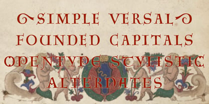 Agedage SimpleVersal is a Opentype font supporting some opentype layout features. To use these functions, you need to use an application which supports OpenType advanced features such as Adobe InDesign CS, Illustrator CS and Photoshop CS. The font includes: Stylistic Alternates Ordinals Numerators, Denominators and Fractions


