10,000 search results
(0.035 seconds)
- Hitormis by Forberas Club,
$16.00 Hitormis is handwritten font with uppercase style. Recommended to use for wall art, children theme, funny theme, comics, cartoon, simple write, poster and display.
 - Arise by Monotype,
$30.00 Arise is a humanist typeface designed for both text and display purposes. Its an understated type family with enough subtle nuances and personality to add distinction to your own typographic compositions. As can be seen in the /a/c/f/g/r/y/ glyphs, hooked terminals are a key feature of this typeface. These terminals are blade-like in appearance, defining a distinctive character that is unusual, yet balanced and refined. Practical features include 38 capital swash alternates for intial and final forms that can be particularly effective when used in titling and branding situations. Small caps are also included (along with matching diacritics) – these are designed to harmonise with regular lowercase forms so that you may easily achieve unicase-style typography. There are 18 fonts altogether, with 9 weights from ExtraLight to Ultra in both roman and italic. Arise has an extensive character set that covers all Latin European languages. Key features: 9 Weights Roman & Italic Small Caps 38 Alternates Old Style Figures European Language Support (Latin) 700+ Glyphs per font.
 - Side A by bb-bureau,
$60.00 Side A – Bauhaus-inspired Experimental and spiky type in 3 sizes (1 - 1/2 - 1/3), designed by Benoît Bodhuin (An ideal use could be: Side A unit in 48 pt, half in 24 pt and A third in 16 pt, then bars would have the same width and spaces between the forms would be equal, but it’s just an ideal use)
 - Rase Grimm by Graffiti Fonts,
$24.99 The Grimm family is a blackletter inspired graffiti style built for headline and display. The family includes 3 variants: Grimm Regular & Grimm Curves both utilize traditional upper & lowercase letters while the Grimm Fat variation is an all-caps style. All 3 styles include initial, terminal & isolated letter variations as contextual alternates as well as a number of stylistic alternates, ligatures & other embellishments.
 - Borgson by Alphabet Agency,
$14.00 Borgson font is a sans serif display font that includes capitals and small capitals. The font includes basic Latin characters (128 characters). The font is great for vintage and hipster themes as well as sports related themes.
 - Palmire by Mas Anis Studio,
$23.00 Hi There! Meet our first modern serif typeface Palmire Palmire is a stylish font that is both modern and minimal. A light font that is perfect for feminine logo marks, fashion mastheads & editorial design (works great in layout design for quotes or body copy). The ligatures feature is so amazing, you can convert regular random word to elegant logo just by using the ligature. And there is 75+ ligature to support your amazing design project! Is there anything else? Of course! it has multilingual characters too! We work so hard to keep this elegant font looks elegant, classy, readable, stylish, eye-catching, and easy to use. You can easily pair them with script or sans serif font from all over the world to make your work more interesting!
 - Florentina by Namistudio,
$15.00 If you ever dream about light vibe, playful, easy going, cute, has some nature touch in it and still has a good read-ability font: it's time to wake up. Florentina is here. The "ink bleed", irregular line, it looks like you write it by yourself. Not mentioning that dreamy hand-drawn bonus... LOTS OF THEM. And it is support 22 languages as well. I hope it support yours. Happy designing! BONUS vector can be downloaded from https://www.dropbox.com/sh/fwgkzcecjy8tqsu/AADi06i-Hf0R49mtT8_DPMw8a?dl=0
 - Cowboy Junk by PizzaDude.dk,
$15.00 Cowboy Junk is my loose handmade impression of what would happen if the wild west crashed into grafitti! The letters are loose and jumpy and the terminals are kind of exaggerated to give that firce impression of handcraft! So, better get up early and leave this town, 'cos there’s only room for one sheriff in this here town, and that is Cowboy Junk! Comes with contextual alternates, which means that the font will automatically cycle through the 5 different versions AS YOU TYPE! Yieeehaaar!
 - Whitehaven by Greater Albion Typefounders,
$8.95 Whitehaven is the spirit of the Art Deco movement made into a very solid and blocky Sans Serif font. The name owes its inspiration to Whitehaven Mansions, a block of flats where that greatest of 1930s detectives, Hercule Poirot lived. Use this to make bold statements, to give posters and designs a taste of thee 30s, and wherever you want to be clear and definitive. Whitehaven is offered in two widths and a range of embossed and engraved styles for flexibility in design work.
 - Checkout by Hanoded,
$15.00 Checkout is a fat, slightly cursive, poster font. It was modeled after 'clearance sale' signs and a 1950 Mexican movie poster for Los Olvidados (directed by Luis Buñuel). Checkout can be used for headlines, posters and, of course, for your clearance sale! Comes with a hard-to-beat amount of diacritics.
 - Kings in Disguise by Elemeno,
$25.00Kings in Disguise is a chunky, balloon font of the sort used extensively during the 1970s. It has a retro, disco feel and is ideal for signs and logos. The name comes from a great comic book series published in the late 1980s. The engraved style has a limited character set. - Eckhardt Fancy JNL by Jeff Levine,
$29.00 Eckhardt Fancy JNL was named in honor of Al Eckhardt (1929-2005), a talented sign painter and good friend of font designer Jeff Levine. The design was inspired by a vintage alphabet found within a collection of decorative display alphabets from the type collection of the late Dan X. Solo.
 - Triborough JNL by Jeff Levine,
$29.00Triborough JNL is the heavier-weight version of Wingate JNL, a narrow, all-caps font from Jeff Levine. Evoking the feel of 1930s and 1940s store and architectural signs, use Triborough JNL along with its counterpart for a nice dual-weight contrast... or by itself for an elegant Art Deco look. - Quaint Notions NF by Nick's Fonts,
$10.00This rollicking fun face is based on legendary lettering artist Alf Becker's Super Thick-and-Thin, his twenty-third offering in "Signs of the Times" magazine. The package includes two fonts: a full Adobe Standard character set, and an Alternates version, which features the more extreme elements of Becker's original design. - Ishtar by Hanoded,
$15.00 Ishtar was the Babylonian goddess of war, fertility, love and sex - all in all a lethal combination. She wasn't the sweetheart her lovers had hoped for; I guess the 'war' part in her resume is a dead give-away. Ishtar font is no sweetheart either: it doesn't have a real baseline and its spooky character might not be everyone's cup of tea. It does have a certain charm, however, and befitting a Babylonian goddess, it comes with Babylonian language support!
 - Kaapeli by Suomi,
$20.00 I've had mixed feelings about Kabel; It is a brilliant headline font with a lot of character, but it's the characters I have problems with. The versions of all big foundries have the same flaws (in my opinion), especially lowecase a and s. So I finally went ahead and made an all new version. It is not Kabel, but very much like it. It has unique x-height, weight and width, and many individual characters are also different from the original.
 - Return Policy by Hanoded,
$15.00 I bought something online, but when I received it, it wasn’t exactly what I had hoped it would be. So I read the return policy and sent it back. And… came up with this font and its name in the process! Return Policy is a hand drawn slab serif, inspired by a bunch of slab serifs from the early 20th century. Return Policy has been given a ‘grunge’ overhaul, making it ideal for sturdy products, websites with an industrial look and manly posters.
 - Afronaut PRO by Borutta Group,
$39.00 Afronaut PRO (New version of typeface published in 2019) was inspired by vernacular Latin & Arabic typography in St. Louis (on Senegal-Mauretania Border, Africa). Geometric forms working well and contrasting with smooth, round elements. After reading "Afronautics – from Zambia to the Moon" by Bartek Sabela (about Zambian conquest of space) a breif was set to create typeface that looks like mix between: vernacular Arabic script, futuristic typography and some special lettering that I found in Africa during my travels to Guinée, Bissau, Gambia, Senegal, Mauritania and West Sahara. Afronaut has seven weights, also many letters have 3 different forms. Afronaut PRO can work as regular version of my Yalla Typeface.
 - HGB Unik by HGB fonts,
$23.00 For many years I had repeatedly written names on certificates or designed texts for certificates of honor with a pen. I later digitized a font written with a broad pen from 1988 to make it easier to use. After the technical possibilities for this had developed, I made a PostScript font out of this document font. The "HGB-Unik" is a humanistic antiqua that arose from this written type. In 2009 Unik was chosen as the text font for a book. However, the book designers wanted to have an italic and a bold style as well. The cursive was developed from written texts that I also wrote for various occasions in the 1980s. The resulting font family was thoroughly revised several times until a usable text font with four weights was created. Although the Unik looks very idiosyncratic in display size, it shows a surprisingly balanced, pleasant typeface in read size.
 - Minora by Alex Meier,
$40.00 Minora is a contemporary sans serif type family of three weights. Glyphs with open, plain and reduced forms are attributes of Minora. Several OpenType features allow different figure sets, fractions and more. Minora had its beginning in 2007 during Alex Meier’s Typedesign study (CAS Typedesign) at the ZHdK in Zurich (Switzerland). After graduation, Alex Meier continued working on this project in a shared studio with his former fellow student Dominique Kerber . He completed this fully developed font in April 2011.
 - Valenteena by Ingrimayne Type,
$9.95 Valenteena is in the spirit of the 19th century, but there are no other typefaces quite like it. It is geometric, using distorted hearts to form the letters. The lower-case letters are smaller versions of the upper-case letters. The overlay variant is derived by breaking ValentinaContour into its parts: the inner letter, the white inner border, and the black outer border. To use them one must have a program that allows layers of letters. Type in and format the inside variant to get the message you want. Also select the color you want this layer to have. Copy this layer twice, formatting one to the medium and and the other to outside. Color each of them in the colors you want and them combine the three layers, placing them so the letters exactly align. You will get letters with three colors.
 - Column Sans by Campotype,
$25.00 Column Sans, talking about space efficiency. The character set that condensed can maximize the use of limited space without losing good legibility aspects. The typeface is very appropriate to be used as a text in a small column widths, display text, caption, title, author credit on the film, etc. Column Sans is available in OpenType format in the three weights Light, Regular, and Bold, whereby there are corresponding italics for all variants. In the same narrow italic versions, the "a" has a closed form while the "f" has a descender. Besides of standard ligature, this typeface is also equipped with some additional ligature and deligature like "fr", "tt", "cb", "ch", "ck" and so on as well as three "stylistic ligature": "the", "Mr" and "Mrs". Please find more information about the OpenType Manual of this typeface on the gallery page (pdf) if possible.
 - Echo Soul by Set Sail Studios,
$14.00 Introducing Echo Soul; a free-flowing and carefree brush font duo, hand painted with love. Echo Soul speaks from the heart and doesn't hold back. With elongated brush strokes and a natural flow, it's the perfect choice for handwritten quotes, product packaging, and logo designs with a personal and affectionate touch. The Echo Soul family consists of; 1. Echo Soul • A handwritten script font containing upper & lowercase characters, numerals and a large range of punctuation. 2. Echo Soul Alt • This is a second version of Echo Soul, with a completely new set of lowercase characters. If you wanted to avoid letters looking the same each time to recreate a custom-made style, or try a different word shape, simply switch to this font for an additional layout option. 3. Echo Soul Sans • An all-caps font containing uppercase-only characters, perfect for supporting text to compliment the Echo Soul Script font. Also includes numerals and a large range of punctuation. Stylistic Alternates • Are also available for several lowercase characters - these have elongated tails and look great when placed at the end of a word. These can be used by turning on 'Stylistic Alternates' in OpenType capable software, or accessing via a Glyphs panel.
 - Project D by DM Founts,
$22.00 Project D is the fourth typeface released by DM Founts. It was inspired by the infamous graffiti atop the former Heygate Estate in South London, which I had passed by numerous times on the overground train years ago. Heygate Estate has since been replaced by soulless luxury flats, as per the gentrification agenda. The letters don't entirely match the graffiti as they were created from memory, but I thought such a profound statement should be honoured. Project D is best used for impact at large sizes, although it should scale well. Use it for computer interfaces, retro headings and anything involving defiance, espionage, infiltration and spy games.
 - Christmas Tree by Trim Studio,
$12.00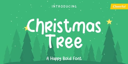 Christmas Tree is fun display font created to help spread holiday cheer. Get inspired by its charming appearance! Its perfectly suited for crafter and graphic artist to complete their design such as invitation, advertisement, poster, logo, birthday, product sign, and many more! Christmas Tree Font is also Lightweight and contains All Standard glyphs and punctuations and can be used beside any font.
 - Pedrera by Etewut,
$20.00 Introducing a vintage typeface Pedrera It is simple pleasure for your eyes. But in the same time, fonts from the family could be used for card signing or product design, they have characters with tiny details that fascinate your attention. Each font is PUA encoded and has foreign symbols. Pedrera family has 6 fonts: - Regular - Bold - Italic - Italic Bold - Script - Script Bold
 - Shera Display by Alandya TypeFoundry,
$18.00 Shera display font are elegant and subtle with touch of luxury. Shera Display represents a classy typeface best suitable for magazines, posters, advertising or any kind of fine and sensitive design. The font includes a full set of uppercase and lowercase letters, diacritics, currency signs, numerals, Unique, playful and versatile display font with ligatures and alternates to enrich your design work.
 - Luxgard Steel by Tadiar,
$23.00 Luxgard Steel is an unique vintage color gradient vector SVG font created for such areas as Media & Entertainment, Food & Drinks, Clothes, Music, Games & Applications, etc. with Multilingual support. Well use in vintage labels, headers & titles, Posters, Street Signs and other Outdoor, Package Design. Luxgard Steel is derivative from Luxgard Layered font (it is also cool and flexible): https://www.myfonts.com/collections/luxgard-font-tadiar
 - Nura by Sabrcreative,
$12.00 Introducing the Nura Font Family is the modern Display sans serif family. The Nura Font family comes in various sizes from Thin to Black, giving you the freedom to get creative with this font. With strong characters in the size of Black, it is very suitable for use for sign displays. and other sizes you can use as needed for your project
 - The Cartel by Say Studio,
$12.00 About the Product The Cartel is a elegant serif font . This typeface has been made carefully to make sure its premium quality and luxury feel. The ligatures makes this typeface unique and stands out rather than the regular serif font. Very suitable for logo, headline, tittle, and the other various formal forms such as invitations, labels, logos, magazines, books, greeting / wedding cards, packaging, fashion, make up, stationery, novels, labels or any type of advertising purpose. Features : numbers and punctuation multilingual ligatures alternates PUA encoded FAQ's : Where are the TTF's? They are included in a download link( in a text file) in your main download file. 1 user 2 computers installation (Desktop License) You may NOT use for broadcast or Cinema/Motion Picture. You may NOT resell this font in any platform without further permission from designer. Do NOT embed font files in app/game/e-pub (for desktop license) You may NOT use the fonts in templates for sale/free. ( web/print/app ) For other license use please contact us. SOFTWARE REQUIREMENTS : Fonts and alternate : No special software required they may be used in any basic program /website apps that allows standard fonts That's it folks! You can go ahead and get cracking :) Follow My Shop For Upcoming Updates Including Additional Glyphs And Language Support. And Please Message Me If You Want Your Language Included or If There Are Any Features or Glyph Requests, Feel Free to Send me A Message. Have a Good Day !
 - Lost and Foundry by Fontsmith,
$15.00 Breaking the cycle of homelessness We are partnered with The House of St. Barnabas, a private members club in Soho Square, whose work as a not for profit charity aims to break the cycle of homelessness in London. Each purchase (of the family pack) comes with a one month membership to The House and 100% of the proceeds from sales of fonts go directly to the charity to help their essential work. This unique collection of 7 typefaces is based on the disappearing signs of Soho, at risk of being lost forever due to the ever changing landscape of the area. By re-imaging the signage as complete fonts, we have rescued this rich visual history from the streets and present the typefaces into a contemporary context for a bright optimistic future. FS Berwick Thanks to its humble tiled origins, this Egyptian serif type maintains a uniform character width, creating the irregular letter proportions found in the final alphabet. Broad-shouldered, the bracketed serifs firmly ground the font, whilst its extreme hairlines become a necessity due to the uniform width. Of note is the upside down ‘S’, to be found on the original sign on Berwick Street. Perhaps due to its ceramic origins, there is a surprising ‘slippiness’ to its final appearance. FS Cattle Cattle & Son is best described as a wide, but not overly extended, grotesque-style sans serif, showing a uniform width and carrying a robust strength to its form. Whilst lightly functional overall, the purposeful diagonal legs of the ‘K’, ‘R’ and the tail of the ‘Q’ add an urgency to its appearance. The reduced size of the ampersand gives away Cattle & Son’s hand-painted origins, and the oblique compacted ‘LTD’ found on the original sign is also included in the final set. This beautiful sign is tucked away under an arch in Portland Mews, sheltering from the weather. Perhaps this is why it has lasted so long. FS Century This somewhat elongated set of Roman capitals was originally rendered in paint circa 1940, but its roots trace back to the Trajan Column in Rome. Witness the slightly unbalanced ‘W’ and the painter’s hand is revealed. Century’s flared serif style is extremely short, sharp and bracketed. The ‘M’ is splayed and has no top serifs. Century has a uniform appearance of width, probably due to its sign-written origins. Yet is elegant, classic and exudes sophistication. FS Charity A true Tuscan letterform, the original is located on The House of St. Barnabas in ceramic tiles and was revealed in all its broken glory in 2014. FS Charity retains the option of using these incorrect characters (try typing lowercase in the test drive above and compare with the more uniform uppercase characters). FS Charity features fishtailed terminals on its strokes, a curious branched ‘T’ and the ‘S’ displays tear-drop ends to its serifs. Almost uniform in width, the ‘A’, ‘M’ and ‘W’ are the widest characters in this set. FS Marlborough The elongated Marlborough features diagonal terminals to some characters and numerals. Also retained is the space-saving contracted ‘T’ glyph from the original sign, while the ‘R’ features a distinctive wedge-shaped leg. Highly individual in this form, similar signage appears around Soho, but featuring a variety of widths in their design. FS Portland The sister type to Cattle & Son, Portland is oblique rather than italic. The serifs are not overly long, yet still enhance its rather rigid cap height and baseline appearance. Its ‘A’ has a top serif, the ‘M’ is square and the ‘G’ foregoes any spur. Particularly delightful is the open ampersand. Numerals align to encourage the horizontal flavour of the oblique style. Overall, Portland is both confident and graceful. FS St James A lineal Continental style, St James also displays a true sense of ‘Londoness’ in its titling form, perhaps influenced by early Underground signage. Irregular letterforms display a continental flavour, particularly evident in its Deco style ‘W’, ampersand and numerals. The rather high cross bar in the ‘A’ is also reflected in the raised middle strokes of the ‘M’. Noteworthy are the distinctive unions found on all of the characters and the additional small caps. The original lettering is still located on Greek St.
 - ABTS Crestwing by Albatross,
$19.95 ABTS Crestwing is a unique initial font with extraordinary flexibility and beauty. There are 5 wing styles to choose from. The wings are accessed through typing numbers. The 5 pairs are: [1, 2] [3, 4] [5, 6] [7, 8] & [9, 0]. The odd numbers in the pairs will give you a left wing, and the even numbers will give you a right wing. The letters are separated into upper and lowercase. Uppercase has a crest point, the lowercase does not, giving you the ability to string letters together to form words and phrases, and place the tip of the crest above the letter of your choosing. Optional endcaps are available using the brackets on your keyboard "[, ]." This allows you to cap off a word if you wish not to use a wing to do so. Crestwing is both beautiful and unique, and works best at large sizes.
 - Sanity by Popkern,
$- The design of Sanity typeface is modernized by abandoning any characteristics associated with hand writing, such as curved lines or elaborate corner details. The design is based on a rigid geometric grid and radiates confidence with its daring contrasts and provocative style. In large amounts of text the font “Sanity” can be hard to read due to a «dazzle» effect caused by alternating thick and thin strokes, particularly as the thin strokes are hardly visible at small point si es. Due to this quality, the “Sanity” font-family is best suitable for titles or large print advertisements. There are five key stylistic principles taken as a main framework for the creation of the “Sanity”: symmetry, contrast, geometry, artificiality and monospacing.
 - Route Du Soleil by Hanoded,
$15.00 Probably everyone living in Europe has heard of the (in)famous Route Du Soleil. The Route Du Soleil (Motorway Of The Sun) is a stretch of road from Paris to Lyon (in the south). It is THE route holiday makers take to reach southern France, so they can get there before everyone else does. The result: endless traffic jams, overheated engines and people and more toxic exhaust fumes than your average petroleum distillery. Route Du Soleil is also a very nice hand written font that comes with swashes and ligatures. If you happen to find yourself in a traffic jam on your way to southern France, then I hope you have downloaded this font. Just one look at it and you’ll forget your problems! ;-)
 - Lemony Crumpet by Kitchen Table Type Foundry,
$10.00 A crumpet is a small griddle bread, mostly enjoyed in the UK, North America, Australia and New Zealand. I have never had one, but I have heard of them and I like the name - which is probably Welsh in origin. Lemony Crumpet is a whimsical, handmade font. It is tall & thin, shaky and jumpy and I wouldn’t use it as a poster font because of its delicate properties, but it would look fantastic on book covers, product packaging and websites. Comes with extensive language support and a set of alternates for the lower case letters.
 - Sleepy Time by Hanoded,
$15.00 Sleepy time… Ah, if only your kids would go to bed, close their eyes and drift off to sleep. This font was created when my son had some problems falling asleep: he'd cry, he wanted to sleep in a different bed, he wanted a different animal friend (he has Tij - a tiger, Meh - a sheep, Rafi - a giraffe, Moo - a cow, Woofy - a dog, Kikker - a frog). Sleepy Time font is an all caps typeface with uneven letters and a very different upper and lower case. It comes with all languages, including Cyrillic!
 - Transmogrifier by PintassilgoPrints,
$35.00 Inspired on Cuban posters by the talented and prolific graphic artist Eduardo Muñoz Bachs, Transmogrifier was hand painted with a thin brush, using loose, fast strokes. This font is packed with lots of contextual and stylistic alternates that automatically transmogrifies the letters as you write, when using opentype savvy programs. It's also possible to pick the alternates by hand and set the text the way you like better. The choice is yours, and there are really plenty of alternates to choose from and create original handlettered-looking designs. The font also brings a rough set of pictures based in charcoal sketches from Shniedewend & Lee Company, 1888. These were painted with the same thin brush as the letters, making it a natural complement. So let the transmogrification begin!
 - Agilo Handwriting Pro by SoftMaker,
$15.99 Digitized handwriting fonts are a perfect way to give documents the “very special touch”. Invitations look simply better when handwritten than when printed in bland Arial or Times New Roman. Short handwritten notes look authentic and appealing. There are numerous occasions where handwritten text makes a better impression. Agilo Handwriting Pro is an upright, medium weight handwriting font with a simplified, slightly sloped print (non-connecting) style that mimics true handwriting closely. Use Agilo Handwriting Pro to create stunningly beautiful designs easily. This typeface comes with many pre-made ligatures and alternative characters for sophisticated typography – all easily accessible as OpenType features. A “random” feature even allows for automated random switching between variations of the same character, resulting in type that looks authentically handwritten.
 - Rumble King by Putracetol,
$20.00 Rumble King is a vintage script font. As the name suggests, Rumble King is inspired by classic poster or vintage magazine. Besides that, I also combine it with a script style and it’s a little irregular in its shape style. I strengthen the vintage/retro impression with the character ligatures, there are 140 ligatures in Rumble King. But if you want to use Rumble King Font with a neater impression, you can disable this ligature feature. Rumble King is perfect for projects with vintage/retro and classic themes. But Rumble King is also suitable for logos, branding, greeting cards, invitation cards, advertisements, titles, healines, book titles, stickers, packaging, quotes, posters, t-shirts/apparel, billboards and others. Rumble King is also support multi language.
 - Local Jeweler JNL by Jeff Levine,
$29.00 Local Jeweler JNL was inspired by an online image of a vintage 1940s-era store sign. This type design features a thin Art Deco sans serif in both regular and oblique versions.