10,000 search results
(0.056 seconds)
- Gleed by VP Creative Shop,
$14.00 Introducing Gleed - serif typeface - 3 fonts Gleed is versatile and minimal typeface loaded with 3 fonts and multilingual support. It's a very versatile font that works great in large and small sizes. This font is perfect for branding projects, home-ware designs, product packaging, magazine headers - or simply as a stylish text overlay to any background image. FEATURES Uppercase, lowercase, numeral, punctuation & Symbol Regular Alternate Italic Multilingual support No special software is required to type out the standard characters of the Typeface. Canva friendly Feel free to contact me if you have any questions! Mock ups and backgrounds used are not included. Thank you! Enjoy!
 - FS Me Paneuropean by Fontsmith,
$90.00Mencap When most of us go about everyday tasks, we take for granted the reading that’s involved, on instructions, labels and so on. For people with learning disabilities, reading is made much harder by certain fonts. FS Me is designed specifically to improve legibility for people with learning disabilities. The font was researched and developed with – and endorsed by – Mencap, the UK’s leading charity and voice for those with learning disabilities. Mencap receive a donation for each font license purchased. Every letter of FS Me was tested for its appeal and readability with a range of learning disability groups across the UK. Inclusive Fontsmith were determined to design a font that was accessible to those with learning disabilities without standing out as such – one that was inclusive of all readers. It should comply with accessibility guidelines and work best at 12pt, but still have a character of its own that was warm and approachable. “So much accessible design is done separately to the main body of brand work,” says Jason Smith. “We wanted to make a typeface that covered both brand tone and neutrality, and that could be used legitimately as a brand font as well as in accessible design.” Me, you, everyone FS Me is about design that doesn’t patronise. People with learning disabilities are often treated as inferior by childlike design. FS Me is designed for adults, not children – a beautifully-designed font for everyone. Its features include very subtle distinguishing elements of each letter to aid the reading and comprehension of texts, and tails, ascenders and descenders that have been extended for extra clarity. What the people said... Here is a sample of comments from the extensive research groups that helped to shape the letterforms of FS Me: “I want something round, clear and friendly.” “We like movement in the letters but don’t want anything childish.” “The ‘b’ and ‘d’ need to be different as they can be confused.” “I prefer the handwriting-style ‘a’.” “It’s important to have an accessible ‘a’ and ‘g’. Teachers sometimes complain that learners cannot read or understand the inaccessible ‘a’ and ‘g’.” - FS Me by Fontsmith,
$80.00 Mencap When most of us go about everyday tasks, we take for granted the reading that’s involved, on instructions, labels and so on. For people with learning disabilities, reading is made much harder by certain fonts. FS Me is designed specifically to improve legibility for people with learning disabilities. The font was researched and developed with – and endorsed by – Mencap, the UK’s leading charity and voice for those with learning disabilities. Mencap receive a donation for each font license purchased. Every letter of FS Me was tested for its appeal and readability with a range of learning disability groups across the UK. Inclusive Fontsmith were determined to design a font that was accessible to those with learning disabilities without standing out as such – one that was inclusive of all readers. It should comply with accessibility guidelines and work best at 12pt, but still have a character of its own that was warm and approachable. “So much accessible design is done separately to the main body of brand work,” says Jason Smith. “We wanted to make a typeface that covered both brand tone and neutrality, and that could be used legitimately as a brand font as well as in accessible design.” Me, you, everyone FS Me is about design that doesn’t patronise. People with learning disabilities are often treated as inferior by childlike design. FS Me is designed for adults, not children – a beautifully-designed font for everyone. Its features include very subtle distinguishing elements of each letter to aid the reading and comprehension of texts, and tails, ascenders and descenders that have been extended for extra clarity. What the people said... Here is a sample of comments from the extensive research groups that helped to shape the letterforms of FS Me: “I want something round, clear and friendly.” “We like movement in the letters but don’t want anything childish.” “The ‘b’ and ‘d’ need to be different as they can be confused.” “I prefer the handwriting-style ‘a’.” “It’s important to have an accessible ‘a’ and ‘g’. Teachers sometimes complain that learners cannot read or understand the inaccessible ‘a’ and ‘g’.”
 - Meanwhile Uncial by Comicraft,
$19.00 Aye! Verily ‘twould seem ’tis time for thee to speak in the majuscule language of legendary gods! Yea, thou shalt speak most eloquently in the style and manner of many a pseudo-Shakespearian Bard. Forsooth, thine utterances such as “HAVE AT THEE, VILE VILLAIN!” shall cause all ye creatures of evil to begone from the hallowed halls of Asgard (or other otherworldly domains of the gods). Forsooth, Meanwhile Uncial is a Capital Font, suitable for Gods of Thunder, Mischief or e’en Warriors Three! Meanwhile Uncial contains alternate uppercase characters, auto-ligatures for a more natural, hand-drawn appearance, and Comicraft's magical Crossbar I Technology™, to keep that Mighty Character in its proper place. (Artwork from ELEPHANTMEN #32 by Richard Starkings & Axel Medellin, available on Comixology)
 - Tetris Quadrate by Melissa Lapadula,
$19.95This font is influenced by the advancement in graphic computer technology that has evolved since the first basic pixilated computer games. This typeface aims to be bold and brazen. The fonts primary function is heading use. - Fluffy Tiger by Fat Hamster,
$20.00 Fluffy Tiger - Hand made brush font Soft & passionately handwritten by brush font perfect for statement, flyers, greeting and invitation cards, social media quotes, logo design, apparel design, label and packaging design, heading, scrapbooking, calendars, book covers.
 - Authemia by Skinny Type,
$15.00 Authemia is a font duo Script, Sans, and plus Extras typeface with characters dancing along its baseline. It has a casual and elegant touch. Can be used for various purposes such as logos, wedding invitations, headings, t-shirts, letterheads, signage, labels, news, posters, badges etc. OpenType features with alternative styles, ligatures, and multi-language support. To enable OpenType Stylistic alternates, you need a program that supports OpenType features such as Adobe Illustrator CS, Adobe Indesign & CorelDraw X6-X7, Microsoft Word 2010 or a later version. How to access all alternative characters, using the Windows Character Map with Photoshop: https://www.youtube.com/watch?v=Go9vacoYmBw How to access all alternative characters using Adobe Illustrator: http://youtu.be/iptSFA7feQ0 There are additional ways to alternate / swash, using the Character Map (Windows), Nexus Font (Windows), Font Book (Mac) or a software program like PopChar (for Windows and Mac). Need help? If you need help or advice, please contact me via email. Thank you!
 - Direct Mail by Partnrz,
$15.00 Direct mail designers rejoice! Finally, a font family made just for you. Created to be as in-your-face as possible: for use as a primary headline; for dates and phone numbers; and for coupon heads and price points. Tired of kerning numbers for your coupons and prices? Then you'll love this font! All of the kerning has been done for you. (No more spacey 1's!) Designed for a tight kern - just track it in on larger sizes. Instead of standard weights, this font was designed to fit different width needs. Have a long headline, but your client wants it in one line and tall? Use the extra-condensed. Need something really bold for a phone number or price point, but you don't have much height available? Use the fat. And there are two more widths for those in-betweens. And to top it off - you can get them all in an oblique as well.
 - Couture Facile by Nathatype,
$29.00 Adding some beauty touches and perfect, unique styles to your designs, without which your designs will be incomplete and ignored, may be tough work and time-consuming. Therefore, Couture Facile is here to help you. Couture Facile is a handwriting-like script font to add combinations of beauty and styles to your designs properly. Its dissimilar, more natural shapes looking spontaneously written are the font’s main characters. In addition, its letters’ details show high contrasts in curvy, sharp scratches on the letters’ edges. Couture Facile shows personal, elegant, creative impressions to the designs and is suitable to apply for either big or small text sizes due to its great legibility. You can also enjoy the available features here. Features: Stylistic Sets Ligatures Multilingual Supports PUA Encoded Numerals and Punctuations Couture Facile fits best for various design projects, such as brandings, headings, magazine covers, quotes, invitations, greeting cards, printed products, merchandise, social media, etc. Find out more ways to use this font by taking a look at the font preview. Thanks for purchasing our fonts. Hopefully, you have a great time using our font. Feel free to contact us anytime for further information or when you have trouble with the font. Thanks a lot and happy designing.
 - Jusline by Letterafandi Studio,
$12.00 Jusline is a modern handwritten font. It can be used for various purposes such as logos, wedding invitations, headings, t-shirts, letterhead, signage, labels, news, posters, badges and so much more.
 - Schwarz by Miguel Ibarra Design,
$20.00 Schwarz is a Black Letter typeface inspired by all that is black. Jagged edges and sharp diagonals make Schwarz a head banging font. Some stylistic alternates and ligatures are also available.
 - Illinoise by Just in Type,
$18.00Illinoise is a mutation of one of the most beautiful screen fonts ever. But, there are no straight lines. Everything is shaking. Let's party! - Airates Script by Maculinc,
$20.00 Airates, this is my first font, as the name suggests and because this is my first font that I introduced to the world. Inspired by a film where someone who loses all and returns to struggle to find meaning in life that actually clings to the edge of the world and that's where the beginning of a story seems to be reborn. Airates Script Fonts is a typeface thick and easy to read so comfortable to wear .You can use it as a logo, badge, insignia, packaging, headline, poster, t-shirt/apparel, greeting card, business card, and wedding invitation and more. The flowing characters are ideal to make an attractive messages to your taste. mix and match with a bunch of alternative characters to fit your project.It will be more interesting if you add swash / alternative swash. The alternative characters in this font were divided into several OpenType features such as Stylistic Alternates, Ligature and Ligature Alternates. Mail support : maculinc@gmail.com Thank you! Maculinc
 - Carrig by Monotype,
$25.99 IMPORTANT – Please consider the superior Carrig Pro before making a purchase decision. Carrig started its life in 1998. I was working for a design agency in Cork, Ireland and was given a new brand identity project for a lakeside hotel in County Kerry. While visiting the hotel I made various sketches of the surroundings and upon returning to the studio, it was clear that my strongest ideas for the identity would be based on these freehand drawings. I wanted a classic, rough, hand-drawn typeface to complement this style but at that time, the studio didn’t have anything suitable, so I decided to draw my own. I found a Trajan-esque typeface that I really liked the look of in an old calligraphy workbook. I set about drawing my own version and then digitised it. Once the client had seen and approved my design, I began working on creating a complete all caps typeface to use for the hotel’s stationery. With ‘carrig’ being the Gaelic word for ‘rock’, my new typeface was all the more appropriate as it had the appearance of letterforms that had been carved into stone and weathered by time. With the project completed and the client happy, Carrig then sat in my unused fonts folder for several years... but there was always a nagging feeling at the back of my mind that I should do something more with it. So, in the autumn of 2014, I finally set about doing just that and created the font family you now find at MyFonts. Carrig’s form and structure was influenced by a hybrid of Classic Roman and Garalde typeface designs. The original calligraphic elements from the 1998 version of Carrig have been retained to add personality—as can be seen in the serifs, strokes, spurs, terminals and open bowls. Perhaps its most distinctive trait is a high x-height combined with relatively short ascenders. I wanted Carrig to immediately resonate with the reader and have designed it to be familiar and friendly. I imagine designers might choose Carrig as an alternative to such typefaces as Trajan, Garamond and Baskerville. I see Carrig as primarily a display typeface for titles/headlines in printed materials. I would also love to see it being used for branding, packaging and promotional material and am keen to hear from designers who use it in their own work.
 - Bladesmith by Hanoded,
$15.00 I have always had a keen interest in forging; I used to be a silversmith, and I love working with metal. Some time ago I forged my first axe (a skeggøx or bearded axe), sharpened it and fitted it with a handmade ash handle. It isn’t perfect, but it is my first ever forged axe and I’m pretty proud of it. All of this went through my head when I started drawing the glyphs for this font. And to be honest, I couldn’t find a more suitable name for it! Bladesmith is a handmade font, forged in fire (haha). It was actually made with an old sharpie. It is a rough and ready font, quite suited for headlines, book covers and posters.
 - Saloon Girl by FontMesa,
$25.00 Saloon Girl is a revival of an old classic font used by sign painters and includes the rarely seen lowercase. Saloon Girl comes with extra fill fonts, you will need an application that works in layers in order to use the fill fonts that come with FontMesa fonts. In this all new 2020 version we've added case sensitive form, small caps and italics.
 - Newmark by Jonahfonts,
$40.00 Very suitable for a wide range of applications including texts, packaging and headings.
 - Mastolleh by Alit Design,
$17.00 Presenting 🕌Mastolleh Ramadan Typeface🕌 by alitdesign. “Mastolleh” is an Arabic font with a blackletter style and beautiful swashes. It is a highly versatile font that can be used for a variety of design projects. This font is designed specifically for users who require a font that can handle various writing systems and special characters. It comes with support for multiple languages. Mastolleh font includes PUA (Private Use Area) Unicode, making it compatible with various software and applications that support OpenType features. It also features 847 glyphs, including uppercase and lowercase letters, numerals, and punctuation marks. Additionally, there is a special version of Mastolleh font called “Mastolleh Dingbats,” which includes 304 bonus dingbat characters related to Ramadan and Islamic themes. These bonus characters include crescent moons, lanterns, and mosque silhouettes. Overall, Mastolleh and Mastolleh Dingbats are highly versatile fonts that can be used in a wide range of projects. Their unique style, multilingual support, PUA Unicode, extensive glyph set, and beautiful swashes make them a great choice for designers and users who need a font that is both beautiful and functional. Language Support : Latin, Basic, Western European, Central European, South European,Vietnamese. In order to use the beautiful swashes, you need a program that supports OpenType features such as Adobe Illustrator CS, Adobe Photoshop CC, Adobe Indesign and Corel Draw. but if your software doesn’t have Glyphs panel, you can install additional swashes font files.
 - Carnival by House Industries,
$33.00 Unlike the modest fonts in your menu content with discreetly imparting information, Carnival is conspicuous by design. Deliberately engineered to attract eyeballs, the typeface’s unmistakable silhouette produces a dramatic visual texture that stands out in print, on screen, or in any environment where your message demands to be noticed. The steady yet vibrant rhythm created by its letterforms also makes Carnival ideal for fashioning alphabet patterns and graphic devices. Flaunting a lean slender body anchored by stout stroke endings, Carnival turns conventional typographic thinking on its head by inverting the relative thickness of its stems and serifs. This reverse-contrast approach stretches all the way back to the roots of modern advertising, when similar types became the favorite for posters, packaging, and loads of consumer products during the 1800s. The striking style prevailed well into the next century, as Harold Horman, co-founder of New York City-based Photo-Lettering. Inc., modernized a version for the company’s popular film-typesetting service in the early 1940s. Digitized and expanded by Dan Reynolds in 2013, Carnival had previously been used exclusively for House Industries projects. Now you can get in on the action, and use this stunning slice of type history anytime you want your work to turn heads. SUGGESTED USES Carnival’s unique character commands attention, making it the perfect voice for promotional pieces, editorial design, labels, packaging, posters, and any other application that needs to strike the right tone. Like all good subversives, House Industries hides in plain sight while amplifying the look, feel and style of the world’s most interesting brands, products and people. Based in Delaware, visually influencing the world.
 - Skema Pro by Mint Type,
$40.00 Skema Pro is a versatile system of 6 serif typefaces - each bearing a distinct character and purpose. Together they form a huge superfamily of 84 fonts to fit any imaginable task. Skema Pro Livro is a low contrast, low x-height typeface with inclined axis. It is designed to work in books, where long ascenders and descenders along with increased line-spacing aid comfortable reading. Skema Pro Text has low contrast, medium x-height, and slightly tilted axis. Its neutrality along with modern feel makes it default choice for long texts of any nature. Skema Pro Omni features medium contrast, medium x-height, and slightly inclined axis. Being a more contrasted version of Skema Pro Text, it shares its intent of usage, however, creates a different texture with more formal look. Skema Pro News is a low contrast, large x-height typeface with vertical axis. Works best in newspapers and in screen applications. Skema Pro Title has medium contrast, large x-height, and vertical axis. Designed to work in larger text sizes, it offers contemporary detailing for pull-quotes and subheadings. Skema Pro Display is a typeface with high contrast, large x-height, and vertical axis. It shows its features in large text sizes, such as editorial headings.
 - Fontwax by Kustomtype,
$25.00 The Fontwax font is inspired by sign painters in sixties advertisings with a touch of Arts & Crafts. This style of type is instantly associated with advertising and design for high-end products. Fontwax is meticulously drawn for quality and readability. Fontwax is great for display, logos, branding, packaging, advertising, food, sports, titles, film, tv, and much more. Fontwax comes in 4 styles which perfectly match together. Fontwax is a great display family with roots in the advertising and sign painting industry of the 20th century. It is smoothly polished with all the features a good designer needs. For the best price, I recommend you grab the whole pack! Fontwax is designed by Coert De Decker in 2018 and published by Kustomtype Font Foundry.
 - Neonstar by Mokatype Studio,
$24.00 Introducing the Neon Sci-fi Futuristic Font called Neonstat a unique font with a futuristic style that can make your futuristic logotype more interesting. Inspired by real-world neon light signs, this font is perfect for adding your own glowing light effects or can be used to actually design real-world neon signs. Neonstar font is suitable for your design and allows you to create beautiful designs, headlines, posters, logos, badges, and much more. It is also best used for posts, logos, posters, labels, and more. Works on PC & Mac, simple installations, accessible in Adobe Illustrator, Adobe Photoshop, Adobe InDesign, and even works on Microsoft Word. PUA Encoded Characters - Fully accessible without additional design software. Fonts include multilingual support Image used: All photographs/pictures/vectors used in the preview are not included, they are intended for illustration only. Thank You
 - Big Moore by Carter & Cone Type Inc.,
$35.00 A 1766 specimen by Isaac Moore, former manager of Joseph Fry’s foundry in Bristol, England, shows many types inspired by John Baskerville’s. But a century later, standardization had foisted inept lining figures and shortened descenders upon these designs. Matthew Carter remedies the tragedy with Big Moore, restoring oldstyle figures, full-length descenders, and historic swashes to this regal serif in two styles.
 - Loraine by Homelessfonts,
$49.00 Homelessfonts is an initiative by the Arrels foundation to support, raise awareness and bring some dignity to the life of homeless people in Barcelona Spain. Each of the fonts was carefully digitized from the handwriting of different homeless people who agreed to participate in this initiative. MyFonts is pleased to donate all revenue from the sales of Homelessfonts to the Arrels foundation in support of their mission to provide the homeless people in Barcelona with a path to independence with accommodations, food, social and health care. Loraine was born in London. She was an ordinary, hardworking family person, with nothing to worry about beyond paying the rent at the end of the month or keeping the fridge full. Until in 2009 she came to Barcelona on holiday. Soon after she arrived her passport was stolen from her and she had a series of problems with the British embassy. Somebody had made illegal use of her passport. So Loraine found herself in a strange place, unable to get home. She didn’t know anyone there and her circumstances meant she couldn’t ask for help from England, either. She had to sell all her possessions and, in time, learn to speak Spanish. “Living in the street is a wonderful adventure,” she says. In the street she discovered a new city, a new country and a new culture. “There are lots of people who prefer to sleep under the stars.” She also made lots of friends who helped her in a completely unfamiliar world.
 - Fakir Pro by Underware,
$50.00 Fakir | A Hindu ascetic or religious mendicant, especially one who performs feats of magic or endurance. The well known feats performed by them include sitting steadily on a bed of nails and walking on burning coals. Blackletter | A script used throughout Western Europe from approximately 1150 to 1500. It continued to be used for the German language until the 20th century. Fakir, a blackletter with a holy kiss is a contemporary interpretation of gone letterforms with origin in blackletters. More precisely, we based the construction on broadnip textura, with lots of broken, edgy, interrupted strokes – try to sit on a nail bed and you’ll know why fakirs like to read just these kind of fonts! After being abandoned for some time (not accepted, nearly forbidden), we would like to give our generation a blackletter from here and now. So Fakir is not a revival, but an all new 21st-century blackletter. Fakir is a set of edgy text and display fonts, ranging from tight and heavy to light and wide. It has 11 fonts, all supporting Underware Latin Plus character set, that covers 219 languages.
 - Pen Elegant JNL by Jeff Levine,
$29.00 A 1918 lettering instruction book by William Hugh Gordon presented a number of lettering styles that were geared toward sign and show card painters along with tips and tricks regarding the correct construction of such signs for maximum effect. One pen lettered Roman alphabet with a beautiful set of numerals has been recreated digitally as Pen Elegant JNL, which is available in both regular and oblique versions. To note, Gordon was the co-inventor of the Speedball lettering pen with Ross F. George in 1915.
 - Hey Girlie by Prioritype,
$19.00 Hey Girlie - Display Font. Catchy display font is here. Equipped with alternative characters to expand your design style. There are two styles, namely regular and slant. Perfect for merchandise designs, posters, titles, stickers etc. Features: Uppercase, Lowercase, Numeral, Punctuation, Multilingual & Alternates. Multilingual contained: Afrikaans, Albanian, Asu, Basque, Bemba, Bena, Breton, Catalan, Chiga, Cornish, Danish, Dutch, English, Estonian, Filipino, Finnish, French, Friulian, Galician, German, Gusii, Indonesian, Irish, Italian, Kabuverdianu, Kalenjin, Kinyarwanda, Luo, Luxembourgish, Luyia, Machame, Makhuwa-Meetto, Makonde, Malagasy, Manx, Morisyen, North Ndebele, Norwegian Bokmål, Norwegian Nynorsk, Nyankole, Oromo, Portuguese, Quechua, Romansh, Rombo, Rundi, Rwa, Samburu, Sango, Sangu, Scottish Gaelic, Sena, Shambala, Shona, Soga, Somali, Spanish, Swahili, Swedish, Swiss German, Taita, Teso, Uzbek (Latin), Volapük, Vunjo, Zulu. Thanks!
 - Periplus by PintassilgoPrints,
$26.00 I got rhythm, I got music, I got my swirls, who could ask for anything more? Periplus is quite an eccentric type, full of twists and nice oddities here and there. It is an all-caps font with 2 variations for each letter and number, stored at upper- and lower-case slots. For added amusement, every letter got not 1 or 2, but 4 swash variations. One can be reached through the OpenType swash feature: just select the letter and hit the swash button. The other ones you will access through a glyphs palette. All of them are neatly organized with the 'access all alternates' feature. The font is yet equipped with some stylistic alternates and ornaments. Have fun!
 - Type Tiles JNL by Jeff Levine,
$29.00 Type Tiles JNL is based on a ‘completed’ version of ‘Alpha-Blox’ by American Type Founders, circa 1944. The capitals, lower case and numerals shown in the sample sheet put out by ATF depicted type made with five-high blocks comprised of modular units spaced two points apart. These units could be combined in varying ways to create custom type of varying heights and widths and was available for purchase in both linear (multi-line) and reverse (white on black) formats. Using the 'reverse' model shown on the sample sheet, all of the characters were re-created digitally, and missing punctuation, foreign characters and other glyphs found in a basic computer font were drawn and added. The 'J' and 'T' in the type sample had truncations, so a more complete character was created for each of those letters. For those wanting an unbroken string of words or blank end caps, there is a double column space on the vertical bar key. A single column space is located on the broken bar key for shorter end caps. Type Tiles JNL is available in both regular and oblique versions
 - Rawbeat by Wasabib Type Foundry,
$9.00 RAWBEAT is a Display Font with graffiti style, this font coming with 3 style : Regular, Outline, and Extrude. this font will make your designs or branding stand out and eye catching. 100% hand drawing to get the artistic look and make it more powerfull.
 - Al Glamour Bouquet by Aluyeah Studio,
$125.00 Hello Aluyeaholics! Glamour Bouquet, a magnificent wadding handwritten font. It's was inspired by a royal wedding that just took place in our town. Uniting the two empires of the two major cities of our country. Coming with 140+ stunning and super easy to use alternates and ligatures. Super Easy to Use alternates - You can easily call alternates using special combination like a.2 k.3 b.4 t.h c.c etc. To get results like the preview just type g.7l.8amour.3 b.6ouquet.2
 - Celtic Knots by Clanbadge,
$20.00 While it is obvious that this is an ornamental style font, it is more than that: it is a Celtic Knotwork design tool! Irish, Scottish, Welsh, even Norse and Viking cultures have used knotwork designs for millenia. These ancient traditional interwoven designs are experiencing a revival as Celtic culture gains exposure in the modern world. Intricate Celtic knots are featured everywhere from jewelry to tattoos. While many enjoy them simply for their beauty and fascinating twists, they can also be used to add an air of myth, magic and mystery to any project. The interlaced lines make them perfect for wedding invitations, borders, dividers and rules, web graphics, and logos. I began using Celtic knotwork designs in my own work as part of my knifemaking and jewelry making hobbies. I read all of the books I could find about Celtic knots and at first I drew them by hand with pencil and paper. Then as I realized how nice it would be to have "undos" I switched over to using Corel Draw. Draw proved to be a natural for this type of artwork with tools like contour and the trim function. But even with these great tools, it was still tedious to create these designs. I noticed that I was able to reuse a lot of parts in repetitive sections. I developed a small library of reusable bits and chunks of Celtic designs. I found them so useful and fun to work with that I began thinking about ways to market my Celtic design kit. I thought about CDR and EPS formats, but then I thought of creating this toolset as a True Type Font. That way anyone with ANY program that uses fonts could easily create Celtic knotwork designs. Word processors, embroidery programs, engraving programs, jewelry design programs, CAD/CAM programs...almost every program can use fonts. I was also interested in CNC work and thought that this font would work well for applications such as laser etching, vinyl signs, and machining. With that in mind, I designed each character of the font with extremes of accuracy. If one character from the font is used at one inch tall, every control point will be placed to an accuracy of better than 0.0001 inch. I wanted every piece to meet exactly with the next, with no possibility for misalignment. The different styles are all very carefully created to fit accurately with each other. So the Filled Style fits exactly into the Outline Style, and the Inverse Style fits precisely around the Outline Style so as to make up the background behind the knotwork. Combining the styles allows you to have complete creative control. By assembling the nearly 200 pieces it is quite easy to produce very complex designs. It is actually a bit like playing with a puzzle and many people really enjoy putting the pieces together to make designs. In fact, I have had many customers tell me of how they love playing with this font and making knots into the wee hours of morning. If you like puzzles then you will absolutely love this font! And creating the patterns is just the beginning of the fun! If you apply your favorite Photoshop tricks on them you can make anything from dazzling chrome knotwork to carved stone. Photoshop plug-ins like SuperBladePro are great for converting knotwork text into corroded bronze or rusted iron. Use your knotwork to add texture to a virtual landscape, or add them as surface embelishments on architecture and furniture. You can also make round knotwork by using this font with "WordArt" (WordArt is included with every copy of Microsoft Word. See http://clanbadge.com/round_knots.htm for a tutorial on how to make round knotwork). For Crafters there are limitless uses for this font. It has been used for embroidery, jewelry, leatherwork, stencils, stained glass, quilting, painting, pyrography, woodcarving and lots more. We have even sold copies to monks for use in decorating handmade books!
 - Dofta by Alcode,
$23.00 Dofta is a serif Decorative typeface with ligatures also complete multilingual glyphs. Dofta come with Regular style, it will make this typeface can be used in all design projects and works perfectly for pairing with script typeface or handmade fonts, Headlines, Posters, Packaging, T-shirts, Postcards, Invitation, Wedding Sign, Sign Painting, Signboard, and much more. Try Dofta, enjoy the richness of OpenType features and let her fun and elegant excitement make you happy and enhance your creativity! You can use this font very easily. •Multilingual Support And Special Ligatures Your download will include OTF format files. If you do not have programs that support OpenType features like Adobe Illustrator and CorelDraw X Versions, you can access all alternative flying machines using Font Book (Mac) or Character Map (Windows)
 - Henderson Slab by Sudtipos,
$39.00 A few bold caps drawn by Albert Du Bois for the 1906 Henderson Sign Painter book started me in the direction of looking at how sign painters approached slabs after the industrial revolution. The usual happened from there. My exercise in the early lettering roots of what eventually became the definition of geometric typography ended up having a life of its own. The majuscules led to minuscules, one idiosyncratic bold weight led to six more, and uprights led to italics. What was kind-of-interesting in the early twentieth century persuaded me to make it interesting enough a century later. This of course meant alternates, swashes, the standard baggage that keeps calling my name. Henderson Slab is a family of seven weights plus italics, all full of open features and extended Latin language support. Part of this family’s appeal is its coverage of nearly the entire of the slab serif through the last 100 years — the basis is the manual, humanist origins, the swashed forms come right out of the phototypesetting era, and the alternates and mostly modern constructs of contemporary ideas. The result is a set with the ability to function in modern spaces, from corporate to editorial, in text or display, while both winking and nodding at the roots of what is now considered a geometric endeavor. (Basic version do not include alternates, swashes, etc).
 - Cobalt 27 by Lee Iley,
$29.00 A typeface based on early Constructivism Design and Early 20th Century Type form the Modernist Movement. Cap Height for the font has been extended to represent early 20th century typography more closely, while rounded shoulders add a contemporary, modern feel, allowing the design to bridge both centuries. Cobalt Bold works best for headers and titles, while Cobalt Medium and Regular lend themselves to body text. Cobalt Text has smaller Cap Heights, Ascenders, and Descenders, and has been designed where smaller leadings in a body of copy is needed.
 - Autoray by PizzaDude.dk,
$16.00 Usually fonts that are related to computers, space, future are not handmade, but rather digital made. Autoray is 100% handmade, and I am not sure which category it fits in. It has this futuristic and intergalactic look, but at the same time the handmade details are pointing in a more grafitti and comic way. I will let you decide where to go with Autoray! I have added 5 different versions of each letter, and they automatically changes as you type - and of course, there's multilingual support - and even intergalactic gravity! :)
 - Pagoda International by Poole,
$18.50Imagine there's an explosion in a comic book, the exclamation that follows is set in PAGODA INTERNATIONAL. This font is inspired by the graphics on one of Honolulu's 1950's skyscrapers - The Pagoda Hotel with the International Ballroom. Created by former wine label designer, Wesley Poole, Pagoda is the opposite of sophisticated elegance. "Big, fat, and horsy, that's what I was after. It's the wacky juxtaposition of these familiar shapes that makes it work. Just try a couple words. You'll be surprised! I'm glad this one's behind me. It's my first pancake." - Rock It by Fenotype,
$29.95 Rock it! is a type family that let's you create instant graphic design for any ROCK, PUNK, HARDCORE, HORROR and so on -gig, poster, logo, and whatever you need. Just type your texts and combine all the tree versions for authentic look! Rock It! includes three ultra condensed sans fonts with different eroded textures and partially different letter shapes. Different versions of Rock It! are set as "Light," "Regular," and "Bold", where Light and Regular have eroded holes in them whereas Bold has "dirty print stains" all over the characters.
 - Mondrake by Flawlessandco,
$9.00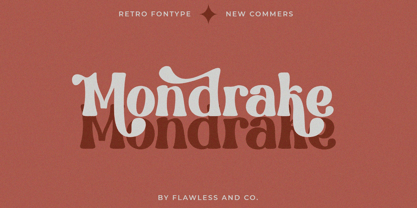 Mondrake is a modern retro with a fun and bold style that perfect for your retro-themed projects. Try out some alternate characters for another visual result! There's some connected letters and some alternates that suitable for any graphic designs such as branding materials, t-shirt, print, business cards, logo, poster, t-shirt, photography, quotes .etc This font support for some multilingual. Also contains uppercase A-Z and lowercase a-z, alternate character, numbers 0-9, and some punctuation. If you need help, just write me! Thanks so much for checking out my shop!
 - Croist by Flawlessandco,
$9.00 Croist is a modern retro with a fun and bold style that perfect for your retro-themed projects. Try out some alternate characters for another visual result! There's some connected letters and some alternates that suitable for any graphic designs such as branding materials, t-shirt, print, business cards, logo, poster, t-shirt, photography, quotes .etc This font support for some multilingual. Also contains uppercase A-Z and lowercase a-z, alternate character, numbers 0-9, and some punctuation. If you need help, just write me! Thanks so much for checking out my shop!