10,000 search results
(0.042 seconds)
- ITC Tremor by ITC,
$29.99ITC Tremor is the work of British designer Alan Dempsey. You might think that it looks like the letters are in a seismically lively geological zone, but Dempsey had other kinds of motion in mind. Most of the faces I design come from trace 'work-outs' for advertising products. In the case of Tremor, it was to reflect a lively teenager," says Dempsey. The result is ITC Tremor, a cartoony slab serif typeface with irregular angles, straight-edged curves, and lines surrounding each character, making them look like they are jittery. - Basilia by Linotype,
$29.99 Among the countless typefaces available today, the Modern Face style is relatively underrepresented. During the 19th century and then later with the competition from the mechanized hot metal types and film setting, a number of attractive headline types appeared in this style. For text, however, the available types were limited to those based on tried and true classics like Walbaum, Didot and Bodoni, which were created between 1780 and 1830, as well as a few variations from the end of the 19th and beginning of the 20th centuries. The demand for new Modern text types remained nonexistant until the 1960s. Such was the situation when the Haas'sche Schriftgiesserei (Haas Type Foundry) commissioned me to come up with a concept and sketches of a new hot metal type. I was able to convince the director of the foundry that there was a niche to be filled with contemporary Modern typography. Another reason for the production of a new type was of a technical nature: the introduction of a new setting technique should not be limited to existing typefaces, but instead should lead to innovative text types suited to the demands of the new applications. André Gürtler, Basilia's designer: I began to work on the concept and initial designs of the new text type in 1968. I wanted to give the type a classical look, expressed above all in the strong stroke contrast between the robust verticals and fine horizontal strokes and serifs. This is one of the main characteristics of Modern typography.""This new typeface, Basilia, is distinguished by its soft, open appearance as well as a number of details which together mark a departure from historical models. For example, it has nothing of Bodoni's round letters and their angular, narrow spacing, and displays instead round forms with a much softer stroke in the curves. It was very important to me to avoid the Modern characteristic of stiff, vertical, grid-like strokes and to create instead a lighter, more transparent type. I retained the Modern style by using straight horizontal serifs at right angles to the strokes to still give the type its sense of rigidity." Three sketches for Basilia (normal, italic, and bold) were finished in 1973. Only the 9-point size was produced at first. In the following years, basic weights were made and adapted to filmsetting."
 - Bold Line Icons Font by Howcolour,
$42.00 Enjoy this exclusive set of line vector icons font pack including 3700 icons with a cheat sheet. They are pixel perfect and infinitely scalable. You can use these icons to design websites, apps, blogs prints. Created with taste and passion! Please Send a message to info@howcolour.com with your order code to get a link to Cheatsheets file.
 - Bardamu by Groteskly Yours,
$25.00 Bardamu is a variable slab serif font family designed by Eugene Tantsurin and Anna Remm, and released by Groteskly Yours Studio. Bardamu is a type family that is open to interpretation and experimentation, yet this ambiguity does little to hide its inherent friendliness and good vides. Bardamu can easily be used in a variety of projects and feel at home both in graphic design, branding, web design or editorial design. Thanks to its unique letterforms and eye-catching design choices, it can be that final touch that makes your brand pop! One of the standout qualities of Bardamu is its remarkable versatility. Bardamu comes in 25 styles, allowing users to choose a style that best fits their needs. In addition to that, it offers a wide range of styles, from sleek backward-slanted italics at -20° to elegant upright styles, as well as regular 20° italics. For static fonts, there are two extra subfamilies available (10° Half Italic and 10° Half Reverse) that can be used for creating more complex hierarchy in any text. With a total of 25 static fonts and 1 Variable font, Bardamu is the perfect workhorse display slab serif with unlimited typesetting capabilities. Each font in the Bardamu family boasts an extensive 700+ character set, encompassing all major Latin-based languages, punctuation marks, symbols, and even supplementary characters. Bardamu takes flexibility to a whole new level with its incredible OpenType features that further enhance its versatility. With features such as Case-Sensitive Punctuation, Stylistic Alternates, Sub- and Superscript, Tabular Figures, and Localised Forms, you can fine-tune every detail of your design to perfection. Moreover, the multiple stylistic sets available in Bardamu allow you to switch between various versions of the same glyph effortlessly. Bardamu type family includes 25 static styles as well as a variable font. All styles can be purchased separately or as a full family package. Two styles can be downloaded free of charge. If you'd like to explore Bardamu further, we also offer free trials upon request.
 - The Cartel by Say Studio,
$12.00 About the Product The Cartel is a elegant serif font . This typeface has been made carefully to make sure its premium quality and luxury feel. The ligatures makes this typeface unique and stands out rather than the regular serif font. Very suitable for logo, headline, tittle, and the other various formal forms such as invitations, labels, logos, magazines, books, greeting / wedding cards, packaging, fashion, make up, stationery, novels, labels or any type of advertising purpose. Features : numbers and punctuation multilingual ligatures alternates PUA encoded FAQ's : Where are the TTF's? They are included in a download link( in a text file) in your main download file. 1 user 2 computers installation (Desktop License) You may NOT use for broadcast or Cinema/Motion Picture. You may NOT resell this font in any platform without further permission from designer. Do NOT embed font files in app/game/e-pub (for desktop license) You may NOT use the fonts in templates for sale/free. ( web/print/app ) For other license use please contact us. SOFTWARE REQUIREMENTS : Fonts and alternate : No special software required they may be used in any basic program /website apps that allows standard fonts That's it folks! You can go ahead and get cracking :) Follow My Shop For Upcoming Updates Including Additional Glyphs And Language Support. And Please Message Me If You Want Your Language Included or If There Are Any Features or Glyph Requests, Feel Free to Send me A Message. Have a Good Day !
 - Fartha by Nahda Creative,
$15.00 Fartha is a lovely and delicate script font that exudes elegance and class. This font was particularly crafted for those who need a beautiful and refreshing look to their designs.
 - Autosmash by Rockboys Studio,
$15.00 Autosmash is a lovely and brushed script font that exudes elegance and class. This font was particularly crafted for those who need a beautiful and refreshing look to their designs.
 - Yesslyn by ARToni,
$19.00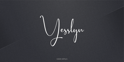 Yesslyn is a lovely and delicate script font that exudes elegance and class. This font was particularly crafted for those who need a beautiful and refreshing look to their designs
 - Nippon Note by Hanoded,
$15.00 I just returned from a short holiday in Japan. I stayed in hostels and small guesthouses and noticed a peculiar thing they all had in common: they love little notes, telling you where to go, what to do, how to use the microwave oven and when to check out. These notes were sometimes printed, but more often they were handwritten. I found that the Japanese way of writing roman characters is a little, well, unusual. The letters are correct, but they have that typical ‘Japanese look’ - most notably the a and A the b, d and g, the p and P and the t and T. I can’t really tell you what makes them look different, maybe it’s the proportions, but I do know that a Nippon Note is highly recognisable. So, here is Nippon Note, a highly recognisable, handmade font. You don’t really have to be in Japan to use it, but it will give your designs that extra cachet. And don’t forget Nippon Note Kawaii - the cute doodle font which is free if you download the Nippon Note family! Comes with extensive language support, but unfortunately not Japanese…
 - Linotype Russisch Brot by Linotype,
$29.00Linotype Russisch Brot is part of the Take Type Library, chosen from the entries of the Linotype-sponsored International Digital Type Design Contests of 1994 and 1997. The inspiration of German designer Markus Remscheid is not hard to see for those who are familiar with the chocolate cookies in the form of letters which are called Russisches Brot. The font is available in six weights. The basic weight is perfectly legible and is good for both headlines and shorter texts and from there the weights become more and more nibbled away, leaving the basic form of the characters and a few crumbs. - ZT Vollun by Khaiuns,
$29.00 ZT Vollun is a work of awakening from my valley of boredom in making fonts, it is not only a transformation of thickness, but also in terms of theme, aura, shape and beauty. Maybe this is a superstition of adulthood and also as we get older, our taste in cigarettes can change too. And the taste of the coffee is also getting bitter, in fact there is no sugar anymore, but the enjoyment is increasing. ZT Vollun consists of seven weights, starting from the thin one with curves combined with thin strokes, offering a playful aura, to the thickest one with a firm design that will present a thick modern atmosphere. Whether you're working on a branding project, an editorial project, or any other graphic project, ZT Vollun is the perfect choice for a modern, elegant look or any design vibe you can get your hands on. I hope you have fun using ZT Vollun. Thanks for using this font
 - Tepuy by John Moore Type Foundry,
$20.00 Tepuy is the name given to the ancient plateau-shaped mountains that abound in the Venezuelan Amazon. Tepuy is a display typeface inspired by the symbolic forms of the Venezuelan ethnic roots. It is constructed based on a very precise geometry of open forms that produce a double letter in form and counterform. Tepuy originates as an evolution curve of my Font Makiritare rectilinearly. Was devised for a book of photographs of the ancient mountains of the Venezuelan Amazon, its form and Makiritare are morphologically inspired crafts in the ethnic groups of the region. Tepuy is held in a very precise geometric construction based on rounded forms, each letter is a form envelope enclosing another in counterform, is a letter to display. Tepuy comes in four versions Regular, Light and thin, and there is a double line version enclosed. Tepuy recommended for creative headlines for the label and packaging design aimed at all ages.
 - Sticky Shoes by Bogstav,
$15.00 Sticky Shoes was inspired by a sign at a local flea market. The artist behind the sign obviously didn’t care much about painting the letters “in the right way” - leaving a slobby and uneven impression. And what is wrong with that? Nothing, if you ask me. I tried my best to capture the charm and innocence behind that sign in Sticky Shoes. I even made the paint version go outside the outline in the Regular version! I added 6 different versions of each letter, and they automatically changes as you type. That goes for all 4 versions, and they even mix very nicely!
 - Linked Now by Jehoo Creative,
$16.00 Linked Now is so named because this Typeface has Multiple Discreationary Ligatures that unite two different letters to make a striking shape. Is a powerful grotesque typeface designed to be versatile in a wide range of contexts. Having more than 50 stylish Dsicreationary Ligatures on Uppercase letters and unique Alternate on certain letters makes it seem like they have various shapes, so they are great to use as display fonts. To complete it, Linked Now typeface is equipped with 8 weights from Extralight to black and each includes italic. More than 485 glyphs on each and support most European languages .
 - Spitzkant by Julien Fincker,
$29.00 About the design Spitzkant is a serif typeface family that is characterized by strong contrasts. Pointed, sharp serifs and edges contrast with round and fine forms, making it very individual and expressive. This makes it particularly suitable for branding, editorial, packaging and advertising. The high-contrast display version has been complemented by a lower-contrast text version, making Spitzkant in combination suitable for both strong headlines and extensive body text. An allrounder that can be used for many purposes. Features The Spitzkant Head and Text family has a total of 2 optical sizes, 5 weights and 20 styles, from thin to bold and matching italics. With over 850 characters, it covers over 200 Latin-based languages. It also has an extended set of currency symbols and a whole range of open type features. For example, there are alternative characters as Stylistic Sets, Small Caps, automatic fractions and many other features. Ligatures Especially the extensive selection of ligatures (standard and optional) is a special feature which was an important part during the design process. With over 95 different ligatures there are many possibilities to give headlines and logos an individual touch. Get the Variable Font here: https://www.myfonts.com/fonts/julien-fincker/spitzkant-variable/
 - Sztos by Borutta Group,
$39.00 Sztos (2018-2022) is a remix of one of the most famous grotesques used in Poland – Baccarat (published by Jan Idźkowski i S-ka in 1922). My version loosely refers to the original. On the one hand, I wanted to modernize the drawing and proportions, on the other hand, I did’t want to lose the historical flavour and details in which you can still feel traditional printing. In addition to the fairly wide version of the normal style, there is also a narrow version. Thanks to this contrast, Sztos gives the possibility of expressive combinations of different styles. The whole family consists of 10 weights, two widths and an additional slant version. Design Support: Małgorzata Bartosik, Karol Mularczyk
 - Our Love Word by Putracetol,
$24.00 Our Love Word - Quirky Love Font Our Love Word - Quirky Love Font is a unique and playful font designed for those who want to add a touch of whimsy to their design projects. This font is perfect for those looking to create designs that are romantic and fun. If you're looking for a font that is perfect for Valentine's Day or wedding-related projects, then Our Love Word is a great option. It would also be ideal for invitations, posters, logos, quotes, product packaging, headers, merchandise, social media posts, and greeting cards. One of the best features of Our Love Word is its versatility. It comes with three different versions of the font, each with a different layout of the word "love". This allows you to choose the best version of the font for your specific design needs. Additionally, the font includes uppercase and lowercase letters, as well as a variety of alternate characters and ligatures. In the font package, you will find three different file types: Our Love Word otf, Our Love Word ttf, and Our Love Word woff. This ensures that you can use the font on a variety of different devices and software programs. If you're looking to add a touch of whimsy and romance to your design projects, then Our Love Word - Quirky Love Font is the perfect choice. With its playful design and versatile features, it's sure to add a touch of fun to any project. In summary, Our Love Word - Quirky Love Font is a unique and playful font that is perfect for Valentine's Day, wedding-related projects, and a variety of other design projects. It's versatile and comes with three different versions of the font, as well as alternate characters and ligatures. With its playful design and romantic feel, it's sure to be a hit with anyone looking to add a touch of whimsy to their designs.
 - Santa Christmas by Ake,
$12.00 Santa is a lovely duo font (display and script). Together or apart, these fonts are ideal for adding a chic and cheery touch to your crafts. This font is PUA encoded which means you can access all glyphs and swashes with ease!
 - TT Fellows by TypeType,
$39.00 TT Fellows useful links: Specimen | Graphic presentation | Customization options There can't be too many universal fonts! Meet TT Fellows, a new workhorse whose functionality allows you to comfortably use the font in a variety of projects. Calm and neutral at first glance, the mood of TT Fellows can change. Working with the typeface, you can reveal its soft and friendly nature, or even the brutal one, for example, by typing the text exclusively in capital letters in the bold style. TT Fellows is easy to use and perfect for setting large text arrays. Thanks to the font's uniwidth and versatility, the font is ideal for use on websites or in periodicals. Bold styles will work harmoniously in headlines or as accents in print or on packaging. TT Fellows is a humanist sans serif with a mechanical touch. With its open shapes, the friendly neutral character of thin weights and an even softer character in bold weights, the new typeface differs in character from the classic TT Norms® and TT Commons sans serifs, while still offering the same functionality. Calm regular styles differ from bold, deliberately display and more expressive ones. By the way, TT Fellows is a unwidth typeface. It was important for us that the user could change the styles, knowing that the layout will not suffer. The typeface features equal width proportions, open apertures, and slightly squared ovals, which associatively brings it closer to other popular modern fonts. Since the idea of the typeface was focused on it being a uniwidth typeface, we needed to fit the bold styles into the regular em squares, which led to interesting graphic solutions that are noticeable, for example, in the k and ж characters, in which the branches are cut directly into the stems. TT Fellows consists of 19 styles: 9 upright, 9 italic and 1 variable, each with over 700 glyphs. The font has 26 useful OpenType features. For example, there is a switch to single-part versions of letters a and y, fractions, tabular characters, case versions of punctuation, and localized versions of characters for different languages. There is a ligature for a combination of two characters of a complex design fl. TT Fellows font field guide including best practices, font pairings and alternatives.
 - DIN 1451 by Linotype,
$40.99 DIN stands for Deutsche Industrienorm, German Industrial Standard. In 1936, the German Standard Committee settled upon DIN 1451 as the standard font for the areas of technology, traffic, administration, and business. The committee chose a sans serif font because of its legibility and easy-to-write forms. This font was not seen in advertisements and other artistically oriented uses, and there were disagreements about its aesthetic qualities. Nevertheless, this font was seen everywhere on German towns and traffic signs and hence made its way into advertisements because of its ease of recognition.
 - Alimentary by Missy Meyer,
$12.00 Alimentary (adjective): relating to nourishment or sustenance. If you've seen my other fonts, you know I tend to lean into food-based names. This name has to do with food and science combined, so it's double nerdy in the ways I like to be nerdy! I started with Alimentary Medium, which was inspired by my shorter, wider font MacGuffin - I wanted something taller, narrower, with a hip and retro feel. When I finished the Medium weight, I felt like I wanted a Light weight. Then a Heavy weight. Then I figured, "what the heck," and made an outline version of the Medium weight too. In the end, I wound up with four members of the Alimentary family, each with over 700 glyphs! Not only do they all have the basics (A-Z, a-z, 0-9, and tons of punctuation), but they also each have 330 characters for European language support, and a limited selection of Greek, Coptic, and Cyrillic characters. Plus a double handful of alternates and ligatures to add a little variety to your designs! And of course, all of the Alimentary fonts are super-smoothed, with reduced nodes and clean curves, so whether you're cutting them out, printing them, engraving them, or using them in a way I haven't even thought of, these fonts will be sharp and crisp!
 - Symbolic Prophecy by Hanoded,
$15.00 I am not one for prophecies of impending disaster and all that, don’t worry! I just liked the name and it seems to suit this handmade font quite well. Symbolic Prophecy was made with a broken bamboo satay skewer and Chinese ink. I quite like using broken satay skewers, as they give a fantastic ‘random’ effect. Use Symbolic Prophecy for your posters, your product packaging and, just maybe, a sign about the end of times… ;-)
 - Uranus by Supremat,
$12.00 Uranus is a futuristic font inspired by space and extraterrestrial civilizations. The proportions of the letters are wide, the elements of the letters have organic curves, reminiscent of the design of streamlined spaceships. What gives the font a special character is the excessive contrast between the upper element and the crossbar in letters such as A, B, E, F, K, P, R. In these letters, there is a barely noticeable intra-letter gap in the form of a line. Due to this contrast and rounded elements in these letters, a negative space of a triangular shape also turned out. Particular attention should be paid to the broad language support for the font. The font has support for Latin, extended Cyrillic, and Korean (2780 base syllables). Total glyphs: 3562. Uranus is well-suited for large typography, logos, and any other design related to futurism and space.
 - Classic Trash BRK Pro by CheapProFonts,
$10.00 A typical Art Deco font with high contrast. I have mirrored the uppercase A and M to give the strokes a correct direction, and shortened/widened a few lowercase letters to give the text a more even color. A stylistic 30s-looking font is ready for international text-setting! ALL fonts from CheapProFonts have very extensive language support: They contain some unusual diacritic letters (some of which are contained in the Latin Extended-B Unicode block) supporting: Cornish, Filipino (Tagalog), Guarani, Luxembourgian, Malagasy, Romanian, Ulithian and Welsh. They also contain all glyphs in the Latin Extended-A Unicode block (which among others cover the Central European and Baltic areas) supporting: Afrikaans, Belarusian (Lacinka), Bosnian, Catalan, Chichewa, Croatian, Czech, Dutch, Esperanto, Greenlandic, Hungarian, Kashubian, Kurdish (Kurmanji), Latvian, Lithuanian, Maltese, Maori, Polish, Saami (Inari), Saami (North), Serbian (latin), Slovak(ian), Slovene, Sorbian (Lower), Sorbian (Upper), Turkish and Turkmen. And they of course contain all the usual "western" glyphs supporting: Albanian, Basque, Breton, Chamorro, Danish, Estonian, Faroese, Finnish, French, Frisian, Galican, German, Icelandic, Indonesian, Irish (Gaelic), Italian, Northern Sotho, Norwegian, Occitan, Portuguese, Rhaeto-Romance, Sami (Lule), Sami (South), Scots (Gaelic), Spanish, Swedish, Tswana, Walloon and Yapese.
 - Beautiful in White by HKL Studio,
$19.00 Hi Font Lovers! Bring back my newest font, Introduce Beautiful in White. Script! This is a modern font script. This font comes in a sleek and italic style, created very slowly for a neat result that will give this font a very elegant impression. There are 410 glyphs in it! so you can get used to it freely and follow the current trends. Please try and hope you enjoy it! With a style like this, this font is suitable for logos, branding projects, home appliance designs, product packaging, mugs, quotes, posters, shopping bags, logos, t-shirts, book covers, business cards, invitation cards, congratulations. cards, and all your other beautiful projects. You can use this font for your work very easily. Because there are many features in it. Contains full set of lowercase and uppercase letters, punctuation, numbers, web fonts, and multilingual support. This font also includes several ligatures and alternative styles for the Stylistic Set for those of you who have software that can work with OpenType (Corel Draw / Photoshop / Illustrator / InDesign). Thank you for purchasing!
 - Rearview Mirror by Hanoded,
$15.00 Rearviewmirror (no space) is a Pearl Jam song and it happens to be my favourite! Rearview Mirror is a handmade tall & thin font. It comes in a regular and bold style with their italics.
 - Bahar by Hurufatfont,
$29.00 Bahar was inspired by the playful-energetic nature of Cooper Black from Souvenir's soft but confident stance and was born from the idea of creating a new structure by blending this structure with calligraphic strokes. The title and body are presented in two sets for perfect results. Bahar has a wide variety of character alternatives to create the perfect and fun title. It offers calligraphic flavors with swashes, start-finish forms, and fun ligatures. Bahar Text is prepared for Body texts and offers a good reading experience. Does not include swash and style alternatives. Bahar consists of five weights, Bahar Text four, a total of nine weights, and 18 styles with true italics. For each weight, there is a complete set of open type features including ligatures, small caps, old-style and table numbers, and positional numbers.
 - Paradise Lost by Hanoded,
$15.00 Paradise Lost is a 1667 poem by John Milton which mostly concerns the Biblical story of the Fall of Man, Eve's temptation by the devil and the expulsion of Adam and Eve from Eden. It's quite a hefty read, as the poem consists of ten books with over 10.000 lines of verse. Needless to say, I didn't read it all. But, it did give me inspiration for a font, which I called Paradise Lost. It's a good name, even though there is nothing Biblical about this font. Paradise Lost was created (pun intended) using a broken bamboo satay skewer and Chinese ink. It is all caps, but upper and lower case differ and like to mingle. I also included several ligatures for double lower case letters (aa, ee, jj, kk, etc.). Paradise Lost comes with an eternity of diacritics.
 - Varent Grotesk by Identitype Co,
$25.00 Identitype is very pleased to present Varent Grotesk, a sans serif family designed by Hendra Maulia and Aulia Rahman who was inspired by modern sans serif. The weights of the family itself contain 18 styles plus italic, ranging from Thin to Black. Ideally, it works to capture in a graphic way the universe related to technology, sci-fi, industry, and similar topics. It is a mixed family because of the construction of certain letters (as in “a”, “e”, “h”, “k”, “A”, “B”, and more). Another important line in the creative concept of this typeface is the function of its ink traps, which, in addition to fulfilling their primary function, serve to gain gestuality in its use. This font is capable of covering complex design needs by enabling association with specific themes, which makes it highly competitive in its graphic line.
 - Shout by HiH,
$12.00 Shout is a “Hey, Look at ME” font. It is an attention-getting font for posters, flyers and ads. Its lineage includes the Haas Type Foundry’s 19th century advertising font, Kompakte Grotesk, which Jan Tschichold (1902-1974) dryly described as “extended sans serif” and which graphic designer Roland Holst (1868-1938) would have disapprovingly referred to as a “shout,” as opposed to the quiet presentation of information that he believed was the proper function of advertising. In 1963 Letraset released what appears to be an updated variation in multiple weights designed by Frederick Lambert called Compacta. Shout draws heavily on Compacta, as well as other similar fonts of the 50s and 60s like Eurostile Bold Condensed and Permanent Headline. In weight, it falls about halfway between Compacta Bold and Compacta Black, but with a relatively heavier lower case that is not so easily pushed around by the upper case. After all, one can shout while sitting down. Shout is the first font released with our new encoding, as noted in the All_customer_readme.txt. The Euro symbol has been moved to position 128 and the Zcaron/zcaron have been added at positions 142/158 respectively. Otherwise, Shout has our usual idiosyncratic glyph selection, with the German ch/ck instead of braces, a long s instead of the Greek mu and our usual Hand-in-Hand symbol. There are also left and right glyphs of a big mouth ]ing (135/137) and left and right glyphs of an angry man shouting (172/177). Please use Shout with discretion. Folks get tired of being yelled out. After awhile, they stop listening. Shout ML represents a major extension of the original release, with the following changes: 1. Added glyphs for the 1250 Central Europe, the 1252 Turkish and the 1257 Baltic Code Pages. Add glyphs to complete standard 1252 Western Europe Code Page. Special glyphs relocated and assigned Unicode codepoints, some in Private Use area. Total of 355 glyphs. 2. Added OpenType GSUB layout features: pnum, ornm, liga, hist & salt. 3. Added 266 kerning pairs. 4. Revised vertical metrics for improved cross-platform line spacing. 5. Revised hyphen, dashes & math operators. 6. Minor refinements to various glyph outlines. 7. Inclusion of both tabular & proportional numbers. Please note that some older applications may only be able to access the Western Europe character set (approximately 221 glyphs). The zip package includes two versions of the font at no extra charge. There is an OTF version which is in Open PS (Post Script Type 1) format and a TTF version which is in Open TT (True Type)format. Use whichever works best for your applications.
 - Miluero by Luxfont,
$18.00 Introducing the stylized Miluero family. Graceful cut, rounded corners combined with austere shapes. Accent fonts with color padding and a classic basic monochrome version in the set. Perfect for logos, headlines and captions. Looks elegant in a minimalist modern design. An assortment of colors will help you get started quickly. This font family is based on the Regular font Pacardo - which means that if necessary you can combine these two families and they will be absolutely stylistically identical and complement each other. Check the quality before purchasing and try the FREE DEMO version of the font to make sure your software supports color fonts. P.s. Have suggestions for color combinations? Write me an email with the subject "Miluero Color" on: ld.luxfont@gmail.com Features: - Free Demo font to check it works. - Uppercase and lowercase the same size but different forms. - Color in letters. - Kerning. IMPORTANT: - Multicolor version of this font will show up only in apps that are compatible with color fonts, like Adobe Photoshop CC 2017.0.1 and above, Illustrator CC 2018. Learn more about color fonts & their support in third-party apps on www.colorfonts.wtf -Don't worry about what you can't see the preview of the font in the tab "Individual Styles" - all fonts are working and have passed technical inspection, but not displayed, they just because the website MyFonts is not yet able to show a preview of colored fonts. Then if you have software with support colored fonts - you can be sure that after installing fonts into the system you will be able to use them like every other classic font. Question/answer: How to install a font? The procedure for installing the font in the system has not changed. Install the font as you would install the classic fonts. How can I change the font color to my color? · Adobe Illustrator: Convert text to outline and easily change color to your taste as if you were repainting a simple vector shape. · Adobe Photoshop: You can easily repaint text layer with Layer effects and color overlay. ld.luxfont@gmail.com
 - We Love Nature Leaves by kapitza,
$79.00 We Love Nature Leaves is an extensive and versatile collection of foliage illustrations. This font consists of 52 highly detailed drawings of twigs and leaves which can be used on their own or in combination with the other illustrations in the ‘We Love Nature’ font collection. All illustrations are drawn by hand and of the highest quality.
 - Navaja by Andinistas,
$39.95 Very few letter types with the context of grunge style fonts offer hierarchies to differentiate words in sentences or paragraphs. With Navaja I developed a font family that meets this need. This family is useful to organize the information into a hierarchy with an eroded look. Its central idea mixes grotesque, geometric and humanistic letter conventions. This way, Navaja is a grunge-sans with dense proportions to make graphic design with eroded character. Its main purpose appeared when one of my customers asked me for a t-shirt design for a fan club of an important football player. For this reason its starting point were stained and muddy letters characterizing the toughness and coldness of the sport. Over time their glyphs began to imitate the robustness of "wood type & Tuscan Type" widely used in posters in the late nineteenth century. Its purpose was strengthened in a family with 6 members that when mixed they produce mind catching contrast levels ideal for designing T-shirts, stickers, flyers, brochures, posters, billboards, cinema or TV. Therefore its variants are short up and down height X combined with different widths that by working together produce information that radiates outstanding apparently destroyed controlled violence. Navaja Dingbats consists of 52 illustrations useful for frames and textures. In that vein, the origin of each member comes from skeletons of Roman and Italic calligraphy. The low amount of contrast between thick and thin lines matching the contours apparently gnawed but strictly regulated by optical adjustments equating the sum between full and empty areas. Factors such as finishes, shapes and counter internal and external forms are meticulously planned although its scruffy look which strategic arrangements are offset to provide color typographical homogeneous. And in conclusion, I have plans to continue expanding the family with more complete versions in the future.
 - Shifters by Arendxstudio,
$17.00 Shifters Handwritten Script is a font with distinctive handwritten characters and is perfect for branding projects, logos, wedding designs, media posts, advertisements, product packaging, product designs, labels, photography, watermarks, invitations, stationery, and any project that needs a handwritten touch. Features Character Set A-Z , Numerals & Punctuations (OpenType Standard), Accents (Multi-lingual characters), Ligatures. There it is! I really hope you enjoy it. Comments and likes are always welcome and accepted. More importantly, don't hesitate to send a message if you have a problem or question. Now just read this, go there and make it happen.
 - Klasted by Arendxstudio,
$18.00 Klasted Brush Script Font is a font with distinctive handwritten characters perfect for branding projects, logos, wedding designs, media posts, advertisements, product packaging, product designs, labels, photography, watermarks, invitations, stationery, and any project that needs a handwritten feel. Features : • Character Set A-Z • Numerals & Punctuations (OpenType Standard) • Accents (Multilingual characters) • Ligature • Swash There it is! I really hope you enjoy it - comments & likes are always welcome and accepted. And more importantly, don't hesitate to send a message if you have a problem or question. Now just read this, go there and make it happen!
 - Bilal by Arendxstudio,
$16.00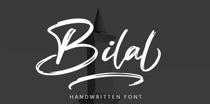 Bilal is a script font with distinctive handwritten characters, perfect for branding projects, logos, wedding designs, media posts, advertisements, product packaging, product designs, labels, photography, watermarks, invitations, stationery, and any project which needs a handwritten feel. Features : • Character Set A-Z • Numerals & Punctuations (OpenType Standard) • Accents (Multilingual characters) • Ligature • Swash There it is! I really hope you enjoy it - comments & likes are always welcome and accepted. More importantly, don't hesitate to send a message if you have a problem or question.Now just read this, go there and make it happen :)
 - Righteous by Arendxstudio,
$19.00 Righteous is a font with distinctive handwritten characters, perfect for branding projects, logos, wedding designs, media posts, advertisements, product packaging, product designs, labels, photography, watermarks, invitations, stationery, and any project that needs a handwritten touch. Features : • Character Set A-Z • Numerals & Punctuations (OpenType Standard) • Accents (Multi-lingual characters) • Ligatures • Alternates • Swashes There it is! I really hope you enjoy it - comments & likes are always welcome and accepted. More importantly, don't hesitate to send a message if you have a problem or question.Now just read this, go there and make it happen.
 - Duetto by ParaType,
$25.00 The letterforms of this face represent a "subtraction" of two different faces by weight, style, and shape -- one from another. The shapes of TM Miniature Italic are subtracted from FreeSet Bold with subsequent deconstruction. Though the spots may look amorphous they create images of both external and internal. At the same time none of them is explicit. The alphabet is lower case only. Designed by Boris Popov and licensed by ParaType in 2002 .
 - Holy Ornaments by Gerald Gallo,
$20.00 Holy Ornaments was inspired by the religious motifs used to embellish altar cloths, crosses, and church vestments in the Middle Ages. There is an assortment of 47 ornaments located under the character set keys.
 - Rebel Train Goes by Dharma Type,
$14.95 Based on retro vinyl records in the middle of 20th century. There are three other fonts designed by in the same concept. -Word From Radio -African Elephant Trunk -Moon Star Soul -Rebel Train Goes