10,000 search results
(0.02 seconds)
- Debora Celina Script by Gatype,
$5.00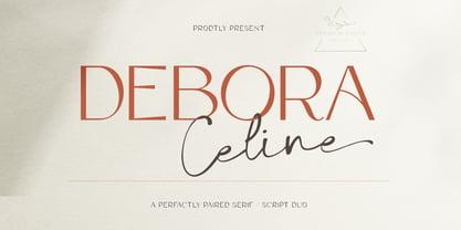 Debora Celina is a font Duo Script and Serif that is simple and unique looking.This customizable font will look great on a variety of design ideas such as Christmas themes,valentines, posters, invitations, weddings, branding projects, social media posts, magazines, book covers and more. This will add a fun and friendly touch to any of your projects.This font is PUA encoded which means you can access all the glyphs and sweeps easily.
 - Horror Vibes by Gassstype,
$25.00 Introducing of our new product the name is Horror Vibes - Handmade horror Font and Multilanguage support.Introducing of designs look modern, unique and fun. It’s perfect for labels, quotes, posters, DIY projects, branding, packaging, greeting cards, websites, photos, photography overlays, signs, window art, scrapbooking, tags and so much more!our new product that inspired by Street Tagging, graffiti style with a fun theme very good for graffity poster, flyer, childrenbook, cartoon, comic etc
 - Godysun by Twinletter,
$15.00 Godysun Arabic style font. Create the perfect Arabic and Islamic decorative design with this collection of exclusive value examples. With this stylish font, you can create all kinds of themes, from elegant to modern, and get the same result as shown. To get a variety of styles into your projects, they come in both upper and lower case, as well as several Alternates. You will be able to easily create quality designs.
 - Hyugos by Fateh.Lab,
$20.00 Hyugos is a condensed type of font that has a different character from the previous condensed font, Hyugos has a strong but soft character, with a cheerful and fresh theme, supported by 24 choices of font types. Hyugos is able to answer your current needs who are designing something great. Its weight is superior in posters, social media, headlines, magazine titles, clothing, large print formats - and wherever you want to see it.
 - Hungry Beast by Bombastype,
$35.00 Hungry Beast is a Victorian theme font. With another old fashioned feel on it, because we were very passionate with that kind of typeface style. This typeface will be suitable for a lot of display purposes like you can see in our previews for the work samples. And don't forget about the Layer system, because who hates layers typeface? We also give you the ornaments for FREE. So let's try this Beast asap.
 - Infectious Halloween by Ardyanatypes,
$20.00 Infectious is a Halloween themed font with unique shapes that invite curiosity. Each letter is inspired by ancient magical symbols, with sharp strokes and curved lines that create a mysterious atmosphere. The font is not only visually appealing, but also interactive thanks to its advanced OpenType feature. Users can combine letters, slashes, and ligatures to create creative and unexpected looks. Features: A – Z Character Set a – z Characters set Numerals & Punctuations OpenType Multilingual
 - Magrit by Creativemedialab,
$20.00 Magrit is a bold serif display font, It has many alternates character with nice curve that you can arrange to create a nice logo lettering, or use it as a display face on a poster and add a few alterations to it to make a beautiful eye catching words. Magrit font is best for branding, logo lettering, headlines, product packaging, tshirt design, wedding theme, poster, book cover, wedding invitation, Christmas and many more
 - Hola Witch by Piece of Cake Typework,
$19.00 Hello World, Introducing, Hola Witch is a display font suitable for your design project needs, such as; Halloween themes, social media posts, quotes, overlays on images, tagline logos, posters, print needs, website banners, and more. Features * A set of uppercase and lowercase glyphs * Number, symbol, and punctuation * Multilingual Support * Some Swashes and alternates Thank you a million times for downloading and using this font for your projects. Enjoy this font and happy creating! Thank You
 - Mechanikschrift by Victory Type,
$12.00Mechanikschrift, roughly German for “mechanical writing”, is a typeface from Noah Rothschild and Victory Type. The aesthetic of this font is just what its name points towards: machine-like structure with a German flare. Minimalism is often associated with German design, and Mechanikschrift is a minimalist typeface. Furthermore, the designs of the characters, outside of the general theme of squared-off corners and angular appearance, are related to Herbert Bayer’s work at the Bauhaus. - Eskapade by TypeTogether,
$53.50 The Eskapade font family is the result of Alisa Nowak’s research into Roman and German blackletter forms, mainly Fraktur letters. The idea was to adapt these broken forms into a contemporary family instead of creating a faithful revival of a historical typeface. On one hand, the ten normal Eskapade styles are conceived for continuous text in books and magazines with good legibility in smaller sizes. On the other hand, the six angled Eskapade Fraktur styles capture the reader’s attention in headlines with its mixture of round and straight forms as seen in ‘e’, ‘g’, and ‘o’. Eskapade works exceptionally well for branding, logotypes, and visual identities, for editorials like magazines, fanzines, or posters, and for packaging. Eskapade roman adopts a humanist structure, but is more condensed than other oldstyle serifs. The reason behind this stems from the goal of closely resembling the Fraktur style to create harmony in mixed text settings. Legibility is enhanced by its low contrast between thick and thin strokes and its tall x-height. Eskapade offers an airy and light typographic colour with its smooth design. Eskapade italic is based on the Cancellaresca script and shows some particularities in its condensed and round forms. This structure also provided the base for Eskapade Fraktur italic. Eskapade Fraktur is more contrasted and slightly bolder than the usual darkness of a regular weight. The innovative Eskapade Fraktur italic, equally based on the Cancellaresca script previously mentioned, is secondarily influenced by the Sütterlin forms — an unique script practiced in Germany in the vanishingly short period between 1915 and 1941. The new ornaments are also hybrid Sütterlin forms to fit with the smooth roman styles. Although there are many Fraktur-style typefaces available today, they usually lack italics, and their italics are usually slanted uprights rather than proper italics. This motivated extensive experimentation with the italic Fraktur shapes and resulted in Eskapade Fraktur’s unusual and interesting solutions. In addition to standard capitals, it offers a second set of more decorative capitals with double-stroke lines to intensify creative application and encourage experimental use. The Thin and Black Fraktur styles are meant for display sizes (headlines, posters, branding, and signage). A typeface with this much tension needs to keep a good harmony between strokes and counters, so Eskapade Black has amplified inktraps and a more dynamic structure seen in the contrast between straight and round forms. These qualities make the family bolder and more enticing, especially with the included uppercase alternates. The Fraktur’s black weights are strident, refusing to let the white of the paper win the tug-of-war. It also won’t give away its secrets: Is it modern or historic, edgy or amicable, beguiling ornamentation or brutish presentation? That all depends on how the radically expanded Eskapade family is used, but its 16 fonts certainly aren’t tame.
 - Optima Cyrillic by Linotype,
$65.00Many typefaces are distinctive or attractive at the expense of legibility and versatility. Not so the Optima® family. Simultaneously standing out and fitting in, there are few projects or imaging environments outside of its range. Although Optima is almost always grouped with sans serif typefaces, it should be considered a serifless roman. True to its Roman heritage, Optima has wide, full-bodied characters – especially in the capitals. Only the E, F and L deviate with narrow forms. Consistent with other Zapf designs, the cap S in Optima appears slightly top-heavy with a slight tilt to the right. The M is splayed, and the N, like a serif design, has light vertical strokes. The lowercase a and g in Optima are high-legibility two-storied designs. Optima can be set within a wide choice of line spacing values – from very tight to very open. In fact, there are few limits to the amount of white space that can be added between lines of text. Optima also benefits from a wide range of letter spacing capability. It can be set quite tight, or even slightly open – especially the capitals. If there are any guidelines, Optima should be set more open than tight. It’s not that readability is affected that much when Optima is set on the snug side; it’s just that the unhurried elegance and light gray typographic color created by the face are disrupted when letters are set too tight. Optima is also about as gregarious as a typeface can be. It mixes well with virtually any serif design and a surprisingly large number of sans serif faces. The Optima family is available in six weights, from roman to extra black, each with an italic counterpart. In addition, the family is available as a suite of OpenType® Pro fonts, providing for the automatic insertion of small caps, ligatures and alternate characters, in addition to offering an extended character set supporting most Central European and many Eastern European languages. When you’re ready to find its perfect pairing, browse these fantastic matches: Monotype Century Old Style™, Dante®, Frutiger® Serif, Joanna® Nova, Malabar™, and Soho®. - Optima by Linotype,
$45.99 Many typefaces are distinctive or attractive at the expense of legibility and versatility. Not so the Optima® family. Simultaneously standing out and fitting in, there are few projects or imaging environments outside of its range. Although Optima is almost always grouped with sans serif typefaces, it should be considered a serifless roman. True to its Roman heritage, Optima has wide, full-bodied characters – especially in the capitals. Only the E, F and L deviate with narrow forms. Consistent with other Zapf designs, the cap S in Optima appears slightly top-heavy with a slight tilt to the right. The M is splayed, and the N, like a serif design, has light vertical strokes. The lowercase a and g in Optima are high-legibility two-storied designs. Optima can be set within a wide choice of line spacing values – from very tight to very open. In fact, there are few limits to the amount of white space that can be added between lines of text. Optima also benefits from a wide range of letter spacing capability. It can be set quite tight, or even slightly open – especially the capitals. If there are any guidelines, Optima should be set more open than tight. It’s not that readability is affected that much when Optima is set on the snug side; it’s just that the unhurried elegance and light gray typographic color created by the face are disrupted when letters are set too tight. Optima is also about as gregarious as a typeface can be. It mixes well with virtually any serif design and a surprisingly large number of sans serif faces. The Optima family is available in six weights, from roman to extra black, each with an italic counterpart. In addition, the family is available as a suite of OpenType® Pro fonts, providing for the automatic insertion of small caps, ligatures and alternate characters, in addition to offering an extended character set supporting most Central European and many Eastern European languages. When you’re ready to find its perfect pairing, browse these fantastic matches: Monotype Century Old Style™, Dante®, Frutiger® Serif, Joanna® Nova, Malabar™ and Soho®.
 - Constant by Underscore,
$32.00 Constant is a meticulously constructed slab serif display typeface of a sturdy lineage. The strong horizontal and vertical rhythm and calculated angles dominate its appearance, yet sweeping broad shapes infuse the design with an overall warm undertone. Constant is best suited for setting short headlines, word marks, posters and other visual communication ephemera. Particular when set in all uppercase the typeface’s squarish and resolute nature commands attention and projects authority. Despite the prominent slab serifs and their angular corner details, these fonts work well also for shorter text passages, especially in the lighter to medium weights. When typesetting Constant in paragraphs spanning several lines the face requires a fair amount of leading to not appear vertically compressed. As customary for Underscore’s catalog the fonts have very extensive support for languages in the Latin script, reaching from Afrikaans to Vietnamese and Zulu. The fonts are carefully spaced, kerned and hinted, and include a variety of typographic glyphs and OpenType features like various ligatures, number features and case alternatives. Constant has been developed and released in 2018 as the proud forth release from the Underscore label. This design by Johannes Neumeier is available from the Underscore webshop as well as selected retailers.
 - Scholz Secession by HiH,
$8.00 We named this font Scholz Secession. Fin-de-siecle Vienna, Austria is the source of this Jugendstil design from Schriftgiesserei Eduard Scholz. The original release was under the name Reklameschrift Secession. Most of the curve strokes look like commas to me. The letters are as soft and plump as the comforter on the bed I slept on in a Salzburg B&B many years ago. I was traveling with a college buddy and our next stop was Vienna. There a kind, young student named Hanna and her boyfriend took us under their wing. One of the places Hanna proudly showed us was Otto Wagner’s Majolika Haus, built in 1898, and only about 8 blocks from Secession Hall. Hanna explained to us that the style was called Jugendstil and represented Art Nouveau as interpreted within the framework of their culture. I even took a picture. After all, memories are part of who we are. Figures are old-style for text use. This font would not be my first choice for a spread sheet. Included are German ligatures ch (alt-0123) & ck (125), two period ornaments (135, 175) and lower case o and u with Hungarian long umlaut (215, 247)). A very likeable and easy-to-use font.
 - Sun-kissed by Krafted,
$10.00 “Live in the sunshine. Swim in the sea. Drink the wild air.” ― Ralph Waldo Emerson Hey there sun-kissed beauties! Are you looking for a gorgeous handwritten font that’ll captivate your viewers and make your branding shine as bright as the sun? Introducing Sun-kissed - A Handwritten Font. With every hand-drawn stroke and curve, Sun-kissed will delight and add brightness, modernity, and fun to wherever it’s placed. Impress your party guests with gorgeous invitations, make a statement on your social media banners, and add a little bit of sunshine to your corporate identity. This stylish Handwritten font is also can be used for headings, logos, business cards, printed quotes, cards, packaging, and presentations. What you’ll get: Multilingual & Ligature Support Full sets of Punctuation and Numerals Compatible with: Adobe Suite Microsoft Office KeyNote Pages Software Requirements: The fonts that you’ll receive in the pack are widely supported by most software. In order to get the full functionality of the selection of standard ligatures (custom created letters) in the script font, any software that can read OpenType fonts will work. We hope you enjoy this font and that it makes your branding sparkle! Feel free to reach out to us if you’d like more information or if you have any concerns.
 - Pastiche Brush by Eclectotype,
$40.00 This handmade looking brush font is inspired by the titles of the 1959 movie, Imitation of Life, by prolific film titles artist, Wayne Fitzgerald. The 'pastiche' of the font's name derives from the 'imitation' of the film's title, and from the imitation of the brush. OpenType enabled software can make Pastiche Brush feel even more handmade. There are alternates for every letter and number, and most punctation marks and symbols. Every letter has at least one alternate glyph, and more commonly used (in English at least) letters have up to three, so when contextual alternates are enabled, the font automatically cycles through glyphs in a pseudo-random manner. This means no double letter combination will ever contain two identical glyphs. Not only this, but it's highly likely the same word will look different elsewhere in the sentence. The contextual alternates feature also takes care of start and end forms of letters, for an even more handmade feel. This is a great font for headlines in fashion glossies, food packaging where an organic look is desirable, posters, perfume bottles, wine bottles... the list goes on. And with extensive language support, it's going to be a very usable addition to your display font repertoire.
 - APF Lagoon Regular by Pomegranate,
$30.00 In 2007-8, Carolyn Puzzovio developed this OpenType typeface: Lagoon which is based on an Armenian model from the Mechitarist monastery, Venice, 1810. This project was supported by a grant from the AHRC (Arts & Humanities Research Council, UK) and won a first prize in the Granshan 08 type design competition. Oſten, Armenian digital types are designed to match the forms of Latin type characters and ‘Latinized’, by uprighting the forms; truncating ascenders and descenders and raising the x-height – but in this case the Latin characters in the OpenType font have been designed to blend in with the traditional Armenian proportions which are based on cursive forms – also incorporating some of the quirky shapes from the original model. Faithfully following the original created difficulties of ‘clashing’ characters, particularly those with long descenders, so the font contains over 100 alternative characters in the Armenian part, which will normally substitute automatically where necessary. The sloping lower case characters and upright capitals are traditional in Armenian – capitals are used less in the Armenian language. Three new characters for the Armenian unicode range are included: the Armenian dram (currency) symbol; the eternity symbol; and the index number symbol. This font which will be one of the first OpenType fonts to incorporate these newly unicoded characters.
 - Metal Cry by Fabulous Rice,
$25.00 Metal Cry is a font family that was inspired by countless hours spent playing video games, watching old movies or reading comic books. And even more hours closely analysing the design of all these things. The art of creating beautiful letters has slowly declined with the rise of the digital age and its solid-colour, 2D fonts. And most of the time, the care given to typography in cultural products just isn't what it used to be anymore. This was the inspiration for Metal Cry, a family of 4 layerable fonts that can bring a feeling of depth to its letters, and offers endless possible combinations. Metal Cry Outlands is the basic shape of all the characters, it can be used as the bright side of the bevel. Metal Cry Front is the inline border font that can be used as the front side of the bevel. Metal Cry Shadow can be used as the dark side of the bevel. Metal Cry Depth can be used to flash out the inside shape of the letter. But of course, any font can be combined with any other font(s) to obtain various results. The planets in the above visuals are courtesy of 3D artist Thomas Veyrat / veyratom.com
 - High Beginning by Twinletter,
$12.00 High Beginning is our newest script font, a product font with a modern, artistic style. each letter has a strong and beautiful character to be used as a title, a sentence that if you use it creates an elegant effect in the appearance of your design. not limited to that, the bold calligraphy font is designed to keep paying attention to the beauty of each letter, there are alternate options for the letters which are certainly easy for you to access, so you can automatically customize the letters you want to enhance the visual appearance of your design project. This font also offers harmoniously beautiful abstract typography for a wide variety of design projects. This font is also perfect for wedding invitations, quote designs, for social media business designs, advertisements, trademarks, food and beverage promotion banners, text, posters, signatures, and any design that requires handwriting. This font is equipped with uppercase, lowercase, numbers, punctuation marks, swhas and several variations on each character including multi-language. ================================================== This font is best suited for open type friendly applications. How to get alternative glyphs from open type fonts: http://adobe.ly/1m1fn4Y PUA Character Code - Fully accessible without additional design software. we hope you enjoy this font. Feel free to send whatever message you want to convey.
 - FS Meridian Variable by Fontsmith,
$199.99Timeless imperfection FS Meridian is a rhythmic geometric grotesque which takes inspiration from the precise yet imperfect nature of time. There are 24 hours in a day. 60 minutes in an hour. 60 seconds in a minute. Well, almost. The Earth’s orbit isn’t a perfect circle – and nor is the Earth itself. Each day varies a few dozen seconds and up to 16 minutes each year. Look closer and time is more flexible than we think. Geometry with a twist From a geometric base, FS Meridian’s rounded forms veer and extend, creating unexpected humanistic shapes – while the straight terminals remain reliably rigid. This combination of forms gives this grotesque sans serif a pleasingly dynamic rhythm, every time it’s read. Added quirks The unconventional character of rigid terminals and ink traps are balanced with emphasized extended forms to develop visual differentiation. Designed by Kristina Jandová, the complete family has been carefully crafted with distinguishing marks. Take a look at the cap ‘Q’ which comes with three alternative options. Deliciously loopy FS Meridian has a wide geometric, mono-liner appearance with humanistic elements. Quirky individual touches like the loopy expressive pound sign help the typeface to stand out. Available in five weights, FS Meridian is both timeless and timely, a distinctive font for all screens and surfaces. - Core Sans GS by S-Core,
$29.00 The Core Sans GS Family is a rounded version of Core Sans G and a part of the Core Sans Series such as Core Sans N, M, A, E, D. Core Sans GS is constructed of straight, circular or square shapes. These geometric shapes are inspired by classic geometric sans (Futura, Avenir, Avant Garde etc.). Every stem is a rectangle or a straight line and every letter, lowercase or uppercase, seems to be in perfect geometric form and even weighted. The small x-height makes readability clean and clear. Core Sans G can be used equally well in headings or in body copy. The Core Sans GS Family consists of 9 weights (Thin, Extra Light, Light, Regular, Medium, Bold, Extra Bold, Heavy, Black) with maching Italics. It also includes alternate characters (a,g,t) and a bunch of ligatures. The Core Sans GS provides a wide range of character sets to support (Cyrillic, Central and Eastern European characters) and advanced typographical support with features such as proportional Figures, tabular Figures, numerators, denominators, superscript, scientific Inferiors, subscript, fractions, standard ligatures, discretionary ligatures and stylistic alternates. Core Sans G is an ideal font family for use in magazines, web pages, screens, displays, and so on.
 - Frutiger Serif by Linotype,
$42.99 Frutiger® Serif is a re-envisioning of Meridien,a typeface first released by Deberny & Peignot during the 1950s. Working closely with Adrian Frutiger, Linotype's Type Director Akira Kobayashi expanded the original metal type version of Meridien into a new digital family of 20 variants. Renamed Frutiger Serif, this up-to-date Meridien has new weights, widths, and styles that correspond better with several other of Frutiger's designs. Just as Meridien has always been a fine choice for text settings, Frutiger Serif works brilliantly for large amounts of text & also at small point sizes. With its many weights and styles, this family is strong enough for most typographic projects. However, its added versatility is revealed when used in combination with other fonts. Frutiger Serif works well with the original Frutiger, Frutiger Next, and Univers - just to name a few. Paring these serif and sans serif families together is perfect for creating complex hierarchies and clear information design. Working with complicated typographic systems - involving elements such as headlines, captions, pull quotes, multilingual text, etc - is made easy by selecting Frutiger Serif and another of Frutiger's sans serif families. The designer needs simply to mix and match different weights and styles for the various textual elements to create smart and innovative layouts.
 - Bion by Type Forward,
$38.00 Bion is a contemporary geometric sans serif with a down-to-earth attitude. It is distinguished by a high x-height, vertically cut terminals, and a minimal stroke contrast, giving it a distinctive, sharp look that is both timeless and universally appealing. Bion comes with 40 weights in a single variable file, ranging from Hairline to Black. We also included Upright, Italic, and Condensed variations to give you a fresh and diverse look for poster and title designs. Whatever message you want to get across, Bion has you covered - with support for 220 languages and 1,220 glyphs in total, as well as Extended Latin, Cyrillic and Greek scripts and an exhaustive list of typographic symbols. Our latest typeface also arrives packed full of OpenType features, including an alternative glyph set that will transform the way your text looks, giving it a more squarish appearance and offering additional visualization options. The Bion type family also includes an extensive set of standard and discretionary ligatures, tabular and small figures, fractions, and language localizations. These features work in static and variable fonts alike, providing a ready-made solution to all your advanced typographic needs. This functional, pragmatic typeface is clean and easily readable, making it an ideal choice for both print and on-screen media.
 - Aviano Future by insigne,
$24.99 The Aviano series returns with a vigorous and futuristic sans serif. Aviano Future’s powerful squared forms lend intensity and authority to your designs. Aviano Future’s extended forms give the face strength and muscle. Aviano Future is a versatile new addition to the Aviano titling series. Aviano Future comes in six different weights with “fast” Fasts and is packed with OpenType features. Want to use more traditional rounded forms? Need swash forms? Art Deco alternates? Aviano Future includes 390 alternate characters. Eleven style sets are available, two sets of art deco inspired alternates, small forms, tough swash, constructivist titling and traditional stylistic alternates. Aviano Future also includes 40 discretionary ligatures for artistic typographic compositions. Please see the informative .pdf brochure to see these features in action. OpenType capable applications such as Quark or the Adobe suite can take full advantage of the automatically replacing ligatures and alternates. This family also includes the glyphs to support a wide range of languages. Aviano Future is a great choice for a professional designer that wants to achieve a technological, futuristic or epic look. Be sure to check out the rest of the Aviano series which can be used as complementary faces, including Aviano, Aviano Serif, Aviano Sans, Aviano Didone, Aviano Flare and Aviano Slab.
 - Business Penmanship by Sudtipos,
$79.00 Business Penmanship is an ode to the business handwriting from the era penmanship was a highly-valued part of business education and practice. In the early 1800s, Platt Rogers Spencer (1800-1864) created what would become the most widely accepted and prized cursive writing method used in business. Before the American Civil War, Spencer was the undisputed king of handwriting. He was also an outspoken supporter of American business education. By the late 1800s business education included some focus on penmanship, and there were many colleges that specialized in it. One of the most influential penmanship schools was founded by Charles Paxton Zaner and his partner E. W. Bloser. Later on, in the early 1900s Austin Palmer introduced the Palmer Method of business penmanship, and it soon became the most popular handwriting system in the United States. Business Penmanship is a single feature-rich font that includes over 1100 characters, covering ligatures, alternates, a large set of beginning and ending extensions, as well as a wide range of Latin-based languages, including Turkish and the languages of Central and Eastern Europe and the Baltic region. To take advantage of all the OpenType features included in the font, please use within programs that support such advanced typography.
 - La Coffee by Creativetacos,
$12.00 Introducing La Coffee Font, a sleek, cool and professional handmade font that is perfect for adding a unique touch to your branding, logos, or your instagram quotes. It includes uppercase, lowercase, numbers, symbols and with Latin extended character support, it is versatile for a variety of creative endeavors, while exuding a rustic charm. La Coffee will look great on invitations, packaging, slideshows, logos, headlines, lettering, posters, branding, inspirational quotes, headlines, magazine layouts, website designs, advertising, invitations, packaging designs, book covers and any other creative endeavour. What's Inside the Product? - Weight of the Font: Regular The Font Kit comes packed with: - Big Letters (Uppercase) - Small Letters (Lowercase) - Numbers & Symbols - Multilingual Support Here's a sneak peek at the characters supported: - All the letters from A-Z (uppercase and lowercase) - All the numbers from 0-9 - All these special characters - !"#$%&'()*+,-./:;=?@[]^_`{|}~ ¡¢£¤¥§¨©ª«®°±²³´¶¸¹º»¿ˆˇ˜–—‘’‚‛“”„†‡•…‰‹›⁄€™− - And a range of international characters like á â à ä å ã æ ç é ê è ë í î ì ï ı ñ ó ô ò ö õ ø œ š ß ú û ù ü ý ÿ ž  À Ä Å Ã Æ Ç É Ê È Ë Í Î Ì Ï Ñ Ó Ô Ò Ö Õ Ø Œ Š Û Ù Ü Ý Ÿ
 - FS Meridian by Fontsmith,
$80.00 Timeless imperfection FS Meridian is a rhythmic geometric grotesque which takes inspiration from the precise yet imperfect nature of time. There are 24 hours in a day. 60 minutes in an hour. 60 seconds in a minute. Well, almost. The Earth’s orbit isn’t a perfect circle – and nor is the Earth itself. Each day varies a few dozen seconds and up to 16 minutes each year. Look closer and time is more flexible than we think. Geometry with a twist From a geometric base, FS Meridian’s rounded forms veer and extend, creating unexpected humanistic shapes – while the straight terminals remain reliably rigid. This combination of forms gives this grotesque sans serif a pleasingly dynamic rhythm, every time it’s read. Added quirks The unconventional character of rigid terminals and ink traps are balanced with emphasized extended forms to develop visual differentiation. Designed by Kristina Jandová, the complete family has been carefully crafted with distinguishing marks. Take a look at the cap ‘Q’ which comes with three alternative options. Deliciously loopy FS Meridian has a wide geometric, mono-liner appearance with humanistic elements. Quirky individual touches like the loopy expressive pound sign help the typeface to stand out. Available in five weights, FS Meridian is both timeless and timely, a distinctive font for all screens and surfaces.
 - Lady Edith by MKGD,
$13.00 Lady Edith harkens back to the days of flappers and cocktail parties. The early part of the twentieth century, when Art Deco was at it’s height and high fashion was all the rage. A time of beauty, class and elegance. A minimalistic font with clean lines and just enough flare to make it unique. The perfect font for any occasion that needs a bit of high end magic. There is no lower case for Lady Edith as it is a decorative font. The Upper case version serves both the upper and lower case keys. Lady Edith has a glyph count of 397 and supports the following languages; Supported Languages: Afrikaans, Albanian, Asu, Basque, Bemba, Bena, Bosnian, Catalan, Chiga, Colognian, Cornish, Croatian, Czech, Danish, Embu, English, Esperanto, Estonian, Faroese, Filipino, Finnish, French, Friulian, Galician, German, Gusii, Hungarian, Icelandic, Indonesian, Irish, Italian, Kabuverdianu, Kalaallisut, Kalenjin, Kamba, Kikuyu, Kinyarwanda, Latvian, Lithuanian, Low German, Lower Sorbian, Luo, Luxembourgish, Luyia, Machame, Makhuwa-Meetto, Makonde, Malagasy, Malay, Maltese, Manx, Meru, Morisyen, North Ndebele, Norwegian Bokmål, Norwegian Nynorsk, Nyankole, Oromo, Polish, Portuguese, Romanian, Romansh, Rombo, Rundi, Rwa, Samburu, Sango, Sangu, Scottish Gaelic, Sena, Shambala, Shona, Slovak, Slovenian, Soga, Somali, Spanish, Swahili, Swedish, Swiss German, Taita, Teso, Turkmen, Upper Sorbian, Vunjo, Walser, Zulu
 - Tupelo by Canada Type,
$39.95 Philip Bouwsma’s offbeat mind, always working in mysterious ways, brings us one of the unlikeliest syntheses of historical influences in a perfectly fluid, organic, and highly expressive connected script. Tupelo takes its inspirational roots from the handwritings of two of the most influential men in world history: Elvis Presley and Abraham Lincoln. It took a little research and analysis on Bouwsma’s part to reveal that The King’s and Honest Abe’s methods of writing shared a common ancestor: a writing system they had both learned as youths during their early school years. While Tupelo’s lowercase maintains the slant, color, texture, and flourish of Elvis’s handwriting, its uppercase is the embodiment of Lincoln’s well-versed originality. This is the closest a typeface has ever come, in its timeliness and historic relevance, to making a statement about these modern days' fusion of politics and popular culture. Tupelo comes in two main fonts, plus a set of beginning lowercase, a set of ending lowercase, and plenty of alternates and extras. The non-Pro set consists of five fonts, while Tupelo Pro combines the lot in a single font of over 840 characters, which includes programming for push-button swash caps, stylistic alternates, oldstyle figures, beginning and ending letters. Elvis and Abe would be proud!
 - Change Serif by Borutta Group,
$39.00 Change Serif is a typeface family designed as a part of Mateusz Machalski's PhD project, carried out in 2015-2021. The main goal was to create a typeface allowing for the typesetting of complex humanistic texts, containing many historical letterforms. The starting point was the preparation of most of the glyphs provided in unicode for Latin, Cyrillic and Greek. From the formal point of view, the Change family is based on Renaissance proportions with contemporary details. Classic upright version is paired with expressive and calligraphic italics, inspired by the works of Robert Granjon. Each of the styles contains about 4,000 characters, allowing for a broad range of typesetting capabilities – multiscript publications, historical translations, and texts transcription. The crucial aspect was to treat all scripts equally. All OpenType features, such as swashes, final forms, decorative ligatures, can be found in Latin, Cyrillic and also Greek. The name of the typeface refers to the design process in which there are constant changes and corrections. On the other hand, it means to convey how this project influenced my perception of typography and allowed me to embrace it as a medium of artistic expression. Due to its similar proportions, Change works perfectly with the Gaultier typeface.
 - Fontazia Christmas Tree by Deniart Systems,
$24.00 Add a little flair to the holiday season with Fontazia Christmas Tree featuring 62 elegantly simple tree illustrations inspired by the art deco movement. These stylish tree motifs are sure to add pizzazz to all your holiday designs.
 - Claire News by Monotype,
$29.99Claire News is a clear choice for text, especially for newspapers and books. The Claire News font family has a resemblance to New Clarendon but there is a greater contrast in strokes and serifs have more defined brackets. - Graigway by alphabeet.at,
$30.00 Graigway is an art deco styled display font face in sans and serif. It has small caps and ‘halfcap’ alternatives included. There is an outline version with separate fillings for multilayering and color fonts with the layer-combination.
 - Sister Frisky by Chank,
$99.00 Sister Frisky jumps up and down and drinks a lot of coffee. There are no two parallel lines in this font, and no right angles. Here's a flashy, dancing, retro script with an sharp edge and clear wit!
 - Digital Stitch by 2D Typo,
$28.00 Digital Stitch is the embroidery of digital era. This font is a blend of pixel stylization of traditional cross-stitch embroidery and stylization of printed circuit boards. There is a big collection of ornaments in the symbols set.
 - Just in case by PizzaDude.dk,
$14.00 Just in case you need something crispy for your next project - this could be it! Handmade, multilingual and with contextual alternates - 4 different versions of each letter, and these cycle automatically as you write, for a random look.
 - Pylox Street by Garisman Studio,
$22.00 Introducing a new graffiti Pylox Street Inspired from street art born Pylox Street Suitable for many design project, branding, packaging, logo, wall art, headline, template, banner, poster, and many more projects. These include all caps, punctuation, and numerals.
 - Rocker stage by Jehansyah,
$9.00 This font is very beautiful if we combine it into a design that wants to appear bold, bold and unique, there are several alternatives that you can use to make this font as support for your design project.
 - Hebrew Stencil by Samtype,
$49.00 This is a modern Sans Serif font. There are 12 letters This font is for logos, covers and small texts and children books This font has the modern Hebrew punctuation: Shevana, Kamatz Katan, Dagesh Hazak, and Cholam Chaser.
 - Bullhead by Gassstype,
$28.00 Here comes a New font, Bullhead is a handwritten brush that is written casually and quickly. these strong Letters are made with brushes on Procreate. Bullhead is perfect for homeware designs, branding projects, Logo design, Quotes product packaging.