10,000 search results
(0.029 seconds)
- TE Mona Tharwat Emara by Tharwat Emara,
$35.00 TE Mona Tharwat Emara," a masterpiece of Arabic calligraphy crafted by the renowned Egyptian calligrapher, Tharwat Emara. This exquisite Ruqaa font seamlessly blends tradition with innovation, offering a timeless elegance that captures the essence of Arabic script. Tharwat Emara, a distinguished figure in the world of calligraphy, has lent his artistic prowess to create a font that is not merely a collection of characters but an embodiment of cultural richness. Each stroke of the pen reflects the heritage of Egyptian calligraphy, echoing the historical echoes of an ancient civilization. "TE Mona Tharwat Emara" stands as a testament to Emara's dedication to perfection. The font's graceful curves and meticulously designed letterforms pay homage to the classical Ruqaa style, while subtle contemporary touches infuse it with a modern flair. It is a harmonious blend of tradition and innovation, making it an ideal choice for projects that demand sophistication and cultural resonance. Designed with precision and passion, this font is not just a typographic tool; it's a work of art that brings the beauty of Arabic calligraphy to the forefront. Each character is a brushstroke of inspiration, contributing to a seamless flow that captures the eye and mesmerizes the reader. Whether you are working on a branding project, publication, or artistic endeavor, "TE Mona Tharwat Emara" adds a touch of timeless class. Embrace the elegance of Arabic script with this font, where every detail reflects the expertise of a master calligrapher. As you embark on your creative journey, let "TE Mona Tharwat Emara" be your muse. Elevate your designs, captivate your audience, and embrace the heritage of Arabic calligraphy with this exceptional font. Embrace the legacy, embrace the art – TE Mona Tharwat Emara awaits, a font that transcends time and tradition
 - PG Gothique by Paulo Goode,
$30.00 This is my addition to a long line of traditional gothic typefaces. As you can probably tell, PG Gothique is inspired by classics such as Trade Gothic, News Gothic, Franklin Gothic, Alternate Gothic, and Gothic Gothic. Well, maybe not the last one... But Paulo, we have all those already, why would we want to add PG Gothique to our collection? This typeface has many subtle design nuances that differentiates itself from its historical influences. Also, this is possibly the most comprehensive Latin gothic font family released to date. It has 99 fonts that cover pretty much every style you could ever need, and if you do require more, this family is available as a single variable font that covers all the weights and widths in between. PG Gothique is designed to handle a multitude of applications, from branding projects, to titles, body text, user interfaces, and film poster credits. This type family has a style that will suit the purpose. There are 99 fonts in this family, ranging from Thin to Ultra weights across six widths in both roman and italic*. Activate Stylistic Set 1 and you will get the alternate slab serif-style capital “I” that offers improved legibility when placed adjacent to a lowercase “l”. PG Gothique has an extensive character set that covers every Latin European language. If you would prefer PG Gothique as a single variable font, please choose PG Gothique Variable. Test drive PG Gothique today – both the Regular and Italic fonts are offered as a free download. See full details and hi-res examples at https://paulogoode.com/pg-gothique Key features: 9 Weights 6 Widths 99 Fonts Small Caps Old Style Figures European Language Support (Latin) 600+ Glyphs per font *Compressed weights do not include italics.
 - Bahlull by Alit Design,
$17.00 Presenting 🕌Bahlull Arabic Typeface🕌 by alitdesign. Bahlull Arabic Typeface is a beautifully crafted font product with a unique style that is perfect for religious and Islamic designs. This font is specifically designed to cater to the design needs of the Ramadan promotion, and it has a distinctively Islamic and religious vibe that is sure to impress your audience. One of the standout features of Bahlull Arabic Typeface is its support for PUA Unicode, which ensures that users can easily access all of the font's characters without any issues. The font also supports multilingual characters, making it perfect for use in various languages. With 861 glyphs characters, Bahlull Arabic Typeface offers a wide range of characters, allowing users to create stunning designs with various styles and options. The font's characters are well-crafted and easily readable, making it an ideal choice for any design that requires an Arabic font. As a bonus, Bahlull Arabic Typeface comes with Bahlull Dingbats font, which includes a collection of beautifully crafted Islamic symbols and ornaments. These extra glyphs can be used to add a unique and personal touch to your designs, making them stand out even more. In summary, Bahlull Arabic Typeface is a versatile and elegant font product that is perfect for Ramadan promotions and other religious and Islamic design projects. With PUA Unicode support, multilingual characters, 861 glyphs characters, and a bonus Bahlull Dingbats font, this product is sure to meet all of your design needs. Language Support : Latin, Basic, Western European, Central European, South European,Vietnamese. In order to use the beautiful swashes, you need a program that supports OpenType features such as Adobe Illustrator CS, Adobe Photoshop CC, Adobe Indesign and Corel Draw. but if your software doesn't have Glyphs panel, you can install additional swashes font files.
 - Mrs Eaves XL Serif by Emigre,
$59.00 Originally designed in 1996, Mrs Eaves was Zuzana Licko’s first attempt at the design of a traditional typeface. It was styled after Baskerville, the famous transitional serif typeface designed in 1757 by John Baskerville in Birmingham, England. Mrs Eaves was named after Baskerville’s live in housekeeper, Sarah Eaves, whom he later married. One of Baskerville’s intents was to develop typefaces that pushed the contrast between thick and thin strokes, partially to show off the new printing and paper making techniques of his time. As a result his types were often criticized for being too perfect, stark, and difficult to read. Licko noticed that subsequent interpretations and revivals of Baskerville had continued along the same path of perfection, using as a model the qualities of the lead type itself, not the printed specimens. Upon studying books printed by Baskerville at the Bancroft Library in Berkeley, Licko decided to base her design on the printed samples which were heavier and had more character due to the imprint of lead type into paper and the resulting ink spread. She reduced the contrast while retaining the overall openness and lightness of Baskerville by giving the lower case characters a wider proportion. She then reduced the x-height relative to the cap height to avoid increasing the set width. There is something unique about Mrs Eaves and it’s difficult to define. Its individual characters are at times awkward looking—the W being narrow, the L uncommonly wide, the flare of the strokes leading into the serifs unusually pronounced. Taken individually, at first sight some of the characters don’t seem to fit together. The spacing is generally too loose for large bodies of text, it sort of rambles along. Yet when used in the right circumstance it imparts a very particular feel that sets it clearly apart from many likeminded types. It has an undefined quality that resonates with people. This paradox (imperfect yet pleasing) is perhaps best illustrated by design critic and historian Robin Kinross who has pointed out the limitation of the “loose” spacing that Licko employed, among other things, yet simultaneously designated the Mrs Eaves type specimen with an honorable mention in the 1999 American Center for Design competition. Proof, perhaps, that type is best judged in the context of its usage. Even with all its shortcomings, Mrs Eaves has outsold all Emigre fonts by twofold. On MyFonts, one of the largest on-line type sellers, Mrs Eaves has been among the 20 best selling types for years, listed among such classics as Helvetica, Univers, Bodoni and Franklin Gothic. Due to its commercial and popular success it has come to define the Emigre type foundry. While Licko initially set out to design a traditional text face, we never specified how Mrs Eaves could be best used. Typefaces will find their own way. But if there’s one particular common usage that stands out, it must be literary—Mrs Eaves loves to adorn book covers and relishes short blurbs on the flaps and backs of dust covers. Trips to bookstores are always a treat for us as we find our Mrs Eaves staring out at us from dozens of book covers in the most elegant compositions, each time surprising us with her many talents. And Mrs Eaves feels just as comfortable in a wide variety of other locales such as CD covers (Radiohead’s Hail to the Thief being our favorite), restaurant menus, logos, and poetry books, where it gives elegant presence to short texts. One area where Mrs Eaves seems less comfortable is in the setting of long texts, particularly in environments such as the interiors of books, magazines, and newspapers. It seems to handle long texts well only if there is ample space. A good example is the book /CD/DVD release The Band: A Musical History published by Capitol Records. Here, Mrs Eaves was given appropriate set width and generous line spacing. In such cases its wide proportions provide a luxurious feel which invites reading. Economy of space was not one of the goals behind the original Mrs Eaves design. With the introduction of Mrs Eaves XL, Licko addresses this issue. Since Mrs Eaves is one of our most popular typefaces, it’s not surprising that over the years we've received many suggestions for additions to the family. The predominant top three wishes are: greater space economy; the addition of a bold italic style; and the desire to pair it with a sans design. The XL series answers these requests with a comprehensive set of new fonts including a narrow, and a companion series of Mrs Eaves Sans styles to be released soon. The main distinguishing features of Mrs Eaves XL are its larger x-height with shorter ascenders and descenders and overall tighter spacing. These additional fonts expand the Mrs Eaves family for a larger variety of uses, specifically those requiring space economy. The larger x-height also allows a smaller point size to be used while maintaining readability. Mrs Eaves XL also has a narrow counterpart to the regular, with a set width of about 92 percent which fulfills even more compact uses. At first, this may not seem particularly narrow, but the goal was to provide an alternative to the regular that would work well as a compact text face while maintaining the full characteristics of the regular, rather than an extreme narrow which would be more suitable for headline use. Four years in the making, we're excited to finally let Mrs Eaves XL find its way into the world and see where and how it will pop up next.
 - FS Millbank by Fontsmith,
$80.00 A sign of something better When designer Stuart de Rozario surveyed the fonts used in signage on London’s public transport systems, he reached a dead end. They seemed staid, sterile, lacking in personality, and ill-suited to use by modern brands. He was pointed in another direction entirely. ‘The driving force behind my thoughts was to design something more current and fresh without compromising legibility and clarity. A font with both personality and function, that’s versatile and large and small sizes, and effortless to read, but which also says something new.’ Speed reading Late for a meeting and can’t find your way? Trying to catch a flight? Lost in a hospital? Reading signs is a different business to reading a book or a newspaper. Text on signs needs to be deciphered quickly and effortlessly. So the legibility criteria for signage letterforms are different to those for normal reading, too. Throughout FS Millbank’s uppercase and lowercase alphabets, characters have been given features for extra definition, including: wide ink traps on the A, K, M, V, W, X and Y; a serifed i, accentuated spurs on the a, d, l u; and different x-height shapes on the b, g, p and q. Distinctive forms and generous, open internal shapes all help the quick reading of sign text, and wide, open terminals and counters allow similar letter shapes to be distinguished easily when viewed at different angles. Running down a corridor, maybe... Positive/negative Standard type tends to glow on the kind of dark backgrounds often used for signage, and look heavier than its true weight. To correct the imbalance caused by this optical trick, special weights of the typeface have to be drawn for these ‘negative’, light-on-dark applications. These are lighter than their comparable positive weights to overcome the ‘glow’ effect. After extensive tests of the negative weights, at all sizes, we achieved the right optical balance. Glowing, glowing, gone. Icons This wouldn’t be a signage typeface without its own set of icons, or symbols, to help people find what they’re looking for. So, to sit alongside the positive and negative fonts, we’ve created a comprehensive set of 172 icons, covering a wide range of applications from transport and user interface to information and directional. Designed within the typeface capital height, they sit on the baseline and are spaced centrally.
 - Neue Haas Unica by Linotype,
$53.99 The Neue Haas Unica™ family is an extended, reimagined version of the Haas Unica® design, a Helvetica® alternative that achieved near mythical status in the type community before it virtually disappeared. Originally released in 1980 by the Haas Type Foundry and designed by Team ’77 — André Gürtler, Erich Gschwind and Christian Mengelt— for phototypesetting technology of the day, the design was never successfully updated for today’s digital environments – until now. Toshi Omagari of Monotype Studio has given this classic a fresh, digital facelift with more weights, more languages and more letters to meet today’s digital and print needs. Available in 18 styles, the Neue Haas Unica family is remarkably appropriate for a wide range of applications, possessing a delicate gradation of weights and clear character shapes. The family's lighter weights are perfect for headlines and other large settings, as well as small blocks of copy at typical text sizes. The regular, medium and bold weights know no boundaries and the heavy and black designs are ideal for when typography needs to be powerful and commanding. Like the Neue Helvetica and Univers Next typefaces, the Neue Haas Unica family can be used just about anywhere – or for any project. In addition to its 9 tailored weights and complementary italics, the Neue Haas Unica family also possesses additional characters for Eastern and Central European, Greek and Cyrillic language support, which did not exist in the original design. A cosmopolitan typeface for today's modern, discerning design needs, the Neue Haas Unica collection is a new classic in the making—one that every designer should surely have at their disposal.
 - Upton by Halbfett,
$30.00Upton is a modern and condensed sans serif. The initial inspiration for its design came from lettering Wim Crouwel created for a poster design. It also takes some cues from neutral grotesks like Helvetica and Akzidenz. Because of its narrow letterforms, Upton is best applied to headlines and poster-sized typography. Upton’s italics were designed with high-quality compensation for all circles and strokes. Upton ships in two different formats. Depending on your preference, you can install the typeface as two Variable Fonts or use the family’s 14 static OpenType font files instead. Those weights run from Extralight to Extrabold. While the static-format fonts offer a good intermediary-step selection, users who install the Variable Font have vastly greater control over their text’s stroke width. The weight axes in Upton’s Variable Fonts allow users to differentiate between almost 1,000 possible font weights. That enables you to fine-tune your text’s exact appearance on-screen or in print. In its fonts, Upton has several ligatures. That includes optional “discretionary ligatures,” which bring a unique tone to display usage. For instance, the fonts include optional ligatures for the letter combinations “E-T”, “F-l”, “L-E-T-T-E”, “L-E-T-T”, “L-E-T”, “L-E-L-O”, “L-U”, “i-j”. and “m-m”. There are also many alternate glyphs. Stylistic Set 1 substitutes in new forms for “G”, “R”, “a”, “f”, “g”, “i”, “r”, “t”, and “y”. Six more Stylistic Sets have alternates for the “æ”, “g”, “k”, “o”, “K”, “O”, and “Q”. Additional OpenType features activate other useful features, such as fractions, numbers in circles, or symbols. - ITC Tactile by ITC,
$29.99ITC Tactile is a puzzle of subtle typographic contradictions. Capitals have traditional epigraphic proportions, but the lowercase has a uniform optical width. Light weights are stately and elegant, but bold designs are almost jolly. This paradoxical alphabet even combines two distinctively different serif designs. Designer Joe Stitzlein says, “I wanted to create a modern and dynamic serif face that draws its forms from antiquity. I also wanted to have as much fun as possible with the drawing and architecture of each letter. Hopefully I've created a very legible typeface that grabs the reader's eye in a nice, 'tactile' way.” The apparent inconsistencies of the design are the result of careful consideration. Of the seemingly odd serif design, Stitzlein explains, “The transitional serif is an entry point for the eye into the letterform, and the long slab is an exit, leading to the next letter.” The result is a typeface that's easy to read at text sizes but offers surprising details when enlarged to display sizes, setting ITC Tactile apart from more traditional designs. While this is his first commercial typeface design, Stitzlein has ample experience creating custom typefaces for corporate branding, including companies such as Silicon Graphics and Sempra Energy. His graphic design business has served a wide range of clients, including Apple Computer and the 2002 Salt Lake City Olympics. The ITC Tactile family is available in three weights, with complementary italic designs and a suite of small caps for each of the roman designs. Stitzlein drew the small caps to match the height of the lowercase x-height, which enables “bi-form” or “unicase” setting in display copy. - Bona Nova by Borutta Group,
$- ☞ Bona Nova is a collective revival project of Bona typeface designed in 1971 by the author of polish banknotes Andrzej Heidrich. Besides giving the project a digital font form the aim was to expand the base character set: preparation of small caps, designing the alternative glyphs and multiple opentype features. Working together with the author we designed two new text versions: regular and bold – to give the family a form of a classic script triad. ☞ It is accompanied by three title versions and three contour styles under the name of Bona Sforza. All styles contains over 1200 glyphs. ☞ Bona Nova is an unprecedented typographic adventure for our team. We hope that our work will allow the cultural heritage of Bona and the work of Andrzeja Heidricha to gain new followers and fans. This project connected three generations of graphic designers who graduated the same school – the Academy of Fine Arts in Warsaw. ☞ Bona Nova isn’t only a typeface. We have also prepared a book about the project (including an interview with Andrzej Heidrich, my text about the digitalisation and a font specimen). The Bona Nova release party was a big exhibition (over 1000 guests). I’ve invited 26 graphic designers to prepare their own initials of Bona Nova – they were presented as posters on exhibition too. LINKS Bona Nova WEB Bona Nova FP Bona-Nova-(FREE-FONT) Bona Nova Book BONA NOVA IN THE MEDIA Typeroom Typography Guru Slanted Designalley Stgu Typografie Info Wikipedia Bona Nova is a non-profit project, all founds that we raise we reinvest to develop the Bona Nova project (new styles, Cyrillic & Greek, extend character set).
 - Torcao by insigne,
$24.00 Torcao is one of the sporks of the font universe, a useful and functional outlier. Half square, half circle, this uncommon squircle of a family with its asymmetry of curved and angular shapes drives through headlines and body copy with forward velocity. The robust, technical appearance is light-hearted and inviting, and its organic nature plays off of its one-of-a-kind kinks and hybrid forms. Torcao is not merely an experimental font, though. The figures have been crafted and refined into a functional, hard-working typeface that lends itself to many sizes and environments. The font family features a tall x-height and light modulation, which give the typography its unique color highly effective in headlines but still quite legible in longer text. This family contains a comprehensive range of nine weights--slender to black--and features condensed and extender selections for a complete set of forty-eight fonts. The font has been decked out for experienced typographers, together with swash alternates and simplified titling. The typeface also contains a range of numeral sets, together with fractions and old-style figures. OpenType-capable programs including Quark or the Adobe suite allow quick changes to ligatures and alternates. Previews of these options can be found in the .pdf brochure. Torcao also features the glyphs to enable all Central, Eastern, and Western European languages. In all, the font supports around forty languages that utilize the prolonged Latin script, making it an excellent option for multi-lingual publications and packaging. Simple, technical, and open, the Torcao type family could just be the perfect choice for your web type or print project.
 - African Paradise by Gilar Studio,
$9.00 African Paradise a Handwritten Display Font With 3 Style (Regular,Outline and Shadow) You Can Mix And Match for Your Awesome Project This fonts is ideal for crafting, branding and decorate your any project. This fonts are perfect for wedding invitation or your blog. Also with their help, you can create a logo or beautiful frame for your home. Or just use for your business, book covers, stationery, marketing, magazines and more. FEATURES : Uppercase & Lowercase Number & Punctuation More than 251 of glyphs Multilingual Language PUA Encode Ligatures Alternate The alternative characters were divided into several Open Type features can be accessed by using Open Type savvy programs such as Adobe Illustrator, Adobe InDesign, Adobe Photoshop Corel Draw X version, And Microsoft Word. And this Font has given PUA unicode (specially coded fonts). so that all the alternate characters can easily be accessed in full by a craftsman or designer. If you don't have a program that supports OpenType features such as Adobe Illustrator and CorelDraw X Versions, you can access all the alternate glyphs using Font Book (Mac) or Character Map (Windows). To Access Alternate Characters Click The Link Below: Adobe illustrator CS https://www.youtube.com/watch?v=geL0Ye02Ryk Adobe illustrator CC https://www.youtube.com/watch?v=V25yiUh8BcE Ms Word https://www.youtube.com/watch?v=HxkhZiCuwEw Coreldraw X7 https://www.youtube.com/watch?v=UBVsufJjons Adobe Photoshop CC https://www.youtube.com/watch?v=BYKXl58AdNY Indesign CS https://www.youtube.com/watch?v=HgZTCxKG14Q Thanks and happy designing :-) NOTE : The Mock-ups and photos used in the presentation of the font are for Preview Purposes only (Unsplash & Freepik source), not included in main file.
 - Cohen by TripleHely,
$16.00 Hello! Let me introduce Cohen – a handwritten font named in memory of the great poet and singer Leonard Cohen. On the day he passed away I did my routine calligraphy practice and wrote a part of his song 'Night Comes On'. You may see this work in presentation pictures, and after time I designed a font based on this calligraphy. Cohen signature font is perfect for logos, branding, web, blog headlines, invitations, magazine and book design, product packaging – or for any text on postcards and on your favorite photos. Cohen includes: a standard set of characters with wide multilingual support: Western-, Central- and Eastern-European, Baltic, Turkish, Latin-type Africans, and Asian (94 languages in total) two additional character sets: lowercase letters with alternates shapes and lowercase letters with a little end-swash - for the position at the end of a word 39 ligatures for double letters and frequent combinations Cohen has a large number of embedded context-dependent auto-replacement features that give the text a natural, handwritten look and correct inharmonious combinations of letters. These features work well in many apps (even simple ones like Notepad/TextEdit), and if you need to customize their application – you could use programs that support OpenType features (for example, Adobe apps or CorelDraw). All these additional glyphs are PUA-encoded, so if your software does not support OpenType — you could access them through Character Map (Windows) or Font Book (Mac). I hope you will like Cohen and create great designs with it! And if you have any questions, feel free to contact me via e-mail: triple.hely@gmail.com
 - Kadonk by Typodermic,
$11.95 Listen to the rumbling roar of the mighty Kadonk! This barbaric typeface will strike fear into the hearts of your enemies with its brutal and spiky design. Its sharp edges and aggressive curves are as merciless as a battle cry. With Kadonk, you’ll never be held back by plain and repetitive characters. This savage typeface features unique letter pair ligatures that break up the monotony and give your words a ferocious edge. Incorporate Kadonk’s primordial, savage war cry into your messaging and let your audience know that you mean business. With its powerful presence and fierce spirit, Kadonk will help you dominate the battlefield of design. So, sound the drums of war and unleash the fury of Kadonk! Most Latin-based European writing systems are supported, including the following languages. Afaan Oromo, Afar, Afrikaans, Albanian, Alsatian, Aromanian, Aymara, Bashkir (Latin), Basque, Belarusian (Latin), Bemba, Bikol, Bosnian, Breton, Cape Verdean, Creole, Catalan, Cebuano, Chamorro, Chavacano, Chichewa, Crimean Tatar (Latin), Croatian, Czech, Danish, Dawan, Dholuo, Dutch, English, Estonian, Faroese, Fijian, Filipino, Finnish, French, Frisian, Friulian, Gagauz (Latin), Galician, Ganda, Genoese, German, Greenlandic, Guadeloupean Creole, Haitian Creole, Hawaiian, Hiligaynon, Hungarian, Icelandic, Ilocano, Indonesian, Irish, Italian, Jamaican, Kaqchikel, Karakalpak (Latin), Kashubian, Kikongo, Kinyarwanda, Kirundi, Kurdish (Latin), Latvian, Lithuanian, Lombard, Low Saxon, Luxembourgish, Maasai, Makhuwa, Malay, Maltese, Māori, Moldovan, Montenegrin, Ndebele, Neapolitan, Norwegian, Novial, Occitan, Ossetian (Latin), Papiamento, Piedmontese, Polish, Portuguese, Quechua, Rarotongan, Romanian, Romansh, Sami, Sango, Saramaccan, Sardinian, Scottish Gaelic, Serbian (Latin), Shona, Sicilian, Silesian, Slovak, Slovenian, Somali, Sorbian, Sotho, Spanish, Swahili, Swazi, Swedish, Tagalog, Tahitian, Tetum, Tongan, Tshiluba, Tsonga, Tswana, Tumbuka, Turkish, Turkmen (Latin), Tuvaluan, Uzbek (Latin), Venetian, Vepsian, Võro, Walloon, Waray-Waray, Wayuu, Welsh, Wolof, Xhosa, Yapese, Zapotec Zulu and Zuni.
 - CA Normal by Cape Arcona Type Foundry,
$40.00 CA Normal is a typeface aiming for beauty without ostensible effects, merely relying on clarity and well balanced proportions. True beauty is not to be found in perfect geometry, so slight irregularities and inconsequences are spread throughout the typographic image. That’s perfection through imperfection. CA Normal merges influences from European grotesques and American gothics, breeding an experimental mongrel. The underlying concept stays in the background, giving the design a great self-evidence. Although it is doubtful if there can be such thing as neutrality, CA Normal comes pretty close to what people mean when speaking of a neutral font. Nevertheless it’s not faceless, anonymous or confound able. It’s just that the charm comes from subtle details rather than obvious design features. As good text typefaces must not be too smooth nor too agitated, CA Normal is smuggling little uneven details into the typographic image, that keep the readers eye awake. The well crafted oblique follows the grotesque tradition which knows no individually drawn italics. A rather unexpected addition is the reverse oblique, a style mainly used for maps. Under the classic surface lies a modern well equipped font, featuring small caps, a Central European character set and numerals in all kinds of flavors. Numerous ligatures round up the overall impression. By default CA Normal will set numbers as proportional lining figures. But if you prefer oldstyle figures, or tabular figures, just use the OpenType functions of your layout program. These allow access to the small caps as well, which feature a complete central European character set, brackets, punctuation and lining figures in small caps height.
 - Esmeralda Pro by Sudtipos,
$59.00 From the beginning “Esmeralda” was born with a strong influence of the classical “capitalis monumentalis”, carved in stone. In the same way, the origin of this majuscule writing emerged from the brush, from a way of writing made merely by hand. For this reason, these two universes were intended to lie beneath the shape of each letter, redefining them. And this combination of styles should also be reflected in a lower case set that also allows to open up the spectrum of usage possibilities. Foundational calligraphy represented a solid base for the development of lower case glyphs, ensuring proper interaction with the upper case letters. “Esmeralda” features a great number of ligatures that mix classic structures with a more contemporary impression. With more than eleven hundred glyphs, it provides a multiplicity of uses across a wide combinatory of ligatures, alternative signs, initial caps, miscellaneous and connectors; each one of them accessible through Open Type. “Esmeralda” is perfect to speak with a classical yet fresh, modern – and a little bit bold – tone of voice. Designed by Guille Vizzari, together with the tough and remarkable work of Ale Paul, in use “Esmeralda” stands out in a subtle and unexpected way that’s almost unnoticeable. Its delicate yet solid curves, serifs and endings give each composition a fine, elegant and exquisite feeling, along with a firm and sturdy look. “Esmeralda” was initially born as a typographic project developed by Guillermo Vizzari – tutored by Ale Paul and Ana Sanfelippo – under completion of the Specialization in Typography Design at University of Buenos Aires, Argentina, during the years 2011 and 2012.
 - Collogue by Heyfonts,
$25.00 Collogue - Variable Font is a cutting-edge and versatile typeface that brings a new level of adaptability to display typography. Unlike traditional fonts with fixed styles, a variable font allows designers to manipulate various aspects of the typeface, such as weight, width, and slant, along a continuous spectrum. Here's a comprehensive explanation of the features and functions of the Display Variable Font: Key Features: -Adaptive Design Elements: The primary feature of the Display Variable Font is its adaptability. -Designers can seamlessly vary specific attributes of the font, including weight, width, slant, and more. -This flexibility empowers designers to fine-tune the typography to suit the visual aesthetics of their projects. -Single Font File, Multiple Styles: Display Variable Fonts consolidate multiple styles into a single font file. This eliminates the need for separate files for different styles, providing a streamlined and efficient solution for designers. -Smooth Transitions: Changes in the font attributes occur smoothly and continuously. Unlike traditional fonts that switch abruptly between styles, a Display Variable Font ensures a fluid transition, allowing for a more harmonious and visually pleasing typographic experience. -Precision Control: Designers have precise control over the variation axis, enabling them to adjust the font's appearance with granular precision. This level of control enhances the typographic customization possibilities and allows for fine-tuning based on specific design requirements. -Responsive Typography: Display Variable Fonts excel in responsive design. They adapt gracefully to various screen sizes and resolutions, ensuring optimal readability and aesthetics across different devices. Functions: -Dynamic Branding: For brands looking to establish a dynamic and adaptable visual identity, Display Variable Fonts offer the perfect solution. The font's ability to adjust seamlessly allows for a versatile and cohesive branding experience across diverse applications. -Editorial Freedom: In editorial design, Display Variable Fonts provide editorial teams with the freedom to experiment with typography. The font can be adjusted to suit different sections or emphasis points within publications, enhancing the overall visual appeal. -Web Design Innovation: Display Variable Fonts are at the forefront of innovation in web design. They enable designers to create dynamic and interactive typographic elements that respond to user interactions, contributing to a modern and engaging web experience. -Attention-Grabbing Displays: Whether used in signage, banners, or large-scale displays, Display Variable Fonts stand out with their adaptability. Designers can experiment with different styles within a single font to create attention-grabbing and visually dynamic displays. -Customizable Interfaces: In digital interfaces, Display Variable Fonts provide a customizable typographic experience. Designers can optimize text elements for different device sizes and orientations, ensuring a seamless and visually pleasing user interface. -Innovative Advertising: Display Variable Fonts offer a fresh approach to advertising typography. Brands and advertisers can leverage the font's adaptability to create visually striking and memorable campaigns across various media channels. In summary, Display Variable Fonts represent a groundbreaking evolution in typographic design, providing designers with unprecedented flexibility and control
 - Costa Std by Typofonderie,
$59.00 A mediterranean style sanserif in 4 styles The original idea of Costa was to create a contemporary mediterranean typeface style. Costa is a synthesis of the purity, as found on Greek capitals, and softness, found in Renaissance scripts. First thing was the design concept that take its roots on the Chancery script. Such writing style appeared during Italian Renaissance. Later few typefaces have been developed from such cursive models. Today most serifed typeface italic take their roots on such triangular structure we can find on gylphs like the n, p, or d. The Costa capitals remains close to pure sanserif models when the lowercases features an ending serif on many letters like the a, n, d, etc. This ending serif being more like a minimal brush effect, creating a visual contrast and referencing the exoticness of the typeface. Knowing that the Costa typeface family began life in the 90s as a bespoke typeface for Costa Crociere, an Italian cruise company — it suddenly makes sense and explains well why Jean François Porchez focused so much on Italian Chancery mixed to a certain exotism. The curvy-pointed terminals of the Costa n can obviously get find on other glyphs, such as the ending of the e, c and some capitals. So, the sanserif looks more soft and appealing, without to be to pudgy or spineless. The general effect, when set for text, remains a sanserif, even not like Rotis Semiserif. Costa is definitly not a classical typeface, or serif typeface which convey past, tradition, historicism as Garamond does beautifully. Because of the Costa crocieres original needs, Costa typeface was designed to be appropriate for any uses. Anytime you’re looking for good mood, qualitative effects, informal tone, cool atmosphere without to be unconvential or blowzy, Costa will convey to your design the required chic and nice atmosphere, from large headlines sizes, brands, to small text sizes. It’s a legible typeface, never boring. A style without neutrality which doesn’t fit comfortably into any typeface classification! Does it proves the novelty of its design and guarantees as well as its originality? Its up to you to be convinced. Barcelona trip Originally not planned, this need appeared because of a trip to Barcelona at the time of the project, where Jean François was giving a lecture. He wanted to pay an homage to that invitation to create something special. So, he designed during his flight some variations of the Spanish Ch, following ideas developed by the Argentinian type designer Rubén Fontana for his typeface called Fontana ND (published by the Barcelona foundry Bauer). Then, he presented during his lecture variations and asked to the audience which design fit the best to their language. They selected the design you can find in the fonts today. Read more about pairing Costa Type Directors Club 2000 Typographica: Our Favourite Typefaces 2004
 - Glamour Shine by V Anderson Designs,
$10.00 Glamour Shine is a handwritten serif mixed-case/unicase font to give your products that handwritten, spunky feel. It's perfect for greeting cards, fun branding, and crafting files.
 - First Grade by m u r,
$10.00Searching for a font that resembled true children's handwriting, this font's creator designed a font from his own first grade penmanship assignments. Ideal for anything related to children. - Aargh! by Hackberry Font Foundry,
$24.95 Aargh is a deconstructed, twisted mess of what maybe used to be Courier or Typewriter that is maybe a little tight for the genre, but it is effective.
 - Trango by Juraj Chrastina,
$29.00 A funny childish handwritten font, with a spirit. This typeface can tell fairy tales. Trango is a sans serif that goes well with the slab serif Besley Hand.
 - Ghost Flames by Letterafandi Studio,
$14.00 Ghost Flames is a bold and spooky decorative font. Add it to your Halloween crafts, horror movie posters, t-shirts and anything else that requires a spectacular look.
 - Park Lane by Alan Meeks,
$45.00 A Classic italic Roman with a set of alternative swash caps and a number of original swash lower case characters that can create a number of unusual ligatures.
 - Sugared Beat by PizzaDude.dk,
$14.00 Its handmade, playful and super useful for anything that needs a fun and handmade twist! I have added 3 different versions of each letter and multilingual support - enjoy!
 - Abudabi by Etewut,
$20.00 Abudabi is a connected script typeface that includes 3 font styles: • REGULAR for signs and basic text • BOLD for titles and highlights • STONE for single words or backgrounds
 - Printers Playtoys JNL by Jeff Levine,
$29.00 Printers Playtoys JNL is another set of vintage letterpress cuts and embellishments that have been carefully re-drawn and added to the growing collection at Jeff Levine Fonts.
 - Friendly Shaded Sans by Greater Albion Typefounders,
$16.00 ‘FRIENDLY SHADED SANS’ is just what the name says. It’s a chubby and cheerful Sans Serif typeface that is ideal for poster work, headings and informal design generally.
 - TXT Long Hand by Illustration Ink,
$3.00The letters of this cursive font connect together to create script lettering that will add a unique touch to your special occasion announcements, invitations, scrapbook layouts, and programs. - Nd Harquied by Notdef Type,
$25.00 What about some spooky type? Nd Harquied is great for Halloween, Comics, Monsters, or maybe something that you came up with melting cheese! How creative can you be?
 - All Over Again by Hanoded,
$20.00 All Over Again is a messy, scratchy script that looks like someone wrote a lengthy letter, realized he had screwed up and had to start all over again.
 - Championship Inline by Device,
$39.00 A punchy heavy sans suitable for headlines that require impact with character. The inline imparts a celebratory tone reminiscent of sport jerseys, car marques or ice-cream parlors.
 - H74 Lucky's Flash by Hydro74,
$20.00 Lucky's Tattoo Flash is a unique tattoo styled font with sharp edges and a mean streak that can only be defined by the amount of whiskey it consumes.
 - Weekend Tabloid JNL by Jeff Levine,
$29.00Weekend Tabloid JNL is a classic sans serif wood type design that found its way into the setting of newspaper headlines during the pre-electronic age of publishing. - Karn by Typebae,
$10.00KARN is a display typeface inspired by psychedelics. Regular, bold, outline, and summer dingbats are available. Perfect for projects that require fun and creativity. Punctuation, Multilingual & PUA Encode - Sticky Beat by Bogstav,
$15.00 Yes, it's handmade - and yes, it's super funky! Sticky Beat is quite useful for everything that needs a quirky approach, and at the same time not overdoing It.
 - Quakeland by ARToni,
$24.00 Quakeland is a cool, modern and stylish display font. Add this trendy font to your web designs, logos or pretty much anything that requires a smart, cool touch.
 - Arastla Script by TM Type,
$12.00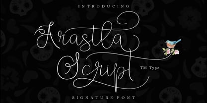 Arastla Script is a stylish and unique signature font that is easy to remember. It’s great for unique branding, photo overlays, watermarks, business cards, invitations, and much more.
 - Golden Moment by MJB Letters,
$17.00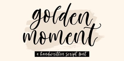 ‘Golden Moment’ a handwritten script font that has multilanguage and PUA encoded, this font is perfect for t-shirt designs, quotes, logos, display, branding, wedding invitations, and more.
 - Monoline Deco JNL by Jeff Levine,
$29.00 Monoline Deco JNL is a thin, elegant typeface that is reminiscent of the Art Deco Streamline influence of the 1930s and 1940s, complete with angular and truncated characters.
 - Classy by Typefactory,
$14.00 Classy is a modern serif font, that features a simple and minimalist feel. This font will brighten up each of your designs. The only limit is your imagination!