10,000 search results
(0.02 seconds)
- Aztek 2D by 2D Typo,
$36.00 Aztek emerged as a custom face for an ethno-music festival, and gradually developed a more robust, geometric base. The original ethno roots can still be seen in some of the alternative caps, and the ease with which Aztek forms decorative elements and borders. There is also an alternative “Tall Caps” set, that goes alongside normal uppercase characters as if they were Small Caps. The font features Latin (extended to support German and Polish) and Сyrillic character sets. Though Aztek is an accidental face designed primarily for display work, it holds well at smaller sizes and can endure high ink gain printing found in letterpress and silk-screen processes.
 - Meltow by Typesketchbook,
$39.00 In the age where stationery is replaced by typing devices, Meltow brings back memories with the design created from the actual writing tools and then developed into a convenient-to-use set of font. It features Brush (written with larger painting brush), Script (smaller painting brush), and Hand (watercolour texture). It also comes with a Sans Serif design to befit a caption, a body and a headline. With the Rust option for a retro appeal and an all-round usage, a mix of Meltow and other types can bring you something new. Offering 25 letters in 4 options, Meltow is most desirable for your creative projects.
 - Brush Type Standard by Brush Art Design Office,
$39.50I created the brush font named "BrushType Standard" in my unique brush style. I made it for ad designers. I believe this is the only one brush font in the world, so using it will enable them to get easily satisfied on their work. Brush handwriting in Japan has a long and proud Tradition and History. I tried to interject this feeling of Tradition into my font designs for you to comprehend its true meaning. I trust I have succeeded to convey my feelings to you. In addition, I can say each letter of the "BrushType Standard" is truly art. I am a pioneer of Brush Art. - AM Floriana by URW Type Foundry,
$39.99 The origin of AM Floriana is already several decades ago. At a time when there was no photo set and the choice of metal type fonts was still very manageable, Alois Menacher received an order to design a custom business logo from a flower shop. He then created a hand-drawn lettering based on the form of leaves and plants. Now Alois Menacher professionally designed and developed AM Floriana on the basis of this lettering. AM Floriana is ideally suited for packaging design, as well as for display design and logo design. AM Floriana is available as a Bold version and will soon be complemented by further cuts.
 - Wasty Pudding by PizzaDude.dk,
$15.00 Wasty Pudding was made by drawing a lot of letters, over and over again - and not caring so much about the looks, but focusing more on the speed of drawing, because I wanted a font that represented the way I write, when I am taking notes for myself. It’s not pretty, but it’s legible and scribbeliciously beautiful! :) Anyway, I think the purpose of this font is massive amounts of text. Song lyrics, novels, stories, diaries, manuscripts, books, etc. I bet you can fool someone with them thinking that this is not a font, because I have added 6 different versions of each lowercase letter!!!
 - SK Coisa by Shriftovik,
$32.00 SK Coisa is a decorative slanted geometric typeface with a daring character. Its sharp shapes and angles, and indeed the whole structure, scream for its extraordinary nature. It is unusual and stands out, and most importantly, it does not hesitate to be not like everyone else. SK Coisa is built on the contrast of rounded and sharp geometric shapes, and because of it, its appearance is impossible to forget. The typeface has both capital and lowercase characters. It supports the basic and expanded Cyrillic and Latin alphabet, as well as many other languages and character sets. If you want your design to scream, then SK Coisa is exactly what you need!
 - Bayamo by Monotype,
$29.99 Emil Bertell's Bayamo is a contemporary, digital take on the brush script tradition. It echoes the loose forms and energetic personality of sign painted letters, tapping into the current nostalgia for hand-drawn type. “I think most script fonts nowadays are either some kind of modern calligraphy, or synthetic/mechanical scripts,” says Bertell. “This one leans more towards a classic American sign painting tradition.” Contextual alternates ensure that lowercase characters change depending what's next to them, mimicking the more varied word shapes created by sign writers. Well suited for branding projects, packaging and headlines, Bayamo also pairs well with strong sans serif, and other typefaces with angular forms.
 - Emmeline by Dear Alison,
$19.00 There's something about the endless variations of handwriting, the tactile process of pen, pencil or brush to paper, and the personal and ephemeral quality as a whole. I recently came across some old handwritten letters from when my younger sister was going to college, and as soon as I saw them, a flood of memories came back to me. All just from seeing her handwriting. That's just one thing handwriting can do. I hope you find enjoyment in my sister's handwriting as much as I still do. This font is complete with alternates that will auto-typeset via the ligature feature to give a more handwritten feel.
 - Oyster by PintassilgoPrints,
$19.00 The Oyster family is a useful toolkit for hand-draw moods. It's a super casual and somewhat messy font that comes in two flavors: regular and outline, or rather, truly-hand-drawn-outline. Both styles have two choices for each upper- and lower-case letter, for that additional handmade feel. The OpenType contextual alternates feature instantly get these alternate glyphs to dance. The regular style also brings a set of glyphs with filled counters in a stylistic alternates pack, for a little twist now and then. And finally, the family has also a picture font with useful icons and ornaments. Handmadify your message and give Oyster a try!
 - Sassafras by Monotype,
$49.00Arthur Baker's display script Sassafras, designed in 1995, is based on the natural inline effect created when writing with a split-metal nibbed pen. Black and white are nicely balanced, giving this calligraphic face a remarkably smooth appearance. The regular and italic versions of Sassafras include two alternate faces: one with long, tall ascenders and regular-length descenders, and one with shortened ascenders and descenders that allow it to fit where its companion might not. In both, the ascenders increase in width as they move upward, while the descenders taper to a fine point. This variety of form makes Sassafras a very flexible choice for display work. - Arabetics Latte by Arabetics,
$59.00 Arabetics Latte is a Latin Serif typeface with a comprehensive support for the Arabetic scripts, including Quranic texts. While its seemingly-idiosyncratic Latin design eliminates the excessive usage of serifs and offsets the visual effects of several geometrically-intense glyphs, its Times Romanesque proportions gives a full nod to the beginnings of Latin types and produces an overall stable look-and-feel of a classical Serif style, making it suitable for both text and display applications. Liberal spacing is maintained throughout to match that of the Arabic text and is further supplemented by a careful implementation of a typical Latin kerning. The overall design of this font, including metrics and dimensions, was intended to make its Latin harmonize well with most other Arabetics foundry fonts. Arabetics Latte fully supports MS 1252 Western and 1256 Arabic code pages, in addition to all the transliteration characters required by the ALA-LC Romanization tables. Users can either select an accented character directly or form it by keying the desired combining diacritic mark following an unaccented character. For Arabic, it fully supports Unicode 6.1, and the latest Arabic Supplement and Extended-A Unicode blocks. The Arabic design of this font family follows the Mutamathil Taqlidi design style with connected glyphs, emphasizing vertical strokes to bring added harmony, and utilizing slightly varying x-heights to match that found in Latin. The Mutamathil Taqlidi type style uses one glyph for every basic Arabic Unicode character or letter, as defined by the Unicode Standards, and one additional final form glyph, for each freely-connecting letter of the Arabic cursive text. Arabetics Latte includes the required Lam-Alif ligatures in addition to all vowel diacritic ligatures. Soft-vowel diacritic marks (harakat) are selectively positioned with most of them appearing on similar high and low levels—top left corner—, to clearly distinguish them from the letters. Tatweel is a zero-width glyph. Keying the tatweel key (shft-j) before Alif-Lam-Lam-Ha will display the Allah ligature. Arabetics Latte includes both Arabic and Arabic-Indic numerals, in addition to generous number of punctuation and mathematical symbols. Available in both OpenType and TrueType formats, it includes two weights, regular and bold, each has normal, Italic, and left-slanted styles.
 - Ma Braille by Echopraxium,
$5.00 The "Ma" in "Ma Braille" is used as a minimalist way to say "Negative Space". "Ma" in japanese arts is an "esthetical usage of emptiness". Thus this font explicits the negative space around visible braille dots in each glyph. A. Font user guide a.1. Lowercase glyphs { A..Z } In these glyphs, dots are represented as "black squares" while the negative space is displayed as 1 or 2 white filled polygons. a.2. Uppercase glyphs { a..z } In these glyphs, dots are represented as "white squares" while the negative space is displayed as 1 or 2 black filled polygons. a.3. Digits: they are just the same than a..j, but the "North US version" is also provided in ascii codes 0xE0..0xE4 (1..5) and 0xE7..0xEB (6..0). a.5. "Dashed Border": a.5.1. "Black dashed" border glyphs; { £, ¥, µ, Â, Ä, Ê, Ë, Î, Ï, Ô } a.5.2. "White dashed" border glyphs; { Ö, Õ, °, ô, ö, î, ï, û, u, õ } B. Posters Poster 1: "Font Logo" version 1, it displays "Ma Braille" text surrounded by the "black dashed border" glyphs. Poster 2: "Font Logo" version 2, it displays "MA" glyphs in big size and smaller "Braille" glyphs within "M" and within "A" as well. Poster 3: the classical pangram to test a font "The Quick Brown Fox jumps over the Lazy dog". Poster 4: Article 1 of the Human Rights: All human beings are born free and equal in dignity and rights. They are endowed with reason and conscience and should act towards one another in a spirit of brotherhood. Poster 5: the "Glyph set" (Border glyphs not included) with A..Z, a..z, digits and special characters.
 - Sica Condensed by dooType,
$30.00 The Sica Family was designed in order to address issues related to technology, while maintaining humanistic forms. Thus, a font with square shapes emerged, but with smooth curves and slightly rounded terminals making it friendly. The family has three widths – condensed, normal and expanded – each of them with six weights and their respective italics, resulting in 36 fonts. With particular details and open shapes that increase legibility, it can be used for both text compositions as well for display sizes. It has 774 glyphs, covering more than 50 languages, as well as ligatures, lining, oldstyle, tabular and proportional figures, fractions, superiors, inferiors, and small caps, all of them accessible through OpenType features.
 - Bejo by Twinletter,
$15.00 BEJO is a display font in the Japanese style, with each letter having its own individual personality. This font is appropriate for a wide range of project demands, particularly those involving Asian features. By utilizing this typeface, you will create a project with a gorgeous, original, and elegant appearance that will be remembered by many people. Logotypes, food banners, branding, brochure, posters, movie titles, book titles, quotes, and more may all benefit from this font. Of course, using this font in your various design projects will make them excellent and outstanding; many viewers are drawn to the striking and unusual graphic display. Start utilizing this typeface in your projects to make them stand out.
 - Sica Expanded by dooType,
$30.00The Sica Family was designed in order to address issues related to technology, while maintaining humanistic forms. Thus, a font with square shapes emerged, but with smooth curves and slightly rounded terminals making it friendly. The family has three widths – condensed, normal and expanded – each of them with six weights and their respective italics, resulting in 36 fonts. With particular details and open shapes that increase legibility, it can be used for both text compositions as well for display sizes. It has 774 glyphs, covering more than 50 languages, as well as ligatures, lining, oldstyle, tabular and proportional figures, fractions, superiors, inferiors, and small caps, all of them accessible through OpenType features. - DangeR NighT by Absonstype,
$19.00 DANGER NIGH is the horror display typeface with high contrast all caps style looks and feel nice balanced. Honestly it works perfectly for headlines, logos, posters, packaging, T-shirts and much more. Recommended to use in Adobe Illustrator or Adobe Photoshop with opentype feature. Ligatures feature is default setting in Adobe Illustrator or Adobe Photoshop in Uppercase character. So when you want not to use the ligatures. Open glyphs panel : In Adobe Photoshop choose tool Window Character and then please click fi symbol In Adobe Illustrator choose tool Window Type Open Type and then please click fi symbol If you have questions, just send me a message and I’m glad to help. Have a great day, Absonstype
 - Dirty Sundae by Fenotype,
$19.00 Dirty Sundae is a casual hand drawn typeface with interlocking ligatures. Dirty Sundae comes in four styles: Regular and Condensed plus Regular and Bold version of them both. Dirty Sundae suits great into a film title, as a logotype for a cartoon or an animation film or for a new superhero, as well as in a jazz gig poster, magazine, packaging and branding. It can be easily fit into a vintage or modern context as long as it’s on the cheerful side. Dirty Sundae is equipped with 128 interlocking ligatures that you can access by turning on Discretionary Ligatures in any OpenType savvy program or by fetching them manually from the character window.
 - Sica by dooType,
$30.00The Sica Family was designed in order to address issues related to technology, while maintaining humanistic forms. Thus, a font with square shapes emerged, but with smooth curves and slightly rounded terminals making it friendly. The family has three widths – condensed, normal and expanded – each of them with six weights and their respective italics, resulting in 36 fonts. With particular details and open shapes that increase legibility, it can be used for both text compositions as well for display sizes. It has 774 glyphs, covering more than 50 languages, as well as ligatures, lining, oldstyle, tabular and proportional figures, fractions, superiors, inferiors, and small caps, all of them accessible through OpenType features. - Yel Yeah by Allouse Studio,
$16.00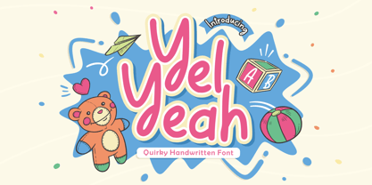 Yel Yeah a Quirky Handwritten Font tha will bring an fun and playful impression. Yel Yeah is perfect for any tittles, logo, product packaging, branding project, megazine, social media, wedding, or just used to express words above the background. Yel Yeah also come with Multi-Lingual support. Enjoy the font, feel free to comment or feedback, send me PM or email. Thank You!
 - Dear Sarah Pro by Betatype,
$119.00 Carefully considered letters written long-hand, sealed in an envelope and sent across continents were once the only connection for distant friends and lovers. Dear Sarah is a type that evokes the emotion of those handwritten messages. Using alternates, ligatures and a complex system for randomization and natural connected characters, Dear Sarah seeks to push the boundaries of digital type. The guiding question that drove the design of Dear Sarah was whether it was possible to create a natural looking script that worked well in running text. Hand-written types often work for two or three words, but as soon you you look at them in a paragraph, their unnatural textures make them feel contrived. As one of the first serious types to explore OpenType for a connected script, Dear Sarah uses a unique system to create natural connections. Often script types rely on one connecting point to make sure that all their characters fit together properly. Characters that naturally connect much higher, such as the ‘o’ or ‘v’ are distorted to connect at the same point as an ‘a’ or a ‘c’. Dear Sarah uses multiple sets of lower-case characters to connect at multiple points, creating a much more natural looking script. OpenType is also used to create variety, by using randomization techniques to insert disconnected characters as well as alternates, ligatures, swashes and ink blots to create a natural rhythm across multiple lines.
 - Barcis by insigne,
$24.75 Take your reader far away to a tropical morning, where the inviting aroma of a fresh roast introduces them to a gentle breeze and the first, warm light of day. Take them there with Barcis. This organic face with its tall x-height and neo-humanist attributes shows its free spirit through unique terminals, calligraphy-inspired strokes, and a rich variety of OpenType alternates All insigne fonts are loaded with OpenType options. Barcis is geared up for pro typography. The font features many numeral sets, with fractions, old-style figures, superiors and inferiors. OpenType-capable programs like Quark or the Adobe suite allow you to quickly change ligatures and alternates. You can see these options shown in the .pdf brochure. Barcis also features the glyphs to aid a variety of languages, together with Central, Eastern and Western European languages. In all, Barcis supports around forty languages that utilize the Latin script, earning Barcis the pick for for multi-lingual publications and packaging. Barcis features three different widths and seven weights from exceptional Light-weight to dense Black. Each of these individual fonts offers its own authentic italics and alternate glyphs as well. With its high versatility, Barcis is without a doubt an amazing titling font, a great choice for journals, a solid option for web use, or even for clearly defining your mark in logotype. Bring Barcis into your library, and use it to carry your audience away.
 - BD Gitalona by Balibilly Design,
$22.00 We introduce our high-complex typeface. A wide range of serifs for text and display titles are divided into one prominent sub-family and four display sub-families. Comes shifted from serif to sans serif to fulfilling the completeness of this font family that we named BD Gitalona. In addition to these massive things, this font family is filled with an explorative and experimental decorative version that we present separately. Figure out the decorative version BD Gitalona Moxa to make the aesthetic appeal of this whole typeface! Inspiration The world of entertainment moves non-stop. One by one, figures appeared and left. We expect to create something to entertain previous trends with packaging more relevant to the present. More specifically, we admire and are inspired by some of the world's leading and top singers with a segmented nature. We imagine so many figures that can affect every viewer. However, each artist or singer has a segment because almost all of them have characteristics. The Design The basic design of this typeface begins with a transitional serif shape with sharp, shapeless corners. Then in the middle of the invention, there was an opportunity to explore it further from the readability side by adding an optical variable that can adjust the serif thickness when used together between large, medium to paragraph text sizes for editorials. The shift from serif to sans-serif with the contrast initiated by the shift of the serif family form as a different variable also makes this font richer in terms of the features it contains. Parts are expected to add to the user satisfaction with the complexity of this font. The Features BD Gitalona consists of one sub-family intended for body text with nine weights from Thin(100) to Black(900) and four other display sub-families such as Display serif, Flick, Harmony Sans and Contrast Sans. Each consists of four weights Thin(100), Regular Weight(400), Bold(700), and Black(900). And again, there are also retailed separately; the BD Gitalona Variable font, which is designed to accommodate all Subfamily in 1 font file, and BD Gitalona Moxa, an experimental typeface. A total of 700+ glyphs in each style. Advanced OpenType features functionally and aesthetically, such as Case-sensitive forms, small caps, standard and discretionary ligatures, stylistic alternates, ordinals, fractions, numerator, denominator, superscript, subscript, circled number, slashed zero, old-style figure, tabular and lining figure. Supports multi-languages including Western Europe, Central Europe, Southeast Europe, South America, and Oceania.
 - Lemonado by Melvastype,
$29.00 Lemonado is a type family drawn with a dry brush pen. It includes upright and italic scripts and all caps fonts with brush texture or with smooth edges. Lemonado Script is playful and slightly bouncing connecting script. It includes two sets of lower cases to increase the hand writing effect. By enabling Contextual Alternates from OpenType panel you can cycle these two sets and achieve variation. Lemonado Script also includes set of lowercases without connecting stroke, you can use those in the middle of words or automatically add them at the end of words by enabling Stylistic Set 1 at the OpenType panel. There are also set of lower cases with end swashes, you can automatically add these swashes to end of words by enabling Stylistic Set 2 at the OpenType panel. Also other alternate characters and underlines are included to give you even more possibilities to play with. Lemonado Caps has two sets of upper case letters, high and low ones. You can achieve this fun looking bouncing effect by varying them. Just enable Contextual Alternates from OpenType panel and those two sets will cycle.
 - Wingman by Fontforecast,
$23.00 Wingman consists of nine fonts, that can work together in perfect harmony to create beautiful designs. Like a true wingman they reinforce each others potential and offer mutual support. Wingman Brush takes the lead and is, with its six styles, well equipped for many challenging typographic tasks. All Brush styles (except Brush Extra) have 815 glyphs and are packed with Open Type magic, e.g. contextual alternates, that automatically replace beginning and ending glyphs as you type. There are lots of swashes to choose from, organized in several stylistic sets. The bold and the regular styles have matching shadow versions. Brush Bold and Brush Silhouette fit together also. Nice logo-like effects can be achieved by layering these styles. On top of that Brush Vintage was added for a rustic feel. Brush Extra has 322 design elements in both smooth and vintage style. Wingman Serif was designed to use together with the brush styles. It comes in a solid and outline version. Both fonts can fly solo, but together with Wingman Brush they make a powerful formation. Wingman Family requires the use of an Open Type savvy application.
 - Boxy by Hackberry Font Foundry,
$24.95 In my on-going quest for display fonts to be used with my books and on my book covers, I decided I need a squared sans serif. I started the build off of Fiscal, a font I designed back in 2006. I never liked the font, plus my tastes have changed. So, I opened it, made it narrower, increased the x-height, and various stuff like that. I made it much heavier—an ended up with Boxy. Then my brain slapped me and said, "Why don't you make a sorta modern version?" So, I did and decided to call that style Chic. But then I wanted a thin version also. Fiscal was always too heavy and ponderous for me. So, I made the Thin style. Finally, I felt I needed an italic of Chic. OpenType features didn't seem to work well with the family, so all I added was oldstyle figures. So, I ended up with another of my unique families—with two unmodulated fonts: Thin and Medium, and two modulated fonts: Chic and Chic Italic. But, I'm pleased with it. My hope is that you will like it also.
 - New Icon by Set Sail Studios,
$34.99 Introducing the New Icon Font Duo. This luxury script and timeless serif are perfectly designed for one another-not only are they strong standalone fonts, but will pair beautifully when placed side by side. Feeling creative? They can even be mixed together within the same word for a more eye-catching layout, giving you a versatile set of fonts which can be used & loved across a range of design projects. Included in this family; New Icon Serif • A classic, all caps serif font with nostalgic notes. Contains alternate large-width O,G,Q,C characters in the ‘uppercase’ set. New Icon Serif Condensed • A thinner version of the New Icon Serif. New Icon Script • A luxury, cursive script font containing upper & lowercase characters. A beautiful letter set inspired by traditional calligraphy, which can be used on it’s own or paired effortlessly with the serif font. Contains alternate lowercase y & g with elongated tails, accessible by turning on ‘Stylistic Alternates’ or via a Glyphs panel. Language Support • English, French, Italian, Spanish, Portuguese, German, Swedish, Norwegian, Danish, Dutch, Finnish, Indonesian, Malay, Hungarian, Polish, Croatian, Turkish, Romanian, Czech, Latvian, Lithuanian, Slovak, Slovenian.
 - FS Split Sans by Fontsmith,
$80.00 Quirky and irregular FS Split is no ordinary typeface. Its irregular proportions make it unique, with round letters appearing wide, and straight letters narrow. Other quirks include its eclectic crossbars – the uppercase ‘A’ has an unusually low bar, while the bar on ‘G’ is particularly long. The uppercase has many interesting features in fact, including large counters, closed terminals on certain letters like ‘J’, and a cap-height that lines up with ascenders. The lowercase also holds surprises – the dots on ‘i’ and ‘j’ are unusually large, and some characters, such as ‘g’, feature double-storey counters. An extreme but stylish italic The italic versions of FS Split Sans and Serif are particularly striking. While similar in style to their upright, Roman versions, they take on a larger-than-usual 18-degree angle, making the forward-slant more dramatic. Although the main purpose of any italic is to help words and phrases stand out, this unique execution helps to make the italic variants of FS Split stylish fonts in their own right – they would work brilliantly on magazine covers, in titles and headlines, pull quotes, and even used commercially in logos and corporate branding. Serif and sans: a split personality FS Split Sans and Serif have their differences but also their similarities, contrasting and complementing each other perfectly. This ‘love hate’ relationship inspired the name of the typeface family, and means the two variants provide a versatile, typographic palette for use in graphics and branding. While its proportions are similar to the sans, the serif has a bigger contrast between its weights of bold, regular and light, bracketed serifs, and different styles of terminals, some being straight and others ball-shaped. FS Split Sans has more subtlety and simplicity, with a smaller weight contrast, less flamboyant terminals, and more consistent counter sizes. The two variants are distinct yet alike, so can be used successfully either in isolation or together.
 - FS Split Serif by Fontsmith,
$80.00 Quirky and irregular FS Split is no ordinary typeface. Its irregular proportions make it unique, with round letters appearing wide, and straight letters narrow. Other quirks include its eclectic crossbars – the uppercase ‘A’ has an unusually low bar, while the bar on ‘G’ is particularly long. The uppercase has many interesting features in fact, including large counters, closed terminals on certain letters like ‘J’, and a cap-height that lines up with ascenders. The lowercase also holds surprises – the dots on ‘i’ and ‘j’ are unusually large, and some characters, such as ‘g’, feature double-storey counters. An extreme but stylish italic The italic versions of FS Split Sans and Serif are particularly striking. While similar in style to their upright, Roman versions, they take on a larger-than-usual 18-degree angle, making the forward-slant more dramatic. Although the main purpose of any italic is to help words and phrases stand out, this unique execution helps to make the italic variants of FS Split stylish fonts in their own right – they would work brilliantly on magazine covers, in titles and headlines, pull quotes, and even used commercially in logos and corporate branding. Serif and sans: a split personality FS Split Sans and Serif have their differences but also their similarities, contrasting and complementing each other perfectly. This ‘love hate’ relationship inspired the name of the typeface family, and means the two variants provide a versatile, typographic palette for use in graphics and branding. While its proportions are similar to the sans, the serif has a bigger contrast between its weights of bold, regular and light, bracketed serifs, and different styles of terminals, some being straight and others ball-shaped. FS Split Sans has more subtlety and simplicity, with a smaller weight contrast, less flamboyant terminals, and more consistent counter sizes. The two variants are distinct yet alike, so can be used successfully either in isolation or together.
 - Wigwams by Struvictory.art,
$14.00 We would like to introduce our new product Wigwams - Handwritten Geometric Font. Wigwams is a linear font in a hand-drawn minimalistic style, the lowercase is decorated with geometric elements. The typeface includes Regular and Symbol versions. Combine the font with symbols to get a unique design. The font is easy to use in various design programs or without any program. Wigwams is suitable for lettering posters, camping products, photo overlays in hipster style and music albums. The font works great both for printing clothes and craft products, branding and packaging (herbal tea, handmade soap, organic food). Also use individual letters and symbols to create logos and monograms.
 - 112 Hours by Device,
$9.00 Rian Hughes’ 15th collection of fonts, “112 Hours”, is entirely dedicated to numbers. Culled from a myriad of sources – clock faces, tickets, watches house numbers – it is an eclectic and wide-ranging set. Each font contains only numerals and related punctuation – no letters. A new book has been designed by Hughes to show the collection, and includes sample settings, complete character sets, source material and an introduction. This is available print-to-order on Blurb in paperback and hardback: http://www.blurb.com/b/5539073-112-hours-hardback http://www.blurb.com/b/5539045-112-hours-paperback From the introduction: The idea for this, the fifteenth Device Fonts collection, began when I came across an online auction site dedicated to antique clocks. I was mesmerized by the inventive and bizarre numerals on their faces. Shorn of the need to extend the internal logic of a typeface through the entire alphabet, the designers of these treasures were free to explore interesting forms and shapes that would otherwise be denied them. Given this horological starting point, I decided to produce 12 fonts, each featuring just the numbers from 1 to 12 and, where appropriate, a small set of supporting characters — in most cases, the international currency symbols, a colon, full stop, hyphen, slash and the number sign. 10, 11 and 12 I opted to place in the capital A, B and C slots. Each font is shown in its entirety here. I soon passed 12, so the next logical finish line was 24. Like a typographic Jack Bauer, I soon passed that too -— the more I researched, the more I came across interesting and unique examples that insisted on digitization, or that inspired me to explore some new design direction. The sources broadened to include tickets, numbering machines, ecclesiastical brass plates and more. Though not derived from clock faces, I opted to keep the 1-12 conceit for consistency, which allowed me to design what are effectively numerical ligatures. I finally concluded one hundred fonts over my original estimate at 112. Even though it’s not strictly divisible by 12, the number has a certain symmetry, I reasoned, and was as good a place as any to round off the project. An overview reveals a broad range that nonetheless fall into several loose categories. There are fairly faithful revivals, only diverging from their source material to even out inconsistencies and regularize weighting or shape to make them more functional in a modern context; designs taken directly from the source material, preserving all the inky grit and character of the original; designs that are loosely based on a couple of numbers from the source material but diverge dramatically for reasons of improved aesthetics or mere whim; and entirely new designs with no historical precedent. As projects like this evolve (and, to be frank, get out of hand), they can take you in directions and to places you didn’t envisage when you first set out. Along the way, I corresponded with experts in railway livery, and now know about the history of cab side and smokebox plates; I travelled to the Musée de l’imprimerie in Nantes, France, to examine their numbering machines; I photographed house numbers in Paris, Florence, Venice, Amsterdam and here in the UK; I delved into my collection of tickets, passes and printed ephemera; I visited the Science Museum in London, the Royal Signals Museum in Dorset, and the Museum of London to source early adding machines, war-time telegraphs and post-war ration books. I photographed watches at Worthing Museum, weighing scales large enough to stand on in a Brick Lane pub, and digital station clocks at Baker Street tube station. I went to the London Under-ground archive at Acton Depot, where you can see all manner of vintage enamel signs and woodblock type; I photographed grocer’s stalls in East End street markets; I dug out old clocks I recalled from childhood at my parents’ place, examined old manual typewriters and cash tills, and crouched down with a torch to look at my electricity meter. I found out that Jane Fonda kicked a policeman, and unusually for someone with a lifelong aversion to sport, picked up some horse-racing jargon. I share some of that research here. In many cases I have not been slavish about staying close to the source material if I didn’t think it warranted it, so a close comparison will reveal differences. These changes could be made for aesthetic reasons, functional reasons (the originals didn’t need to be set in any combination, for example), or just reasons of personal taste. Where reference for the additional characters were not available — which was always the case with fonts derived from clock faces — I have endeavored to design them in a sympathetic style. I may even extend some of these to the full alphabet in the future. If I do, these number-only fonts could be considered as experimental design exercises: forays into form to probe interesting new graphic possibilities.
 - Allioideae by URW Type Foundry,
$49.99 This fine lined display type face was named Allioideae because of the ascenders of the lower cases. They are rising upright with a single stroke and are ending - depending on the font style - into a spherical blossom. The name was chosen concerned to the plant allium, that forms an umbel at the top of a leafless stalk, when it is blooming. Allioideae is the name of a subfamily of monocot flowering plants in the family Amaryllidaceae. The name is derived from the generic name of the type genus, Allium. The wide and round capital letters are showing a nice contrast to the lower cases and giving the font a kind of female feeling. That provides a functional and lovely use in headlines for all beauty and cosmetics issues.The typeface appears in 4 different styles. a plain style – Allioideae, a stencil style - Allioideae Stencil, a (dotted) style for both - Allioideae Dot and Allioideae Stencil Dot. It supports multi language as it covers all the latin diacritics and a cyrillic character set. Lots of numbers as monospaced, lining figuers, old styles, sub- and superscript and many fractions in two different styles are giving a nice finish to that font. Also some matching ornaments are included.
 - Kometa by Kiril Zlatkov Type Foundry,
$40.00 Kometa Sans is a contemporary grotesk with a certain personality. She has a steady geometric skeleton, but its appearance is rather humanistic. The precise details of the artwork, the carefully drawn true italics, the six types of numerals, the variety of alternates, the broad range of open-type features and the extensive glyph set can meet most of the contemporary typographer’s demands for a neutral, but not boring type family for both long text and display use. Among the distinctive qualities of Kometa are also the forms of ligatures (both default and discretionary). They follow the natural constructive transitions between oval parts and stems, which is an advantage to mark, at least for designers who respect the beauty of clean forms. Note the specially designed Kometa Unicase sub-family, substantially enough to exist as a separate typeface. Its elegant and expressive letterforms are boosting further the power to create outstanding design work. Kometa Unicase has original and playful, yet reasonable approach to letterforms variety. Kometa has a very broad usability range – from logotypes and poster designs to corporate identities and complex editorial projects. The contemporary Cyrillics of Kometa allows easily completion of graphically consistent multilingual corporate and artistic design projects. Designed by Kiril Zlatkov and Vassil Kateliev.
 - Dream Within A Dream by Storm Type Foundry,
$55.00 Dream Within a Dream was the title of exhibition of Czech art inspired by the work of Edgar Allan Poe curated by Otto M Urban and Veronika Hulíková. Three dozens of artists exhibited their works in the Czech National Gallery in 2020. The cataloguje was printed with the use of the present typeface. Artists took significant interest in Poe's literary oeuvre only after the writer's untimely death. This was mainly thanks to the poet Charles Baudelaire who translated Poe's works to French. As early as in the second half of the 19th century, prominent artists such as Edouard Manet, Odilon Redon, James Ensor and Gustave Doré created remarkable artworks inspired by Poe. Although the first Czech translations of Poe's woks date to the 1850s, artworks inspired by them only appeared several decades later, at the turn on the 20th century. Poe's poems and short stories inspired František Kupka and soon after him, Josef Váchal, Jan Konůpek and František Kobliha. Alfred Kubin, a German artist born in Bohemia, made illustrations for the German translation of Poe's collected stories. Later on, Alén Diviš and František Tichý created further Poe-inspired artworks. Poe was a source of inspiration for Jan Švankmajer and more recently, František Štorm and Jaroslav Róna.
 - Thalweg Poetica by Ani Dimitrova,
$29.00 Thalweg Poetica is a revival font that comes with a story created in 1993 by the Bulgarian artist Ivan Kyosev. It is a sequel to the Thalweg font family completed in 2020. The construction of characters combines the upright character of the Thalweg font and the handwritten character of Thalweg Italic. The font partners perfectly with the Talweg font family and gives designers a new opportunity for expression. Thalweg Poetica contains 4 widths / Normal, Semi Condensed, Condensed & Extra Condensed / and 8 weights ranging from Thin to Black with small caps versions, each style containing more than 1100 glyphs. The font comes with extended coverage of the Latin, Cyrillic, and Greek Scripts. All of the weights are specifically equipped for complex, professional typography with Open Type Features. These features include Small Caps, Ligatures, Discretionary Ligatures, Superscript, Subscript, Tabular Figures, Old-Style Figures, Circled Figures, Arrows, Matching currency symbols, and fraction. The Thalweg Poetica family is ideally suited for small text, books and magazines, branding, posters, as well as web and screen design, headlines, and more. The Regular and Medium weights are perfect for body text and they give an interesting texture to the text. The range of styles gives good flexibility to this family.
 - Blackhaus by Canada Type,
$25.00Almost a half of a millennium after being mistaken for the original 4th century Gothic alphabet and falsely labeled "barbaric" by the European Renaissance, the blackletter alphabet was still flourishing exclusively in early 20th century Germany, not only as an ode to Gutenberg and the country's rich printing history, but also as a continuous evolution, taking on new shapes and textures influenced by almost every other form of alphabet available. Blackletter would continue to go strong in Germany until just before the second World War, when it died a political death at the height of its hybridization. For almost 50 years after the war, blackletter was very rarely used in a prominent manner, but it continued to be seen sparely in a variety of settings, almost as a subliminal reminder of western civilization's first printed letters; on certificates and official documents of all kinds, religious publications, holiday cards and posters, to name a few. In the early 21st century, blackletter type has been appearing sporadically on visible media, but as of late 2005, it is not known how long the renewed interest will last, or even whether or not it will catch on at all. The last few years before World War II were arguably the most fascinating and creative in modern blackletter design. During those years, and as demonstrated with the grid-based Leather font, the geometric sans serif was influencing the blackletter forms, taking them away from their previous Jugendstil (Art Nouveau) hybridizations. Blackhaus is a digitization and elaborate expansion of a typeface called Kursachsen Auszeichnung, designed in 1937 by Peterpaul Weiss for the Schriftguss foundry in Dresden. This is one of very few designs from that time attempting to infuse more Bauhaus than Jugendstil into the Blackletter forms. This is why we used a concatenation of the words blackletter and Bauhaus to name this face. The result of injecting Bauhaus elements into blackletter turned out to be a typeface that is very legible and usable in modern settings, while at the same time harking back to the historical forms of early printing. The original 1937 design was just one typeface of basic letters and numbers. After digitizing and expanding it, we developed a lighter version, then added a few alternates to both weights. The Rough style came as a mechanically-grunged afterthought, due to current user demand for such treatment. Having the flexibility of 2 weights and many alternates of a blackletter typeface is not a very common find in digital fonts. More specifically, having the flexibility of 2 weights and alternates of a 20th century blackletter typeface is almost unheard of in digital fonts. So the Blackhaus family can be quite useful and versatile in an imaginative designer's hands. - Costa Std by Typofonderie,
$59.00 A mediterranean style sanserif in 4 styles The original idea of Costa was to create a contemporary mediterranean typeface style. Costa is a synthesis of the purity, as found on Greek capitals, and softness, found in Renaissance scripts. First thing was the design concept that take its roots on the Chancery script. Such writing style appeared during Italian Renaissance. Later few typefaces have been developed from such cursive models. Today most serifed typeface italic take their roots on such triangular structure we can find on gylphs like the n, p, or d. The Costa capitals remains close to pure sanserif models when the lowercases features an ending serif on many letters like the a, n, d, etc. This ending serif being more like a minimal brush effect, creating a visual contrast and referencing the exoticness of the typeface. Knowing that the Costa typeface family began life in the 90s as a bespoke typeface for Costa Crociere, an Italian cruise company — it suddenly makes sense and explains well why Jean François Porchez focused so much on Italian Chancery mixed to a certain exotism. The curvy-pointed terminals of the Costa n can obviously get find on other glyphs, such as the ending of the e, c and some capitals. So, the sanserif looks more soft and appealing, without to be to pudgy or spineless. The general effect, when set for text, remains a sanserif, even not like Rotis Semiserif. Costa is definitly not a classical typeface, or serif typeface which convey past, tradition, historicism as Garamond does beautifully. Because of the Costa crocieres original needs, Costa typeface was designed to be appropriate for any uses. Anytime you’re looking for good mood, qualitative effects, informal tone, cool atmosphere without to be unconvential or blowzy, Costa will convey to your design the required chic and nice atmosphere, from large headlines sizes, brands, to small text sizes. It’s a legible typeface, never boring. A style without neutrality which doesn’t fit comfortably into any typeface classification! Does it proves the novelty of its design and guarantees as well as its originality? Its up to you to be convinced. Barcelona trip Originally not planned, this need appeared because of a trip to Barcelona at the time of the project, where Jean François was giving a lecture. He wanted to pay an homage to that invitation to create something special. So, he designed during his flight some variations of the Spanish Ch, following ideas developed by the Argentinian type designer Rubén Fontana for his typeface called Fontana ND (published by the Barcelona foundry Bauer). Then, he presented during his lecture variations and asked to the audience which design fit the best to their language. They selected the design you can find in the fonts today. Read more about pairing Costa Type Directors Club 2000 Typographica: Our Favourite Typefaces 2004
 - Almoneda by Sudtipos,
$49.00 Almoneda: Sale at public auction of movable goods, generally used. And also: private and voluntary sale of jewelry and junk that is made without the intervention of justice. Formerly, it was nothing more than the market or sale of things and spoils won from the enemy in war. Nowadays, the almoneda is practically associated with spaces where the sale of "old things" takes place and, in Madrid, they are usually concentrated in the area of El Rastro, an open-air market that is set up on Sundays and some holidays in the center of Madrid. There, you can find everything and, if you walk around a lot and look hard enough, great typographic finds. It is there where I find a large number of elements (usually from the late nineteenth and early twentieth century) such as boxes, posters, books, etc.. in which appear uppercase letters with a variety of shapes, letters embedded, rare ligatures ... In addition, many elements extracted from street signs, tiles from bars and commemorative elements of Madrid have been used to complete this font design made with care and patience. Thus was born Almoneda, a modern typeface with a marked axis and great contrast, and an uppercase with several sets of characters to play with and enjoy. It also includes a large number of ligatures and discretionary ligatures. A Variable font is included with the full package license. Almoneda, a typeface that will not leave you indifferent. They take it out of my hands, hey!
 - Metron by Storm Type Foundry,
$52.00 Metron is so far the most ambitious typeface made to order in the Czech Republic. Despite the fact that for a number of years it has not been used for the purpose for which it was designed, every inhabitant of Prague is still well aware of its typical features. Metron Pro was commissioned by the Transport Company of the Capital City of Prague in 1970 to be used in the information system of the Prague Metro. It was first published in the manual of the Metroprojekt company in 1973 and then used to the full, under the author’s supervision, for lines “A” and “C”. Since 1985 Rathouský's system has been disappearing from the Prague Metro; it survives only in the form of metal letters at its stations and at some stations of the Czechoslovak Railways. In 2014 we're mentioning the 90th birthday of Jiří Rathouský. It’s a good opportunity for updating and re-introducing his Metron. Extended was the choice of figures and fractions, new currency signs added, diacritics revised, etc., but above all the newly designed Cyrillics including true SmallCaps. Now we have six weights plus italics, where the tone of the basic style is even closer to the original. Ten years back we've had the feeling that this typeface should again take a part of Prague’s traffic system and today, when revisiting of all the fonts, the feeling turned to certainty. The main feature of this typeface is namely a noticeability a property above all welcomed in rush of platforms.
 - Moliere by Eurotypo,
$44.00 The life of Molière is a story of struggle, hard work, domestic unhappiness, death and burial in obscurity and almost in shame. Molière left behind a body of work that not only changed the face of French classical comedy, but has also come to influence the work of other dramatists from around the world. Despite his own preference for tragedy, which he had tried to further with the Illustre Théâtre, Molière became famous for his farces, which were generally in one act and performed after the tragedy. Both the comic and the serious drama were powerfully affected by the work of Molière, not only in his own age and country but everywhere and up to the present time. Didot is a name given to a group of typefaces named after the famous French printing and type producing family. The classification is known as modern, or Didone. The typeface we know today was based on a collection of related types developed in the period 1784–1811. Firmin Didot cut the letters, and cast them as type in Paris. Along with Giambattista Bodoni of Italy, Firmin Didot is credited with establishing the use of the "Modern" classification of typefaces. The types that Didot used are characterized by extreme contrast in thick strokes and thin strokes, by the use of hairline serifs and by the vertical stress of the letters. As in the extreme contrasts of the literature of Molière, in Didione's typefaces, thick and thin strokes, straight and curved, are the most relevant characteristic for an era marked by the changes.
 - Olympukes 2012 by Barnbrook Fonts,
$30.00 Released on the occasion of the 2012 London Olympics, Olympukes 2012 was a new set of pictograms telling the ‘real’ story of the Olympics and extending the unofficial project that began in 2004. The occasion of the London games provided an opportunity to revisit the complex contradictions of the modern Olympics and to acknowledge the geopolitical shifts of the intervening eight years. The 2012 games arrived at a time of great economic and political uncertainty for the nation and Europe. Greece – the host of the 2004 games – was now located at Ground Zero of a disintegrating Eurozone and the United Kingdom was two years into a programme of austerity enacted by the coalition government of Conservatives and Liberal Democrats. Given that the previous London Olympics had been held in 1948, in a climate of recovery and austerity after a devastating World War (1948’s Olympiad was dubbed the ‘Austerity Games’) there was a sick irony to the 2012 games' arrival. The suppression of human rights in order to deliver the perfect games for PRoC’s Beijing games shocked no-one and yet, in London, the security measures seemed grossly excessive. Then again, in a country with an estimated 1.8 million cctv cameras, perhaps we shouldn’t have been so surprised. Another aspect of the Olympics that returned for 2012 was the unfettered commercialism – if you think the Games are about pure sport, about noble human endeavour, think again. Please note that Barnbrook Fonts is in no way affiliated with, or has received any endorsement from, the International Olympic Committee, the organising committees of the Olympic Games, or any national Olympic committee.