10,000 search results
(0.036 seconds)
- Wardah by Omotu,
$18.00 Wardah! A handwrittent signature font. Comes with two styles, regular and rounded. Wardah font is suitable for branding, logotype, apparel, T-shirt, Hoodie, product packaging, quotes, flyer, poster, book cover, advertising, etc. Whats Include? Opentype support Multilingual support PUA encoded Features: Uppercase, lowercase, numerals, punctuations, stylistic sets, alternate, and ligatures Accessible in the Adobe Illustrator Glyphs panel, or under Stylistic Alternates in the Adobe Photoshop OpenType menu, Adobe InDesign, Corel Draw, even work on Microsoft Word Please message me if you’re unsure of any language support. Thanks for looking, and I hope you enjoy it! Please don’t hesitate to drop me a message if you have any issues or queries.
 - Wingstone by Omotu,
$18.00 Wingstone is a modern beautiful display sans font. Comes with 2 styles, decorative and regular. Suitable for logotype, branding, packaging design, poster design, website/display, editorial, headline, advertising, and more. Whats Include? 01. Opentype support 02. Multilingual support 03. PUA encoded 04. Features: Uppercase, lowercase, numerals, punctuations, contextual alternates 05. Accessible in the Adobe Illustrator Glyphs panel, or under Stylistic Alternates in the Adobe Photoshop OpenType menu, Adobe InDesign, Corel Draw, even work on Microsoft Word Please message me if you're unsure of any language support. Thanks for looking, and I hope you enjoy it! Please don't hesitate to drop me a message if you have any issues or queries.
 - Karika Swirls by Deniart Systems,
$20.00 Add charm with intricate swirls! Karika Swirls was inspired by our obsessive love of swirly patterns and symmetric designs. Karika, a Hungarian word for circle, is a charming way of saying we love circular symmetrical forms. These 52 original illustrations are great for creating stationery, adding borders to greeting cards or design projects, background images, etc. The glyphs can be used individually or combined with other glyphs to form complex patterns. Karika Swirls is part of the Karika Collection of fonts. These intricate swirls are symmetrically sized in height and width so they'll work charmingly together for any project. See also Karika Hearts and Karika Encore .
 - Adoret Loves by Say Studio,
$12.00 About the Product Adoret Loves is a beautiful a Fabulous hybrid font from modern serif with elegant script . come with 2 versions regular & italic. Adoret Loves is made mainly for headlines, titles, and other short texts and is well-suited for advertising, vintage mood board, branding, logotypes, packaging, titles, editorial design, modern logos, websites, social media quotes, wedding branding, modern and vintage design. What you get: - Adoret Loves Regular - Adoret Loves Italic - Accessible in the Adobe Illustrator, Adobe Photoshop, Coreldraw, even work on Microsoft Word. PUA Encoded Characters – Fully accessible without additional design software. - Fonts include multilingual support. Thanks, Have a wonderful Day Say Studio
 - Bonitto by Omotu,
$18.00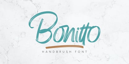 Bonitto is a handwritten script font with 2 styles, Regular and Slant. Bonitto is suitable for branding, logotype, apparel, t-shirts, hoodies, product packaging, quotes, flyers, posters, advertising and more. What's Included? 1. Uppercase and lowercase characters 2. Multilingual support. 3. Numerals, punctuations, and ligatures 4. Accessible in the Adobe Illustrator Glyphs panel, or under Stylistic Alternates in the Adobe Photoshop OpenType menu, Adobe InDesign, Corel Draw, even work on Microsoft Word. Please message me if you're unsure of any language support. Thanks for looking, and I hope you enjoy it! Please don't hesitate to drop me a message if you have any issues or queries. Omotu Studio
 - Hibrush by Omotu,
$18.00 Hibrush is a font that comes in 2 versions, a brushed texture regular version and a solid style. Hibrush is perfect for logos, apparel, T-shirt, hoodies, product packaging, or anything else. It includes Uppercase and lowercase characters, Supports international languages, contains numerals, punctuations, ligatures, stylistic alternates, and stylistic sets. Those are accessible in the Adobe Illustrator Glyphs panel, or under Stylistic Alternates in the Adobe Photoshop OpenType menu, Adobe InDesign, Corel Draw, even work on Microsoft Word. Thanks for looking, and I hope you enjoy it. Please don't hesitate to drop me a message if you have any issues or queries. Omotu (ibnu.blawong2@gmail.com)
 - Sore by Omotu,
$18.00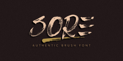 Sore is an authentic brush font, real brush texture. All caps characters. Sore is suitable for branding, logotype, apparel, T-shirts, Hoodies, product packaging, quotes, flyer, poster, advertising and more. Whats Include? 1. Uppercase and lowercase characters 2. Multilingual support. 3. Numerals, punctuations, alternate, and ligatures 4. Accessible in the Adobe Illustrator Glyphs panel, or under Stylistic Alternates in the Adobe Photoshop OpenType menu, Adobe InDesign, Corel Draw, even work on Microsoft Word. Please message me if you're unsure of any language support. Thanks for looking, and I hope you enjoy it! Please don't hesitate to drop me a message if you have any issues or queries. Omotu Studio
 - Fresh Milk by Omotu,
$16.00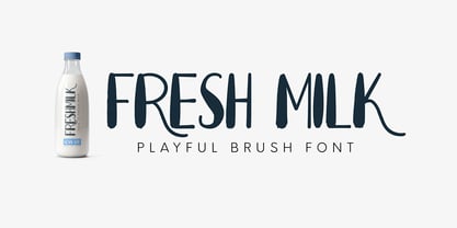 Fresh Milk! A handbrush font with all uppercase glyphs, regular and slant. Fresh Milk font is suitable for branding, logotype, apparel, T-shirt, Hoodie, product packaging, quotes, flyer, poster, advertising, etc. Whats Include? 1. Uppercase characters 2. Multilingual support. 3. Numerals, punctuations, and alternates 4. Accessible in the Adobe Illustrator Glyphs panel, or under Stylistic Alternates in the Adobe Photoshop OpenType menu, Adobe InDesign, Corel Draw, even work on Microsoft Word. Please message me if you're unsure of any language support. Thanks for looking, and I hope you enjoy it! Please don't hesitate to drop me a message if you have any issues or queries. Omotu Studio
 - Billy Signature by Omotu,
$16.00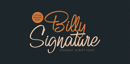 DETAILS Billy Signature! A handwrittent script font with 2 styles, regular and slant. Billy Signature font is suitable for branding, logotype, apparel, T-shirt, Hoodie, product packaging, quotes, flyer, poster, advertising, etc. Whats Include? 1. Uppercase and lowercase characters 2. Multilingual support. 3. Numerals, punctuations, and ligarures 4. Accessible in the Adobe Illustrator Glyphs panel, or under Stylistic Alternates in the Adobe Photoshop OpenType menu, Adobe InDesign, Corel Draw, even work on Microsoft Word. Please message me if you're unsure of any language support. Thanks for looking, and I hope you enjoy it! Please don't hesitate to drop me a message if you have any issues or queries. Omotu Studio
 - Ten Pounds by Up Up Creative,
$29.00 Introducing Ten Pounds, a fun, hand-drawn serif font with tons of character (and tons of characters!). Ten Pounds is perfect for branding, poster design, t-shirts, invitations, design for children, and editorial design. It comes with more than 1300 glyphs, including more than 100 ligatures. OpenType features include stylistic sets, character variants, initial and final forms, and multilingual support (including multiple currency symbols). The OpenType features can be very easily accessed by using OpenType-savvy programs such as Adobe Illustrator and Adobe InDesign. (To access these awesome features in Microsoft Word, you'll need to get comfortable with the advanced tab of Word's font menu.)
 - Halus by Omotu,
$22.00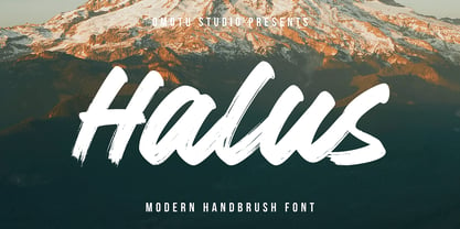 HALUS! A handwritten display script brush font, uppercase and lowercase. HALUS font is suitable for branding, logotype, apparel, T-shirt, Hoodie, product packaging, quotes, flyer, poster, book cover, advertising, etc. Whats Include? Opentype support Multilingual support PUA encoded Features: All uppercase, numerals, punctuations, and ligatures Accessible in the Adobe Illustrator Glyphs panel, or under Stylistic Alternates in the Adobe Photoshop OpenType menu, Adobe InDesign, Corel Draw, even work on Microsoft Word Please message me if you're unsure of any language support. Thanks for looking, and I hope you enjoy it! Please don't hesitate to drop me a message if you have any issues or queries.
 - GRINdS by Omotu,
$22.00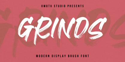 SEPHIRO! A handwritten display brush font. SEPHIRO font is suitable for branding, logotype, apparel, T-shirt, Hoodie, product packaging, quotes, flyer, poster, book cover, advertising, etc. Whats Include? Opentype support Multilingual support PUA encoded Features: Uppercase, lowercase, numerals, punctuations, and ligatures Accessible in the Adobe Illustrator Glyphs panel, or under Stylistic Alternates in the Adobe Photoshop OpenType menu, Adobe InDesign, Corel Draw, even work on Microsoft Word TTF, OTF, and WOFF files Please message me if you're unsure of any language support. Thanks for looking, and I hope you enjoy it! Please don't hesitate to drop me a message if you have any issues or queries.
 - Sabilla Solid by Omotu,
$10.00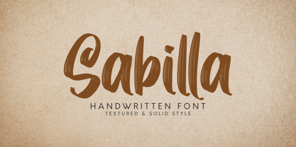 DETAILS Sabilla! A handwritten script font with textured and solid styles. Sabilla font is perfect for branding, logotype, apparel, T-shirt, Hoodie, product packaging, quotes, flyer, poster, etc. Whats Include? 1. Uppercase and lowercase characters 2. Supports international languages 3. Numerals, punctuations, stylistic alternates. 4. Accessible in the Adobe Illustrator Glyphs panel, or under Stylistic Alternates in the Adobe Photoshop OpenType menu, Adobe InDesign, Corel Draw, even work on Microsoft Word. Please message me if you're unsure of any language support. Thanks for looking, and I hope you enjoy it! Please don't hesitate to drop me a message if you have any issues or queries. Omotu
 - Gondess by Omotu,
$16.00 Gondess, a handwritten script font with 4 lowercase alternate variations. Gondess is perfect for branding, logotypes, apparel, T-shirts, Hoodie, product packaging, quotes, flyers, posters, and more. Whats does Gondess offer? 1. Uppercase and lowercase characters 2. Supports international languages 3. Numerals, punctuations, stylistic alternates. 4. Accessible in the Adobe Illustrator Glyphs panel, or under Stylistic Alternates in the Adobe Photoshop OpenType menu, Adobe InDesign, Corel Draw, even work on Microsoft Word. 5. Multilingual support. Please message me if you're unsure of any language support. Thanks for looking, and I hope you enjoy it. Please don't hesitate to drop me a message if you have any issues or queries.
 - Coconut Leaves by Omotu,
$16.00 COCONUT LEAVES! A handwritten display brush font, all caps. Coconut Leaves font is suitable for branding, logotype, apparel, T-shirt, Hoodie, product packaging, quotes, flyer, poster, book cover, advertising, etc. Whats Include? Opentype support Multilingual support PUA encoded Features: All uppercase, numerals, punctuations, and ligatures Accessible in the Adobe Illustrator Glyphs panel, or under Stylistic Alternates in the Adobe Photoshop OpenType menu, Adobe InDesign, Corel Draw, even work on Microsoft Word Please message me if you're unsure of any language support. Thanks for looking, and I hope you enjoy it! Please don't hesitate to drop me a message if you have any issues or queries.
 - Chips Snack by Omotu,
$16.00 Chips Snack! A hand-written font with 2 styles, regular (brush texture) and solid. Chips Snack is perfect for short typography, logotype, apparel, T-shirt, Hoodie, product packaging, quotes, flyer, poster. Whats Include? 1. Uppercase and lowercase characters 2. Supports international languages 3. Numerals, punctuations 4. Accessible in the Adobe Illustrator Glyphs panel, or under Stylistic Alternates in the Adobe Photoshop OpenType menu, Adobe InDesign, Corel Draw, even work on Microsoft Word 5. Multilingual support Please message me if you're unsure of any language support. Thanks for looking, and I hope you enjoy it! Please don't hesitate to drop me a message if you have any issues or queries.
 - Manees by Omotu,
$16.00 DETAILS Manees! A modern calligraphy font with two styles, regular and slant. Manees font is suitable for branding, logotype, apparel, T-shirt, Hoodie, product packaging, quotes, flyer, poster, advertising, etc. Whats Include? 1. Uppercase and lowercase characters 2. Multilingual support. 3. Numerals, punctuations, and alternates 4. Accessible in the Adobe Illustrator Glyphs panel, or under Stylistic Alternates in the Adobe Photoshop OpenType menu, Adobe InDesign, Corel Draw, even work on Microsoft Word. Please message me if you're unsure of any language support. Thanks for looking, and I hope you enjoy it! Please don't hesitate to drop me a message if you have any issues or queries. Omotu Studio
 - Grayfel by insigne,
$- As designers, we seek perfection and originality. The more we step back and look at our work, the more changes we tend to find necessary. Drastic modifications are inevitable. The same is true of Grayfel. Grayfel began as an exercise at insigne to explore the crowded space of neutral sans. While the world of sans serifs is admittedly crowded, I still managed to find something new and different. The final Grayfel consists of 42 full-featured OpenType fonts containing three widths: Regular, Condensed, and Extended. Every width consists of 14 fonts--seven weights with matching italics, making it a good companion for setting clear text and headlines for print and screen. OpenType features are also available. There’s figure choices, such as proportional and old style figures. Additionally, Greyfel includes sophisticated typographic attributes: ligatures, fractions, alternate characters, small caps, superscripts and subscripts. Its extended character set supports Central, Western and Eastern European languages. Optical compensations also mean the outcome of this family is a hybrid of humanistic proportions. It’s a well-finished design with optimized kerning gives it a friendly look. If you like sans serifs within the tradition of Futura, Helvetica, Avant Garde and Avenir, then you’ll love Greyfel, too. Grayfel works well in a variety of applications. Subtly neutral yet fun, it’s suitable for headlines of all sizes as well as for text. Put it to the task for marketing, packaging, editorial work, branding and even on-screen projects. Try it out: it’s not just fun and playful; it’s Grayfel.
 - Le Mano by Afkari Studio,
$13.00 "Le Mano" is a captivating serif display font that seamlessly blends classic elegance with modern sophistication. Crafted with precision, its graceful strokes and refined serifs exude a sense of timeless charm, making it a versatile choice for various design projects. This font commands attention with its distinctive and carefully balanced letterforms, each meticulously designed to offer a harmonious flow and readability. The deliberate spacing and clean lines ensure clarity, even at larger sizes, while maintaining a graceful presence in smaller text. Features: - Uppercase, Lowercase, Number, and Punctuation - Standard and Special Ligatures and alternates - Works on PC & Mac - Simple installations - Accessible in Adobe Illustrator, Adobe Photoshop, Adobe InDesign, and even works on Microsoft Word - Fully accessible without additional design software - Multilingual Support, ä, ö, ü, Ä, Ö, Ü, ß, ¿, and ¡. Utilizing this font for titles, headings, or focal points within a design can create a unique juxtaposition that captures attention and adds a touch of sophistication to the fun and spooky theme. If you're looking to insert "Le Mano" into your designs for these themes, consider experimenting with its application in headlines, titles, accent text, horror theme, and horror font, leveraging its elegant yet slightly haunting aesthetic to amplify the overall feel of the design.
 - Hoofer by Scholtz Fonts,
$15.00 Light and flexible, slightly retro, casual and readable, Hoofer combines 28 brush script, mono line script and sans-serif styles with ornaments into one Mega-Family. The different styles of the Hoofer Mega-family have been chosen to work together and to harmonize in a pleasing way. The Hoofer Mega-Family of fonts can be divided into three sub-families: Hoofer BRUSH subfamily: An eclectic group of five fonts. These are mainly joined scripts. Hoofer LINE subfamily: Seven mono-line scripts with joined letters in a number of weights, widths and styles. Hoofer SANS subfamily: Sixteen casual, Sans-Serif fonts. They are very readable and in a variety of weights & styles The mood of the Hoofer mega-family is light and flexible, slightly retro, casual and readable. It combines script and many sans-serif styles with ornaments into one Mega-Family. The different styles of the Hoofer Mega-family have been chosen to work together and to harmonize in a pleasing way. The Brush Sub-Family is designed for titling, packaging and display purposes, The Line Sub-Family can also be used for titling, packaging and display, however, it is less “showy”, and conveys an air of informality. The Sans Sub-Family is designed to shine as sub-heads and as body text. The wide range of Hoofline styles gives you, the designer, great flexibility in creating just the mood or impression that you want. Most of the fonts can use one or more OpenType Features. These can be accessed in a number of ways. The reason for this is that the major software producers provide different (and often conflicting) ways of accessing OpenType Features. In some cases such software manufacturers provide NO way of accessing certain OpenType Features. We have tried to remedy this by providing a highly flexible family of fonts. OPENTYPE (these OpenType features are only available in the “otf” fonts and not in the “ttf” fonts.) OpenType features that Hoofer makes use of are: Swashes (Word-Begin and Word-End Features); Alternate Numerals; and True Small Caps. ORNAMENTS In addition the Hoofer family has a font containing 94 ornaments. ALTERNATE NUMERALS You can access two sets of figures (numbers) in Hoofer Sans fonts. Both sets are tabular and lining but they differ in the height (but not the width) of the figures. The height of the alternate figures has been chosen so that they are compatible with the small caps. However, these alternate figures are available in ALL Hoofer Sans fonts, whether they feature small cap fonts or not. Hoofer has all the features usually included in a fully professional font. Language support includes all European character sets, Greek symbols and all punctuation. Opentype features include automatic replacement of some characters and discretionary replacement of stylistic alternatives.
 - Circolino by Aspro Type,
$19.99 Circolino is calligraphic script typeface set that is inspired by the letterforms taught in Italian schools. Each letter combination is designed to tie in perfectly within the word. In this regard, many contextual alternatives and letter variants have been designed, especially to make a more calligraphic feel. The Circolino character set consists of two families: Circolino Classic and Circolino Sport. The Classic Family has an almost vertical tilt axis, while Sport Family has a much more pronounced tilt axis that gives it more dynamism and movement.
 - Mufan by Majestype,
$22.00 Mufan is a Typeface project with a simple concept that wants to emphasize readability and can be used in almost anything. Through this idea we made it in 3 styles, textured, rough and clean aiming to give the impression of handwriting, retro, vintage and modern. To make it work well in various design conditions. Mufan comes with 260 Glyphs, has support for OpenType features, and has been specially designed to work well in uppercase only, lowercase only, or in sentences, and titles. We have also created a basic version called “Mufan PFS” for free which you can use in your work, with the aim that you get a clear idea whether this font works well or not in your current job. We hope you enjoy this font as much as we enjoyed creating it, and we hope that this font family will help you create great works in the future. Thank You! Majestype 2022
 - Quarzo by Corradine Fonts,
$39.95 This script font is inspired by the flexible nib strokes to create a concatenation of refinement with character mixing the contrast with pronounced but rounded angles. This angles along with the inktraps give the font a better performance when printing. Texts will have a very even rhythm due to its consistency on the stroke’s angle and spacing. The words can receive a dramatic touch by using the wide range of glyphs with curly and refined ornamentation. There are lots of caps and number variants dressed up with a variety of swashes. Also, two sets of versatile ornaments will be found: a first set of ending flourishes that match with any lowercase letter and a second set of independent flourishes to be placed around the words. Quarzo will give a great sophistication level to invitations, cards, tags, menus, advertising and packaging. Its character map covers Western and Central European characters.
 - Geminian by Sudtipos,
$49.00 Geminian is a set of fonts that started as a simple idea based on a theoretical level and developed during a long time, to be able to take shape under a creative impulse inspired by the need to communicate, today more than ever. From an astrological point of view, it celebrates and contributes to this practice, the study of stars position and movement and their influence on people's destiny. As a good Gemini, this set revives the main features of the opposite twins sign. Gemini is associated with thoughts, creativity, and communication. Its ruler Mercury (Hermes for the ancient Greeks), messenger of the Gods, and spokesman of the divine word, gives the natives of this sign intelligence, wit, eloquence and poetry. Geminian aims to be a medium to carry different messages from one end to the other. And this is because when using words, Geminis always surprise. Thanks to this gitf (and language and communication), they are able to bring up the most ingenious ideas, to solve any problem and to contribute new perspectives. These qualities may be the secret of its magnetism. The Geminian set comes in 5 styles including a script with multiple ligatures and alternates, 3 sets of caps and dingbats. In addition the complete font family supports a wide variety of Latin alphabet-based languages.
 - Overloaded by PizzaDude.dk,
$19.00 Overloaded is an excellent font for a wide variety of use - most likely something that needs a kind of worn look. Works well in both large and small sizes, that being headlines and/or display. Surprisingly versatile and will fit tons of different purposes. I put in 3 different versions of the lowercase letters for you to pick as you please, and play around with. Comes with multilingual support
 - Regional News JNL by Jeff Levine,
$29.00 A roughened and worn version of Daily Tabloid JNL was originally created as a non-exclusive custom font for a client. The design emulates the look of old letterpress wood type and has now been released commercially as Regional News JNL; available in both regular and oblique versions. A special acknowledgement goes to Michael Hagemann of Font Mesa Fonts who partnered with Jeff Levine Fonts for the original project. His creativity and skill resulted in the textured look needed for the typeface. For some beautiful antique typefaces or fine text face collections, please visit Font Mesa Fonts.
 - Grunge Standard by Scholtz Fonts,
$9.50 Grunge Standard is to grunge fonts what Jazz standards are to the world of Jazz – timeless, easy to use, great for every occasion. The font is easily recognized, clear and legible, just like the tune that everyone knows. Use Grunge Standard for contemporary display work, for fashion items, for event posters, movie posters, music posters, videos, DVD covers, in fact, anywhere that grunge fonts could possibly appear. Grunge Standard contains over 250 characters - (upper and lower case characters, punctuation, numerals, symbols and accented characters are present). It has all the accented characters used in the major European languages.
 - Festina by Twinletter,
$14.00 Festina is our newest font, which is handwritten which is neat and clean and proportionate in usage. gives a friendly, relaxed, and cool impression when reading. Not limited to that, the bold calligraphy font is designed to keep paying attention to the beauty of each letter, there are alternate options for the letters which are certainly easy for you to access, so you can automatically customize the letters you want to enhance the visual appearance of your design project. This charming font also offers the beauty of abstract typography harmony for a wide variety of design projects, including digital natural handwriting for designs, quote designs, for social media business designs, advertisements, trademarks, food and beverage promotion banners, text, posters, a signature, and all designs require handwriting or whatever design you want. What’s Included : File font Web Fonts Standard glyphs Ligature Works on PC & Mac Simple installations Accessible in Adobe Illustrator, Adobe Photoshop, Adobe InDesign, even work on Microsoft Word. PUA Encoded Characters – Fully accessible without additional design software. Fonts include multilingual support for; Afrikaans, Albanian, Croatian, Czech, Danish, Dutch, English, Estonian, Finnish, French, German, Hungarian, Italian, Norwegian, Polish, Portuguese, Slovak, Slovenian, Spanish, Swedish Thank you for your purchase! Hope you enjoy our font!
 - Aspire to Inspire by Tlatous Type,
$19.00 Introducing Aspire to Inspire Font by Tlatoustype Aspire to Inspire is a cursive display Font. This font is perfect for book cover, product packaging, branding project, megazine, social media, wedding, or just used to express words above the background.This font includes TTF and OTF, This font also multilingual support.
 - Gilbert Qualifi by EmbunStudio2018,
$20.00 Hello Everyone have a nice day, let me introduce our new Classy Serif Font called "Gilbert Qualifi" !! Are you ready to make the project more elegant and classy? makes every eye that sees it stunned and silent for a moment This font is part of our dedication to the world of fonts, the work that takes a long time, makes us make this font as our mainstay font Whether you have a client that needs a new chic logo, or you're designing your social media posts. Maybe you're preparing your wedding mood board, stationery, invitations, Gilbert Qualifi font is just perfect for all of that and more. you can check it all on preview !! Enjoy !! and start Creating !! Include Multilingual : ÀÁÂÃÅÄĄĀĂÆÇĆČĎÈÉÊËĘĒĖĚĞÌÍÎÏĪİÐÑŃŇÒÓÔÕÖŌŐOEŔŘØÙÚÛÜŪŮŰŲŚŠŞŁÝŸŻŹÞ àáâãąåäāăæçćčďđèéêëęěēėğıìíîïīðñńňòóôõöoőoeøùúûüūůűŭųþýÿŕřśšşłżźž
 - Railroad Gothic by Linotype,
$29.99Railroad Gothic was originally designed in 1906 for ATF (American Type Founders). This uppercase-only typeface is very condensed and also heavy, giving it a distinct 19th American wood type feeling. Like those 19th Century classics, Railroad Gothic is best used when set really big. Originally designed for use in railroad signage, Railroad Gothic has since been adapted for use in many American tabloid journals, which employ it in screaming headlines. When you need to set something large and loud for the whole world to see, this old ATF classic may be right for you. Railroad Gothic is an all caps font, and is available in digital format exclusively from Linotype. The typeface is included in the Take Type 4 collection from Linotype GmbH." - Aparcero JNL by Jeff Levine,
$29.00 Vintage sheet music with the title of "Aparcero" lettered in a bold, Art Deco sans is the basis for Aparcero JNL. The title is a Spanish word that translates to "tenant farmer" or "sharecropper".
 - Mr Happy by Hipopotam Studio,
$22.00 Hand drawn narrow typeface designed for one of our books. You can layer different styles over the background style to achieve lots of colorful effects. Use just one style to get a single color letter or set the shadow and fill over the background style to get a full, three color mode. Mr Happy has upper and lowercase characters with up to three alternate glyphs. Build in OpenType Contextual Alternates feature will automatically set alternate glyphs depending on frequency of appearance of the same character (even in web font but only in HTML5 browsers). The script doesn’t throw random glyphs. For example in the word “HIPPOPOTAMUS” you will automatically get three different “P” glyphs and two “O” glyphs. It really works great but of course you can always fine tune it by hand.
 - Bejraby by Phoenix Group,
$13.00 Bejraby is a handwritten font, which cultivates love, and attracts all the beautiful things in the world. This font was created with the theme of beauty and freedom in love.
 - Happy Cookies by Tlatous Type,
$19.00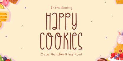 Introducing Happy Cookies Font by Tlatoustype Happy Cookies is a Modern Handwritten Font. Happy Cookies is perfect for book cover, product packaging, branding project, megazine, social media, wedding, or just used to express words above the background. This font also multilingual support.
 - Osnova Navigation by AndrijType,
$18.75 The common Slavic word Основа (Osnova) means basis in English and βάση in Greek. This universal but still distinctive typeface can make a good ground for any design project. Special Navigation version separated by Western Latin, Greek and Cyrillic families is here.
 - Serat by Wahyu and Sani Co.,
$24.00 Serat is a medium contrast flared serif with mixed up styles of classic typefaces which is highly influenced by early stages of Latin based hand writing. The lowercase are modernized versions of Carolingian minuscules, vertical stems which touch the baseline have been modified to have horizontal cut for simpler look and keep the calligraphic style for terminals & stroke ends. Then the uppercase are flared serif which were influenced by Roman inscriptional capitals. The font name was taken from the Javanese word "serat" which means writing (noun). It comes with some unique features, such as: - Carolingian style alternate for some letters (a,e,f,g,t), also comes with separated stylistic set for long 's', and long left leg 'x' and alternative ampersand. - Discretionary ligatures for all caps titling. - Standard Ligatures. - Tabular and Proportional for both Lining and Old-style figure. - Fraction with Nominator and Denominator. - Superscript and Subscript for numbers, etc. Serat would be suitable for "classic" themed work; poster, book cover, branding, videography, etc.
 - Hand Print Stamp Rough by TypoGraphicDesign,
$29.00 The typeface Hand Print Stamp Rough is designed in 2018 for the font foundry Typo Graphic Design by Manuel Viergutz. The rough hand-printed typeface based on old wood letters, rubber-stamps and plastic stamps. 7 font styles (Reg + Mix, Circle, Diamond, Square Star + Icons) each with 1350+ glyphs incl. 200+ decorative extras like icons, arrows, dingbats, emojis, symbols, geometric shapes, catchwords, decorative ligatures (type the word LOVE for ♥ or SMILE for ☻ as OpenType-Feature dlig) and stylistic alternates (9+ stylistic sets). For use in logos, magazines, posters, advertisement and packaging plus as webfont for decorative headlines. The font works best for display size. Character Set: Latin Extended (Adobe Latin 3). 1350+ glyphs with 200+ extra icons like arrows, dingbats, symbols, geomatric shapes, catchwords and many alternative letters. (9× A–Z, 9× a–z, 9× 0–9) For use in magazines, posters, headlines and advertisement, plus as webfont for decorative headlines. Have fun with this font & try-before-buy the DEMO-FONT (with reduced glyph-set) FOR FREE! ■ Font Name: Hand Print Stamp Rough ■ Font Weights: Regular + Mix, Circle, Diamond, Square, Star + Icons + DEMO (with reduced glyph-set) ■ Font Category: Sans Serif + Slab Serif Display for Headline Size ■ Font-Format: .otf (OpenType Font for Mac + Win) + .ttf (TrueType Font) ■ Glyph Set: 1350 glyphs ■ Language Support: 27+ for Latin Extended (Adobe Latin 3). Afrikaans, Albanian, Catalan, Croatian, Czech, Danish, Dutch, English, Estonian, Finnish, French, German, Hungarian, Icelandic, Italian, Latvian, Lithuanian, Norwegian, Polish, Portugese, Romanian, Slovak, Slovenian, Spanisch, Swedish, Turkish, Zulu ■ Specials: 200+ decorative extras like icons for arrows, dingbats, emojis, symbols, geometric shapes, catchwords + German Capital Eszett. Open Type Features: Kerning (kern), Stylistic Set 1 (ss01) … Stylistic Set 16 (ss16), Localized Forms (locl), Superscript (sups), Ordinals (ordn), Slashed Zero (zero), Fractions (frac), Standard Ligatures (liga), Contextual Alternates (calt) e. g. Stylistic Set-Loop and Decorative Ligatures (dlig) e. g. type the word “LOVE” for ❤ or “SMILE” for ☺ ■ Design Date: 2018 ■ Type Designer: Manuel Viergutz
 - Ongunkan Byzantine Empires by Runic World Tamgacı,
$100.00 For this Byzantine Empire calligraphy font, I had to work for 2 weeks and 3-4 hours a day and search the internet. It made me very tired, but I finally finished it, and it was good. This font can use both latin keyboard and greek keyboard. I also added Greek unicode characters. I will adapt this font to the latin alphabet, I will make the full character set font, this will take less time. I wish you good work.
 - Biblia Serif by Hackberry Font Foundry,
$24.95 This all started with a love for Minister. This is a font designed by Carl Albert Fahrenwaldt in 1929. In the specimen booklet there’s a scan from Linotype’s page many years ago. They no longer carry the font. I’ve gone quite a ways from the original. It was dark and a bit heavy. But I loved the look and the readability. This came to a head when I started my first book on all-digital printing written from 1994-1995, and published early in 1996. I needed fonts to show the typography I was talking about. At that point oldstyle figures, true small caps, and discretionary ligatures were rare. More than that text fonts for book design had lining OR oldstyle figures, lowercase OR small caps—never both. So, I designed the Diaconia family using the Greek word for minister. It was fairly rough. I knew very little. I later redesigned and updated Diaconia into Bergsland Pro—released in 2004. It was still rough (though I impressed myself). Now, with 4-font Biblia Serif family 13 years later, I’ve cleaned up, made the fonts more consistent internally, added more functional OpenType features, and brought the fonts into the 21st century. I used the 2017 set of features: small caps, small cap figures, oldstyle figures, fractions, lining figures, ligatures and discretionary ligatures. These are fonts designed for book production and work well for text or heads. Finally, in 2021, I went over the fonts entirely and remade them in Glyphs.