10,000 search results
(0.041 seconds)
- Kalperica by Keristyper Studio,
$14.00 Kalperica is a futuristic font for the design of minimalist characteristics that has a digital world feel of the metaverse. This font is good for logo design, Social media, Movie Titles, Books Titles, short text even long text letters, and good for your secondary text font with sans or serif. Featured: Standard Uppercase & Lowercase Numeral & Punctuation Multilingual : ä ö ü Ä Ö Ü ß ¿ ¡ Alternate & Ligature PUA encoded We recommend programs that support the OpenType feature and the Glyphs panel such as Adobe applications or Corel Draw. so you can use all the variations of the glyphs. Hope you enjoy our fonts!
 - RM True To Type by Ray Meadows,
$19.00 Throw away the carbon paper, ribbons and Tippex ... now you can get that typewritten look with RM True to Type. Legible at all sizes, it is available in regular and bold. That faithful old typewriter has given many years of valiant service, but now the keys are worn and blocked with ink. The Old styles replicate the wear and tear of years of use. Includes: Western European, Central European, Baltic & Turkish sets Due to the modular nature of this design there may be a slight lack of smoothness to the curves at very large point sizes (around 100 pt and above).
 - 1682 Writhed Hand by GLC,
$42.00 This funny font was created inspired from a contract of sale for a field prepared by a French notary in the end of the year 1682 (December seventh). We have worked to transform the almost illegible original form into a contemporary usable typeface, but keeping the special "writhed" appearance. It is a "pro" font containing Western (including Celtic) Eastern and Central European, Icelandic, Baltic, and Turquish diacritics. The numerous OTF alternates and ligatures(about 5 different glyphs or ligatures for almost each basic lower case letter) made the font looking like a real various hand as closely as we can do it.
 - Festivo LC by Ahmet Altun,
$19.00 With the lowercases of Festivo Letters Font Family, Festivo LC comes with new sketches, new shadows and also ornaments. Festivo LC Font Family is a handmade layered font which includes several textures and shadows. Different font types can be created using various combinations of Festivo LC Fonts and colors. The kernings and the metrics of Festivo LC Fonts are not the same as Festivo Letters' kernings and metrics. It is advised not to use them together. The various possibilities of the Festivo Font Family allows you to create a lot of great works such as posters, magazines, printings, t-shirts etc.
 - Victorina by John Moore Type Foundry,
$35.00 Victorina is a fantasy sans letter or display, inspired by the Victorian letters whose stylistic influence dominated the scene graph of the nineteenth and twentieth century. Victorina has a perfect structure of rigorous geometry. Victorina comes in several versions in both Black and Condensed, in italics with a varied repertoire of styles, besides providing small caps and ornaments. Victorina lets you work fine fantasy headlines when they overlap in layers of different styles. Victorina is a letter designed to recreate, with a contemporary vision, the spirit of those days of the industrial revolution and the early days of modernism.
 - Nucliometer by Supremat,
$12.00 Nucleometer is a very contrasting and at the same time elegant display font. It is ideal for large headlines and impressionable typography. A feature of the Nucleometer is the rounding of the lowercase letters a, b and r, as well as a funny "tail" in the letters t, g, j, f, t, y. This gives it a more lively and unique character. Another interesting feature is the increased proportion of the ascender height of Ultra Condensed, which is larger than the usual Bold font. Together, this font is ideal for a designer who needs stylish and very contrasting typography in his work. Nucliometer is available in 5 styles, starting from Bold to Bold UltraCondensed and also has a variable format.
 - Cosmic Turtle by Hanoded,
$10.00 Cosmic Turtle is the belief that the world is supported by a giant turtle. It is mostly found in Hindu and Chinese mythology and the mythologies of the indigenous peoples of the Americas. I had to think of this, as the idea of the Cosmic Turtle is referenced to in the 1982 book ‘A Wild Sheep Chase’ by Haruki Murakami - my favourite author. Cosmic Turtle is a font that I made using a broken chop stick and Chinese ink. I was actually trying to create something scary for Halloween, but this is what came out and I quite like it. Cosmic Turtle is a fat display font with rough edges, wobbly glyphs and a set of double letter ligatures for you to play with.
 - Cavole Slab by insigne,
$22.00 Cavole Slab is a new slab serif, designed in early 2011, that has a strong influence from Dutch typography. The name is an altered form of the Portuguese word for feather, emphasizing the typefaceís soft and friendly character. Slab serifs give this face plenty of impact and make it an excellent choice for contemporary designers. The font family includes a very dark and powerful black all the way down to a hairline thin weight, giving a tremendous versatility. The family also features dynamic italics that add plenty of emphasis and momentum. Cavole Slab is suitable for both headline and text settings and should easily find its place in a number of different settings, from corporate identity to magazine body copy. There are six weights that come with complementary italics, and each font includes over 450 characters and extended Latin-based language support. The typeface family comes in OpenType format, and OpenType alternates are easily accessible through OpenType enabled applications such as the Adobe suite or Quark. Please see the informative .pdf brochure to see what OpenType features are available and to see them in action.
 - Mr Palker by Letterhead Studio-YG,
$35.00 A slab serif Mr Palker and grotesque Mr Palkerson build one superfamily together. These are blank types. In a way even the display ones. Typefaces for newspapers, announcements, cheap advertising and police posters. Mr Palker and Mr Palkerson will turn every language into a fence. And due to six types of faces one can choose what material should the fence be made from — from Thin steel rods to the Black stone blocks. In their simplest appearance Mrs P&P are intended for the solid blank composition in victorian or industrial style. They are quite decent, a bit old-fashioned slab serif and grotesque with closed aperture. All my types have layers. Walker and Palkerson also do. Besides the standard set of symbols, they have 4 add-ons. 1. Alternate glyphs, including unicase ones. 2. Ligatures with A letter. 3. Extra tall small caps. 4. Two-storey ligatures. All this options are intended for the complex composition. The additional letters are rather eccentric as their main function here is to imitate the victorian oddities. Imitate, parody, just not repeat. There are lower-case As and Es in the set in height of small caps and uppercases. They can turn every writing into the unicase. The lower-case A (as well as uppercase and small caps version of it) has deliberately by my taste grown a ludicrous tail. To compensate it I’ve built all the possible ligatures - ад, ал, ая. There are 35 of this ligatures all together. Take a closer look at the Russian letters D, L, K, Ya from the main set as well as their alternates. The additional glyphs are one more comic than the other — on purpose to imitate (not to repeat!) the victorian set. This sets have lowercase numbers. And small caps numbers as well. What a modern typeface without them. They also have an У-letter with a generously curvy tail. As if before the WWI. The Latin of course has alternates as well. It has letters to make the perfect French sound more like the russian provincial version of it. The tails of Js and Ts can be made a little bit more open — or a little bit closed. My favorite feature here, an invention of a kind - extra tall small caps. It allows to compose logos with the small caped uppercases directly from the keyboard. The small caps of this typefaces are usually much taller than the customary ones. This is the kind of small caps that Palker and Palkerson have. More to that, the strokes’ weight and the letters width are corresponded to the uppercases. Just a ready set for making a logo a la 1913 style. With a unicase, one has to mind! One more trick with the tall small caps is a possibility to make them work like lower uppercases. Their height is just in between of lower- and uppercases. Isn’t it great to have an additional set of uppercase working ponies in stock for the case of emergency. And finally — the trademark of Palkers family, two-storey ligatures. They are made in the height of uppercases and turn every writing into an ornament or a puzzle of a kind, while at the same time making them much shorter. Each face has 90 of them. Mainly those are twins: CC, BB, DD and so on. ll this things are for the unhasty compositing, even for lettering. Which means that for the things which are not there you always should have Command+Option+O and some patience. Also — among the two storey ligatures one also can find some belvedere villas. All my types are glasses from the one kaleidoscope. The P&Ps family was preliminary part of the victorian set, which already has 1 Cents and Clarendorf - optionally one can add Costro, Gordoni, Handy, Guardy, Surplus, Red Ring, Red Square, Babaev to the list. And also Sklad, Odessa, Dreamland, Romb, Platinum - here, at Letterhead’s, every second one is victorian. All together our typefaces can allow one to set advertisement of any kind, even the trickiest one, and compose everything, from the coffee place’s menu to the antiquarian magazine.
 - Mr Palkerson by Letterhead Studio-YG,
$35.00 A grotesque Mr Palkerson and slab serif Mr Palker build one superfamily together. These are blank types. In a way even the display ones. Typefaces for newspapers, announcements, cheap advertising and police posters. Mr Palker and Mr Palkerson will turn every language into a fence. And due to six types of faces one can choose what material should the fence be made from — from Thin steel rods to the Black stone blocks. In their simplest appearance Mrs P&P are intended for the solid blank composition in victorian or industrial style. They are quite decent, a bit old-fashioned slab serif and grotesque with closed aperture. All my types have layers. Walker and Palkerson also do. Besides the standard set of symbols, they have 4 add-ons. 1. Alternate glyphs, including unicase ones. 2. Ligatures with A letter. 3. Extra tall small caps. 4. Two-storey ligatures. All this options are intended for the complex composition. The additional letters are rather eccentric as their main function here is to imitate the victorian oddities. Imitate, parody, just not repeat. There are lower-case As and Es in the set in height of small caps and uppercases. They can turn every writing into the unicase. The lower-case A (as well as uppercase and small caps version of it) has deliberately by my taste grown a ludicrous tail. To compensate it I’ve built all the possible ligatures - ад, ал, ая. There are 35 of this ligatures all together. Take a closer look at the Russian letters D, L, K, Ya from the main set as well as their alternates. The additional glyphs are one more comic than the other — on purpose to imitate (not to repeat!) the victorian set. This sets have lowercase numbers. And small caps numbers as well. What a modern typeface without them. They also have an У-letter with a generously curvy tail. As if before the WWI. The Latin of course has alternates as well. It has letters to make the perfect French sound more like the russian provincial version of it. The tails of Js and Ts can be made a little bit more open — or a little bit closed. My favorite feature here, an invention of a kind - extra tall small caps. It allows to compose logos with the small caped uppercases directly from the keyboard. The small caps of this typefaces are usually much taller than the customary ones. This is the kind of small caps that Palker and Palkerson have. More to that, the strokes’ weight and the letters width are corresponded to the uppercases. Just a ready set for making a logo a la 1913 style. With a unicase, one has to mind! One more trick with the tall small caps is a possibility to make them work like lower uppercases. Their height is just in between of lower- and uppercases. Isn’t it great to have an additional set of uppercase working ponies in stock for the case of emergency. And finally — the trademark of Palkerson family, two-storey ligatures. They are made in the height of uppercases and turn every writing into an ornament or a puzzle of a kind, while at the same time making them much shorter. Each face has 90 of them. Mainly those are twins: CC, BB, DD and so on. ll this things are for the unhasty compositing, even for lettering. Which means that for the things which are not there you always should have Command+Option+O and some patience. Also — among the two storey ligatures one also can find some belvedere villas. All my types are glasses from the one kaleidoscope. The P&Ps family was preliminary part of the victorian set, which already has 21 Cents and Clarendorf - optionally one can add Costro, Gordoni, Handy, Guardy, Surplus, Red Ring, Red Square, Babaev to the list. And also Sklad, Odessa, Dreamland, Romb, Platinum - here, at Letterhead’s, every second one is victorian. All together our typefaces can allow one to set advertisement of any kind, even the trickiest one, and compose everything, from the coffee place’s menu to the antiquarian magazine.
 - Certificate by Scholtz Fonts,
$18.20 Elegant, fluid and romantic are but a few of the words that describe this beautiful font. Certificate is a perfect choice for awards, wedding invitations, greeting cards - in fact any products for which a sophisticated, contemporary yet formal look is sought. Certificate was designed for situations that require: - a classical, “award” like font (for certificates, invitations, formal notices etc); - a very legible font (particularly important for invitations to events such as weddings and formal occasions where details of the occasion are very important and should not be mis-read); Certificate is fully professional, carefully letterspaced and kerned. All upper and lower case characters, punctuation, numerals and accented characters are present.
 - Notorious by W Type Foundry,
$15.00 Notorious is a brush script typeface with features that come from gestural calligraphy plus a touch of personality, therefore, it delivers wider freedom in both rhythm and composition of words. As a result, this typeface is highly suitable to convey expression in a most natural way. Notorious is composed by two styles; the first one is black and the other one textured. Both generate a more natural look when it comes to writing. Every weight includes alternative characters, ligatures, numbers, final forms, swashes, extras and catchwords giving you more options in terms of fostering your creativity. If you are looking to create expressive and gestural messages Notorious is your ideal choice.
 - IMA ISO GPS No Frame by Iain Macleod Associates Ltd,
$27.00 ISO GPS symbols without frames for producing ISO GPS specifications in documents such as CAD drawings, word processor documents, spreadsheets, and slideshow presentations. Full set of symbols and modifiers from ISO 1101:2017 (without frames), ISO 1660:2017 (without frames), ISO 14405 (including all size modifiers), ISO 1302 (surface texture symbols) and ISO 8062 series (castings). Fully compliant with the ISO 3098 series and ISO 7083. Use in conjunction with IMA ISO GPS Frame font to create the full range of ISO GPS specifications This fonts is sold with a single user licence, contact Iain Macleod Associates Ltd (www.macleod.co.uk) for multi-user licences, site licences or corporate licences.
 - Laughing Kids by Putracetol,
$24.00 Junior Schoolboy - Bold Fun Display Font. Junior Schoolboy a bold, quirky display font with a fun and trendy cute characters. With a childish style, it will be very suitable for your project, which is related to children. Such as story books, illustrations, comic books, t-shirts, posters, greeting cards, logos, branding, stickers, svg, crafting. The alternative characters were divided into several Open Type features such as Swash, Stylistic Sets, Stylistic Alternates, Contextual Alternates, and Ligature. The Open Type features can be accessed by using Open Type savvy programs such as Adobe Illustrator, Adobe InDesign, Adobe Photoshop Corel Draw X version, And Microsoft Word. This font is also support multi language.
 - Berta by Eurotypo,
$60.00 This font is versatile and expressive, it can create appealing atmosphere and attract attention, conveying a gamut of message and emotions. It is well suited in the jobbing areas like packaging, logotypes, magazines, web pages and advertising, etc. Berta has all the advantages of OpenType features that allow a variety of combinations: You may choose to set types in connected or unconnected ways, being used as body text or headlines for its good legibility, visual impact and accurate kerning. It has swashes, standard and discretional ligatures, contextual alternates, word ending and tails. It has also an extended character set to support Central and Eastern European as well as Western European languages.
 - Grok by PintassilgoPrints,
$20.00 Bold as love, Grok is a hand-drawn typeface, assertive but soft. Showy and friendly. It's an all caps font with 2 choices for each letter, accessible via keyboard upper and lower case slots. For that handcrafted look, you know. Turn on the contextual alternates feature to automatically alternate these. Grok originally comes in two cuts: bold and… less-bold :) Later the outline style was added as a gift, a free font. And finally, there's yet a nifty picture font with dozens of dingbats to beautify your words every now and then. Perfectly suited for display uses: packaging, signage, web titlings, editorial design, book covers – and not-only-covers. Grok it?
 - Gotcha by Nicky Laatz,
$15.00 Say hello to GOTCHA! A versatile new marker font with bounce and vigor and a a super-sexy-casual vibe! The Gotcha fonts are incredibly versatile , from street urban, to styled fashionista, to hearty food branding - whatever the weather, Gotcha! has you covered :) Gotcha! comes with a set of alternate upper and lower case letters, and a second set of lowercase letters - this way you can write one word in a million different ways - and keep things ultra natural looking. A comprehensive set of double letter ligatures are also included. Gotcha! also comes with an “Extras Font” which include textured swashes and splatters/grit to add some pizazz to your design.
 - Quinshia Script by Cooldesignlab,
$10.00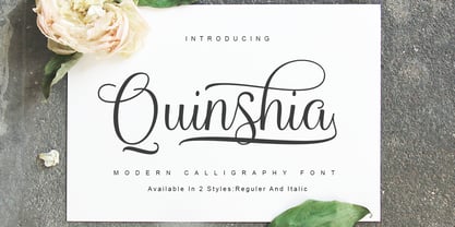 Quinshai Script a new fresh & modern script with a handmade calligraphy style, decorative characters and a dancing baseline! So beautiful on invitation like greeting cards, branding materials, business cards, quotes, posters, and more!! Quinshai Script including alternate glyph and beautiful swirl in a font including stylistic sets, Ligatures etc. The Open Type features can be accessed by using Open Type savvy programs such as Adobe Illustrator CS, Adobe Indesign & CorelDraw X6-X7 and Microsoft Word. And this Font has given PUA unicode (specially coded fonts). so that all the alternate characters can easily be accessed in full by a craftsman or designer. Thanks and happy designing :-)
 - Tailor Craft by Putracetol,
$24.00 Tailor Craft - Bold Quirky Display Font. Tailor Craft a bold, quirky display font with a fun and trendy cute characters. With a childish style, it will be very suitable for your project, which is related to children. Such as story books, illustrations, comic books, t-shirts, posters, greeting cards, logos, branding, stickers, svg, crafting. The alternative characters were divided into several Open Type features such as Swash, Stylistic Sets, Stylistic Alternates, Contextual Alternates, and Ligature. The Open Type features can be accessed by using Open Type savvy programs such as Adobe Illustrator, Adobe InDesign, Adobe Photoshop Corel Draw X version, And Microsoft Word. This font is also support multi language.
 - NorB TypeWriter by NorFonts,
$35.00 NorB TypeWriter is my emulation of the IBM Selectric 'Light Italic' ball witch was used by my grand-brother for his correspondance during the 70’s and 80’s. It's however a slanted mono-spaced looking typewriter font. You may want to use this font with any word processing program for text and display use, print and web projects, apps and ePub, comic books, graphic identities, branding, editorial, advertising, scrapbooking, cards and invitations and any casual lettering purpose… or even just for fun! NorB TypeWriter features 677 glyphs, OpenType features and comes in 8 weights each with their matching italics and in a Thin, Light, Normal and Bold version.
 - Chubby Chicks by Putracetol,
$22.00 Chubby Chicks - Funky Display Font. Chubby Chicks a bold, quirky display font with a fun and trendy cute characters. With a childish style, it will be very suitable for your project, which is related to children. Such as story books, illustrations, comic books, t-shirts, posters, greeting cards, logos, branding, stickers, svg, crafting. The alternative characters were divided into several Open Type features such as Swash, Stylistic Sets, Stylistic Alternates, Contextual Alternates, and Ligature. The Open Type features can be accessed by using Open Type savvy programs such as Adobe Illustrator, Adobe InDesign, Adobe Photoshop Corel Draw X version, And Microsoft Word. This font is also support multi language.
 - Junior Schoolboy by Putracetol,
$16.00 Junior Schoolboy - Bold Fun Display Font. Junior Schoolboy a bold, quirky display font with a fun and trendy cute characters. With a childish style, it will be very suitable for your project, which is related to children. Such as story books, illustrations, comic books, t-shirts, posters, greeting cards, logos, branding, stickers, svg, crafting. The alternative characters were divided into several Open Type features such as Swash, Stylistic Sets, Stylistic Alternates, Contextual Alternates, and Ligature. The Open Type features can be accessed by using Open Type savvy programs such as Adobe Illustrator, Adobe InDesign, Adobe Photoshop Corel Draw X version, And Microsoft Word. This font is also support multi language.
 - Holy Type by The Ocean Studio,
$15.00 HOLY TYPE FONT a handwritten font inspired and dedicated or consecrated to God or a religious typeface , meaningful of type. You can get special characters by access Character Map for Windows user, and Font Book for MAC user. Download tutorial below : How to Access special characters, You can Download the link for Support you http://www.mediafire.com/file/o3sml68hxp6h6yd/Access_Spesial_Characters.pdf/file This is information and tutorial how to use ligatures in Adobe Illustrator, Adobe Photoshop, Microsoft Word (Windows and Mac). And Enable alternates characters in other apps. Download the guide here : http://www.mediafire.com/file/edm9sjjwx9g1vi2/How_to_Active_Ligature.pdf/file if you get a trouble on our font kerning : http://www.mediafire.com/file/9e0q5sjzx97e06m/how_to_slove_trouble_kerning.pdf/file
 - Manadis Deadly by Allouse Studio,
$16.00 Proudly Present, Manadis Deadly a Quirky Font. Manadis Deadly come with many Stylistic-Alternates for Uppercase and Lowercase. This also come along with Multi-Lingual Support so thats all will give you more choices to play arround. We highly recommend using a program that supports OpenType features and Glyphs panels like many of Adobe apps and Corel Draw, so you can see and access all Glyph variations. Manadis Deadly is perfect for any tittle, logo, product packaging, branding project, megazine, social media, or just used to express words above the background. Enjoy the font, feel free to comment or feedback, send me PM or email. Thank You!
 - Virgin by John Moore Type Foundry,
$95.00 Virgin is a hybrid typeface with a Victorian spirit, based on script forms of Romanesque ornamentation. With his rich variety of stylistic forms, ornaments and catchwords, Virgin is a chance to create completely new texts, varied and elegant. About 1100 Glyphs allow users to create words out standard, thanks to its Opentype programming in countless combination of alternates. The variety of styles makes it easy to create texts according to your taste and use because Virgin offer an unlimited combinations of stylistics alternates. Virgin is ideal for humanistic texts, tourist ads, liquor and wine labels, fashion and even for cosmetic purposes. Virgin is presented in solid and inline version, and a basic version for web in lighter weight, also providing a refined collection or ornaments and catch Words. Virgin has been specially designed for logotype, packaging & publishing design project. Virgin evokes the richness of nature in its biodiversity.
 - Sumergible Script by Andinistas,
$39.95 Sumergible Script is a striking font that simulates it has been written with a dry pointed brush on textured paper. Its purpose is to decorate and accompany photos, illustrations and textures by letters designed with a generous horizontal spacing between lowercase which reinforces the idea of hurriedly and interrupted cursive calligraphy. In that sense it is spontaneous and useful to form vibrant words and sentences, shining short messages on book covers, posters and other graphic design media. Sumergible Script has new alternative letter forms that are activated with OpenType features creating hierarchy changes in writing. With Swash for example, you can change the character case with metric and similar proportions. With Titling it becomes even more expressive capitalization. Other OpenType features are: Fractions and Superscript. In short, Sumergible Script is designed to mix and match words and short phrases with a vital and expressive handwritten feel.
 - Treacherous by Comicraft,
$29.00 Midnight, Pacific Coast Highway. You're driving home alone at night and your battery's dying. Your headlights have dimmed and you can barely see the road or the signpost up ahead. But there's an eerie green light glimmering in your rear view mirror and that strange warning uttered by the pump attendant at the Devil's Elbow gas station has put the frighteners on you. Is that Satan's face glowering at you through the mist, or something far worse? The only way to handle this font is with one foot on the gas pedal and one foot on the brake. Originally designed by John Roshell for GAMBIT titles, this sharp font has appeared on vampire & rock magazine covers, Star Wars & Star Trek merch, and the logo for the INHUMANS comic & TV show!
 - Boston by Latinotype,
$29.00 Designed by Daniel Hernández and Paula Nazal with digital editing by Elizabeth Hernández. Corrections and review by Alfonso García and Rodrigo Fuenzalida. Boston is a slightly rounded-edged typeface, which is inspired by “Trenda”—a geometric sans serif based on the uppercase of “Trend”(a Latinotype font, released in 2013, that was very well received). This new typeface comes with a wider character set that offers a complete family of uppercase and lowercase in different weights. Boston is a versatile, easy-to-use, functional display font with a strong personality, especially its uppercase, which makes the designer’s work easier. Boston’s lightest and heaviest variants are ideal for display use while its middle weights work well with short and mid-length texts. This typeface has been designed especially for corporate projects, logotypes and publishing. Boston comes in 8 weights, ranging from Thin to Heavy, and includes matching italics as well as small caps and alternates. The family contains a 634-character set that supports 206 different languages.
 - Lady Suettaya by Sulthan Studio,
$12.00 Hi Font Lover! Lady Suettaya is a classic font, I build it with my relaxed hands. designing a classic font but having a modern element in it, which makes it particularly suitable for wedding media, book covers, greeting cards, logos, branding, business cards and certificates, in fact for any design work that requires a clasik, formal or luxury look. Try Lady Suettaya in your hands, enjoy the richness of OpenType features and let her fun and elegant excitement make you happy and enhance your creativity! You can use this font very easily. There are so lovely features in it. Contains the full set of lowercase and capital letters, punctuation, numbers, and multilingual support. This font also includes some ligatures and alternative styles Stylistic Set For those of you who have software that is able to work OpenType (Corel Draw / Photoshop / Illustrator / InDesign). About Multilingual? Don't worry, I Have added the characters in International Language.
 - Austral Slab by Antipixel,
$15.00 Austral Slab is a hand-drawn layered font designed by Antipixel, with unique textures & styles that combine giving your work a distinctive impression. This font comes in three weights, Regular, Light & Thin, with irregular outlines and uneven/crooked strokes, giving your work more personality and making it exclusive and powerful. For this same reason it can be used in a vast variety of projects, such as logos & branding, stationery, book covers, magazine design, clothing prints & tags, packaging, animated videos, and many more! Austral Slab has three sets of alphabets in uppercase and lowercase to avoid repeating the same character pattern, and giving the font a more natural handwritten feel. This is included in the Open-Type Contextual Alternates, which applies an automatic substitution of glyphs as long as the Open-Type features are activated. Also, Austral Slab offers other Open-Type features such as Stylistic Alternates, Ligatures, Discretionary Ligatures, Fractions, Superscript, Subscript, Denominator, Numerator, Scientific Inferiors & Kerning. This font has a very large glyph coverage and can be used in a wide range of languages, including English, Spanish, Italian, French, German, Polish, Czech, Vietnamese, Finnish, Icelandic, among many others. The style Maplines Thin is offered Free for commercial & personal use!
 - Vinea by Greater Albion Typefounders,
$12.00 Vinea is a family of ten display faces that take us on an enjoyable excursion into the world of the retro-futuristic. Ideal for posters, book covers, and anything that needs the sort of futuristic feel that abounded in designs from the 30s to the fifties. The en faces have been designed with uniform metrics, to facilitate multi-coloured overlay effects.
 - Miyagi by Thinkdust,
$10.00 Miyagi brings the classic Yagi Link Double to the digital world, a modern form for a timeless typeface. Miyagi pays tribute to the decade it was created while pushing it into the boundaries of the future as well, a double image to match its double lines. Complex in design but easy to read, Miyagi embodies the stylistic ideas inherent in typeface design.
 - Junge Holiday Cuts NF by Nick's Fonts,
$10.00A charming series of 26 holiday “type warmers” based on the works of Carl S. Junge for the Barnhart Brothers & Spindler type foundry in the 1920s. Single-color cuts are in the uppercase positions, while 13 of the cuts suitable for two-color usage occupy the lowercase in adjacent pairs; e.g., a and b, c and d, and so on. - Buffalo Western by Kustomtype,
$25.00 Frederick Cody, as known as Buffalo Bill, and his renowned travelling Western Circus are now celebrated through the creation of the Buffalo Circus and the Buffalo Western type fonts, both developed quite in the spirit of the stirring wood type fonts from the 19th century. All characters are fully hand traced and vectorized and provided with appealing glyphs and cool catchwords.
 - ITC Gramophone by ITC,
$29.99ITC Gramophone is a work of Canadian designer Serge Pichii. The distinguishing feature is the large spiral which is part of the form of almost every capital letter as well as many other characters. The capitals can also be used as drop capitals. The forms of ITC Gramophone are perfect for displays and will surely catch the eye of any reader. - Buffalo Circus by Kustomtype,
$25.00 Frederick Cody, as known as Buffalo Bill, and his renowned travelling Western Circus are now celebrated through the creation of the Buffalo Circus and the Buffalo Western type fonts, both developed quite in the spirit of the stirring wood type fonts from the 19th century. All characters are fully hand traced and vectorized and provided with appealing glyphs and cool catchwords.
 - Good Show by HIRO.std,
$17.00 Good Show is a Bold Script Font This font describes about stylist, humanist, dynamic, funny, easy going, cool, and easy to use and will bring a good harmony when the letters are connected and paired each other. Good Show inspired from pop culture era. FEATURES - Uppercase and Lowercase letters - Support Opentype Features - Contextual Alternates - Stylistic Alternates - Numbering and Punctuations - PUA Encoded Characters - Multilingual Support - Works on PC or Mac - Simple Installation USE Good Show works great in any Branding, Logotype, Apparel, Poster, Product Packaging, Advertisement, Label, Product Design, Magazine and any projects that need Bold Handwritten Font. Enjoy using! Thanks. HIRO.std
 - Lucemita - Personal use only

- Ivy Tiles by Aga Silva,
$9.50 Ivy Tiles was designed as a set of 62 seamless, endless patterns accompanied by font map(s). They well might be a base for designing your own wallpapers, textiles, glass wall opaque foil privacy screens or even wooden fancy trellises - the choice is yours :) The font features simple, fancy, intricate patterns in three variants (Fill, Outlines and Stencil). - Outlines were designed with an idea of serving as an unobtrusive pattern on its own, or as a playful addition to the Fill pattern. - Fill pattern was designed to give more statement to Outlines, which in some cases may be too subtle for the job you have to be done. - Stencil has the most robust shapes. I have thrown this one in just in case you might want to do some DIY stencils. You may also use this file as a starting point for some CNC cut fancy trellis, however please do match pattern to the cutting method (ie. CNC, bolt cutter etc.) to the pattern and the material you intend to cut. -By overlaying Outlines & Fill (or Stencil & Fill) and manipulating those two layers you may get “more flat” or “more 3D” look. Have fun! Note: Please be aware that you may need to prepare those patterns in order to work with them in CAD-CAM or if you intend them for bolt cutter etc.
 - Mirava by Din Studio,
$25.00 Hi, Everyone! Ready to make your branding spark? If you need to create a big, bold logo for your business, work on a poster for an event, or whatever your project may be-then this is the perfect font for you. Mirava Sans-A Sans Serif Font Family If we can give you many options then why not? Mirava San is a package that will delight you. With this family you will get many options to maximize your designs with stylish fonts. This font designed to bring your branding to life and add a touch of modernity, fun and style. Mirava paves the way for you to write the information you need to send out to your audience. Perfect to create amazing headings, logos, menus, social media graphics, and many more. Our font always includes Multilingual Support to make your branding reach a global audience. Features: Multilingual Support PUA Encoded Numerals and Punctuation Thank you for downloading premium fonts from Din Studio
