10,000 search results
(0.041 seconds)
- Future Bugler by Breauhare,
$35.00 Future Bugler is a font based on the second logo created by Harry Warren in early 1975 for his sixth grade class newsletter, The Broadwater Bugler, at Broadwater Academy in Exmore, Virginia, on Virginia’s Eastern Shore. This font can convey several perspectives or moods. It can suggest a space-age vision of the future, or an art-deco perspective of the future as in the movie “Sky Captain and the World of Tomorrow”. It also communicates the idea of high performance, or extreme sports, without the grunge. Also be sure to check out the upright version of this font, Future Bugler Upright, available separately. Digitized by John Bomparte. Additional tags: NFL, NFL Network, NFLN
 - Leegione by Almarkha Type,
$35.00 Introducing The Neon Sci-fi Futuristic Font called Leegione A unique font with a futuristic style can make your futuristic logotype more interesting. Inspired by real world neon light signs, this font is perfect for adding your own glowing light effects or can be used to actually design real world neon signs. Leegione fonts with 9 unique ligatures are ideal for your project and will allow you to create beautiful designs, headlines, posters, logos, badges, and much more. It is also best used for posts, logos, posters, labels, and more.
 - Love Conchetta by HIRO.std,
$17.00 Love Conchetta is a semi casual script font. This font describes about easy going, beautiful, feminist, elegant, dynamic, humanist, easy to use and will bring a good harmony when the letters are connected and paired each other. FEATURES - Support Opentype Features - Support Ligatures - Uppercase - Lowercase - Numbering and Punctuations - Multilingual Support - Works on PC or Mac USE Love Conchetta works great in any branding, logos, magazines, invitation, wedding designs, social media posts, advertisements, product packaging, product designs, label, photography, invitation, stationery, elegant brush, quotes and any projects that need handwriting taste.
 - Feels so Good by HIRO.std,
$16.00 Feels so Good is a semi casual script font. This font describes about girly, feminist, elegant, dynamic, humanist, easy to use and will bring a good harmony when the letters are connected and paired each other. FEATURES - Support Opentype Features - Support Ligatures - Uppercase - Lowercase - Numbering and Punctuations - Multilingual Support - Works on PC or Mac USE Feels so Good works great in any branding, logos, magazines, invitation, wedding designs, social media posts, advertisements, product packaging, product designs, label, photography, watermark, invitation, stationery, quotes and any projects that need handwriting taste.
 - Billy Coaster by HIRO.std,
$20.00 Billy Coaster is a Modern Retro Typeface. This font describes about stylist, modern retro, modern vintage, cool, and easy to use. Billy Coaster Typeface inspired from the modern retro typography and designs in late 80's untill 90's. FEATURES - Uppercase and Lowercase letters - Support Opentype Features - Stylistic Alternates - Numbering and Punctuations - PUA Encoded Characters - Multilingual Support - Works on PC or Mac - Simple Installation USE Billy Coaster Typeface works great in Logotype, Branding, Apparel, Poster, Magazine and any projects that need Modern Retro taste. Enjoy using! Thanks. HIRO.std
 - Lovely Wedding by HIRO.std,
$21.00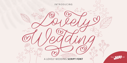 Lovely Wedding is a lovely Wedding script font. This font describes about casual, classy, luxury, elegant, stylish, dynamic, easy to use and will bring a good harmony when the letters are connected and paired each other. FEATURES - Support Opentype Features - Support Ligatures - Alternate Uppercase and Lowercase - Swash - Numbering and Punctuations - PUA Encoded Characters - Multilingual Support - Bonus Pack - Works on PC or Mac USE Lovely Wedding Font works great in any wedding invitation, product packaging, logotype, quotes and any projects that need all about love script taste. Enjoy using! Thanks. HIRO.std
 - Madfool by Washabib Studio,
$13.00 A tall condensed sans serif font If you are looking for letters with attitude, Madfool is the perfect fit. It's a memorable, strong and elegant typeface. Madfool is a modern clean sans serif font. With bold stroke, fun character. To give you an extra creative work. Madfool font support multilingual more than 100+ language. This font is good for logo design, Social media, Movie Titles, Books Titles, a short text even a long text letter and good for your secondary text font with sans or serif. Make a stunning work with Madfool font.
 - Undersong by PintassilgoPrints,
$19.00 Undersong brings 13 fancy hand-drawn stackable fonts which can be combined in many, many tasty ways. Layered or not, you'll see that these little ones work together scrumptiously well. For added flavor and freshness, each font brings at least 3 variations for each letter, making it for a cool natural handmade look. T-shirts, posters, book covers, packaging projects, Undersong will nicely fit many design applications. Some great font families out there are said to be workhorses. Figure this one like a work-unicorn: perfect for fantastic designs. Enjoy the ride!
 - Squack by Olivetype,
$25.00 Introducing Squack, the brush typeface that will turn heads! With its excellent texture and carefree attitude, this typeface is perfect for any project. Whether you need it for a poster, branding, movie title, headlines, or logotype - Squack is sure to give your work an explosive boost! Featuring strong thick strokes and sharp edges on each letterform, you'll get a look that can't be beaten. Squack font includes : Standard Latin. Numbers, symbols, and punctuations Multilingual Support. Fully accessible without additional design software Simple Installations Works on PC & Mac Thank You.
 - Heidorn Hill - Unknown license

- Moondog Fifteen - Unknown license

- Asenine Super Thin - Unknown license

- Moondog Thirty - Unknown license

- Backpage Article JNL by Jeff Levine,
$29.00Backpage Article JNL and its oblique counterpart are a variant to the popular sanserif wood types used in newspaper headlines and on broadsheets in years past. - Greeting Monotone by Monotype,
$29.99Based on Art Nouveau models, Greeting Monotype was created by M.F. Benton in 1927. The Greeting Monotone font works well for titling, packaging and greeting cards. - Mick by Oleg Stepanov,
$12.00 Mick is a hand-drawn typeface inspired by graffiti works of old style. The family contains Regular and Light styles. Cyrillic and extented latin character sets.
 - Churchward Heading by BluHead Studio,
$25.00 BluHead Studio LLC is pleased to be working with New Zealand designer Joseph Churchward in the digitizing of his extensive library of exciting and unique designs.
 - ITC Peter's Miro by ITC,
$29.99ITC Peter's Miro is the work of New York designer John Peter. It was inspired by the letters used by Joan Miro in his paintings. No one used letterforms more frequently in his work than Joan Miro," says Peter. For his typeface, however, "considerable liberty has been taken with his [Miro's] original letters and missing characters have been added." The letters are a simple script, irregularly and almost crudely written, but bursting with energy. To give designers free rein with their creativity, Peter designed two complete versions of the alphabet in both upper- and lowercase, Peter's Miro and Peter's Miro Too." - Faberge by Larin Type Co,
$18.00 FABERGE This is elegant logo serif font. It has a light weight and playing forms, the uppercase are more elongated and the lowercase are compressed but they have the same height as the uppercase, with this you can play with space and mix them, with this you will expand the boundaries of your ideas for your project. This font has 44 ligatures ( use uppercase to get them ), 124 alternatives for uppercase and 88 alternatives for lowercase, they will add a touch of playfulness and elegance and make your design unique.
 - Manteiga by Plau,
$49.00 Julia Child once said: the secret to great french cooking is butter, butter, butter. Thus, we present to you Manteiga - butter in Portuguese! - a typeface for heart-melting, word-spreading goodness. The idea we had was to play with brush lettering - a style we love - and go as far as we can with the shapes of the letters while finding balance between positive and negative space. We wanted biiiig personality. And small inconsistencies - the ones that add texture and life to lettering. We left extensive OpenType features and technical stuff aside for a moment, adding later only what we thought was necessary, like different shapes for the Q, a and g - for example. All caps setting was something we wanted from the beginning. In text case, the x-height is rather short for a brush script, and this lends a quirky voice. Spacing is ultra tiiiiight so don’t go too small, but make it as big as you want! Ah! And there are some fun dingbats thrown in for good measure.
 - Athelas by TypeTogether,
$65.00 An attempt to go back towards the beauty of fine book printing, inspired in Britain's literary classics. Athelas takes full advantage of the typographic silence, that white space in the margins, between the columns, the lines, the words, the lettershapes and finally, within the characters themselves. It is also intended to take advantage of the great advances and technical developments made in offset printing. Athelas shows its best side in finely crafted book editions and good printing conditions. Athelas has a large character set that covers most of the languages that use the Latin script. Although inspired in British literature, this typeface respects the cultural values behind different languages, where diacritic marks have an utterly important role. Athelas features four weights and about 800 characters per weight, including small caps, discretionary ligatures, fractions, a complete range of numerals for every use and a set of ornaments and arrows.
 - Mallaire by Rochart,
$20.00 Mallaire is a calligraphy font with an exclusive style and a touch of classic, inspired by the handwriting of ancient manuscripts. Carefully designed to work together in harmony that makes it very suitable for wedding media, book covers, greeting cards, logos, branding, business cards and certificates, even for any design work that requires a classic, formal or luxurious.
 - Notelia by Gatype,
$14.00 Notelia The elegant font I work with is creative in mood and perfect in shape, inspired by today's beautiful serif look. bold, balanced and varied, born for luxury and beauty. includes uppercase letters, numbers, and a wide variety of punctuation marks. Serif font with a modern style. Made for posters, web design, branding, illustrations, badges and many other works.
 - Blop11 by osialus,
$15.00 Blop11 is a geometric sans-serif type family, consisting of 3 weights. Blop11 Bold is inspired by 1800s-style wood, poster typeface. Owing to its rounded terminals, Blop preserves natural organic quality of wood typeface. The Regular and Light versions are contemporary original projects. Blop11 is well-suited to headlines and short text. See also Blop77
 - ASTRALYS by Cerri Antonio,
$37.00 Astralys is a linear decorative font, works very well as a type of identity logo, poster and 3d works. It continues the tradition of precedent Xova but with a hard linear impact. Its interesting to note that with it its possible to play with straight corners to create endless couplings geometric styles and beyond. Caps only fonts.
 - Sabinard by Greater Albion Typefounders,
$12.95 Sabinard offers a distinctive form of 'Swash' lettering. It is excellent for poster work, or for headings and titles. Its distinguishing feature is the combination of long ascenders and descenders with a small cap height. It has been designed to compliment Greater Albion's Sabio, but also works splendidly as a 'feature' type alongside any Roman Face.
 - Ability by Scholtz Fonts,
$15.00 Ability is a family of stylish and contemporary handwriting fonts that combine the vigor of hand-drawn fonts such as Affable with the elegance of fonts such as Blythe. What is unusual about Ability is that it enables a word to be formed from a group of letters in a variety of ways: not only the conventional linking of letters as in a cursive script or the placing of letters close to each other on a common baseline, but it uses the overlapping of the swashes and swirls that contribute to the individuality of the characters to integrate the letters into a single word. Ability comes in a number of styles: Legacy - Regular (medium weighted and the basic type of the other styles); - Black (a vigorous and dramatic version of Regular); - Condensed Medium - Condensed Light - Linear 45 (medium-weight font made from a mono-width line) - Linear 25 (light-weight font made from a mono-width line) Suggestions for use: - wedding stationery - greeting cards - valentines day media - beauty products media - lingerie tags - women’s magazine pages - classical music media - award certificates - magazine pages The font is fully professional: carefully letterspaced and kerned. It contains over 235 characters - (upper and lower case characters, punctuation, numerals, symbols and accented characters are present). It has all the accented characters used in the major European languages.
 - Astrid Grotesk by Eclectotype,
$40.00 Astrid Grotesk is a normalized version of Schizotype Grotesk. Normalized; not neutralized. Where many neo-grotesks appear cold with their harsh neutrality, Astrid has a warmth, eminating from its (for want of a better word) clunkiness. With the latest update, it becomes a true workhorse, with a range of widths and italics for the normal widths. Astrid Grotesk, while being clearly a neo-grotesk in appearance, has a personality all of its own. Standout characters include the f and t, and the default binocular g, unusual in neo-grotesks. And the right angled terminals on c, e and s. Stylistic sets offer up alternate forms of a, g, y, I, @, dutch IJ, german eszett and l. A full complement of numerals is included: proportional and tabular, lining and oldstyle, plus fractions, subscript and superscript. Note also that the tabular figures are duplexed across weights - very useful when highlighting specific entries in tables. The tabular figures feature also substitutes in fixed width (across all weights) comma and period, so your decimals line up perfectly always. Lastly, case sensitive forms of certain glyphs are included for all-cap settings. This typeface will be useful for corporate identities and branding work. It’s spaced more for text settings in the normal width, and gets more display-optimized as the width decreases, but with careful tracking, all styles can sing at display sizes. Bored of those other Swiss style typefaces? Astrid Grotesk could be the face you need to breathe new life into your designs. Coupled with Schizotype Grotesk, its more eccentric cousin, you've got an unorthodox branding system ready to use straight out of the box.
 - Minora by Alex Meier,
$40.00 Minora is a contemporary sans serif type family of three weights. Glyphs with open, plain and reduced forms are attributes of Minora. Several OpenType features allow different figure sets, fractions and more. Minora had its beginning in 2007 during Alex Meier’s Typedesign study (CAS Typedesign) at the ZHdK in Zurich (Switzerland). After graduation, Alex Meier continued working on this project in a shared studio with his former fellow student Dominique Kerber . He completed this fully developed font in April 2011.
 - York Handwriting by Thinkdust,
$10.00 A hand-drawn font inspired by the menu from a tearoom in York. York Handwriting is simple but with accentuated features, creating an effect that is decorative and distinct while still being clear. Giving the look of chalk or wet-wipe pens, this font will provide you with texture to make your work stand out, almost literally. With York Handwriting, any design can be granted the humble, homely look of a small, side-alley tearoom, especially with the emphasised x-height helping the text to stand out.
 - Amsterdam Signature by Lettersiro,
$25.00 The Amsterdam font is a simple and classy font, comes with 4 Elegant Variations, opentype features such as stylistic alternates,initial and final form, and ligatures. We keep this font looks elegant, classy, readable, stylish, catchy and easy to use. The Amsterdam Font is the great choice for watermark on photography, signature or signature logo design, quotes, album cover, business card, and many other design project. From business cards to photo watermarks, The Amsterdam is here to elevate your work to the highest level
 - Architype Bayer by The Foundry,
$99.00 Architype Universal is a collection of avant-garde typefaces deriving mainly from the work of artists/designers of the inter-war years, whose ideals underpin the design philosophies of the modernist movement in Europe. Their ‘universal’, ‘single alphabet’ theory limits the character sets. Architype Bayer was drawn from Bauhaus Archiv sketches for a minimal sans typeface that was created in 1925 by Herbert Bayer, based on his single-alphabet student thesis. This ‘universal’ alphabet was designed for exclusive Bauhaus use, but never cut as a typeface.
 - BringInTheFrowns by Ingrimayne Type,
$14.95 Why use a simple emoticon to express unhappiness or sadness when you can have an entire font proclaiming your feelings? This is a font that may work for notes of sympathy, whether real or in jest. For the smiley version, see AllSmiles, and if you only want to proclaim a only a little sadness, you can temper the feelings with a plain version of the typeface, FebDrei. In the update of 2011, emoticons were added in the appropriate unicode slots (unicode 1F601 to 1F640 slots)
 - Blog Script by Sudtipos,
$39.00 Technology is making it so that we’re all connected without the need for the physical-presence kind of being connected. That is strange, fascinating, and has a certain magnetism that is very difficult to resist. What’s at stake is no less than the transformation of centuries of human behaviour, and that’s part of the fascination. But while our existence morphs and we rush headlong into our socially minimalist future, we use our present culture to helplessly signal our nostalgia about our past. We know what our future will be missing, and we’re already full of nostalgia about it, but we know that what little we can do about isn’t going to affect the outcome that much. So, almost in full hindsight now, the DIY implosion of the past few years must have really been a reaction to our technological dis/connection. In typography, the minimalist future is already here, with something as austere as the sans serif having become the preferred expression of progress and fortune, both part of the connected isolation we are undergoing. But when physical interaction must take place, like coffee shops and gin joints, our organic alphabets ride high and mighty. That sense of human heritage — elegance and exuberance in our writing, the use of flaws to charmingly brand our own individualism — keeps turning up in all kinds of places, most unexpected of which is the digital world. The overall message seems to be that we’re still creative, imaginative, and unique. In the digital world, on blogs where we write about our puny music and fashion preferences, we’re just articulating this individualism of ours, this third domain of existence our future seems eager to dismiss. These were the thoughts behind Blog Script, the second collaboration between Carolina Marando and Alejandro Paul, after their successful stint with the Distillery set of fonts. This typeface comes in two weights, alternates for most letters, and a strong aesthetic rooted in individuality and freedom of spirit. Use it to be alone together, to tell the world that we’re still human, for now.
 - Radilant by great19,
$18.00 Radilant script is a bold typeface, an incredible font to make iconic word marks, logotypes, typography. A simple script but also powerful for branding project, it is easy to use. This font is perfect to make an eyecatching tittle on a poster, music album, book tittle and more. Radiant script was made manually, handwritten with a brush pen, then carefully digitalized using vector software to make it nice and correctly proportional.
 - Chocolate Smoothies by Mevstory Studio,
$20.00 Chocolate Smoothies is an experimental display font, which was hand-drawn and then digitized. This playful and stylish font draws inspiration from Lettercorner vintage & handrawn Font. If you have any queries, questions or issues please don't hesitate to contact us directly. Download within a few clicks and use across a huge range of programs including Silhouette, Cricut, SCAL, Photoshop, InDesign, Illustrator, and Microsoft Word as well as many more.
 - PAG Julio by Prop-a-ganda,
$19.99Prop-a-ganda offers retro-flavored fonts inspired by lettering on retro propaganda posters, retro advertising posters, retro packages all the world over. This is perfect font for your retrospective project. PAG Julio is a eye-catching, counter-contrast font with retro touch. This cool and cute font woks best for display uses, headlines, branding, print, and web design projects. - Simple On Sunday by Icedbear,
$15.00 warmly welcome to "Icedbear" I am so proud to represent the simple handwriting font name Simple On Sunday :) This font was inspired by ideas from my handwriting every day and is perfect to use this one for any of your ideas to have handwriting font in your work like logos, prints, note homework, decorating cards or artwork, branding, and much more :)
 - McKenna Handletter NF by Nick's Fonts,
$10.00Here’s a warm, casual text font based on an early twentieth century work by lettering artist Elizabeth Colwell, released by American Type Founders in 1923. For this update, all four fonts have been completely redrawn, and many new characters have been added. Both versions of this font contain the complete Latin A Extended character set, as well as extended ligatures and fractions. - Magnitudo by ZetDesign,
$16.00 Magnitudo is a very amazing handwritten font. This font is equipped with many choices of styles (alternative A-z forms), making it easier for design workers to determine the form of writing according to their desired tastes. This font also features an international accent to be used in several countries at once.I hope you are interested in my work. Thank you...


